Jump to content

Teranishi Guitar - Emotional Olive


namrehsnoom

Recommended Posts

Teranishi Guitar – Emotional Olive


Teranishi Chemical Industries – based in Osaka, Japan –  was founded during the Taisho period around 1916, and got quite some fame as one of the earlier ink producers in Japan. For this review I did some digging on the internet to find out more about the company and its background.


During the Taisho period (1912-1926), Japan experienced an influx of new technologies and ideas, bringing it swiftly into the modern age. Western philosophy and style were embraced, and permeated every aspect of Japanese life. New styles of literature and drama were introduced, influenced by Western novels and plays. This movement in Japanese culture became known as “Taisho Roman”, referring to the European age of romanticism that inspired it (and definitely not the Roman Empire as I originally and wrongly thought).

Fountain pens also became popular in Japan during this time, with Teranishi producing its first writing ink, called “Guitar Ink”. As far as I know, nobody remembers where that “Guitar” reference comes from. One hypotheses that I found was that Teranishi exported a lot to the Philippines, where the guitar was a popular instrument. But there’s no definite explanation why Teranishi decided to associate its inks with guitars. That will probably remain a mystery forever.


For their 105th anniversary, the company introduced some stylish retro-inks, hinting at this exciting start-up period. The inks come in beautiful – almost art deco – boxes, containing a nice-looking 40ml bottle of ink. And please take a close look at the ink’s bottle cap: it’s marked with Teranishi’s original “Gold Star Guitar” brand, featuring a queen strumming a guitar … weird!


large.teranishi-emotionalolive-titlephoto.jpg.bd49f997df8663ed87b29b1910c7c94a.jpg


I discovered the Teranishi inks in 2022, and have enjoyed them a lot. These inks are well saturated, but at the same time manage to look muted and toned-down. This combination works quite well, and I’m becoming very fond of this brand. In this review, I take a closer look at Emotional Olive, a pale yellow-green with heavy shading and lots of depth. I had high hopes for this ink, but as will become clear in this review, the ink is a bit too pale to play nice with my favourite pens, which came as a disappointment. But don’t worry… at the end of the review I have some tips to save the day.


large.teranishi-emotionalolive-detail1_1nib.jpg.8d976af6bb9299651843ee4e1927f6d6.jpg


Emotional Olive is well-saturated, maybe a touch too dry, but it writes really well when using wet-writing pens. My biggest issue with this ink is its pale colour… for me personally this yellow-green is simply too light, which results in two problems: 1/ contrast with the page is too low, resulting in eye strain when reading a full page of it, and 2/ the shading becomes too strong, making this already pale ink even more difficult to read. Due to that heavy shading and low contrast, I couldn’t use my scanner for the review pictures, but had to use photos instead. The colour of this Emotional Olive absolutely gets an emotional response from me: I want to like it, but I simply can’t … for me, this particular mix of yellow and green doesn’t work. Which really irritated me, because there’s hidden greatness in this ink.


To illustrate the colour span of this Teranishi ink, I did a swab on 52 gsm Tomoe River paper, where I really saturated portions of the paper with ink. Emotional Olive has a wide colour span with a stark contrast between light and darker parts. Wet pens and/or broad nibs tend to use the right side of the saturation range, where the colour looks at its best. Shading is really harsh in most pens, and too heavy to be aesthetically pleasing. 


large.teranishi-emotionalolive-saturation300ppi.jpg.d7bac638a797572aa8c169d737f5790c.jpg


On the smudge test – rubbing text with a moist Q-tip cotton swab – the ink behaved perfectly. Almost no smearing can be detected, and the text remains firmly on the page. Water resistance is exceptionally good. The yellow-green colour quickly detaches from the paper, but a light blue residue remains that is perfectly readable. That’s much better than most non-waterproof inks. This is also evident from the chromatography, which shows an intriguing complexity with light-blue, rose-purple and yellow dyes in the mix. The light-blue dyes remain firmly attached to the paper, as shown by the bottom part of the chroma.


large.teranishi-emotionalolive-chromatography300ppi.jpg.dc09100a37ec163e0c7b6fc453d3dc95.jpg


I’ve tested the ink on a wide variety of paper – from crappy Moleskine to high-end Tomoe River. On each scrap of paper I show you:

  • An ink swab, made with a cotton Q-tip
  • 1-2-3 pass swab, to show increasing saturation
  • An ink scribble made with a Lamy Safari M-nib fountain pen
  • The name of the paper used, written with Nakaya M-nib
  • A small text sample, written with a Pelikan M600 F-nib
  • Source of the quote, written with a wet Edison Collier with 1.1 stub
  • Drying times of the ink on the paper (with the M-nib Safari)

The multi-paper writing test shows that Teranishi Emotional Olive works well with both white and cream paper. Due to its paleness, contrast works best on pure white paper. There is a tiny amount of feathering on lower-quality paper, with the expected see-through and even some bleed-through. Drying times are average in the 10-20 second range, with the longest drying times on glossy paper. Overall, a technically solid ink – what I’ve come to expect from Teranishi.


large.teranishi-emotionalolive-sampletextscan1.jpg.051678e331b12d5722bebb12c33ee98e.jpg

large.teranishi-emotionalolive-sampletextscan2.jpg.1f678126dd4128452103f4ee4450b806.jpg

large.teranishi-emotionalolive-sampletextscan3.jpg.f0d5c6f99392017cfd18543ac5afa690.jpg

large.teranishi-emotionalolive-sampletextscan4.jpg.3c3b156920c9d9e1d4934be6d7f9ae18.jpg

large.teranishi-emotionalolive-sampletextscan5.jpg.547d9ebd949a1e10d81d257306c44340.jpg


I used photos for the writing samples above to get the most accurate results. In scans, the contrast gets blown up, and looks totally unrealistic – see the scan below. My scanner absolutely messed up here: the colour is too yellow, and the text looks harsh and unpleasant. 


large.teranishi-emotionalolive-sampletextscan.jpg.4afe1b32334d215d6e17c882ccedf69a.jpg


Below you’ll find some zoomed-in parts of writing samples. On Paperblanks, there’s a tiny amount of feathering – just noticeable enough to be annoying. I usually have no problems with Paperblanks paper, but noticed that there can a bit of variation in quality … sometimes I come across a page where the fibers are less densily packed, and where you get a tiny bit of feathering. Looks to me that the production parameters are not 100% under control. Fortunately, they get it right 90% of the time, so they still remain my favourite journals.


large.teranishi-emotionalolive-sampletextdetail.jpg.6a761226a48818402d03b3c164d07f08.jpg


Writing with different nib sizes
The picture below shows the effect of nib sizes on the writing (written on Rhodia N°16 80 gsm paper). All samples were written with a Lamy Safari. I also added a couple of visiting pens: a Nakaya M-nib that writes like a fine, a wet Pelikan M600 Vibrant Orange with a gold F nib, and an Edison Collier with 1.1 stub. This Teranishi ink looks at its best in fine-nibbed wet pens, where the ink tends to be more saturated, compensating a bit for Emotional Olive’s paleness.


large.teranishi-emotionalolive-nibsizes.jpg.3543d4ccefdcef64dec0d1b63132c365.jpg


Related inks
To compare Teranishi Emotional Olive with related inks, I use my nine-grid format with the currently reviewed ink at the center. This format shows the name of related inks, a saturation sample, a 1-2-3 swab and a water resistance test – all in a very compact format. Kyo-no-oto kokeiro is a similar yellow-green, but a bit darker, and more pleasant-looking. 


large.teranishi-emotionalolive-relatedinks300ppi.jpg.3239a619b738c2d0d72a2c585b9e1e75.jpg


Inkxperiment – Geometry 101 Squares
As a personal challenge, I try to create interesting drawings using only the ink I’m reviewing. For me, that’s where the fun starts: experimenting with the ink to see how it behaves in a more artistic context.  And as is often the case with yellow-toned inks, this Teranishi Emotional Olive seems to be born to draw with. 


I love mathematics and am always in awe of the many ways it is used to concisely describe the physical world around us. That’s where the inspiration for my “Geometry 101” series of ink drawings comes from. Previous entries focused on circles and triangles, and in this episode I conclude the series with a study in squares.


large.teranishi-emotionalolive-inkxperiment600ppi.jpg.d19ddd4fc7f4e6c74d5a4b22e439faf3.jpg


I started with an A4 piece of HP photo paper, and used a cotton swab with heavily water-diluted ink to draw in the background. I then used potato-stamps to draw the squares, starting with water-diluted ink and adding more and more Emotional Olive to the mix. The corner structure was painted using a piece of carpet underlay as a stencil. I added final touches with a glass dip pen and pure Emotional Olive. The end result shows quite well what can be achieved with this Teranishi ink in an artistic context. Really nice drawing ink – I especially like the green/brown tones that show up on the photo paper.


large.teranishi-emotionalolive-collage.jpg.3a5c7302181194091a256c6dfa7c0371.jpg


Inkxpired – computational art
I love experimenting with pen/ink/paper, and have added another layer as part of the hobby. I’m exploring computational art, inspired by the ink drawings I do during ink reviews. Another fun offshoot of the hobby… and all that starting with a few drops of dye-coloured water on paper.


large.teranishi-emotionalolive-inkxpired.jpg.24d617f3bfbc53a5f1acee088d1ab466.jpg


I started by using a graphic art filter that abstracts the drawing a bit, and then used a couple of colour filters to steer the picture towards more greyish tones. For the final result, I rotated by 90° counter-clockwise. For some unknown reason, the picture looks stronger that way (my opinion).


large.teranishi-emotionalolive-inkxpiredevolution.jpg.d8247502d2dfc2d3f936eea0ebe8ad03.jpg


Conclusion
Teranishi Emotional Olive is an ink that draws mixed feelings from me. I love the way it looks when using it for graphic artwork. But for writing … nah … it just doesn’t work for me. Technically no issues, but the colour is too pale, the shading too heavy, the yellow-green too unpleasant to my eye. Not my type of ink colour, but that’s just me. If you happen to like it, go for it!


Saving the Olive
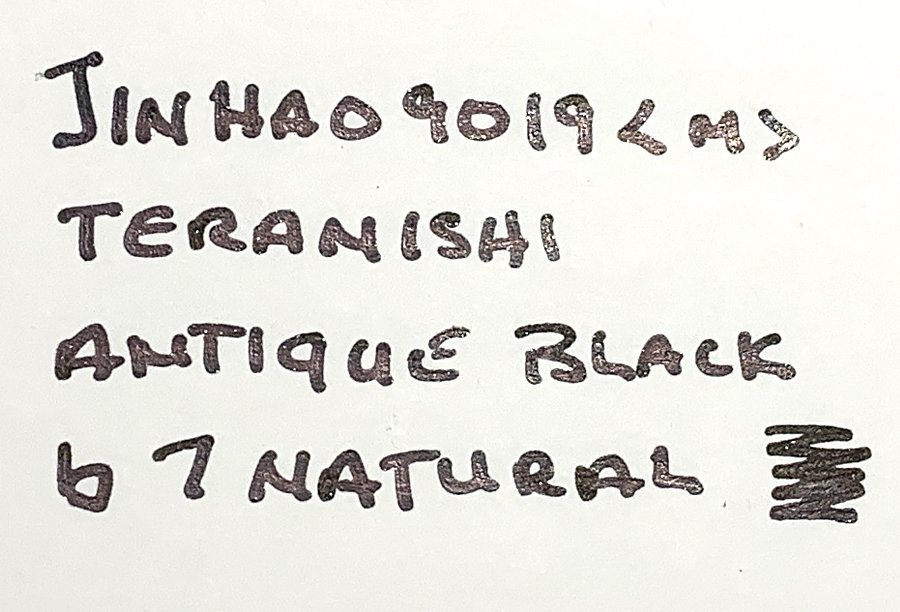
Although I don’t like the colour tone of Teranishi Emotional Olive, this is something that is easily fixed. Yellow inks are easy to steer in a different direction, just by adding a drop of some other colour. Adding a drop of Antique Black (1:10 ratio) darkened up the original yellow-green sufficiently to remedy all my complaints: the colour becomes more of a golden-green, the extreme shading has been tamed, and the contrast with the paper is way better. Or you can choose to add a bit of red or blue, morphing the ink to an orange or grass green. There’s definitely more than one way to rescue the original bottle.


large.teranishi-emotionalolive-mixes600ppi.jpg.9e83f31c92174397036c417a1429e0cb.jpg


Technical test results on Rhodia N° 16 notepad paper, written with Lamy Safari, M-nib


large.teranishi-emotionalolive-watertest.jpg.8702e15da43ce906144f09d2e013c644.jpg


Backside of writing samples on different paper types


large.teranishi-emotionalolive-sampletextbackside.jpg.74573bff9848df0bc615d542667f7981.jpg


Link to comment
Share on other sites

  • Replies 5
  • Created
  • Last Reply

Top Posters In This Topic

  • LizEF

    2

  • yazeh

    1

  • inkstainedruth

    1

  • namrehsnoom

    1

Top Posters In This Topic

1 hour ago, namrehsnoom said:

Shading is ... too heavy to be aesthetically pleasing. 

Blasphemy! ;) :D


1 hour ago, namrehsnoom said:

...contrast with the page is too low, resulting in eye strain when reading a full page of it...

I believe this, though. :)


Gorgeous chroma!


What in the world are TACCIA thinking with that Natane!? :yikes:


Love your Geometry 101 (way more than the geometry class I took in high school ;) ).  Both forms look great.  And especially in that series of 4 smaller images showing the computational transition, it reminds me of an aerial view of an older US suburb with small square houses on small lots... :) The in spots without straight lines would be the trees...  Kind of cool, actually


Thank you for another great review!  I don't know what to think of the ink.  Some of the comparisons - like Herbin Vert Olive - have never appealed to me, but I like what I see in many of your photos.  Sigh.  Good thing I still have 160 inks to review - I'll have forgotten all about this before I'm ready to get any more samples. :)


Shadily yours,

Liz

Link to comment
Share on other sites

Thanks for an in-depth review of this is so-so ink @namrehsnoom :thumbup:

I especially enjoyed your creativity with your mixing, the dreamy green and sepia look especially nice :)

I think you could make some interesting art work,  washes, especially if you use a water brush on the nib and then apply on paper, creating kaleidoscopical effects with that complex chromatography. 


Looking forward to next month :)

Link to comment
Share on other sites

@namrehsnoom Definitely NOT a color for me (although the drawing of the flowers in the first image is lovely!).  But thanks as usual for a comprehensive review.

Ruth Morrisson aka inkstainedruth

"It's very nice, but frankly, when I signed that list for a P-51, what I had in mind was a fountain pen."

Link to comment
Share on other sites

Thank you, @namrehsnoom, for your comprehensive ink review! I'm impressed by your stamina in doing all these writing samples on various paper types with an ink you do not like so much. :thumbup:

From what I see on my screen, It reminds me more to Rohrer & Klingner Alt-Goldgrün, with only a slight shift towards ochre. And yes, same to me, the mix with black looks much better than the original.

I love how you used the potato stamp and this rubber grid - well done!

Always a pleasure scrolling through your extensive reviews! :thumbup:

One life!

Link to comment
Share on other sites

Create an account or sign in to comment

You need to be a member in order to leave a comment

Create an account

Sign up for a new account in our community. It's easy!

Register a new account

Sign in

Already have an account? Sign in here.

Sign In Now


×
×
  • Create New...