
-
Forum Statistics
355.2k
Total Topics4.6m
Total Posts -
Member Statistics
128,277
Total Members18,857
Most Online Newest Member
HarryF
Joined -
Images
-
Albums
-

It's all downhill from here
- By A Smug Dill,
- 1
-

USG 9
- By USG,
- 0
- 0
- 2
-

USG 8
- By USG,
- 0
- 0
- 100
-

dgc01
- By kestrel,
- 0
- 5
- 24
-
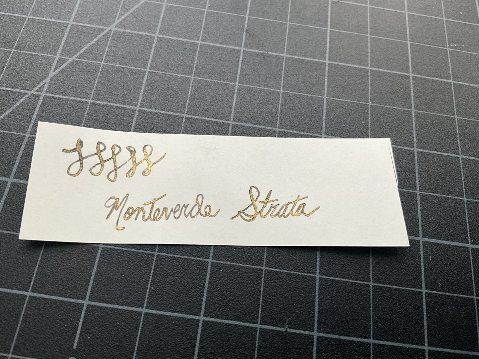
Ink
- By Penguincollector,
- 0
- 4
- 69
-


-
-
Most Contributions
-
 amberleadavis
43964 -
.thumb.jpg.f07fa8de82f3c2bce9737ae64fbca314.jpg) PAKMAN
PAKMAN
34432 -
 inkstainedruth
28630 -
 Ghost Plane
28220 -
 Bo Bo Olson
27054
-
-
Upcoming Events
-
Blog Comments
-

By vikrmbedi · Posted
While removing tax … I used to make the same mistake. removing x% tax from the final amount ( be 10% for japan or 21% for europe). say base price of a pen is 10000 with tax 10% so retail is 10000+ 10000*{ 10/100} = 11000) so the tax component is only 1000 for 11000 retail price pen- which is 9.09% of retail price. For Europe it would come out to be 17.35% not 21off of retail). base price + base price * tax%= retail Base price( 1+ tax%) = retail -

By Ali Hobbies · Posted
Nice haul. How do you like that Logical paper? -

-
.thumb.jpg.331e554113c33fb39d5bf3233878978a.jpg)
-
By Prof Drew · Posted
I also picked up a TUZU. I quite like the blue color and basic Sailor steel nib. It's a good basic EDC at the Japanese price. It is a quite wet writer. I imagine lefties will enjoy the nib angle customization. I haven't tried playing with that aspect.
-
-
-
Files
-


Recommended Posts
Create an account or sign in to comment
You need to be a member in order to leave a comment
Create an account
Sign up for a new account in our community. It's easy!
Register a new accountSign in
Already have an account? Sign in here.
Sign In Now