
-
Forum Statistics
357.8k
Total Topics4.7m
Total Posts -
Member Statistics
130,415
Total Members21,671
Most Online Newest Member
Karina Farish
Joined -
Images
-
Albums
-

USG 24
- By USG,
- 0
- 1
- 59
-

4posts2
- By Tashi_Tsering,
- 1
- 1
- 72
-
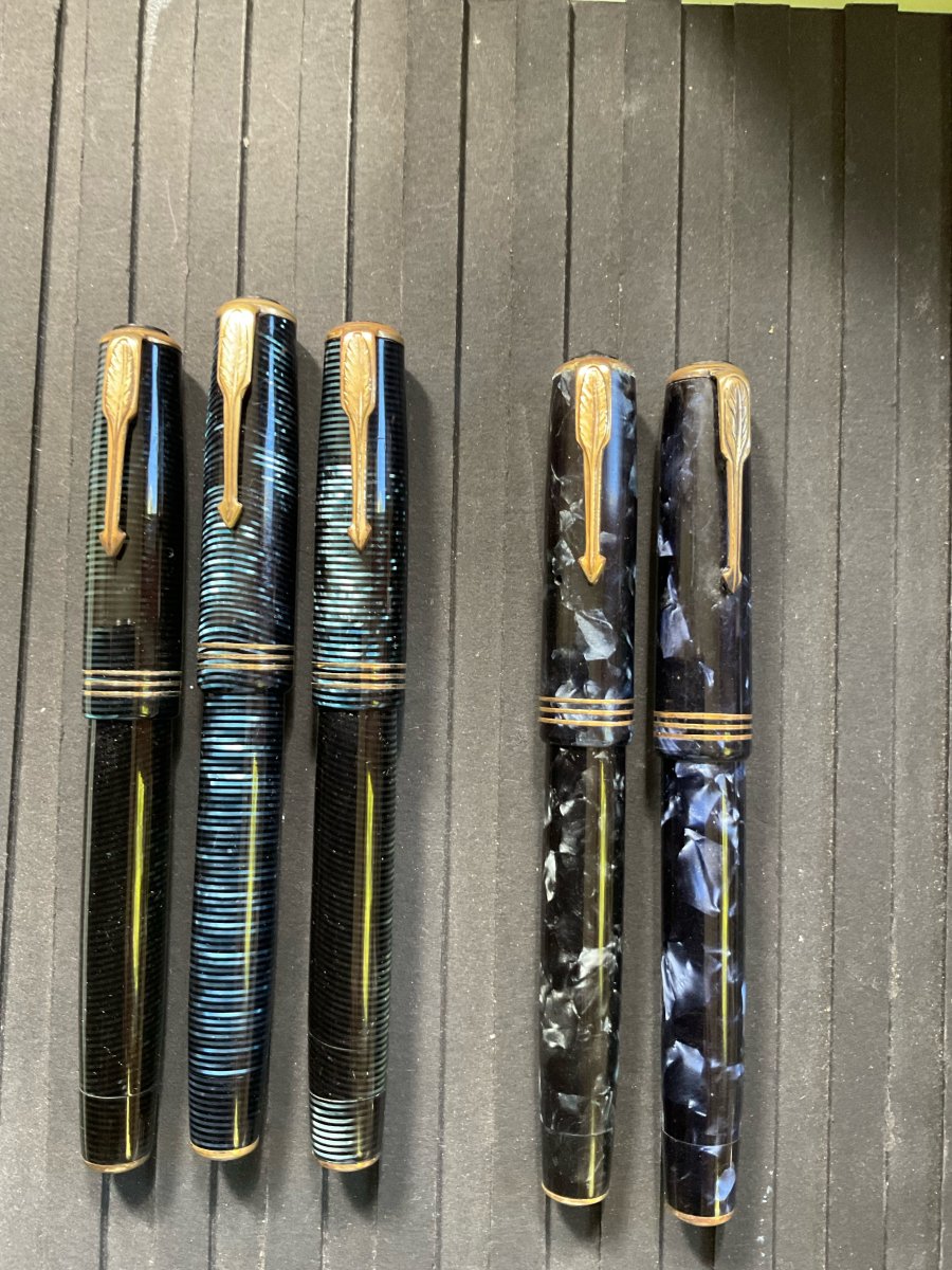
Black Vacumatic OS -Williamson 12/2021
- By VacNut,
- 0
- 0
- 5
-
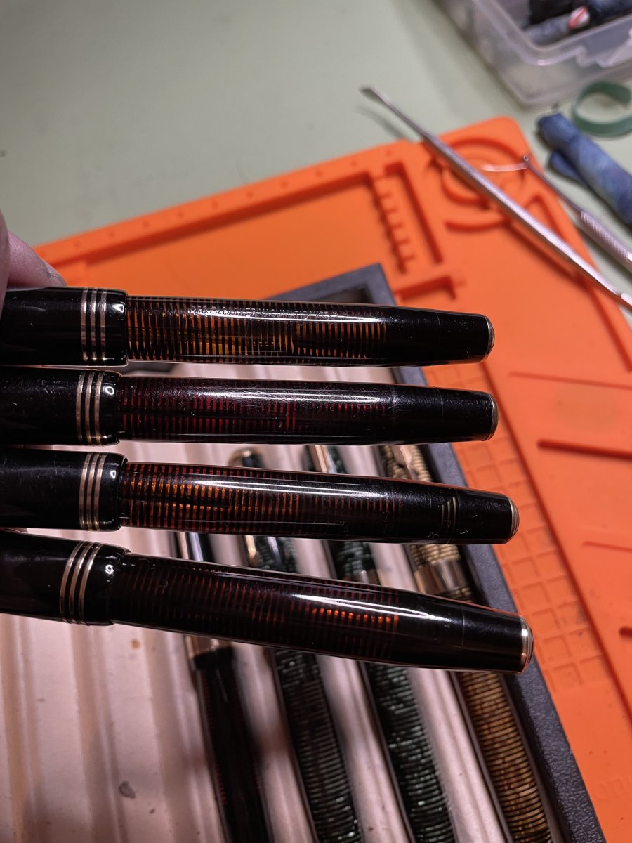
Vacumatics Gallery
- By VacNut,
- 0
- 2
- 19
-

European pens
- By A Smug Dill,
- 12
- 40
-


-
-
Most Contributions
-
 amberleadavis
43972 -
.thumb.jpg.f07fa8de82f3c2bce9737ae64fbca314.jpg) PAKMAN
PAKMAN
35492 -
 inkstainedruth
31045 -
 Ghost Plane
28220 -
 Bo Bo Olson
27746
-
-
Upcoming Events
-
Blog Comments
-

By stylographile · Posted
Awesome! I'm in the process of preparing my bag for our pen meet this weekend and I literally have none of the items you mention!! I'll see if I can find one or two! -
By inkstainedruth · Posted
@asota -- Yeah, I think I have a few rolls in my fridge that are probably 20-30 years old at this point (don't remember now if they are B&W or color film) and don't even really know where to get the film processed, once the drive through kiosks went away.... I just did a quick Google search and (in theory) there was a place the next town over from me -- but got a 404 error message when I tried to click on the link.... Ruth Morrisson aka inkstainedruth -

By alkman · Posted
There is still chemistry for processing regular chrome (positive) films like Kodak Ektachrome and Fuji Velvia, but Kodachrome was a completely different and multistep beast. -

By Ceilidh · Posted
Ah, but how to get it processed - that is the question. I believe that the last machine able to run K-14 (Kodachrome processing) ceased to operate some 15 or so years ago. Perhaps the film will be worth something as a curiosity in my estate sale when I die. 😺 -

By Mercian · Posted
Take a lot of photos! If the film has deteriorated or 'gone off' in any way, you can use that as a 'feature' to take 'arty' pictures - whether of landmarks, or people, or whatever.
-
-
-
Files
-


Recommended Posts
Create an account or sign in to comment
You need to be a member in order to leave a comment
Create an account
Sign up for a new account in our community. It's easy!
Register a new accountSign in
Already have an account? Sign in here.
Sign In Now