Jump to content

Montblanc Glacier Blue


mizgeorge

Recommended Posts

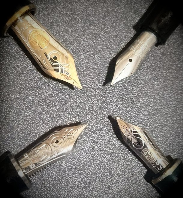
This arrived with me this morning, and as I hadn't seen any reviews or even swatches of it, I thought I'd better put something together quickly in case anyone else was as curious as I to see what this one was like. It's only in one pen so far (a Narwhal Voyage with a stub nib). 


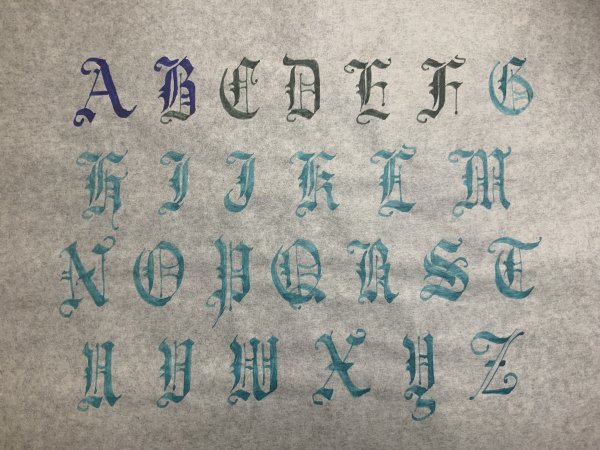
These first images on TR 52g


large.mb-glacier-1.jpg.c6e247f3f971ad36744d5d23d6a496bb.jpg


large.mb-glacier-2.jpg.0fbb405fe536441cbbf5177ab15c6c79.jpg

(I would say this is the most accurate in terms of colour reproduction)


The chroma was not quite what I expected
large.mb-glacier-5.jpg.0ecac5003ad7e9dcf5d91efe2b12d85f.jpg


but explains what happened with a wet in wet on watercolour paper

large.mb-glacier-4.jpg.6033ff3538ab3b6e6e8c61e253b9dcf3.jpg


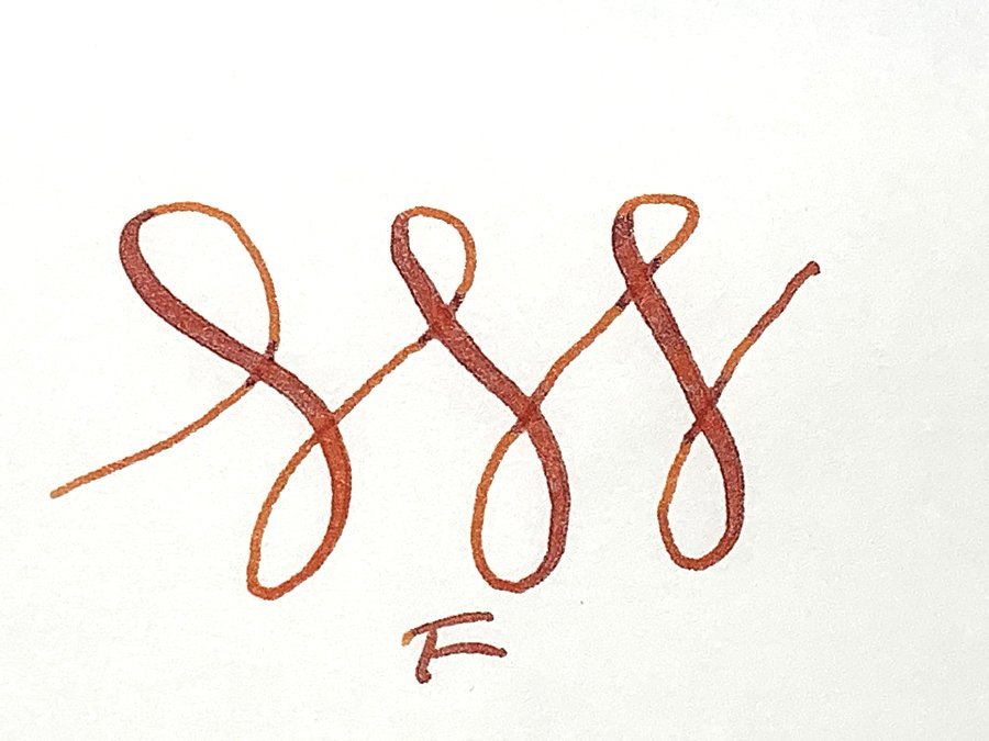
As for comparisons to other colours - there's nothing that close in my MB collection (which is fairly comprehensive) 

large.mb-glacier-3.jpg.ee8a05d27a5252ac3ae22c68c581f0e9.jpg

but one or two contenders from other inks - including some that are significantly cheaper. All swatches are on exacompta 150g white.


Overall, I like it very much indeed - it's up there with my current favourite MB blues (of which there are probably far too many). I don't doubt I'll be getting at least a backup bottle, if not more whilst it's still available.


If anyone wants to see it in with any particular nib or paper, let me know, and I'll see what I can do.

Link to comment
Share on other sites

  • Replies 14
  • Created
  • Last Reply

Top Posters In This Topic

  • mizgeorge

    2

  • mallymal1

    1

  • PithyProlix

    1

  • namrehsnoom

    1

@mizgeorgethanks for an absolutely fabulous review :thumbup: 

It looks like a refreshing colour just before our first mini heat-wave.... 😎


Link to comment
Share on other sites

Thanks, @mizgeorge!  The color in that closeup of the swatch and hash marks looks appealing.  Not sure it's appealing enough for me to go looking for it, but I'm definitely enjoying your review - especially those watercolor paper drawings. :)

Link to comment
Share on other sites

Beautiful colour!

Thanks for this review, very helpful. :) 


LETTER EXCHANGE PARTICIPANT

Link to comment
Share on other sites

I really like how it looks in these photos. I reminds me of my beloved Platinum Blue Black with its slightly dusty and muted blue color when dry as well as the slight extra in the edges of wetter applications. 

Link to comment
Share on other sites

I really like how the ink looks! Thanks for sharing. Would love to see it in other nib size like F/EF if you get a chance to do another sample  :) 

Link to comment
Share on other sites

Thanks for the review! Looks like it shades nicely, which is what I prefer in an ink, and why I have so many broad nibs. 🙂

Link to comment
Share on other sites

Thank you very much for the nice look at this cheery, attractive ink! It looks as if it is shading half-way or so towards turquoise, is that correct?


(😍 Isatis. Kicking myself again for not getting it when I could!)

My pens for sale: https://www.facebook.com/jaiyen.pens  

Link to comment
Share on other sites

8 hours ago, siddr90 said:

I really like how the ink looks! Thanks for sharing. Would love to see it in other nib size like F/EF if you get a chance to do another sample  :) 

here you are:


large.mb-glacier-6.jpg.23fbd0e1330ed52fae4b50aa7488fe02.jpg


This pen has a horrible nib (I need to sort it out but keep forgetting to get round to it), but it will certainly give you a good idea of the difference.


7 hours ago, PithyProlix said:

Thank you very much for the nice look at this cheery, attractive ink! It looks as if it is shading half-way or so towards turquoise, is that correct?


(😍 Isatis. Kicking myself again for not getting it when I could!)

Yes, there's a definite lean to turquoise. It's nice.

(and yes, Isatis is lovely!)

Link to comment
Share on other sites

Thank you for the lovely review! Truly a beautiful blue - it deviates enough from standard blue to make it look interesting, and it’s sort of muted/dusty … really nice! 

Link to comment
Share on other sites

Great review. Looks like I have another ink to get now. Thanks for posting!

"If people never did silly things nothing intelligent would ever get done"  Ludwig Wittgenstein


"It is impossible to design something that is foolproof because fools are so ingenious." - Groucho Marx

Link to comment
Share on other sites

  • 2 weeks later...

Thank you.

Fountain pens are my preferred COLOR DELIVERY SYSTEM (in part because crayons melt in Las Vegas).

Create a Ghostly Avatar and I'll send you a letter. Check out some Ink comparisons: The Great PPS Comparison 

Don't know where to start?  Look at the Inky Topics O'day.  Then, see inks sorted by color: Blue Purple Brown Red Green Dark Green Orange Black Pinks Yellows Blue-Blacks Grey/Gray UVInks Turquoise/Teal MURKY


Link to comment
Share on other sites

Thank you @mizgeorge for the review.

There may be some up and down in preference about how pale or how intense an ink should be. While I currently love the dark and intense inks a lot, there is still room for some muted ones in between.

So do I like the R&K Isatis and Glacier Blue may be a good successor.

One life!

Link to comment
Share on other sites

  • 1 year later...

Create an account or sign in to comment

You need to be a member in order to leave a comment

Create an account

Sign up for a new account in our community. It's easy!

Register a new account

Sign in

Already have an account? Sign in here.

Sign In Now


×
×
  • Create New...