
-
Forum Statistics
354.8k
Total Topics4.6m
Total Posts -
Member Statistics
127,878
Total Members18,857
Most Online Newest Member
Scott in Austin
Joined -
Images
-
Albums
-
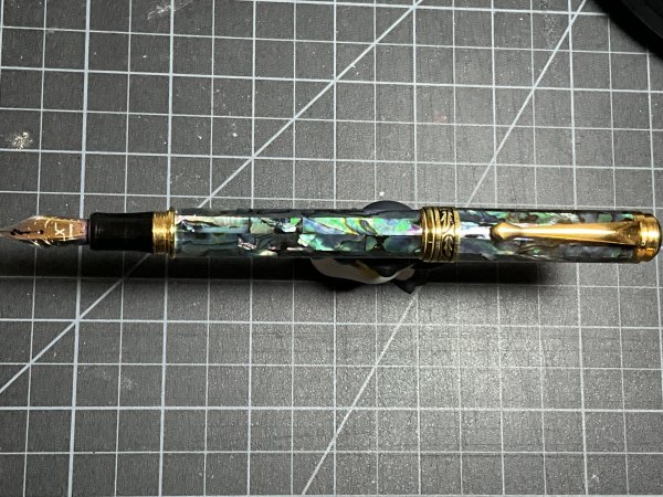
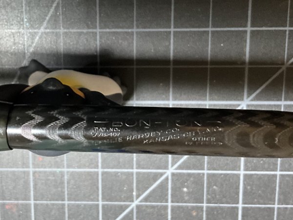
Pen Club additions
- By Penguincollector,
- 0
- 0
- 8
-

Andrew Lensky Arts
- By Andrew_L,
- 0
- 19
- 33
-

USG 7
- By USG,
- 0
- 0
- 8
-

Trios
- By Penguincollector,
- 0
- 2
- 68
-

OCArt #2
- By OCArt,
- 0
- 1
- 30
-


-
-
Most Contributions
-
 amberleadavis
43951 -
.thumb.jpg.f07fa8de82f3c2bce9737ae64fbca314.jpg) PAKMAN
PAKMAN
34276 -
 inkstainedruth
28368 -
 Ghost Plane
28220 -
 Bo Bo Olson
26927
-
-
Upcoming Events
-
Blog Comments
-

By Ali Hobbies · Posted
Nice haul. How do you like that Logical paper? -

-
.thumb.jpg.331e554113c33fb39d5bf3233878978a.jpg)
-
By Prof Drew · Posted
I also picked up a TUZU. I quite like the blue color and basic Sailor steel nib. It's a good basic EDC at the Japanese price. It is a quite wet writer. I imagine lefties will enjoy the nib angle customization. I haven't tried playing with that aspect. -

By irony · Posted
Thanks for posting, great information on the Tuzu by Sailor. Cannot wait for it to appear on Amazon USA.
-
-
-
Files
-


Recommended Posts
Create an account or sign in to comment
You need to be a member in order to leave a comment
Create an account
Sign up for a new account in our community. It's easy!
Register a new accountSign in
Already have an account? Sign in here.
Sign In Now