Jump to content

Enjoying Montblanc Pens — Broad, Oblique, Extra Fine, Le & Bespoke


Tom Kellie

Recommended Posts

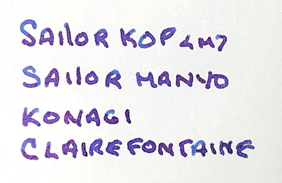
Really hard to tell. But I want to say the top one is a teeny tiny bit more crisp. But veeeery subtle.


Ink wise. Bottom one is darker. My burgundy looks different. Is that a scan or a picture taken?

Bottom ink looks like Shakespeare velvet red. But Im guessing its Fritz rot?


Yes. It's a photo - terrible one at that. Sorry. The lighting in my room leaves much to be desired and I always have a problem capturing reds on my phone camera.


The bottom ink is Fritzrot. On my paper very close to the Burgundy Red. Maybe just a tad darker and with a shade more brown :)

Link to comment
Share on other sites

  • Replies 2.6k
  • Created
  • Last Reply

Top Posters In This Topic

  • Tom Kellie

    1114

  • Ghost Plane

    224

  • zaddick

    102

  • thygreyt

    73

Top Posters In This Topic

Posted Images

Maybe I should open my fritz rot as well. Its still sealed.

I like the Shakespeare red a lot. Burgundy red looks nice too. How do you like the italic100?

Link to comment
Share on other sites

Maybe I should open my fritz rot as well. Its still sealed.

I like the Shakespeare red a lot. Burgundy red looks nice too. How do you like the italic100?

I like it. It's a unique pen with the platinum trim and the bespoke nib. However, I suppose you could almost get the same results with a fine CI grind on a regular pen for a much lower price! It's a keeper though.

Link to comment
Share on other sites

yeepers, thanks for the compare picture... I currently have 3 Pelikan nibs out to Mr Bacas for the CI grind and now I can hardly wait to get them back! And I imagine one of my 146's will find its way to him shortly after.

Edited by BillH

"Inspiration exists, but it has to find you working." -Pablo Picasso


Link to comment
Share on other sites

Both your nibs & inks are lovely.

I see more of a crisp CI grind in the top writing sample. Love the shading of the Burgundy Red.

The bottom sample shows a "stubby" italic, my preferred nib grind. The 135 Yahre burgundy ink seems more saturated.


You mentioned that the first nib was ground by Mark Bacas. Who did your second one? Were your nibs set up for what would be called "normal" flow or were they adjusted on the wet side?


BTW: your writing has a beautiful, individualistic flair.

Edited by tinta

*Sailor 1911S, Black/gold, 14k. 0.8 mm. stub(JM) *1911S blue "Colours", 14k. H-B "M" BLS (PB)

*2 Sailor 1911S Burgundy/gold: 14k. 0.6 mm. "round-nosed" CI (MM) & 14k. 1.1 mm. CI (JM)

*Sailor Pro-Gear Slim Spec. Ed. "Fire",14k. (factory) "H-B"

*Kaweco SPECIAL FP: 14k. "B",-0.6 mm BLS & 14k."M" 0.4 mm. BLS (PB)

*Kaweco Stainless Steel Lilliput, 14k. "M" -0.7 mm.BLS, (PB)


Link to comment
Share on other sites

I've had no success in finding Mark Barcas through Google. I don't do social medias.

Tried the Google Search function on FPN. No results. :unsure:


Does anyone have a link to this person?

*Sailor 1911S, Black/gold, 14k. 0.8 mm. stub(JM) *1911S blue "Colours", 14k. H-B "M" BLS (PB)

*2 Sailor 1911S Burgundy/gold: 14k. 0.6 mm. "round-nosed" CI (MM) & 14k. 1.1 mm. CI (JM)

*Sailor Pro-Gear Slim Spec. Ed. "Fire",14k. (factory) "H-B"

*Kaweco SPECIAL FP: 14k. "B",-0.6 mm BLS & 14k."M" 0.4 mm. BLS (PB)

*Kaweco Stainless Steel Lilliput, 14k. "M" -0.7 mm.BLS, (PB)


Link to comment
Share on other sites

fpn_1516516004__pavoni.png


Montblanc Oblique Fine Nibs, Bespoke and Otherwise


~ Over twenty years ago there was a period when I carefully examined pen and ink sketches made by field naturalists in the late 19th and early 20th Centuries.


With hastily sketches strokes, they captured the essence of wildflowers, dragonflies, conifers, crocodiles and the like.


The sketches relies on extra fine or fine lines but included wider strokes as needed. I wondered what sort of writing equipment they used for their minor masterpieces.


Eventually several venerable learned field biologists explained that the favored pens were something akin to what became known as Oblique Fine nibs, with Flex.


In the early 20th Century it wasn't fountain pen enthusiasts but rather field naturalists who drove interest in what might best be described as OF Flex nibs.


When visiting natural history museums, occasionally there are exhibits showing a naturalist's traditional gear. Several times I've noticed old pens with what appear to be OF Flex nibs.


Sketching in field conditions is subject to the vagaries of precipitation, variable wind gusts, the day's schedule and the hunger pangs of others.


Having a pen which writes default fine lines, but with the capacity to provide the occasional broader stroke for emphasis, is invaluable when there's limited time for sketching a given subject.


Several years ago I was told that an FPN thread showed a Bespoke 149 OF nib, but until today I was unable to find it.


When pavoni listed the Montblanc pens in his collection, there it was, along with a 344G OF, no less.


Not only that, but in that thread Pen Nut mentions a preference for Oblique Fine nibs.


Below are links to several FPN threads discussing OF nibs and the benefits of Flex nibs for drawing and sketching.


What a happy day to come across this store of information and a photograph — at last — of a Bespoke OF nib.


Tom K.


https://www.fountainpennetwork.com/forum/topic/37727-how-many-mont-blanc-do-you-have/page-17


https://www.fountainpennetwork.com/forum/topic/227094-an-enthusiasts-collection/


https://www.fountainpennetwork.com/forum/topic/250773-meisterstuck-149-oblique-fine-nib/


https://www.fountainpennetwork.com/forum/topic/50939-no-oblique-fine-offered-huh/


https://www.fountainpennetwork.com/forum/topic/210392-mb-149-full-flex-nib/

Link to comment
Share on other sites

Not only that, but in that thread Pen Nut mentions a preference for Oblique Fine nibs


( I use an Edson with an OBF nib on a daily basis )

A wise man once said    " the best revenge is wealth "   but a wiser man answered back    " the best revenge is happiness "


The true definition of madness - Doing the same thing everyday and expecting different results......

Link to comment
Share on other sites

With hastily sketches strokes, they captured the essence of wildflowers, dragonflies, conifers, crocodiles and the like.


Tom. If you have not already done so please check out the sketches of one JOHN RUSKIN, think they may interest you.


I always call in and visit his home, Brantwood in Coniston, if I am up that way. Lovely place with some amazing field drawings on show.


A link, there are many more, which shows examples of his work


http://www.lizzieharper.co.uk/news/article/124/botanical_illustration_inspirations


A feather by Ruskin


fpn_1516528326__feather.jpg

Edited by Pen Nut

A wise man once said    " the best revenge is wealth "   but a wiser man answered back    " the best revenge is happiness "


The true definition of madness - Doing the same thing everyday and expecting different results......

Link to comment
Share on other sites

Not only that, but in that thread Pen Nut mentions a preference for Oblique Fine nibs


( I use an Edson with an OBF nib on a daily basis )


~ Pen Nut:


I send my appreciation to you for mentioning your Edson OBF.

Until reading this, yours truly had never heard of an Edson, not knowing that it was a former Waterman model.

Last evening, while completing a photography project, it was enjoyable to read about the Edson and other Waterman pen models.

I've learned that the Waterman Carène continues to offer OF nibs. While it may not be an Edson, it's a welcome alternative.

A few comments here and there mentioned a certain scratchiness to the finer Waterman nibs.

If it's a daily writer for you, surely that mustn't be an issue.

Thank you for mentioning it, and thereby educating yours truly.

Tom K.

Link to comment
Share on other sites

Tom. If you have not already done so please check out the sketches of one JOHN RUSKIN, think they may interest you.


I always call in and visit his home, Brantwood in Coniston, if I am up that way. Lovely place with some amazing field drawings on show.


~ Pen Nut:


Were there ever a more welcome post in this thread than a Ruskin sketch!

Yours truly was raised with this quote from Ruskin:

When love and skill work together, expect a masterpiece.”

Visiting Brantwood must be a special pleasure. I'd relish seeing his superlative drawings.

Thank you so much for providing the link. Ruskin's exceptional skill at observation is exemplary.

The feather sketch you posted gave my visual faculty a jolt. Such sensitivity to the fine essence of a single tiny plume.

Our age would do well to maintain Ruskin's thoughts and work as models of a life well lived.

With Appreciation,

Tom K.

Link to comment
Share on other sites


~ Ghost Plane's Title for the above is: “Needle Nib”.

Tom K.

Well, the tip DOES resemble insulin needles in some aspects...

Link to comment
Share on other sites

Not only that, but in that thread Pen Nut mentions a preference for Oblique Fine nibs


( I use an Edson with an OBF nib on a daily basis )

I only know of the standard range of nibs and their abbreviations (ef to bb) and having little to no knowledge on exotic nibs, what does "obf" actually stand for?

Link to comment
Share on other sites

I only know of the standard range of nibs and their abbreviations (ef to bb) and having little to no knowledge on exotic nibs, what does "obf" actually stand for?


~ Blueberry567:


As I understand it, “OBF” is “Oblique Fine”.

In older Pelikan and Montblanc fountain pens it's often written as OF.

Like you, I've been faced with terms which I don't recognize.

This morning someone wrote “nib creep” in a private message to me.

It was necessary to investigate to determine what “nib creep” might mean.

The FPN Montblanc Forum continues to be a class in fountain pen terminology.

Thank you for posting such a pertinent question.

Tom K.

Link to comment
Share on other sites

fpn_1516636900__in_a_flowering_quince.jp


Ixos mcclellandii in a Flowering Quince


~ A student asked me why I enjoyed writing with fountain pens and ink, specifiying that a one-word answer was best.


That caught me off-guard, as I'd never considered what a succinct expression of my motivation for writing with fountain pens might be.


They're all workhorses for me, whether sketching details during field investigations, recording observations during safari game drives or writing notes to friends and colleagues.


After thought, it was clear:


Beauty.


The sheer beauty of fine quality ink on high grade paper lifts my spirit every time I see it, whether my own handwriting or that of FPN Montblanc Forum friends.


The lovely strokes and calligraphy from Pravda's new Bespoke Cursive Italic Small Signature nib provide a rare visual beauty which inspires me.


I'm looking forward to enjoying more examples of fountain pen sketching and handwriting beauty in 2018.


Tom K.


Edited by Tom Kellie
Link to comment
Share on other sites

Guest
This topic is now closed to further replies.

Announcements


×
×
  • Create New...