
-
Forum Statistics
355k
Total Topics4.6m
Total Posts -
Member Statistics
128,103
Total Members18,857
Most Online
-
Images
-
Albums
-

USG 7
- By USG,
- 0
- 0
- 97
-
GlenV
- By GlenV,
- 0
- 2
- 77
-

Bad Gateway
- By A Smug Dill,
- 0
- 6
-
namrehsnoom-16
- By namrehsnoom,
- 0
- 0
- 100
-

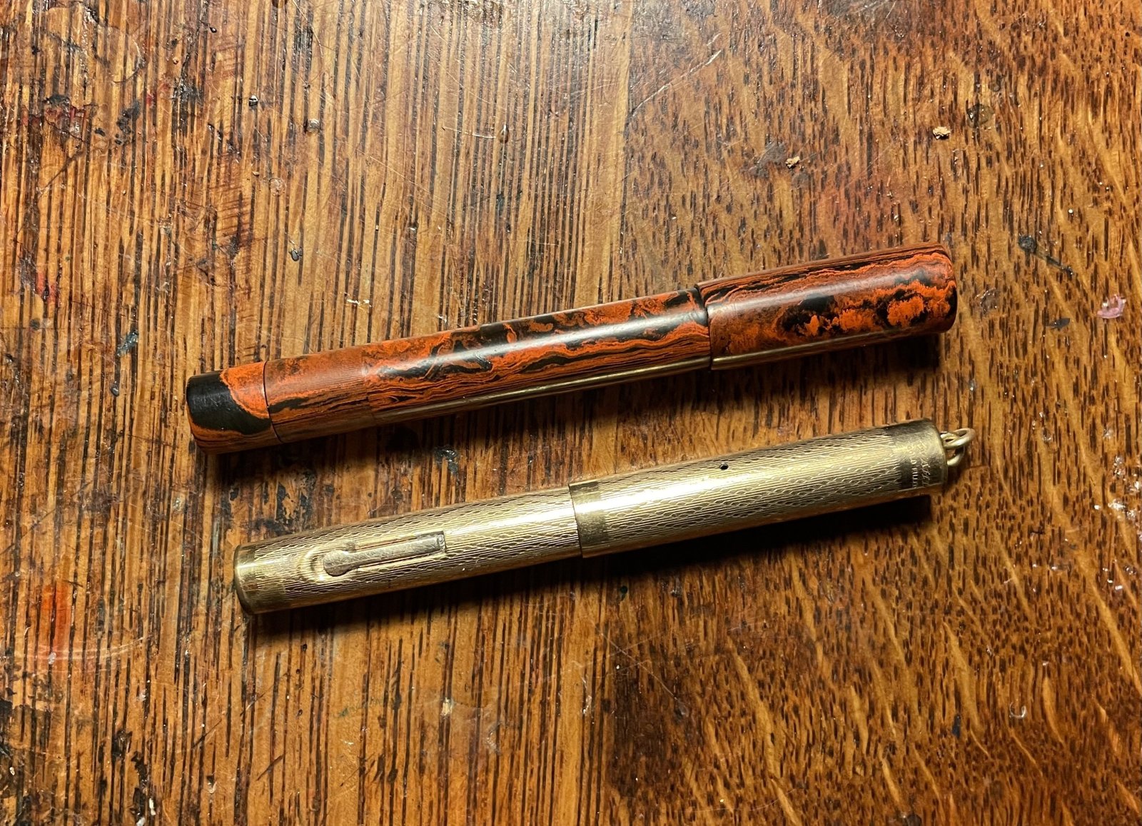
Photo for my Posts 2
- By AceNinja,
- 0
- 0
- 30
-


.jpg.bb75364a26b18a63496819477f579f15.jpg)

.jpg.f469fe4ce9d029f5f4b2776c7a938b9a.jpg)
.jpg.3fd12eb2f3773b8452f3b3bf5055df09.jpg)
.jpg.41122b492d1863808e9b48a742692105.jpg)
.jpg.88058c2f39f1d1fab291eb5e82a6e27d.jpg)
-
-
Most Contributions
-
 amberleadavis
43951 -
.thumb.jpg.f07fa8de82f3c2bce9737ae64fbca314.jpg) PAKMAN
PAKMAN
34365 -
 inkstainedruth
28490 -
 Ghost Plane
28220 -
 Bo Bo Olson
27006
-
-
Upcoming Events
-
Blog Comments
-

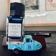
By Ali Hobbies · Posted
Nice haul. How do you like that Logical paper? -

-
.thumb.jpg.331e554113c33fb39d5bf3233878978a.jpg)
-
By Prof Drew · Posted
I also picked up a TUZU. I quite like the blue color and basic Sailor steel nib. It's a good basic EDC at the Japanese price. It is a quite wet writer. I imagine lefties will enjoy the nib angle customization. I haven't tried playing with that aspect. -

By irony · Posted
Thanks for posting, great information on the Tuzu by Sailor. Cannot wait for it to appear on Amazon USA.
-
-
-
Files
-


Recommended Posts
Create an account or sign in to comment
You need to be a member in order to leave a comment
Create an account
Sign up for a new account in our community. It's easy!
Register a new accountSign in
Already have an account? Sign in here.
Sign In Now