Jump to content

L'artisan Pastellier Callifolio - Téodora


namrehsnoom

Recommended Posts

L'Artisan Pastellier Callifolio - Téodora


L’Artisan Pastellier is a small company in southern France that specialises in natural pigments, and offers customers authentic and reliable products in beautiful colours based on mineral or vegetable pigments. In a collaboration with Loic Rainouard from Styloplume.net, the chemist Didier Boinnard from L’Artisan Pastellier created the line of Callifolio fountain pen inks. These pastel-coloured inks are traditionally crafted, and can be freely mixed and matched. Overall these inks are only moderately saturated, and have low water-resistance. The inks were specifically designed to work well with all types of paper, and all types of fountain pens.
Being pastel-tinted, these inks have a watercolour-like appearance, and are not only fine inks for journaling, but are also really excellent inks for doodling & drawing. I only recently discovered them, and they are already the inks I gravitate towards for personal journaling.
fpn_1494701478__callifolio_-_teodora_-_t

In this review the spotlight is on Téodora, one of the two green inks of the series (the other one being Olivastre). But where Olivastre is an awe-inspiring green, Téodora fails to woo me. The ink tries to be green, but has an off-putting blue tinge to it. In my opinion, the resulting colour just doesn’t work. If you want to be a teal – be boldly blue-green! Not this faint trace of blue that distracts from your green nature. To tell you the truth, Téodora is my first Callifolio ink that I dislike.
Technically, Téodora behaved really well, with good performance and good contrast with the paper. The ink looks flat in an EF-nib, works well in F/M, and exhibits heavy shading in the broader nibs.
fpn_1494701492__callifolio_-_teodora_-_d
On the smudge test – rubbing text with a moist Q-tip cotton swab – the ink starts to show its weakness with heavy smearing of the text. Water resistance is near zeo, both on the droplet test (15 minute soak) and on the running water test. The colour completely disappears, leaving nothing of the words you’ve written. Not good!
fpn_1494701506__callifolio_-_teodora_-_c

I’ve tested the ink on a wide variety of paper – from crappy Moleskine to high-end Tomoe River. For the Callifolio reviews, I’m using a new format to show you the ink’s appearance and behaviour on the different paper types. . On every small band of paper I show you:
  • An ink swab, made with a cotton Q-tip
  • 1-2-3 pass swab, to show increasing saturation
  • An ink scribble made with an M-nib fountain pen
  • The name of the paper used, written with a B-nib
  • A small text sample, written with an M-nib
  • Drying times of the ink on the paper (with the M-nib)
Callifolio Téodora worked well with all the paper types, without any feathering even on the lower quality papers in my test set. Drying times are fairly short in the 5-10 second range on most papers. The ink works well with both white and more cream-coloured paper.
At the end of the review, I also show the back-side of the different paper types, in the same order. The ink behaved well on all paper types, with the exception of Moleskine (which is a notoriously bad paper for almost all fountain pen inks).
fpn_1494701529__callifolio_-_teodora_-_s
fpn_1494701548__callifolio_-_teodora_-_s

Conclusion
Callifolio Téodora is a well-performing green ink, but one with a complete lack of water resistance. Well… I have other inks without water resistance that I still like. Unfortunately, Téodora is not one of them: in the looks department, I personally consider it a complete failure. The ink leans towards the blue, but fails to go all the way and become a real teal (and I happen to like bold blue-greens). In this case though, the ink stays stuck in ugly-land! I’m sure some people will still like the colour, but for me this is one ink that L’Artisan Pastellier could have done without.
fpn_1494701569__callifolio_-_teodora_-_s
Technical test results on Rhodia N° 16 notepad paper, written with Lamy Safari, M-nib
fpn_1494701590__callifolio_-_teodora_-_t
fpn_1494701610__callifolio_-_teodora_-_w
Backside of writing samples on different paper types
fpn_1494701641__callifolio_-_teodora_-_s
fpn_1494701656__callifolio_-_teodora_-_s


Link to comment
Share on other sites

  • Replies 8
  • Created
  • Last Reply

Top Posters In This Topic

  • visvamitra

    2

  • namrehsnoom

    2

  • ca49reber

    1

  • ManofKent

    1

Top Posters In This Topic

A great review, as usual. Thank you. I would use this ink if I had it but don't think I will make the effort to buy it. My mother's name was Theodora & green was her favorite color. When I was little our whole house was decorated in green, therefore my favorite color is blue. All my children prefer green.

Link to comment
Share on other sites

Stellar review. Personally I dislike this ink due to its hideous color. I would say It's my least favorite Callifolio ink. Thanks for testing it though :) Which Callifolio inks are left for you to review in the future?

Link to comment
Share on other sites

Stellar review. Personally I dislike this ink due to its hideous color. I would say It's my least favorite Callifolio ink. Thanks for testing it though :) Which Callifolio inks are left for you to review in the future?

Still a whole bunch to go :-) But I don't mind, I'm enjoying every minute of playing around with them. Next up will be Violet, a joyful colour suited to springtime...

Link to comment
Share on other sites

Thank you for the great review. I'm not keen on that shade of blueish green either.


I'm loving Olivastre as a colour (would prefer a little more lubrication, but that's a minor point)

Link to comment
Share on other sites

Awesome review; not my cup of tea either, unfortunately.

"The trouble with the world is that the stupid are cocksure and the intelligent are full of doubt."


B. Russell

Link to comment
Share on other sites

Thank you for this splendid review! I'm so glad you include the Moleskine paper since it tends to show how well inks cope with more absorbent papers.

Link to comment
Share on other sites

  • 2 years later...

9FhKAa5.jpg


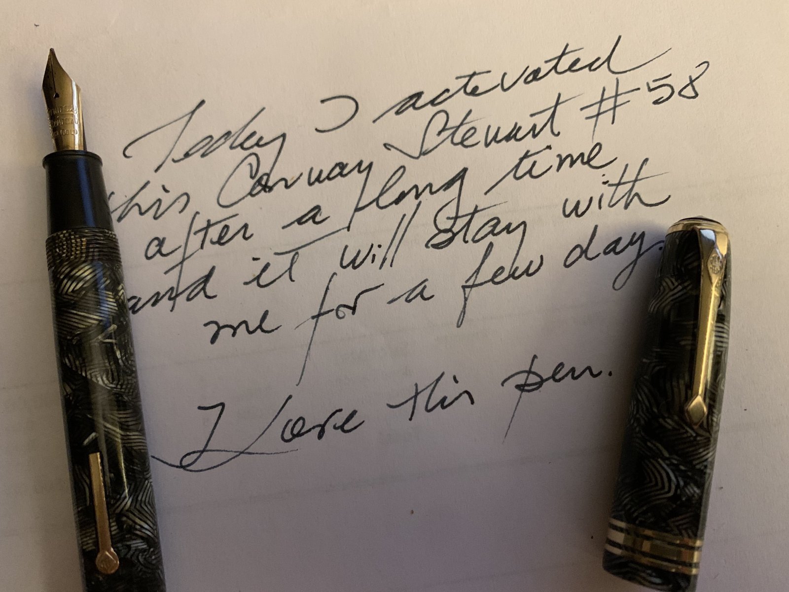
Just got this despite a lot of bad reviews about the color. I like it. A green just a bit on the blue side. Or, on cream paper, just green.

Link to comment
Share on other sites

Create an account or sign in to comment

You need to be a member in order to leave a comment

Create an account

Sign up for a new account in our community. It's easy!

Register a new account

Sign in

Already have an account? Sign in here.

Sign In Now


×
×
  • Create New...