Jump to content

Rome Is Burning - Noodler's


visvamitra

Recommended Posts

Noodler's is one of the companies that don't need introductions. Nathan's Tardiff work is unimaginable. The guy must be a vampire who doesn't sleep and feeds on developing ideas: new inks, new pens.

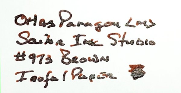
Rome is Burning has cool name. I enjoy it a lot. There's of course quite a biy of history / philosophy behind it as it was created by Nathan Tardiff who describes this ink as follows: "Rome Burning” has a bulletproof patrician core color of Caesar’s purple with the colors of the inferno that wash away from it with excess liquidity. As it dries there are shades of brass that can actually shine on some paper grades and can halo the darker core when using the right nib/feed combination. On very absorbent cellulose paper the patrician core can be seen in the center as the fire surrounds it – as if an eclipse of the sun. The image on the webpage and the attached film demonstration should make the ink’s design and inspiration manifest to all…and if more is desired please see the YouTube video on link below"

Sounds great. The guy knows his way with words :) And now time to make a confession. Lately my enthusiasm toward inks reviewing weakens. Rarely I find / discover new inks that would delight me. Rome is Burning isn't good ink. It has it issues. It causes feathering on absorbent papers but I absolutely love it. The color is amazing, especially when the ink is wet and you see it on the paper. With time the colors becomes more muted yet still I find it great.

Ink splash

fpn_1451335216__romeisburning_is.jpg

Software Id

fpn_1451335244__romeisburning_leuchtturm

Tomoe River, Kaweco Sport Classic, B

fpn_1451335330__romeisburning_tomoe_1.jp

fpn_1451335336__romeisburning_tomoe_2.jp

fpn_1451335352__romeisburning_tomoe_3.jp

fpn_1451335201__romeisburning_clairefont

fpn_1451335208__romeisburning_clairefont

Leuchtturm 1917, Kaweco Sport Classic, B

fpn_1451335244__romeisburning_leuchtturm

fpn_1451335234__romeisburning_leuchtturm

fpn_1451335252__romeisburning_leuchtturm

Oxford, Kaweco Sport Classic, B

Water resistance (after 30 minutes of soaking)

Yes, it turns purple after soaking

fpn_1451335560__romeisburning_h20.jpg


Link to comment
Share on other sites

  • Replies 23
  • Created
  • Last Reply

Top Posters In This Topic

  • Luma

    5

  • visvamitra

    4

  • migo984

    3

  • Ursus

    2

Top Posters In This Topic

Wow it's one of my most hated ink!


When I first got into fountain pens back in 2013, my first batch of inks I purchased from Goulets were inks in shades of sepia and olives. This very ink was in my first order. Little did I know of it's permanence properties, and proceeded to fill a Visconti demonstrator full of this ink. To my horror, it stained the barrel a beautiful uniform pink of which nothing was able to remove said hue.


Still love this shade of sepia. Ina ho is still one of my favorites. After the staining fiasco, this ink only goes into Noodler's pens. Visvametra, if you'd like the rest of my bottle, I'd be happy to send it to you.

Edited by gerigo
Link to comment
Share on other sites

I keep thinking about trying a sample of Rome Burning. And then keep not doing it. Why? Because i think of it as "the dog and pony show ink".... And I have more Noodler's inks than any other brand.

But thanks for the review.

Ruth Morrisson aka inkstainedruth

"It's very nice, but frankly, when I signed that list for a P-51, what I had in mind was a fountain pen."

Link to comment
Share on other sites

Vis, have you tried Noodler's Banker's Tan?

Nope - I need to check it :)

If I remember correctly, I was told it is very similar to RIB. Will post a photo of it as soon as I find my sample.

http://img525.imageshack.us/img525/606/letterji9.png


Link to comment
Share on other sites

I love this color. Others may see baby poop, but I see it as a beautiful flax or wheat color...soft, earthy and organic. Sometimes I see it as a true gold color, not really yellow, but truly the color of the unburnished metal.


I've avoided RIB because of the behavior of the ink, as described in many reviews. But it seems that Iroshizuku Ina Ho is a similar color, slightly warmer. Ina Ho is one of my all time favorites, and I can attest to its friendly behavior and incredible shading.


Color appreciation is such a subjective thing.

Edited by EKE

Learning from the past does not mean living in the past.

Link to comment
Share on other sites

INK: Noodler's Banker's Tan

PAPER: Tomoe River - White


fpn_1451613484__2015-12-31_193527.jpg


The lines are done with a poster nib. This one in particular is 10mm wide and fits perfectly in a sample vial.


fpn_1451613139__2015-12-31_193338.jpg

http://img525.imageshack.us/img525/606/letterji9.png


Link to comment
Share on other sites

RIB is really a unique ink. I bought it, I gave away samples. It's too strange for me...but I am really impressed with it.

Fountain pens are my preferred COLOR DELIVERY SYSTEM (in part because crayons melt in Las Vegas).

Create a Ghostly Avatar and I'll send you a letter. Check out some Ink comparisons: The Great PPS Comparison 

Don't know where to start?  Look at the Inky Topics O'day.  Then, see inks sorted by color: Blue Purple Brown Red Green Dark Green Orange Black Pinks Yellows Blue-Blacks Grey/Gray UVInks Turquoise/Teal MURKY


Link to comment
Share on other sites

Maybe I'm in the minority and agree with OP here more? This is a great ink to me. I use incredibly cheap paper at work (You'd think moving from the public sector to private sector they could afford better despite saving money). It doesn't feather that bad, at least more than any other ink would on the paper I use.


I LOVE the color, once it's dry of course. When wet, it looks... eh gross I guess. Dry, it's a gold to me.


My only issue is the insane nib creep and crud to wipe off. The nib creep is the purple core, which isn't shocking as that's the bulletproof part and that's what usually spreads all over the nib.


I really couldn't get the color of purple to come out in the center or anything with thick lines, but I didn't try every pen and paper combo (mostly writing just on junk paper with it).

Link to comment
Share on other sites

INK: Noodler's Banker's Tan

PAPER: Tomoe River - Whitefpn_1451613484__2015-12-31_193527.jpg

The lines are done with a poster nib. This one in particular is 10mm wide and fits perfectly in a sample vial.fpn_1451613139__2015-12-31_193338.jpg


A thirty-second intermission from FPN browsing later, and I've "accidentally" bought a set of poster nibs. Thanks, Luma. (How did I not own these before?)


Slightly more on-topic: I don't love brown inks, but I do enjoy Rome Burning. It might be because I'm waiting for it all to turn purple. :)

Link to comment
Share on other sites

Create an account or sign in to comment

You need to be a member in order to leave a comment

Create an account

Sign up for a new account in our community. It's easy!

Register a new account

Sign in

Already have an account? Sign in here.

Sign In Now


×
×
  • Create New...