Jump to content

Printing, Cursive, Cursive Italic Or Fancy Schmancy


GClef

See Pic Below  

154 members have voted

  1. 1. Easiest on the eyes?

  2. 2. Easiest to read?


Recommended Posts


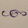
Now, who, without having to "google" it, knows what "letter" I'm referring to?


Luke, Commentaries.

Edited by tinkerteacher

Semper Faciens, Semper Discens

Link to comment
Share on other sites

  • Replies 75
  • Created
  • Last Reply

Top Posters In This Topic

  • GClef

    36

  • Cepasaccus

    8

  • tinkerteacher

    7

  • domnortheast

    5

Luke, Commentaries.


Thank you.


So, if I wanted to get someone's attention here, I'd write it out in cursive, or "fancy-schmancy...

but, if I wanted to reach the most people here, and have them actually read what I wrote, I'd write it out in print...


http://i1128.photobucket.com/albums/m496/gclef1114/The%20Word/1108140425a-1-1.jpg


http://i1128.photobucket.com/albums/m496/gclef1114/The%20Word/2_intro.jpg

Link to comment
Share on other sites

Click here* if you are interested in reading excerpts from Luke's "commentaries".


*(WARNING:The link will take you to an FPN post that has 32 large picture files.)

Link to comment
Share on other sites

For me the content is the most important. Even with print writing you will not attract me reading 32 large picture files of Luke.

Link to comment
Share on other sites

Thanks, but nope. It would really be wasted on me and there are surely lot of people here who would appreciated it very much.


My post might have be a bit brusque, but it was not meant with any offense.


Cepasaccus

Link to comment
Share on other sites

Thanks, but nope. It would really be wasted on me and there are surely lot of people here who would appreciated it very much.


My post might have be a bit brusque, but it was not meant with any offense.


Cepasaccus

First, I do not think anyone is ever beyond hope.

Second, I offered it to YOU.

Third, no offense taken...otherwise, I would've shot you a nasty--really nasty--PM!

And, fourth, I will keep the 32 page, Coptic-stitch bound (by me), 5 1/2" X 8 1/2" replica of the 32 handwritten pages on the side for you...just in case you change your mind.

Edited by GClef
Link to comment
Share on other sites

fpn_1428076937__det158sixtyeight.jpg


Fred

Redacting.....Or even leavin' out an E in the word....

works for me..................................................................

Edited by Freddy
Link to comment
Share on other sites

  • 1 year later...

http://i1128.photobucket.com/albums/m496/gclef1114/Tutuguans/B7CE43CF-AB46-4E6A-A00F-0AEECF62325F.jpg


http://i1128.photobucket.com/albums/m496/gclef1114/Tutuguans/8DD1C864-FD5B-4FA9-B424-4DD09F4FF2E2.jpg

Link to comment
Share on other sites

post-135325-0-46916100-1489880918_thumb.jpgMust say, I don't know my pens but looks like a vintage beaut in your last post.


Thank you.


So, if I wanted to get someone's attention here, I'd write it out in cursive, or "fancy-schmancy...

but, if I wanted to reach the most people here, and have them actually read what I wrote, I'd write it out in print...


http://i1128.photobucket.com/albums/m496/gclef1114/The%20Word/1108140425a-1-1.jpg


http://i1128.photobucket.com/albums/m496/gclef1114/The%20Word/2_intro.jpg


Link to comment
Share on other sites

http://i1128.photobucket.com/albums/m496/gclef1114/Tutuguans/E31D3397-9C87-414A-9BEC-8F380186816B.jpg
Link to comment
Share on other sites

Must say, I don't know my pens but looks like a vintage beaut in your last post.

http://i1128.photobucket.com/albums/m496/gclef1114/Tutuguans/0DCF7BBD-08AF-4D7C-A09D-0121B305F4FE.jpg

Link to comment
Share on other sites

Interesting thread.


Since discovering FPN I have become aware of different styles of cursive writing. there are clearly stylistic differences between what we are [still] taught in the UK and those extant in, e.g., France or USA. I find the American family of styles to be especially fascinating because, to my eye, they look extremely old-fashioned (I don't say that in a pejorative manner): they look as if they might have been written by my grandparents, and share similarities to scripts like copperplate (I am loose with my use of definitions because I know little of calligraphy). When I see writing described as Palmerian or D'Nealian I see similarities.


It also surprises me that American contributors seem to hint that cursive is neither taught nor encouraged during school education. My children (22, 19, and 13) have all been taught (in a state schooling system) to default to cursive writing. I have always (from early childhood) used cursive and wouldn't dream of printing my letters and words. In fact, printing would slow me down too much for it to be practicable. On the other hand, I have work colleagues who really ought to be banned from cursive writing in an attempt to improve their legibility!


I am also curious about what to call my style of writing:

fpn_1489614710__onoto6035.jpg


It is just the way I was taught. I was taught by nuns and christian brothers from age 4 to 18 and I vaguely remember having to practise italic letter shapes (using chalk on lined pieces of Welsh slate), so I presume that my hand is a sort of italicy thing. I don't think about it; I just write. Strangely, if I slow down to make my letter forms more consistent, the legibility declines. I presume that my rhythm and cadence is so in-grained that forcing myself to slow down upsets the balance. The main problem that I have is in making distinctions between "m", "n", "r", "i", and "u" sufficiently clear: my "murmur" is inseparable from a zigzag of the same length:

fpn_1489688899__murmur.jpg


Cheers,

David.


Link to comment
Share on other sites

Another thought:


I am intrigued by the readability assessments which compare cursive to print. I once read a book about desktop publishing (I can see why my wife thinks I'm crazy). One of the many interesting things that I learned was why publishers tend to use serif fonts in texts that are intended for extended continuous reading. The serifs naturally lead the eye from one letter to the next within each word, making the reading process subliminally less intermittent. It works: if you read a page of text in serif and non-serif fonts, it is much easier to read the former. On the other hand, non-serif fonts, because the eye has an almost undetectable pause between letters, are used for headlines, where transient arrest of attention is a boon.


Reading this thread has made me ponder whether there are parallels to be drawn between serif/non-serif and cursive/printing with regard to legibility. Actually, not just legibility but also sustainability of reading.


Legibility presumes upon well-formed and distinct letter shapes, of course, but given that prerequisite I would think that cursive (without the fanshy-shmanshy) would be easier to read for longer.


Cheers,

David.

Edited by the_gasman
Link to comment
Share on other sites

One thing to consider is the speed at which something is written. It seems to me that cursive loses more of its legibility than print at speed, with the loss being greater at greater slants.


I read recently that Thomas Edison had his telegraph operators use an ad-lib combination of print and cursive, written vertically or with a slight backslant, on the job. He found that this was the most legible style of longhand when written quickly. (His support for the vertical grade was often quoted by proponents of 'Vertical Penmanship' in the 1890s, though they by and large favored a strict cursive.)


Of course, one problem fairly unique to print at speed is in letterspacing. This can be a problem in cursive as well, but there it tends to be an aesthetic blot; in print, poorly spaced letters may take on the appearance of spaces between words, and snag the reader mid-sentence.


Anyway: all things held equal and caveats aside, I go for that broad category, cursive, for both goggling at and reading. I don't like much in the way of flourishes, and I'm afraid that when I see, e.g., Spencerian script, I tend to think of an awning in front of a high-rise apartment building. I do feel as though they've spoiled it for me, but then I'm just deflecting blame from myself.


With print, I typically feel that a computer or platen press could do the job better. But there are print styles I like. Curiously, quite a few of these are all-caps, which comes perhaps closest to an easily automated hand. Either I contain multitudes, or I think I hold principles which I actually don't. (I'd guess number two!)


As for cursive italic, the joins frequently look like they're only there for the sake of appearances, and that happens to run against my taste. I'd love to watch someone write italic cursive rapidly so that I could be proved wrong. But at first glance, certain joins look so inefficient, and I suspect that some require pen lifts. I can get distracted by these thoughts. (By these thoughts--you see, I'm deflecting the blame again!)


One thing that no poll could get at: the exceptions to the rule are always the best, in handwriting as in everything. Occasionally you see a hand that is in a style you would ordinarily dislike, but it has precisely the right character to it, and you find you like it doubly.


These are my George Eliots. If you were to describe George Eliot's fiction in the broadest possible terms, I would say, "No, thank you. I've read the kind of thing before, and it's not for me." But George Eliot does it so beautifully, and with such an inimitable character, that I don't like any writer half so much as I like her.

Edited by strikes
Link to comment
Share on other sites

Create an account or sign in to comment

You need to be a member in order to leave a comment

Create an account

Sign up for a new account in our community. It's easy!

Register a new account

Sign in

Already have an account? Sign in here.

Sign In Now


×
×
  • Create New...