Jump to content

Montblanc Burgundy Red Flex Art Review


Sinistral1

Recommended Posts

Montblanc Burgundy Red:


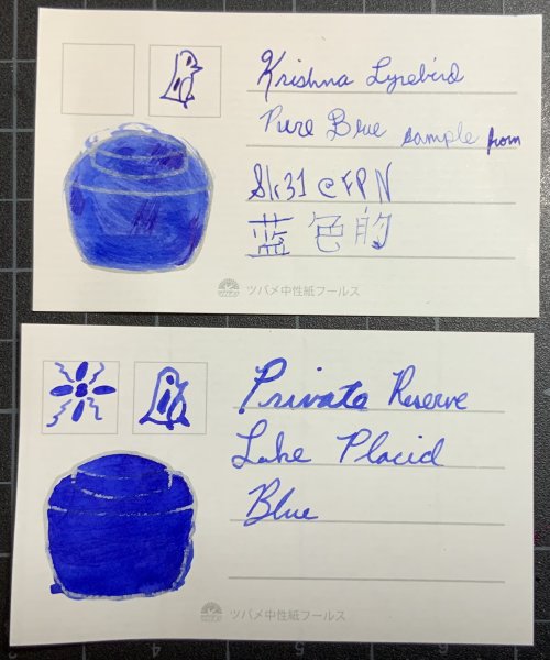
This review might look different, because it is. I wanted a compact, informative way to organize my inks, so I put the information I want on these cards. I am an artist who loves to write with wet, flexible nibs, so I wanted to see how each ink behaved on the various papers I like and use, including the nasty paper at work.


I used an iPhone 4S to take and upload the photos. Color accuracy was not within my means to convey.


I have included the date and time I created the card, as well as the temperature and humidity.


There is a list of pens and paper used on the front of the card, down at the bottom.


Please see other reviews of this ink if you want to know about its waterproof qualities, lubrication, saturation, archival or fade/light resistance properties.


I was not concerned about bleed-through, smearing, or drying time. I did want to know how well the ink would wash with water, so you can see the two symbols for that, one using a wet paintbrush while the ink was still wet, the other using a wet paintbrush after the ink had thoroughly dried.


I wanted to have a large enough swatch to quickly see the color as it relates to other, similar colors, which is how I will sort the cards when I'm done. This swatch also shows shading and any sheen the ink exhibits.


Miscellaneous Comments: I think this is the current MB red, it was a sample from Amberleadavis, so I'm not sure. It has a gnat's eyelash more orange/yellow tone than my vintage Bordeaux has, if you turn your left eye at a 90 degree angle and hold your breath. Nice ink, for sure.


fpn_1401772077__image.jpg

fpn_1401772108__image.jpg

Breathe. Take one step at a time. Don't sweat the small stuff. You're not getting older, you are only moving through time. Be calm and positive.

Link to comment
Share on other sites

  • Replies 4
  • Created
  • Last Reply

Top Posters In This Topic

  • Sinistral1

    1

  • gclyn

    1

  • wastelanded

    1

  • CaptainBA

    1

Top Posters In This Topic

I usually like darker inks, but this red is very nice

_________________________________________________________


Link to comment
Share on other sites

I really love Sinistral1's reviews and I thought I'd post some pictures of the reviews that were color corrected to take away some of the yellow hue. This is by no means any of my work, all credit is due to Sinistral1. I just thought it should be shown in a better colored lighting.


http://i.imgur.com/oysHdrn.jpg

http://i.imgur.com/JEh0w5G.jpg

I'll keep on struggling, 'cause that's the measure of a man.

Link to comment
Share on other sites

I'm not a huge user of red inks, but I do like this one. It shades beautifully, it just needs a wider nib to breathe.

"I was cut off from the world. There was no one to confuse or torment me, and I was forced to become original." - Franz Joseph Haydn 1732 - 1809
Link to comment
Share on other sites

Wow, I"ve never gotten it to be that red. It's from the 1990s.

Fountain pens are my preferred COLOR DELIVERY SYSTEM (in part because crayons melt in Las Vegas).

Create a Ghostly Avatar and I'll send you a letter. Check out some Ink comparisons: The Great PPS Comparison 

Don't know where to start?  Look at the Inky Topics O'day.  Then, see inks sorted by color: Blue Purple Brown Red Green Dark Green Orange Black Pinks Yellows Blue-Blacks Grey/Gray UVInks Turquoise/Teal MURKY


Link to comment
Share on other sites

Create an account or sign in to comment

You need to be a member in order to leave a comment

Create an account

Sign up for a new account in our community. It's easy!

Register a new account

Sign in

Already have an account? Sign in here.

Sign In Now


×
×
  • Create New...