

-
Forum Statistics
355.6k
Total Topics4.6m
Total Posts -
Member Statistics
128,469
Total Members18,857
Most Online Newest Member
BVLogan
Joined -
Images
-
Albums
-

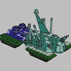
Andrew Lensky Arts
- By Andrew_L,
- 1
- 21
- 48
-

USG 11
- By USG,
- 0
- 0
- 12
-
Pelikan Xuan Wu (2001) - Asia Limited Edition
- By tacitus,
- 0
- 0
- 15
-
00-Feb-March-April2025
- By yazeh,
- 0
- 0
- 88
-

Misfit’s 3rd Album for pens, paper, ink
- By Misfit,
- 13
-


-
-
Most Contributions
-
 amberleadavis
43972 -
.thumb.jpg.f07fa8de82f3c2bce9737ae64fbca314.jpg) PAKMAN
PAKMAN
34608 -
 inkstainedruth
28906 -
 Ghost Plane
28220 -
 Bo Bo Olson
27166
-
-
Upcoming Events
-
Blog Comments
-
desaturated.thumb.gif.5cb70ef1e977aa313d11eea3616aba7d.gif)
By A Smug Dill · Posted
Thanks! Now that I'm back home (and have been for a while) in Australia, when I look in local stationery stockists and even Daiso stores in my neighbourhood, I just can't stomach paying their asking prices for the same items I bought on the trip, which are loosely threefold what I paid while in Japan. -

By palimpsesto · Posted
What a haul! Life Noble Note blanks have been my go-to journals for about a decade. (I love Mnemosyne too but the spiral bindings on most of them don’t work anymore for the system I have in place.) Nobody is doing stationery like the Japanese nowadays, so I’m quite jealous. Congratulations! -

By vikrmbedi · Posted
While removing tax … I used to make the same mistake. removing x% tax from the final amount ( be 10% for japan or 21% for europe). say base price of a pen is 10000 with tax 10% so retail is 10000+ 10000*{ 10/100} = 11000) so the tax component is only 1000 for 11000 retail price pen- which is 9.09% of retail price. For Europe it would come out to be 17.35% not 21off of retail). base price + base price * tax%= retail Base price( 1+ tax%) = retail -

By Ali Hobbies · Posted
Nice haul. How do you like that Logical paper? -

-
-
-
ChatboxYou don't have permission to chat.
-

-

-

-
-

-
 lamarax 2 Mar 20:38Oh well. In case of failure you can always wring the paper to have a nice -albeit somewhat stale- cup of coffee back.
 - T.D. Rabbit 2 Mar 10:20@Astronymus I could use cornstarch... Or i could distill it and make it very concentrated.
- T.D. Rabbit 2 Mar 10:20@lamarax That's what I used! (In reply to black coffee).. But the milk might not be good at all for paper.
-

-
 Gertrude F 20 Feb 17:58Sorry think I posted this in the wrong place. Used to be a user, just re-upped. Be kind. 😑
 - Gertrude F 20 Feb 17:56Looking to sell huge lot of pretty much every Man 200 made - FP, BP, MP, one or two RBs. Does anyone have a suggestion for a bulk purhase house? Thanks - and hope this doesn't violate any rules.
- lamarax 17 Feb 18:05Cappuccino should work. Frothy milk also helps to lubricate the nib. But it has to be made by a barista.
-
 Astronymus 17 Feb 16:19YOu might need to thicken the coffee with something. I admit I have no idea with what. But I'm pretty sure it would work.
 -

-
-
-
-

-

-
 stxrling 13 Jan 1:25Are there any threads or posts up yet about the California Pen Show in February, does anyone know?
 -
-
-

-
.thumb.jpg.3af3eb57a0bc069ef20476220b4d1b2e.jpg)
-
-
 Just J 25 Dec 1:57@liauyat re editing profile: At forum page top, find the Search panel. Just above that you should see your user name with a tiny down arrow [🔽] alongside. Click that & scroll down to CONTENT, & under that, Profile. Click that, & edit 'til thy heart's content!
 -
 liapuyat 12 Dec 12:20I can't seem to edit my profile, which is years out of date, because I've only returned to FPN again recently. How do you fix it?
 -
 mattaw 5 Dec 14:25@lantanagal did you do anything to fix that? I get that page every time I try to go to edit my profile...
 - Penguincollector 30 Nov 19:14Super excited to go check out the PDX Pen Bazaar today. I volunteered to help set up tables. It should be super fun, followed by Xmas tree shopping. 😁
-

-

-

-
 Misfit 9 Nov 2:38lantanagal, I’ve only seen that happen when you put someone on the ignore list. I doubt a friend would do that.
 -
 lantanagal 7 Nov 19:01UPDATE - FIXED NOW Exact message is: Requested page not available! Dear Visitor of the Fountain Pen Nuthouse The page you are requesting to visit is not available to you. You are not authorised to access the requested page. Regards, The FPN Admin Team November 7, 2024
 - lantanagal 7 Nov 18:59UPDATE - FIXED NOW Trying to send a pen friend a reply to a message, keep getting an error message to say I don't have access. Anyone any ideas? (tried logging our and back in to no avail)
-

-

-
 carlos.q 29 Oct 15:19@FineFinerFinest: have you seen this thread? https://www.fountainpennetwor...nging-pelikan-nibs/#comments
 -
 FineFinerFinest 24 Oct 8:52No replies required to my complaints about the Pelikan. A friend came to the rescue with some very magnification equipment - with the images thrown to a latge high res screen. Technology is a wonderful thing. Thanks to Mercian for the reply. I had been using the same paper & ink for sometime when the "singing" started. I have a theory but no proof that nibs get damaged when capping the pen. 👍
 -
 Mercian 22 Oct 22:28@FineFinerFinest: sometimes nib-'singing' can be lessened - or even cured - by changing the ink that one is putting through the pen, or the paper that one is using. N.b. *sometimes*. Good luck
-

- FineFinerFinest 21 Oct 5:23I'm not expecting any replies to my question about the singing Pelikan nib. It seems, from reading the background, that I am not alone. It's a nice pen. It's such a pity Pelikan can't make decent nibs. I have occasionally met users who tell me how wonderful their Pelikan nib is. I've spent enough money to know that not everyone has this experience. I've worked on nibs occasionally over forty years with great success. This one has me beaten. I won't be buying any more Pelikan pens. 👎
- FineFinerFinest 21 Oct 4:27I've had a Pelikan M805 for a couple of years now and cannot get the nib to write without singing. I've worked on dozens of nibs with great success. Ny suggestion about what's going wrong? 😑
-

-
 Glens pens 8 Oct 15:08@jordierocks94 i happen to have platinum preppy that has wrote like (bleep) since i bought it my second pen....is that something you would wish to practice on?
 -
 jordierocks94 4 Oct 6:26Hello all - New here. My Art studies have spilled me into the ft pen world where I am happily submerged and floating! I'm looking to repair some cheap pens that are starving for ink yet filled, and eventually get new nibs; and development of repair skills (an even longer learning curve than my art studies - lol). Every hobby needs a hobby, eh ...
 -
 The_Beginner 18 Sept 23:35horse notebooks if you search the title should still appear though it wont show you in your proflie
 -
 Jayme Brener 16 Sept 22:21Hi, guys. I wonder if somebody knows who manufactured the Coro fountain pens.
 -
 TheHorseNotebooks 16 Sept 13:11Hello, it's been ages for me since I was here last time. I had a post (http://www.fountainpennetwork...-notebooks/?view=getnewpost) but I see that it is no longer accessible. Is there anyway to retrieve that one?
 -
 Refujio Rodriguez 16 Sept 5:39I have a match stick simplomatic with a weidlich nib. Does anyone know anything about this pen?
 -
- Glens pens 11 Sept 1:22Hello, Im new to FPN I'm so happy to find other foutain penattics. collecting almost one year ,thought I would say hello to everyone.
-
 DustyBin 8 Sept 14:34I haven't been here for ages... do I take it that private sales are no longer allowed? Also used to be a great place to sell and buy some great pens
 -

-
 JungleJim 1 Sept 1:55Perhaps it's like saying Beetlejuice 3 times to get that person to appear, though with @Sailor Kenshin you only have to say it twice?
 -
-

-

-

- Seney724 26 Aug 21:43I have no ties or relationship. Just a very happy customer. He is a very experienced Montblanc expert.
-
- Diablo 26 Aug 21:35@Seney724. The pen was recently disassembled and cleaned, but the nib and feed were not properly inserted into the holder. I'm in Maryland.
-
-
-
- Penguincollector 19 Aug 19:42@Marta Val, reach out to @terim, who runs Peyton Street Pens and is very knowledgeable about Sheaffer pens
-
 Marta Val 19 Aug 14:35Hello, could someone recommend a reliable venue: on line or brick and mortar in Fairfax, VA or Long Island, NY to purchase the soft parts and a converter to restore my dad's Sheaffer Legacy? please. Thanks a mill.
 - The_Beginner 18 Aug 2:49is there a guy who we can message to find a part for us with a given timelimit if so please let me know his name!
-

-

-
 fatehbajwa 14 Aug 12:17Back to FPN after 14 years. First thing I noticed is that I could not see a FS forum. What has changed? 🤔
 -

-
- Scribs 29 July 18:51@ TDRabbit, even better would be in Creative Expressions area, subform The Write Stuff
-
- JungleJim 29 July 0:46@T.D. Rabbit Try posting it in the "Chatter Forum". You have to be logged in to see it.
- T.D. Rabbit 28 July 17:54Hello! Is there a thread anywhere 'round here where one can post self-composed poetry? If not, would it be alright if I made one? I searched on google, but to no avail...
-
 OldFatDog 26 July 19:41I have several Parker Roller Ball & Fiber Tip refills in the original packaging. Where and how do I sell them? The couple that I've opened the ink still flowed when put to paper. Also if a pen would take the foller ball refill then it should take the fiber tip as well? Anyway it's been awhile and I'm want to take my message collection beyond the few pieces that I have... Meaning I don't have a Parker these refills will fit in 🙄
 -
 RegDiggins 23 July 12:40Recently was lucky enough to buy a pristine example of the CF crocodile ball with the gold plating. Then of course I faced the same problem we all have over the years ,of trying to find e refill. Fortunately I discovered one here in the U.K. I wonder if there are other sources which exist in other countries, by the way they were not cheap pen
 - The_Beginner 20 July 20:35Hows it going guys i have a code from pen chalet that i wont use for 10% off and it ends aug 31st RC10AUG its 10% off have at it fellas
- T.D. Rabbit 19 July 9:33Somewhat confusing and off-putting ones, as said to me by my very honest friends. I don't have an X account though :<
-
 piano 19 July 8:41@The Devil Rabbit what kind of? Let’s go to X (twitter) with #inkdoodle #inkdoodleFP
 -
 Mort639 17 July 1:03I have a Conway Stewart Trafalgar set. It was previously owned by actor Russell Crowe and includes a letter from him. Can anyone help me with assessing its value?
 -
- T.D. Rabbit 15 July 12:45Hullo! I really like making ink doodles, and I'd like to share a few. Anywhere on the site I can do so? Thanks in advance!
-
-

- JungleJim 3 July 16:14@Bill Wood-- just look at the message below you that was posted by @PAKMAN. He is a moderator here on the forums.
-
 Bill Wood 2 July 14:24Just checking on a classified section and where we are with that. Many thanks. Bill
 - PAKMAN 29 June 1:57@inky1 The software for the classified stopped working with the forum. So no we don't have a sales section anymore at FPN
-

-
-

-

-
 Al-fresco 21 June 12:11@Eppie_Matts Shouldn't be a problem - I've just put a Bock #6 Titanium into a La Grande Bellezza section. Went straight in without any problem.
 -

- Eppie_Matts 20 June 1:32Hi all - I'm new to experimenting with pens and nibs. Can I put a bock 6 on a Pineider? Thanks!
-
 penned in 16 June 17:33Hi, I'm new to this forum and was wondering where is the best place to sell a Montblanc ballpoint pen? Are ballpoints allowed here? It's a beautiful pen that deserves a great listing. Thanks.
 -
 ChrisUrbane 9 June 3:16I havent logged in here for a while. I have moved and when I try to change my location on my profile, when I go to save it, it sais 'page not found' and that I do not have authority to change that.
 -
 Dlj 6 June 20:19I am looking for someone who can repair a Waterman Preface ballpoint that won’t stay together
Load More -
-
Files
-


Recommended Posts
Create an account or sign in to comment
You need to be a member in order to leave a comment
Create an account
Sign up for a new account in our community. It's easy!
Register a new accountSign in
Already have an account? Sign in here.
Sign In Now