Jump to content

Search the Community

Showing results for tags 'violet'.

  • Search By Tags

    Type tags separated by commas.
  • Search By Author

Content Type


Forums

  • FPN Community
    • FPN News
    • Introductions
    • Clubs, Meetings and Events
    • Pay It Forward, Loaner Programs & Group Buys
  • The Market Place
    • The Mall
    • Market Watch
    • Historical Sales Forums
  • Writing Instruments
    • Fountain & Dip Pens - First Stop
    • Fountain Pen Reviews
    • Of Nibs & Tines
    • It Writes, But It Is Not A Fountain Pen ....
    • Pen History
    • Repair Q&A
  • Brand Focus
    • Cross
    • Esterbrook
    • Lamy
    • Mabie Todd Research/Special Interest Forum/Group
    • Montblanc
    • Parker
    • Pelikan
    • Sheaffer
    • TWSBI
    • Wahl-Eversharp
    • Waterman
  • Regional Focus
    • China, Korea and Others (Far East, Asia)
    • Great Britain & Ireland - Europe
    • India & Subcontinent (Asia)
    • Italy - Europe
    • Japan - Asia
    • USA - North America
    • Other Brands - Europe
  • Inks, Inc.
    • Inky Thoughts
    • Ink Reviews
    • Ink Comparisons
    • Co-Razy-Views
    • Th-INKing Outside the Bottle
    • Inky Recipes
  • Paper, and Pen Accessories
    • Paper and Pen Paraphernalia
    • Paper & Pen Paraphernalia Reviews and Articles
  • Creative Expressions
    • Pen Turning and Making
    • Pictures & Pen Photography
    • The Write Stuff
    • Handwriting & Handwriting Improvement
    • Calligraphy Discussions
    • Pointed Pen Calligraphy
    • Broad (or Edged) Pen Calligraphy

Blogs

  • FPN Board Talk
  • Incoherent Ramblings from Murphy Towers
  • The Blogg of Me
  • FPN Admin Column
  • Rules, Guidelines, FAQs, Guides
  • Musings on matters pen
  • Marketing & Sales
  • Iguana Sell Pens Blog
  • Newton Pens' Blog
  • Peyton Street Pens Blog
  • holygrail's Blog
  • A Gift For Words
  • I Don't Have a Name; So This Will Do
  • Karas Kustoms' Blog
  • Debbie Ohi's Inky Journal
  • Sus Minervam docet
  • Crud!
  • Clut and Clutter
  • Federalist Pens

Product Groups

  • FPN Pens
  • FPN Inks
  • FPN Donations
  • Premium/Trading/Retailer Accounts

Categories

  • Fonts
  • Tools & Software
  • Rules for Notepads & Paper

Find results in...

Find results that contain...


Date Created

  • Start

    End


Last Updated

  • Start

    End


Filter by number of...

  1. I saw 50ml bottles of this ink going on clearance dirt-cheap, with no free shipping on offer but a fixed charge per order irrespective of its contents, so I took a big leap of faith and ordered eight bottles at once on a whim, hoping I'll like the ink. My initial reaction upon seeing it on paper up close was one of disappointment; my writing with it (produced with a very fine nib, of course) looked blue-grey without any violet or purple, and so I hadn't been much inclined to fill any of my pens with it. I've since tried it in nibs I don't really like writing with: Aurora Stub and Oblique (Medium?) nibs, and an 18K gold BB nib I bought also on a whim for a Pelikan M815 Metal-Striped pen I don't enjoy using. It turned out that this ink is quite nuanced, and the violet colour is there but subtle (yet not as subtle as, say, the purple undertone in Sailor Shikiori Chushu). With narrower lines it's difficult to see, but if you look closely enough, it's there, especially when viewed at a slight angle. Alas, my scanner is quite hopeless at picking up the true colour. On to the review: Colour: The scans of splats done on the Arttec Como Sketch Pad 210gsm and Canson Drawing 220 Pad 220gsm papers present the colour much better than the scans of the writing samples. I've marked out, in the 300dpi scanned image fragment above, two squares that best represent the complexity of what I see across most of the actual writing. For some reason on which I cannot yet zone in, on the odd occasion (say, 1% of the time at a wet-finger-in-the-air estimate), the ink marks will come out just blue-grey without any hint of violet, but that is rare. Flow and lubrication: Somewhat wet as in watery, coupled with long dry time; not slick at all and provides little lubrication. Feathering: Not observed on Rhodia DotPad 80g/m² paper, in spite of the ink feeling watery. Show-through: Negligible on Rhodia DotPad 80g/m² paper when written with a Fine nib; mild when written with a BB nib. Bleed-through: Short of doing triple passes over the same spot, there was no bleed-through on Rhodia DotPad 80g/m² paper. However, I did observe that on the Canson 220gsm paper, where the ink pooled there is significant bleed-through; but similarly big splats and heavy drops of ink on the Arttec Como 210gsm paper showed no bleed-through. That there are thin, faint blue haloes around the shapes on the Canson paper, while the perimeters dried to a slightly raised and faintly glossy crust on the Arttec paper, suggests that the Canson paper is rather more absorbent. Composition: From chromatography of the ink, it appears there are two main component dyes, and the turquoise component is keen to leave the pink-magenta component behind entirely if given the opportunity. I think that's why there is that faint blue (or turquoise) halo on the Canson paper, and in fact you'll see a little bit of that where I've done 10 ‘parallel’ vertical lines within a 5mm square area on Rhodia DotPad paper. Where I've inadvertently allowed two or three adjacent lines to touch each other, and gave room for the watery ink to pool across lines, you can see that little bit of blue stand out from the grey. Shading: Abundant where the ink marks are not too wet, apparent even when written with a Fine nib, and the transitions from lighter to darker shades are relatively smooth as opposed to demarcated. I've written a page of consecutive lines with deliberately shifting wetness, to show the range of the ink. (Unfortunately, as mentioned before, my scanner is hopeless at picking up the violet colour from that page of writing samples.) Sheen: None observed. I wouldn't call the raised perimeters (or rim, or crust) of dried excess ink on the Arttec paper sheen, even though they do reflect light in a colour that is different from either violet or blue-grey. If you rub those perimeters hard with the pad of your finger, they'll smear slightly. Water resistance: You'd still be able to read what was written if the page got wet and you patted it dry quickly; but after being under (a drop, streak, or bath, of) water for 4–5 minutes, the ink marks will be obliterated.
  2. namrehsnoom

    Jacques Herbin - Violet boréal

    Jacques Herbin – Violet boréal La Société Herbin, Maître Cirier à Paris, was established in 1670. This makes J. Herbin probably the oldest name among European ink makers. Today, Herbin produces a range of beautiful fountain pen and calligraphy inks, writing instruments, gift sets and accessories. Herbin inks are made in France, and the finishing touches on the bottles are still done by hand in Paris. Like so many others, the company jumped on the premium product bandwagon, and started to release higher-end inks under the Jacques Herbin “Les encres essentielles” label. Nicer boxes, nicer packaging, much higher price (18,50 EUR versus the 7,50 EUR for the J. Herbin inks from the “La perle des encres” series). Nevertheless, I couldn’t resist and decided to test these new inks – are they really better than the standard J. Herbin inks? In this review, I take a closer look at Violet boréal, a violet purple with a spring-time feel to it. A wet and well-saturated ink, that works with all nib sizes. There is some nice shading, especially in drier pens. With a wet pen, the ink has a serious tendency to oversaturate, drowning out the shading. With Violet boréal, I recommend using a dry pen – it will definitely enhance the ink’s appearance on the page. The ink has quite satisfactory lubrication, even in drier pens like my Lamy Safari. With my wetter Pelikan pens the ink is actually too saturated for my taste, it loses its depth and becomes one-dimensional, diminishing its appeal. With stronger saturation, the colour also shifts from a light violet to a much darker purple. Violet boréal has a medium colour span that ranges from a light violet to a darker violet-purple. Contrast between light and dark parts is fairly low, which translates to subtle shading. To illustrate this, I did a swab on 52 gsm Tomoe River paper where I really saturated portions of the paper with ink. This clearly demonstrates the ink’s colour span. On the smudge test – rubbing text with a moist Q-tip cotton swab – there was lots of smearing. The text itself remains very readable though. Water resistance is fairly low. There remains some text on the page, and with lots of patience you might be able to reconstruct your writing. But if this aspect is important to you, simply choose a different ink. The ink’s chromatography suggests that some ink remains on the paper, but that’s only partly true: what remains on the page is a smudgy mess, not easily readable text. Drying times for this Jacques Herbin ink are around the 10 second mark with my Lamy Safari M-nib. The ink prefers the better-quality paper in my test set. With lower quality paper, I see a small amount of feathering, and quite some see-through with a bit of bleed-through. But overall, the ink behaved really well. Violet boréal looks good on both white and creamy paper. One thing to note is that this ink’s colour is crazy difficult to capture. Scans show it too blue-violet – while in reality it’s more a red-violet. And the photos show it darker than it appears in real life. To my eye, the photos are closest to its real-life appearance. I’ve tested the ink on a wide variety of paper – from crappy Moleskine to high-end Tomoe River. On each scrap of paper I show you: An ink swab, made with a cotton Q-tip 1-2-3 pass swab, to show increasing saturation An ink scribble made with a Lamy Safari M-nib fountain pen The name of the paper used, written with a Lamy Safari B-nib A small text sample, written with the M-nib Lamy Safari The source of the quote, written with my F-nib Yard-o-Led Viceroy Drying times of the ink on the paper (with the M-nib Safari) Since scans alone don’t tell the complete story, I’ve added some photos of the same writing samples to give you another view on the ink. Writing with different nib sizes The picture below shows the effect of nib sizes on the writing. All samples were written with a Lamy Safari, which is typically a dry pen. I also added a visiting pen – a wet-writing Yard-o-Led Viceroy with F-nib. With the wet pen, the ink leaves a very saturated violet-purple line, and loses much of the shading. I personally prefer this ink in combination with a dry pen – it simply looks nicer: a light-violet with subtle shading. The wetter the pen, the darker and more one-dimensional the ink becomes. Related inks To allow for a good comparison with related inks, I employ my nine-grid format, with the currently reviewed ink at the center. Each grid cell shows the name of the ink, a saturation sample, a 1-2-3 swab and a water resistance test – all in a very compact format. Callifolio Violet from L’Artisan Pastellier looks fairly close – I might do a shoot-out between these two in the near future. Inkxperiment – multiverse As a personal challenge, I try to create interesting drawings using only the ink I’m reviewing. With these monochromatic pieces, I get to explore all the colour-range nuances that are present in the ink. And I really enjoy creating these little pieces – pure quality time spent with my hobby! Inspiration for this painting comes from an astronomy book I’ve been reading lately, which also covered the concept of a multiverse. This somehow stuck in my head, and I used it as the concept for this drawing. For this drawing I used a textured Fellowes binding cover. I started by painting the different quadrants using a piece of cardboard and pure Violet boréal. The world circles were created with a small glass bottle: I dipped the bottom of the bottle in ink, and used it as a stamp to create the circles. I next painted in the scenes using water-diluted ink. For the stardust in the background, I splashed some ink on the paper with a toothbrush. I finally added some extra detail to the world circles using a glass dip pen. The resulting piece gives you an idea what can be achieved with Violet boréal in a more artistic setting. Conclusion Jacques Herbin Violet boréal is a good-looking violet that I find quite enjoyable. But… you really need a dry pen to make the best of this ink. With wet pens, the ink tends to over-saturate, shows a too dark violet-purple colour, and becomes really one-dimensional. I don’t like the ink in that incarnation (my opinion of course). Overall not a bad ink. But, for a so-called premium product, I had higher expectations. Technical test results on Rhodia N° 16 notepad paper, written with Lamy Safari, M-nib Backside of writing samples on different paper types
  3. I-am-not-really-here

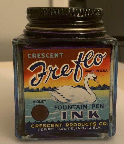
    Crescent Freflo Violet

    From the album: Ink bottles

    Violet ink

    • 0 B
    • x
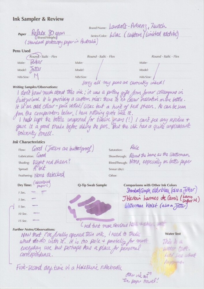
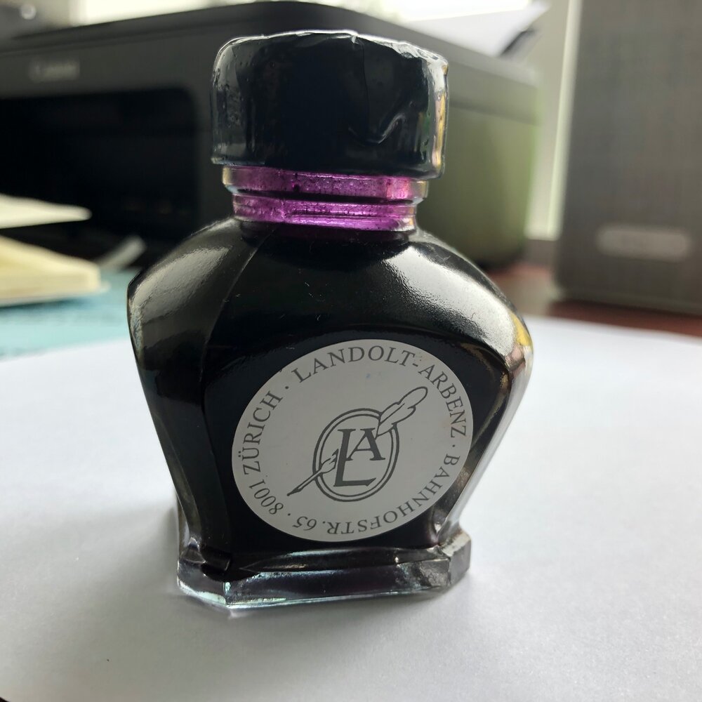
  4. Spurred on by the encouragement of "A Smug Dill", I decided to finally open a bottle of ink that was given to me as a parting gift by former colleagues, 12 years ago. It was nothing like what I expected. Although Landolt-Arbenz is a known manufacturer of ink in Switzerland, it is possible that this was a limited edition run. The bottle is different from the other example in the reviews here, and totally different from the inks shown in their web site now. The cap was covered in wax, though this was not a seal and didn't need to be broken to open the bottle. As noted in the review form, I was expecting a deeper, redder colour based on the bottle neck, and there is indeed a bit of a red sheen when wet. But it dries quickly to a pastel lilac. It dries quite quickly and flows nicely, which matters to me as a left-hander. This is my first review, so I might not have done everything correctly. Certainly before I did the water test, I should have checked that there wasn't already ink on the paper towel. The white point on the scan is a bit grey but the colour itself is about right.
  5. akszugor

    Cross Violet

    Manufacturer: Cross Series, colour: Violet Pen: Waterman Hemisphere „F” Paper: Image Volume (gramatura 80 g / m2) Specifications: Flow rate: very good Lubrication: good Bleed through: noticeable Shading: noticeable Feathering: unnoticeable Saturation: good A drop of ink smeared with a nib The ink smudged with a cotton pad Lines Water resistance Ink drying time Ink drops on a handkerchief Chromatography Sample text in an Image Volume (gramatura 80 g / m2) Sample text in an Oxford notebook A5 (90 g / m2) Sample letters in a Rhodia notebook No 16 (90 g / m2) Sample letters in a Clairefontaine (gramatura 120 g / m2) Palette of shades
  6. akszugor

    Robert Oster Signature Viola

    Manufacturer: Robert Oster Signature Series, colour: Viola Pen: Waterman Hemisphere „F” Paper: Image Volume (gramatura 80 g / m2) Specifications: Flow rate: very good Lubrication: good Bleed through: unnoticeable Shading: noticeable Feathering: unnoticeable Saturation: very good A drop of ink smeared with a nib The ink smudged with a cotton pad Lines Water resistance Ink drying time Ink drops on a handkerchief Chromatography Sample text in an Image Volume (80 g / m2) Sample text in an Oxford notebook A5 (90 g / m2) Sample letters in a Rhodia notebook No 16 (90 g / m2) Sample letters in a Clairefontaine (120 g / m2) Palette of shades
  7. visvamitra

    Cross Violet Ink

    A.T. Cross Company was founded in 1846 by Richard Cross in Lincoln, Rhode Island. Cross is the oldest manufacturer of quality writing tools in America. Personally I ws never interested in their pens and inks. However yesterday during Pen Hub in Poland I had a chance to fill a pen with their new blue/black ink. As I had only one solid fill it won't be review, more my impressions after using 1 ml of ink. New inks come in 2oz (62.5ml) elegant glass body with a custom cap embossed with the new Cross lion logo. The new squared-off corners of the cap makes for easier gripping when opening and closing the bottle. The new bottle looks interesting. New inks are available in six colors: Black Blue Blue/Black Green Red Violet Blue?Black wasn't bad so I was interested in trying other inks in the line. Some people suggested that Cross Violet ink can be treated as Lamy's Dark Lilac Substitute. It can't. It's nowhere near. Still the ink is quite ebjoyable. The flow is nice, lubrication acceptable and I would be surprised to hear about it causing problems like clogging the pen of producing feathering. It's fairly well behaved violet ink that looks nice on most papers. I won't buy a bottle but if you're into purples, violets and megentas you can't go wrong with this one. Drops of ink on kitchen towel Software ID Color range Rhodia, Montegrappa Parola, broad nib Leuchtturm 1917, Kaweco Classic Sport, broad nib Linen, Montegrappa Parola, broad nib Water resistance Micro-comparison
  8. A new calligraphy ink by Manuscript with extreme shimmer. Definitely not something to use in the office but it looked interesting to write some cards with in the upcoming holiday season. This ink is clearly not meant for long notes or letters. A very dark violet or purple with heavy gold shimmer. I find it a hard to use ink. OK to use in a fountain pen like the TWSBI ECO with a stub nib, but a dip pen made the ink feather and spread, even on Clairefontaine or Crown Mill Vellum paper. On Lalo Vergé it was much better. The ink is very wet, causing considerable show-through and even some bleed-through. The drying time wasn't too bad though with 35 seconds. The shimmer smears easily for a bit longer. As can be seen even on this scan, shimmer is gold and very high. A bit of water will keep the ink readable, enough to rewrite. The violet or purple is comparable to Herbin's Améthyste de l'Oural. Diamine's Imperial Purple (no shimmer) is brighter and lighter. All in all this is a nice ink to have and it will have its use for greeting, holidays, or birthday cards.
  9. smruthib

    Penhouse.in Inks

    Hello all. This is my review for the penhouse.in inks. Attached below are the swatches of violet (above), and turquoise (below). The paper I have used is the Thought Slot dotted inserts which are readily available on amazon.in. The pen I have used is the Camlin KOKUYO Trinity, which I also got from penhouse.in. The turquoise ones show some amount of feathering on the paper, while the violet does not have the issue. The ink takes about 3 seconds to dry. It is not waterproof. This isn't available in cartridges, but the ink comes in plastic bottles, and costs about Rs. 30, or ~$0.5. The turquoise was kind of disappointing, it seems to be more of a bright blue than a greenish blue shade that I was expecting. The violet is bright and lovely, and writing with it seems like a charm. Regards, Smruthi
  10. lgsoltek

    Sailor Kobe Le Monet Violet

    This is a limited edition ink from Nagasawa Kobe, Monet Violet, to celebrate a Zurich Museum exhibition in Japan. One of the painting exhibited is a Monet's Water Lily Pond. Obviously the ink is violet, to replicate the colour of water lilies. PACKAGING This ink comes in a gorgeous box. http://s1.homezz.com/201503/5915/50375_z.jpg I unfolded the box and scanned it (and joined the two parts with software): http://s2.homezz.com/201503/5915/50369_o.jpg As you can see it's the box that attracts me and motivated my purchase. And the bottle, very pretty as well: http://s1.homezz.com/201503/5915/50374_z.jpg It comes with a piece of paper introducing the ink. http://s2.homezz.com/201503/5915/50370_z.jpg SPLASH Photo and scan. The scan is bluer than it actually is. http://s2.homezz.com/201503/5915/50371_o.jpg SAMPLE The colour, however, is not so special as the box. It's a moderately saturated violet. The shading is very nice. It doesn't sheen in normal writing (quite a letdown considering it's a Sailor). It's well behaved as other Sailors. In terms of water resistence, the darker part actually holds up quite well to water. http://s0.homezz.com/201503/5915/50373_o.jpg COMPARISON In case the handwriting is not easy to read, these are: (left) Monet Violet, Iroshizuku Murasaki-shikibu, Sailor Kingdom Note Sasakia charonda, Private Reserve Tanzanite, Sailor Nioi-sumire. (right) Diamine Pansy, R&K Solferino, R&K Magenta, R&K Cassia, Iroshizuku Yama-budo. Monet Violet and Murasaki-shikibu are quite close in terms of saturation, MS being more red and MV more blue. The rest are more saturated. If you really like the colour of Monet Violet, I think you can mix Iroshizuku Murasaki-shikibu with Ajisai and get a similar colour. I might try that myself sometime. http://s2.homezz.com/201503/5915/50372_o.jpg CONCLUSION Don't get me wrong. I do like this ink. I like the colour. It's quite beautiful. However it just lacks that little something special to be limited edition and to match the nice box. And normally I like more saturated inks. I like this ink, a lot. Maybe I'll love it the more I use it. And the more I look at the box.
  11. Dip n Scratch

    Raduga 2 Ink Question

    I have been mixing my own violet/purple inks & I have read about the Raduga Ink & it's use in Soviet educational establishments. It looks like you shouldn't keep it in a pen for any length of time and also it lacks preservative elements, so it 'goes bad'. I like the violet colour. Just wondering if it was more trouble than it was worth as it looks like there are close equivalents by Diamine & others.
  12. Akkerman #14: Parkpop Purper Akkerman inks are made by P.W. Akkerman in The Hague. Akkerman inks have unique bottles that make filling pens very easy. This review is based off a sample that I purchased several months ago and I am just now getting around to trying. My overall impression is very favorable. The ink is not lubricated, but flows nicely and behaves well overall. But what really sets this ink apart is the sheen! I had seen some sheen when I wrote in my journal (MD Midori) and really saw sheen when I wrote a letter today. But I was hugely surprised to see so much sheen on the HP copy paper that I wrote this review on. My overall score is 8/10, with such great sheen! Thank you, KaB and lapis for your assistance to correct my typing blunders! I do appreciate it!
  13. thacky

    The Right Blurple Ink

    I have been endlessly searching for the perfect blurple ink.I want an ink that when dry looks blue but is also purplish. I live in an area where there are sadly no pen stores that sell fountain pen ink. I have tried relying on samples shown online but when I receive an ink it is either too blue or too purple. The closest to what I want is Private Reserve Tanzanite. Tanzanite is a shade or two too purple. Does anyone have any suggestions of an ink that is slightly more blue, barely more blue, than Tanzanite? Inks that I am looking at online are: J. Herbin Eclat de Saphir(seems too blue in some pictures and too purple in others) De Atramentis Sapphire(seems close but maybe slightly too blue) Diamine Imperial Blue(same problem as with pictures of Eclat de Saphir) Diamine Sapphire Blue(seems too blue in pictures that I have found) Of course screen color calibration could show the wrong color as my screen has been off with the inks that I have tried which all looked perfect until I got them and used them. I have tried Private Reserve Cosmic Cobalt(too blue) and Private Reserve Electric DC Blue(too blue), Pilot Iroshizuku Asa-Gao(once again too blue), Private Reserve Tanzanite(close but slightly too purple). Thank you in advance.
  14. I am finding myself warming to this ink from the new 'Chromatics' series. I am not a big user of violet, but there is some versatility here that I find useful and a depth to the colour that does not show up on the scan. Suggested usage DAILY WRITER: Very possible. BUSINESS: Hmmm, I normally have a strict 'no violet at work' policy, at least for men, but I am actually considering this one: from a wet pen it is very dark and would not be completely out of place for business communication and from a dry pen (perhaps slightly diluted) it might be pressed into service for marking edits. NOTES AND JOURNALS: Yes, very much so. INFORMAL LETTERS: Oh yes, so very much. Please send me some with this. FORMAL LETTERS: Unlikely. LOVE LETTERS: In diluted form - probably. Undiluted? Not sure: what do you think? Review Note that the soak test is on a random slip of office paper, not Rhodia, and notice the darker colour on the more absorbent papers. The two lines under the 'ultra violet' heading are one and two passes, respectively. What do you think? Would you use it in the office? For a love letter?
  15. L'Artisan Pastellier Callifolio - Violet L'Artisan Pastellier is a small company in southern France that specialises in natural pigments, and offers customers authentic and reliable products in beautiful colours based on mineral or vegetable pigments. In a collaboration with Loic Rainouard from Styloplume.net, the chemist Didier Boinnard from L'Artisan Pastellier created the line of Callifolio fountain pen inks. These pastel-coloured inks are traditionally crafted, and can be freely mixed and matched. Overall these inks are only moderately saturated, and have low water-resistance. The inks were specifically designed to work well with all types of paper, and all types of fountain pens. Being pastel-tinted, these inks have a watercolour-like appearance, and are not only fine inks for journaling, but are also really excellent inks for doodling & drawing. I only recently discovered them, and they are already the inks I gravitate towards for personal journaling. In this review, Callifolio Violet takes center stage: a springtime light-purple ink obviously named after the violet flower (aka viola of the Violaceae family of flowering plants). You can also think of the colour of lavender if you prefer. Violet is a fresh, lively and primarily beautiful looking ink. The ink gives me a playful feeling - perfectly suited for this late spring / early summer season. It is not too intrusive though, and in my opinion not only suited for personal journaling but also well adapted for notetaking at work. Be aware that this is a reformulated version of the older Callifolio Violet, and a totally different ink than the one previously reviewed by visvamitra (no golden glitter in this incarnation of the ink!). As far as I'm concerned, this ink doesn't need a golden shimmer to shine. It's a beauty in its own right. The ink works well in all nib sizes but is a bit undersaturated in drier fine nibs. It shows some really nice shading in the broader nibs, from light to dark violet. I'm not a fan of too bold a shading (with a large difference between light and dark) - here the contrast between the light & dark portions of the text is obviously present, but remains subdued with an aesthetically pleasing look. I really like it ! This flowery ink really blossoms in wetter nibs where it leaves a much more saturated and darker-looking line, which looks amazing. Be sure to find a wet pen to use with this ink - you'll be well rewarded with the eye-pleasing result. Below you'll find a writing sample with my drier Safari M and B nib, compared to the wet golden M-nib of my Lamy Dialog 3. The difference is obvious On the smudge test - rubbing text with a moist Q-tip cotton swab - Violet behaved perfectly with almost no smearing. Water resistance is remarkably good ! This is the first Callifolio ink I've used that is nearly water-proof. A 15-minute soak in still water posed no problem at all. Running tap water caused some purplish smudging, but the text remained perfectly readable. This water resistance makes Callifolio Violet all the more suited for the workplace, earning an extra plus from me. The ink's water resistance is demonstrated clearly in the chromatography, which shows that most of the ink remains in place when coming into contact with water. It also clearly shows that this is a one-pigment ink. I've tested the ink on a wide variety of paper - from crappy Moleskine to high-end Tomoe River. For the Callifolio reviews, I'm using a new format to show you the ink's appearance and behaviour on the different paper types. On every small band of paper I show you: An ink swab, made with a cotton Q-tip1-2-3 pass swab, to show increasing saturationAn ink scribble made with an M-nib fountain penThe name of the paper used, written with a B-nibA small text sample, written with an M-nibDrying times of the ink on the paper (with the M-nib)Callifolio Violet behaved perfectly on all the paper types I used, without any feathering even on the lower quality papers in my test set. Drying times are fairly short in the 5-10 second range on most papers. In my opinion, the ink looks best on true white paper, and is a bit less eye-pleasing on more yellow paper. I find it great-looking on the readily available Rhodia paper. At the end of the review, I also show the back-side of the different paper types, in the same order. The ink behaved superbly on all paper types. Only with Moleskine there was a tiny bit of bleed-through - given that Moleskine is a notoriously bad paper for fountain pens, this was really surprising (in a good way). Violet is a really well-behaving ink. Conclusion Callifolio Violet from L'Artisan Pastellier is a wonderful ink, perfectly suited for late spring / early summer. I am really impressed by the ink's performance on different paper types, as well as its near-perfect water resistance. But primarily I am totally charmed by the ink's colour, which looks fresh & beautiful, but is still not too out-of-bounds for an office setting. A great-looking ink for any occasion ! You should really try it out for yourself ! Technical test results on Rhodia N° 16 notepad paper, written with Lamy Safari, M-nib Backside of writing samples on different paper types
  16. csgebhart

    Shading Violet Ink ?

    My current favorite ink is Robert Oster Fire & Ice because I love how it shades, and turquoise is one of my favorite colors. Another of my favorite colors is violet, but I haven't found a violet ink that shades nicely yet. I've sampled a lot of inks that are lovely colors, but rather flat. I would prefer an ink that isn't too far into the red range; more true violet or leaning towards the blue range. Does anyone have any suggestions? Thanks.
  17. Penbbs No.152 Mix Set Violet Penbbs is a Chinese online fountain pen community similar to FPN. They not only talk about inks but also produce their own inks every year. Each series consists of ten to fifteen inks and 2017 marks the release of Penbbs’ fifteenth ink series. Due to Chinese postal restrictions, these inks are virtually impossible to obtain outside of China. Within China they are extremely affordable (21 RMB or about US$3 per 60ml bottle) and can easily be purchased through the Chinese online shopping giant Taobao. This ink up for review is from Penbbs’ twelfth series. It is one of seven “Mix Set” inks in this series that are designed to “mix to create miracle.” The color is true to its name, giving a nice deep violet. This ink is rich and deeply saturated with virtually no shading. It’s a beautiful vibrant hue that I enjoy seeing on the page. Judging purely from scans in other reviews, I have a feeling that Penbbs No. 152 may be a good contender for a Lamy Dark Lilac substitute. [bTW, If anyone is interested in selling me their bottle of that precious elixir please let me know!! :puddle: ] It also seems to be darker and more saturated than Pelikan 4001 Violet, but I don’t have any on hand to compare. No. 152 also has some great writing properties. There is a little feathering and bleed through on copy paper and Moleskine, but it isn’t significant. This ink also dries quickly and has good water resistance. When exposed to water the red component will lift, but the remaining dark purple line is still very legible. This is the first of the Penbbs inks I’ve reviewed so far that has actually impressed me. It’s a nice color that behaves well and is a joy to write with. If you like purples/violets and are able to get a bottle of this, you won’t be disappointed! Pens used (in order): 1. Pilot 78G Fine 2. Lamy Safari Broad 3. Pilot Plumix Italic 4. Noodler’s Nib Creaper Flex 5. Hero 5028 1.9mm Stub Swab Paper Towel Drop 80gsm Rhodia 73gsm Chinese Tomoe River Wannabe (brand unknown) 70gms Deli Copy Paper Moleskine Water Resistance Comparison Here is Penbbs’ image of the bottle and label for reference: SDG
  18. Sailor Hougado Pen Gallery Nodaiko Violet For a long time I had my eye on the Hougado Pen Gallery inks, a shop located in Matsuyama, Ehime Prefecture, Japan on the island of Shikoku. Their original series of bespoke Sailor inks were kinds of blacks, and don’t seem to be reviewed here on FPN, except one by Lgsoltek, which has references to writing samples by saskia_madding, who didn’t like them. The shop has another series of inks based on the well known Japanese book Botchan. This book may be as famous in Japan as Huckleberry Finn is in America. The inks are colors representing some of the main characters in the book. Boochan Blue after Botchan, the main character in the novel, a mathematics instructor. Nodaiko Violet after Nodaiko, The Redshirt’s sidekick and accomplice. Yamaarashi Sepia, after Yama Arashi, the head math teacher at the school in the novel. Uranari Green, after Uranari, the school’s English teacher engaged to Madonna. The Redshirt, the “bad guy” in the novel, who himself wants Madonna’s affections. Madonna Purple, the beautiful local girl engaged to Uranari by arrangement. The information on the characters comes from a Wikipedia page about the novel Botchan and this helps explain the colors to those of us not familiar with the book. Sadly I have to have limits, and I rarely buy inks that I won’t ever use (reds), but I recently obtained some of these inks. The box top has a sticker label with a picture of the book’s author Natsume Sōseki, in thought, along with the shop name and ink color. Perhaps he’s planning the next chapter, or considering the next words in his famous novel. This is a deep rich violet similar in hue to the Quinacridone Violet pigment, especially as used in some watercolor paints. It's definitely not bright, but a muted color. While dark, it cannot be mistaken for black. It's quite wet, and in the wet Fine nib of the Edison Premiere used in this review, the line was somewhat wider. On the inkjet paper, the pen wrote more like a broad with a great deal of show through. The ink is not water resistant. I didn't have any problems writing, no hard starts, skips, nib dry out. No staining observed on the converter. Pen: Edison Premiere (F-steel) Papers: MvL=Mohawk via Linen, TR=Tomoe River, Hij=Hammermill 28 lb inkjet, Rhodia=Rhodia 90g ivory. Camera: iPhone 7 You can see on this image how much show through there is on the inkjet paper with this wet "Fine" nib.
  19. richofthetower

    Ink Like A Purple Yam?

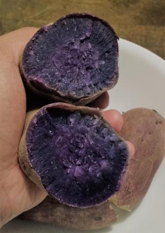
    Hey all you ink lovers, My wife is a big, big fan of purple. Even our wedding had lots of purple accents in it. But, personally, I've never thought too much about the color. Until, I got into fountain pens. And furthermore, until I recently chowed down on an ube. Allow me to explain: the Filipino ube (Dioscorea Alata, local pron. "OOH-beh") is a yam with a sweet-ish purple/indigo flesh indigenous to Southeast Asia. In the Philippines, it is prized as the essential ingredient of various sweets, and that is how I, being of Filipino extraction, am most familiar with it. However, it is also very nice after a simple boiling. Behold, plain-looking spud on the outside, tuber royalty within: I haven't eaten one of these in months - before my pen obsession began. Mid-bite, I gazed into its deep indigo insides, stopped chewing and thought, "If only I could find an ink of that hue!". It would be gorgeous and serve as a nostalgic reminder of a childhood stuffing my face with sweetened, creamy cakes and tarts. Now, I've seen various posts on the FPN and elsewhere in regards to purple inks, but I think the subject could stand a bump. What inks do you think would match this vibrant veggie? Or simply, what is your favorite indigo ink? Regards, Rich
  20. This is an incredibly hard ink to photograph. Artificial light does not bring out the real color, and sunlight makes it something else really, but maybe because I was trying to take pics at 3:00 Pm and not early morning. Then you have the problem of ink appearing too pink when there isn't any pink in it. Nevertheless, I really like it. I was considering old burgundy again, but I don't regret inking this one up. http://i.imgur.com/EshlLRQ.jpg http://i.imgur.com/aevU5dx.jpg I'd suggest zooming in to see the real color of the ink. Another thing with this ink is, that it is extremely free flowing. I do all my ink reviews with the same pen, an Eyedropper filler with 6ml ink capacity. Usually I do not hear the ink sloshing inside (due to barrel being completely full of ink) until i write 8-9 pages with it. But with this ink, I am hearing the ink moving inside the barrel after ~4 pages. So it's going to get used up quickly. Some Close-ups: http://i.imgur.com/sq9kINX.jpg http://i.imgur.com/ei5j48l.jpg http://i.imgur.com/QW51Cf6.jpg http://i.imgur.com/6UfyoFe.jpg There is some sheen too: http://i.imgur.com/p9SsgaH.jpg The bottle: http://i.imgur.com/FkHfldK.jpg
  21. white_lotus

    Kwzi Violet #2

    Perhaps everyone knows by now, but in case some do not, that there are wonderful inks coming out of Poland under the brand name KWZ Inks. They are really very well made, have good characteristics, and are well worth your consideration. Not many stores stock these inks, but Vanness does in the US and I think there is a store in Belgium perhaps. I think one can even order direct from KWZ online, but that may only be necessary if an existing supplier is out of stock. The prices are very reasonable, $12/60 ml bottle in the US. I purchased this ink, the Violet #2, as part of the 3rd North American "group buy" in early 2015. It is part of the "water resistant" series of KWZ inks, which is only available direct from KWZ Inks. I imagine that stores don't see a reason to carry such an ink when you could buy an IG ink, but some of us don't need permanent inks, nor the extra pen care that goes with IG inks. The Violet #2 is more of a muted purple compared with Violet #7 which is more of a red-violet. I tested the ink on my usual papers: MvL=Mohawk via Linen, Hij=Hammermill 28lb inkjet, and TR=Tomoe River. I apologize for my poor photo manipulation skills. They always show the ink as darker than it really is and often more saturated, so comparison with other reviews, as well as images on the sales sites and the reference images here on FPN done by Cyber6 for the full list of KWZ Inks (May 2015 edition) will prove valuable. I personally find the last being the most accurate representation of the inks. https://www.fountainpennetwork.com/forum/topic/280869-kwzi-full-list-may-2015/?p=3215166 Color representation not bad, but too saturated. Definitely darker and more saturated than how the ink on paper looks. Much better... A little dark, but about right.
  22. white_lotus

    Kwzi Violet #7

    As some of you may know, there are some inks being made by an industrious fellow named Konrad in Poland. There's been a few North American "group buys" in the past, and most inks in the line are carried by Vanness Pens and can be ordered online. I picked up a few of the inks in the last group buy in early 2015. I have a much longer list of inks I want to acquire. The ink here is one of the water-resistant inks, Violet #7. Unfortunately, I don't see this ink at Vanness as I like this color range, but it may well be available directly from KWZI through the website kwzink.com. The papers were the usual suspects: MvL=Mohawk via Linen, Hij=Hammermill 28lb inkjet, TR=Tomoe River. This ink has a vibrancy that I wouldn't have expected from a violet, which usually is a dark color. It's not retina-searing by any means, but just has a spark of life to it that I like quite a bit. As typical, my old iPhone doesn't capture color the best, especially when it is dark. Definitely seeing it as redder than presented. There was a little bit of staining on the converter, a common problem with violet inks, but it washed out easily. This actually seems closest to the authentic color. The ink is actually claimed as water-resistant, not waterproof as I wrote. And it meets that criteria. Some wet paper towel chromatography.
  23. white_lotus

    Akkerman #15 Voorhout Violet

    Akkerman is the line of inks from The Hague, Netherlands, said to be made by Diamine for them. They have the coolest ink bottles. And the ink inside those bottles is very good. The inks are available in the US from Vanness Pen and Anderson Pens. Google's ability to translate Dutch is stymied by the word "voorhout". The ink is a soft, muted violet, very pleasing on the eyes, more neutral and bluer than the KWZI Violet #7. And the ink handles very well. Not water resistance at all. The usual papers: MvL=Mohawk via Linen, Hij=Hammermill 28 lb inkjet, TR=Tomoe River. The MvL and Hij pics seem to show up a little too dark. The value is closer to the KWZI Violet #7, and the ink is not really a black at all. My image adjustment skills are lacking, but the image capture device is old technology (iPhone4). This pic of the TR paper still seems too red even though I adjusted it quite a bit.
  24. white_lotus

    Anderson Wood Violet

    Recently I learned that the inks made for Anderson Pens were being discontinued. Their original marker, Scribal Workshop, wasn't going to make them any longer, and Anderson couldn't find a replacement producer to their satisfaction. So with the encouragement of another FPN member I picked up a bottle of the remaining inks (except the black). This is a review of the Wood Violet, a nice violet/purple color. The color in reality if not quite as dark as shown in the images; it's definitely more soft. These inks had gotten a reputation for being "dry", and even on the web site it says "Some people have found these inks to be dry". Well this IS NOT a dry ink. It's an ink of normal wetness. Perhaps if you are comparing this ink with certain brands known for being especially wet, you may well think this ink was dry, depending on the pen and paper used. In fact, I found the ink to be a slow drier. This could be a problem for some people. The color was good, it was shady on some papers. Perfectly good handling and behavior. The ink is not very water resistant, but that wasn't expected. The ink blot isn't very exciting, just a single color dye. But a good color nonetheless. At the time when the review was written, this ink was available from Anderson Pens, and was on sale at $9 for a 2 oz. bottle. Usual papers for me: MvL=Mohawk via Linen, Hij=Hammermill 28 lb inkjet, TR=Tomoe River.
  25. white_lotus

    Noodler's The Violet Vote (2016)

    Noodler's has released a limited edition 2016 edition of their ink "The Violet Vote" which was originally a Pendamonium exclusive that was discontinued when one or more ingredients became unavailable. I never had the original ink, so I cannot compare this ink to it. So it will be evaluated on it's own merits. To me the color seems very unique. The ink is eternal, so it is totally waterproof, and proof against many other methods of erasure/alteration. I have a number of Noodler's inks and have never had problems with them. I must say, it is the exception rather than the rule. This ink howeverdid have some issues with the Hammermill inkjet paper. This is a fairly heavy paper, 28 lb text weight, so it's not thin at all. I rarely have any problems with "show through", and even less with "bleed through". For some reason this ink had problems in both areas. I was able to write a review of another ink on the back side without problem, and probably could have written using The Violet Vote, but I rarely have these problems even with Noodler's inks, so I feel I should mention this. You may need to choose your nib and paper more carefully with this ink. The ink also has a strong chemical aroma, even when writing. So those with chemical sensitivities may wish to consider an alternative ink. The ink dried in a reasonable time on the MvL, and on the Hij almost immediately, within three seconds. That's very fast in my estimation. The ink is more expensive than the usual Noodler's line as I suspect there may have been a custom order of dye involved, which anyone in manufacturing knows ends up costing quite a bit more. As of this writing (3/6/2016), Anderson Pens and Goulet Pens are out-of-stock of this ink. GoldSpot lists the ink as available. I suspect within a few more weeks this ink will be unobtanium. The papers used were MvL=Mohawk via Linen, Hij=Hammermill 28 lb inkjet, TR=Tomoe River. Since we have an ink that's all about voting, we have a list of the Democratic Presidential candidates since 1968. There is another review (F-C Tenebris Purpuratum) that has the corresponding Republican candidates over that time frame.


×
×
  • Create New...