Search the Community
Showing results for tags 'view'.
-
- 11 replies
-
- birmingham
- ink
- (and 6 more)
-

Ink View: Lake Michigan Summer - Papier Plume’S Chicago Pen Show Exclusive!
Jackokun posted a topic in Ink Reviews
Pictures should be ok now Ink View: Lake Michigan Summer - Papier Plumes Chicago Pen Show Exclusive! I first came to know about this and the Ivy 108 a couple of weeks ago while conversing with Papier Plume on new upcoming inks. At that point the inks were already created and I was just at the tail end of it. I was lucky enough to receive a small sample of each. As the main batch hadn't been done yet, I got what was left from what was sent for review. Still I was happy to tryout these inks, especially since I dont have an Ink Hookup at the Chicago Show to get me some these ink bottles. Still! Many thanks to Papier Plume for providing the sample. I meant to have this out a few days back but I was tasked with painting our Condo.... and lets say it has been time consuming to say the least. I do hope you enjoy reading this (re)view as much as I enjoyed writing it. A small evident warning: This is a limited ink to 60 Bottles only available at the Chicago Pen Show. I do not know any plans for re-releasing these inks in the future, one can hope and I asked! Lake Michigan Summer (LMS) The Name and the Ink When I look at an ink I want to know if there is any story behind it, this could be a simple or could be an elaborate story, but in a way it helps me signal out an ink from many others that could be close in terms of color or properties. The Lake Michigan is the third largest of the Great Lakes (when measured by water surface) and the only Great Lake located entirely in the United States. The Lake Michigan Summer ink was meant to represent the colors of Lake Michigan in the Summer! Which when looking at the pictures you can find if the lake it does look like the ink spoilers I think it does. Here is a couple picture of the Lake Michigan in the summer http://i.imgur.com/qaYhBb1.jpghttp://i.imgur.com/D38WRN7.jpg How does the Lake Michigan gets its colors? As per some research : The blue is the color given by the light hitting the water with hues varying as the light hits sediment brought to the surface when strong winds churned the lakes.In the same way the green tint is the light hitting the algae and sea weed, reflecting the green(from the plants, which are filled with clorophile) from the waterHere is where the name meets the ink, the combination of the reflecting lights gives off a blue-green color. You can see that the LMS would probably be a teal color ink and it is. Here is the picture of the bottles http://i.imgur.com/79VVl8c.jpg Lets see the swab in the Mnemosyne card: http://i.imgur.com/WEkUXu4.jpg This ink looks consistent across different nib sizes (from EF to Stub), with main differences from one side to the other on shading and for some papers pooling. So on to the tools: Pens: Sailor Realo Medium, Franklin Christoph Blade Turk (Mark Bacas), Visconti HS Bronze Stub and Nemosyne Broad Waverly (Mark Bacas) Paper Tomoe River, Rhodia, Tomoe River 68 gr, Clairefountaine Thriomphe (CF), traditional copy paper, Velum paper and Oxford Optic 90gsm paper. Tests: Flow, saturation, shading, sheen, bleed-through, see-through/show-through, feathering and pooling. With other tests such as water, bleach and alcohol and dry times. Sometimes it will be a yes/no answer, sometimes 1-5 (1 being poor, 5 being excellent) CrossOver Card As with my other reviews here is the ink behaving across all papers . http://i.imgur.com/qL2dT6v.jpg You can see that each column is representative of the paper used. Thoughts on the ink-paper behavior · Flow: Flow is good, consistent in most papers, tiny feathering in traditional copy paper. · Saturation: Medium/Heavy, which is in part responsible for the ink color to be consistent · Sheen: there is a slight hint of sheen, it is mostly sheen when the ink is laid down heavily on paper i.e Tomoe River Both and Rhodia. · Shade: Shading is between 3 and 4 not bad shading not super shading and you can see it across most papers, vellum and copy paper excluded. · Bleed-through: I saw bleed through on copy paper and Tomoe River Both. This is a wet ink and if the paper is not well coated or thick you might find some bleed through. It was tiny tiny on the Tomoe River , but worth mentioning. · Show-through: Same as Bleed Through, This is a wet ink and if the paper is not well coated or thick you might find some show through. However in TR paper it is not enough (IMHO) to not be able to write on both sides. · Feathering: fairly good on fathering, with some on copy paper and some on Clairefountaine which incidentally I do get feathering on this paper with some inks. · Pooling: woohoo hoo you can have some pooling! TR being the best and Rhodia being the worst. No pooling on Vellum or CopyP · Water Resistance: Tests (eye dropper and smear ) show that the ink is not waterproof, and what is left id very faint making difficult to recover some of the writing if need be. · Alcohol Resistance: Very consistent across. You would be able to recover from this one almost no effect. · Bleach Resistance: None, Zip , nada. Ink was here and now is gone! Magic! · Dry Times: As noted this is a wet ink and the drying times were high with all, but copy paper, ranging from 20-30 secs. Cleaning was fairly quick and straight forward. Comparison Here are some other inks for comparison, http://i.imgur.com/NX7kmtb.jpg?1 From the top and then left to right: The biggest contendent ,in my opinion, is Diamine steel blue. Steel blue is darker and a little bit more saturated. Ink ComparisonSteel Blue - Diaminevery close to Lake MIchigan Summer - with a darker tone a a little more saturatedBlue Steel - Noodlersa lot more blue than green good shadingLake Michigan Summer- Papier Plumen/aIG. Turquoise - KWZIa good ink close to Blue steel Mentol Green - KWZIpictures does not show it but it is a good teal more close to LMS and Steel Blue than anything else Fire & Ice - Rober Osterlighter blue with red sheen And here is a quick sketch using Lake Michigan Summer http://i.imgur.com/RgeEAyR.jpg Here is some Cursive and Block writing for reference. http://i.imgur.com/hAJ6aJa.jpg Opinion I like teals and I dont have many of them, Im still waiting for Zeeblau from Akkermans Dutch Masters, which is currently in the mail. But teals are in that in between place of not being green or not being blue and for those ink lovers there is no in between for these types of colors : you either like it or you dont. I know some Ink lovers that will sit on either side of this opinion J That being said , from an objective perspective, this ink is okish for using on a work environment, I like it and I can find it to have while Im making notes. Everyday use is also not a bad thing, although I dont see this being an everywhere ink. The shading on this ink is great, whats more, the ink does pool giving that nice border effect and when concentrated and with the right paper it can even give you some hints of sheen. Someone said to me that sheen has to do with oxidization, I dont know how much of that is true, but it makes sense. After all sheen happens as the inks dries up. As always Im very grateful that I got this sample, and would be happy to have this ink as part of my collection even if it just as what is left of my sample Availability As noted at the beginning of this view this is an exclusive ink to the Chicago Pen Show and limited to 60 bottles. Which is an issue for me as I really like this ink, and I got a really small sample (only have a couple of ml left!) and Im actually going to Chicago but a month later! If you are going to the pen show, or have a friend that is picking up a bottle for you, and you are a fan of greens I strongly recommend it. Papier Plume notifies their ink availability through their newsletter first, then Instagram, then Facebook, and finally twitter (in that order). Thank you again for keeping up with me up to this point !- 6 replies
-
- lake michigan
- summer
-
(and 8 more)
Tagged with:
-

Ink View: Margi Gras Indians Purple: An Ink Homage To One Of Many Mardi Gras Secrecies!
Jackokun posted a topic in Ink Reviews
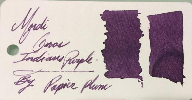
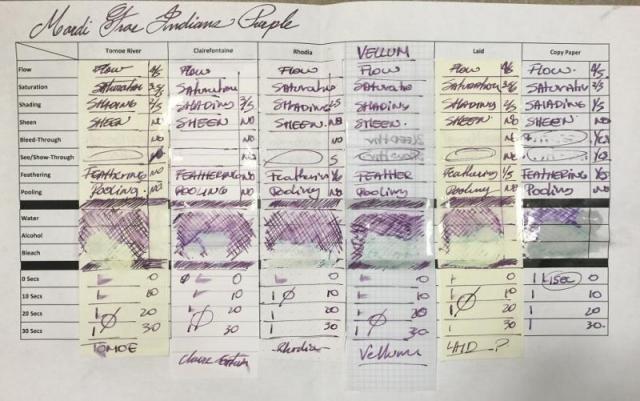
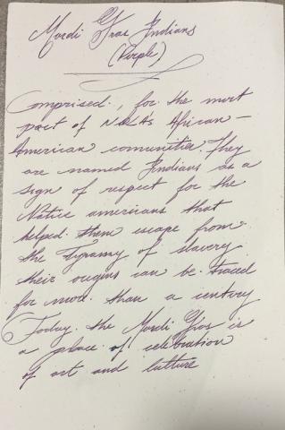
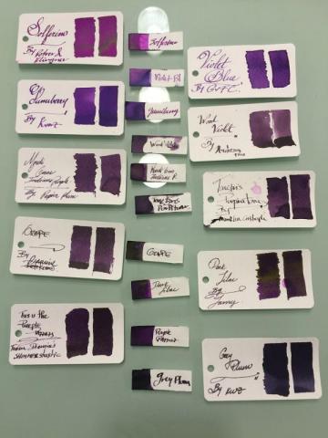
Ink View: Margi Gras Indians Purple: An Ink homage to one of MANY Mardi Gras Secrecies! So here we have the 4th installation of the limited edition inks. I would have liked this to be ready to go before the launch of the ink (gone by now) a couple of weeks ago, but the mail system here in Canada hasn’t been that kind, however it is picking up now J and as I am putting this up I will be getting the sample of the next one up Garden District Azalea, so look for my view on this one in a couple of days! PS: A quick peek is at the end ! Once again a big thanks to Papier Plume for sending me this sample, this is a really nice purple and one named after another good piece of history. And off we go! The Mardi Gras Indians (The brief – brief history) The Mardi Gras Indians is one of many New Orleans secrecies, and one of that surrounds the Mardi Gras festival. The Indians are made of African-American communities that had taken the name Indians in honor of the native Americans who during the time of oppression and slavery assisted in their freedom. Sounds nice and all, but at the beginning (and it seems that it was around a century ago, the different Indian organizations (tribes) had their disputes, and these were often violent and used the Mardi Gras to “settle” those scores as the police would have had a difficult time to do their enforcement as a result of the overly crowed city and busy streets that the Mardi Gras festival would bring. Now all is in the past. Today seeing Mardi Gras Indians are one of those things that if you go attend the Mardi Gras, and you are not attentive, you’ll miss. Their parades are not scheduled, happen at odd times and at random locations. The tribes will form a krewe – a group task with the parade – who will then give themselves a name for that moment. There will be a leader – The Big Chief who will guide and decide where the parade will go, and if the tribe meets another tribe there is an exchange between the tribes, this is reflected in dance (based on traditional African dance movement), singing and a little taunting of their suits. Their suits (not costumes) , and this is where our purple will be coming from, are full of vibrant colors resembling Native American ceremonial apparel. This apparel is made out of elaborate intrinsic designs, using a variety of materials, including feathers, beads and sequins. Some of the suits will take months and months to prepare, and will include a hefty amount of symbolism embedded within. So what does Indians’ suits look like? Something like this: This is just one of the many and unique expressions of a Mardi Gras Indian’s suit, as each suit is particular to that Indian. Would this then mean that there are many expressions of colors including the purple? and that may vary from suit to suit, correct? Correct. So what about PP’s ink? Well let’s just say that it falls (in my opinion) in that middle part of the spectrum of purple. But let’s see more in detail! The Mardi Gras Indians (The ink view) – Purple The 4th installment, out of five, that were intended to commemorate the city of New Orleans. Mardi G-P (for short ) follows the previous inks of this line: Street Car Green , Calle Real and Sazerac. A purple ink that reflects the color found on that of Mardi Gras Indians’ suits (see pic above). Here is how the production bottles looked like And here is the Swab From a first glance you will notice a couple of things: some degree in shading , looks like this is a little more saturated that it’s previous counterparts, and some feathering! Let’s look at this more in depth So how I looked at this view? Pens: I used three pens this time One fine/EF (Platinum President – Fine Nib ) , One Medium ( Faber Castell Emotion – Medium) and one BROAD – modified Mnemosyne, with a custom Broad Waverly Nib ! Paper: Tomoe River, Rhodia, Clairefountaine Thriomphe (CF), traditional copy paper , laid paper and Vellum ß this one courtesy of Barkingpig , thank you Sir! . Tests: Flow, saturation, shading, sheen, bleed-through, see-through/show-through, feathering and pooling. With other tests such as water, bleach and alcohol and dry times. Sometimes it will be a yes/no answer, sometimes 1-5 (1 being poor, 5 being excellent) Crossover Card My way to see all the papers and how the ink behaves across. You can see that each column is representative of the paper used. Thoughts on the ink-paper behavior Flow: Flow is good, very fluid, consistent across all papers and pens usedSaturation: Medium/High, sometimes it looked more saturated depending on the paper, there is definitely less shading on this ink than in the other releases..Sheen: None, Zip, Nada.Shade: There I shading on this ink, again no as drastic as with the other inks in this collection, but there is shading, the shading on this ink is more gradual. Bleed-through: On copy paper , now I was using a very wet nib, but it went through quickly.Show-through: There is some slight, very slight on most papers, I’ve circled the ones where this happened, more intense on the vellum, but that is expected. You would be able to write on both sides on most quality papers .Feathering: Now, I was using a wet nib and that might have contributed to some of the feathering, but I’ll say that this ink in wet-heavy pens will leave a lot of ink on the paper and will feather – not much but it will. Please take note that you the paper you are using is sensitive to the oils of your hand this ink will feather where the oils mix with the paper.Pooling: (This is not the shading but more on the pooling on the edges of the letters, I enjoy when the inks provide this). There was none that I could observe in any of the papersWater Resistance: The tests shown on the card were done using an eyedropper, leaving it a few seconds then using a tissue paper to retrieve the excess. But offline I did a more smear/spread test. Tests show that the ink has some waterproofness, however it is not a WP ink. You would be able recover the writing if need you need to. Big shout to Tomoe river as the ink just held on to the paper, for a paper that rejects ink by nature it is a bit odd. Alcohol Resistance: Very consistent across. You would be able to recover from this one – almost no effect. Where it shows that the ink has gone from the comparison is where the bleach spread to.Bleach Resistance: None, Zip , nada. Dry Times: As noted this is a wet ink and the drying times were there to support it with drying times that were around the 20sec mark and on some papers longer than that. On copy paper it is almost immediate, I’ll say this is because the ink is so watery that goes through quickly between the fibers One thing I had mentioned before, it is how easy is to clean any of PP’s inks from the pens. I would attribute this to the fact that they are not meant to be waterproof, as well as that they are not viscose and not too saturated. Ink Comparison Ink NameMakerOverall notesSolferinoR&KVery bright – lots of sheen (gold) – on the high of being the most violet of them allViolet BlueGvFCNew of GvFC a light Violet blue ink with good shading on moderate to heavy wet pens – see the middle sample on the two big shades this ink gives.Gummy berryKWZBig shout to Barkingpig for this one as well, more purple than blue ,very fruit like – good shadingWood VioletAnderson PensVery dry ink – good shading – the spectrum for this on is middle to darkMardi Gras Indians PurplePapier PlumeThe featured InkTenebris PurpiratumFCSomehow dry ink with good shading – however starts on the darker portion of the spectrumGrapeDiamineOn the Mnemosyne looked VERY similar to Mardi G-P, but on the sketch paper (the one in the middle) you can see that the grape is darker in all senses.Dark LilacLamySuper saturated, golden sheen, shading ink from dark to darker!Purple PazzazzDiamineInk with sparkles, good shading, and nice sparkles Grey PlumKWZDark, dark – however still manages to shade I realized now, that I had more purples that I imagined and I didn’t even show them all. But hopefully you can see that the Mardi G-P is indeed a medium hue purple, which is good in terms of shading since it can go from light to dark on that range. And here is a (quick) sketch of a Mardi Gars Indian using Mardi G-P - wasn’t as quick this time Here is some Cursive and Block writing for reference. Opinion This is a good purple, is subtle and has some fun to it, it is a wet ink, but this is very characteristic of the PP inks, so you should handle it with care on wet nibs. This is an ink that shows waterproof-ness. On finer nibs It is pleasant to read but as it is a wet ink will also be looking a slightly more than average dry times, again it all depends on the paper and how wet you nib is. To my later point be careful with possible feathering. This is not the more friendly ink you might want to use on copy paper. I’m very grateful that I got this sample, and happy to have this ink as part of the – now that I see – seemingly long list of purples. Availability As noted at the beginning of this view this is now sold out. For this release Papier Plume did 60 1 Oz / 30ml bottles. There is one more ink of this series and this one will have the same number of bottles. The name of the ink is Garden District Azalea – On sale September 16, 2016 (sample at the end of the View). Papier Plume notifies their ink availability through their newsletter first (link), then Instagram, then Facebook, and finally twitter (in that order). AND Here is a not so known story about this ink and why was purple and not another of the equally deserved colors of the Indians’ suits : “After the first one was released someone called about the green. While talking he asked if we were going to make a purple. At the time we only had 4 of the 5 colors. But I told him that it wasn't likely. He gave me his email address anyway to get on the mailing list. His email address had the word Tribe in it and he told me that he was a Cleveland Indians fan. So after I hung up I decided that the next color would be named after the Mardi Gras Indians and would be purple.” This is in my opinion a great story and another example of the influence we each carry (if you are not a fan of the Cleveland Indians, please don’t get mad). Now, how do I get to influence someone to do a likeness of me on an ink…. Still thinking And Now Garden District AZALEA!!! The (re)View on this will be up Monday/Tuesday! Remember the release is Friday the 16thJ Thanks for reading until the end!- 14 replies
-
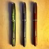
One of my recent Sheaffer acquisitions has a very hazy, fuzzy ink view, pretty much opaque unless held up to light. I believe it has been heat or environmentally exposed to make it that way. Is it possible to sand/polish off or treat the hazy part to get a clearer ink view underneath? Not a crucial thing, as the pen works superbly otherwise, but would be nice to make the view section clear again, at least a bit more so.


