Search the Community
Showing results for tags 'vector calligraphy fine'.
Found 1 result
-

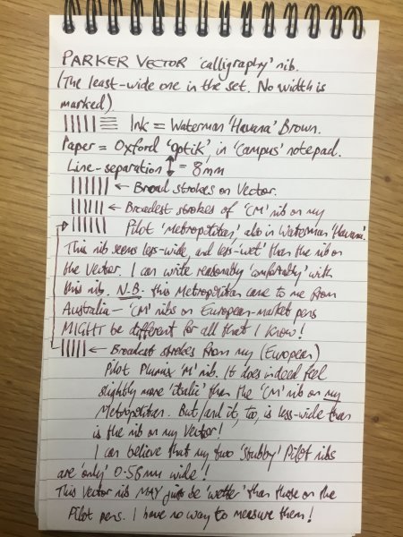
A quick-&-dirty comparison of some ‘stubby’ nibs.jpeg
Mercian posted a gallery image in FPN Image Albums
From the album: Mercian’s Miscellany
This is a quick comparison of any differences in the widths - and in my perception of the widths - of the following ‘stubby’ nibs: 1- Parker Vector ‘calligraphy’ set, least-broad nib (no marking); 2- Australian Pilot Metropolitan with ‘CM’ nib; 3- European-market Pilot Plumix, with ‘M’ italic nib. The ink is Waterman ‘Havana’ - which nowadays is sold as ‘Absolute Brown’. The paper is Oxford ‘Optik’, from an Oxford ‘Campus’-branded ‘Reporter’s Pad’. There should not be any ‘spread’ of this ink on this, hard-coated, paper. Although all three nibs look as though they are the same width when the pens are placed nib-to-nib, I find that the nib on the Vector feels subjectively as though it is wider than the two Pilot nibs when I am writing with it. I do not know if this subjective experience is an artefact of the grind-width, or of the greater ‘wetness’ of this nib over that of the two Pilot nibs. I would say that both Pilot nibs are equally ‘wet’-writing. I.e. neither of them writes as ‘wet’ as does the Parker nib. The steel of the Parker nib may be slightly ‘deeper’ (in the ‘z’ axis) than the is steel of the Pilot nibs, or the Pilot nibs may be ground to be finer/crisper at their edges, or the Pilot nibs may be shaped slightly, so that their edges do not contact the paper to deposit ink upon it, and that only a central section near their nib-slits does. I do not have any way to determine this objectively, so I can only report my subjective felt-experience of writing with the different nibs. The italic ‘M’ nib on my European-market Plumix feels subjectively more-crisp than does the ‘CM’ nib on my Australian-market Metropolitan. The ‘CM’ nib feels most-comfortable for me to use when writing ‘normally’ - i.e. without any particular or especial care to form my letters deliberately and correctly. I had hoped that this comparison would provide objectively-useful ‘data’ - but it seems to only add-to the confusion surrounding the nature of these nibs 🤦♂️
- 0 B
- x