Search the Community
Showing results for tags 'ur'.
Found 1 result
-
Pineider Avatar Ur Review: A “Pen-Eider” Recommend? Let’S See...
RoSpectre posted a topic in Fountain Pen Reviews
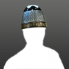
Pineider Avatar UR Review - Riace Bronze – Fine Nib Full Disclosure: I bought this pen because it is the same colour as my cat. She can use it to work on her meowmoirs. Raison d’acheter: I've been trying to reduce/narrow my collection to pens I know I will use on a regular basis at the office, and this one fit the bill. The bronze colour caught my eye and I pounced. I’ve justified purchases with worse reasons than fur colour, trust me. I found a discount code, ordered the pen from Pen Boutique, and got a free bottle of ink, a free vial of ink, and a free leather pen pouch thrown in. They shipped USPS to Canada, which didn't hit me with import or handling fees, where as DHL or FedEx always do. Nice. Pen came in a box with converter, manuals, nothing special. First Impression: Pow! The resin is lovely. This is the Riace Bronze version, and mine lands more in the blue-grey spectrum, with some tan and orange streaks and patches. There is a bit of shine, a bit of depth/translucency, and a lot of swirl. Nothing too distracting though. There are very fine tiny sparkles in the material… maybe this is the mother of pearl? The resin feels thick, solid and sturdy… probably 2mm thick in the body, and 1.5mm in the cap, so I am confident it could take an above average beating. The finish does have some tiny tiny indentations/finishing marks, but it feels like a well-engineered material, and it’s probably worth the hype. The Cap (and here my troubles began…): The cap is loose…up and down, side to side, spins easily, and rattles like a maraca when I shake the pen even slightly. The magnet holds well, so the cap won’t fall off, but the issue is that the cap magnet is loose in its place in the cap. Pen Boutique confirmed that a wiggle of some degree is present on all their pens, and they contacted the distributor Yafa, who said, “a little bit of play on that cap should be considered normal, but if the customer feels it’s excessive please have them send it to me and I’ll take care of it.” I do feel it’s excessive, but I’m not sure if the problem is with my pen or the design itself. Propagations to Pen Boutique customer service on this matter, as they were quick to respond and solution-oriented. GlueLess and ClueLess: So why the wiggle? You can see above they’ve secured the magnet in a ridiculous way… a thin, stamped metal lock ring, that A. can clearly allow too much wiggle, and B. has sharp edges that will scratch anything it touches! I am already seeing small scratches on the section, and scuffs on the body from posting. So the tragedy is they have created this problem in the name of going glueless. They should have used a strong friction fit for the magnet, maybe a rubber coating on the magnet would do it, or else just used some glue! Ironically, I may just tear out the metal lock ring, and glue the bloody magnet in myself. (Edit Spoiler: I did this shortly after writing this review… see following post.) Moving on... The cap band’s imprint isn’t the crispest, and while the metal band feels strong enough, it’s thin, and you can see in the photo above some of the chrome has already chipped off to reveal a copper colour underneath. The band is fit and aligned well on the cap, though (no gaps, no looseness). The Clip: near perfection. Love the design, tension’s good, it’s fit well with almost no wobble, it has the perfect upturn at the end that allows is to slide smoothly onto your pocket, pen pouch, notebook, etc. Notice there are two seams near the top of the cap, running to the clip pin holes. First I thought these were cracks, but they are symmetrical and can be seen in other photos online, so I am thinking they are molding seams of some kind. Overall Fitness: Things are tight, yo! No unsightly gaps, joins between materials are smooth, nothing loose besides the magnet, section threads hold great and tighten very well. Let’s Get Inked: The pen fills with a good quality, snug-fitting, branded, standard international (likely Schmidt) converter. The tip fits perfectly into a generic blunt needle that I use as a snorkel! The ink started flowing after a few taps, and has maintained perfect flow since. I've had a few faint horizontal strokes like on the "t" in the writing sample... could be me rolling my pen though. The fine nib draws a fine line leaning towards western XF, with medium wetness. I don’t have much experience with other Bock nibs, but I would say I prefer this nib’s flow and feel over Jowo fine nibs I’ve used. There is what I would call medium-level feedback (pencil-like), but it is consistent on all strokes and letters, so it never feels scratchy or toothy—impressive for a finer nib tip. The tip appears to be mostly spherical, with a slightly flared out and flattened writing surface. This shape looks and writes like ST Dupont fine nibs I have, and this is a very good thing. I dislike hearing that a nib is excellent or very smooth “for a steel nib,” so without qualifying I can say this nib has a touch of spring, and is an overall fantastic writer by any measure. I like the nib design – it has no breather hole, and an imprint that is deep, crisp and visually unique. It may not be for everyone, but I feel the geometric pattern and mirrored “Pineider” lettering gives the nib a postmodern look that helps keep the overall pen from looking too dainty or outdated. Also, I left this pen uncapped for 15 minutes, and it only missed one stroke (the top of a capital ‘T’) before it picked up writing perfectly again. This is a valuable benefit for note-taking in lectures or meetings. Grip Gripes: Yes it’s metal, yes it’s a bit slippery, but the curved shape helps your fingers lock in a bit. If anything, it’s TOO curvy though, and narrows too much, so my fingers get a bit crowded and feel like they’re gripping a pretty steep angle. If the slipperiness starts to bother me, I may coat this section in ProtectaClear, a semi-permanent brush-on resin coating that improves grip and could help prevent scratches and fingerprints. I wish companies would start to knurl, brush, etch, engrave, or clear coat their metal sections… slippery sections are a deal breaker for many, and a pain to all. If the Avatar’s section were engraved with the same diagonal lines the cap band has, it would be a work of art. I’d even settle for an inexpensive laser job. Dream on, I guess. The balance of this pen is excellent, posted and non. When posted, the balancing point is right below the cap band, where the pen rests on my hand when writing. It’s right on the line of being back-heavy though, so if you have smaller hands you might not like it posted. You can see the Avatar compares to the Safari and Michelangelo in size. Just personal preference, but I would go Avatar over Rembrandt, and call it a draw between Avatar and Michelangelo. Avatar is way cheaper and has a finer nib, but Michelangelo has a sturdier magnet and cap band, and a slight edge in the finishing. Of course, if you’re comparing to Visconti’s newer edition pens with the weak #4 nibs, then it’s Avatar all the way. Wrap-up! Cons: --Loose cap magnet from bad lock ring design --Metal grip section: hourglass shape helps prevent some slipping, but can be awkward to grip. --Cap band could be stepped up in quality Pros: --Fantastic writer --Magnetic cap (despite the loose magnet, it holds well and posts well) --Neat-looking size 6 nib in fine, and overall design that combines classic aesthetics with modern touches --Versatile size, with a good, balanced weight --Reasonable price, costing less than comparable pens and even the previous Avatar --“Unbreakable” resin: If you’ve watched Goulet’s video closely, Dante actually cracks the pen when he hits it with the hammer, but they cut away quickly. So this is not a miracle material, but I am convinced it will have added chip and crack resistance from impacts or time. I also like that Dante is at least paying attention to engineering and trying to advance the craft of pen making by simplifying and strengthening, not just adding frills. Who should buy this? If you’re looking for a mid-priced pen with a superb nib and some stand-out features (great clip design, coolvenient magnetic closure, stylized nib) or a pen that looks classy but can still take some abuse (UltraResin body, simple design, few parts, no glue), then this is the “Pen-eider” buy, if I were you. Final Word: If you're prepared to live with a potentially wobbly cap, or you are game to fix the wobble yourself (very easy to do...see my post below), then I would highly recommend this pen.