Search the Community
Showing results for tags 'tutorial'.
-
Lihit Lab Twist Rings: Love The Rings, Hate The Paper? Here's What To Do
Plume145 posted a topic in Paper and Pen Paraphernalia
Okay, 'hate' is a bit much, I don't hate it, it's quite nice actually. The only thing that spoils it a bit for me is that the lines on the grid pattern are just a touch too strong - I like mine barely-there. And if you don't like grid at all, you're SOL when it comes to this notepad because the paper only comes in grid. There is a punch available (from Rakuten) but it only punches like one sheet at a time, not even business card thickness, so not something you could ever use to MYO refills. So, what to do? Get another A7(ish) wire bound notepad, cut off the rings to liberate the pierced paper, and bind it together with the lihit lab binding mechanism Here's the detailed how-to: You need: A pair of wire cutter pliers. Jewelry making weight should be all you need, no need to haul out the fence cutters Your Lihit Lab Twist Ring notepad (I'm calling it LL) Your refill notepad: it should be wire-bound in the twin-ring format, in a size that's about a7 - exact dimensions down to the mm are unimportant, it's the holes that matter most: the number and the spacing of them need to match the ones on the LL. I could go on in the abstract about how to do that by measuring, but really the most intuitive way to ascertain this is to get one sheet off the notebook you want to use to replace the aqua drops, and test it with the binding (that's step 1). Step 1: Make sure your paper fits the LL binding. Don't cut open the rings on your replacement notebook just yet, in case it turns out the holes don't match up - wouldn't want to destroy the binding only to find you can't reuse the loose sheets as a refill Start by separating one sheet from the notebook - to avoid getting the fluffed-out bits of paper where it was torn from the rings, don't tear it in the usual upward side to side motion, but pull outwards: Remove the extra bits that may still be stuck. Then just slide it up to the rings of the LL. This fits: This doesn't: Okay, you're all done with the tricky part Step 2: Liberate the paper. Cut open the rings with your wire cutter. Not much more to say than that - just go to town on the rings, it doesn't matter, all you need to do is make sure not to damage the paper and you're done. Step 3: Switcheroo Open the lihit lab and take the paper out - maybe the covers too if you want to ditch those. Replace with the liberated paper and covers from your other notebook, starting with the covers (one on each half of the open rings), then the paper. The only thing to mind here is not to overfill the LL. It takes less paper than most pocket A7 notepads, because the twist ring mechanism needs room to work. Done! Here's a list of the notepads I tried (because I had them on hand) and the results: These fit: Kokuyo CamiApp (note: if you want the Scanner feature to work you have to transfer the covers too because the black works as a frame for the app when you take the photo, otherwise it might not work). Midori Diamond Memo Small This didn't: maruman Mnemosyne 184 Roots (meh, this one sucks anyway - only one side printed, WTH?) If you try this, could you please list your results here? I would love to know how you got along as this is my first pen-related tutorial (hey, gotta start somewhere lol). I would also love to know if anyone tries this with any of the larger sizes of LL twist rings notebooks, like the B5 that Jetpens stock- 12 replies
-
How-to: Insert image by drag-and-drop where it is to be embedded
A Smug Dill posted a gallery image in FPN Image Albums
From the album: The Answer
You can just drag an image file from a folder on your computer into the WYSIWYG post editor, and drop it exactly where you want it to be embedded as an inline image.© A Smug Dill
- 0 B
- x
-
From the album: The Answer
In answer to this: https://www.fountainpennetwork.com/forum/topic/357211-managing-followed-content-method-to-delete/
- 0 B
- x
-
- unfollow
- followed content
-
(and 1 more)
Tagged with:
-
How-to: Change inline image size and to where it links
A Smug Dill posted a gallery image in FPN Image Albums
From the album: The Answer
On the upgraded FPN forum platform, raw HTML is no longer allowed. However, you can still turn your inline images into hyperlinks that point somewhere other than full-sized copies of themselves, and it is in fact easier now to control the size of your inline images than before. The illustrated method works for inline images irrespective of whether they are FPN gallery images, attachments hosted by FPN, or externally hosted images that were inserted by URL.© A Smug Dill
- 0 B
- x
-
From the album: The Answer
The quickest way to put a fellow forum member on ignore is not to actually visit his/her profile page, but simply: find a post, or activity stream entry, in which his/her profile photo (or tile) appears; hover over the profile photo, without clicking on it, and wait for the profile ‘speech bubble’ to appear; click on ‘Ignore user’, which then takes you to your account settings' Ignored Users page, with the user's name already filled in; select the categories you want to ignore for that user; and click Update Preferences. There is no equivalent shortcut on the user's profile page.© A Smug Dill
- 0 B
- x
-
From the album: The Answer
Take note: after you have uploaded the image from your mobile device, you still need to click on the plus symbol on the attachment to insert it into your post, with the cursor being the insertion point. (The illustration was done in the Safari browser on my iPad, but the procedure is essentially the same on iOS and Android devices alike; I tried it using Google Chrome on a Samsung Galaxy Tab S.)
- 0 B
- x
-
- insert image
- tutorial
-
(and 5 more)
Tagged with:
-
How-to: Insert a partial image into your post
A Smug Dill posted a gallery image in FPN Image Albums
From the album: The Answer
You can copy-and-paste image content from the operating system's clipboard directly into the WYSIWYG editor. What you paste thus will be saved as an attachment in PNG format, with the generic filename image.png. If the operating system allows you to do so, you can select a part of the desktop, and take a partial screenshot that is copied onto the clipboard, then paste it into your post.© A Smug Dill
- 0 B
- x
-
How-to: Insert image on your computer, choosing in Explorer/Finder pop-up
A Smug Dill posted a gallery image in FPN Image Albums
From the album: The Answer
This is essentially what to do when using a tablet or phone, and you want to attach an image that is only in the device's storage, but cannot use the drag-and-drop and insert-image-from-URL methods.
- 0 B
- x
-
How-to: Insert image by drag-and-drop onto catchment area in the editor
A Smug Dill posted a gallery image in FPN Image Albums
From the album: The Answer
You can drag an image file from a folder on your computer, and drop it onto the attachments catchment area in the WYSIWYG post editor. Once it has been uploaded, you can the reposition the cursor, then click on the plus button for the image you want to embed as an inline image in that spot in your post.© A Smug Dill
- 0 B
- x
-
Repositioning an inline image in the WYSIWYG post editor
A Smug Dill posted a gallery image in FPN Image Albums
From the album: The Answer
Just drag and drop. (Yes, I realise now that I misspelt the name of the ink.)
- 0 B
- x
-
How-to: Insert image from URL pasting from the clipboard
A Smug Dill posted a gallery image in FPN Image Albums
From the album: The Answer
The WYSIWYG editor will automatically attempt to make sense of any URL you supply while composing a post. In the case of images, it will attempt to retrieve the resource (hosted on FPN's server or externally), and insert it inline where the cursor is; just give it a moment.
- 0 B
- x
-
How-to: Insert image from URL using Other Media button
A Smug Dill posted a gallery image in FPN Image Albums
From the album: The Answer
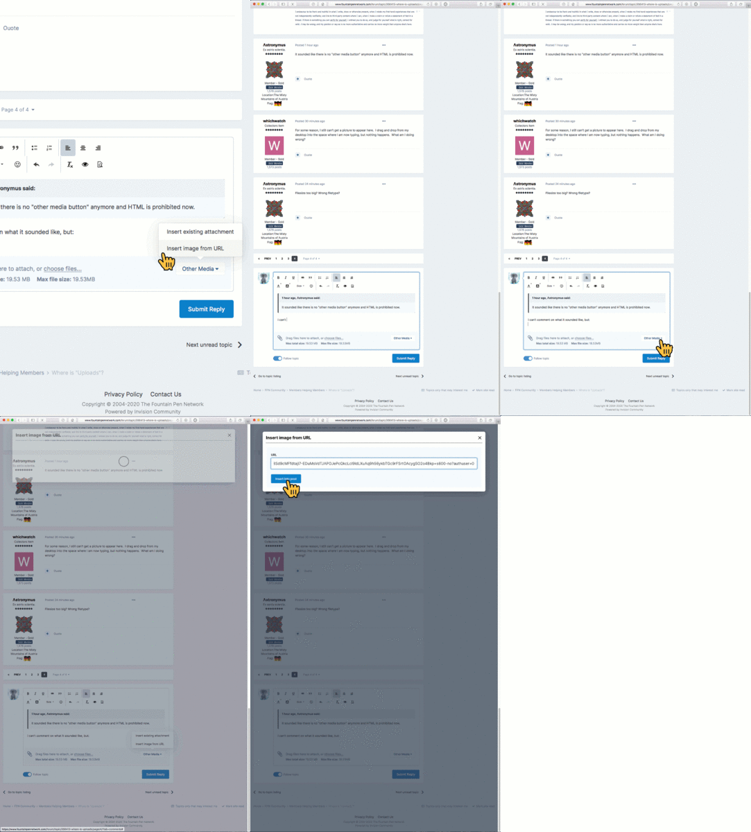
To insert an (either externally hosted, or previously uploaded by you to FPN's server) image by URL: Click on the Other Media button in the bottom right corner of the WYSIWYG editor panel. Select ‘Insert image from URL’ on the pop-up menu. Type or paste the URL into the thus-named field in the pop-up dialog box, and click on ‘Insert into post’. (In this example, I inserted an image that is hosted on Google Photos.)
- 0 B
- x
-
Learning Copperplate As promised, I am adding my Copperplate lessons here. We will start our study of Copperplate with the small letters i.e. the minuscules. I have divided the minuscules into four groups. The first three groups are based on strokes common to the group. The last group contains the letters that do not share a pattern with other letters - these are the misfits. The process is that students will study each lesson, do their practice and submit the assigned words for feedback. Students move on to the next group only when sufficiently proficient with the current one. Each group will have it's own thread so things don't get mixed up. We will need some materials before we start. I always recommend using the best materials you can afford for practice. The time we spend practicing is our most valuable asset. It does not make sense to waste a second of it fighting with uncooperative paper or ink that doesn’t flow well. Here is what I recommend: Ink: I will start with ink because it determines the other materials to some degree. I know the following to work well: Higgins Eternal with a few drops of Gum Arabic. Walnut ink (can be bought in liquid form or as crystals that are dissolved in water to make ink). Pelikan Black with a good dollop of Gum Arabic - experiment to find what works best for you. Noodler’s Black with a good amount of water added. Fountain pen inks contain surfactants which sometimes causes the ink to slide off the nib in an uncontrollable manner. The last two inks on my list are fountain pen inks but work well with pointed pens in my experience. Please feel free to experiment with other inks but stay away from pigmented inks like Sumi or India. These can be made to work well with pointed pens but I don’t think it is worth the effort to fiddle with these inks when one is learning. Paper: The paper you use should be smooth and should be able to take the ink you have chosen to work with. Higgins Eternal has a higher tendency to bleed than the other inks but it flows well. Some experimentation will be needed here. Also, I recommend printing the guidelines on the paper you will be writing on. It makes a big difference over placing printed guidelines underneath the paper you are writing on. The paper you choose should be suitable for printing guidelines on the type of printer you have. You can use paper with pre-printed lines on it e.g. Rhodia pads. Please make sure the lines are at least 6mm apart though. On such papers you will only need the slant lines. We will be writing Copperplate at the traditional 55 degree angle from the baseline. You can either draw these on your paper or place a printed sheet with just the slant lines underneath. Nib(s): We will be writing the minuscules at ¼ inch x-height i.e. letters without ascenders or descenders will be ¼ inch tall. We will need a nib that can handle writing at that size. I can recommend the following: Speedball Hunt 101. These are commonly available in art stores and work very well. Speedball Hunt 22. These are stiffer than the 101’s and a bit smoother. These work well for people who find the 101 difficult to use. Brause 66EF. These are easily available online and in some stores. This is very small nib but has more than enough flexibility for our purposes. It works well with inks that might be problematic with other nibs. Because of it’s small size, it needs a specially adjusted holder. Leonardt Principal EF. This is an excellent nib and could have been at the top of the list. I have placed it at no.3 because it requires a delicate hand to get the best performance from it. Also, there have been reports of loss of quality lately (new nibs turning out bad). Gillot 303. This is also an excellent nib but can be hard to use as it requires a delicate touch on the up strokes. There have been quality issues with this nib too but reportedly Gillott has invested in new tooling that will take care of these issues. Nibs produced with the new tooling are expected to be available in a few months from the time of this writing (May, 2016). Various G nibs are very popular and often recommended for beginners because of their forgiving nature. These are excellent nibs but are a bit too stiff for writing at the size we will be practicing with. By all means get some (my favourite is the Zebra G) to play with. You will definitely find a use for it outside of these lessons - or for practicing Copperplate at a smaller size. Holder(s): Oblique holders are usually recommended (but not absolutely necessary) for right handed people. I use one and do recommend it highly. However, you can write Copperplate with a straight holder if you want. You will need to turn the paper so that the slant lines are lined up with the direction of your holder shaft. The goal is to allow the nib to spread evenly on both sides of the shade on the down strokes. Left handed people, if they are underwriters, can use a regular oblique holder (like the one used by right handed people) and write with the paper turned clockwise between 40 and 60 degrees. It is difficult to draw the hairlines as upstrokes using a straight holder. One of the advantages of an oblique holder is that it presents the nib at a shallow angle to the paper. This helps sharp nibs make smooth hairlines on the upstroke without catching on the paper. In my opinion, this is a big enough advantage to consider using one - even for left handed scribes. Left handed oblique holders are available but I believe a regular one works better for left handed calligraphers. Guidelines: As mentioned above, we will be using ¼ inch x-height. I have prepared the guidelines in 2 sizes, A4 and US Letter. Both are attached to this post as pdf files. Please download the appropriate one and print it out on the paper of your choosing. The illustration shows how the guidelines are laid out. The traditional proportions for Copperplate are 3:2:3 i.e. the ascenders and descenders are 1.5 times the x-height. However, at the ¼ inch x-height we are using, the ascenders will be hard to draw at those proportions. We will be drawing our ascenders and descenders at 1 times the x-height. Some exceptions apply though and will be noted as we go along. http://thesixapp.com/smk/CopperplateLessons/Copperplate-Guidelines-Explained.gif Copperplate Minuscules - Group 1 OK - enough about the preparation. Let's get started with some Copperplate. The first group of letters we will be working are based on the ‘i’ stroke i.e. the stroke that makes up the letter ‘i’. The ‘i’ stroke starts at the waist line and goes down to the base line. The stroke is started at full shade (i.e. the full thickness of the letter) and drawn at this thickness down ⅔ rds of the way down. As the illustration shows, pressure is released in the last third while simultaneously moving the pen to the right. This causes the right tine of the nib to keep drawing a straight line down while the left tine closes down making an arc as the tines come together at the base line. This is where you stop. Pick up the pen off the page and put it back down to start the hairline stroke that will connect to the following letter if there is one. http://thesixapp.com/smk/CopperplateLessons/structure-i.gif The picking up of the pen ensures that the bottom of the shade comes to a point as well as avoids pulling excess ink into the hairline. Here is the group of letters based on the ‘i’ stroke: http://thesixapp.com/smk/CopperplateLessons/CuPl8-group1.gif i - Start with a hairline at the base line and go up to the middle of the x-height or slightly above - this is the entry hairline. Now place the pen at the waist line and apply pressure to the nib to spread the tines and pull down towards the base line. The stroke should be placed such that it meets the entry hairline halfway down the stroke. Gradually release the pressure on the nib two-thirds of the way down while moving the pen to the right bringing the stroke to a point on the base line directly below the right side of the stroke. This will cause the left side of the stroke to have a curved shape. Now lift the pen for a beat, put it back down and draw the hairline back up to the middle of the x-height, this is the exit hairline. The dot is placed directly above the ‘i’, halfway between the waistline and the the 1st Ascender line. It is the same thickness at the letter - no more. You can go back and make the top of the starting stroke ‘square’ now. In time, you will learn to square the tops directly at the start of the stroke but there is no need to spend time on it at this time. It is worth your while to practice this stroke until you can do it without thinking. The best way to do that is to use Mr. Geoff Ford’s method of practicing in groups of 5. Here is how you do it: Write the letter 5 times. Now stop and look at each letter you have drawn and place a tick mark against ones that are good. Now pick the best one and try to replicate or improve on it 5 more times. Repeat. This process not only take the boredom out of the practice, it helps sharpen the eye in the process. Once you can see what a good letter is, making it well is just a short distance behind. So when do you know when you have it? When you can consistently make 3-4 out good ones in a group of 5. u - All that practice with the ‘i’ will come in use here. The ‘u’ is nothing more than two ‘i’s written next to each other i.e. the exit hairline of the first ‘i’, is the entry hairline of the second. All done. w - The ‘w’ is just a ‘u’ with the exit stroke drawn all the way up to the waist line. The ‘blob’ in the end comes ⅓ of the way down and back up to the waistline, or the following letter if there is one. You can draw the blob without any pressure on the nib and then fill it in - or you can make it one go if you feel like it. Please note that the hairline stroke becomes pretty much parallel to the main stroke as it reaches the waistline - it does not curve back into the letter. t - Now things are getting interesting. The ‘t’ is drawn like an ‘i’ that starts halfway between the waistline and the 1st Ascender line and goes down to the baseline. The tapering at the bottom is the last third of the ‘i’ part of the letter so if you cover the tops, the bottoms of the ‘t’ and the ‘i’ would look the same. The crossbar is drawn halfway between the top of the letter and the waistline. l - This is beginning to feel like cheating now. The ‘l’ is just and ‘i’ that starts at the 1st Ascender line and goes all the way down to the baseline. As with the ‘t’, the tapering at the bottom should match that of an ‘i’. b - The ‘b’ is an ‘l’ that is finished like a ‘w’ i.e. the exit stroke it taken all the way to the waist line and then the blob is drawn. j - Things were getting a bit repetitive with the ‘i’ stroke so we will play with something a little different. The ‘j’ is not strictly based on the ‘i’ stroke but it begins like one. It is used in a few other letters so practising it with the first group will pay dividends later. You start just like with the ‘i’ but keep moving down at full thickness through the baseline. As you move below the baseline, start to taper your stroke towards the right gradually until you come to a point at about the 1st Descender line. Continue to draw the stroke as you go a little (about 1/3rd) below the 1st Descender line and come around to form the bowl of the letter and go up to join the downstroke just below the baseline where you lift the pen. The exit stroke continues on the right side of the downstroke as a hairline. The reason you pick up your pen is to avoid drawing excess ink into the hairline exit stroke from the still wet downstroke. The dot is placed above the main stroke just as in the ‘i’. This completes our first group. Take your time with it. When satisfied with your work, post the following words for review: ill, will, built, jilt and a word of your choice made up of these letters. A note about joins: This is the standard join when the hairline exiting at the baseline joins the following letter at mid-height between the base and waist lines. This is the simplest join. http://thesixapp.com/smk/CopperplateLessons/joins/till.jpg Care should be taken to make the join as seamless as possible. Leaving a very small gap (as in the first hairline before the ‘t’) helps to avoid ink from the following shaded stroke bleeding into the hairline. This is quite acceptable although the gap in this example is a bit too big. The exit hairline should be nearly in line with the slant lines at mid-height. This ensures that the join with the following letter is seamless. The second type of join in Group-1 is from letters that end at the waist line. http://thesixapp.com/smk/CopperplateLessons/joins/wit.jpg These letters (‘w’ and ‘b’) end with a blob at the top of the final stroke. This blob is drawn about ⅓ of the way down from the waist line and a looping connector is drawn to the following letter. The bottom of the loop is about halfway between the waist and base lines allowing a join to the following stroke a little below the waist line. This join is slightly steeper than the ones starting at the base line but the transition can still be made smooth by drawing the hairline loop in such a ways that it matches the slant of the letters at the place where it joins the following stroke. Video Demonstration I made a short video demonstrating the letters in this group with the exception of the 'j'. I will add that in the future. You can find the video here: Copperplate Lessons - Group 1 I made a separate video for the 'j' stroke as I also wanted to tackle the 'g' and 'q' at the same time. You can view it here: Copperplate Lessons - j, g & q Copperplate-qtr in-US Letter.pdf Copperplate-qtr in-A4.pdf
- 2 replies
-
- copperplate
- tutorial
-
(and 1 more)
Tagged with:
-
Here is a tutorial on how to repair a pen I love: Wahl Eversharp Doric Second generation with plunger Filler. Hope this could help the aficionados... And please forgive my bad English... Properties of the filling system: The filling system looks like early Onoto's: it is kind of "reverse syringe" called the "one shot vacuum filler" by Eversharp. To fill the pen you have to pull the piston syringe, then dip the pen in ink and finally push the piston: it fills with ink. When you push the piston, a vacuum is created behind the piston which is released as the piston comes close to the proximal end of the barrel which is larger. Anatomy of the pen (according to Eversharp's patents) : 1: Disk nut 2: Plunger disc 3: Plunger rod 4: Rubber plunger Washer #1 5: Cork plunger Washer 6: Rubber plunger Washer #2 7: Lock nut 8: Nib 9: Feed 10: Section 11: Section pin 12: Barrel 13: Barrel brushing (AKA "packing unit") 14: Banded sleeve 15: Barrel end ("piston button") Initial cosmetic aspect of the pen: Here is a second generation oversize doric with desirable garnet shell color, adjustable nib and plunger filler, unfortunately without the ink shut off device... Two main cosmetic problems for this pen: a dent on the section and some irregular aspects of the facets. First part: pen disassembly: A. Piston button unscrew: To unscrew the piston button, first twist the piston button counterclockwise to pull the plunger rod, then with a pair of pliers hold firmly the lock nut and unscrew the piston button counterclockwise. One important thing here: you have to note where exactly the lock nut is on the plunger rod to put it in the same place for re-assembly: if you don't do so you may experience ink flow problems of filling problems at the end of the repair. Then unscrew the lock nut. B.Banded sleeve removal: The banded sleeve is press fit onto the packing unit. To remove the banded sleeve I first use a thin scalpel blade between the barrel and the banded sleeve and carefully move my hand right to left to loosen the banded sleeve. Then when you manage to create a small gap between the banded sleeve and the barrel do the same thing with a thicker and stronger blade to farther loosen the banded sleeve. Sometimes the banded sleeve is too tight and you have to use heat to loosen it (see below on how to use heat with Eversharp's celluloids). C. Packing unit unscrewing: This is for me the most feared, most time consuming, and most critical step. Not done properly you can ruin the pen forever. Always remember that Packing unit unscrews CLOCKWISE!!! Be very, very patient: It usually takes one hour to unscrew, in my experience I almost spent a day unscrewing this pen part! The key to the success is to use heat, the aim of using heat is to soften the shellac used to seal the packing unit onto the barrel. You will have to heat and cool the barrel end up to 20 times (sometimes) to unscrew the packing unit. Always use dry heat (using boiled water will make a celluloid hydrolysis and ruin the pen), never use open flame as celluloid is a furiously flammable material. I personally use a machine used to bend glasses frames, but the most common tool used is a heat gun (ideally with a variable thermostat). On the other hand heating can bend or burn celluloid: to avoid this pitfall you must always keep an eye on the celluloid you are heating. A good trick is to use a sharp pool and to push it against the heated celluloid: as soon as the celluloid starts to melt the tool starts to sink in the celluloid: this is a good alert to stop heating and to wait the celluloid to cool. NEVER try anything (like unscrewing the packing unit) when the celluloid is hot: you will bent it forever. You must protect the rest of the pen from heat: I use a sheet of paper I wrap around the pen, and only let the part I want to heat unprotected. D. Nib section unscrewing: The section unscrews counterclockwise. You have to use heat to unscrew (Cf C.). If you use heat, you don't have to use players to grab the section and the barrel (scratching it...) to unscrew, fingers are sufficient!. E. Section disassembly: First you have to get the section pin out of the section: use a needle to push the pin. On the picture the pin is broken: you will have to make another one after... Then rock the nib and feed assembly out of the section, not by pulling it but pushing it from the section back end with a flat ended cylindrical tool (nail punch) and a hammer onto a nib block (Cf picture). If the feed and nib are stuck into the section, soaking the whole section overnight in water can help. F. Disk and Disk nut disassembly: Get the plunger rod out of the pen from where the section screws on the barrel. Use pliers to grab the disk nut and unscrew it counterclockwise, using heat can help (Cf C.). Get rid of the plunger disk remnants. G. Cap disassembly: Disassembling the clip from the cap seem to be a good idea but is impossible on second generation doric (unlike first generation where the clip can be disassembled by removing the inner cap) Second Part: Cleaning and Polishing: A. Barrel and cap cleaning and polishing: Dorics are faceted pens, traditional methods of polishing (machine polishing with discs for example) are not suitable as it would ruin the facets and make the pen round. Faceting the barrel seems to be a better option. I grind each facet of the pen with sandpaper, progressively increasing the grit of the sand paper: I start at 800 grit, then 2000 grit, and end at 5000 grit: the result is a high gloss facet with a nice geometric barrel. For each facet I put the sandpaper onto a flat surface (like a mirror) and rub the facet against this flat surface making movements from the end of the barrel to the tip of the barrel (I never do any rear movements from left to right). I decide to increase the grit only when the surface of the facet is evenly flat and ground. The inner surface of the barrel can be cleaned with a soft cloth with a mix of 50% domestic ammonia and water (use gloves it dissolves inks but also skin!). NEVER use steel wool on the inner surface to the barrel as it could scratch it and damage the filling system. You can do the same for the cap, but always protect the gold plated ornaments (clip and cap band) as polishing could damage them. To protect the ornaments simply wrap tape around them. Never try to polish the facet where are the cap imprints ("Wahl Eversharp made in USA") it will definitively erase them. B. Packing unit and screw thread cleaning: Using a kind of torn pin expel the old plunger washer (see on picture). Then clean the threads of the section, the threads of the barrel (at both ends), the threads of the packing unit: clean the remnants of the sealing material which are in the threads. You can use the torn pin to put it into the threads to clean them. C. Rest of the cleaning: Cleaning nib and feed can be done using a mix of 50% domestic ammonia and 50% water: soak the nib and feed for 30 minutes then use a tooth brush to clean the feed channels. Cleaning the cap can be done using the same mixture and a clean cloth put into the cap, but do not soak the cap into the ammonia solution as it could destroy the gold platting of the clip and cap band. Polishing the gold nib and the gold ornaments can be done using a clean cloth and polishing-cleaning solutions (Mirror etc...) Third Part: Re-creating the missing parts: A. Cork plunger washer turning: To re-create the cork plunger washer I use The cork sheets which are glued to the bottom of champagne corks (it is a very good quality cork with few holes for a good seal). Use a cutter blade to separate the cork sheet from the champagne cork then flatten both ends of this sheet with sand paper (600 grit is ok). Use a punch of a diameter above the inner diameter of the packing unit to cut a small disc. Drill a hole in the center of the disc with a thin drillbit (the diameter of the drillbit must be inferior than the diameter of the plunger rod to provide good seal. Then finally fine tune the external diameter of the disk twisting it against sand paper (600 grit). The disk should be pressfit into the packing unit. B. Rubber plunger washer turning: Two or three (depending on the packing unit depth) rubber plunger washers are generally used to provide a good seal. To recreate them I use a rubber sheet (bought on Ebay) of around 1mm thickness. I cut small disks of rubber using a punch with a diameter just above the inner diameter of the packing unit. Then I drill a hole in the center of the disk just below the diameter of the plunger rod. To fine tune the external diameter of the rubber disk I set it on the drill bit and make the drill turn with the disk set on it against sandpaper (600 grit). The disk should be pressfit into the packing unit. C. Plunger disk re-creating and fine tuning: Cut a rubber disk with a punch with a diameter just above the size of the inner diameter of the barrel. Cut with a punch, or drill a hole in the center of the disk (around 2mm diameter). Set the disk onto the plunger rod screwing the disk nut clockwise (you sometimes need shellac to lock the nut onto the plunger rod) until it is blocked onto the plunger rod and then fine tune it setting the plunger rod on a drill (Dremel for example). Fine tuning the plunger disk is the second most delicate step for repairing the pen (see second pic). The rubber disk should not be too large nor too small otherwise vacuum cannot be created in the barrel. To know wether the disk is too small or too large, put the plunger rod with plunger disk in place into the barrel, then push the plunger rod and watch the plunger disk through the ink window: if the disk slightly bents upwards: it is good, but if it stays bent downward it is too large. Then pull the plunger rod and watch again the plunger disk through the ink window: if it stays flat the plunger disk is too small, if it bents downward the plunger disk could be of a good size or too large. D. Section pin re-creating: I use a stainless steel rod to re-create the section pin: I use a disk sander to decrease the diameter of the rod, polish it with sandpaper, ad cut it to the size of the native section pin. I then place it into the section pushing it with a needle. The pin should not be too large otherwise there is a risk to destroy the barrel end threads. Fourth part: Re-assembly: A. Barrel reassembly: Put the plunger rod with the plunger disc in place into the barrel, put allot of silicone grease onto the cork and plunger washers, put the plunger rod through the washers, set the washers into the packing unit, put silicone grease on the packing unit threads, screw the packing unit counterclockwise until it stops, set the banded sleeve on the packing unit end (some of the packing unit must protrude through the banded sleeve). B. Piston button reassembly: Screw the locknut clockwise on the plunger rod and set it at the same place that it was before disassembly. Screw the piston button clockwise on the plunger rod and tighten it holding the locknut with a pair of pliers. C. Section reassembly: Put the nib on the feed at the exact position it was before disassembly (some marks can be seen on the feed). Holding the nib-feed between two fingers press-fit it into the section at the same position it was before disassembly. Then put some silicone grease into the threads of the section and screw it clockwise into the barrel. Fifth part: conclusion and troubleshooting: With this method Dorics can fill up to 80% barrel capacity (back to factory standards). If the pen does not sucks ink, many problems can be encountered: proceed as follows: - First the packing unit is not airtight: unscrew section and piston button and lock nut, then insert the plunger rod into the back of the pen, with your mouth "suck" the "section end" of the barrel, if the barrel stands sticked on your tongue or lips the packing unit is airtight. If not fine tune the washers or add another rubber washer in the packing unit or put more silicone grease. - Second the plunger disc is not airtight: put the plunger back in place (through the "section end of the pen") pull the plunger rod and push it slowly downward it you ear a "pop!" it is airtight, if not fine tune the plunger disk again. If the pen is too wet writer proceed as follows: - First: repeat the first operation for "pens does not sucks ink" and wait a long time the pen sticked on your lips: if vacuum breaks there could be a subtle air breach in the packing unit. - Second: it could be a nib/feed problem (check elsewhere on the forum). If you cannot pull the piston the the end of the barrel: It seems that the plunger disc is too large: fine tune it again!! Thanks you, hope it will help Doric lovers. If you need any advice on how to repair a broken doric adjustable nib slider please check: https://www.fountainpennetwork.com/forum/topic/316447-wahl-eversharp-adjustable-nib-slider-repair-technique/
-
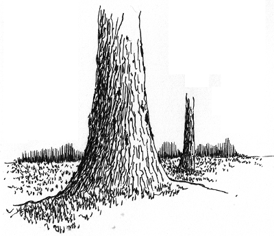
As a pen and ink artist, my aim is to help people discover drawing simple landscapes with pen and ink as a creative and relaxing hobby. I have created completely free tutorials that help absolute beginners get started drawing with pen and experience the pleasure of putting your creative expression on paper. Let this be your new year resolution In the following, you can see how easy it is to draw simple bark texture and trunk with pen. Learn to draw other elements of nature with pen and ink and get started today. Have fun Rahul www.pendrawings.me Drawing a tree trunk with pen and ink Add a horizon with distant tree line and a scattered trunk or two and you have a simple landscape.
- 10 replies
-
- landscapes
- drawing
-
(and 3 more)
Tagged with:
-
A Course In Drawing P&i Landscapes: Week I
rahul_jain posted a topic in Fountain & Dip Pens - First Stop
I am very happy to announce release of completely free course for learning to draw pen and ink landscapes. You can get an overview of the course in this video and access the course here. Starting today, I will present activities from this course in my weekly posts. Do follow along and start your creative journey today. We start by looking at some of the choices for pens to use for drawing. As you become more proficient, you can try different choices, but to start with, it is sufficient to have a quality gel pen and a small sketch book to practice. In this video, I discuss some of the choices. Understanding some of the simple pen strokes that are used for drawing landscapes is very useful and we will do this next. In this online tutorial and video, you can study some of the basic pen strokes for drawing landscapes. Following is an overview of 'parallel line' stroke that we will practice this week. Do practice this stroke extensively this week as this is the most basic stroke in P&I drawing. ********************************************************************** Parallel Lines:This is the most important and basic technique to create a tone in P&I. Practice drawing lines equal distance from each other. It is important to make sure that your hands are not hesitant when drawing a line. In other words, DO NOT draw a line very slowly and deliberately. This will cause the line to have edges and bad impression. Instead, slowly bring your pen down to the paper and create a confident FLOWING line with a swift stroke. Don’t hurry it either. Key is to find the balance between slow deliberation and fast impatience to create a line that is confident and inviting. This will come with practice as every person has their own rhythm. Practice often and find your own rhythm. You will know when you get it. The lines also don’t have to be exactly parallel and equidistant. The key is to create an impression of ‘uniform’ tone with a set of lines. In other words, the deviations in the distance between the lines should be small enough so that our mind and eye don’t notice them. Instead our mind should instead see and focus on the lines as a whole to see a uniform tone. Initially, don’t attempt to draw longer parallel lines as this requires movement and control from the shoulder that takes more time to attain. Lines an inch or so long can be drawn using the movement of wrist and should be attempted initially. ********************************************** Have fun, Rahul- 3 replies
-
- drawing
- landscapes
-
(and 2 more)
Tagged with:
-
This thread is about people who are willing to contribute with a link and possibly a short description to: articles, posts, discussions, technical articles, pictures, diagrams, videos or other instructional info, armamentarium needed, etc anything that could be relevant on ways to add flex to a fountain pen nib. Everyone's input will be highly appreciated. Any link deemed useful for someone when they tried there own flex nib modification that they are willing to share with the forum will be welcome here. Hopefully at the end, the list of references accumulated will help pen users to have a condensed thread to study about their own pen flex modification attempts, instead of looking for information scattered all around the web. The goal is to gather in as much material, from as many sources on this topic as possible, for everyone to use in the future; think of it as a reference list at the end of a book or a bibliography on this subject. The material will remain property of the FPN and its members for as long the forum wishes to host it. Reference to non-copyrighted material should clearly indicate the source of the link. Reference to useful links to copyrighted material as well as benevolent comments about them are mostly welcome, but copying and pasting experts from copyrighted material is strictly NOT allowed, unless accompanied by a written consent by the copyright owner. Many thanks to all who are willing to share, Photios PS: I have no commercial interest in fountain pens, I am just a fp enthusiast. My respects go to all people, professional and amateurs, who have toiled for the advancement of the fountain pen experience, as we all enjoy it.
-
Hi all, I am excited to announce my upcoming class on Copperplate Calligraphy. This 6-hour class will be held at Wonder Pens in Toronto. This is a Level-1 class where we will start our study with the structure of the minuscule letters. Both beginners and practitioners of Copperplate are welcome. The class is limited to 10 students. This ensures that I will be able to spend plenty of time with each participant. Further details are available at: Copperplate Class with Salman Khattak I hope to see some FPN'ers there. - Salman
- 2 replies
-
- copperplate
- calligraphy
-
(and 2 more)
Tagged with:
-
Diy / Easy, Cheap, Simple Fountain Pen Box In 60 Minutes
ARVA posted a topic in Paper and Pen Paraphernalia
I decided to take some pictures while I was making a simple pen box for my father's birthday. I was so happy when I found a Parker 45 (that was in great aesthetic and functional condition) for my father's 45th birthday. But there was no box so I needed to make one myself. If you want to give away fountain pens without a box, maybe this simple tutorial can help you. I managed to finish this box under one hour and I spent nothing, every material and tool that I used was found at home. 1. Materials needed: - coloured cardboard - some kind of foam (polystyrene, thick cardboard, etc) - piece of old paper (for the greeting card) - any kind of textile - a few pins - short leather strip (or any other material that you think will work) 2. Tools needed: 3. Making the cutting plans for the box (dimensions in centimetres): 4. The bottom part cut and prepared for folding: 5. The bottom part folded and prepared for glueing: 6. Top part cut and prepared for folding: 7. Top part folded and prepared for glueing: 8. Cut the foam to the interior dimensions of the bottom part: 9. Cut the groves in the middle of the foam with the sharp blade, two cuttings at an angle of 45 degrees: 10. Take the piece of textile and cut it to the dimensions so it covers the foam. After it is positioned fix it to the foam using some pins. Install the leather strip in the same way: 11. Take the greeting card, write whatever you want in it and glue it in the inside of the top cardboard piece: (the inscription 'Boldog születésnapot' means Happy birthday in hungarian) 12. Put the top part on the bottom part and you're finished : I know it is nothing special or fancy, but it is simple, cheap and fast to make if you need a basic gift box. Hope I was helpful for somebody. Have a nice day! -
I would love for this to be made a pinned topic so all who enter can quickly find tips on photographing their pens.
- 17 replies
-
- photo
- photography
-
(and 5 more)
Tagged with:
-
I was given a beautiful 1927 Waterman 512 1/2. I replaced the sac after the nervewracking process of getting the section off. I inked it up and have enjoyed writing with it but I know there is more to flex nibs than just normal writing. Where would you lead me for the best instruction on different writing styles for flex nibs and their care?