Search the Community
Showing results for tags 'tsukushi'.
-
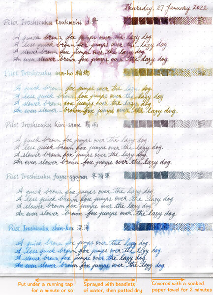
Water resistance testing of 5 Pilot Iroshizuku inks
A Smug Dill posted a gallery image in FPN Image Albums
From the album: Ink performance testing
Putting the sheet found here: https://www.fountainpennetwork.com/forum/gallery/image/9273-shortlist-of-candidates-for-an-order-of-3-bottles-of-pilot-iroshizuku-ink/ through the paces.© A Smug Dill
- 0 B
- x
-
- pilot iroshizuku
- iroshizuku
- (and 6 more)
-
Ink Review : Pilot Iroshizuku Tsukushi (horsetail) Pen: TWSBI Micarta v2, F-nib Paper: Rhodia N°16 notepad 80 gsm "horsetail basking in sun-showered forest beautiful inkdrops" When an ink review starts off with a haiku, you just know that it will cover a Japanese ink. And you would be right ! This review examines Pilot Iroshizuku Tsukushi, a nice reddish-brown ink. As most of you know, Iroshizuku is Pilot's luxury line of fountain pen inks - read: these inks are really expensive. The name Iroshizuku is a combination of the japanese words Iro (coloring) and Shizuku (droplet). The name is meant to reflect the image of dripping water in a variety of beautiful colors. All the inks in the line are named after natural landscapes & plants, with each ink trying to capture the depth and essence of color of its namesake. For some reason, iroshizuku inks always remind me of Akira Kurosawa's movie Ran - in his castle, the Great Lord Hidetora Ichimonji writes his final will on a parchment, dividing his domain among his three sons. Iroshizuku tsukushi would have been an ink worthy of such an occasion. Tsukushi is a nicely saturated soft reddish-brown ink with some subtle shading. The shading is almost unnoticeable in finer nibs, but becomes more pronounced if you move to broader nibs. The reddish components become more visible with the wetter pens. This is a serious-looking ink that is not at all misplaced for business correspondence. It is one of my favorites for use at work. Furthermore, this reddish-brown ink is a match made in heaven for my TWSBI Micarta - these two go together perfectly. Looking at a chromatography of this ink, you will be amazed at the complexity of the components used - a greyish base complemented with purple and orange dyes. The greyish base is quite water-resistant, as is apparent in the water resistance tests I performed. Even after 30 seconds under running tap water, a clearly readable version of the text remains. Drying times are somewhat high - on the order of 25 seconds with finer nibs on Rhodia paper. Rhodia N°16 notepad 80 gsm - drying time 25-30 seconds, negligible show-through, no bleed-throughPaperblanks journal paper - drying time 15-20 seconds, negligible show-through and no bleed-throughGeneric notepad paper 70 gsm - drying time 10-15 seconds, some show-through and some minimal bleed-throughMoleskine journal - drying time 5-10 seconds, serious show-through and very noticeable bleed-throughOverall, a very well-behaving ink on all but the most crappy paper. Drying times are a bit on the high side, but still OK. They haven't really bothered me. Conclusion Brown inks are not my personal favorite, but this one I couldn't resist because it pairs perfectly with my TWSBI Micarta. In finer nibs, the ink looks really professional. In broader nibs it exhibits a really nice shading. If you're into browns, you really can't go wrong with this ink. Sure, it's not cheap, but you get a good quality ink in return. My overall rating: B+ (but A++ when paired with my Micarta ;-)
- 5 replies
-
- iroshizuku
- tsukushi
-
(and 1 more)
Tagged with:
-
I presume nearly everyone knows of the Iroshizuku line of inks. I'm sure this ink has been reviewed many times, but decided to add my two cents. Most browns on the market fall into the reddish-brown category. Tsukushi is not an exception. This ink has a strong burgundy undertone while Iroshizuku's Yama-guri has a much more green cast to it. As expected, a very well behaved ink. The chromatography isn't terribly interesting. The ink has some water resistance, a lot of the ink washes away, but some if left behind to be readable. As usual papers are MvL=Mohawk via Linen, Hij=Hammermill 28 lb inkjet, TR=Tomoe River.
- 13 replies
-
- iroshizuku
- brown
-
(and 1 more)
Tagged with:
-
http://i900.photobucket.com/albums/ac209/jasonchickerson/_FUJ6445.jpg http://i900.photobucket.com/albums/ac209/jasonchickerson/_FUJ6446.jpg Iroshizuku's lineup of brown inks is a short list of two, or three if we include the golden wheat color, Ina-ho. Top is Rhodia Dotpad. Bottoms is Original Crown Mill Pure Cotton. These three inks are excellent, interesting colors and very well-behaved. While not exactly unique, they are as good or better than their doppelgangers among other brands. Tsukushi is very similar to Faber-Castell's Hazelnut Brown and J. Herbin's Café des Îles, while Yama-guri is a darker, more saturated R&K Sepia or J. Herbin Cacao du Brésil. I don't have enough experience with colors like Ina-ho to draw comparisons. Here's a breakdown: Tsukushi - burgundy undertone Hazelnut Brown - lavender undertone Café des Îles - no undertone (single dye ink) Yama-guri - burgundy undertone R&K Sepia - neutral/brown undertone Cacao du Brésil - lavender undertone While I won't be dropping Cacao du Brésil, I will be adding Yama-guri to my ink drawer. It is an incredibly organic looking ink, reminiscent of writing with a charred stick. It has an early man on cave wall feel. And, these inks dip very well on the right paper.
- 18 replies
-
- iroshizuku
- browns
- (and 4 more)