Jump to content

Search the Community

Showing results for tags 'tortoise'.

  • Search By Tags

    Type tags separated by commas.
  • Search By Author

Content Type


Forums

  • FPN Community
    • FPN News
    • Introductions
    • Clubs, Meetings and Events
    • Pay It Forward, Loaner Programs & Group Buys
  • The Market Place
    • The Mall
    • Market Watch
    • Historical Sales Forums
  • Writing Instruments
    • Fountain & Dip Pens - First Stop
    • Fountain Pen Reviews
    • Of Nibs & Tines
    • It Writes, But It Is Not A Fountain Pen ....
    • Pen History
    • Repair Q&A
  • Brand Focus
    • Cross
    • Esterbrook
    • Lamy
    • Mabie Todd Research/Special Interest Forum/Group
    • Montblanc
    • Parker
    • Pelikan
    • Sheaffer
    • TWSBI
    • Wahl-Eversharp
    • Waterman
  • Regional Focus
    • China, Korea and Others (Far East, Asia)
    • Great Britain & Ireland - Europe
    • India & Subcontinent (Asia)
    • Italy - Europe
    • Japan - Asia
    • USA - North America
    • Other Brands - Europe
  • Inks, Inc.
    • Inky Thoughts
    • Ink Reviews
    • Ink Comparisons
    • Co-Razy-Views
    • Th-INKing Outside the Bottle
    • Inky Recipes
  • Paper, and Pen Accessories
    • Paper and Pen Paraphernalia
    • Paper & Pen Paraphernalia Reviews and Articles
  • Creative Expressions
    • Pen Turning and Making
    • Pictures & Pen Photography
    • The Write Stuff
    • Handwriting & Handwriting Improvement
    • Calligraphy Discussions
    • Pointed Pen Calligraphy
    • Broad (or Edged) Pen Calligraphy

Blogs

  • FPN Board Talk
  • Incoherent Ramblings from Murphy Towers
  • The Blogg of Me
  • FPN Admin Column
  • Rules, Guidelines, FAQs, Guides
  • Musings on matters pen
  • Marketing & Sales
  • Iguana Sell Pens Blog
  • Newton Pens' Blog
  • Peyton Street Pens Blog
  • holygrail's Blog
  • A Gift For Words
  • I Don't Have a Name; So This Will Do
  • Karas Kustoms' Blog
  • Debbie Ohi's Inky Journal
  • Sus Minervam docet
  • Crud!
  • Clut and Clutter
  • Federalist Pens

Product Groups

  • FPN Pens
  • FPN Inks
  • FPN Donations
  • Premium/Trading/Retailer Accounts

Categories

  • Fonts
  • Tools & Software
  • Rules for Notepads & Paper

Find results in...

Find results that contain...


Date Created

  • Start

    End


Last Updated

  • Start

    End


Filter by number of...

Found 19 results

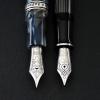
  1. Maybe it is known to many Pelikan fans already, of the beauty of vintage tortoise shells. However, I was shocked when I opened the parcel and saw my 400 tortoise for the very first time. This is some otherworldly kind of beauty, breathtaking! The tortoise shells change color from light to dark, from honey to blood red. The rest of the pen is in warm brown color, clearly brown, striking and matching perfectly with the tortoise. I inked it with MB Toffee Brown. Here are my two tortoise pens. The 400 cap and knob matches perfectly with the ink. It has a KM nib, marked on the knob. The nib is KM. To my surprise, the ball-ish nib is still nicely stubbish! And it is smooth, I can rotate my pen a little and still write the same. The nib has script logo, no marking on the cap ring. From what I read, it is made in the early 50s only. It gives line variations. Without pressure it writes like a stub, with subtle line variations. Nice semi-flex. Easier to flex (as in less pressure needed) than my 400nn M nib with bird logo. I have a theory of script nib being better at semi-flex, dont know if you would agree. The nib makes a sound when I write, much more so than my 400nn nib. The sound is similar to my M101n M nib, but I have CI grind on that nib, dont know if that changes the sound. The 400 nib is extremely wet. Toffee brown looks much darker. I will appreciate any suggestions to make the nib dryer. All my birds (less the 400nn, I swapped its nib into M620). The 400 is clearly brown. I am really lucky to acquire a 400 tortoise in this condition. The pen is almost mint, can pass for NOS, if you ignore the old metal look inside the cap. The piston seal is nice, no leak. I applied some oil that came with my TWSBI eco, the piston moves smoothly. I can see through the tortoise under light, to check ink levels. I paid E235 shipped. It is steep, almost the same as a new M400 white tortoise. Well, but it is hard to find one in this condition. I think it is worth the price. Now the 400 is competing against M101n red tortoise for the spot of my favorite pen. I swapped a semi-vintage OB nib into M101n. Cant say which I like better, they are very different pens and nibs.
  2. While Pelikan does a lot of special editions, there are relatively less number of special editions of M400 fountain pens except for sterling-silver variations, which are now all discontinued. You have only two widely available options if you want special M400 fountain pens; M400 White Tortoiseshell and M400 Brown Tortoiseshell. I just want to give comparison between them. 1. Tortoiseshell material Two materials are totally different from each other. The brown tortoiseshell is a striated mixture of brown, grey, and black while the white tortoiseshell is that of yellow, green, and orange. The brown one looks more classic, but less translucent. You can easily see the internal piston mechanism of the white tortoiseshell, but you can't do in the case of the brown one. I prefer the white tortoiseshell to the brown one. 2. Cap, grip section, and the piston knob material. Cap, grip section, and the piston knob of the brown one looks black, but not exactly. It is actually a very dark brown resin to match color of the brown tortoiseshell material. Otherwise, the white one is made of white resin. It's not ivory, but just white. Staining can be an issue when you use white fountain pen. You can see the residual ink after filling it with ink bottle, and it is not easy to remove them especially if the residue is on the cap thread and boundary between the nib unit and the grip section. I had ink residue when I firstly filled the pen with Pilot Iroshizuku Kon-Peki. I left the residue for a few days, and tried to clean it after emptying the pen. I could remove them after several times of using wet tissue and clean water, and it remained no staining. But I can't be sure that the ink staining will not happen in long-term usage. 3. Trim color Both have gold trims, but color of them are different. One in the brown tortoiseshell pen is more saturated. It reminds me the gold trim of modern Parker Duofold. The deep gold trim makes the pen look more classic with the dark brown resin body and brown tortoiseshell material. Otherwise, gold trim of the white tortoiseshell pen looks more like white-gold-ish. It looks like the gold trim of MB Meisterstuecks. With white resin and light tortoiseshell material, it makes the pen look more fancy and bright. I think both trim colors are well chosen. 4. Others Both are modern Pelikan M400 with latest-style M400 two-tone 14C gold nib and one-tone logo at the cap finial. The MSRP of them are the same, but more retailers are selling white tortoiseshell version a bit less expensive than the brown version. Thank you for reading and please leave some comments on them.
  3. Hyukken

    Acceptable Price Of M800 Tortoise

    Hello I am a newbie to the fountain pen world, but since the first sight of M800 tortoise even I already have a dozen of FP now, it's still on my mind. I've done some research, but it was two years before, https://www.fountainpennetwork.com/forum/topic/317433-value-of-m800-tortoiseshell-brown/ so as the topic says, what's the acceptable / latest buying price of you??? also would like to know about the price of GvFC Intuition Pernambuco (I just can't resist brown color
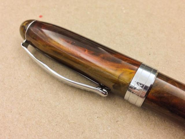
  4. As soon as I discovered the original M800 Brown Tortoise, it was my favorite Pelikan and THE end game to my fountain pen acquirement to own one someday. Of course at that point it was just a pipe dream. It was practically semi-mythical and sold for over $2000 on the rare occasions it might surface. There was no way I would spend that kind of money on a pen on principle. So like many others I held on to the great hope that Pelikan would one day decide to produce it again and our collective dream was fulfilled, though not exactly as we'd hoped. Nevertheless, I saved up for it and once I had the funds ready, I waited. For nearly a year. I had the money, I knew what nib I wanted and which seller I could buy it most cheaply from, but for some reason I just kept waiting. I watched others post wonderful reviews of the pen, most notably this recently revived thread from FPN member Niagara Falls. There I saw the M400 Brown Tortoise and decided that it, along with the M800 Brown Tortoise would be my ultimate Pelikan mini collection. Eventually. It was long discontinued and I didn't expect to come across a M400 Brown Tortoise any time soon. Then last week I finally made up my mind to buy the new M800. I was going to buy it from ebay, but for some reason decided to browse Regina Martini's auction site first. I saw the M400, and I snapped it up. I had spent months prevaricating with the last pen I'd bought, and nearly a year with the M800, and yet in the span of a few minutes I'd purchased the M400. I probably spent too much on it, but I don't even have a hint of buyer's remorse. It hasn't arrived yet though, so maybe that will change. This is one of the best pictures I've found of the pen. All credits to this Japanese blog entry from 2012. I had been under the impression that the particular M400 Brown Tortoise I bought was exlcusive to the Galeria Kaufhof and had been in limited production. Regina told me that it was not a limited or special edition of any sort, nor was it exclusive to any retailer, but for some reason ended up being produced for only a short time. Regina also added that the tortoise color on this binde is the same as the original M800 tortoise, so that's nice. I'd like to get more information on the M400 Brown Tortoise. When was it produced? Was it just a regular M400, or actually a special edition like the white tortoise is? Do members around here own this pen? How do you like it? It'll be here any day now. I'm so excited!
  5. bruhuhuhu

    New M600 White Tortoise Price?

    Hi all, I've been reading the forum for quite some time and decided to make my first post here. I would like to let go of my "as new as it gets" pelikan m600 white tortoise with a fine nib that has only been inked once and i am struggling to find a price guide for it on the classified section. Does $375 seem outrageous for such a pen with complete box and papers? The pen is just so beautiful i can't bare to use it!
  6. Introduction: Up for review is a brand-new 2017 Onoto Magna Classic Tortoiseshell fountain pen. In almost every way, this pen significantly impresses me. Onoto is certainly back, and they are not messing around. Onotos inception took place in England in 1905, and the company had a good run through 1958 when they had to shut their doors. About 50 years later, a British man purchased the brand and re-launched the storied and quality Onoto name. Retail price for this pen as equipped was $581 after currency conversion on the Onoto website, where one can pay in CNY, USD, Euros, or GBP. There is a price range on these pens as one can select a gold or steel nib, custom ground nibs, an interchangeable rollerball kit, and an optional brass-weighting insert. I selected the 18kt gold medium nib by Bock and a weighted barrel insert. More on this to come. In short, this pen has become one of my favorites; and, its not merely I just got it! syndrome. I have recently acquired other quality and long-sought-after pens (some highly rare!) that are still un-inked and shelved because this new addition to my collection has captured my time and attention. My assessment of this pen is as follows: Appearance: 9.5 Disclaimer: I deeply enjoy all things tortoiseshell. If you dont, this may be an even more subjective category than usual. I am also somewhat subconsciously scoring the unprecedentedly beautiful display box into this unusually high score. Its a package deal that emotes fun! The box solicits my attention from across the room every time it catches my eye. Then, I typically open the box just to look. Then, the opened box yields the beauty of the pen and I just have to hold it. And then, I just have to write with it. Schedule ruined. Not all shiny things easily sway me. For example, I store this pen next to a far more expensive and stereotypically over-the-top Montegrappa luxury pen with its bright red lacquered oversized box. Thats beautiful, too, but I havent paid any attention to it since I got this Onoto pen. When I am not busy playing with the Onoto pen and box, I find myself reading the included literature and pamphlets; this pen came with the most fun stuff to read I have ever received with a new purchaselet alone just a pen! The engraved barrel is a very nice touch that reminds me of the engraving on my Conway Stewart Wellington. Some may resent brand-engraved barrels and see them as an unwelcomed conquest into your pens lines. However, Omas has legend status and they did it on a lot of their precious celluloid pens. Just saying. The Onoto engraving reads: ONOTO THE PEN MADE IN ENGLAND. They are not hiding that their longstanding roots with this marquee. There are three gold cap bands that are evenly spaced and laid flush with care. These are a really nice touch because it carries the gold through the design from the cap to the finial rather seamlessly. The top of the cap displays proudly the Onoto logo in a beautiful and truly eye-catching way. Whoever designed the logo should be complimented, often. It reminds me of BMWs propeller logo (since BMW used to be more known for plane engines). I like that its not just a boring O like on some of my Visconti pens that have just a V on the top. This is again appreciated on the functionally-tight clip, where the full logo is displayed again and not just an O. I also really, really like that there is a flat gold-plated metal surface on the finial instead of a boring rounded or flat plastic surface. This is a somewhat unique feature (not rare, but unexpected). The solitary reason I did not score this pen an even 10 is that Onoto failed to polish the finial on my pen prior to shipping. This was their only lack of attention to detail. Very minor, but unfortunate. Photo included. By the way, when looking at the finial micro-scratches, please also note that no engraved numbering is present. Internet searches revealed that some of these pens have a number out of 100 engraved on the finial. Mine does not have this; however, there is a marking on my paperwork that indicates I have number 4 out of an edition of 200. Does this mean Onoto will make (or has made and/or sold) another 196 of these? How many of these pens exist and how many editions of the same pen have been made or will be made? Whats the point of having a numbering system just to start over and use the numbers again in another edition of the same pen? Perhaps Onoto did this, or perhaps it didnt. Its altogether a mystery to me. I am not unhappy about it, but I am perplexed. Design: 8 I was going to score this pen a 6, not because there is anything wrong with it, but simply because if pens are shaped a certain way and of a functional size and weight for writing they are all somewhat the same and underserving of higher than average scores. Unless there is something new or innovative involved, like how the Kaweco Supra allows the user to quickly change the length of the pen barrel, I dont think pen designs are generally groundbreaking very often these days (Conid bulkfiller excluded?). Average is not a bad thing. Side note: We might consider teaching our kids this instead of giving them a trophy for walking across the room without tripping. Its fine to be average! However, I ended up giving this pen an 8 because of how impressed I was by five things: 1) The effortlessly customizable nature involved in the ordering process allows numerous options at varying price ranges (including an interchangeable rollerball kit for $100). 2) The weighted option is really wonderful. I chose the 7g weight addition and it makes for an awesome feel in the hand. The rolled brass shank is firmly nestled and secure in the barrel and I think it was custom made when I placed my order. I say this because there was a very small amount of water on the brass inside the barrel, like the metal work was just done before shipping (in a good way). 3) The acrylic material is wonderfully thick and hefty in my opinion (as can be seen in the brass-shank barrel photo and the side-by-side photo with the Platinum pen). 4) The tortoiseshell materials were wisely chosen for appearance. Also included for reference in this regard are some preliminary photos of a brand new Platinum Tortoiseshell Celluloid pen. The Platinum pen was about $325so considerably cheaper. And, though a steal for a new celluloid pen from a Japanese big three manufacturer, the Platinum i¬¬¬¬¬¬¬¬¬¬¬s far lighter (in a negative way), uses less material, feels overall weaker, and has an inferio¬¬r finish to the Onoto. Am I bashing the Platinum? No. I just got it. I may do a review. It deserves its chance, and I like the gold ring on the end of the section by the nib unitOnoto should do this! But from a head-to-head first impression standpoint, the photos tell the story pretty well on why the Platinum is less expensive and less impressive than the Onoto. 5) The flat gold-plated metal finial is cool. Construction/Quality: 9.5 I have no reservations scoring this a 9.5. I will come back and blast this pen if the rings get loose or if the cap breaks, etc. I find this to be the easiest category to score as something is either well-made or not well-made. The thick material was a big factor here as Onto didnt skimp on material. According to Onoto (who I contacted directly for some of the technical information relayed in this review), they source the raw high density acrylic sheets (not starting with rods) from Italy and then process and turn them into pens in England. I was informed that all silver plated items (clips, bands, and other aesthetic metal pieces) are currently being phased out in favor of solid sterling silver pieces (which in the case of my pen are then 23kt gold-plated). I wanted to score this pen a 10 but I am still annoyed that the finial was not polished. There is nothing loose on this pen and it posts and closes securely. The nib has not dried up after sitting unused (finally) for three weeks. The nib is another big quality factor, but this category is yet to come. Weight/Dimensions: 7 Sourced from the Onoto Website: Dimensions: Capped (closed): 139mm Uncapped including nib: 122mm Posted including nib: 161mm Barrel diameter: 11 13.2mm Cap diameter: 14 15.8mm Cap length: 67mm Weight: 25gms or 32gms (if you select the optional weight addition) Nib/Feed: 9 I, too, am shocked that I am scoring a usually plug and play canned medium Bock nib as a 9. After my initial Wow, this nib is nice moment, my very next thought was, Why does Visconti keeps sending me mediocre Bock nibs when this glorious Onoto experience is possible? This pen came with one of the best nibs I have ever used or even seen directly coming from a seller (retailer and manufacturer alike). The tines were 100% perfectly aligned, something I have never seen on a Visconti (or any other new pen!). The slit is neither too wide nor too small. There is no babys bottom. There is zero scratch when writing, just the slightest hint of feedback as it glides across paper. The pen writes smoothly and with an extra fine line upside-down. There is a small around of spring to the nib, but not enough to warrant a label like semi-flex. In this sense the nib performed just as expected for a Bock nib. I like big and buttery nibs with some flex (not that this #7 nib is small and nail-like) so its not a 10 for me, but for many people this pen would be a 10. But seriously, I have quality nibs from every major brand, and some local artisans, too. Only my factory-direct Sailor King Eagle nib is more enjoyable than this nib. I am completely befuddled. I had to investigate. My investigation revealed somewhat conflicting information, but all positive. Onoto first said they rely on Schmitt to assemble, test, and service their nib units from Bock before they arrive at Onoto. Later, Onoto told me they also inspect and align nibs in-house before shipping them. Regardless of if its one or both, its working! KEEP UP THE GOOD WORK, ONOTO! I hope they hear me. Dont skimp on the processes that make sure the end user actually gets a great product from start to finish. Well done, Onoto. On a tangent, it is perplexing that we in the pen community have come to generally accept that really expensive pens may arrive with mediocre-writing nibs right from the manufacturers and retailers. So many of us love our pens only after seeing the nibmeister. We should not be buying luxury Rolex watches that look pretty but dont tell time, so to speak. Better to buy a $0.49 Bic pen and have it work properly than to endure the nibmeister malarkey we have grown accustomed to on oh-so-many occasions with our brand new pens (specialty grinds excluded). We deserve and must demand proper behavior from all sellers and makers of fine pens when it comes to functional nibs! Rant over. The feed appears to be ebonite and iswell, a feed. It flows normally and doesnt clog or drip. Im not sure how much the feed is helping with the overall great writing experience; it appears to be a normal feed that encourages great capillary action. Filling System/Maintenance: 6.5 In 1905 Onotos claim to fame was their plunger-filled fountain pen that was guaranteed not to leak. In 1923 they released a lever-filler. In 2017, my pen has a boring cartridge converter. I wish Onoto had returned to its roots in this regard. If this pen had a piston filler it would probably be my favorite pen. I am 50-50 on converter pens, only liking them 1) when I need to clean them, or 2) when I need to draw ink from those dreadful 30ml Diamine ink bottles that most nibs wont fit into (come on Diamine!). I probably should score this category a 5 for being average, but it works well and smoothly and I like how snugly the converter fits. There is a missed opportunity here by Onoto, but theres nothing negative to speak of functionally with the converter. The pen also takes a standard European cartridge per their website. Cost/Value: 9 This pen is a good value. Fully equipped it gets a little pricey, but one can have this pen $155 cheaper without a gold nib, and another $23 cheaper without the extra weights. Factor that in and this beauty can be had for about $400. Bear in mind there are other Magna color options in the line beside the tortoise if you hate turtles, lol. There is a blue one I have my eye on, too, but budget-wise I may have to pass. Side note: After I purchased the tortoise pen it appears to have disappeared from their website altogether, leading me to believe they may have discontinued it or simply make one at a time? I suggest emailing them if youd like one to see if they can whip one up for you, or perhaps they will post it again. This is as of 6/9/17. This pen is a very good value for the quality provided. I initially planned to score this pens value at an 8 because it is still somewhat pricey for not being made of silver or celluloid, but then I went with a 9 because the buyer can basically pick his or her price range and features. Onotos excellent customer service rounded off the great experience. They write back quickly for being on the other side of the pond from the U.S. I consider good service to truly be part of the value category. Conclusion/Score: 8.36 I truly enjoy this pen. I cannot imagine selling it. I am thrilled that Onoto is back! I wish I didnt wait 12 years to try their new offerings. I must also give a shout-out to the customer service team who answered my questions quickly and accurately. Shipping time is acceptable as well from the (previously? Brexit?) United Kingdom. If this pen were celluloid and a piston filler it would be a 10 and my favorite pen most likely. Be that as it may, I do think this pen actually earned its solid score. I came in quite skeptical because this is my first Onoto pen and there was no brand affinity affording them mercy points. Well done, Onoto. Enjoy the photos! A few of them are not posting with the proper orientation despite an identical process for each. I also would like to respectfully gripe that I had 30 photos and FPN wouldn't let me post them all. So I had to scale back. A nifty chemical-treated polishing cloth was included sporting the Onoto logo. I might have preferred no chemicals, but it's very cool! I would have enjoyed a more crisp and legible stamping here for the precious metal indicators, etc. Below is a photograph of the unnumbered and unpolished finial mentioned in the review. The alignment of the tines is spot on! The optional weighted brass insert can be seen inside the barrel in the photograph below: Here are some photos of the Onoto Tortoiseshell next to a Platinum Celluloid Tortoiseshell Fountain Pen: Side-by-side, one can really see the difference in the amount/thickness of materials used by each company. The Onoto, on the left, scores bonus points here in my book. Left To Right: Danitrio Tame-Nuri Genkai, Visconti Homo Sapiens Maxi Size Lava Steel 25th Anniversary, Onoto Magna Classic Tortoiseshell, Mont Blanc 149, Stipula Etruria Titanium Flex, Faber-Castell Ondoro Wood.
  7. I hav a pelikan MM400 torquoise fountain pen "Old style" (1980's-1990's i guess) that needs to be repaired. I tried to twist off d piston cap since the stopper inside d barrel got stuck. In short, i broke d piston mechanism inside bummer. Some of the destroyed parts even got stuck inside the barrel. If not for the piston, the pen is in pristine condition, but I guess the most practical way to fix it is to replace the barrel. Where could I purchase old style tortoise barrels? Here are some photos of the destroyed beauty. Any advice or suggestions are welcome. Thanks in advance.
  8. The Good Captain

    M400 Brown Tortoise

    I'm really looking forward to getting my hands on one of these little beauties! September, here in the UK, it seems. Wonderful!
  9. Fantomet

    M800 Tortoise Wtih Wrong Cap

    Sadly, after winning an auction, I received a M800 Tortoise with the wrong cap. The last owner was unaware of the fact that it had the wrong cap. Which probably means that someone, without knowing it, has a a special edition brown cap on their non-tortoise M800. I would love to have the original cap for the pen, even though it seems the original color is very close to black, if not put under a bright light, like here: If anybody can help me with find a brown cap for the 2013 version of this pen, I would be very grateful. It should have the new gold Pelikan logo. Thanks.
  10. Uncial

    My Little Flock

    I've been meaning to do this for ages and I'm only getting around to it now. This is my little flock of Pelikans but one little Frakenbird is missing from the picture - a blue wave m200 with a 400 nib. I would very much appreciate help in identifying the older Pelikan in the picture. It has a monotone gold nib and is in green stripe with a rounded end and round domed end to the cap. The cap also appears to be lined in brass. It's a medium nib, but has a bit of flex and seems to me to write slightly stubby. It was sold to me as a 400N from the 70's; would this be correct? Below is a shot of the older pen.
  11. Warning! This is a long, picture-heavy rant about my Pelikan journey. My Souveran M400 and M800 Brown Tortoises under morning light. As I've posted here before, my ultimate goal from the beginning of my fountain pen days was to acquire these two pens. Or at least it was once I discovered the existence of these two pens. Of course back then, the new M800 Brown Tortoise didn't actually exist nor was there any indication that it ever would. What I liked was the old style M800 BT, but that is such a rare pen and is way too expensive for me to even want to buy. What I wanted more in general was an M800. Either the blue M805 or the green M800. But I just couldn't commit to either pen and it wasn't until the new M800 BT was announced that owning a Pelikan was a realistic consideration. The Brown Tortoise duo was really more of a fantasy. If it was ever to happen it was going to be over a decade into the future, and I certainly didn't expect to acquire both pens in a short period of time. It took me over a year after saving up for the new M800 BT to finally commit to buying it. I had handled an M800 before but couldn't remember what it had been like, so I had reservations about its size and balance. In February, while I was on Regina Martini's site to bid on it, I came across the M400 and jumped on it. I most likely overpaid. I really should have thought it through but I psyched myself out wondering how long it would be until I came across an old style M400 BT again, if ever. I was much more enamored with the idea of owning the set than the practicality of it. But I'd had this fantasy of a Brown Tortoise fp set for so many years that I was set on the idea. Being so suddenly faced with the possibility of making my fantasy a reality, I didn't stop myself to think. If you read some of my previous posts, you know that I was extremely excited for this pen to arrive and once it actually did, was shocked by its lightness. I then whined about it to you guys and even posted the pen on the Classifieds to immediately get rid of it. My beef in particular was with the cap. On one hand it's a testament to Pelikan's quality that they can work with such a material to make such a durable, thin, and light cap, but on the other it initially felt cheap and fragile. I got over it and can now appreciate its ergonomics and suitability to posting, but it made me really hate the pen at first. M800 on top, M400 on bottom. While I was considering what to do with the M400, I was given some money and took the opportunity to splurge on what had been my goal in the first place, the M800 Brown Tortoise. And this pen did not disappoint in any capacity. That's a first. With every pen I've ever gotten I was initially disappointed with, but the M800 exceeded my expectations. If I had the benefit of visiting B&M stores beforehand to see and handle the pens I'm sure this would be the norm but unfortunately that's not the case. The M800 is definitely a hefty pen. I've been constantly handling it ever since it arrived and I can still feel that it has weight. Thankfully, I hold my pen at a fairly low angle so it rests on the web where my index and thumb fingers meet and doesn't cause me fatigue. Posting the pen makes it too long for my liking but surprisingly doesn't change the balance by much, whereas the M400 becomes a much more back-heavy pen posted. The M800 is back-heavy in the first place. There is a noticeable difference between the BT finishes of the two pens. The M800 BT has more vibrant orange tones and metallic silver sheen. Its stripes are more consistent and longer than those of the M400 BT. However, it is actually a darker pen overall. Both pens have areas in which several stripes in a row are muted and the color seems to be under the surface. I absolutely hated this at first, but it's grown on me. According to Regina Martini, the BT finish of the M400 is actually the same as that of the old style M800 BT, and that was one of the big draws of the M400 for me. I wanted to be able to own examples of both the old and new BT finish. The stripes of the M400 are a bit more fragmented and less likely to reach from the top to the bottom of the barrel. Instead of being metallic, the M400 BT has more of a pearl-like (not swirly) golden sheen. It has a lighter golden honey color and is slightly less conspicuous than the M800 BT. The overall effect is that the M800 BT colors are shinier and flashier, but the M400 BT colors are richer and classier. New style M800 Brown Tortoise, M nib. The M800 I'm keeping for the rest of my life, no question. I haven't completely decided what to do with the M400. It's grown on me and I'm not so sure I want to sell it anymore. It's so pretty and it's part of a set! But I don't feel so good about keeping it. Buying both pens was a rash decision and while I don't have an acute need for funds, fountain pens are relatively frivolous things to own and I'm not comfortable with owning such expensive pens. Buying the M400 was a flight of fancy and owning it may be little more than a hassle and a poor use of money. Old style M400 Brown Tortoise, BB nib. There's also the fact that these are extremely similar pens. Kind of the point of the Souveran range is that it's the same pen in different sizes, and I have pretty much the same finish on both. Wouldn't it be redundant to keep the M400? I happen to be a person who prefers to keep a very limited number of pens. I can't see the point in ever having more than three pens inked at the same time or owning more than six or so good ones. I don't know whether I'd get enough use out to both to justify their stay. I also want a broader nib to have ground down to a cursive italic on the M800, and that can't be done without the funds that would come out of selling the M400. Sell M to get BB to grind? Or keep M and have it ground? But that's a whole other can of beans.
  12. I've always been a huge fan of Noodler's and Nathan, but they've always been undeniably drab in their color offerings for me. But I want more of these deep, luscious tortoise materials.
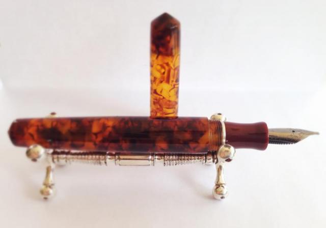
  13. Hello Fountain Pen enthusiasts. Today I want to share a review of a recent aquisition I made from Scriptorium Pens. First of all I have to say that communicating and working with Renée, who is the wonderful person behind the lathe and who makes all these beautiful pens, was a joy. First we had to stablish what materials I wanted for the pen. This was not an easy task since there is hundreds and hundreds of different materials and colors to choose from. Well, I waited a month to think about what I wanted, and thank God I waited because in that time Renée did the first Idyll model. This was the model pen I wanted, and after all the thought I chose a beautiful German Lucite called Illuminated Amber. What sold it to me was a picture from the Scriptorium Pens website. Also, Renée told me that it was her favorite, and that sealed the deal. Then there was the choice of using another material for the section, which I decided to use an acrilic called Red Urushi. It gives the appereance of laquer, and it has a wonderful deep red color. I was sure that it was going to make a nice contrast with the translucency of the amber tortoise. The nib I chose is a 1.1 stub, and it is a German made Jowo nib with a Ruthenium coating. The detail that complements the pen and gives it an elegant look and feel is a Sterling Silver band that I decided to put between the barrel and the section. This way the different materials have a piece that separate them and gives them more character. The nice part of doing a Custom pen is the endless possibilities of shapes, sizes, nib types, materials, colors, etc. Renée leads you on what she thinks works best, but always tells you that is your pen and you should do whatever pleases your pen appetite. When Renée starts the pen she confirms you with an email, and this starts a wonderful experience looking at all the process of your pen beeing produced by hand on a lathe. All thanks to instagram and the wonderful pictures Renée puts in her feed. The pen was finnished and sent to me with insured shipping, very fast indeed. The pictures that Renée sent me to my email confirmed that what she made was what i visualized in the begining and exactly what I wanted. But still I had to get the pen on my hands to feel it and sense it in person. Well, I must say that it is a work of art. it is total perfection, and by far my favorite pen of my humble collection. The feel in the hand is incredible. The polished lucite and the texture is undiscribable, it is like wet but at the same time so smooth. The translucency of the material is gorgeous, you can see the nib through the cap. The threads are impecable, all the work is done to perfection. For size comparisons the pen is the size of a Montblanc 149. So it fits perfectly in my hands. The balance is just right. It is a light pen, but it has more weight on the front. The nib writes smoothly, they are inspected and tested before leaving, so it was no problem the first time I inked it and wrote right away. The section is just beautiful, and that band....cant give any more complements on this beauty. I hope you liked this review, and really the pictures dont do justice to the pen. You have to feel it in your hands to experience it. Fully recommend Scriptorium Pens. Thanks for looking!
  14. SujiCorp12345

    My First Bird!

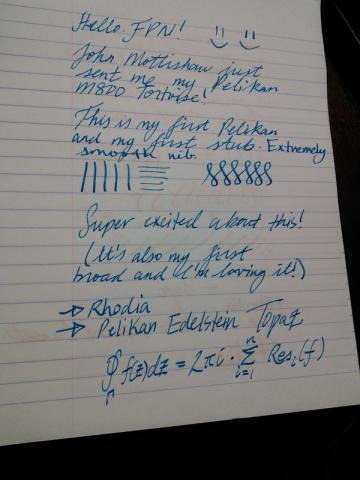
    Hi all, I opened my mail today and was delighted to find my very first Pelikan M800 Tortoise that I purchased from John Mottishaw. Just wanted to share some photos! It's a broad stub. (My first broad, and my first stub!) -Best regards, Suji
  15. I'm curious about the color progressions Pelikan celluloids go through over time. I know it's a topic of discussion in Japanese sections of the forum--people talk about the marked color changes in urushi, and in Waterman celluloid, but haven't seen any on Pelikans. Apologies if it is discussed online or a book I don't have... I like the green the light tortoise changes to almost more than the pristine light tortoise, for example, and it's fun to think about what these pens will look like a few decades on. I've tried to guess some of the progressions in color below. Pelikan enthusiasts and collectors, please chime in and correct or add to the list! 400, 400N, 400NN light tortoise --> light green (or are these the 'export' pens?) light tortoise? --> yellow mid-brown tortoise --> red-brown/orange vibrant green --> green/grey grey --> light grey/white 100N green --> blue-green (turquoise blue)---> slate blue-green/grey green --> olive green 100 marbled red --> burgundy brown --> gold dark jade green --> olive green 101N light tortoise --> light green (but could just be green barrel showing through) tortoise --> murky olive brown-green 80's-90's Modern/'old-style' 400 green --> blue/green brown tortoise (dark brown) --> light brown --> ambering/transparency New Modern: crackles, surface becomes opalescent (as a side note, I've noticed in modern pens I have the modern celluloid and plastics are unstable, too; the colors tend to bleed into each other over time)
  16. caric

    400 Nib Bent

    I have a Pelikan 400 tortoise from the early 1950s. I posted a review here Now that I have a bit more experience looking at nibs under magnification, I've discovered the tines on this extra fine nib were out of alignment and the entire tip of the nib itself is crooked and a bit twisted. I was able to align the tines but the nib is still twisted. Fixing only the alignment leaves the nib very scratchy. Ink flow is very good and I think just as it should be for an EF and even keeps up when I add pressure to my writing to get line variation.It's so scratchy though that I want to get someone to fix it for me. Not sure what my options are; any recommendations?
  17. Hi, I've received my M800 Tortoise today! It is my 10th pen right now, and one of my grail pens. I'm very happy with it, and glad that I've decided to spend more than what I usually do! http://www.kepfeltoltes.hu/131118/P1170317_www.kepfeltoltes.hu_.jpg http://www.kepfeltoltes.hu/131118/P1170309_www.kepfeltoltes.hu_.jpg http://www.kepfeltoltes.hu/131118/P1170299_2_www.kepfeltoltes.hu_.jpg M800 & M400 http://www.kepfeltoltes.hu/131118/P1170329_www.kepfeltoltes.hu_.jpg http://www.kepfeltoltes.hu/131118/P1170336_www.kepfeltoltes.hu_.jpg M400-M600-M800 http://www.kepfeltoltes.hu/131118/P1170255_2_www.kepfeltoltes.hu_.jpg http://www.kepfeltoltes.hu/131118/P1170258_www.kepfeltoltes.hu_.jpg Thank you for watching!
  18. Here are my thoughts on the Vintage Pelikan 400 EF Tortoise I recently received. For comparison, I'll rely heavily on my experience with a modern Pelikan M600 Souveran and a Lamy 2000. First Impressions (10) The Pelikan 400 is absolutely gorgeous with the tortoise finish! I love the color variations. http://farm4.staticflickr.com/3818/9689506858_0e1703f821_b.jpg Vintage Pelikan 400 & Modern Pelikan M600 Souveran by astrophoenix, on Flickr Appearance and Design (10) On first glance, the 400 looks just like a modern Pelikan Souveran, only missing some gold bands (which I personally think are a bit over the top anyway). The piston-turning knob, the barrel, the cap, and the section are pretty much exactly the same shape as the modern pens. http://farm8.staticflickr.com/7313/9686271465_00018c3127_b.jpgVintage Pelikan 400 & Modern Pelikan M600 Souveran by astrophoenix, on Flickr as you look a bit closer, you can start to pick out some differences: the piston-turning knob on a modern Souveran has much "sharper" edges than on the vintage 400, and lacks the marking of the nib line width. The nibs look quite a bit different, even though both are 14K gold nibs. The emblem on the top of the cap is probably the most pronounced difference to the casual observer, with the modern gold emblem which relies on texture for contrast, versus the simpler etched design of the vintage 400: http://farm4.staticflickr.com/3767/9688991580_0d232c738c_b.jpgPelikan 400 Tortoise by astrophoenix, on Flickr In general, I would never think to myself, "I want to add a pen in the color brown to my collection". but there is brown, and then there is this: http://farm3.staticflickr.com/2871/9685752267_29efd694db_b.jpgPelikan 400 Tortoise by astrophoenix, on Flickr http://farm4.staticflickr.com/3680/9685751943_3659824876_b.jpgPelikan 400 Tortoise by astrophoenix, on Flickr This type of brown made me lose my mind with desire. I'm only exaggerating a little bit, here. I love the way different lighting brings out different elements of the stripes. There are some red patches in there. there are a few stripes which look like marble. and of course there are darker smoky-looking patches, as well as honey and yellow. The non-tortoise parts of the pen actually are a dark brown, so dark they almost look black (difficult to pick out in most of the photos). so ok, yes, I did add a brown pen to my collection! Another big difference between the vintage 400 and a modern Pelikan M600 is the material the pens are made from. The modern pen feels like sturdy and smooth plastic in the hand. the 400 feels much more textured. the smoothness of the M600's material makes the stripes on the barrel seem flatter; my mind says "a material that smooth can't have stripes, they must be under the surface somehow". The subtle texture of the 400, on the other hand, makes the tortoise stripes come alive, as if they are part of the "skin" of the pen. I think it could be best summed up as, the M600 feels modern, static, cold; the 400 feels dynamic, organic, and living, almost like it should be breathing. Construction and Quality (9) This Pelikan 400 is somewhere between 59 and 64 years old at the time of this writing (2013-09-06), so I think its construction and quality are very high. The Piston turns easily and smoothly. I was a little shocked at how smoothly it turned. I'd give it a 10, but the piston seal did leak a little bit when I was flushing all the old ink out of it. (inky water came out at the top, near the piston-filling knob) I need to pull the piston out and probably lubricate the seals or possibly re-cork it. This requires a special tool though, which I don't have yet. The modern pelikans' piston can be removed with the wrench TWSBI ships with their pens, which is a really nice bonus. http://farm3.staticflickr.com/2812/9685753045_f3e5a19417_b.jpgPelikan 400 Tortoise by astrophoenix, on Flickr Weight and Dimensions (8) The Pelikan 400 is a somewhat light pen, but heavier than I remember the Pelikan M200 Souveran being, which is good, since the M200 was too light for me. when I hold the 400 in one hand and the modern Pelikan M600 Souveran in the other, I think the M600 is just perceptibly heavier. which makes sense: the M600 has a larger nib, a larger section, a larger cap, a larger piston-turning knob, and the barrel of the pen has a slightly higher diameter than that of the 400. The barrels (at least the colored parts) of the 400 and the M600 seem to be the same length. The Pelikan 400 is noticeably lighter than my Lamy 2000 (again holding each in opposite hands). I can write comfortably with my M600 unposted, but I prefer it posted. the 400, on the other hand, was just slightly shorter enough to keep me from writing unposted. I'd probably be happier if the 400 were the size of the M600, but I don't mind its very slightly smaller size too much. Nib & Performance (8) This 400 has an EF nib. One of the reasons I wanted a vintage pelikan was to try out a flexible nib. Wow, does this nib deliver! I'm a total n00b at varying pressure to vary line size, but here is a shot of one of my first attempts, applying pressure on the downstroke, and no pressure on upstrokes: The ink is Noodler's Luxury Blue. the paper is a Clairefontaine spiral notebook. One of the loops in that picture looks like a skip; the pen didn't skip, I was trying to vary pressure and went so light that I wasn't touching the paper anymore. Here's a writing sample, trying to apply the same effect, with my M600 (F) ... I mainly tried it on the swooshy loops, not on the words themselves: The 400 nib has a readily-noticable springiness to it. apply some pressure, the tines spring apart. with no pressure, I get a very precise, thin line, certainly worthy of the EF marking on the piston-turning knob. the Modern M600 is much wetter but has no spring whatsoever to it. in the loops above, I can see some line width variation but it doesn't feel like the nib is flexing to me, certainly not the same way as the spring of the 400. I can't really explain the line variation I see with the M600. comparing to the flexiness of my Lamy 2000: when I apply pressure to the 2000, I can feel the nib changing shape a bit, but not with a spring like the 400. it feels like the 2000's nib is a bit softer, so it has some give to it. (The Lamy 2000 also has a 14K gold nib) The 400 nib doesn't feel soft, it's almost like it has two settings: tines together, or tines apart, with a spring to go from one to the other. http://farm8.staticflickr.com/7371/9685751525_4db30550b5_b.jpgPelikan 400 Tortoise by astrophoenix, on Flickr the feed is ebonite, not plastic, and is impeccable. I've never had it skip or railroad on me, even though at least half the writing I've done so far is while applying pressure to play with the flex. http://farm4.staticflickr.com/3724/9685751059_8787631957_b.jpgPelikan 400 Tortoise by astrophoenix, on Flickr When it comes to smoothness, the 400 is fairly smooth. as it goes across the paper, it sings the whole time. at first I thought it was a scratchy noise, but it's not. the only time it gets scratchy is when I apply pressure, then try to switch from downstroke to upstroke; at that point, it feels like the nib is trying to dig into the paper. in reality, I shouldn't apply pressure on the upstroke at all, so the "digging in" might just be my lack of experience. The M600, on the other hand, is super smooth and wet. the 400 is not a dry writer, but the M600 is much wetter. I think the 400 nib has a decently-size sweet spot for such a fine line, but once a word or so I can "snag" it on the paper. also, I have a pocket notebook made by dodo case: http://www.dodocase.com/products/dodocase-notes-for-iphone-5 I think the paper is comparable to moleskine paper. even though the M600 is much wetter, it doesn't feather on the dodocase notebook, whereas the 400 feathers like crazy. (Note, a TWSBI 580 M also feathers on this paper, but not as much as the 400 does) One thing I did notice is that after I wrote a bit with the 400, then switched to the M600, was that anytime I wrote the letter e, the loop to make the e was filled in. My handwriting is naturally small, and getting used to the M600's wetness meant I was forcing myself to write larger. once I started writing with the extra-fine line of the 400, my handwriting snapped back to small, and if I didn't adjust back when writing with the M600, all my letters and loops were getting run together by the bigger line. The nib on the 400 is a lot of fun, when you try to vary the line width by applying pressure, but it's also hard work to use the line variation properly. and when applying low pressure, it's not as smooth as a modern nib. it probably needs a bit of tuning or alignment; I might send it off someday. Conclusion (9/10) I'm really thrilled with this 400 Tortoise. It's going to be the pen I use the most for quite some time. I'm a little concerned about the occasional snags I get with the nib, and I'm definitely going to investigate the piston leak, but since it's over half a century old, and not restored, I'd say this is to be expected. The 400 looks good, feels good in the hand, and is exciting to write with. for everyday writing, I can write softly and the pen lays down a nice thin wet line. and when I want to play with line variation, the 400 instantly responds.
  19. After springing for an italic nib for my 80s M400, because the semi-flex gold nib was not appealing to me (not a flex lover) I'm actually considering offloading it. I love my M800 but thought it would be nice to have something smaller for journaling, and though that is true, after several weeks, I find that the M400 is just a bit too small and light to be truly comfortable during long writing sessions. My thought is that the M600 (it is bigger, right) might have been a better choice for journaling- and my italic nib would actually fit it, which is nice- but now I'm torn because I do so love this tortoise. Talk about #firstworldproblems, I can't decide whether I want a slightly bigger fountain that's plain but comfortable, or my slightly too small fountain pen, which is gorgeous.


×
×
  • Create New...