Search the Community
Showing results for tags 'take sumi'.
-
I have 2 black inks that I like a lot. Aurora Black and Pilot Iroshizuku Take Sumi. I've decided to compare them and figure out which one is my favorite, because I rarely use black ink and technically just want one. As a result of the comparison, I'm more confused than before I started. They both have their strengths and weaknesses. The posted samples below are limited to very fine nibs for writing and sketching. Take-Sumi shows more obvious shading with broader cursive italic nibs. Aurora is highly lubricated but has more conservative flow vs velvety but free-flowing Take Sumi. It's easier to control line width with Aurora. Take-Sumi washes off more easily with water / water brush, smearing off a heavier amount of loose dye. The remaining dark line is more smeary looking and also feathery with Take Sumi, whereas Aurora Black keeps a neat black line under the smeared dye. Take-Sumi can be a deeper black in the dark areas, but it's slightly blue-tealy tinted, and also there's a beautiful gentle shading gradient visible even with Extra Fine Japanese nibs! Aurora Black is pretty much just a flat black, almost no shading, looks a bit like black laser printer ink. I'm describing this qualitatively, because it's difficult to tell from the scans, but Take-Sumi definitely has a more watercolor look with deeper dark areas, where Aurora is either straight black or a grayish solid color depending on amount in a line. Take-Sumi is more difficult to wash out of a pen: takes longer, quite a few flushes. Take-Sumi sheens readily, whereas Aurora generally doesn't show sheen unless in large amounts. For writing: I love Take-Sumi For drawing and Calligraphy: Aurora might have the edge. I like that it's a bit more neutral and much easier to control with a water brush for gradients, where Take Sumi just smears off more heavily with a water brush. Pens used: Aurora Black - Pilot Vanishing Point EF Take-Sumi - Sailor Pro Gear Slim EF On Fabriano Bioprima, lightly textured uncoated paper: Tomoe River 52g in a Hobonichi Techo Cousin planner:
- 16 replies
-
I found a stash of old reviews that got misplaced during a house move, so a belated thank you goes out to Terminal, who sent me this and two other Iroshizuku inks to test drive for a review. http://imagizer.imageshack.us/v2/xq90/537/pNbi3R.jpg
- 11 replies
-
- iroshizuku take-sumi
- iroshizuku
-
(and 2 more)
Tagged with:
-
I recently used a sample of Iroshizuku kiri same and I loved it, but I have to wonder, before I buy a bottle, if gray ink is worth it. Isn't it just watered down black ink? I put two drops of Noodler's Heart of Darkness and mixed it with almost 1ml of water and I got something quite similar in color, although it is missing the warmth of kiri same. Just looking for any other thoughts on this, if anyone is able to justify gray inks. Kiri same is a really nice ink, so I may buy it anyway, but I can't get that nagging feeling out of the back of my mind that I could be much more frugal and just water down my black inks. Has anyone tried watering down take sumi?
- 92 replies
-
- iroshizuku
- kiri same
-
(and 6 more)
Tagged with:
-
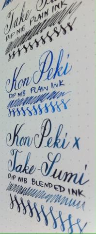
A blend I love and that has been in my go-to pen (fine Lamy Vista) for a month. As a serial ink switcher, that says a lot. I write on both white and powder blue papers, and this works on each. The blend I had in my Lamy was done by eye. I was asked what it looked like so needed to find ratios. It's 4.5mL Kon Peki to 0.75mL Take Sumi. I would personally add another drop or two of Take Sumi to match my prior version, but that's getting over the top . (My iPhone can't take true colour shots. It's also early evening on an overcast day.) I've included writing in plain Kon Peki, Take Sumi, Ku Jaku, and Tsuki Yo. The Kon Peki x Take Sumi blend in terms of colour is between Ku Jaku and Tsuki Yo. It's not as green as Ku Jaku, and not as blue-grey as Tsuki Yo.
-
Hi, after being indoctrinated by LindaMedley into Noodler's CMYK mixing, I'm going to venture into Iroshizuku as well. Obviously, Iroshizuku don't offer a pure black nor a yellow. For yellow, I can get away with orange Yu Yake down the magenta end of the spectrum, and green Chiku-Rin down the cyan. Kon Peki will be my cyan, and Tsutsuji my magenta. Along the black lines, Take Sumi will be adequate for most mixes down the cyan line, however my sample appeared to have a touch of yellow in it which gave Kon Peki a touch of green when blended. I have ordered a bottle of Take Sumi, I'll see what that's like. However, Iroshizuku have no deep blacks down the Magenta line. Are there any pure black inks or black with magenta overtones in chromatography that I may be able to safely mix with Iroshizuku inks? I do have Noodler's bulletproof black which I haven't tried yet, but I'm hoping someone's tried something else with Iroshizuku that they know works. Thanks!
- 3 replies
-
- iroshizuku
- blend
- (and 4 more)


