Search the Community
Showing results for tags 'tag kyoto'.
-
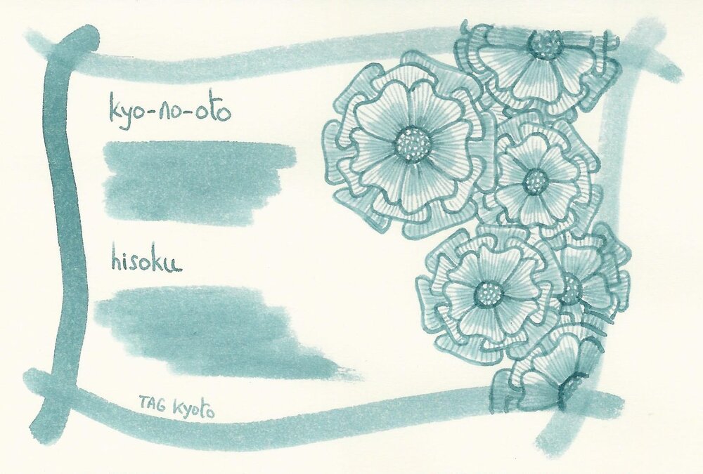
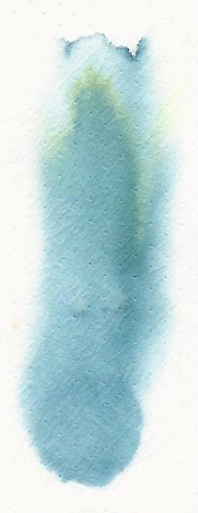
TAG Kyoto – kyo-no-oto #13 seiheki TAG is a stationery shop in Kyoto (Japan) that produces some interesting soft watercolour-style inks. With the kyo-no-oto series they produce a line of inks that replicates traditional Japanese dye colours. According to available online info, the manufacturing process of the kyo-no-oto inks follows traditional dying techniques dating back to the Heian era between the years 794 and 1185. The inks come in 40 ml bottles, packaged in luxurious thick paper with a texture that feels like heavy watercolour paper. In this review I take a closer look at seiheki, a pale green and blue that takes its inspiration from the colour of the daytime sky. In a deviation from previous inks in the kyo-no-oto series, TAG Kyoto decided to produce a pigment-based ink. It’s described online as a light pigment ink, with a combination of fine pigment particles and dyes. Just to get this out of the way: this was a really bad move! Where previous kyo-no-oto inks were a joy to use, this one is a pure nightmare! This ink just doesn’t work with fountain pens. It dries in the feed like crazy: after a day or so, my pens didn’t write anymore. I had to clean them first, just to get them writing again for the purposes of this review. And this behaviour was consistent across the 3 test pens I use below. You are warned! This ink is for dip pens only. Seiheki gets my points for biggest disappointment of the year! On the positive side: the pale green and blue colour of Seiheki is really beautiful…. I totally love it. The complexity is simply stunning: when writing/drawing with the ink you see blue and green and even yellow, clearly visible in one and the same ink. It must be seen to be believed. The ink manages to walk a line between blue and green that meanders between both sides. One time you definitely see a pale blue colour, the next instant the ink imprints itself on your brain as a green. Simply wonderful. Seiheki is a pale and unsaturated ink. This makes it soft and wispy and delicate, but it also makes it difficult to read. You really need a very wet writer to get enough contrast with the paper – e.g. by using a dip pen. But to be brutally honest: I think the ink is way too light to be usable for normal writing. For me, this ink should be dedicated to ink artistry: it looks great in ink drawings. To show you the impact of saturation on the ink’s look & feel on paper, I made some scribbles where I really saturated portions of the Tomoe River paper with ink. This gives you a good idea of what the ink is capable of in terms of colour range. Seiheki has a medium dynamic range, going from a wispy green/blue that’s barely there, to a slightly more saturated pale colour. With most inks, a medium dynamic range translates to soft and elegant shading. Unfortunately, that isn’t the case here. The lighter strokes are simply too light, and barely visible. As a result, the writing feels broken, with choppy shading that looks quite ugly (especially in person – the photos in this review softened up that choppy shading. I assure you that it looks a lot worse to the naked eye). The chromatography clearly shows the colour components that are present in this ink: blue, green, and yellow. These usually mix together to give a more-or-less uniform colour, but not so with Seiheki. Here the colours manage to live their own lives and can surface independently from one another. Maybe that’s because of the pigmented nature of the ink, where the colour particles live in a suspension rather than a solution? It’s a mystery to me, but the result is a multi-chrome ink with a lovely complexity – just take a look at the inkxperiment at the end of this review: all this colour variation from one ink! I’ve tested the ink on a wide variety of paper – from crappy Moleskine to high-end Tomoe River. On every small band of paper I show you: An ink swab, made with a cotton Q-tip 1-2-3 pass swab, to show increasing saturation An ink scribble made with a wet Parker F-nib The name of the paper used, written with a BB-nib Kaweco A small text sample, written with the F-nib Parker Source of the quote, with a wet-writing Edison Collier 1.1 stub Drying times of the ink on the paper (with the F-nib Parker) Due to the pale colour of the ink and the fact that it struggles with fountain pens, I couldn’t use my normal Safari test pens for the writing samples. Instead, I used some of my wettest pens, and even those struggled mightily with this pigment based Seiheki. Overall the writing samples confirm that Seiheki is too light to be usable for everyday writing. Also, that choppy shading looks horrible. There is one interesting fact though that really surprised me: Seiheki writes at its best on crappy paper. The more absorbent the paper, the better the writing experience. My impression was that the absorbent paper helped ink flow. In contrast, with hard surface paper, the writing experience was terrible. I’ve also added a scan of some writing samples to give another view on the ink. As you can see, my scanner couldn’t cope with the paleness and high-contrast, and made a mess of the representation. The photos look more realistic, although they softened up that choppy shading too much. Writing with different nib sizes The picture below shows the effect of nib sizes on the writing. Kyo-no-oto seiheki is very pale with low saturation, making it a bad match for my dry-writing Safari test pens. The wet visiting pens did a little better but suffered mightily from the ink drying in the feed over a short span of time. I got the best results with dip pens – saturation increases, and there are obviously no issues with ink flow. Related inks To compare this soft green and blue seiheki with related inks, I use my nine-grid format with the currently reviewed ink at the center. This format shows the name of related inks, a saturation sample, a 1-2-3 swab and a water resistance test – all in a very compact format. The comparison shows the uniqueness of seiheki’s colour – I have nothing in my ink collection that comes close to it. Inkxperiment – park playground With every review, I try to create an inkxperiment using only the ink I’m working on. These one-ink drawings are a great way to show off the colour-range nuances that are present in the ink. I really enjoy doing them: it’s fun, and a good way to stretch my creativity and drawing skills. This is the third and final drawing in a series – “Counting … one two THREE”. This final picture shows a scene with three trees and three persons. In this case, a young family enjoying their time together at the park playground. Life is good! I started with a piece of HP photo paper on which I drew the sky with cotton swabs dipped in water diluted ink (covering up the sun and foreground). Blue and yellow tones come to the front. I next used a fine brush to draw the trees, and added the family grouping in the foreground. Finally, I used the rough side of a dish-washing pad to add the foliage in the trees with pure seiheki. Notice the green tones that dominate here. I really enjoyed using kyo-no-oto seiheki for drawing … there is a lot of complexity present in this ink! This inkxperiment drawing shows quite well what can be achieved with this blue/green ink in a more artistic setting. Inkxpired – computational art I love experimenting with pen/ink/paper, and have added another layer as part of the hobby. I’m exploring computational art, inspired by the ink drawings I do during ink reviews. Another fun offshoot of the hobby… and all that starting with a few drops of dye-coloured water on paper. For this computational derivation, I kept is simple. I first used a “warm” colour filter, and next applied the same urban art filter I used with the previous drawings in this series. The resulting pictures works well for me. This concludes the “Counting… one two three” mini-series of drawings. Below, you can see the three paintings together. I enjoyed the format of the mini-series a lot: a set of drawings developing across time, telling a story that slowly develops. Conclusion I’ve tried a number of TAG Kyoto inks to date and loved them all. Until now! Coincidence or not, this number 13 in the kyo-no-oto line turned out to be a disaster as a fountain pen ink. Totally unusable, and it should be kept away from fountain pens. But what a great colour for drawing! I won’t be using this ink again in my pens, but will most certainly revisit it for more artistic playtime. Technical test results on Rhodia N° 16 notepad paper Back-side of writing samples on different paper types
- 10 replies
-
- tag kyoto
- kyo-no-oto
-
(and 2 more)
Tagged with:
-
TAG Kyoto - kyo-iro - Cherry Blossom of Keage TAG is a stationary shop in Kyoto (Japan) that produces some interesting soft watercolour-style inks. With the kyo-iro series they produce a line of inks that that are inspired by the city's many beautiful and historic sights. Each of these inks is dedicated to a specific town in the Kyoto area. The inks come in 40 ml bottles, packaged in luxurious thick paper with a texture that feels like heavy watercolour paper. In this review the spotlight is on Cherry Blossom of Keage. This is a soft and delicate red-leaning rose ink, whose colour is inspired by the sight of cherry blossoms arching over the train tracks at Kyoto's Keage Incline in the spring. I don't usually write with pink/rose inks, but that doesn't mean I can't like them. And this ink does look beautiful - it's a quiet and toned-down rose, that captures quite well the delicacy of the cherry blossom. Cherry Blossom of Keage is a nicely saturated and relatively wet-writing ink. It provides a sufficient but not too harsh contrast with the paper, making it easy to read in all nib sizes from EF to 1.9 stub. It lays down a substantially darker rose line with wet pens like my Pelikan M101N Red Tortoise. The ink looks great on both white and yellow paper. In fact, this is one of the few inks that I like better on yellow paper, where it looks softer and more delicate. To show you the impact of saturation on the ink's look & feel on paper, I made some scribbles where I really saturated portions of the Tomoe River paper with ink. This gives you a good idea of what the ink is capable of in terms of colour range. As you can see, Cherry Blossom of Keage moves from medium to relatively high saturation, without resulting in extreme contrast between the light and darker parts. This translates to elegant & subtle shading over a wide range of nib sizes. The shading is mostly absent with my Lamy EF nib, but is present in F and above. Due to the restrained contrast, shading looks both elegant and subtle. Wetter pens - like my Pelikan - lay down a much darker and more saturated line, and the subtle shading almost drowns in the saturation. I definitely prefer this ink in drier pens. The ink's chromatography shows pink, red and purple-grey tones, that combine to the rose-red colour of this Cherry Blossom. The purple-grey - I've found no better way to describe it - removes any vibrancy from the ink, and is probably responsible for the ink's toned down appearance. The result is simply lovely. The lower part of the chroma seems to indicate that the purple-grey remains attached to the paper. In reality though, this ink is absolutely not water-resistant. Some colour remains on the paper, but it's only smudges and nothing really legible remains. I've tested the ink on a wide variety of paper - from crappy Moleskine to high-end Tomoe River. On every small band of paper I show you: An ink swab, made with a cotton Q-tip 1-2-3 pass swab, to show increasing saturation An ink scribble made with an M-nib Lamy Safari The name of the paper used, written with a B-nib Lamy Safari A small text sample, written with the M-nib Safari Source of the quote, with a Pelikan M101N with F nib Drying times of the ink on the paper (with the M-nib Safari) Cherry Blossom of Keage behaves really well on my test papers, with no noticeable feathering, not even on the notoriously bad Moleskine paper. See-through and bleed-through are also absent. Only with the Moleskine paper did I get visible bleed-through when using broad nibs or wet pens. Drying times are mostly in the 10 second range with the Lamy Safari M-nib. The ink looks great on all papers, but - as I already mentioned - I like it better on the more yellowish paper. Writing with different nib sizes The picture below shows the effect of nib sizes on the writing. Kyo-iro Cherry Blossom of Keage can handle all nib sizes without a problem. With the EF nib, you still get a nicely saturated line. Shading is present in nib sizes of F and above when using dry pens. With wet pens, the shading tends to disapper, buried under a much darker-rose saturated line. This is one ink whose looks I prefer in dry nibs/pens! Related inks To compare Cherry Blossom of Keage with related inks, I use my nine-grid format with the currently reviewed ink at the center. This format shows the name of related inks, a saturation sample, a 1-2-3 swab and a water resistance test - all in a very compact format. Diamine Amaranth comes close in colour, but lacks the delicate and soft-toned nature of this kyo-iro ink. Inkxperiment - Spring is in the Air With every review, I try to create an interesting drawing using only the ink I'm working on. These inkxperiments show what the ink is capable of in terms of colour range. They are without any doubt my favourite part of doing an ink review: playing with the ink, experimenting with drawing techniqes and just having lots of fun. For this drawing, the topic derives from the ink's name: cherry blossom. No need to brainstorm another theme for this inkxperiment! I started with a piece of HP photo paper. This has become my favourite medium for ink drawings. The photo paper really enhances any ink's colour, making it look much more vibrant. I first created the background, experimenting with some drawing materials like kitchen paper and a plastic sheet with holes in it. This translates to a nicely textured background for the cherry blossom. The resulting drawing shows what can be achieved when using this kyo-iro ink for artistic purposes. Conclusion TAG kyo-iro Cherry Blossom of Keage is a soft rose-red ink - quiet, elegant, delicate... An ink with lots of character, that works on all papers and in all nib sizes. This is also one of the few inks that I prefer on more yellow paper, which essentially enhances Cherry Blossom's delicate character. The ink also works quite well for artistic purposes. I really enjoyed using this TAB Kyoto ink - if you are on the lookout for this type of colour, Cherry Blossom is certainly worth a try. Technical test results on Rhodia N° 16 notepad paper, written with Lamy Safari, M-nib Back-side of writing samples on different paper types
-
TAG Kyoto – kyo-no-oto ruriiro TAG is a stationary shop in Kyoto (Japan) that produces some interesting soft watercolour-style inks. With the kyo-no-oto series, they produce a line of inks that replicates traditional Japanese dye colours. According to available online info, the manufacturing process of these kyo-no-oto inks follows traditional dying techniques dating back to the Heian era between the years 794 and 1185. The inks come in 40 ml bottles, packaged in luxurious thick paper with a texture that feels like heavy watercolour paper. In this review I take a closer look at ruriiro, a limited edition subtle deep blue-violet ink with a silvery shimmer. Yes… this is another ink with glitter, which seems to become more popular with ink makers. If you don’t care about that, just don’t shake the bottle and the glimmer particles won’t bother you. My feeling is that ink producers simply add the glitter to up-market their inks, supposedly to a more premium level, with corresponding price tag. It’s a trend that I personally can do without. The ink’s name reflects the colour of lapis lazuli, a vivid deep blue with violet undertones. In the Buddhist cosmology, “ruri” is produced on the south side of Mount Meru, the sacred five-peaked mountain that sits in the center of all universes. Ruriiro is a beautiful blue – it looks elegant & refined, and at the same time subdued & muted. The Buddhist connection fits this ink. For a TAG Kyoto ink, ruriiro is on the wet side, which was a pleasant surprise. I also noticed that there is fairly harsh shading while you write, with wetter parts being a substantially darker blue. But while the ink dries on the paper, that harshness disappears, leaving a muted blue behind with mostly soft and pleasant shading. The ink has a tendency to absorb into the paper, with quite a lot of see-through & bleed-through on most non-high-quality papers. For me, ruriiro is a samurai ink – refined, elegant, restrained – but with a deadly attack that only high quality paper survives. To show you the impact of saturation on the ink’s look & feel on paper, I made some scribbles where I really saturated portions of a strip of 52 gsm Tomoe River paper with ink. This gives you a good idea of what the ink is capable of in terms of colour range. As you can see, ruriiro’s colour span is fairly limited – there is not that much contrast between light & dark parts (once the ink has dried). This translates to subtle-looking shading. Shading becomes more prominent with broad nibs & wet pens. What I like about this ink is that it adapts to the terrain – as you’d expect from a samurai warrior. This ink can look quite different depending on the pen/nib combination (see the nib size comparison’s below). Interesting! The ink’s chromatography clearly shows the strong violet undertones. It’s easy to overdo this, but with ruriiro, the blue & violet are nicely well-balanced. It’s definitely a blue ink, but with that violet undertone always subtly present in the background. Lovely! The bottom part of the chromatography indicates that the dyes easily detach from the paper. Ruriiro is not a water-resistant ink. I’ve tested the ink on a wide variety of paper – from crappy Moleskine to high-end Tomoe River. On every small band of paper I show you: An ink swab, made with a cotton Q-tip 1-2-3 pass swab, to show increasing saturation An ink scribble made with an M-nib Lamy Safari The name of the paper used, written with a B-nib Safari A small text sample, written the M-nib Safari Source of the quote, written with a Pelikan M101N (F-nib) Drying times of the ink on the paper (with the M-nib Safari) Ruriiro is best used with pure white paper, where its elegance & muted character is best displayed. With more creamy paper, the ink loses most of its beauty. The ink coped well with all paper types with no visible feathering, even on (bleep) paper like Moleskine. But I already explained that ruriiro is a samurai ink: the katana cuts deep into the paper, and the result is visible on the backside. Quite some see-through and bleed-through on many paper types. Drying times are all over the place: from almost zero on highly absorbent paper, to a full 20 seconds on some hard-surface papers (with the M-nib Safari). I’ve also added a few photos to give you another view on the ink. Scanned images and photos often capture different aspects of the ink’s colour & contrast. That’s why I present them both. In this case, both scanner and photo capture quite well the real-world colour. Writing with different nib sizes The picture below shows the effect of nib sizes on the writing. Kyo-no-oto ruriiro works well with all nib sizes, even the finest ones. The ink keeps its subtle character across the nib range, and always leaves a nice contrast-rich line. Be aware that this ink adapts to the terrain, and can look quite different depending on the paper used. For my nib-size test, I use Rhodia N°16 paper which has a hard surface. With Rhodia, the ink is not deeply absorbed into the paper, but dries more on the surface. With ruriiro, this seems to result in more explicit shading. With more absorbent paper, shading becomes a lot softer. I personally find this terrain-adapting character of ruriio fascinating, and one of this ink’s strong points. Related inks To compare this muted violet-blue ruriiro with related inks, I use my nine-grid format with the currently reviewed ink at the center. This format shows the name of related inks, a saturation sample, a 1-2-3 swab and a water resistance test – all in a very compact format. I have no other blue like this in my collection. There are similarities with Diamine Tchaikovsky and Callifolio Bleu Ultramarine, but they still look quite different. Inkxperiment – city rain With every review, I try to create an inkxperiment using only the ink I’m working on. This one-ink drawing is a great way to show off the colour-range nuances that are present in the ink. I really enjoy this more creative part of the review: always good for a couple of fun-packed hours. The last couple of weeks, we had some mild rain showers in the area. Not the gloomy wheather kind, but the occasional soft showers alternating with sunny periods. I love the look of the the city at the end of these showers – everything looks so fresh and sparkly. I tried to capture this “city rain” feeling in today’s inkxperiment. The concept for this drawing started with a quick outline sketch in my journal. I used water-diluted ruriiro to paint the background on a sheet of A4-sized HP photo paper. I then used cotton Q-tips to draw the city blocks on the horizon. Next, I painted the foreground details with brush & pen, using pure ruriiro. I then did a finishing pass over the drawing, adding some final touches. The resulting picture gives you an idea of what can be achieved with ruriiro in a more artistic context. Inkxpired – computational art I love experimenting with pen/ink/paper, and am now adding another layer as part of the hobby. I’m exploring computational art, inspired by the ink drawings I do during ink reviews. Another fun offshoot of the hobby… and all that starting with a few drops of dye-coloured water on paper. Conclusion TAG Kyoto kyo-no-oto ruriiro is a great-looking blue-violet with a muted character. The ink definitely looks at its best on pure white paper. But what I find really fascinating about ruriiro is that it expresses itself so differently across paper types, and even across nib sizes on a single page. Not only a beautiful blue, but also an interesting one with some unexpected moves. Technical test results on Rhodia N° 16 notepad paper, written with a Lamy Safari (M-nib) Back-side of writing samples on different paper types
- 10 replies
-
- tag kyoto
- kyo-no-oto
-
(and 3 more)
Tagged with:
-
TAG Kyoto – kyo-no-oto – imayouiro TAG is a stationary shop in Kyoto (Japan) that produces some interesting soft watercolour-style inks. With the kyo-no-oto series, they produce a line of inks that replicates traditional Japanese dye colours. According to available online info, the manufacturing process of these kyo-no-oto inks follows traditional dying techniques dating back to the Heian era between the years 794 and 1185. The inks come in 40 ml bottles, packaged in luxurious thick paper with a texture that feels like heavy watercolour paper. In this review the spotlight is on imayouiro, a bright and vibrant pink-coloured ink. Not an ink that fits my personal taste – I got it anyway because I want to try everything that TAG Kyoto has to offer. Although the ink’s colour is not my thing, I will still do my best to give you an objective review. Imayouiro is definitely not well-lubricated: in my usual Safari test pens, it writes dry and with serious feedback. With wetter pens, the lubrication issue is easily fixed, and you also get a much more saturated line. With dry pens, the ink looks quite nice and shows decent and elegant shading. Unfortunately, once you move to wetter pens, the ink’s saturation quickly drowns out that shading, and you get a very one-dimensional look, that I personally find unpleasing… the geisha is applying too much make-up, all beauty hidden beneath flat-looking paint. To show you the impact of saturation on the ink’s look & feel on paper, I made some scribbles where I really saturated portions of a strip of 52 gsm Tomoe River paper with ink. This gives you a good idea of what the ink is capable of in terms of colour range. Imayouiro has a medium colour span, without too much contrast between light and darker parts. With dry writers, this translates to elegant shading. Wet pens tend to show only the upper part of the colour span: with imayouiro, shading is lost and your writing turns fairly flat and uninteresting. The ink’s chromatography shows a single-dye composition, with most of the colour moving away with water. This is confirmed in the water test at the end of the review: most of the ink disappears when you have a watery accident, leaving only some pink smudges on the paper. Imayouiro is not a water-resistant ink. I’ve tested the ink on a wide variety of paper – from crappy Moleskine to high-end Tomoe River. On every small band of paper I show you: An ink swab, made with a cotton Q-tip 1-2-3 pass swab, to show increasing saturation An ink scribble made with an M-nib Lamy Safari The name of the paper used, written with a B-nib Safari A small text sample, written with the M-nib Safari Source of the quote, written with a Pilot Capless with M-nib Drying times of the ink on the paper (with the M-nib Safari) There is no visible feathering with this ink – it behaves well in this respect even on crappy paper. With low-quality paper there is a small amount of bleed-through. Not much, but enough to make the back-side of the paper unusable for writing. Drying times are mostly around the 5 second mark on absorbent paper, and 10 seconds on more hard-surfaced paper (with the Lamy Safari M-nib). Be aware that I mainly use the dry-writing Lamy Safari for the writing samples. As stated before, imayouiro looks real nice with these dry pens. When writing a full page with a wet pen, you get a much flatter look, that I personally find unappealing… too much make-up! I’ve also added a few photos to give you another view on the ink. Scanned images and photos often capture different aspects of the ink’s colour & contrast. That’s why I present them both. In this case, both scanner and photo capture quite well the real-world colour. Writing with different nib sizes The picture below shows the effect of nib sizes on the writing. Kyo-no-oto iamyouiro is a vibrant and saturated ink, that works well with all nib sizes, even the finest ones. With dry pens, you get some beautiful shading. Use wetter pens though, and most of that shading is drown out – the ink then loses a lot of its appeal. For me, this TAG Kyoto ink is best used with pens that are on the dry side. Related inks To compare imayouiro with related inks, I use my nine-grid format with the currently reviewed ink at the center. This format shows the name of related inks, a saturation sample, a 1-2-3 swab and a water resistance test – all in a very compact format. The two inks that – in my opinion – come closest are Pelikan Edelstein Turmaline (the 2012 ink-of-the-year, that is now unobtanium) and Callifolio Andrinople. Turmaline is quite alike, but is a more complex ink that looks more interesting on the page. Callifolio Andrinople has a bit less red in the mix, and looks softer and more fragile (also a geisha, but one that uses moderation with her make-up). Personally, I find both Turmaline and Andrinople superior pinks. Inkxperiment – Tenerife Sunset For my ink reviews, I always add a drawing using only the ink I’m working on. This inkxperiment is a great way to illustrate all the colour-range nuances that are present in the ink. I really enjoy this part of my reviews – experimenting with the ink in a more artsy context. For this inkxperiment, inspiration comes from a recent family vacation on the Canary Islands – a real treat, and the first real holiday in two years. We visited the Teide Volcano National Park in Tenerife at late afternoon – an eerily beautiful place! At sunset, my niece made a photo of our shadows. I used this photo as the subject of this inkxperiment – with a bit of artistic freedom: I added the setting sun (which obviously is nonsense, because you can’t get the shadows I painted with the sun in front). I started with a piece of A4-sized HP photo paper, on which I placed a paper cut-out of our shadows. I then covered the lot with a piece of kitchen towel, that I thoroughly wetted with water-diluted ink, thus creating the background. I drew in the sun using a plastic cup, and darkened the ground below with a piece of dish-washing sponge dipped in pure ink. Finally, I removed the paper cut-out, and filled in the shadows with a paintbrush and pure imayouiro. The resulting drawing shows what can be achieved with this kyo-no-oto ink in an artsy context. Inkxpired – computational art I love experimenting with pen/ink/paper, and am now adding another layer as part of the hobby. I’m exploring computational art, inspired by the ink drawings I do during ink reviews. Another fun offshoot of the hobby… and all that starting with a few drops of dye-coloured water on paper. Conclusion TAG Kyoto kyo-no-oto imayouiro is a very pink ink – vibrant and saturated. It looks best when paired with dry-writing pens where it shows some really nice shading, but – alas – also sub-par lubrication. With wet pens the writing experience improves substantially, but the ink also tends to over-saturate, resulting in a fairly flat look (my opinion). A nice ink to try out for the purpose of this review, but not one that convinced me. Technical test results on Rhodia N° 16 notepad paper, written with Pelikan M405 F-nib Back-side of writing samples on different paper types
- 8 replies
-
- tag kyoto
- kyo-no-oto
-
(and 2 more)
Tagged with:
-
TAG Kyoto – kyo-no-oto – ginkaisyoku TAG is a stationary shop in Kyoto (Japan) that produces some interesting soft watercolour-style inks. With the kyo-no-oto series, they produce a line of inks that replicates traditional Japanese dye colours. According to available online info, the manufacturing process of these kyo-no-oto inks follows traditional dying techniques dating back to the Heian era between the years 794 and 1185. The inks come in 40 ml bottles, packaged in luxurious thick paper with a texture that feels like heavy watercolour paper. In this review I take a closer look at ginkaisyoku, a limited edition subtle blue-grey verdigris-type ink with a silvery-blue shimmer. Yes… this is another ink with glitter, which seems to become increasingly popular with ink makers. If you don’t care about that, just don’t shake the bottle and the glimmer particles won’t bother you. The ink’s name reflects the colour of thin clouds, as referred to in the waka poem that Genji composed, mourning the passing of Fujitsubo: “Being overwhelmed with grief, I’m wondering whether the colour of the thin cloud over the ridges, which is covered by the rays of the setting sun, copied the colour of the sleeves of my mourning dress” (from the 19th chapter of the Tale of Genji). The blue-grey wispy colour of this kyo-no-oto ink is stunningly beautiful, and I was totally in love with it from the moment I laid eyes on it. Unfortunately – as we shall see – that relation quickly turned into a love-hate affair. The ink looks stunning, but has so many technical issues that it’s painful to use with many paper-pen-nib combinations. This is the first kyo-no-oto ink that I found frustrating – I love its appearance, I hate writing with it. The ink writes really dry, unsaturated and with very harsh shading in my usual Safari test pens – not pleasant at all. I had to use much wetter pens for this review to get an acceptable writing experience from this blue-grey ginkaisyoku. Be aware that it takes serious effort to find the right pen for this ink – in my case, I finally found a great match with my Pelikan M205 Demonstrator with a gold Pelikan M cursive-italic nib. With this particular combination, the ink can express itself in all its beauty. To show you the impact of saturation on the ink’s look & feel on paper, I made some scribbles where I really saturated portions of a strip of 52 gsm Tomoe River paper with ink. This gives you a good idea of what the ink is capable of in terms of colour range. As you can see, ginkaisyoku has a really wide colour span. The ink moves from a wispy blue-grey to a much darker verdigris-type colour. The contrast between light & dark parts is fairly extreme. This translates to very harsh shading with many pen/nib combinations. You need a really wet pen that writes a very saturated line in order to tame that shading and get a more balanced appearance. The ink’s chromatography shows a wonderful complexity with different hues of grey, blue and even a bit of yellow in the mix. These all combine to create a verdigris-style colour – a blue-grey with hints of green in the undertones. Just lovely. The bottom part of the chromatography indicates that the dyes easily detach from the paper – this is not a water-resistant ink. I’ve tested the ink on a wide variety of paper – from crappy Moleskine to high-end Tomoe River. On every small band of paper I show you: An ink swab, made with a cotton Q-tip 1-2-3 pass swab, to show increasing saturation An ink scribble made with an M-nib Lamy Safari The name of the paper used, written with a Pelikan M205 Demonstrator with M ci nib A small text sample, written with a Pelikan M405 Silver White with F-nib Source of the quote, with a B-nib Lamy Safari Drying times of the ink on the paper (with the M-nib Safari) I used wetter pens for these writing samples. With my normal Lamy Safari test pens, the ink just feels ugly … scratchy writing, too light in appearance, extremely harsh shading. Even with wet pens, ginkaisyoku remains a heavy shader – so much so that scans of the writing samples just didn’t work. With the scanner, the contrast was blown out of proportion, as you can see below. I therefore use photos to show you the looks of this TAG Kyoto ink on the different paper types. Ginkaisyoku works best on the more absorbent papers without a hard surface. The hard-surface paper tends to result in harsher shading with this ink. Also, not a good ink for use on creamy paper. The yellowish character of the paper will shine through the wispy blue, resulting in a green tinge that detracts from its blue-grey beauty. Ginkaisyoku looks at its best on pure white paper. There is no visible feathering with this ink – it behaves well in this respect even on crappy paper. But with the lower-quality paper you do get quite some see-through and bleed-through. Drying times are mostly around the 5-10 second mark with the Lamy Safari M-nib. Writing with different nib sizes The picture below shows the effect of nib sizes on the writing. Kyo-no-oto ginkaisyoku does not work well with my dry-writing Lamy Safari test pens… scratchy writing, extremely harsh shading… not pleasant at all. The writing experience improves significantly when using wetter pens and broader nibs. Increased saturation of the ink gives two benefits: the ink writes much more smoothly (lubrication improves), and the contrast range becomes less extreme, resulting in much more tolerable shading. Mind you… ginkaisyoku remains a strong-shading ink, even with wet pens. Related inks To compare this grey-blue ginkaisyoku with related inks, I use my nine-grid format with the currently reviewed ink at the center. This format shows the name of related inks, a saturation sample, a 1-2-3 swab and a water resistance test – all in a very compact format. This kyo-no-oto ink looks like no other in my collection, which is cool. It reminds me a bit of a faded version of J. Herbin Vert de Gris. A really nice colour! Inkxperiment – mountain cabin For my ink reviews, I always add a drawing using only the ink I’m working on. This inkxperiment is a great way to illustrate all the colour-range nuances that are present in the ink. The broad contrast range of ginkaisyoku makes it an excellent drawing ink, that can cover a very wide tonal range. And that verdigris-type faded-looking colour is simply beautiful. As always, this colour type makes me think of snowy landscapes. So the subject for this drawing was easy to find… a winter scene with a man and his dog walking through a snow-covered landscape to the mountain cabin, where the warmth of the burning wood in the fireplace is waiting for them. The concept for this drawing started with a quick outline sketch in my journal. I then used an A5 piece of 300 gsm rough watercolour paper, on which I drew a background with water diluted ginkaisyoku. Using paper cut-outs, I drew in the mountains with cotton pads. I then used my Pelikan fountain pen to draw in the mountain cabin, and the man and his dog. Finally, I used a brush with pure ginkaisyoku to paint in the treeline. I finished the drawing by adding some accents to the treeline using my fountain pen. The resulting drawing shows quite well the broad colour range you can extract from this single ink – really impressive. Kyo-no-oto ginkaisyoku truly is a great ink for more artistic purposes. Conclusion TAG Kyoto kyo-no-oto ginkaisyoku is a great-looking ink: the blue-grey colour with its green undertones is stunning! I simply love it. As such, it pains me that the ink behaves so badly with many paper-pen-nib combinations. You really have to hunt for that one combination that works, and that results in a glorious look on the page. Mostly though, you will rip out your hair in despair 😉 But use this ink for drawing, and all these negative thoughts disappear… ginkaisyoku can produce truly beautiful variations in colour. Overall – I have a love/hate relationship with this ink. I totally love the colour and its application in drawings, but cannot recommend this one for normal writing. Technical test results on Rhodia N° 16 notepad paper, written with Pelikan M405 F-nib Back-side of writing samples on different paper types
- 7 replies
-
- tag kyoto
- kyo-no-oto
-
(and 3 more)
Tagged with:
-
TAG Kyoto – kyo-iro Stone Road of Gion TAG is a stationery shop in Kyoto (Japan) that produces some interesting soft watercolour-style inks. With the kyo-iro series they produce a line of inks that that are inspired by the city’s many beautiful and historic sights. Each of these inks is dedicated to a specific town in the Kyoto area. The inks come in 40 ml bottles, packaged in luxurious thick paper with a texture that feels like heavy watercolour paper. In this review the center stage is taken by Stone Road of Gion. The cool grey-brown colour of this ink is a reference to the stone-paved streets of Kyoto’s Gion district, where it’s still possible to glimpse a traditional geisha-san with her apprentice. This ink’s colour ranges from a soft almost sepia-brown to a a much darker grey-brown. A cool-toned brown that I like best in its most saturated grey-brown incarnation – wet pens are your friend here. Personally, I would have preferred that the ink would be a tad darker-looking, with more of that lovely grey-brown at the lighter side of the spectrum. This ink is a heavy shader, with quite some contrast between light and darker parts. Shading looks best with drier pens, where contrast is more subtle. With wet pens the shading looks harsher, due to the increased contrast between the sepia-brown light parts and the much darker grey-brown. For optimal results, you need to hunt a bit for the right pen/nib combination. In my case, the ink looks great with my Pelikan M405 Tortoise Brown with a F cursive italic nib. This combination delivered the right combination to get both good saturation and not-too-harsh shading. Be aware that Stone Road of Gion is a very dry ink. It’s not a pleasant experience when using dry-writing pens or EF nibs – it feels like you’re fighting the paper. Stick to wet pens with this one! To show you the impact of saturation on the ink’s look & feel on paper, I made some scribbles where I really saturated portions of the 52 gsm Tomoe River paper with ink. This gives you a good idea of what the ink is capable of in terms of colour range. Stone Road of Gion has a fairly wide colour span, which translates to strong shading that can sometimes be a bit harsh. I personally prefer my shading to be soft & delicate, so with this ink I had to hunt for the right pen/nib combination. The ink’s chromatography clearly shows the grey undertones in the ink, with hints of pink and orange in the mix. It’s also clear that most colour dissipates with water – this is not a water-resistant ink, which is confirmed by the water test at the end of the review. I’ve tested the ink on a wide variety of paper – from crappy Moleskine to high-end Tomoe River. On every small band of paper I show you: An ink swab, made with a cotton Q-tip 1-2-3 pass swab, to show increasing saturation An ink scribble made with an M-nib Lamy Safari The name of the paper used, written with a B-nib Lamy Safari A small text sample, written with the M-nib Safari Source of the quote, with a Platinum 3776 Century with B-nib Drying times of the ink on the paper (with the M-nib Safari) The ink looks good on all papers, but is really at its best on off-white paper (not yet creamy, but moving in that direction). I noticed a tiny amount of feathering on lower-quality papers (mostly Moleskine and the printing paper in my test set). Also a small amount of bleed-through on the lower quality paper. Overall, a nice-looking cool brown, but personally I would have preferred an even darker brown colour. Since scans alone are not always enough to give you a complete picture of the ink, I also provide you with a few photos for an alternative look at Stone Road of Gion. In this case, the photos work best to represent the ink – in the scans, the contrast in the ink’s shading is too exaggerated. Writing with different nib sizes The picture below shows the effect of nib sizes on the writing. Stone Road of Gion writes with good contrast in all nib sizes, but feels very dry in the EF/F nibs (with the Lamy Safari). Writing quality improves substantially with wet pens. With wet-writing pens, the ink gets more saturated and moves to much darker grey-brown tones. In my opinion, that’s the sweet spot for this ink. Combine it with an off-white paper, and it just looks great. Related inks To compare this kyo-iro brown with related inks, I use my nine-grid format with the currently reviewed ink at the center. This format shows the name of related inks, a saturation sample, a 1-2-3 swab and a water resistance test – all in a very compact format. My personal preference would be an ink that looks like iroshizuku yama-guri at the low saturation point, and Stone Road of Gion at high saturation. Inkxperiment – walking home I love to experiment with my inks in an artistic context. With these inkxperiments, I limit myself to the single ink I’m reviewing, allowing me to explore all of its colour range nuances. I love this part of the review: experimenting with different techniques, and trying to coax many different shades of colour from the single bottle. For this drawing, I used an A4-sized piece of HP photo paper. I wanted to do a landscape with a dark sky, but the clouds turned out to be way too dark and weird-shaped. Instead of starting over, I tried to salvage the drawing, turning the clouds into trees, and adding the town on the horizon line. I finally added the walking people as a foreground subject. The trees lacked life, so I sprinkled bleach on top of them to add some sparkle (a bit too much, to be honest – at the right side the bleach burned away too much of the ink). Nevertheless, the end result is not too bad for a salvage operation – I’m quite satisfied with it. The picture definitely gives you an idea of the many colour tones you can extract from this kyo-iro ink. Conclusion TAG Kyoto kyo-iro Stone Road of Gion is a cool-toned grey-brown with a wide contrast range. A heavy shader that looks best in wet pens and on off-white paper. The ink is really dry, and you need to hunt for the right pen/nib combination with this one. A nice enough ink, but not one that really wow-ed me. Technical test results on Rhodia N° 16 notepad paper, written with Lamy Safari, M-nib Back-side of writing samples on different paper types
- 13 replies
-
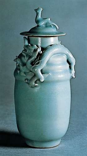
TAG Kyoto kyo-no-oto ryokuyuiro TAG is a stationary shop in Kyoto (Japan) that produces some interesting soft watercolour-style inks. With the kyo-no-oto series they produce a line of inks that replicates traditional Japanese dye colours. According to available only info, the manufacturing process of the kyo-no-oto inks follows traditional dying techniques dating back to the Heian era between the years 794 and 1185. The inks come in 40 ml bottles, packaged in luxurious thick paper with a texture that feels like heavy watercolour paper. For this review, ryokuyuiro is the shimmering star in the spotlight. Like so many other ink producers recently, TAG Kyoto also jumped on the glitter-ink bandwagon. With this ink, they added some silver glitter – fortunately, they didn’t exaggerate with the glitter particles. And even more fortunately, the glimmer isn’t there to cover up for a boring ink colour. Personally, I just ignored the glitter – don’t shake the bottle before filling your pen, and all the silver dust particles remain at the bottom. Ryokuyuiro is a beautiful muted green with strong blue undertones. Not yet a teal, but definitely reaching towards blue territory. A dangerous colour spectrum to explore, but this kyo-no-oto ink manages to walk the fine line. It could easily have been a failure, but with ryokuyuiro the result is a stunning ink colour. The ink’s name is derived from the ryokuyu glaze, which produces a green colour in pottery. It is one of the oldest glazes and was already used in China in BC. In Japan, it has been produced since the Heian period and has been favoured by many aristocrats. The ink captures the colour wonderfully well – a soft pastel-like dusty dark green with that beautiful blue undertone. This colour caters perfectly to my personal taste – a great ink to start off the new year! The ink feels fairly wet and well-lubricated, especially when compared with others in the kyo-no-oto series. In fact – I would recommend using the ink with drier pens. With dry pens, ryokuyuiro looks even more dusty, and shows some really elegant & expressive shading. The ink is not without its flaws though: on more absorbent paper it has a slight tendency to feather, and with lower quality paper it definitely suffers from see-through and some bleed-through. But use this ink with good quality and hard-surface paper and you will be in writer’s heaven! To show you the impact of saturation on the ink’s look & feel on paper, I made some scribbles where I really saturated portions of a strip of 52 gsm Tomoe River paper with ink. This gives you a good idea of what the ink is capable of in terms of colour range. Ryokuyurio has a medium colour span, with a soft contrast between the light and darker parts. At the lighter end, the blue undertones are clearly visible. At the dark end, you get that yummy dusty dark green. In writing, this translates to soft and aesthetically pleasing shading that adds both character and beauty. Nicely done! Before doing the saturation sample, I stirred the bottle of ink to activate the shimmer. The silver glitter particles are present, but not in-your-face. They are mostly visible when looking at the paper from a fairly steep angle. See the picture below for some glitter in action: The ink’s chromatography shows the dusty character of the ink, and the delicate mix of yellow and blue dyes. TAG Kyoto’s ink masters balanced the dye mix extremely well, providing us with a beautiful soft & dusty blue-leaning green. Kudos! The bottom part of the chroma already suggests that this is not a water resistant ink. This is confirmed in the water test at the end of this review: ryokuyuiro cannot survive watery accidents. I’ve tested the ink on a wide variety of paper – from crappy Moleskine to high-end Tomoe River. On every small band of paper I show you: An ink swab, made with a cotton Q-tip 1-2-3 pass swab, to show increasing saturation An ink scribble made with an M-nib Lamy Safari The name of the paper used, written with a Pelikan M200 with M cursive italic nib (and with the shimmer activated) A small text sample, written with an M-nib Pelikan M120 Green-Black Source of the quote, with a B-nib Lamy Safari Drying times of the ink on the paper (with the M-nib Safari) Since this is my first review of 2022, you get a new set of quotes. This year, quotes originate from Dennis Taylor’s Bobiverse novels. Original SciFi novels with a strong humorous touch, and lots of references to the Star Trek and Star Wars universe (it helps when you know this stuff, otherwise you might miss the relevance of e.g. a reference to the Kobayashi Maru scenario). I really enjoyed reading these novels. Ryokuyuiro looks beautiful on all types of paper – it shows it muted pastel-like character really well on both white and creamy paper. The ink exhibits a small amount of feathering on lower quality paper, together with definite show-through and bleed-through. With hard-surface high-quality paper none of these shortcomings appear. Drying times with the Safari M-nib are mostly in the 5 to 10 second range. I’ve also added a few photos to give you another view on the ink. Scanned images and photos often capture different aspects of the ink’s colour & contrast. That’s why I present them both. In this case, both scan and photo capture ryokuyuiro’s colour equally well. Writing with different nib sizes The picture below shows the effect of nib sizes on the writing. Ryokuyuiro can handle the complete nib-range without any problem. It shows truly elegant and expressive shading, even with the finer nibs. The ink’s dusty character is best expressed when using drier pens like the Lamy Safari. With wetter pens you get stronger saturation, and some of that dustiness gets lost. Anyway – the ink manages to look stunning and beautiful no matter what combination of pen and nib you use. Related inks To compare the dusty-green ryokuyuiro with related inks, I use my nine-grid format with the currently reviewed ink at the center. This format shows the name of related inks, a saturation sample, a 1-2-3 swab and a water resistance test – all in a very compact format. I don’t have enough inks in this colour-range to fill the grid, so I had to add a few more distant relatives. Mont Blanc Jungle Green comes close, as does the Murky Waters ink mix (3 parts Pelikan Edelstein Jade – 2 parts Pelikan Edelstein Onyx). Inkxperiment – aboriginal lizard With every review, I add an inkxperiment using only the ink I am presenting. Such a one-ink drawing works great to show off the colour-range nuances that are present in the ink. These inkxperiments are the favourite part of my reviews: always loads of fun and a perfect way to experiment with inks using a number of different techniques. I recently viewed a documentary on Australian Aboriginal culture, where the gecko lizard represents the deity Adnoartina. Inspiration for this inkxperiment comes from an aboriginal art drawing I saw on Pinterest. I started with an A4 piece of 300 gsm watercolour paper. To paint the background, I used heavily water-diluted ink – which brings the blue undertones of ryokuyuiro to the foreground. Next I coloured in the lizard figure with my Lamy Safari B-nib fountain pen filled with pure ryokuyuiro. I finally used an old Kaweco sport filled with bleach to outline the lizard’s silhouette. Bleach reacts nicely with ryokuyuiro, producing a golden colour. As a finishing touch, I stamped in the lizard’s paw prints with a self-made rubber stamp. The resulting drawing shows what can be achieved with this soft pastel-like green in a more artistic context. Conclusion TAG Kyoto kyo-no-oto ryokuyuiro is a stunning dusty blue-leaning green, that implements this difficult colour range superbly well. It’s so easy to miss the mark here – add too much blue, and you’re in teal territory. With ryokuyuiro, the balance is perfect and results in a soft & elegant pastel-tinted green. Wonderful stuff and a great way to start off the new year! Technical test results on Rhodia N° 16 notepad paper, written with Lamy Safari, M-nib Back-side of writing samples on different paper types
- 10 replies
-
- tag kyoto
- kyo-no-oto
-
(and 2 more)
Tagged with:
-
TAG Kyoto – kyo-no-oto – keshimurasaki TAG is a stationary shop in Kyoto (Japan) that produces some interesting soft watercolour-style inks. With the kyo-no-oto series they produce a line of inks that replicates traditional Japanese dye colours. According to available online info, the manufacturing process of the kyo-no-oto inks follows traditional dying techniques dating back to the Heian era between the years 794 and 1185. The inks come in 40 ml bottles, packaged in luxurious thick paper with a texture that feels like heavy watercolour paper. In this review I take a closer look at keshimurasaki. This ink is supposedly inspired by the formal kimono dresses during the Heian era, when Kyoto was the capital of Japan. 'Keshi' means 'off' and 'murasaki' means 'purple' - this quite accurately describes the blue-purple-grey colour of this ink. This definitely is my type of ink: an unsaturated soft pastel-type colour, shadowy and smoky, with an elegant complexity. A word of warning though: be aware that this is a very dry ink, that is not meant to be used with dry pens. My traditional Lamy Safari test pens were totally not OK with this ink. Very dry feeling, scratchy writing, really undersaturated. This is easily solved by using a wet pen - with my wet-writing Pelikan pens, keshimurasaki transforms into a real beauty. For this review I use Pelikan pens with F, M and B nib sizes. With these pens, the ink lays down an elegant grey line, with blue-purple undertones. You also get really sophisticated and aesthetically pleasing shading. And with a wet pen, the ink writes much more smoothly. It's still a bit dry, but that's easily forgotten when you see the beautiful result of your writing. To show you the impact of saturation on the ink's look & feel on paper, I made some scribbles where I really saturated portions of the Tomoe River paper with ink. This gives you a good idea of what the ink is capable of in terms of colour range. As you can see, keshimurasaki has a broad colour range. This ink moves from a very undersaturated smoky blue-purple-grey, darkening significantly as more layers are added. Nice! The ink's chromatography shows a wonderfully complex mix of muted pastel-like dyes. The resulting mix is definitely a grey, leaning to the blue or the purple depending on variables like light, paper, ... keshimurasaki is an ink with character! The bottom part of the chroma seems to indicate that there is some measure of water-resistance, but alas... in practice the ink shows zero tolerance for water (both with still and running water). On the other hand, keshimurasaki has no problem with smudging - the text shows little to no smearing when rubbed with a most Q-tip cotton swab. I've tested the ink on a wide variety of paper - from crappy Moleskine to high-end Tomoe River. On every small band of paper I show you: An ink swab, made with a cotton Q-tip 1-2-3 pass swab, to show increasing saturation An ink scribble made with an F-nib Pelikan M800 The name of the paper used, written with an M-nib Pelikan M400 A small text sample, written with the F-nib Pelikan M800 Drying times of the ink on the paper (with the F-nib Pelikan) Keshimurasaki behaves well on my test papers, with no visible feathering. The only exception is the horrible Moleskine paper - here the ink suffers from lots of feathering, see-through and bleed-through. Drying times vary and are mostly in the 10-15 second range (with the F-nib Pelikan). With the wet Pelikans keshimurasaki looks great: a muted grey, with hints of blue-purple, and with elegant shading. A real joy! Writing with different nib sizes The picture below shows the effect of nib sizes on the writing. The top lines were written with my typical Safari test pens. This is just to illustrate that keshimurasaki is not a great companion for dry pens. The rest of the writing sample shows the ink with some wet-writing Pelikan pens with F-M-B nib sizes. With the wet pens, the ink looks well-saturated, shows good contrast and some nice shading. It's still a touch dry, but this does not detract from the writing experience. Related inks To compare keshimurasaki with related inks, I use my nine-grid format with the currently reviewed ink at the center. This format shows the name of related inks, a saturation sample, a 1-2-3 swab and a water resistance test - all in a very compact format. Inkxperiment – For Dulcinea ! With every review, I try to create an interesting drawing using only the ink I'm working on. Such a one-ink drawing is excellent for showing the different colour-range nuances of the ink. These drawings are always my favourite part of the ink review: often challenging, but always great fun. For this drawing inspiration comes from the Miguel de Cervantes novel I'm currently reading. I started with a sheet of 300 gsm rough watercolour paper. With a simple Q-tip I painted in the background. I then added the man from La Mancha and the wind-mill with the fountain pen. With the Q-tip I added more and more ink to different parts of the drawing, resulting in the darker areas. I really enjoyed keshimurasaki - its broad tonal ranges makes it an excellent ink to draw with. Conclusion TAG kyo-no-oto keshimurasaki probably is not for everyone. You really need wet pens to reach the ink's potential. But then you are rewarded with a sophisticated grey with blue-purple undertones. A muted and shadowy colour that looks totally beautiful on the page. This is my type of colour, and I really enjoyed it ! Technical test results on Rhodia N° 16 notepad paper, written with Lamy Safari, M-nib Back-side of writing samples on different paper types From Idea to Drawing The idea for this inkxperiment comes from the Don Quichote novel I'm currently reading. Not unexpectedly, the iconic fight with the wind-mill is a totally logical choice for this drawing's topic. I'm really bad at doing realistic drawings, so I naturally tend to a naïve and child-like style ;-) I started with some rough ideas, and a simple sketch of the composition I wanted to achieve. Next I used a sheet of 300 gsm rough watercolour paper, and painted in the background with a Q-tip cotton-swab, lightly dipped in the bottle of keshimurasaki. The rough paper allows for some nice-looking textures. I then sketched in the drawing's subjects with my fountain pen. Once satisfied with the composition, I accentuated the drawing's outline, and added multiple layers of ink with the Q-tip. I finished the piece by adding the sun in the sky, and some trees on the horizon. The toolset for this inkxperiment was really simple: some Q-tips, a fountain pen and the bottle of ink. The resulting drawing shows quite well the tonal range that can be obtained with this beautiful grey ink from the kyo-no-oto series.
- 15 replies
-
- tag kyoto
- kyo-no-oto
-
(and 3 more)
Tagged with:
-
TAG Kyoto – kyo-no-oto adzukiiro TAG is a stationary shop in Kyoto (Japan) that produces some interesting soft watercolour-style inks. With the kyo-no-oto series they produce a line of inks that replicates traditional Japanese dye colours. According to available online info, the manufacturing process of the kyo-no-oto inks follows traditional dying techniques dating back to the Heian era between the years 794 and 1185. The inks come in 40 ml bottles, packaged in luxurious thick paper with a texture that feels like heavy watercolour paper. In this review the spotlight shines on adzukiiro, a burgundy wine-red ink that really succeeds in its implementation of this fairly difficult colour. Often too red, too purple or too brown, but with adzukiiro the balance is just right - I like what I see! A fine ink for the autumn/winter season, and one that works well with all pens and nib sizes. I especially liked this ink in broad stubs, where the shading becomes truly beautiful … a really classy look. The ink is named after the colour of adzuki beans, which are the most important legume in Japan after the soy bean. Red-coloured adzuki beans were believed to have the effect of quelling negative vibes and bad luck, and were frequently used during ceremonial activities. The ink writes with good lubrication in my Safari test pens, not at all dry like some other kyo-no-oto inks. It easily handles the complete range of nib sizes, and manages to look well-saturated even with the finest nibs. Shading is subdued but definitely present, especially in the broader nibs. With wet pens and broad nibs, the dark parts look almost black, contrasting nicely with the burgundy lighter parts. The result just looks stunning! This is one ink that I will use primarily with very broad nibs. I’ve tested quite a number of TAG Kyoto inks to date, and most of them operate well above the average. With the kyo-iro and kyo-no-oto inks, TAG Kyoto has two well-performing ink families, that continue to impress me. Wonderful inks that totally fit my tastes. I’m really glad that I discovered them. To show you the impact of saturation on the ink’s look & feel on paper, I made some scribbles where I really saturated portions of a strip of 52 gsm Tomoe River paper with ink. This gives you a good idea of what the ink is capable of in terms of colour span. As you can see, adzukiiro has a medium colour range. The ink moves from a fairly light burgundy to a much darker – almost black – wine-red, while keeping a nice balance between these extremes. In writing, this translates to subtle shading which is aesthetically very pleasing. Shading keeps in the background with finer nibs (up to M-size). You really need broad and broader nibs to get the great-looking prominent shading that is – in my opinion – the selling point for this ink. The ink’s chromatography shows a wonderful complexity with different hues of blue, purple and red in the mix. The grey-blue dyes fix more readily to the paper, while the red dyes are much less water-resistant. The bottom part of the chromatography seems to indicate a small measure of water-resistance. But no… the water test clearly shows that what’s left on the paper is unreadable. Adzukiiro is not water-resistant at all. I’ve tested the ink on a wide variety of paper – from crappy Moleskine to high-end Tomoe River. On every small band of paper I show you: An ink swab, made with a cotton Q-tip 1-2-3 pass swab, to show increasing saturation An ink scribble made with an M-nib Lamy Safari The name of the paper used, written with an Esterbrook Estie with 1.1 stub nib A small text sample, written with a TWSBI VAC Mini with M-nib Source of the quote, with a B-nib Lamy Safari Drying times of the ink on the paper (with the M-nib Safari) This TAG Kyoto adzukiiro looks great on all my test papers. There is a tiny amount of feathering on the more absorbent papers, but you almost need a magnifying glass to notice it. See-trough and bleed-through are no issue – except with the Moleskine paper, but even here it is quite acceptable. Drying times vary widely with paper type: close to the 5-second mark with absorbent paper, close to the 15-20 second mark on paper with a harder surface. The ink looks great on both white and more yellow paper. Like many inks in this colour range, it’s difficult to capture adzukiiro’s true colour with a scan – it just looks too purple! For this reason, I decided to use photo’s of the writing samples – these best capture the ink’s natural colour. Below a more close-up photo of the ink. Just look at that beautiful shading in the word “Paperblanks” – black and dark burgundy from a 1.1 stub nib. This ink simply shines with extra-broad nibs! Writing with different nib sizes The picture below shows the effect of nib sizes on the writing. Kyo-no-oto adzukiiro can handle all nib sizes without a problem. With the EF nib, you still get a nicely saturated and lovely-looking line. For prominent shading you need the broader nibs though – B and above. Really worth it … adzukiiro looks at its best with these very broad nibs. Related inks To compare the wine-red adzukiiro with related inks, I use my nine-grid format with the currently reviewed ink at the center. This format shows the name of related inks, a saturation sample, a 1-2-3 swab and a water resistance test – all in a very compact format. This kyo-no-oto ink looks like a slightly more saturated version of Papier Plume Red Beans and Rice. Note that in this scan, both Super5 Australia Red and Diamine Merlot look too brown. In reality they are a much better match with adzukiiro … like I said before, these ink colours are devilishly difficult to capture with a scan. Inkxperiment – zen in the city With every review, I try to create an inkxperiment using only the ink I’m working on. Such a one-ink drawing is a great way to show off the colour-range nuances that are present in the ink. These inkxperiments are the favourite part of my reviews: always great fun and a good way to stretch my creativity and drawing skills. Modern life can get really hectic and stressful at times. I’ve just come to the end of such a period… we started this academic year at Leuven University in on-campus mode. After more than a full year of remote learning (a result of the covid19 virus), that meant there was quite a lot of IT-work to get our campuses ready for on-site mode… installing extra WiFi, CO2 sensors, … – as always – most of this last-minute 😉 At the end of such a busy work-day, I often take a walk at the nearby “Abdij van Park” … an oasis of zen, and an ideal environment to unwind. I tried to capture this zen-like moment in this inkxperiment… with the fisherman finding his place of quiet in the busy cityscape. I started with a quick outline sketch of the drawing I wanted to make. I used an A4 piece of 300 gsm rough watercolour paper, on which I drew a background with water diluted adzukiiro. For the city buildings, I used Q-tips and multiple water-ink ratios. The rest of the painting was drawn with an M- and B-nib Lamy Safari. For the darker subjects (train and electricity wires), I used an Esterbrook Estie with a 1.1 stub nib. Because adzukiiro scans badly, I used a photo to capture the true colours in this inkxperiment. The resulting drawing shows really well the colour-range nuances that can be achieved with this TAG Kyoto ink. I’m quite impressed with the broad tonal range that can be extracted from this one ink. A fine drawing ink! Conclusion TAG Kyoto kyo-no-oto adzukiiro is a well-executed wine-red burgundy ink. This one works with all nib sizes and with all types of paper. I especially liked this ink with super-broad nibs, where the shading becomes truly beautiful. Adzukiiro is also a great drawing ink, with a broad tonal range. Overall, another fine example of the craftsmanship of TAG Kyoto’s inkmasters. Technical test results on Rhodia N° 16 notepad paper, written with Lamy Safari, M-nib Back-side of writing samples on different paper types
- 6 replies
-
- tag kyoto
- kyo-no-oto
-
(and 3 more)
Tagged with:
-
TAG Kyoto – kyo-no-oto ochiguriiro TAG is a stationary shop in Kyoto (Japan) that produces some interesting soft watercolour-style inks. With the kyo-no-oto series they produce a line of inks that replicates traditional Japanese dye colours. According to available only info, the manufacturing process of the kyo-no-oto inks follows traditional dying techniques dating back to the Heian era between the years 794 and 1185. The inks come in 40 ml bottles, packaged in luxurious thick paper with a texture that feels like heavy watercolour paper. In this review I take a closer look at ochiguriiro, a soft warm brown that works great as a journaling ink for the late-winter season in my part of the world. The colour is supposedly named after the colour of freshly fallen chestnuts. An interesting brown, this one, with a colour that sits somewhere between iroshizuku yama-guri and J. Herbin Lie de Thé. Quite different from the other brown inks in my collection. This ink was a welcome surprise after the dry to very dry kyo-no-oto inks I tried earlier. It writes wet with excellent lubrication, even in the drier Lamy Safari pens. It’s also a well-saturated ink that can handle all nib sizes, including the finer ones. I prefer the ink’s look in finer nibs, where it produces a softer pastel-brown line. My perfect pairing is with a Pelikan M400 Tortoiseshell Brown with a fine cursive-italic nib (see nib sizes sample below) – this combination of ink & pen looks simply gorgeous. To show you the impact of saturation on the ink’s look & feel on paper, I made some scribbles where I really saturated portions of the Tomoe River paper with ink. This gives you a good idea of what the ink is capable of in terms of colour range. Ochiguriiro has a fairly broad contrast range. Fortunately, there is no harsh contrast between the light and dark parts. As a result you get strong shading that avoids being excessive, giving extra elegance to your writing. Well executed! The chromatography shows the complex nature of this kyo-no-oto ink, with dark red-orange and grey-blue in the mix. The bottom part of the chroma suggests a fair amount of water resistance, but this is not reflected in the real world. With water tests, there does remain a ghosting image of your writing on the paper, but it’s very faint making it nigh impossible to reconstruct your writing. Not an ink that can survive watery accidents. I’ve tested the ink on a wide variety of paper – from crappy Moleskine to high-end Tomoe River. On every small band of paper I show you: An ink swab, made with a cotton Q-tip 1-2-3 pass swab, to show increasing saturation An ink scribble made with an M-nib Lamy Safari The name of the paper used, written with a B-nib Lamy Safari A small text sample, written with the M-nib Safari Source of the quote, with a Pelikan M400 wit F cursive italic nib Drying times of the ink on the paper (with the M-nib Safari) Ochiguriiro works well with all test papers, with just the tiniest bit of feathering on the low quality papers (Moleskine, cheap notepad & copy paper). No issues with show-through or bleed-through, with the exception of the crappy Moleskine. Drying times are mostly in the 5 to 10 second range with the Lamy Safari M-nib. I like this kyo-no-oto ink best on the creamy paper, where it gains extra warmth and softness. Very nice-looking brown! I’ve also added a few photos to give another view on the ink. In this case, the scanned images seem to capture the ink’s actual colour best. Writing with different nib sizes The picture below shows the effect of nib sizes on the writing. Kyo-no-oto ochiguriiro lays down a wet and fairly saturated line in all nib sizes. This one easily handles F and EF nibs – it evens shows some shading with the EF nib, which is not a mean feat. My perfect pairing for this ink is my Pelikan M400 Tortoiseshell Brown with an F cursive italic nib I bought from fpnibs.com. With this combo the ink looks gorgeous – you get really elegant shading and line variation. Just perfect! Related inks To compare this soft warm brown with related inks, I use my nine-grid format with the currently reviewed ink at the center. This format shows the name of related inks, a saturation sample, a 1-2-3 swab and a water resistance test – all in a very compact format. Ochiguriiro is quite different from my other browns. My first thought when using the ink was that it looked similar to Lie de Thé or Edelstein Smoky Quartz. But in a side-by-side comparison, ochiguriiro looks more of a grey-brown. Not as grey a brown as iroshizuku yama-guri though. This ink sits somewhere in the middle between grey- and yellow-brown. Inkxperiment – playtime I find great satisfaction in creating inkxperiments using only the ink I’m working on. A fun and at the same time challenging way to show off the colour-range nuances that are present in the ink. And I definitely enjoy the monochromatic look of the resulting drawings. For this inkxperiment, I decided on an interpretation of a cat playing with a mouse. I’m lousy at realistic-looking drawings, and therefore tend to go for a more abstract interpretation. Ochiguriiro with its broad colour span made it easy to get a good-looking result. I started with an A4 piece of watercolour paper. I first drew in the cat figure with a pencil, and then painted in the checkered background with heavily water-diluted ink. As a next step, I coloured the cat figure while adding ever more ink to the mix. Final accents on the cat and the drawing of the mouse were added with my Lamy fountain pen and pure ochiguriiro. The resulting picture shows what can be achieved when using this kyo-no-oto as a drawing ink. Drawing with ink is fun but challenging. You can’t paint over ink to correct mistakes – it just doesn’t work. So I learned to live with less than perfection, and tolerate errors in the drawing as being part of the creative process. And this drawing definitely has its number of mistakes: the square next to the cat’s head is too wide, some bleed-out of ink in the cat’s body, and the cat’s ears are out of proportion. But who cares… I had great fun drawing this one. Conclusion I’ve tried a number of TAG Kyoto inks to date, and love them all. This line of inks really fits my taste – I’m glad I discovered them. Ochiguriiro is a surprisingly wet and satured ink in the kyo-no-oto series. An earthy brown – sitting somewhere between grey-brown and yellow-brown - that looks great on creamy paper. I was impressed with the shading in this ink – quite heavy but still not harsh – really well executed in my opinion. If you enjoy warm brown inks, this one is certainly worth a closer look. Technical test results on Rhodia N° 16 notepad paper, written with Lamy Safari, M-nib Back-side of writing samples on different paper types
- 8 replies
-
- tag kyoto
- kyo-no-oto
-
(and 2 more)
Tagged with:
-
TAG Kyoto – kyo-no-oto kokeiro TAG is a stationary shop in Kyoto (Japan) that produces some interesting soft watercolour-style inks. With the kyo-no-oto series they produce a line of inks that replicates traditional Japanese dye colours. According to available only info, the manufacturing process of the kyo-no-oto inks follows traditional dying techniques dating back to the Heian era between the years 794 and 1185. The inks come in 40 ml bottles, packaged in luxurious thick paper with a texture that feels like heavy watercolour paper. For this review, kokeiro is the shining star in the spotlight. The olive-green ink’s name is inspired by old mossy trees and stones that can often be found in Kyoto’s beautiful gardens. It is a symbol of the Wabi-Sabi aesthetics that permeates Japanese culture. According to Wikipedia, the Wabi-Sabi world view is centered on the acceptance of transience and imperfection. The aesthetic is sometimes described as one of appreciating beauty that is “imperfect, impermanent and incomplete.” The yellow-green kokeiro embodies this aspect well. It is a beautiful ink with intricate complexities, but also with its share of imperfections that make you appreciate its beauty even more. With the right combination of the holy trio ink-pen-paper, kokeiro can get an almost old-green-gold shine that looks truly beautiful. This is not a workplace ink, but one for personal and intimate writing. I am totally enamored by this kyo-no-oto ink! The ink is not meant for dry pens – these don’t give it enough room to express its beauty. Kokeiro is at its best with wet pens and broader nibs (M and above), where it showcases its dreamy beauty, laying down a well-saturated line with truly stunning shading. With dry pens and/or fine nibs, the ink not only feels unlubricated, but the ink is also too unsaturated resulting in an overly light line that makes it difficult to read. Choice of paper is also important: kokeiro feels not so great in combination with hard-surface paper. I like it most on slightly absorbent paper. But once you hit the right combination, I guarantee you writer’s heaven! Kokeiro is a perfect companion for my Pelikan M400 White Tortoise. The gold-green colour almost exactly matches the colour of the Pelikan's binde. To show you the impact of saturation on the ink’s look & feel on paper, I made some scribbles where I really saturated portions of a strip of 52 gsm Tomoe River paper with ink. This gives you a good idea of what the ink is capable of in terms of colour range. Kokeiro has a fairly broad dynamic range, ranging from a light yellow-green to a much darker olive-green. The contrast between light and dark is not harsh though. This translates to strong but still soft and aesthetic shading, that really adds character and beauty to your writing. Well executed! The ink’s chromatography is a work of beauty, and shows the craftsmanship of TAG Kyoto’s ink masters. The subtle and complex mix of light-blue and yellow dyes combines to the soft beauty of the olive-green kokeiro. The bottom part of the chroma seems to indicate a certain measure of water resistance, but in reality this is not the case. Kokeiro is not an ink that can survive watery accidents. I’ve tested the ink on a wide variety of paper – from crappy Moleskine to high-end Tomoe River. On every small band of paper I show you: An ink swab, made with a cotton Q-tip 1-2-3 pass swab, to show increasing saturation An ink scribble made with an M-nib Lamy Safari The name of the paper used, written with a B-nib Pelikan M200 A small text sample, written with a B-nib Nakaya (western fine) Source of the quote, with a Pelikan M400 with M nib Drying times of the ink on the paper (with the M-nib Safari) Kokeiro looks good on all types of paper – both white and creamy ones. The ink shows a small amount of feathering on lower quality paper, together with some show-through and bleed-through. With hard papers, I personally found the ink to feel fairly unlubricated, which detracts from the writing experience. Kokeiro seems to prefer slightly more absorbent paper. Drying times with the M-nib Safari are in the 5 second range. With the wet M-nib Pelikan the drying time approximately doubles. I really enjoyed the ink most with a wet B-nib Pelikan in my Paperblanks Embellished Manuscript journal. I’ve also added a few photos to give you another view on the ink. Scanned images and photos often capture different aspects of the ink’s colour & contrast. That’s why I present them both. In this case, the photo’s capture kokeiro’s colour best – the scans of the writing samples seem to be a bit too yellow. Writing with different nib sizes The picture below shows the effect of nib sizes on the writing. The top part shows kokeiro with my Safari pens in different nib sizes. Here the ink is too unlubricated, and lays down too light a line. This TAG Kyoto ink should definitely be used with wet pens and broader nibs, like the pens I used in the bottom part. Combine broad & wet, and kokeiro blossoms, rewarding you with a surreal beauty. The strong shading and soft olive-green colour combine to create a richness and elegance that lift your writing to a whole new level. Related inks To compare the olive-green kokeiro with related inks, I use my nine-grid format with the currently reviewed ink at the center. This format shows the name of related inks, a saturation sample, a 1-2-3 swab and a water resistance test – all in a very compact format. I don’t have enough inks in this colour-range to fill the grid, so I had to add an number of more distant relatives. The Noir Dorée is not a commercial ink, but a 5:1 mix of Callifolio Heure Doréé and Noir. The ink I found most similar is Diamine Wagner, which seems to be a bit more yellow, but looks quite alike in writing. I will definitely explore this further in a future ink shoot-out. Inkxperiment – forest god With every review, I try to create an inkxperiment using only the ink I am presenting. Such a one-ink drawing works great to show off the colour-range nuances that are present in the ink. These inkxperiments are the favourite part of my reviews: always loads of fun and a perfect way to experiment with inks using a number of different techniques. In a previous review I introduced a river goddess. This inkxperiment continues on that same theme, and shows a forest god, with the yellow-green representing the golden sunrays shining through the green forest canopy. The forest god is inspired by the Celtic horned god Cernunnos – see the corresponding Wikipedia entry for more information. I started with an A4 piece of HP photo paper, and a small doodle in my daily journal. To paint the background, I dripped ink in different water/ink ratios on a piece of kitchen towel. The ink transfers to the photo paper through the kitchen towel, creating the background pattern of the forest floor. I used a cutout of Cernunnos to draw his silhouette on the photo paper, and then used a brush and fountain pen to paint in the forest god. The trees on the left were drawn in with a glass dip pen and pure kokeiro. Final touches were added with a B-nibbed Safari. The resulting drawing shows what can be achieved with this beautiful yellow-green ink in a more artistic context. Conclusion TAG kyo-no-oto kokeiro is a true Wabi-Sabi ink. An ink with imperfections and shortcomings, but that is also of a phenomenal beauty when pen/ink/paper come together in the right combination. I really like the softness and complexity of this TAG Kyoto ink. In my opinion, one of the successes in the kyo-no-oto series. Technical test results on Rhodia N° 16 notepad paper, written with Pelikan M400, M-nib Back-side of writing samples on different paper types
- 8 replies
-
- tag kyoto
- kyo-no-oto
-
(and 3 more)
Tagged with:
-
TAG Kyoto – kyo-no-oto – yamabukiiro TAG is a stationery shop in Kyoto (Japan) that produces some interesting soft watercolour-style inks. With the kyo-no-oto series they produce a line of inks that replicates traditional Japanese dye colours. According to available online info, the manufacturing process of the kyo-no-oto inks follows traditional dying techniques dating back to the Heian era between the years 794 and 1185. The inks come in 40 ml bottles, packaged in luxurious thick paper with a texture that feels like heavy watercolour paper. For this review, yamabukiiro takes the stage and fills it with its presence. This ink is named after the Yamabuki flower (“Mountain Breath”), that is found in abundance on Japanese mountainsides. The yellow-amber colour grabs your attention, not because it is bright and bold – au contraire – but because it is tender and soft, harmonious and elegant, and with a surprising depth of character. No ink for mundane work, but one that feels right at home for personal journaling. I guess there’s no need to tell you that I like this ink – a lot! The ink writes moderately wet in my standard Lamy Safari M-nib test pen, but with fairly low lubrication. I also found the ink to be too light and low-contrast with the dry-writing Safari. You really need a wet pen to make this ink blossom and to unlock its full potential – it works great with e.g. a Pelikan, even when using an F-nib. With the Pelikan, the ink has decent saturation, and also shows its subtle complexity with a hint of green in the undertones. The TAG Kyoto inks share a common gene-pool, which consistently delivers nicely muted, elegant, good-looking inks. They totally fit my taste, and I’m quite glad that I discovered them. To show you the impact of saturation on the ink’s look & feel on paper, I made some scribbles where I really saturated portions of a strip of 52 gsm Tomoe River paper with ink. This gives you a good idea of what the ink is capable of in terms of colour range. Yamabukiiro has a fairly broad dynamic span, ranging from a wispy light-yellow to a fairly dark amber with a touch of green. Despite this broad range, there is no harsh contrast between the light and darker parts. This translates to subtle shading, definitely present but never too strong. This aesthetic shading adds character to your writing. The ink’s chromatography shows the subtle depth and complexity of the dye-mix. The ink’s base colour derives from the yellow and orange dyes. The depth and character come from the blue component, that combines with the yellow to produce the ink's green undertone. This is without a doubt the work of a master mixer! I’ve tested the ink on a wide variety of paper – from crappy Moleskine to high-end Tomoe River. On every small band of paper I show you: An ink swab, made with a cotton Q-tip 1-2-3 pass swab, to show increasing saturation An ink scribble made with an M-nib Lamy Safari The name of the paper used, written with a B-nib Lamy Safari A small text sample, written with an F-nib Pelikan M600 Source of the quote, with a Pelikan M200 with M nib Drying times of the ink on the paper (with the M-nib Safari) Yamabukiiro looks good on all types of paper. Personally though, I like it best on pure-white paper. The ink performs well on my test papers, even on the Moleskine paper (which is quite an accomplishment). With the lower-quality paper (Moleskine, generic notepad paper) there is a certain amount of bleed-through. Drying times are mostly around the 5 to 10 second mark. Water resistance is clearly absent – this ink won’t survive watery accidents. If you are in the habit of tipping your drink over your notebook, this is no ink for you 😉 I’ve also added a few photos to give you another view on the ink. Scanned images and photos often capture different aspects of the ink’s colour & contrast. That’s why I present them both. In this case, both scanner and photo capture yamabukiiro’s golden glow fairly well. Writing with different nib sizes The picture below shows the effect of nib sizes on the writing. In my opinion, kyo-no-oto yamabukiiro really requires a wet pen. It is too light for my taste in the dry-writing Safari. With the wetter pen, the sub-par lubrication of this ink mostly disappears. Also, the ink becomes more saturated, gains more depth and brings forth its green undertones. The wet pen really shows off the ink’s golden radiance. Related inks To compare the yellow-amber yamabukiiro with related inks, I use my nine-grid format with the currently reviewed ink at the center. This format shows the name of related inks, a saturation sample, a 1-2-3 swab and a water resistance test – all in a very compact format. This kyo-no-oto ink is different from my other yellow-gold-amber inks, and as such a welcome complement to my ink collection. Inkxperiment – genesis With every review, I try to create an inkxperiment using only the ink I am presenting. Such a one-ink drawing works great to show off the colour-range nuances that are present in the ink. These inkxperiments are the favourite part of my reviews: always loads of fun and a perfect way to experiment with inks using a number of different techniques. Yellow inks are often great for drawing, and this TAG Kyoto ink is no exception! Inspiration for this drawing comes from the cycle of life – a seedling starts growing, and metamorphoses into a beautiful flower. I started with an A4 piece of HP photo paper, onto which I drew the background with water-diluted ink, spread on the paper through a kitchen towel. I also used a piece of carpet anti-slip underlay to add some background accents. I next used different-sized glass jars to stamp in the enlarging circles that represent the seed’s growth. Finally I drew in the flowers to complete the drawing. The end result is not too bad, and shows what can be achieved with this beautiful yellow-amber ink in a more artistic context. Conclusion TAG kyo-no-oto yamabukiiro is a great journaling ink – a complex yellow-amber with a unique colour that is both soft and elegant. The ink works best in wet pens, where it can express itself in full saturation, showing its golden glow with subtle green undertones. A truly beautiful ink, that makes a great impression! In my opinion, you can’t go wrong with this ink – a piece of art from the master mixer at TAG Kyoto. Technical test results on Rhodia N° 16 notepad paper, written with Pelikan M600, F-nib Back-side of writing samples on different paper types
- 10 replies
-
- tag kyoto
- kyo-no-oto
-
(and 3 more)
Tagged with:
-
TAG Kyoto – kyo-iro – Flaming Red of Fushimi TAG is a stationary shop in Kyoto (Japan) that produces some interesting soft watercolour-style inks. With the kyo-iro series they produce a line of inks that that are inspired by the city’s many beautiful and historic sights. Each of these inks is dedicated to a specific town in the Kyoto area. The inks come in 40 ml bottles, packaged in luxurious thick paper with a texture that feels like heavy watercolour paper. In this review the center stage is taken by Flaming Red of Fushimi. The vermillion red colour of this ink is a reference to the vibrant torii gates of the Fushimi Inari shrine, that is home to the revered Inari god of abundant harvests, thriving businesses, safe homes & family. This ink’s colour ranges from a soft rose-red in dry pens to more of a crimson red in wet pens. Use it in a Lamy Safari and you get the soft rose-red look, with subdued shading and a very delicate feel. In a wet pen (like a Pelikan), Flaming Red of Fushimi transforms to a heavily saturated red that loses most of the shading. Personally, I much prefer this kyo-iro ink’s character in the dry pen: soft, subdued, delicate writing that simply looks lovely! And yes, like other TAG Kyoto inks, it feels fairly dry – but if that’s the price to pay for delicate beauty, then I can live with it. Flaming Red of Fushimi works well with all nib sizes, with enough saturation in even the finest nibs. Be aware that it does feel very dry in EF/F nibs combined with dry pens. On the plus side, this ink looks good on both white and cream paper. To show you the impact of saturation on the ink’s look & feel on paper, I made some scribbles where I really saturated portions of the 52 gsm Tomoe River paper with ink. This gives you a good idea of what the ink is capable of in terms of colour range. Flaming Red of Fushimi has a moderate colour span. This should translate to soft shading, but this only happens in dry pens. With a wet pen, the ink becomes really saturated and drowns out the shading. The ink’s chromatography shows uniform & monochromatic red tones. From the bottom part of the chroma you can already derive that this is not a water-resistant ink. Most of the colour dissipates with water. I’ve tested the ink on a wide variety of paper – from crappy Moleskine to high-end Tomoe River. On every small band of paper I show you: An ink swab, made with a cotton Q-tip 1-2-3 pass swab, to show increasing saturation An ink scribble made with an M-nib Lamy Safari The name of the paper used, written with a B-nib Lamy Safari A small text sample, written with the M-nib Safari Source of the quote, with an Edison Collier with M nib Drying times of the ink on the paper (with the M-nib Safari) The ink looks great on all papers – both the white and creamy ones in my test set. Show-through and bleed-through are no problem at all – just a tiny bit of bleed-through on the horrible Moleskine paper. Drying times are in the 5 to 10 second range with the Lamy Safari M-nib. I didn’t find the ink “flaming” at all – the heat remains smoldering beneath the surface. This makes it a non-obtrusive red that is well-suited for marking up papers & articles. Since scans alone are not always enough to give you a complete picture of the ink, I also provide you with a few photos for an alternative look at Flaming Red of Fushimi. In this case, both the scans and photos seem to capture the ink equally well. Writing with different nib sizes The picture below shows the effect of nib sizes on the writing. Flaming Red of Fushimi writes with good contrast in all nib sizes, but feels very dry in the EF/F nibs. Writing quality improves substantially with wet pens. Nevertheless, I prefer to use this ink with a dry pen (like the Lamy Safari), where you get the delicate soft-rose look. A medium-wet pen like the Edison Collier provides a good middle ground: the colour still looks soft & subdued, with the added advantage that the dryness of the ink mostly disappears. Related inks To compare this kyo-iro red with related inks, I use my nine-grid format with the currently reviewed ink at the center. This format shows the name of related inks, a saturation sample, a 1-2-3 swab and a water resistance test – all in a very compact format. Robert Oster Fire Engine Red and Pelikan Edelstein Garnet are very similar looking reds. Inkxperiment – Fiery Flowers I love to experiment with my inks in an artistic context. With my inkxperiments, I limit myself to the single ink I’m reviewing, allowing me to explore all of its colour range nuances. I always enjoy this part of the review: experimenting with different techniques, and trying to coax many different shades of colour from the single bottle. The fiery flowers are a direct reference to the ink’s name: Flaming Red. For this drawing, I used an A4-sized piece of HP photo paper. I drew in the background by covering it with a paper towel, and painting water-diluted ink on it. The wooden grid pattern was drawn in with a piece of cardboard and pure ink. I next used a brush to paint in the flowers, and added texture using the Lamy Safari M/B fountain pens. And I totally forgot to make my usual drawing-construction photos… As is often the case with red inks, this one is difficult to draw with. Reds saturate quickly, which means that it’s difficult to control the contrast (as is evident with the flowers). Not the nicest drawing, but you do get an idea what Flaming Red of Fushimi is capable of in a more artistic context. Conclusion TAG kyo-iro Flaming Red of Fushimi ranges from a soft rose-red to a more vibrant vermillion red, depending on the dryness/wetness of your pen. I definitely prefer this ink in dry pens, where you get a soft & delicate rose-red with subdued shading. In wet pens, I find the ink a bit overwhelming. This is not the type of red I prefer – I like my reds much darker (think MB Shakespeare Velvet Red), but I can see myself using it for marking up papers/articles. A good ink, but not one that I get overly enthusiastic about. Technical test results on Rhodia N° 16 notepad paper, written with Lamy Safari, M-nib Back-side of writing samples on different paper types
-
TAG Kyoto – kyo-no-oto – aonibi TAG is a stationary shop in Kyoto (Japan) that produces some interesting soft watercolour-style inks. With the kyo-no-oto series they produce a line of inks that replicates traditional Japanese dye colours. According to available only info, the manufacturing process of the kyo-no-oto inks follows traditional dying techniques dating back to the Heian era between the years 794 and 1185. The inks come in 40 ml bottles, packaged in luxurious thick paper with a texture that feels like heavy watercolour paper. For this review, the spotlight shines on aonibi. And I can tell you up front that this ink fully deserves to be the centre of your attention. Kyo-no-oto aonibi is a soft dark blue, more of a muted blue-grey instead of the typical blue-black. The colour is inspired by the light of the moon floating in a blue-grey sky above Kyoto. Tranquility, harmony, softness, elegance… a pastel-like toned-down dark blue that looks great on paper. I guess you can already tell that I like this ink a lot 😉 The ink writes fairly dry with moderate flow in my standard Lamy Safari M-nib test pen. With broader nibs or wetter pens, the dryness disappears. Although fairly dry, the ink writes with sufficient saturation even in EF nibs. Contrast with the paper is good across all nib sizes. Being a dark blue, aonibi offers a business-friendly colour that is not out-of-place at the office. It’s quite an elegant blue with lots of character, that will certainly draw attention… be prepared for some oohs and aahs. The TAG Kyoto inks share a common gene-pool, which consistently delivers nicely muted, elegant, good-looking inks. They totally fit my taste, and I’m quite glad that I discovered them. To show you the impact of saturation on the ink’s look & feel on paper, I made some scribbles where I really saturated portions of the Tomoe River paper with ink. This gives you a good idea of what the ink is capable of in terms of colour range. Aonibi has a fairly broad dynamic range, ranging from light-blue to a fairly dark blue-black-grey. Despite this broad range, there is no harsh contrast between the light and darker parts. This translates to subtle shading, definitely present but never too strong. This aesthetic shading adds character to your writing. The ink’s chromatography shows the pastel-like nature of the dye-mix. The chroma reflects the soft elegance of the ink. It looks simple and monochromatic at first sight, but a closer look shows hidden beauty and complexity. The bottom part of the chromatography indicates a measure of water-resistance. In practice, aonibi is just borderline water-resistant. It can survive a small accident, but that’s about it. Definitely not a water-resistant ink. I’ve tested the ink on a wide variety of paper – from crappy Moleskine to high-end Tomoe River. On every small band of paper I show you: An ink swab, made with a cotton Q-tip 1-2-3 pass swab, to show increasing saturation An ink scribble made with an M-nib Lamy Safari The name of the paper used, written with a B-nib Lamy Safari A small text sample, written with the M-nib Safari Source of the quote, with a Pelikan M205 Demonstrator with M cursive italic nib Drying times of the ink on the paper (with the M-nib Safari) Aonibi looks best on pure-white paper. With more creamy paper, the ink loses quite a bit of its beauty (in my opinion). The ink performs well on my test papers, even on the Moleskine paper (which is quite an accomplishment). Drying times are mostly around the 10 second mark. I’ve also added a few photos to give you another view on the ink. Scanned images and photos often capture different aspects of an ink’s colour & contrast. That’s why I present them both. In this case, the scanner captures the colour best, while the photos give a more accurate impression of the ink’s shading. Writing with different nib sizes The picture below shows the effect of nib sizes on the writing. Kyo-no-oto aonibi always provides enough contrast with the page, even in EF nibs. But with finer nibs in dry pens, the ink writes too scratchy and with bad lubrication, not pleasant at all. Once you move to broader nibs or wetter pens, the dryness disappears and aonibi becomes much nicer to write with. I really like the way the ink looks in the Pelikan with M cursive italic nib. This pen/nib combination brings out the best the ink has to offer: beautiful colour and really elegant shading. Related inks To compare this dark blue-grey aonibi with related inks, I use my nine-grid format with the currently reviewed ink at the center. This format shows the name of related inks, a saturation sample, a 1-2-3 swab and a water resistance test – all in a very compact format. This kyo-no-oto ink is different from my other blue-greys – Prussian Blue comes close, but has more grey to it. Inkxperiment – blue mountain With every review, I try to create an inkxperiment using only the ink I am presenting. Such a one-ink drawing works great to show off the colour-range nuances that are present in the ink. These inkxperiments are the favourite part of my reviews: always great fun and a perfect way to experiment with inks using a number of different techniques. The drawing started with a doodle in my journal. I used an A4 piece of HP photo paper, and taped off the bars with masking tape. Next I painted in the background and sun. I then added texture to the mountain using multiple ink/water ratios and some Q-tips. Once dried, I removed the masking tape, and used a piece of cardboard and pure aonibi to paint in the bars. Finally, I used my Safari M-nib fountain pen to add the trees and birds, and to add some extra texture to the mountain. I cropped the scan of the drawing to a square format, because it looked stronger that way. The resulting picture shows really well what can be achieved with aonibi in a more artistic context. Conclusion TAG kyo-no-oto aonibi is a great ink – a muted grey-blue with a unique colour that is both soft and elegant. The ink works best with broader/wetter nibs – it’s really too dry for finer nibs. Aonibi fully blossoms with pure white paper – it loses quite a bit of its beauty on more creamy paper. In my opinion, you can’t go wrong with this one: the beauty of Japan in a bottle! Technical test results on Rhodia N° 16 notepad paper, written with Lamy Safari, M-nib Back-side of writing samples on different paper types
- 9 replies
-
- tag kyoto
- kyo-no-oto
-
(and 2 more)
Tagged with:
-
TAG Kyoto – kyo-iro – Moonlight of Higashiyama TAG is a stationary shop in Kyoto (Japan) that produces some interesting soft watercolour-style inks. With the kyo-iro series they produce a line of inks that that are inspired by the city’s many beautiful and historic sights. Each of these inks is dedicated to a specific town in the Kyoto area. The inks come in 40 ml bottles, packaged in luxurious thick paper with a texture that feels like heavy watercolour paper. In this review I take a closer look at Moonlight of Higashiyama. This ink’s colour is a warm burnt-orange, that is inspired by the traditional wooden Machiya houses in Kyoto’s historic Higashiyama district. Like many TAG Kyoto inks, this one looks subdued and delicate, with tons of shading. And the shading is really well executed: very present, but never too harsh. My first impression: a seducing beauty, that is ideally suited for wintertime journaling. There is big but though… this ink is really dry (about on par with kyo-no-oto hisoku), which will probably be a show-stopper for some. Adding a bit of flow-aid solves the lubrication problem, but also results in increased saturation which completely destroys the delicate nature of the ink’s colour. So I hunted for a workable pen/nib/ink combination, which I found with my new treasure: a Pelikan M600 Tortoiseshell Red with M-nib. Here the ink writes with quite tolerable lubrication; still dry but no longer uncomfortable. Moonlight of Higashiyama is a soft ink with moderate saturation. Still, it produces a very readable line on paper, even with the finer nibs. Bear in mind: with EF/F nibs writing is a scratchy affair due to the ink’s dryness and writing is definitely not a pleasant affair. The ink works well with both white and more yellow paper. Personally I prefer this ink on the more yellow paper – the yellow/orange combination enhances the softness of the ink. To show you the impact of saturation on the ink’s look & feel on paper, I made some scribbles where I really saturated portions of the Tomoe River paper with ink. This gives you a good idea of what the ink is capable of in terms of colour range. Moonlight of Higashiyama has a limited colour span, which translates to soft shading. Very elegant and eye-pleasing – I like this ink’s shading a lot. The ink’s chromatography shows yellow, orange and red tones. It also indicates that the ink’s dyes are only loosely attached to the paper. This is clear from the bottom part of the chroma: almost all colour dissipates with water. This already indicates that Moonlight of Higashiyama has no water-resistance to speak of. I’ve tested the ink on a wide variety of paper – from crappy Moleskine to high-end Tomoe River. On every small band of paper I show you: An ink swab, made with a cotton Q-tip 1-2-3 pass swab, to show increasing saturation An ink scribble made with an M-nib Lamy Safari The name of the paper used, written with a B-nib Lamy Safari A small text sample, written with the M-nib Safari Source of the quote, with a Pelikan M600 with M nib Drying times of the ink on the paper (with the M-nib Safari) The ink looks great on all papers, but – as I already mentioned – I prefer its looks on the more yellowish paper. See-through and bleed-through are not a problem. Only with the Moleskine paper did I get visible bleed-through. Drying times are in the 5 second range with the Lamy Safari M-nib. The ink has a tendency to feather a bit on some papers in my test set. Unexpectedly, I also noticed some feathering on the Paperblanks paper, which is usually very fountain-pen friendly. Because scans don't always capture an ink's colour and contrast with good precision, I also add a few photos to give you an alternative look on the ink. Writing with different nib sizes The picture below shows the effect of nib sizes on the writing. Moonlight of Higashiyama writes with good contrast in all nib sizes, but feels horribly dry in the EF/F nibs. I like it best in a wet Pelikan M600 with M-nib – here is still looks subtle and elegant and with beautiful shading, while also loosing enough of its dryness to make for pleasant writing (word of warning: I have a high tolerance for dryness, so what I consider pleasant may not fit your definition). Related inks To compare Moonlight of Higashiyama with related inks, I use my nine-grid format with the currently reviewed ink at the center. This format shows the name of related inks, a saturation sample, a 1-2-3 swab and a water resistance test – all in a very compact format. Callifolio Anahuac comes close in colour, but shows harsher shading. Inkxperiment – Kindergarten I love to experiment with my inks in an artistic context. With my inkxperiments, I limit myself to the single ink I’m reviewing, allowing me to explore all of its colour range nuances. This is the part where I play with the ink, experiment with drawing techniques, and just have loads of fun. For this review, inspiration comes from the drawing of a lion that the youngest member in the family brought home from Kindergarten. “Kindergarten” … the word triggered an association: a child’s drawing in a garden setting. Et voilà, this inkxperiment was born. I started with a piece of A4-sized HP photo paper. This has become one of my favourite media for ink drawings. The photo paper really enhances any ink’s colour, making it look that much more vibrant. I created the background using a piece of kitchen sponge. Next I drew in the lion’s mane, and added flower stems. As a final step I used my fountain pen and a glass dip pen to add structure to the lion’s mane of the three flowers and to draw in the lions faces. The end result is my Kindergarten, which shows what can be accomplished with Moonlight of Higashiyama as a drawing ink. In my opinion: an ink with lots of potential for artistic purposes. Conclusion TAG kyo-iro Moonlight of Higashiyama has a beautiful burnt-orange colour. A soft-looking and elegant ink, warm and glowing, and ideal for winter-time journaling. But also: annoyingly dry and with a slight tendency to feather. Hunting for the right pen/nib/paper combination is a must with this ink. But still… I personally like the looks of this kyo-iro ink a lot, and really appreciate its potential in more artistic settings. Not an ink for everyone, but for me Moonlight of Higashiyama totally works. Technical test results on Rhodia N° 16 notepad paper, written with Lamy Safari, M-nib Back-side of writing samples on different paper types
- 15 replies
-
TAG Kyoto - kyo-no-oto - hisoku TAG is a stationary shop in Kyoto (Japan) that produces some interesting soft watercolour-style inks. With the kyo-no-oto series they produce a line of inks that replicates traditional Japanese dye colours. According to available only info, the manufacturing process of the kyo-no-oto inks follows traditional dying techniques dating back to the Heian era between the years 794 and 1185. The inks come in 40 ml bottles, packaged in luxurious thick paper with a texture that feels like heavy watercolour paper. In this review I take a closer look at hisoku, a grey steel-blue with green undertones. An interesting colour this one, soft and pale, but at the same time delicate as the seijit porcelain from which it draws its inspiration. Another TAG Kyoto ink that’s right up my alley. Hisoku translates to “secret colour”. It is named after the mysterious beauty of the ash-coloured blue-green unique to Celadon pottery (also known as greenware). The colour of this ink catches the porcelain’s colour perfectly. Very nicely done! The ink writes really dry with my standard Lamy Safari test pens. Saturation is also quite low, especially with the finer nibs. Nevertheless, it still leaves a very readable line even with the Lamy EF nib. This may be a soft and pale ink, it still provides enough contrast with the paper to ensure very legible writing. With wetter pens, the writing experience improves significantly. I would personally avoid this ink with drier pens. To show you the impact of saturation on the ink’s look & feel on paper, I made some scribbles where I really saturated portions of the Tomoe River paper with ink. This gives you a good idea of what the ink is capable of in terms of colour range. Hisoku has a fairly broad dynamic range, but being a pale ink, there is no harsh contrast between the light and darker parts. This translates to strong but still elegant shading. Be aware that my scanner tends to exaggerate the contrast, making the shading look harsher than in reality. I’ve therefore added some photo’s to the writing samples below, to allow you to get a better feel for the ink. The chromatography shows the soft and delicate nature of this kyo-no-oto ink. The bottom part of the chroma suggests a fair amount of water resistance, but this is not reflected in the real world. With water tests, there does remain ink on the paper, but it’s not easily readable and requires patience deciphering. Slightly accident-proof would be more accurate to characterise hisoku’s water resistance. I’ve tested the ink on a wide variety of paper — from crappy Moleskine to high-end Tomoe River. On every small band of paper I show you: An ink swab, made with a cotton Q-tip 1-2-3 pass swab, to show increasing saturation An ink scribble made with an M-nib Lamy Safari The name of the paper used, written with a B-nib Lamy Safari A small text sample, written with the M-nib Safari Source of the quote, with a wet-writing Lamy Dialog 3 with M-nib Drying times of the ink on the paper (with the M-nib Safari) Hisoku looks great on all my test papers, with no visible feathering even with the horrible Moleskine paper. Show-through and bleed-through are quasi absent — only the Moleskine gets some minor bleed-through, but still not too bad. Drying times cluster around the 5 second mark with my Lamy Safari M-nib pen. I personally prefer hisoku with pure white paper, where it looks its best. A beautiful soft & delicate pale-blue that simply looks wonderful. I really appreciate the beauty of this ink. I’ve also added a few photos to give another view on the ink. In the scanner samples above, the shading contrast in the written text is a bit exaggerated, making it look too harsh. The photos below show a more realistic view of the ink’s shading. Writing with different nib sizes The picture below shows the effect of nib sizes on the writing. Kyo-no-oto hisoku has low saturation, but still manages enough contrast with the page to make for very legible writing, even with the EF nib. Be aware that it is a dry ink, and as such no good match for dry pens like the Lamy Safari. I suggest you use this ink with wetter pens and/or broader nibs to get a more enjoyable experience. And the ink’s elegant shading is always present, enhancing your writing, no matter what pen/nib combination you choose. Related inks To compare this soft grey-blue hisoku with related inks, I use my nine-grid format with the currently reviewed ink at the centre. This format shows the name of related inks, a saturation sample, a 1-2-3 swab and a water resistance test — all in a very compact format. I really have no other ink that comes close in colour. J. Herbin Vert De Gris is from the same family but way more saturated. It doesn’t even try to match hisoku’s soft delicacy. Inkxperiment — angry Mother Earth With every review, I try to create an inkxperiment using only the ink I’m working on. These one-ink drawings are a great way to bring out the colour-range nuances that are present in the ink. I really enjoy doing them: it’s fun, and a good way to stretch my creativity and drawing skills. Inspiration comes from the evermore visible results of climate change: climbing temperature, melting icecaps, stronger storms, … Mother Earth is not happy! I started with a piece of HP photo paper on which I drew a sketch of Mother Earth with my fountain pen. I then used a rolled-up piece of kitchen paper as a stamp, and filled in the background with water-diluted hisoku. I then added the radiance using Q-tips dipped in multiple water/ink mixes, and filled in the goddess figure with a Q-tip dipped in pure ink. Extra accents were added with my fountain pen. I’m not totally satisfied with the result, but the resulting picture does give you an idea of what can be achieved with hisoku as a drawing ink. Conclusion I’ve tried a number of TAG Kyoto inks to date, and love them all. This line of inks really fits my taste – I’m glad I discovered them. Hisoku is an ink that totally nails it: a soft and delicate pale grey-blue with green undertones. A truly beautiful ink that works really well with all my test papers. Be aware that it definitely is a dry ink, and that it needs wet pens and/or broad nibs for a pleasant writing experience. Hisoku’s colour and toned-down appearance are probably not for everyone, but if you enjoy soft inks, this one is another winner from the TAG Kyoto stable. Technical test results on Rhodia N° 16 notepad paper, written with Lamy Safari, M-nib Back-side of writing samples on different paper types
- 31 replies
-
- tag kyoto
- kyo-no-oto
-
(and 3 more)
Tagged with:
-
TAG Kyoto - kyo-no-oto - urahairo TAG is a stationary shop in Kyoto (Japan) that produces some interesting soft watercolour-style inks. With the kyo-no-oto series they produce a line of inks that replicates traditional Japanese dye colours. According to available only info, the manufacturing process of the kyo-no-oto inks follows traditional dying techniques dating back to the Heian era between the years 794 and 1185. The inks come in 40 ml bottles, packaged in luxurious thick paper with a texture that feels like heavy watercolour paper. In this review I take a closer look at urahairo. This is a wonderful grey-green-blue ink, a beautiful subdued colour that really appeals to me. While some people might see a weak and washed-down ink, I see the softness, elegance and harmonious nature of an ink that delicately caresses the page. To remove any doubt... I love my inks soft & toned-down, and this one is right up my alley. The name urahairo comes from the words "ura" (meaning underside) and "ha" (meaning leaf). The colour reflects the pale and subdued green colour you often find on the underside of leaves. Since the Heian era when Kyoto was the capital of Japan, people loved this colour and used it for the colouring of kimonos and other textiles. The ink writes fairly dry with my standard Lamy Safari test pens. Saturation is also quite low, especially with the finer nibs. This is not an ink to use with an extra-fine. You need broader nibs and/or wetter pens to bring the best out of this TAG Kyoto ink. The colour is difficult to describe. It's definitely a green, but with a lot of blue without becoming a teal. It's also greyed down quite a bit. This mysterious blend of colours provides some extra character to the ink, and works out really well. I've tried a number of TAG Kyoto inks to date, and love them all. This line of inks really fits my taste - I'm glad I discovered them. To show you the impact of saturation on the ink's look & feel on paper, I made some scribbles where I really saturated portions of the Tomoe River paper with ink. This gives you a good idea of what the ink is capable of in terms of colour range. Urahairo has a fairly broad dynamic range, but without a harsh contrast between the light and darker parts. This translates to strong but still elegant shading. Such a broad dynamic range is often difficult to capture by scanner, and that's also true here. The scanner tends to exaggerate the contrast, making the shading a lot harsher than in reality. I've therefore added some photos to the writing samples below, to allow you to get a better feel for the ink. The ink's chromatography shows a wonderful complexity of dyes, with blue, light-blue and yellow in the mix. The bottom part of the chromatography seems to indicate a measure of water-resistance, but this is just an illusion. In reality, there's not much that remains on the paper when it comes into contact with water. Definitely not a water-resistant ink. I've tested the ink on a wide variety of paper - from crappy Moleskine to high-end Tomoe River. On every small band of paper I show you: An ink swab, made with a cotton Q-tip 1-2-3 pass swab, to show increasing saturation An ink scribble made with an M-nib Lamy Safari The name of the paper used, written with a B-nib Lamy Safari A small text sample, written with the M-nib Safari Source of the quote, with a Pelikan M200 with M cursive italic nib Drying times of the ink on the paper (with the M-nib Safari) Urahairo looks great on all my test papers, with no visible feathering. With the lower-quality papers there is just a touch of bleed-through present. Drying times were mostly in the 5 second range with the Lamy Safari M-nib. This delicate ink looks at its best on off-white or cream paper. In my opinion it loses some of its softness on pure white paper. I've also added a few photos to give another view on the ink. In the scanner samples above, the shading contrast in the written text is a bit exaggerated, making it look too harsh. The photos below show a more realistic view of the ink's shading properties. Writing with different nib sizes The picture below shows the effect of nib sizes on the writing. Kyo-no-oto urahairo is a bit too unsaturated for extra-fine nibs, and works best with M nibs and above. With broader nibs (or wetter pens) it loses its dryness and becomes much nicer to write with. Also, the ink's elegant shading needs the broader/wetter nibs to come to the front. Related inks To compare this grey-green-blue urahairo with related inks, I use my nine-grid format with the currently reviewed ink at the center. This format shows the name of related inks, a saturation sample, a 1-2-3 swab and a water resistance test - all in a very compact format. This kyo-no-oto ink is different from my other muted greens - I have no other ink that comes anywhere close. Inkxperiment – autumn With every review, I try to create an inkxperiment using only the ink I'm working on. Such a one-colour drawing is a great way to show off the saturation-range nuances that are present in the ink. These inkxperiments are the favourite part of my reviews: always great fun and a good way to stretch my creativity and drawing skills. Inspiration for this particular inkxperiment comes from the autumn season in this part of the world: the wind blowing through the trees, leaves tumbling to the ground forming a thick carpet at the tree's feet. I started with a piece of HP photo paper and a leaf I picked up outside. I used the leaf to block out the paper, and painted in the background using a piece of carpet anti-slip material. The provides the checkered background for the inkxperiment. I next painted in the tree, and added some texture to the leaf. The resulting picture shows what can be achieved with urahairo in a more artistic context. Conclusion TAG kyo-no-oto urahairo is a wonderful ink - a beautiful grey-green-blue with a unique colour that is both soft and elegant. The ink works best with broader/wetter nibs - it's a bit too dry and unsaturated for EF/F nibs. This is one ink that you really need to use with off-white or cream paper - makes it look so much better. Not an ink for everyone, but if you enjoy toned-down, pastel-like colours, urahairo delivers! I personally like it a lot. Technical test results on Rhodia N° 16 notepad paper, written with Lamy Safari, M-nib Back-side of writing samples on different paper types
- 3 replies
-
- tag kyoto
- kyo-no-oto
-
(and 2 more)
Tagged with:
-
TAG Kyoto - kyo-iro - Soft Snow of Ohara TAG is a stationary shop in Kyoto (Japan) that produces some interesting soft watercolour-style inks. With the kyo-iro series they produce a line of inks that that are inspired by the city's many beautiful and historic sights. Each of these inks is dedicated to a specific town in the Kyoto area. The inks come in 40 ml bottles, packaged in luxurious thick paper with a texture that feels like heavy watercolour paper. In this review the spotlight is on Soft Snow of Ohara. This ink is best described as a muted grey-violet-blue, an intriguingly complex colour that is named after winter scenery found in the village of Ohara near Kyoto. During ice-cold winter mornings the snowy landscape can take on a violet-blue tinge... that's the colour captured by this kyo-iro ink. I really like this subtle and delicate soft grey-purple, that seems to shift from violet to blue depending on the quality of the light. Soft Snow of Ohara is also nicely saturated and relatively wet-writing compared to other TAG Kyoto inks. Shading is simply gorgeous - not too much contrast between the light and darker parts, which makes for an aesthetically pleasing effect. And this beautiful shading even shows up in finer nibs, which is a feat that not too many inks can pull off. The ink looks great on both white and yellow paper: delicate, understated, elegant simplicity. To show you the impact of saturation on the ink's look & feel on paper, I made some scribbles where I really saturated portions of the Tomoe River paper with ink. This gives you a good idea of what the ink is capable of in terms of colour range. As you can see, Soft Snow of Ohara moves from very low to relatively high saturation, without resulting in extreme contrast between the light and darker parts. This translates to elegant & subtle shading over a wide range of nib sizes. The ink's chromatography looks rather monochromatic at first sight, but a closer look shows a range of undertones in the ink - grey, blue, purple, red. Subtle complexity that translates to a beautiful writing ink. In swabs the ink appears like a greyed-down violet, while in writing it's more of an indigo-blue. As is apparent from the lower part of the chroma, the ink has very low water resistance. This is confirmed in my tests: water quickly obliterates your writing, leaving only unreadable smudges on the paper. I've tested the ink on a wide variety of paper - from crappy Moleskine to high-end Tomoe River. On every small band of paper I show you: An ink swab, made with a cotton Q-tip 1-2-3 pass swab, to show increasing saturation An ink scribble made with an M-nib Lamy Safari The name of the paper used, written with a B-nib Lamy Safari A small text sample, written with the M-nib Safari Source of the quote, with a Pelikan M120 with F nib Drying times of the ink on the paper (with the M-nib Safari) Soft Snow of Ohara behaves well on my test papers, with only a tiny (almost invisible) amount of feathering on the more absorbent papers. On lower quality paper there is quite some see-through and bleed-through. Drying times were mostly in the 5 to 10 second range with the Lamy Safari M-nib. The ink looks great on both white and more yellow paper, and lays down a well-saturated line on the page. Writing with different nib sizes The picture below shows the effect of nib sizes on the writing. Kyo-iro Soft Snow of Ohara can handle all nib sizes without problem. With the EF nib, you still get a nicely saturated line. Shading is present in all nib sizes. As usual, broader nibs accentuate the ink's shading capabilities, which never gets too harsh but always remains subtle and elegant. I like the greyed down character of this ink, that adds a layer of sophistication to what would otherwise be a simple indigo-blue. Plus points for character! Related inks To compare Soft Snow of Ohara with related inks, I use my nine-grid format with the currently reviewed ink at the center. This format shows the name of related inks, a saturation sample, a 1-2-3 swab and a water resistance test - all in a very compact format. Of special note is the comparison with kyo-no-oto sakuranezumi, which I also like a lot. When you see them side by side, Soft Snow of Ohara is obviously more blue-leaning, while the purple dominates in sakuranezumi. Robert Oster Purple Rock comes close, but is a touch more purple. Inkxperiment - moment of zen With every review, I try to create an interesting drawing using only the ink I'm working on. These inkxperiments show what the ink is capable of in terms of colour range. They are my favourite part of doing an ink review: simply playing around with the ink, and having lots of fun. Inspiration for this drawing comes from the Dreamworks film company logo with the fishing boy sitting on the moon. From here it shifted to a scene with a boy fishing at a lake within a cave. I started with a piece of HP photo paper. This has become one of my favourites for ink drawings: inks really look much more vibrant on this medium. To create the background I covered the photo paper with a wet piece of kitchen towel, and then applied strongly water-diluted ink with a brush. The ink filters through the kitchen towel onto the photo paper, creating a nicely textured background. Next I used a brush with 1:1 water water-diluted ink to paint in the cave contours. The final scene was drawn in with my Safari fountain pens and pure Soft Snow of Ohara. The end result gives you a good idea what can be achieved with this kyo-iro as a drawing ink. Conclusion TAG kyo-iro Soft Snow of Ohara is a beautiful greyed down indigo-blue that is a real pleasure to write with: nicely saturated, relatively wet-writing, looks great on all paper types. The muted tone of this ink provides an extra dimension of elegance and simplicity, and gives extra character to what would otherwise be another indigo-blue. Really well executed! Soft Snow of Ohara is also a fine drawing ink, that I enjoyed a lot. Another great ink from TAG Kyoto. Technical test results on Rhodia N° 16 notepad paper, written with Lamy Safari, M-nib Back-side of writing samples on different paper types
- 28 replies
-
TAG Kyoto – kyo-no-oto – moegiiro TAG is a stationary shop in Kyoto (Japan) that produces some interesting soft watercolour-style inks. With the kyo-no-oto series they produce a line of inks that replicates traditional Japanese dye colours. According to available only info, the manufacturing process of the kyo-no-oto inks follows traditional dying techniques dating back to the Heian era between the years 794 and 1185. The inks come in 40 ml bottles, packaged in luxurious thick paper with a texture that feels like heavy watercolour paper. In this review I take a closer look at moegiiro. This is a great-looking yellow-green ink, beautiful colour and shading, well-saturated in all nib sizes and on top of that... a happy colour that makes you almost smell the fresh sprouting leaves on spring trees. I guess you can already feel that I'm smitten with this ink ;-) Inspiration for this ink's colour comes from fresh green sprouts in early spring: the Japanese word moegiiro derives from the words "moe" (to sprout) and "negi" (onion). During the Heian era, this fresh yellow-green colour was particularly fashionable as the colour of youngsters. In the tales of Heike, the famous kyudo (Japanese archery) master Nasuno Yoichi wears armour painted in the moegiiro colour as a symbol for the young warrior. The ink writes with good lubrication in my Safari test pens, not at all dry like some other kyo-no-oto inks. The colour is simply wonderful ... I personally like yellow-greens a lot: fresh looking, spring feeling, happy, feel-good. This moegiiro ticks all my boxes, and I immediately took a liking to it. A prime candidate for my 2020 top 3 of inks. I've tried a number of TAG Kyoto inks to date, and love them all. These inks totally fit my tastes. I'm so glad I tried them. The ink feels at home with a broad spectrum of pens, nibs and paper. It writes with good lubrication, even with dry pens like my Safari. The line it produces is nicely saturated, even with fine nibs. Shading is great, without too much contrast between the light and darker parts - just as I like it. And this elegant shading is even present in finer nibs! To show you the impact of saturation on the ink's look & feel on paper, I made some scribbles where I really saturated portions of the Tomoe River paper with ink. This gives you a good idea of what the ink is capable of in terms of colour range. As you can see, moegiiro has a medium colour range. The ink moves from a light yellow-green to a much darker light-green, without a sharp contrast between these extremes. In writing, this translates to subtle shading which is aesthetically very pleasing. The ink's chromatography shows a wonderful complexity with light-blue, yellow and the resulting light-green in the mix. The light-blue dyes fix more readily to the paper, while the yellow dyes are much less water-resistant. The bottom part of the chromatography seems to indicate a small measure of water-resistance. In practice, a very faint light-blue ghost of your writing remains when the ink comes into contact with water. It can still be read when you put some effort to it, but this is definitely not a water-resistant ink. I have tested the ink on a wide variety of paper - from crappy Moleskine to high-end Tomoe River. On every small band of paper I show you: An ink swab, made with a cotton Q-tip 1-2-3 pass swab, to show increasing saturation An ink scribble made with an M-nib Lamy Safari The name of the paper used, written with a B-nib Lamy Safari A small text sample, written with the M-nib Safari Source of the quote, with a Pelikan M120 with F nib Drying times of the ink on the paper (with the M-nib Safari) Moegiiro looks great on all my test papers, with no visible feathering. With the lower-quality papers there is some bleed-through present. Drying times were mostly just above the 5 second mark with the Lamy Safari M-nib. The ink looks great on both white and more yellow paper, and behaves well across all my test papers. Writing with different nib sizes The picture below shows the effect of nib sizes on the writing. Kyo-no-oto moegiiro can handle all nib sizes without a problem. With the EF nib, you still get a nicely saturated line with even a touch of just-visible shading. Shading is elegantly present starting with the F-nib, and looks beautiful in broader nibs. Because of moegiiro's medium colour span, shading is never harsh and looks very eye-pleasing. Related inks To compare the yellow-green moegiiro with related inks, I use my nine-grid format with the currently reviewed ink at the center. This format shows the name of related inks, a saturation sample, a 1-2-3 swab and a water resistance test - all in a very compact format. This kyo-no-oto ink is different from my other light greens, although Diamine Kelly Green and Meadow come close (the Diamine inks have a touch more yellow in them than this TAG Kyoto ink). Inkxperiment - the Ellcrys With every review, I try to create an inkxperiment using only the ink I'm working on. Such a one-ink drawing is a great way to show off the colour-range nuances that are present in the ink. These inkxperiments are the favourite part of my reviews: always great fun and a good way to stretch my creativity and drawing skills. The yellow-green freshness of moegiiro is reflected by the springtime leaves on the trees outside my window. This inspired me to use a tree as the subject of this inkxperiment. I love the Shannara fantasy novels of Terry Brooks. In the "Elfstones of Shanarra" the Elven princess Amberle Elessedil melts with the Elcryss - the magic sapient tree that protects the border with the Forbidding where the demons reside. I started with a quick outline sketch of the drawing I wanted to make. I then used a piece of 300 gsm rough watercolour paper, on which I drew a background with Q-tips using water-diluted ink in a number of different ratios. Next I drew in the Ellcrys tree with my Safari M-nib fountain pen. The three circles represent the three incarnations of the Ellcrys. The first Ellcrys was born of Aleia Omarosian, the second Ellcrys arose with Amberle Elessedil, and the third incarnation appears in the NexFlix Shannara Chronicles when Arlingfant Elessedil merges with it. The foliage of the tree was stamped in with a piece of dishwashing sponge and different water/ink ratios. Final highlights were added with a brush and pure moegiiro. The resulting picture shows quite well the colour-range nuances that can be achieved with kyo-no-oto moegiiro as a drawing ink. Conclusion TAG kyo-no-oto moegiiro is an awesome yellow-green! A fresh happy colour that is a pleasure to write and draw with. This ink works great with any combination of pen/nib/paper: lovely fresh colour, great shading, good saturation. I really enjoyed using it. If you like yellow-greens, you owe it yourself to get a bottle of this! Technical test results on Rhodia N° 16 notepad paper, written with Lamy Safari, M-nib Back-side of writing samples on different paper types
- 6 replies
-
- tag kyoto
- kyo-no-oto
-
(and 3 more)
Tagged with:
-
TAG Kyoto - kyo-no-oto - sakuranezumi TAG is a stationary shop in Kyoto (Japan) that produces some interesting soft watercolour-style inks. With the kyo-no-oto series they produce a line of inks that replicates traditional Japanese dye colours. According to available only info, the manufacturing process of the kyo-no-oto inks follows traditional dying techniques dating back to the Heian era between the years 794 and 1185. The inks come in 40 ml bottles, packaged in luxurious thick paper with a texture that feels like heavy watercolour paper. In this review I take a closer look at sakuranezumi. The ink's name derives from a type of pigment (iron-holding Magnesium-Aluminum-Silicate) that is traditionally used in Japanese painting techniques. The name literally translates to "Cherry Blossom Mouse" and refers to the purple and grey character of the colour. Sakuranezumi is a dusty grey-purple that fits an ancient Japanese setting. Understated and elegant, with an inherent complexity that is very appealing. I immediately took a liking to this ink. It's still early in the year, but this one will probably end up in my top 3 of 2020. The ink feels a bit on the dry side in my fine Safari nibs. But not so dry as to be unusable. The line is still nicely saturated, even with fine nibs - you just get a bit of feedback when writing. With medium Safari nibs and with wetter pens, the ink just feels perfect and writes smoothly. Shading is great, without too much contrast between the light and darker parts - just as I like it. In writing, this purple ink leans heavily towards the grey, which just looks great on paper - classic, vintage, elegant, aristocratic... I love it! To show you the impact of saturation on the ink's look & feel on paper, I made some scribbles where I really saturated portions of the Tomoe River paper with ink. This gives you a good idea of what the ink is capable of in terms of colour range. As you can see, sakuranezumi has a medium colour span. This ink moves from a light to a dark grey-purple, without a sharp contrast between these extremes. In writing, this translates to subtle shading which is aesthetically very pleasing. The ink's chromatography shows a wonderfully complex mix of muted pastel-like dyes. Cherry blossom and mouse-grey/blue tones are clearly present. The resulting mix is definitely a purple, but with a strong grey undertone that clearly shows in writing. In swabs and when used as a drawing ink, the purple dominates. The bottom part of the chroma seems to indicate that there is some measure of water-resistance, but alas... in practice the ink shows zero water resistance (both with still and running water). I've tested the ink on a wide variety of paper - from crappy Moleskine to high-end Tomoe River. On every small band of paper I show you: An ink swab, made with a cotton Q-tip 1-2-3 pass swab, to show increasing saturation An ink scribble made with an M-nib Lamy Safari The name of the paper used, written with a B-nib Lamy Safari A small text sample, written with the M-nib Safari Source of the quote, with a Pelikan M400 with F cursive-italic nib Drying times of the ink on the paper (with the M-nib Safari) Sakuranezumi behaves well on all my test papers, with no visible feathering. It even worked reasonably well on the horrible Moleskine paper, without feathering and with only minimal bleed-through. Drying times were mostly just above the 5 second mark with the Lamy Safari M-nib. The ink looks great on both white and more yellow paper, and behaves well across all my test papers. Writing with different nib sizes The picture below shows the effect of nib sizes on the writing. Sakuranezumi can handle all nib sizes without problem. With the EF nib, you still get a nicely saturated line albeit without shading. Shading starts to appear with the F-nib, and is strongly present in broader nibs. Because of sakuranezumi's medium colour span, shading is never harsh and looks very eye-pleasing. And the strong grey undertones in this ink really add a layer of sophistication and elegance to this dusty purple. Related inks To compare sakuranezumi with related inks, I use my nine-grid format with the currently reviewed ink at the center. This format shows the name of related inks, a saturation sample, a 1-2-3 swab and a water resistance test - all in a very compact format. This kyo-no-oto ink is different from my other dusty purples, although Diamine Damson comes close (Damson has just a touch more purple). Inkxperiment – men's best friend With every review, I try to create an interesting drawing using only the ink I'm working on. Such a one-ink drawing is a great way to show off the colour-range nuances the ink is capable of. These inkxperiments are my favourite part of the review: often challenging, but always great fun. The elegance and complexity of sakuranezumi already implied that this would be a great drawing ink - I just had to verify this with the inkxperiment. I wanted to use watercolour paper for this drawing, but mistakenly grabbed a piece of cardboard paper (a Fellowes binding cover) - I only realized this when the drawing was finished. Inspiration comes from the apocalyptic zombie movie "I Am Legend" starring Will Smith and his dog. The city setting and dog kept lingering in my mind, and form the concept for this drawing. I painted in the background with a Q-tip and 4:1 water-diluted ink. Next I painted in the dog and the people with a fountain pen and brush using pure sakuranezumi. The city backdrop was added with a Q-tip, and building accents were penciled in with the fountain pen. I personally like the end result. It shows quite well what can be achieved with sakuranezumi as a drawing ink. Conclusion TAG kyo-no-oto sakuranezumi is a winner! A very sophisticated dusty grey-purple that is a beauty in writing: nice contrast with all nib sizes, works well with all paper types, looks great on both white and off-white paper. It is also a superb drawing ink, that I really enjoyed. In my book, this is a must-have ink. I can almost guarantee that you will enjoy it! Technical test results on Rhodia N° 16 notepad paper, written with Lamy Safari, M-nib Back-side of writing samples on different paper types
- 19 replies
-
- tag kyoto
- kyo-no-oto
-
(and 3 more)
Tagged with: