Search the Community
Showing results for tags 'taccia'.
-
Taccia Cha Brown This was part of blind ink testing, on another FP site. It's a fun practice, one needs to throw most prejudices out and focus on the ink This is review #173. It is my understanding that the Mandarin word Chá gave birth to the word Cha in Japanese, Chai in Russian, Hindi and Farsi. In this case the ink represents well, the colour of the rare Japanese black tea (Wakoucha). It' a light reddish brown colour with slightly below average lubrication. It looks flat on Rhodia and gorgeous on Iroful. Dry times are long on Rhodia, so very long on Japanese Papers. Shading is only visible with dryish pens and disappears with wet pens. Cleaning the ink stains from my fingers needed a pumice stone. Ink doesn't like copy paper at all. Personally, I don't mind the feathering, I find it gives character to my writing Chroma is gorgeous... Writing Samples: The quotes were to honour the Chinese New Year (year of the snake) Photo: Comparison: Water test: Left side (10 seconds under running water. After 24 hours) Mousy was washed away, so was half the kitty cat. Thankfully, they were reincarnated below @InesF Art Work: Cat and mouse, cosplay tea ceremony Paper is Talens Mixed media. The first is pocket book, the second is a square pocket size. Note both these papers fill a large hand Other inks used: Endless Alchemy Mystic Forest (Green) Kala Onyx · Pens used: Pilot F3A Japanese Ef /soft flex., Lamy (EF/F/M/B/ Stub 1.1) · What I liked: Learning about the rare Japanese Black tea · What I did not like: Lack of water resistance, when the red became too prominent. · What some might not like: Maybe the reddish brown. · Shading: Subtle, disappears with a wet pen. · Ghosting: Yes, on cheap paper. · Bleed through: Yes, on cheap paper. · Flow Rate: Wet · Lubrication: Slightly below average. · Nib Dry-out: Did not notice. · Start-up: Good · Saturation: Reddish brown. · Shading Potential: Decent · Sheen: No. · Spread / Feathering / Woolly Line: Yes on copy paper. · Nib Creep / “Crud”: Did not notice. · Staining (pen): No. · Clogging: Did not notice. · Cleaning: Easy · Water resistance: Non-existent · Availability: 40 ml bottles Please don't hesitate to share your experience, writing samples or any other comments. The more the merrier
-
-
-
-
-
-
-
-
-
-
-
-
Taccia Hiroshige Utagawa Ainezu This was part of 5 blind ink testing. Many thanks @Lithium466 for the sample 🙏🙏🙏 It is one of the most intriguing blue blacks, I’ve ever tested, bordering grey. The colour is refined and elegant. However, it’s not for those people who loved smooth, cushiony writing. There’s a hint of turquoise in the chroma: You can check @namrehsnoom's excellent, detailed ink review here: Writing Samples: The ink is titled as A, as it was a blind test: Photo: Paper is Mnemosyne - Pen is Kanwrite with an Ahab nib. Comparison: Note: A is the Taccia Ink Water test: Left side 10 seconds under running water. No feline were hurt during the experiment 😸 Art Work: It's me, not you! When a pen and ink are not compatible Many thanks @Sailor Kenshin for the inspiration. Yellow ink is R&K Helianthus. · Pens used: Pilot Kakuno Ef, Lamy (EF/F/M/B, BB), Kanwrite with Ahab nib · What I liked: Gorgeous colour · What I did not like: Price , name I would never remember it · What some might not like: It’s not for people who love smooth, well-lubricated inks. · Shading: More prominent from M nibs above. · Ghosting: Yes, on cheap paper. · Bleed through: Yes, on cheap paper. · Flow Rate: Ok · Lubrication: below average · Nib Dry-out: Did not notice. · Start-up: Ok · Saturation: Dark · Shading Potential: It has some potential. · Sheen: No. · Spread / Feathering / Woolly Line: Did not notice. · Nib Creep / “Crud”: Did not notice. · Staining (pen): No. · Clogging: Did not notice. · Cleaning: The Kakuno was a breeze, the Lamy needed a cleaning solution. · Water resistance: decent · Availability: 40 ml bottles. Please don't hesitate to share your experience, writing samples or any other comments. The more the merrier
- 33 replies
-
TACCIA Ukiyo-e Hokusai koiai TACCIA is a Japanese stationery company, that is part of the Nakabayashi group. They offer high-quality fountain pens, inks, pen-rolls, notebooks, etc. More specifically, TACCIA produce a line of inks, inspired by the unique look of Ukiyo-e paintings from Japan’s Edo period (17th century). Ukiyo-e paintings are woodblock prints where the work of an artist is carved into wood by woodworkers and pressed onto paper by printers. This allows the production of multiple prints of an artwork with some different colours as well. In this review, the spotlight is on koiai, a dark indigo blue with a heavy reddish-purple sheen. The colour is inspired by the blue tones in the world-famous painting “The Great Wave of Kanagawa”, painted by the Japanese artist Katsushika Hokusai (1760-1849). It is the best-known painting in his “Thirty-six Views of Mount Fuji” series. The breathtaking composition of this woodblock print ensures its reputation as an icon of world art. Hokusai cleverly played with perspective to make Japan’s grandest mountain appear as a small triangular mound within the hollow of the cresting wave. Koiai is a wet and saturated ink, that can appear very dark in writing. It’s not a blue-black though, but a deep dark blue that is moving a bit towards teal territory - without actually getting there. This is an ink that I have mixed feelings about. In wet pens & fine nibs, the ink is too saturated for my taste, and the resulting very dark blue shade doesn’t do much for me. But use this ink with dry pens and/or stub nibs, and it truly blossoms, showing a wonderful indigo blue. You definitely need to hunt for the right pen/nib combination, but this extra bit of work is totally worth it. Koiai is also an ink with a fabulous reddish-purple sheen, that shows on many types of paper. Lovely! The ink comes in a 40 ml bottle, that is packaged in a beautiful box showing the corresponding Ukiyo-e painting. Lovely packaging for an excellent ink. To show you the impact of saturation on the ink’s look & feel on paper, I made some scribbles where I really saturated portions of a strip of 52 gsm Tomoe River paper with ink. This gives you a good idea of what the ink is capable of in terms of colour range. Koiai has a fairly narrow colour span, quickly moving from a stunning indigo-blue to a very saturated dark blue. Not a lot of shading in this ink, but instead you get lots of sheen in the saturated parts of the letter forms. This ink is a true sheening monster! This TACCIA ink works wonderfully well with my Edison Collier Nighthawk 1.1 stub – a beautiful indigo-blue, loads of sheen, and the pen’s colour matches the ink perfectly. I love it when all these details combine together for a wonderful experience… writer’s heaven! The ink’s chromatography shows a complex mix of dyes, with grey, purple, teal and sky-blue components in the mix. From the bottom part of the chroma you can deduce that all colour will disappear from the page when the ink comes into contact with water, leaving only a grey ghost of your writing. This is confirmed in the water test – colour washes away, with a grey-blue residue clinging to the paper, that remains quite readable. By no means a water-proof ink, but one that can survive a small accident. I’ve tested the ink on a wide variety of paper – from crappy Moleskine to high-end Tomoe River. On every small band of paper I show you: An ink swab, made with a cotton Q-tip 1-2-3 pass swab, to show increasing saturation An ink scribble made with an M-nib Lamy Safari The name of the paper used, written with a B-nib Lamy Safari A small text sample, written with the M-nib Safari Source of the quote, written with an Edison Collier 1.1 stub Drying times of the ink on the paper (with the M-nib Safari) Koiai looks good on both pure white and yellow-cream paper. The ink handles crappy paper well: on Moleskine I saw almost zero feathering, and even see-through and bleed-through are minimal. Drying time are quite long (15-25 seconds) on hard-surface paper, but on more absorbent paper the ink tends to dry almost immediately. This means you can use koiai as an office ink – I’ve used it in my Kaweco Liliput EDC pens with EF nib, and it worked perfectly on the lousy copy paper at work. I’ve also added a photo to give you another view on the ink. Scanned images and photos often capture different aspects of the ink’s colour & contrast. That’s why I present them both. In this case, the photo shows the ink a bit too dark, while the scans come closest to what my eyes can see. Writing with different nib sizes The picture below shows the effect of nib sizes on the writing. The top lines are written with my dry-writing Lamy Safari test pens and show a nice dark blue. The ink starts to blossom when you reach the broader nib sizes (B and stub-nib). With my Lamy Dialog 3 – a wet writer with M-nib – the ink gets too saturated for my taste and loses a lot of its appeal. Koiai provides low-to-medium shading. What the scan totally fails to capture is the tremendous amount of sheen – this has to be seen to believe. Related inks To compare koiai with related inks, I use my nine-grid format with the currently reviewed ink at the center. This format shows the name of related inks, a saturation sample, a 1-2-3 swab and a water resistance test – all in a very compact format. There are quite a number of similar-looking inks in my collection, so colourwise this koiai is not a must have. But that sheen… totally makes it worth it to own a bottle of this TACCIA brew. Inkxperiment – Romeo and Juliet With every review, I try to create a drawing using only the ink I am reviewing. These small one-ink pieces are an excellent way to show the colour-range nuances that are hidden within the ink. And every inkxperiment provides me with a couple of fun hours of quality time. Inspiration for this inkxperiment comes from the “Wyrd Sisters” – a Terry Pratchett novel with lots of references to Shakespeare’s Hamlet and King Lear. But also, a love story between the young witch Magrat and the King’s Fool – one that made me think of Romeo and Juliet. The inkxperiment expresses Romeo’s desperation while trying to reach his Juliet. For this drawing, I started with an A4 piece of 300 gsm watercolour paper. I divided the paper in square grids and used the age-old potato stamp (known from kindergarten times) to print a background of squares using different water/ink ratios. I then used a plastic card to add labyrinth lines to the drawing, and with a glass dip pen added Romeo and Juliet. Technically a really simple drawing, but I like the end result that gives you a good idea of what can be achieved with koiai as a drawing ink. Inkxpired – computational art I love experimenting with pen/ink/paper and have added another layer as part of the hobby. I’m exploring computational art, inspired by the ink drawings I do during ink reviews. Another fun offshoot of the hobby… and all that starting with a few drops of dye-coloured water on paper. I made a square cut-out of the inkxperiment drawing and used a metallic filter to convert the drawing to black & white. Looks great on a 75x75cm canvas poster against a white-painted wall. Conclusion TACCIA Ukiyo-e Hokusai koiai is a dark indigo-blue ink with oodles of sheen. Not an ink for a wet writer though, because it tends to oversaturate. But combine it with a stub-nib in a dry pen and you will be in writer’s heaven! This is also a wonderful ink to draw with – I truly enjoyed experimenting with it. Not the best TACCIA ink, but certainly worth a try. Technical test results on Rhodia N° 16 notepad paper, written with Lamy Safari, M-nib Back-side of writing samples on different paper types
- 18 replies
-
- taccia
- taccia ukiyo-e
-
(and 4 more)
Tagged with:
-
TACCIA Ukiyo-e Utamaro usuzumi TACCIA is a Japanese stationery company, that - as far as I know - is now part of the Nakabayashi group. They offer high-quality fountain pens, inks, pen-rolls, notebooks, etc. More specifically, TACCIA produce a line of inks, inspired by the unique look of Ukiyo-e paintings from Japan’s Edo period (17th century). Ukiyo-e prints are woodblock prints where the work of an artist is carved into wood by woodworkers, and pressed onto paper by printers. This allows the production of multiple prints of an artwork with some different colours as well. In this review, the center stage is taken by usuzumi, a well-behaved and good-looking black ink with a bit of a purple-brown undertone. The ink’s inspiration comes from a woodprint carving by the Japanese artist Kitagawa Utamaro, the leading ukiyo-e artist in the 1790’s in the bijin-ga genre of pictures of female beauties. He was known for his technique that focuses on the heads of his subjects. In the picture, the triangular composition depicts the profiles of three celebrities of the time: geisha Tomimoto Toyohina (middle), and teahouse waitresses Naniwaya Okita (right) and Takashima Hisa (left). The colour of usuzumi is based on the clothing of Naniwaya Okita’s kimono dress. Usuzumi is a well-executed black ink, with some intrinsic complexities that raise it above the average uninspired black. The ink has some purple-brown undertones shimmering below the surface. These are most visible in swatches and when using the ink for drawing. This black also has a bit of a golden-brown sheen when using the right kind of paper (e.g. Tomoe River, Kobeha GRAPHILO). I also like the soft & gentle shading that is present even when using fine nibs – really elegant and it gives some extra depth and character to your writing without being immediately obvious. Usuzumi is fairly water resistant, and can handle all types of paper (even crappy ones). If you’re looking for a good office ink, no need to look further. This one fits the bill perfectly. The ink comes in a 40 ml bottle, that is packaged in a beautiful box showing the corresponding Ukiyo-e print. Lovely packaging for an excellent ink. To show you the impact of saturation on the ink’s look & feel on paper, I made some scribbles where I really saturated portions of a strip of 52 gsm Tomoe River paper with ink. This gives you a good idea of what the ink is capable of in terms of colour range. Usuzumi has a narrow dynamic range, with limited contrast between the light and darker parts. This translates to very gently shading, almost invisible but still present. With wet pens, the increased saturation tends to burn away most of the shading though. With the right kind of paper and the right kind of lighting, usuzumi shows a quite strong golden-brown sheen. The picture below is taken in extreme conditions (sunlight and a low angle) to give you a somewhat exaggerated view. In everyday circumstances, the sheen is much less prominent, but still there (especially in the saturated parts of your writing). The ink’s chromatography shows the complex nature of usuzumi: a black ink with purple components floating beneath the surface and even some sky-blue tones in the mix. Lovely stuff! The bottom part of the chroma shows that a strong dark-grey residue remains on the paper. This clearly indicates that usuzumi is a fairly water-resistant ink, which is confirmed by the water test at the end of this review. I’ve tested the ink on a wide variety of paper – from crappy Moleskine to high-end Tomoe River. On every small band of paper I show you: An ink swab, made with a cotton Q-tip 1-2-3 pass swab, to show increasing saturation An ink scribble made with an M-nib Lamy Safari The name of the paper used, written with a B-nib Lamy Safari A small text sample, written with the M-nib Safari Source of the quote, written with an M-nib Kaweco Special Drying times of the ink on the paper (with the M-nib Safari) This black usuzumi works well with both white and cream paper. It’s also really well-behaved across all paper types in my test set. It surprised me in the way it can cope with really crappy paper like Moleskine: no feathering and almost zero see-through and bleed-through. Really impressive! This alone makes it an excellent office ink. Usuzumi is also well-saturated, and works great with all nib sizes. I’m currently using it at the office with a Pilot Capless with F-nib – a perfect business ink: writes well on all surfaces, and has that neutral unobtrusive look that fits the office setting. Drying times are good all across the board: in the 5 to 10 second range for most paper types (with the M-nib Safari). For the sake of completeness, I also add a photo of text written on a number of different papers. Writing with different nib sizes The picture below shows the effect of nib sizes on the writing. The ink’s saturation makes for a good contrast with the paper across all nib sizes. Shading is soft & gentle, almost undetectable in the EF nib, but easily visible in F-nibs and above. It really adds to the character of your writing. Beware that wet pens will shift the ink to the saturated portion of its dynamic range, where the shading is mostly burned away (like in an overexposed photograph). Myself, I prefer this black in combination with drier pens. Related inks To compare usuzumi with related inks, I use my nine-grid format with the currently reviewed ink at the center. This format shows the name of related inks, a saturation sample, a 1-2-3 swab and a water resistance test – all in a very compact format. The ink is different from other blacks in my collection - the closest I have is Kaweco Black Pearl, which is a bit less saturated and shows less depth and complexity. Looking at the grid, it’s truly amazing that black inks can show so much differences when you put them side-by-side. You might think that black-is-black, but no, there is an unbelievable amount of diversity across implementations by different ink makers. Inkxperiment – Modern Times With every review, I try to create an interesting drawing using only the ink I am reviewing. These small one-ink pieces are an excellent way to show the colour-range nuances that are hidden within the ink. And I totally enjoy the fun couple of hours these inkxperiments provide me. Inspiration for this drawing comes from the overly busy & hectic period I’m currently experiencing at work. My agenda is ruling the day, and work life is dictated by urgent stuff with near impossible deadlines. Not fun, but it happens from time to time 😉 This reminded me of the old black&white movie “Modern Times”, a masterpiece of Charles Chaplin that shows the pressures of modern work life at the time. I tried to capture this feeling in the painting. But also… it’s springtime in my part of the world, and a view out of the window shows nature awakening. This yearly pattern of rebirth in nature works wonders to re-energize my morale! So, when feeling overwhelmed in work, I tend to pause for a few minutes, and simply stare outside the window to the couple of trees in the courtyard with the sun playing through the branches. Excellent for recharging the batteries a bit! For this drawing, I started with a piece of A4 HP photo paper. I first drew the background, keeping some space for the window. Next I drew in the conveyor belt with the exhausted workers executing their daily tasks. With a plastic card dipped in ink, I drew the window frame. I then added the factory background with its geometric shapes. Lastly, I used my fountain pen to paint in the trees and birds in the courtyard. The final painting gives you a good idea of what can be achieved with TACCIA usuzumi as a drawing ink. Personally, I give it high marks – I really enjoyed the range of shades you can get with this ink, and the purple & brown undertones that appear in parts of the drawing. Inkxpired – computational art I love experimenting with pen/ink/paper, and have added another layer as part of the hobby. I’m exploring computational art, inspired by the ink drawings I do during ink reviews. Another fun offshoot of the hobby… and all that starting with a few drops of dye-coloured water on paper. For this computational derivation, I started with applying an urban art filter to the scene. I then added the sparkling sun to the nature scene in the window, which combined well with the urban art filter, creating the illusion of a ray of sunshine falling through the window and illuminating the workplace. I next used a colour filter to create a more somber & industrial-looking colour palette, that fits with the subject of the drawing. I’m really pleased with the end result, which in my opinion enhances the original inkxperiment. Conclusion TACCIA Ukiyo-e Utamaro usuzumi is a near perfect black office ink: good saturation & contrast, water-resistant, can handle all types of paper. And as extras: a bit of added complexity with purple-brown undertones and a lovely golden-brown sheen. Also a great ink for drawing. In my opinion, this is a black ink that’s well worth getting. Technical test results on Rhodia N° 16 notepad paper, written with Lamy Safari, M-nib Back-side of writing samples on different paper types
- 5 replies
-
- taccia
- taccia ukiyo-e
-
(and 2 more)
Tagged with:
-
This ink was part of blind ink testing on another pen site. It's fun testing inks without knowing anything about them. It removes a lot of preconceived ideas about certain brands... For my first Taccia ink, I got an unapologetic screaming pink It’s fun ink for washes for accents, but I don't see myself writing it. It has the subtlety of a bubblegum Just check the chroma: Writing samples: TR 68 gr Mnemosyne Rhodia Midori - Note feed was saturated... on the 2nd line... This is a cheap Hilroy notebook. The paper is so absorbent that you can have ghosting with pencil marks Note bleed through and ghosting but then almost anything bleeds through on this paper... Dry time: It was quite long on Rhodia. But then Jinhao 450s are very wet pens. So take it with a grain of salt: I also added a naïve drawing I did as part of yearly Inktober... The prompt I believe was tooth... I went for tooth fairy... Comparison: Mystery 45 is Momo Pink.. it's very close to Diamine Hope Pink... Water test: · Pens used: Jinhao 450 (medium /fude) · Shading: On some paper... · Ghosting: None · Bleed through: On cheap paper yes. · Flow Rate: Good · Lubrication: Decent · Nib Dry-out: Not noticed · Start-up: Not noticed · Saturation: Pink · Shading Potential: With wide nib on good paper. But good luck with that. · Sheen: Apparently there’s some gold sheen in heavy application. · Spread / Feathering / Woolly Line: Not noticed · Nib Creep / “Crud”: No · Staining (pen): I doubt it. · Clogging: Nope. · Water resistance: Meh! · Availability: 40 ml bottles
-
TACCIA Ukiyo-e Utamaro ume murasaki TACCIA is a Japanese stationery company, that - as far as I know - is now part of the Nakabayashi group. They offer high-quality fountain pens, inks, pen-rolls, notebooks, etc. More specifically, TACCIA produce a line of inks, inspired by the unique look of Ukiyo-e paintings from Japan’s Edo period (17th century). Ukiyo-e prints are woodblock prints where the work of an artist is carved into wood by woodworkers, and pressed onto paper by printers. This allows the production of multiple prints of an artwork with some different colours as well. In this review, the star of the show is ume murasaki, a brown-purple-rose ink with an intriguing personality. The ink’s colour is inspired by the tones appearing in woodprint paintings from the Japanese artist Kitagawa Utamaro. The ink’s inspiration comes from a 1795 portrait of Okita, a waitress who worked at the Naniwaya teahouse near the Asakusa temple in Edo. Okita was one of the most famous beauties in Edo, and was frequently depicted by Utamaro. Ume murasaki has a beautiful brown-rose colour. The ink shows some intriguing tricks too – it’s a real chameleon, that can look totally different depending on pen-nib-paper combination and depending on the light source. I love it when inks show this type of complexity in their make-up! Ume murasaki translates to “plum purple” – myself I mostly see a brown-leaning old-rose that just looks lovely on pure white paper. This TACCIA ink writes fairly saturated – with a wet pen you get a fairly brown-leaning colour without much shading (due to the heavily saturated line). Use ume murasaki with a dry pen though, and it opens up in all its exquisite beauty: seducing old-rose tones, strong but not too contrast-rich shading that looks simply wonderful. As you might guess, this ink is totally to my liking and surely one of the most intriguing inks in the TACCIA Ukiyo-e series. The ink comes in a 40 ml bottle, that is packaged in a beautiful box showing the corresponding Ukiyo-e painting. Lovely packaging for an excellent ink. To show you the impact of saturation on the ink’s look & feel on paper, I made some scribbles where I really saturated portions of a strip of 52 gsm Tomoe River paper with ink. This gives you a good idea of what the ink is capable of in terms of colour range. Ume murasaki has a medium dynamic range, without too much contrast between the light and darker parts. This translates to soft but prominent shading, but only when using a dry pen. With wet pens, the increased saturation drowns out most of the shading. The ink is a real chameleon, whose colour is devilishly difficult to capture. Under my scanner it even looks purple! Below – from top to bottom: a photo taken in daylight, the purple scanner image, and a much more brown-leaning photo taken under artificial light. And yes… that’s all the same ink! This TACCIA ume murasaki looks best in daylight, so for this review I will show photos instead of scans. The ink’s chromatography shows a truly diverse mix of dyes, with rose, green, yellow and blue tones appearing. This already hints at the inherent complexity of ume murasaki. The result is a unique type of colour, that expresses itself with some real personality on the paper. TACCIA’s ink makers definitely show their craftsmanship with this creation. As can be seen from the bottom of the chromatography, this is not a water resistant ink, and as such not really suited for use at the office. Anyway… due to the purple scanning colour, this is not exactly an ink for use in a business setting. I’ve tested the ink on a wide variety of paper – from crappy Moleskine to high-end Tomoe River. On every small band of paper I show you: An ink swab, made with a cotton Q-tip 1-2-3 pass swab, to show increasing saturation An ink scribble made with an M-nib Lamy Safari The name of the paper used, written with a B-nib Lamy Safari A small text sample, written with the M-nib Safari Source of the quote, written with an Esterbrook Estie with 1.1. stub Drying times of the ink on the paper (with the M-nib Safari) Ume murasaki looks good on all types of paper, but it really excels when combined with pure white paper, where the lovely old-rose colour really comes to the front. The ink can handle all types of paper, with only the tiniest amount of feathering on crappy paper (like Moleskine, or cheap copy paper). With the low-quality paper also comes a fair amount of see-through and a tiny bit of bleed-through. You really need to combine this ink with drier pens – that brown old-rose colour with its lovely shading is really something to see! With wet pens, the increased saturation causes loss of depth, and shifts the ink to more brown-leaning tones. Drying times are surprisingly short for a wet-writing ink, and are around 10 seconds for most types of paper (with the M-nib Safari). Writing with different nib sizes The picture below shows the effect of nib sizes on the writing. The EF-nib already shows the shading that the ink is capable of. Depending on the nib's wetness, you get more earth-brown tones, but always a good-looking result. Shading truly is a feast for the eyes – it is not too heavy, but still prominently present, resulting in an aesthetically pleasing look. Related inks To compare ume murasaki with related inks, I use my nine-grid format with the currently reviewed ink at the center. This format shows the name of related inks, a saturation sample, a 1-2-3 swab and a water resistance test – all in a very compact format. The ink is different from other earth-toned ones in my collection. The closest I have is Super 5 Australia Red, but that one cannot match ume murasaki’s complexity. Inkxperiment – Let’s TOK about it With every review, I try to create an interesting drawing using only the ink I am reviewing. These small one-ink pieces are an excellent way to show the colour-range nuances that are hidden within the ink. And I totally enjoy the fun couple of hours these inkxperiments provide me. Inspiration for this inkxperiment comes from a children’s book I have been reading together with the 6 year old in the family. She’s just learning to read, and one of the first stories are about chickens (“kip” in Dutch – one of the first words they learned at school). This got me browsing on Pinterest, and I came across some more-or-less abstract chicken pics, that even I can manage. Et voilà … an inkxperiment is born. For this drawing, I started with a piece of A4 HP photo paper. I first drew the background, using some cotton pads and water-diluted ink. Next I drew the chicken shapes, using pure ume murasaki. I then used water-diluted bleach and applied it with cotton Q-tips to the chicken forms. The bleach reacts really well with ume murasaki, bringing out some nice purple tones. I finally used a piece of cardboard dipped in pure ink to draw the floor of the chicken farm. The final picture gives you an impression of what can be achieved with this TACCIA ink in a more artistic setting. Not bad at all… ume murasaki works really well when used as a drawing ink. Inkxpired – computational art I love experimenting with pen/ink/paper, and have added another layer as part of the hobby. I’m exploring computational art, inspired by the ink drawings I do during ink reviews. Another fun offshoot of the hobby… and all that starting with a few drops of dye-coloured water on paper. For this computational derivation, I first abstracted the scene a bit, and then used negative colour filters for different parts of the drawing. I’m fairly pleased with the result I got. Conclusion TACCIA Ukiyo-e Utamaro ume murasaki is a real chameleon that can look totally different depending on context. It looks at its best when used in the right setting (i.e. dry pens, white paper, daylight) – in that case you are rewarded with an exquisite brown old-rose colour and some great-looking shading. Also a great drawing ink, with tons of character. An ink with unexpected complexity, that has a lot going for it. I loved using it. In my opinion, this is an ink that really deserves your attention. Technical test results on Rhodia N° 16 notepad paper, written with Lamy Safari, M-nib Back-side of writing samples on different paper types
-
TACCIA Ukiyo-e Hokusai sabimidori TACCIA is a Japanese stationery company, that - as far as I know - is now part of the Nakabayashi group. They offer high-quality fountain pens, inks, pen-rolls, notebooks, etc. More specifically, TACCIA produce a line of inks, inspired by the unique look of Ukiyo-e paintings from Japan’s Edo period (17th century). Ukiyo-e prints are woodblock prints where the work of an artist is carved into wood by woodworkers, and pressed onto paper by printers. This allows the production of multiple prints of an artwork with some different colours as well. In this review, the centre stage is taken by sabimidori, a rust-green ink with a strong copper sheen, inspired by colours appearing in woodprint paintings from the Japanese artist Katsushika Hokusai (1760-1849). Hokusai is best known for his “Thirty-Six Views of Mount Fuji” series of prints, with the mountain appearing as a central theme. In this case, the rust-green colour is inspired by the colour of the tree-leaves in the painting of “the village of Sekiya on the Sumida river”. The Met museum describes the scene as: “the speed and urgency of the galloping horsemen stand in contrast to the solitary and static image of Fuji capping the horizon like an omniscient observer and marking that which is eternal. The raised road that winds into the depths of the print directs our gaze to the mountain, as do the trees that function as a framing device.” Sabimidori is not only a beautiful green-leaning teal, but also one with a number of tricks up its sleeve. Most surprisingly: the wet ink looks bright blue, but quicky dries to a muted blue-green. It’s definitely a teal, but one that leans strongly towards the green side – I really like the colour that coalesces from the bright blue liquid. Next, sabimidori – which means “rust green” – hasn’t stolen its name: the rust comes from the heavy copper sheen that the ink shows on many types of hard-surfaced paper. This TACCIA ink is also a heavy shader. Usually, I’m not a fan of heavy shading, which can look harsh and angry, but with blue-green inks the result can work really well. With sabimidori, you get an aesthetically pleasing look with blue undertones in the light parts and a green-copper look in the darker parts. These complement each other wonderfully well. As you might guess, this ink is totally to my liking and surely one of the better inks I tried this year. The ink comes in a 40 ml bottle, that is packaged in a beautiful box showing the corresponding Ukiyo-e painting. Lovely packaging for an excellent ink. To show you the impact of saturation on the ink’s look & feel on paper, I made some scribbles where I really saturated portions of a strip of 52 gsm Tomoe River paper with ink. This gives you a good idea of what the ink is capable of in terms of colour range. Sabimidori has a medium dynamic range, without too much contrast between the light and darker parts. The ink is special though: blue-leaning in the lighter part of the spectrum, and becoming greener the more it saturates. The red-copper sheen appears in the most saturated parts, and is even visible in a scan. The result is an ink that almost looks multichromatic, with really nice contrast in the shading. Shading is most obvious in wider nibs, but you already get some with the EF nib, which is quite impressive. The aesthetics are superb, and add tons of character to your writing. If you use high-sheen paper – like Tomoe River – and look at your writing from an angle, the “rust” component is very obvious. Sabimidori then looks like a blue ink, with a very prominent copper sheen. Wonderful stuff! TACCIA’s ink makers have really outdone themselves with this sabimidori. The ink’s chromatography shows a blue-heavy ink with yellow in the mix, which results in the green-looking appearance. From the chroma, I would have expected a more blue-leaning ink, not the rust-green teal that appears on paper. There definitely is some complex chemistry going on here! The bottom part of the chroma shows the bright blue that remains when water washes away the yellow dyes. This is confirmed in the water test: the ink is fairly resistant to water, and can survive an accident. A lot of the colour disappears, but a bright blue ghost of your writing remains that is quite readable, even after 30 seconds under streaming tap water. That makes sabimidori an ink you can use at the office – where it will certainly attract some well-deserved attention. I’ve tested the ink on a wide variety of paper – from crappy Moleskine to high-end Tomoe River. On every small band of paper I show you: An ink swab, made with a cotton Q-tip 1-2-3 pass swab, to show increasing saturation An ink scribble made with an M-nib Lamy Safari The name of the paper used, written with a B-nib Lamy Safari A small text sample, written with the M-nib Safari Source of the quote, written with a Pelikan M405 with cursive-italic F-nib Drying times of the ink on the paper (with the M-nib Safari) Sabimidori looks good on all types of paper, but I personally like it best on the more cream-coloured variety which enhances its green complexion. No feathering in general, just a teeny tiny bit on HP multipurpose paper. Some bleed-through on low-quality paper, but nothing too excessive. The ink expresses itself totally different, depending on the paper used – from blue- to green-leaning teal. I simply love this complexity … you get totally different experiences from a single bottle! Drying times for sabimidori are on the long side, with up to 30 seconds on hard-surface paper. I’ve also added a few photos to give you another view on the ink. Scanned images and photos often capture different aspects of the ink’s colour & contrast. That’s why I present them both. In this case, scan & photo are very close-matched, with the photo closest to what my eyes can see. One thing that I feel obliged to mention: sabimidori is not the easiest ink to clean out of your pens. It stains a lot, and needed extra effort to completely remove. It’s devilishly difficult to remove it from non-shiny plastic: I couldn’t completely clean it from re-used cartridges using only tap water: soap and hot water were needed. This is not an ink I would use in a clear demonstrator! Writing with different nib sizes The picture below shows the effect of nib sizes on the writing. The EF-nib already shows the shading that the ink is capable of. Depending on the nib, you get more blue or green, but always a good-looking result. Shading truly is a feast for the eyes – it is heavy, but the blue & green parts complement each other really well, resulting in an aesthetically pleasing look. Related inks To compare sabimidori with related inks, I use my nine-grid format with the currently reviewed ink at the center. This format shows the name of related inks, a saturation sample, a 1-2-3 swab and a water resistance test – all in a very compact format. The ink is different from other green-leaning teals in my collection. Murky Waters is a mix of my own: 3 parts Pelikan Edelstein Jade with 2 parts Edelstein Onyx. Inkxperiment – Cradle of Life With every review, I try to create a drawing using only the ink I am reviewing. These small one-ink pieces are an excellent way to show the colour-range nuances that are hidden within the ink. And I totally enjoy the fun couple of hours these inkxperiments provide me: playing around with the ink in a creative way. Not surprisingly, the inkxperiment is for me the most enjoyably part in the making of a review 😉 Inspiration for this inkxperiment comes from the namesake Lara Croft movie I revisited recently: a fun constant-action adventure movie. Definitely not a brainy movie, but the title got me thinking about the origins of life. In puddles of nutrient-rich water on infant Earth, complex molecules arose, that – given aeons of time and billions of tries – resulted in self-replicating structures, that ultimately form the building blocks of life. And from these humble beginnings come the variety of species we know today, like the majestic pine forest… For this drawing, I started with a piece of A4 HP photo paper. I first drew the land borders, drawing them with water into which I dripped pure ink. The colours are real… bright blue, bright green, teal – all this from that single sabimidori bottle. Next I created the sky for the pine forest, printing a pattern with a piece of kitchen paper dipped in ink. I then drew the spheres where the “life cooking” happened, that created the complex molecules. All that in puddles of nutrient-rich water, which I drew with Q-tips dipped in multiple water/ink ratios. Finally I used my fountain pen to draw the pine forests, and to add some texture to the water. The final picture gives you a good idea of what can be achieved with sabimidori as a drawing ink. Inkxpired – computational art I love experimenting with pen/ink/paper, and have added another layer as part of the hobby. I’m exploring computational art, inspired by the ink drawings I do during ink reviews. Another fun offshoot of the hobby… and all that starting with a few drops of dye-coloured water on paper. Conclusion TACCIA Ukiyo-e Hokusai sabimidori is a wonderful rust-green teal. An ink with unexpected complexity, that has a lot going for it. I love its looks on paper, with the great aesthetics of shading and sheen. This is one of the nicest inks I tried this year. If you like teals, you cannot go wrong with this one: highly recommended! Technical test results on Rhodia N° 16 notepad paper, written with Lamy Safari, M-nib Back-side of writing samples on different paper types
-
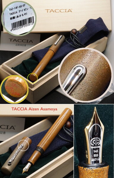
TACCIA 8-pen Kimono pen-rol
namrehsnoom posted a topic in Paper & Pen Paraphernalia Reviews and Articles
TACCIA 8-pen Kimono Pen Roll (Mosaic pattern) TACCIA is a Japanese stationery company, that - as far as I know - is now part of the Nakabayashi group. They offer high-quality fountain pens, inks, pen-rolls, notebooks, etc. One of the products TACCIA produces are beautiful Kimono Pen Rolls, that are crafted with Nishijin Kinran, a traditional Japanese weaving technique that is in use since the 5th century. The patterns of these elegant Japanese pen wraps are inspired by the traditional Japanese Kimono robe. A couple of weeks ago, I bought the 8-pen version of this pen-roll in the Mosaic pattern, as a birthday present for myself. This TACCIA pen-roll fits two purposes: 1/ it’s a functional object designed to protect your pens, and 2/ it’s a thing of beauty with great aesthetics, that just gives you a lot of pleasure. Physically, it’s just an oversized pen-roll. The 8-pen version measures about 38 x 24 cm, and is made from tightly-woven thick polyester, fastened by a traditional rope and hook. Pens are kept in 8 suede slots, that can hold any size of pen (even really oversized ones). A suede cover flap keeps your pens in place, and protects the pens from one another when rolling up the pen-wrap. I typically use this pen-roll in one of two ways. Either I do a classic roll-up, where you end up with a more-or-less circular bundle of about 6 cm in diameter. Or I do a 3-fold wrap, where you end up with a flat slab of about 12 cm in width and 3 cm in height. I use both wrapping methods, depending on where I need to stow away my pens. In both cases you use the rope and hook to close up the pen-roll. This traditional Kimono pen-roll radiates both beauty and quality. The traditional Mosaic pattern with its dark-silver and gold square design looks stunningly beautiful, and the weaving is top-notch. You just feel that you’re holding a high-quality object. I also appreciate the minimalistic branding - just a simple leather tag saying “TACCIA - Japan”. The decorative patterns extends to the inside of the pen-roll, which is a really nice touch that amplifies the aesthetics. A beautiful and well-executed design! My fountain pens are precious to me, and with this TACCIA pen-roll they have a beautiful-looking and well-protected home while I’m carrying them with me. These pen-rolls are not cheap (about 100 EUR for the 8-pen version), but in my opinion still great value for money - both beautiful and functional. I love mine, and am glad I bought it. -
Here in full focus stacked macro glory is the limited edition Taccia Miyabi Imperial Koi. The background is, I think, byakudan-nuri whereas the fish are in rankaku with mother of pearl raden eyes. Usually, koi are not usually represented this large but Taccia made the specific choice to render them this way to good effect. Sailor nib so it writes well. focus stacked logo by Ja Ja, on Flickr focus stacked koi closeup logo by Ja Ja, on Flickr cap logo by Ja Ja, on Flickr
-
I haven't done any ink reviews in a long time, but I also haven't acquired any inks in a long time. I wasn't really looking for any inks but was looking through the Taccia inks and noticed some new ones. Since Taccia was bought by Nakabayashi, it seems like the Taccia brand is being used to offer interesting special inks. There is a new series based on the Ukiyo-e printing of 17th century Japan. https://www.nakabayashi.co.jp/_files/EnProduct/0/82/pdf/TFPI-WD42-e.pdf The packaging is very nice as in the pics above and my own: Tested with two pens, a Sailor 1911 Std (M) and an Edison Premiere (M) on Mohawk via Linen and Tomoe River. The Edison pen is wetter and wider than the Sailor pen, and so a bit of of shading is lost. In the Sailor pen the shading is great. No sheen in the usual sense, but on the Tomoe River from the Sailor pen the ink appears as a silvery sheen when seen at just the proper angle. I'm very particular with red inks. Regular reds I don't like, I don't have any use for them. I was concerned whether this ink would be a standard red-leaning brown like MB Toffee Brown or Visconti Brown. I definitely wouldn't want just another ink like that. It is a red ink, but very muted, earthy. I like it a lot. A red that works like a brown. I didn't test water resistance as that's not a quality important to me. I presume it's not very water resistant. A reasonable price for a stealth Sailor ink. The Sailor 1911 Std on MvL; The Edison Premiere on MvL: Tomoe River:
- 12 replies
-
- taccia
- nakabayashi
-
(and 2 more)
Tagged with:
-
Taccia Uguisi Review of a sample of Taccia Uguisi received from Vanness Pens. Taccia inks are "born in California", but manufactured in Japan. Vanness calls the color "olive green". I am not sure that I would label the color that way. It is a balanced green with a strong blue component (see chromotography below). The ink is not strongly saturated but dark enough in fine nibs to be quite readable and much darker than Pilot Iroshizuku Chiku-rin. The ink flows very nicely from the nib, and is lubricated in much the same way as Sailor inks. There is a very nice reddish-copper colored sheen to the ink on Tomoe River paper, which also shows up on the ink swab as well. The ink also shades moderately well especially in medium and wider nibs. The ink dries fairly quickly and is not water resistant. It does not bleed through or show through except on very cheap paper. Pros: Excellent flow Moderately lubricating Minimal bleedthrough, showthrough, feathering Fast Drying Moderately saturated. Moderate shading. Some sheen. Cons: Not water resistant Price: In the US: $12 for 40 ml at Vanness Pens, Anderson Pens, PenChalet Overall: An Excellent ink in terms of quality and price!
-
ink review : TACCIA Ukiyo-e - Hiroshige - ainezu TACCIA is a Japanese stationery company, that - as far as I know - is now part of the Nakabayashi group. They offer high-quality fountain pens, inks, pen-rolls, notebooks, etc. More specifically, TACCIA produce a line of inks, inspired by the unique look of Ukiyo-e paintings from Japan’s Edo period (17th century). Ukiyo-e prints are woodblock prints where the work of an artist is carved into wood by woodworkers, and pressed onto paper by printers. This allows the production of multiple prints of an artwork with some different colours as well. In this review, I take a closer look at ainezu, a dark and stormy grey that is inspired by the painting “Sudden Shower at Shin-Ohashi Bridge” of the artist Utagawa Hiroshige. It was published in 1857 as part of the series One Hundred Famous Views of Edo and is one his best known prints. Sudden showers are a recurring theme in ukiyo-e works and here, in what Hiroshige calls "white rain", the downpour is depicted using a large number of thin dark parallel lines in 2 directions - a difficult skill in woodblock carving. The dark clouds are produced using a gradated bokashi technique and vary significantly between prints. The rain, sheltering people and log raft at the centre of the image give the image a sense of movement. Ainezu is a dark grey with strong teal undertones, that are mostly visible in swabs or when using the ink for drawing. It’s a beautiful complex grey that lays down a wet & dark line that quickly dries to a lighter but still contrast-rich tint. A very strong shader, this one, even in fine nibs. And on top of that, it shows a fair amount of water resistance. All factors combined, this makes it an excellent choice for use at work: the dark grey colour will fit right in, and the strong shading and dark teal undertones will certainly draw the attention of your co-workers. I like this ink a lot: a great grey for writing, and one that really opens up when using it for drawing. The ink comes in a 40 ml bottle, that is packaged in a beautiful box showing the corresponding Ukiyo-e painting. Lovely packaging for an excellent ink. To show you the impact of saturation on the ink’s look & feel on paper, I made some scribbles where I really saturated portions of a strip of 52 gsm Tomoe River paper with ink. This gives you a good idea of what the ink is capable of in terms of colour range. Ainezu has a fairly wide dynamic range, ranging from a pale indigo-tinged grey to a much more saturated dark teal-grey. The contrast between the light and dark parts is not harsh though, which translates to beautiful shading – very present but not too loud. The shading appears in all nib sizes - just a hint with the EF nib, but really present with F-nibs and above. The aesthetics are superb, adding lots of character to your writing. The ink’s chromatography clearly shows the lovely complexity of this grey: grey, indigo, some sky-blue, and – to my eye – a shimmer of green. The bottom part of the chroma also indicates that this is a fairly water-resistant ink, which is confirmed during water tests. TACCIA’s ink makers Hiroshi Ishiguro and Hanse Matsumoto know their craft, and created with this ainezu a wonderfully complex grey that just looks amazing. I’ve tested the ink on a wide variety of paper – from crappy Moleskine to high-end Tomoe River. On every small band of paper I show you: An ink swab, made with a cotton Q-tip 1-2-3 pass swab, to show increasing saturation An ink scribble made with an M-nib Lamy Safari The name of the paper used, written with a B-nib Lamy Safari A small text sample, written with the M-nib Safari Source of the quote, written with a Pelikan M101N with M-nib Drying times of the ink on the paper (with the M-nib Safari) Ainezu looks good on all types of paper – both white and more creamy ones. It lays down a wet and dark line that quickly dries to a lighter tint (5-10 second range). No feathering that I can see. And it can even handle crappy paper (like Moleskine) with ease – good-looking writing, and only limited show-through and bleed-through. A good ink for the workplace! I’ve also added a few photos to give you another view on the ink. Scanned images and photos often capture different aspects of the ink’s colour & contrast. That’s why I present them both. In this case, the photos capture the ink best. The scans seem to exaggerate the teal undertones in the swabs. Writing with different nib sizes The picture below shows the effect of nib sizes on the writing. The EF-nib already shows a hint of shading. But it is with the F-nib and above that the ink’s elegant shading really comes into play. Look e.g. at the shading with the Safari M and B nib – that’s why I use a fountain pen! I personally prefer to use this ink with the drier pens where the shading is more prominent. With wetter pens (like the Pelikan M101N Lizard), the ink gets a bit too saturated and starts to drown out the shading. Related inks To compare ainezu with related inks, I use my nine-grid format with the currently reviewed ink at the center. This format shows the name of related inks, a saturation sample, a 1-2-3 swab and a water resistance test – all in a very compact format. I have lots of greys in my collection, but this TACCIA colour still looks different from all the other ones. Diamine Earl Grey has that same complexity, but is a much cooler shade (cool as in cold, but it's really cool too ;-). Inkxperiment – Ungawa, Timba With every review, I try to create an inkxperiment using only the ink I am reviewing. These one-ink drawings are great for showing the colour-range nuances that can be achieved with a single ink. And it’s great fun to experiment with inks in a more artsy context – I love doing these inkxperiments. They are one of the many things I enjoy about the hobby. During the holiday season, I re-viewed some of the really old Johnny Weismüller movies – grainy black&white cinema, but fun stories and totally uncomplicated. I really enjoyed one of the scenes where Tarzan and his elephants come to the rescue. That’s where the inspiration for this elephant drawing comes from. The picture itself is an adaptation of one I saw on Pinterest. HP photo paper usually brings out the best in inks, so I decided to use it for this drawing. In this case, it really enhances the dark teal undertones in the ink. I started by wetting the photo paper, and drawing some circles on it with pure ainezu, using a glass jar as a stamp. Next I used several passes with a paintbrush and pure ink to darken up the center of the page. After the background had dried completely, I used a glass dip pen and bleach to draw in Tarzan on his elephant. Bleach reacts nicely with ainezu, producing a golden-white colour. The picture gives you an idea of what can be achieved when using ainezu for drawing. Conclusion TACCIA Ukiyo-e Hiroshige ainezu is a near perfect writing ink – good technical properties on all paper types, fairly water-resistent, good contrast with the page and some very nice shading. Colourwise it is an intriguing dark & stormy grey with definite teal undertones. A beautiful ink that totally fits my tastes. Highly recommended! Technical test results on Rhodia N° 16 notepad paper, written with Lamy Safari, M-nib Back-side of writing samples on different paper types
- 15 replies
-
- taccia
- taccia ukiyo-e
-
(and 3 more)
Tagged with:
-
Here are two limited edition Taccia pens from the Hyakko-Hisho lineup. The Hyakko-Hisho is a compendium of craft techniques from the Edo period including lacquer styles. Taccia has been pulling from that for the past two or three years. Pictured first is the Hakumei or twilight from last year, which is primarily green. Second, is this year's Hakumei or starlight/star shine, which is primarily blue. Both make nice use of blended urushi colors and raden. I thought they made a nice pair. Untitled-1 with logo by Ja Ja, on Flickr Untitled-1 yes logo by Ja Ja, on Flickr together with logo by Ja Ja, on Flickr caps together with logo by Ja Ja, on Flickr tails together with logo by Ja Ja, on Flickr