Search the Community
Showing results for tags 'syo-ro'.
-
From the album: Shades of colour
My Canon CanoScan LiDE 300 scanner does not seem to capture subtleties in green very well, and so leaves post-scanning colour-correction with not a lot to work with. Here, instead of not showing green where there should be some, there is too much green in both colours, but especially Syo-ro. It didn't help that the two ink colours are nigh indistinguishable when written very wet, and somehow the Pilot MR's steel F nib appeared to be writing increasingly wetter with time, even though I didn't see any tine misalignment under a loupe, and the tine gap while seemingly wide for a Japanese nib did not appear to be the problem. Trying to close the tine gap didn't help; and neither did swirling the nib around briefly in dilute solution of aqueous ammonia and dishwashing detergent. I ended up smearing detergent directly onto the nib and rubbing it vigorously, then dunking it into >90°C hot water. That seemed to have more of an effect in taming the wild ink flow witnessed earlier.© A Smug Dill
- 0 B
- x
-
- pilot iroshizuku
- syo-ro
-
(and 2 more)
Tagged with:
-
From the album: Shades of colour
My Canon CanoScan LiDE 300 scanner does not seem to capture subtleties in green very well, and so leaves post-scanning colour-correction with not a lot to work with. It didn't help that the two ink colours are nigh indistinguishable when written very wet, and somehow the Pilot MR's steel F nib appeared to be writing increasingly wetter with time, even though I didn't see any tine misalignment under a loupe, and the tine gap while seemingly wide for a Japanese nib did not appear to be the problem. Trying to close the tine gap didn't help; and neither did swirling the nib around briefly in dilute solution of aqueous ammonia and dishwashing detergent. I ended up smearing detergent directly onto the nib and rubbing it vigorously, then dunking it into >90°C hot water. That seemed to have more of an effect in taming the wild ink flow witnessed earlier.© A Smug Dill
- 0 B
- x
-
- pilot iroshizuku
- syo-ro
-
(and 3 more)
Tagged with:
-
From the album: Shades of colour
The colours here are closer than the scanned image to how I perceive them when staring at the page, but still not quite right. I think they look too blue, while in the scanned image they look too green. The differences between the two ink colours are really subtle; Syo-ro is just ever-so-slightly bluer and a teensy bit more muted than Ku-jaku, so images that lean either blue or green would obscure the differences.© A Smug Dill
- 0 B
- x
-
- pilot iroshizuku
- syo-ro
-
(and 3 more)
Tagged with:
-
From the album: Shades of colour
(colour-corrected and scaled down to 120dpi in GIMP)© A Smug Dill
- 0 B
- x
-

Syo-Ro (Dew On Pine Tree) - Crv - Group Review - 2015-03
Lou Erickson posted a topic in Co-Razy-Views
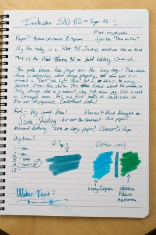
http://www.rdwarf.com/users/wwonko/images/fpn/iro/06-syo-ro-header.jpg Iroshizuku - Syo-ro (Dew on Pine Tree) - CRV - Group Review - 2015-03 The Iroshizuku Group Review color for March 2015 is Syo-ro ”Dew on Pine Tree”. It is a deep green, full of the suggestion of the lush pine needles of the trees it is named for. Please post your reviews and scans of the ink in this thread. If you want to a partner for a Co-Razy View (CRV) of this ink, please write it up and mail it to Lou Erickson. (PM for the address.) If you want to do a Co-Razy View on your own, please do! Other reviews are welcome, too. NOTE: I have a new address as of January! If you have sent me things in the past, please PM for the new address - the old one will stop forwarding eventually. You can look at the full description of the Iroshizuku Group Review to see how this should work and what we’re doing.http://www.rdwarf.com/users/wwonko/images/fpn/iro/06-syo-ro-product.jpgThanks to Rachel Goulet, who gave permission to me to use their beautiful product photo and swab.More thanks to Amberlea who gives so much of her time to herding these inky kittens. Please PM me with any questions. I keep thinking this ink is Christmasy, and that it would be great for holiday cards. Very green, but still dark enough to be readable.- 21 replies
-
- co-razy view
- group review
-
(and 7 more)
Tagged with:
-
- 5 replies
-
- written ink review
- iroshizuko
-
(and 4 more)
Tagged with:

desaturated.thumb.gif.5cb70ef1e977aa313d11eea3616aba7d.gif)
.jpg.bd8d1ac9ebd046371cfb77a354fd599c.jpg)
.jpg.ebc06a65f7ea950d614402007687ef07.jpg)
.jpg.ea7a16a4a8f9ab76b4c42e083ed63203.jpg)
.jpg.7135e591c1859d73ed40ecc784b3a0a6.jpg)


