Search the Community
Showing results for tags 'super5'.
-
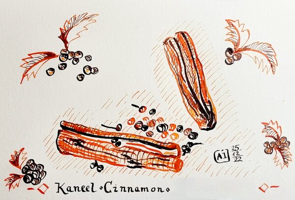
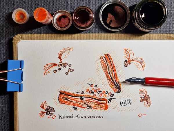
Super5- Delhi I personally would not appreciate receiving a letter with this ink with an Ef nib, however, I enjoyed using this ink for art projects. It is my understanding that the inks were originally made by Roherer and Klingner and used the same bottles, but the packaging has changed and now the inks come in 30 ml bottles. What surprised me was the amount of ink stuck in the transparent section of pilot Kakuno, which I had forgotten in water for 3 days. It needed a pen flush to remove it. It’s no biggy in my book, but it might be for some. Ink is very well behaved and works well on copy paper with most nibs. If you want a slightly reddish waterproof orange go for Carmen, which is easily available in North America and cheaper. Chroma Writing samples: It really well behaved on Hammermill, the only bleed though was with heavy handed flexing Photo: Comparison: Watertest: (Nothing budged) And finally an artwork: Castle, This was part of the inktober challenge, it gave me the opportunity to use Super5-Delhi (rigtht) and R&K Sketchink Carmen (Left) The idea was of walls we built around our selves... The blue ink is Herbin Bleu Nuit.... · Pens used: Pilot Kakuno Ef, Kaweco Sport (EF/F/M/B/1.9), Kanwrite with an Ahab nib · What I liked: Nice bright orange colour. · What I did not like: Price, availability in North America, and cleaning, dryness · What some might not like: Same as above. · Shading: No, only with very wide nibs… · Ghosting: No. · Bleed through: No. · Flow Rate: Medium · Lubrication: Slightly below average, especially with Ef nibs. · Nib Dry-out: No. · Start-up: No. · Saturation: No. · Shading Potential: Dismal. · Sheen: No. · Spread / Feathering / Woolly Line: No. · Nib Creep / “Crud”: No. · Staining (pen): No. · Clogging: No. · Cleaning: It needs a cleaning solution. · Water resistance: Excellent · Availability: 30 ml /Cartridges Please don't hesitate to share your experience, writing samples or any other comments. The more the merrier
-
From the album: OldTravelingShoe's Random Pics of Fountain Pens (2)
© (c) 2022 by OldTravelingShoe. All rights reserved.
- 0 B
- x
-
From the album: OldTravelingShoe's Random Pics of Fountain Pens (2)
© (c) 2022 by OldTravelingShoe. All rights reserved.
- 0 B
- x
-
Ink Shoot-Out : Diamine Safari vs Super5 Dublin Green In 2014, Diamine surprised us with a series of six inks to commemorate their 150th Anniversary. Within this set, Safari is one of my favourites. Some two years ago, I discovered the Super5 inks from papierlabor.de which are waterproof inks. One of them – Dublin Green – looks very similar to Safari in written text. That of course piqued my interest … time do a detailed comparison and find out which of these inks I like the most. Enter... the Ink Shoot-Out. A brutal fight spanning five rounds, where two inks engage in all-out battle to determine who is the winner. Today the billboard announces the exciting fight between two middle-weight female fighters. In the left corner – from Liverpool, England – the reigning champion Denise “the Dancer”. In the right corner the challenger from Darmstadt, Germany: Hildegarde “the Hook”. Both champions are evenly matched, so this promises to be an exciting fight! Tension in the boxing hall is building up... when the fighters enter the arena, they are welcomed to a thunderous applause. The bell rings, signaling the start of the first round. May the best ink win… Round 1 – First Impressions Both inks make a great first impression on me: murky, dirty greyish greens with a touch of yellow. Really nice-looking on all kinds of paper. This is the type of colour that appeals to me. Even though these are muted inks, they provide excellent contrast with the paper even in the finest nibs, leaving a well-saturated line on the Rhodia N°16 notepad paper. Both inks exhibit strong and elegant shading, without too much contrast between the light and darker parts. This immediately elevates the aesthetics of your writing. The inks look nearly identical in writing, but there are some differences: Safari has a broader colour span, and shows more elegant moves. They don’t call her “the Dancer” for nothing. This is clearly illustrated in the saturation sample. Both inks shade nicely, but Dublin Green is a lot more subtle. Due to its narrower colour range, the shading is more subdued, and looks a bit more elegant to me. Dublin Green is a bit greyer, with no yellow in its dye composition. Both inks make a superb first impression – a choreography of dancing moves, circling their opponent and exchanging probing flurries of strikes and counter-strikes. And the public agrees – encouraging their champions with roaring approval and deafening applause. At the end of this first round, it really shows that these fighters are evenly matched. No clear winner emerges, and this round ends with a draw. Round 2 – Writing Sample The writing sample was done on Rhodia N°16 Notepad with 80 gsm paper. Both inks behaved flawlessly, with no feathering and no show-through or bleed-through. With the EF nib, Safari shows its strength, and looks much more saturated. Dublin Green feels less lubricated and leaves a less saturated line with the EF nib. With broader nibs, the Super5 ink no longer has lubrication issues, and both inks write equally well. Colourwise both inks look similar in writing, although there is definitely more of a grey undertone in the Dublin Green ink. Both inks also shade nicely, without too much contrast between light and dark parts. This aesthetically pleasing shading gives more character to your writing, and shows up even with the finer nibs. For this round, the focus is on writing, and here both inks are strong performers. At the beginning of the round, the Dancer from Liverpool broke through the defences of the German ink, delivering a powerful punch. But the Super5 ink recovered nicely, and for the rest of the round both champions were evenly matched. Almost a draw, but that initial punch counts, and so this round goes to Safari on points. Round 3 – Pen on Paper This round allows the batlling inks to show how they behave on a range of fine writing papers. From top to bottom, we have : Midori notebook paper, Paperblanks 120 gsm paper, Tomoe River 52 gsm, Fantasticpaper, Original Crown Mill cotton paper and Clairefontaine Triomphe 90 gsm. All scribbling and writing was done with a Lamy Safari M-nib. Both champions did really well, with no show-through nor bleed-through. But this round is not about technicalities, it is about aesthetics and beauty. Are the fighters able to make the paper shine ? One thing is immediately apparent: these inks are at home on a wide range of papers, both white and off-white ones. On white paper, Dublin Green clearly shows its greyer nature – on cream paper, both inks look more or less the same. The Diamine ink is a bit more expressive and complex-looking in the swabs. Dublin Green, on the other hand, looks more subtle in the shading. Overall, really strong inks with only minimal differences in style. Both inks are on par with each other, with neither of the champions giving any ground. Both fighters gave their all, providing quite a spectacle. The crowd is loving it! But in the end, neither ink could score a solid hit, and as such the third round ends with a draw. The tension in the hall is now going up by the minute. Are both fighters really each other’s equal ? Will one of them show some weakness ? Let’s continue the fight to find out. Round 4 – Ink Properties With the ring of the bell that announces the fourth round, Safari immediately dances to her opponent ready to bring more action to the fight. But wait… what’s happening? The German ink breaks through the defenses with a solid left hook… wham! Oh my god! Safari goes down and hits the canvas! The crowd is shocked into silence, then roars its approval! 10… 9… 8… 7… Oh no… this is a disaster… Safari is groaning, and struggles to right itself … 6… 5… finally Denise “the Dancer” scrambles to her feet, groggily shaking her head. But the round is lost! The referee rightfully grants this round to the German fighter. In this round, the biggest difference between Safari and Dublin Green emerges. The Super5 ink is designed to be water-resistant, and it shows: no smudging, and the ink effortlessly survives a 15-minute soak in water. For the smudge test, I let both inks dry for 30 seconds, and then rubbed a moist Q-tip cotton swab over the text. For the droplet test, I dripped water on the grid and let it sit there for 15 minutes. The difference is clear: Super5 Dublin Green definitely is very water-resistant, making it a good ink for use at the office. Round 5 – The Fun Factor Welcome to the final round. Here I give you a purely personal impression of both inks, where I judge which of them I like most when doing some fun stuff like doodling and drawing. Both inks do well, and show off a lovely colour spectrum, ranging from very light grey- and yellow-green to a really dark and saturated green. I really enjoyed using them. The drawing was done on a piece of 10x15cm HP photo paper. Personally I prefer the slightly greyer looks of Dublin Green. This ink also feels a bit more complex, with more character in the drawing. Safari looks soft and restrained – an ink with a joyous appearance but not too wild. Dublin Green on the other hand is more of a bad girl showing more temparement. In my opinion, the Super5 ink definitely looks better in this drawing. For this round, both champions are again well matched. But for this judge, Dublin Green showed the best moves, and wins this round on points. Mind… this is a relative comparison. Standing on its own, Diamine Safari is still a terrific ink to play around with. But side by side, I definitely prefer the Dublin Green from Super5. The Verdict Both inks are real jewels, that work on all types of paper. These are real champions, that both deserve a place in your ink collection. But counting the points, it’s clear that the challenger from Germany proved to be stronger. Even if you ignore the whopping win in round 4 (i.e. you don’t care about water resistance), Dublin Green still manages to be the slightly better ink. So for this judge, the conclusion is clear: Super5 Dublin Green is the winner of this exciting fight.
- 5 replies
-
- ink shoot-out
- diamine
-
(and 4 more)
Tagged with:
-
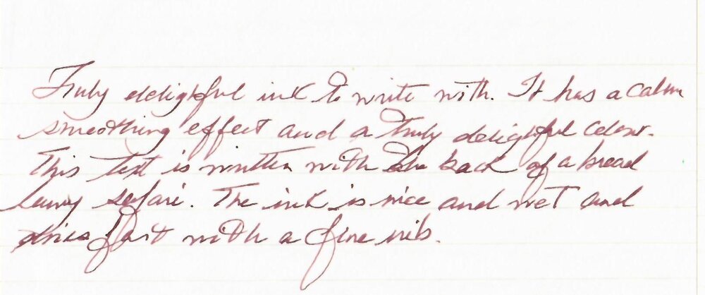
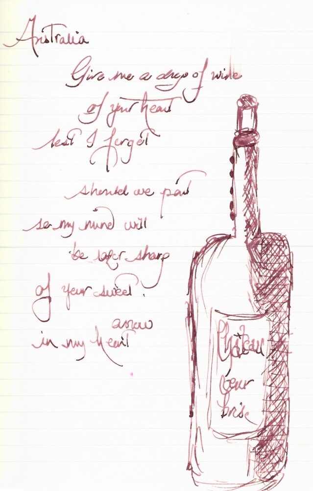
Super5 Australia Pigmented inks made by Rohrer and Klinger fo Papierlabor . They are lightfast and waterproof and designed for sketching, just like the sketchINK by R&K. The naming of this line is a bit haphazard, you can judge for yourself: Atlantic Australia Darmstadt Delhi Dublin Frankfurt They also have line of pens. The pens have a very good seal and the inks don't dry out in them, from what I've read. They are a shade darker in my experience of their sketchInk counterparts. Australia is shade darker than Jule and wetter. Australia is a nice wet ink. Dry time is the same as sketchInk inks. Meaning, if you use broad/flex/wet nibs and ink resistant paper the dry time is about 30 seconds or more and if you use F/EF nibs then you’re good. The price, however, is three times the amount of sketchInk. Very expensive for what is. • Pen used: Lamy Safari – Broad nib both sides • Shading: Yes with wider nibs • Ghosting: None • Bleed through: None. • Flow Rate: Wet • Lubrication: Nice • Nib Dry-out: Depending on the pen. Needs well sealed pen. • Start-up: If not used it can dry out, in pens with high evaporation. • Saturation: Saturated • Shading With wide/ flex nibs • Sheen: Not rally. • Spread / Feathering / Woolly Line: None. • Nib Creep / “Crud”: None • Staining (pen): You might need a pen cleaner. • Clogging: Yes, if pen is not well sealed. • Water resistance: Waterproof • Availability: Only in bottle 30 ml bottles. Chroma: Midori Midori with an attempted sketch... The colour reminds of wine Broad nib full galore.... and inky experiment...on TOmoe River 68 gr Australia
- 7 replies
-
- australia
- made by rohrer and klingner
-
(and 1 more)
Tagged with:
-
Hello everybody! It's my first time in this subforum, so please alert me if I'm doing something wrong. I have somehow accumulated over 20 different bottles of ink and 50 samples in the past two years. Love the variety, but some of these bottles don't get much use, and the ink in them just ages on my shelf. That's been bothering me a lot, since they're actually superb inks that just have had the bad luck of ending up in the hands of someone who doesn't appreciate them the way they deserve. So I'd like to send some of these out as big 5ml samples to anyone who's interested, in exchange for the same courtesy. I feel that that way, each of us gets to try new inks, and since everybody would pay postage, it wouldn't cost one more than the other. Full-sized bottles: De Atramentis AubergineDiamine AmaranthDiamine Ancient CopperDiamine Autumn OakDiamine Asa BlueDiamine BilberryDiamine Classic GreenDiamine Earl GreyDiamine Golden BrownDiamine Majestic BlueDiamine OxbloodDiamine SyrahJ. Herbin Bouquet d'AntanJ. Herbin Lie de ThéJ. Herbin Poussière de LuneKWZ HoneyKWZ MaroonNoodler's Heart of DarknessRohrer & Klingner Alt-GoldgrünRohrer & Klingner HelianthusRohrer & Klingner SalixRohrer & Klingner SepiaSailor Jentle/Shikiori MiruaiSailor Jentle/Shikiori Oku-YamaSailor Jentle/Shikiori Rikyu-ChaSailor Jentle/Shikiori Tokiwa-MatsuSailor Jentle/Shikiori Yama-DoriSailor Nano Sei-Boku Samples: Diamine China BlueL'Artisan Pastellier Callifolio Heure DoréeSailor Jentle/Shikiori Waka-UguisuJ. Herbin Vert OliveSuper5 Frankfurt
- 12 replies
-
- de atramentis
- diamine
- (and 7 more)
-
I saw Appelboom post about the pens in Instagram and my first thought was that they would be nice, cheap, simple knockaround pens. A better looking, sturdier Preppy. Something like a modern Morriset pen with added usability.* From the photo, it even looked like they were piston fillers with that ring at the rear of the barrel.** I followed the link and they cost $26. An older(?) version of them weighs more than an Al-Star so, no, they're not a German alternative to those Indian eyedroppers. Are they good? Has anyone tried them? Would I be better off getting a Prera, a Kaweco, a TWSBI, a Loom, or even a Nemosine? *What is interesting though is that the Super5 reviews I could find (of a similar looking pen but Appelboom calls the new one, well, "new") had a stub nib, which I imagine was carried over to the new colorways, and is now available in 0.5, 0.7, 1.0, and 1.5 stubs. **They're cartridge converters The photo below is from IG: appelboompennen and is the photo that first caught my eye.
-
A Brief Comparison Of Super5 Delhi And Noodler's Apache Sunset
truthpil posted a topic in Ink Comparisons
Hi Everyone, This is just a quick comparison I made of two shading orange inks: Super5 Delhi and Noodler's Apache Sunset. I was surprised at how similar they can look and the shading with both is impressive. The huge advantage, for some at least, of Delhi is that it's completely waterproof once dry! If you've been hoping for a waterproof version of Apache Sunset, Super5 Delhi may be close enough to fit the bill. My only complaint with Delhi as far as behavior goes is that it left pink stains in my TWSBI demonstrator that I still haven't been able to get out. Here's what these two oranges look like on a cheap legal pad: Some close-ups: And on 80gsm Rhodia: Rhodia close-ups: I hope this is useful for someone! -
Heads Up... Super 5 Inks are now on Massdrop !!!... If you ever wanted to try them... this is your chance.. they are approx $20each (with shipping)... it can go down to approx $18each with shipping. https://www.massdrop.com/buy/super5-waterproof-ink?referer=X9GDXR&mode=guest_open&utm_source=Sailthru&utm_medium=email&utm_campaign=Writing%20A%20Product%20Announcement%202015-08-27&utm_term=Community%20-%20Writing%20-%20MAU%20%28Active%29 http://papierlabor.de/wp-content/uploads/files/2015/02/super5-ink-group-6-720x340.jpg
-
Like most people I like novelties, especially when it comes to inks and fountain pens. You know - I've been looking for grail ink for three years and there's always chance it's still ahead of me When I came across Super5 inks mention on Goulet's site, I thought the bottles looked cool and - in a way - familiar. http://papierlabor.de/wordpress/wp-content/uploads/2014/06/super5-ink-group-720x340.jpg The names of cities were cool as well. Colors looked really nice on swabs. My dear friend google helped me to investigate. Super5 inks are sold by Format-Darmstadt GmbH on papierlabor.de site. The company offers also calligraphy pen and converter and some papers. The inks are made by my second favourite ink maker - Rohrer & Klingner. Check their "regular" inks here. That's good news. Really. They know what they're doing and you can expect good quality from R&K. The quality they indeed deliver. So why Super5 inks are much more expensive than R&K inks. First of all - they're pigmented (I believe), then there need to be some margin for the distributor. At 20 euros / bottle yhey're not cheap. However unlike Caran d'Ache or Iroshizuku they offer not only more than satisfying quality, good flow and good lubrication but also added value of waterproofness and lightfastness. Last week I was given the whole set. I'm going to review it and post comparison of the full line. Soon. The colors are really great. Honestly. They're also extremely waterproof. I've already reviewed Atlantic, Australia, Darmstadt, Dublin and Delhi, check them. Today let's take a look at Frankfurt - Super5's brown. I like it. Bottle http://imageshack.com/a/img538/8363/N4oClt.jpg http://imageshack.com/a/img538/103/41AOdW.jpg Ink Splash Mondi 120 g http://imageshack.com/a/img910/7416/HqlGSE.jpg Drops of ink on kitchen towel http://imageshack.com/a/img673/8594/A9XQUL.jpg Software ID http://imageshack.com/a/img537/1607/nLyYse.jpg Color Range http://imageshack.com/a/img903/9135/JYg6uy.jpg Oxford recycled, 90 g - Kaweco Sport Classic, eyedropper mode, B http://imageshack.com/a/img661/671/4YzaX7.jpg http://imageshack.com/a/img910/8088/ftJ9v1.jpg http://imageshack.com/a/img673/547/lMqDbo.jpg http://imageshack.com/a/img633/5125/gmbbLp.jpg Rhodia http://imageshack.com/a/img911/9268/y2oZeL.jpg http://imageshack.com/a/img661/2037/i1pqHH.jpg http://imageshack.com/a/img913/8913/ltSfbj.jpg

