Search the Community
Showing results for tags 'steel'.
-
It is common among the community to say that gold nibs are not better than steel nibs. I disagree since most gold nibs are hand polished and tested one by one while steel nibs are mass produced in automated processes. So, in order for a steel nib to compete against a gold nib, it would need to be hand polished, hand finished and hand tested. Currently the only steel nibs that I am aware that are hand made are the Kaweco Premium Steel nibs (which cost $50 USD), , the steel nib of a Hero 40 years reform and opening special edition 英雄钢笔1978改革开放40 and Edison Pens. Maybe Faber-Castell steel nibs are also hand polished given their quality. But most steel nibs are not: Pelikan, Aurora, Lamy, etc. So, the question is what brands do you know that offer hand polished, hand finished steel nibs? Since today it was a cleaning day, I share a picture of a clogged feed and how I left it.
-
Hello, I have this sailor WG pocket fountain pen. Nib is amazing! But the section is rusted through. Does anyone here have a section that I can buy? Any ideas are welcome. Thank you!
-
desaturated.thumb.gif.5cb70ef1e977aa313d11eea3616aba7d.gif)
Brief Comparison Of Various Lamy Extra Fine Nibs' Output
A Smug Dill posted a topic in Of Nibs & Tines
These are writing samples using just a single unit of each model of LAMY EF nib I have, without any claim or implication that one unit of (say) Z55 EF nib will be identical or comparable with a different unit of such. The first six nibs were all fitted in turn onto the same feed on the same pen drawing from the same reservoir (i.e. converter) of LAMY Benitoite ink. Each nib was cleaned in a dilute solution of ammonia and detergent and patted dry on a paper towel immediately before fitting on the LAMY cp1 pen used, then pressed against a paper towel until the ink being drawn through is dark enough, then written with on another sheet of Rhodia Dotpad 80g/m² paper until the colour and flow appear stabilised. The last of the nibs listed is the EF nib that came fitted on my LAMY 2000 blue Bauhaus pen. There are discernible but relatively minor differences between the ink flow and output of the first six nibs; the LAMY 2000's EF nib is what stood out as glaringly different, and incidentally I find its output the least pleasing. The first nib is somewhat scratchy, to the point that it ripped and picked up fibres from the paper surface from time to time. I don't suppose every Z50 EF nib is equally as damaging, but I didn't feel like either going through my other Z50 EF nibs to find a better, smoother unit to test, or modifying the nib such that it is significantly different from factory condition (or at least as it was supplied to me by the retailer) by smoothing it with micro-mesh. The Z52 and Z53 nibs are both harder than the Z50 nib, but can put down lines that are at least equally as broad when pressed. The gold nibs feel softer than the steel nibs, and I can physically see more elastic deformation in the body when they are pressed, but their tines don't spread as far apart and thus the "maximum" line widths are not as broad. Even though there has been several reports that the EF nibs on LAMY Dialog 3 pens — which use Z55 nibs — exhibit the characteristic of an architect's grind, in that lines left by downstrokes are narrow and cross-strokes wider, the one I tested proves not every Z55 EF nib is like that. (I have two Z55 EF nibs, but I haven't looked at the other one yet; it's on a new pen that only arrived on the weekend.) The Z57 EF nib tested had more of the Sailor Zoom nib-like quality, in that the incident angle between nib and page changes the line widths of cross-strokes notably. The Lamy 200 EF nib is wettest and broadest of them all, and has the least potential for delivering line variation through hand pressure moderation or fluctuation. Ugh. <EDIT> I just tested another Z50 EF nib, and it was as scratchy as the one used above. Alrighty then, micro-mesh it is. All better now. -
Hi All, Just a quick curiosity. I was looking on Bock's website earlier, and they appear to make Platinum nibs labelled Platinum 950(95% platinum). I can't seem to find any info online about them, and there aren't any manufacturers that seem to use Platinum nibs in their pens. Can you purchase these nibs anywhere, and has anyone used them ? If so, what are they like ? I'd be greatly appreciative if anyone could share their knowledge. Cheers
-
the question has come to my mind a few times, which are your favourite steel nibs? and why? Are there some really great steel nibs out there? I usually prefer gold nibs due to their greater degree of springiness (with some notable exceptions especially in more modern nibs) but a few steel nibs deserve my admiration too. The first one that comes to mind is the Pelikan M200 (or 120) steel nib. I like the M200 nibs in almost all widths from F to B (BB should be nice too but have not managed to get one yet). I also have an old OM that is really nice. All of them have this special springiness that's uncommon in steel nibs and that makes me prefer them over any other steel nib. Only the EF admittedly is not my favourite, slightly scratchy, but then again I'm not really an EF guy...still springy though. Another pleasant recent experience with a steel nib is the B nib on my Momento Zero and Furore. Very smooth and... slightly springy! I do like that! (some of you had some bad experience with Leonardo nibs, I have not tried the narrower nibs, but my Bs are really great.) Faber Castell steel nibs: I like these for a different reason, in reality they are stiff, but oh, so smooth! If I had to make a comparison with gold nibs the FC steel nibs would be the Waterman Man100/200 of gold nibs (or Dupont) A few other good steel nibs come to my mind when I think of Stipula, Visconti, Delta. These are likely Bock nibs, made to custom design. They all usually are very smooth, Stipula and Delta, especially in earlier pens like the Journal, sometimes showing slight springiness. Generally speaking, Bock own branded steel nibs are good (I have several on my Ranga pens), nothing too surprising, slightly stiff, but usually very pleasant and reliable. But are there other really great steel nibs out there that I'm not aware of? (I know some of you will come up with those flex nibs like the zebra G nib, but those are really out of my interest/capabilities of use... I also disregard most of the Chinese nibs, some of them can be smooth, but oh, so stiff...)
-
Recently I've ordered some F & LH nibs from my country's official Lamy store to customize some of my Safaris and AL-Stars. While changing the nibs, I've noticed that they are too tight fitting. When I wanted to remove one from my AL-Star with tape, whole feed detached from the pen. Fortunately the feed and the pen are fine but, I'm surprised to tightness of the new Lamy nibs. Did anyone experienced the same phenomena? What if I want to return to old nibs of the pens some day? How can I remove these nibs? The nibs write very good BTW. They are wet, smooth and firm like all Lamy nibs.
-
Honeymoon With The Fountain Pen Revolution (Fpr) Flagship: Jaipur V2 With Ultra Flex
peroride posted a topic in Fountain Pen Reviews
Family owned and operated, Fountain Pen Revolution has come out with their version 2 of the Jaipur fountain pen. Currently there are only 2 acrylics, a blue and an orange and 1 ebonite brown which is the subject of this first look reviewlet. What is it? A piston filler of Indian origin designed and branded by FPR along with a stable of other brands that they sell. The ebonite is smoother and finished better than the Himalaya v2. Himalaya looks and feels more matte whilst the Jaipur is slicker and sheenier. The length is a smidge longer and girthier than the Himalaya with a more cylindrical shape. I much prefer its profile over the himalaya v2 and that pen feels almost perfect. Comparison to an M600 would longer, less taper and slight less girth. Jaipur hits close to Lamy Safari dimensions. Left to right: Leonardo Momento Zero, Pelikan M600, FPR Jaipur v2 with Ultra Flex nib, Lamy Vista (clear Safari) and FPR Himalaya V2 The Jaiput v2 piston filler pen can be completely disassembled for maintenance which is a big plus. Additionally the ebonite feed and nib can be swapped for #6 plastic ones at the FPR shop. Takes about one and a half turns to uncap and Jaipur posts deep and secure. I totally love this. The pen is light at 19.5 grams on my coffee scale. How does it feel?Imagine a light Pelikan M800ish/Lamy Safari sized pen with a very slight tapered grip ending at a very clear and useful ink window. Add an ultra flex steel cut out shouldered nib tuned with an ebonite feed backed by unencumbered volume of piston full of ink. Finally, finally I have converted and firsthand witnessed the praise of pleasurable FPR affordable flex writing. I dare say it is up there with 4x more expensive 14K Gold Jowo flex. Unlike my first stutterings with Himalaya v2, Jaipur v2 wrote straight out of the box no problems. No flushing of feeds or heat settings or bum leaky convertors. I just rinsed the nib and .... WTH!! Let's backtrack... I received shipping at work and could not wait to get home to ink the baby up. Everything check out: no defects and superb build quality, piston worky if not a bit stiff. Knock on wood, I got one from the good batch?! then I came home all hot and bothered in the FP heat phase when to my surprise, I could not undo the blind cap. Blind cap? What's that you say? Well unlike a regular piston converter like Montblanc 146, Pelikan M series, Sailor Realo, etc etc FPR Jaipur v2 has a beautifully thin crafted end cap that the user screws to reveal the actual ribbed piston knob. Clockwise knobbing fills and counter will dispense. I could not get the dang thing off and then I heard a rattle sound and saw separation from the piston mechanism and barrel. We were not dealing with a captured converter here. So just before I'm ready to make love with my new pen, i dun brok it?!@ WTH!@#$ No amount of silicone gripper oven mitt strength twisting would undo the blind cap to access the knob for ink filling! I was really upset as I was not sure I was either tightening the blind cap or loosening it. It would not budge and so I had a pen that could not fill unless I syringed from the nib end which unscrews for nib swaps; basically Jaipur as a crappy eyedropper. Then I remembered FPR introductory video and rewatched for the direction of the twists during the Jaipur overview. https://youtu.be/rkX1p47KbM4 I ended up untwisting out the whole piston assembly then I was able to get better purchase on the blind cap and free it to expose the piston knob. But now I had a piston part to reattach. Luckily I was able to rescrew it back in and get the piston working again. I could filler up! Writing, writing and writingJaipur v2 chews ink up and I love it.Finally can go full plow and refill to use up ink stash. Akkerman Garuda Rood - wet juicy yumCrappy De Atramentis Bamboo Green ink sample - feather like crazy but still juicy though had a couple of skips and hard startsDiluted Organic Studio Nitro also sold at FPR - WOW BAM POW! that and Akkerman have been stellar. I dunno maybe it's the piston volume and not that skinny skank convertor of the Himalaya v2 but the Jaipur v2 feels like a homerun on the writing experience. Page after A5 page, I can just gush and pour without issue with the right ink. The only negatives were the super tightening of the blind cap which I did not truly did not over tightened which I "fixed" with silicone grease ?! to the inner threads AND hard to turn, stiff piston which I hope to fix with silicone grease to the ink chamber though I kinda don't want to mess up the honeymoon by unscrewing the nib and potentially ruins it!! In all, Jaipur v2 is a worthy flagship and I prefer it over my 2 Himalaya v2s: 1 good and the other meh . No heat setting, flushing, leaking, etc. I just fill and write now. As a true testament to this pen, I bought another one at the time of this reviewlet, this time in blue acrylic to see if it holds up to this faithful ebonite version. Hey, need more data points? Here's YouTuber Larry of Larry's Fountain Pens with a word: https://youtu.be/Rj2_eDTcSDU Peace out, write on! -
Greetings, fountain friends, I’ve been an offline observer to this wonderful community for some time now, and it has influenced me in many of my pen decisions and handwriting expansions. I'm an Irish doctor working in England, and in my spare time, I am a keen German language user, chess player, philosophy and psychology enthusiast, and now beginning to dabble in the world of writing. I’d like to begin to give back with my own opinion regarding an undoubtedly biased view on my favourite fountain pen purchase to date – the Lamy 2000M Stainless Steel (my model is a fine nib, and I like to rotate between Diamine Oxblood, Teal, and Montblanc Toffee Brown). Excellent reviews for this well-known model – most prominently the original makrolon edition – already exist in this forum, and further afield. However, I would like to write something about the SS version of this pen, which has attracted mixed-to-negative reviews regarding it’s 1) weight, 2) similarity without difference, and 3) price. I do not pretend to be impartial regarding this particular piece, and I must suggest that this is an opinion primarily for those who are closer-than-not to a purchase regarding this model with the attributes I will discuss, later, and go some way to defend the model fit enough to be considered both distinct and worthy of purchase and recognition. 1). Weight. The most notable set of specifications is the weight of this pen – both in-and-of-itself, and in contrast to the lighter, original version. For convenience, the total (54g), body (34g), and cap (20g) weights are significantly heavier than the makrolon version (typically 25g, 15g, and 10g, respectively). Particularly when the cap is posted, this can be a considerable contributor to writing fatigue, back-heavy imbalance, and an uncomfortable writing experience with poor stamina for even those with larger hands. I think this is an unfair area of criticism, and rather, should be a binary factor for those who like heavy or light pens. Consider a fountain pen reviewer who takes on a ballpoint pen – by the very nature of the pen’s mechanism, this will be reviewed much more poorly than it’s capillary counterparts by the nature of what makes the pen a writing instrument. I believe that weight – as well as dimensional size – are factors in review that should be areas of distinction, rather than comparison, when considering models of pens (even when such models are within the same branding). Therefore, I think that those who favour heavier, metal pens should take interest in the Lamy 2000M as distinct in interest even from those who use the original makrolon Lamy 2000. Whereas the first example I provide is clearly an extreme version of the issue described, here, I think that the factors of size, weight, and filling system are considerable enough to be whittled down to pens that address those precise categories rather than having (e.g.) a Kaweco Liliput scolded by a user who’s daily driver is the MB 149. 2). Similarity without difference. Apart from the material use and the weight of the pen, criticism is offered by reviewers who perhaps borrow too much influence from these paradoxically drastic differences, by finding nothing new offered by this version once the novelties are stripped away. I believe this is an easy mistake that we all can make when we overanalyse versions with heavy influences in one area or another and seeing it as a simple marketing rehash. I’d like to offer the opinion that these two factors bring about differences in performance and suitability in preference that are drastic enough to address an entirely different audience to attract those that were perhaps failed or disappointed by the Lamy 2000 in its original format. The material and weight provide a unique writing experience that is (I’d argue) much more palpable than the difference between modern steel and gold nibs. It is difficult to capture the sensory, tactile, and phenomenological experience in the differences between both versions without robbing the reader of an hour’s time, but there is something tremendously satisfying about the gravity and industrial nature of this instrument. I think it more excellently captures the Bauhaus movement than it’s makrolon parent, but aesthetics aside, even the differences in brushing material and the lack of a two-tone/material compartment provide a different experience to those deliberately sensitive enough to notice a difference. Clearly, there are differences which I think are rather miniscule (the plating on the hinged clip, or the placement of the Lamy logo, for example), whereas others are perhaps discriminatory to those who prefer other attributes (the removal of the ink window seems to be a sore point for many consumers, as is the smoother metal finish of the grip). However, when it comes to the ultimate endpoint of a writing instrument – the writing – then this pen deserves a mention distinct from the original as being paradigmal in it’s feeling, experience, and output. Everything else is style and preference. 3). Price. Finally, the Lamy 2000M is noted as being approximately 50% more expensive than the original*. This is an area of criticism, compounded further when the two areas addressed, above, are neglected in final consideration. One could talk endlessly regarding the economics of price, but I believe there are a few more objective factors to consider before discussing the differences in the intangibles: Stainless steel is a difficult material to manufacture, and clear that it is at least a significant percentage of the pen that this instrument is fashioned with (I have yet to see a demonstrator video in which the pen is sliced in half at various angles for a more accurate opinion on this, though the innards are made from essentially plastic on disassembly). The weight specifications should be enough to reassure most to a reasonable standard of this. Lamy is also a brand of (at least in my experience) good and efficient quality – perhaps the Ikea of manufacturers when it comes to template design with the odd-revolutionary product. With this comes a certain level of brand investment, especially as an edition of an item that sits on permanent display in an art museum. More subjectively, those wishing to purchase something metal, heavy, and made by a manufacturer such as Lamy, will find themselves justifying this purchase (rightly or wrongly), as it is a widely-recognised and reliable model of a pen that has already been proven to survive over long periods of time, but utilises their preferred categories of material choice and weight. Stainless steel is also tremendously robust, and provided that the user is aware of the interplay between it and the more sensitive innards, then this pen should act as its own safeguard against wear, damage, and accidents that will inevitably creep up in the coming years and decades. C). A worthy purchase for those who can discern it. The conclusion may seem as weak as point 2) that I make above – clearly, this is a pen that will satisfy those who will be satisfied by it just as much as it is the same pen without its differences. But I write this piece (which is also my first – constructive feedback would be very much appreciated from the community) in biased defence and justification to what is a wonderful writing instrument that I believe has been treated unfairly even in favourable reviews (who towards the end may conclude that the makrolon version is better simply because it is essentially the same, and more affordable). I argue here that these are two distinct pens that should not be compared any more than a small and a large pen be reviewed by an individual who is more/less suited to one or the other. That is not to argue the Lamy 2000 out of hands who love it – I merely stress that there are differences that are more significant in the review of such pens than are given credit (some which are not even available in filters for online pen retailers, e.g., weight) that will eliminate certain pens from consideration even if they are identical in other superficial aspects. Furthermore, I wish to offer the opinion that such differences then go on to contribute meaningful changes both in hand and on paper, and that these should be noted as both distinct, and as incomparable to pens with category differences such as weight that are paradigmal. Lastly, this is a pen that will suit some, and not others. For those that it will suit, however, will depend more on attributes and qualities of pens that make it knowingly or unknowingly both more appealing and satisfying in acquisition and use than variants (Lamy 2000) and competitors (when considering weight, e.g., Faber-Castell Basic Metal). Clearly, other factors also play a role (i.e., price, availability, European nib sizes, etc.), and some which I have not noted, here. But for those who can discern their ideal pen yet find themselves a little underwhelmed by the community’s reaction despite its pedigree and performance, I hope this piece can help to explain some of the feeling on both sides. Thank you for your time. Schreiber *Thank you to 1nkulus, who corrected my original gross approximation as being double.
-
I have the house to myself for a time and so I'm taking this once-in-a-lifetime opportunity to spread out and go through my collection of steel dip pens and update my inventory. (a Herculean task). I'm coming across pens I have forgotten all about. Here's one with a semi-interesting story I thought I might share. Most people know Milton Bradley as the famous board game manufacturer. That was their first main product and is still their main line of business. But over the years since their founding in 1860, they have produced other items at various times. One line of goods, which was near and dear to Milton himself, was a series of school supplies and educational aids geared toward the new Kindergarten movement in the late 1860's and onward. Milton became interested in the ideas behind early education and began making a whole line of educational supplies which he mostly gave away. This line continued from the 1870's up to about WWI, when it was reduced in scope. The five pens I have are Milton Bradley No. 2 School Pens. They're a little rusty and rough, but I've never seen any others. (cue five other people posting whole salesman's sample kits and advertising posters). The pens themselves are nothing to write home about, but the story and their rarity make them something interesting to me and I thought I'd share.
-
Difference Between Steel, Gold And Titanium Nibs
kikopens posted a topic in Fountain & Dip Pens - First Stop
I don't own any gold nibs right now, except my grandpa's Pelikan P1. All the pens I own are steel ones. Out of curiosity, before trying another gold nibbed pen, I would like to know the difference between these nibs. I know gold nibs add a little bounce to them, whereas steel nibs are nails. Don't know anything about titanium ones though. For example I have a Sailor Shikiori which gives off a very very pleasant feedback I like despite it being a nail. Now if I move on to a Pro Gear, what is going to change? -
Hi all. How do you adjust a very springy steel nib that resists adjustment? I'm trying to make my Visconti Rembrandt nib wetter but any effect I get is temporary as the nib eventually goes back to its original condition. Best regards
-
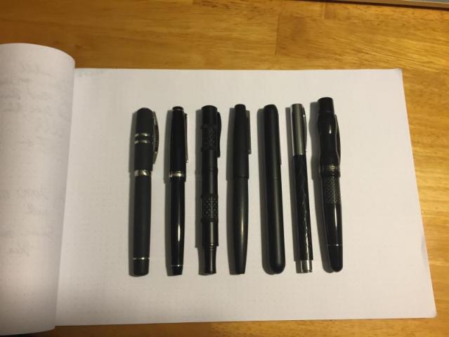
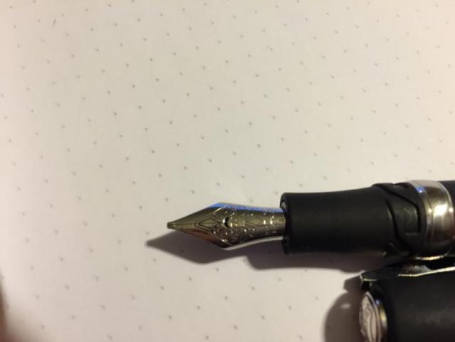
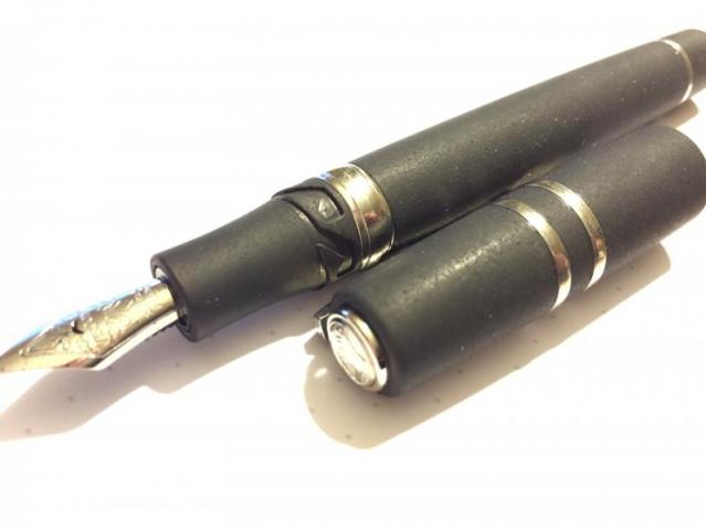
Hello Everyone, I recently purchased a Visconti Homo Sapiens Steel (Midi) Fountain pen in Broad. The Homo Sapiens (Steel) fountain pens come in two sizes: Midi and Maxi. I chose midi, because it fits my hands better, and there's no reason to hold a heavier pen if I don't need it. I chose the Broad nib because I tend to write in a larger font, and I love wet pens. This pen delivers on all fronts, and then some! I highly recommend it. Below I will support my enthusiasm. Unboxing I'm going to give a quick review of my thoughts concerning the pen. Before I do, I'd like to share my unboxing video: http://youtu.be/i_AoUKQiZyk The pen comes in a relatively large leather-covered box. There's a small sliding shelf in the side of the box. It contains a mini catalog of their other fountain pens. There's nothing else in the box other than the pen, itself. The pen came covered in a plastic sleeve. Personally, I didn't like that Visconti covered this piece of art in plastic, but it's not a big deal. Metrics The pen is about average size for a medium sized pen. Below I have a lineup of my black pens. It's about the same length as the Pilot Falcon. The pen is reasonably heavy. It's not as heavy as a fully metal pen like the Lamy Dialog 3 or Monteverde Regatta, but shares the same weight class as the Lamy 2000. Overall, the size and weight are near perfect for me. I can write comfortably with the pen without posting. The Body This pen is beautiful! The body, section, and cap are all made of a special resin containing lava rock. This material is very smooth; it feels like hard rubber. It's a matte color, but still glitters in the light. It's also a water-absorbant material, so with sweaty hands, I don't feel uncomfortable writing with this pen for an extended time. This pen is in the Homo Sapiens 'Steel' family, so the trim is made of steel. The piston turning nob, the center band, two smaller bands on the cap, the clip, and the finial (top of the pen) are all made of steel. I think the black and steel elements give the pen a very classy look. The Cap The cap is fastened to the pen in a unique way. This pen is neither a screw-on, nor a snap on. It's a sort of hybrid. In the above photo you can see what appears to be gaelic knot symbols right below the section, and rectangular hooks in the cap. To remove the cap, push the cap in, and then turn the cap about 90 degrees counter-clockwise ( from the prospective of looking directly at the finial). The hooks in the cap will disengage from the grooves, and release the cap! This is a great system. Not only do you get the quick deployment of a snap cap, but you get the security of a screw-on. There is no way this cap will come off (under normal use) without intentional disengagement. Honestly, wonderful cap! The Clip The clip is the typical Visconti 'bridge clip'. It is spring-loaded, and has very little lateral give (like the Lamy 2000). It is designed to allow the pen to be held deeply in your pocket, regardless of the thickness of your pants. One of my complaints with the Lamy Dialog 3 is that there is very little clip stand-off, meaning the clip won't slide very deeply in your pocket if the pocket is made of thick material. This is not a problem with the Visconti. I have no complaints with the clip. The Nib Honestly, my favorite part of this pen is the nib. What a beauty! The nib is made of 23k Palladium. Sure, it looks like a steel nib, but it has the semi-flex that you'd expect with a Gold nib. The nib is a broad, and it puts down an incredibly wet, broad line. Push the nib a bit, and I can easily double the line thickness. This gives my handwriting some personality, while not requiring me to cut into the paper fibers (see Noodler's steel nibs, Pilot Falcon F or smaller). This pen REALLY dumps the ink on your paper. In its current state, there's no way I'm going to write on cheap copier paper with it. It'll soak throat at least the first sheet, might leave some marks on the next. Honestly, this does not bother me. Visconti Blue dries in a reasonable amount of time, and I appreciate the dark line it puts down. I'm willing to wait the 2 or so minutes until my puddle of blue dries. **One important note** The pen came to me with the nib not fully balanced on the feed; the feed was slightly off-centered The nib also had fingerprints on the nib, which leads me to believe that my eBay purchase was a store demo pen. I pulled the nib and feed from the section, aligned them and reinserted the pair before inking the pen. I cannot give any comments about how it would have written with the misalignment. **Note** Gmax correctly pointed out that this nib is a stub! The picture below shows the line variations when writing in various configurations. The nib says 'B' on it, so either Visconti uses stubs instead of broads, or this was a returned pen. In either case, I'm a happy camper. I appreciate the line variation. The Feed If there was one part of the pen that I had to complain about, its the feed. Not because of its functionality; this feed keeps up with the fastest writing I can throw at it. I just don't like the plastic look. These plastic feeds are made using an injection mold, and you can still see the taps where the hot plastic was pushed in. Honestly, I would have expected Visconti to clean the nib up a bit, or make it from ebonite. These are minor gripes. Filling Upon removing the pen, I inked it up; I have a short video of me doing that here: http://youtu.be/rgWku8e5-f8 The Homo Sapiens Steel fountain pen is a piston filler. Because the barrel is made of an absorbent material, I read that the designers used a captured-converter nested in the barrel. I don't think this feature subtracts from the quality of the pen. The converter is _incredibly_ smooth. Twisting the cap of the pen moves the piston up and down, allowing the pen to pull up ink. For my review, I chose to use Visconti's own Blue ink. It's a fairly wet ink that is easy to clean and looks great. It's a dark, saturated blue with a red sheen. I highly recommend this ink. My only complaint with Visconti Inks is concerning the bottle. The bottle design is great, but they are made of plastic. Personally, bringing back the glass would be much appreciated. Writing On to the writing. I chose a lineup of pens for easy comparison. The video and writing samples have been recorded in my video: http://youtu.be/JPVTGvOtvNs What should be apparent from the video is that the Homo Sapiens pen is _incredibly_ wet and a smooth writer. Although the audio might pick up a scratching sound, there is no feedback whatsoever from this pen. I can honestly say that this pen stands out above the rest. Of course, it also costs more than the rest, but I would consider this pen to have a high bang/buck ratio. The Cost In terms of cost, this pen MSRPs for around $450, but it's not uncommon to run into it for around $350. If you're looking for a first-class pen in the ~$350 range, I highly recommend this pen. Conclusion I would like to conclude my review with two simple questions that I usually ask myself before I purchase a pen: Where would I use this pen? Is it a reasonable EDC? For the first question: I would use this pen at my desk at work or at home. I will store it in a safe place, and never let anyone I do not trust borrow this pen. This pen delivers a writing experience like none of my other pens can, but I cannot afford to have this one walking away from me. For the second question: This pen is far too wet to be my EDC pen. I need to write on receipts, write my signature on cheap paper, and take notes quickly with no time to wait between page flips. The Lamy Dialog 3 or Lamy 2000 will remain my EDCs. This pen will rule my desk.
- 5 replies
-
- visconti
- homo sapiens
-
(and 2 more)
Tagged with:
-
Hi everyone, I have the M120 Iconic Blue for about month now and I don't know why, but I just love its steel nib experience. So much, that I even prefer it over my M400 Gold nib lately (both F). My question is, can the nib be bought somewhere as a spare? And no, I do not like the plain look of M200 spare. I tried look for it everywhere but no luck so far... Or if anyone here is the opposite - and upgrades his or her M120 with gold and willing to sell (if you have F)? ;-) Thanks!
-
- 8 replies
-
- birmingham
- ink
- (and 8 more)
-
- 1 reply
-
- birmingham
- ink
- (and 5 more)
-
So, in an another antique shop in Budapest, I found this one. The nib reminds me of 21 or 75 a little bit, but it's shorter than a 75. It had IIIN engravement in it, which could be either 1979 or 1989. Had the original logo on it, so it can't be 1999 (the new one started that year).
-
Good morning everyone. I'm looking at some very old vintage nibs on eBay, specifically a Brause No. 332EF and see that the box is in terrible condition. I would like to know from your past experiences, what the salvageability from something as bad as this is? Is it worth buying them at all or simply pass? Here are some photos that I have been given: EDIT: Here is another picture I've just been sent: On top of this, whats the general "limit" to the amount of saving one can do for their rusted out nibs?
-
Hello again to all my FP friends! I just wanted to share some writing samples of the 4 nibs I had custom ground by fpnibs.com (no affiliation, just a satisfied customer). Their work is fantastic, reasonably priced, and with excellent service. These nibs all write wonderfully. The 1.1 Oblique Cursive Italic is especially dreamy and now a daily user for me.
-
[Help] Attempting To Disassemble My Lamy 2000 Stainless Steel's Cap.
akaflare posted a topic in Repair Q&A
Hello FPN, This is my first post on this forum because I've tried through all conceivable ways and I've given up. I've owned a couple normal Lamy's in the past but this new Lamy 2000 stainless steel really baffled me. Is there a special way to disassemble the cap portion of the pen? I've tried pushing a stick up the cap to prevent the brass piece from being a piece of (bleep), I've even tried to use a pair of pliers to turn the cap while forcing the stick down (with a rubber piece in-between so no damage ), but at the end, I'm still unable to unscrew the damn thing. -
A first attempt at a review. Apologies for the photo quality - I need to practice. Tactile Turn Gist - all Stainless Steel I bought this pen in the UK rather than through Kickstarter but the full range can be found on the Tactile Turn website. Tactile Turn are a small American company who also produce ballpoints and razor handles. The Gist is available in a range of materials, both metals and polycarbonate, with the opportunity to mix and match materials, or purchase different additional grip sections. This pen is a cartridge converter, supplied with a good quality, slightly shorter converter, but will take standard international cartridges. The pen uses Bock No.6 nib units, so you can easily swap the nib and feed for an alternative unit which can be purchased from Tactile Turn or other locations. This gives you a wide choice in nibs, both standard steel, titanium, gold and steel italic nibs. As it is a number 6 nib you can almost certainly just replace the nib with any number 6 nib, although I've not tried this. Weight I opted for all Stainless Steel, and for those of you who dislike heavy pens, this option won't be for you. This is a heavy pen at around 73 grams. I've got other heavy pens in my collection, and don't generally suffer from hand fatigue issues, but also rarely write at great length. I find that the overall balance of a pen is more important for comfort than weight. Construction The pen is a slimmish short cigar shaped pen, which when capped is roughly equally divided in two between cap and barrel. What sets this apart from most metal pens is the turning on the barrel and cap. They are finely ridged, which to my eyes gives an attractive finish that's neither overly industrial looking or in any way displeasing. I like the feel of the ridges in the hand - they give good grip, but could in no way be described as sharp or unpleasant. The pen is finished with a simple rather squared bent steel clip. I can't dispute the functionality of the clip - it grips well, but it looks very functional and slightly inelegant. Mine came with black coated clip and I think the black coating against the bright stainless steel draws too much attention to the clips aesthetic shortcomings. A plain steel clip is available as replacement and I'll be ordering one. The cap screws on (personally I prefer the security of screw on caps over the speed of click-on) and does take just over two full turns to unscrew. No metal threads on quickly wearing plastic cap liner here (yes I'm looking at you Faber Castell) - this is nicely machined, solid and reliable metal on metal. The threads are slightly sharp if you want to run your fingertips over them, but they're shallow enough and in use never found my fingers resting on them, or causing me any comfort issues. Well designed and machined. Size This is a slightly short pen when capped, but too long to be a shirt pocket pen - approximately 130 mm capped. Comparison shot with a Pilot Custom Heritage 74, Pilot Metropolitan and Faber Castell e-motion. Why it wasn't made 10mm longer escapes me. A few extra milimeters in length would have allowed standard length converters and solved another of my slight issues with this pen. Uncapped it's about 118mm including nib - pretty much identical to the Faber Castell e-motion, which for me is too short to use comfortably for any length of time. It's a noticeably slimmer pen than the Faber Castell and I find it even less comfortable to use unposted - an additional 10mm in length would make this much more comfortable for me. If you've got small hands it might be fine. The good news is unlike my e-motion this posts securely, giving a posted length of approximately 157mm (around 3mm longer than the Pilot Metropolitan). Posting requires a firm push, and I was worried that it would scratch the barrel, but I can't see any scratching. Unfortunately the weight of that substantial cap does leave the pen rather back heavy. The nice balance it has unposted is completely gone. I suspect that if you want a well-balanced pen that posts you really need to look at either the Titanium or Zirconium barrel/cap options with a brass/copper/steel front section. Replacement grip sections are available at reasonable costs, but the only grip section heavier than Steel is Copper and it's less than a gram heavier. If replacement caps were available I would just buy a Titanium or Zirconium cap, but sadly they're not. The Nib Mine came with a fine steel nib. It's on the broader side of fine, and only slightly finer than a Bock medium - in my experience the steps between Bock's steel nibs are fairly small with the medium only slightly wider and the extra fine not that much finer (even the broad isn't that broad). This nib worked flawlessly out of the box, producing a smooth even line and no hard starts or skipping, I have however had other Bock nibs that have needed a bit of work to flow freely and smoothly, although to be fair all have worked well after adjustment. I've yet to try a Titanium nib (one on order) or a gold nib (a significant price jump) but the steel nibs are solid performers - not completely nail like, but there's not a great deal of spring or line variation. I'll probably end up fitting a broadish italic for occasional use unless I get used to the pen's short unposted length or the posted back balance. Conclusion There's a lot to like about this pen, and I think it's very fair value. I don't love it - the length/balance issues in this version are too great to make me want to use it as an everyday carry, which is a shame given the robust construction and reliability. I probably won't order another Gist, but I'd definitely consider other Tactile Turn pens if longer barreled versions are produced in the future, or there's a new design that catches the eye.
-
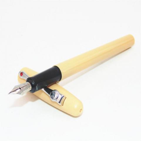
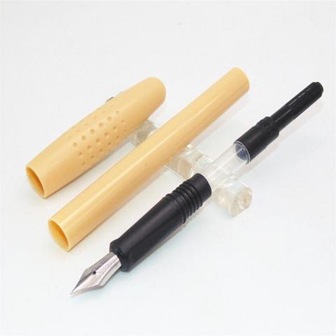
This is a review of a new pen I got recently, it was a complete impulse purchase but I was pleasantly surprised. First Impressions (6/10) This pen isn’t exactly a looker, but I wasn’t expecting that for $1.25. It came in a packaged envelope, and the pen was directly inside. (No box) It is made entirely of plastic (except the nib, obviously), and feels light in the hand. It did, however, come with a convertor, which helped my first impression of it. Appearance (4/10) Like I said before, the pen doesn’t look all that great (In my opinion). It is beige colored, and the cap has little golf ball-esque dimples on it. The cap and nib are steel colored, although the clip is made of plastic. The clip also has a small plastic red “gemstone” on it. The section of the pen is black, and has a subtle triangle grip. (Not as intense as a Lamy Safari, but it’s there). Design/Size/Weight (7/10) The pen is very light, being made out of plastic, and is fairly small. It is closest in size and weight to a Pilot 78g, but that is not to say that it’s design is remotely similar. Instead of the 78g’s simple elegance, the pen somehow manages to seem bland and gaudy at the same time, with a boring and flat beige section and a dimpled cap and fake gemstone bedazzled clip. The nib and section are plain black and silver, respectively, with “Domain Lion” printed on the steel nib. Nib (9/10) Looking at the past categories, I did not have high hopes for this nib. I was wrong. This is where the pen shines. The nib smoothly lays a fine line, and on a scale of 1-10 (1 being very dry, 10 being one of those nibs that is so wet can get your fingers inky just by writing a sentence with it), it is a 6-7 in terms of wetness. Unlike many of its Chinese brethren, it is not a complete nail, either. Although I did not fully push it to its limits, the nib gives a fair amount of spring to play around with. To be entirely honest, the pen I own which most accurately matches it’s writing characteristics is my 18k M Pilot Vanishing Point. Disclaimer on the nib portion of this review: On a lot of Cheap Chinese pens (I’m looking at you Hero 616), nib quality is inconsistent, so I may have just gotten really lucky with an awesome nib. Filling System (8/10) Not much to say here. It’s a simple cartridge convertor system. The pen came with a convertor. I inked it up with 1670 Emerald de Chivor, and have had no problems thus far. Cost and Value (10/10) I got this pen for $1.25 shipped, but they can be had now for $0.99 on Ebay. For a pen with a nib that feels like my vanishing point (At a dollar who cares if it retracts) it’s a complete steal, even if it is ugly. Conclusion (8/10) Yes, this is an ugly pen. But the nib is incredible, and it’s a dollar! I’ve used this pen daily for a week in prep for this review, and I have to say it’s really starting to grow on me. I never had a single issue with it, it always started up right away, and after a weekend of not being used I uncapped it and it started right back up again, even with Emerald de Chivor (which has given me trouble with those things in the past). Overall this is probably one of the best $1.25’s I’ve ever spent on a pen, and I would highly recommend it.
-
Maybe I just haven’t been paying close enough attention to the pen world, but the resurrection of the Wahl-Eversharp pen company slipped right past me. For those of you who haven’t delved into vintage pens or their history, a brief explanation may help. During the Golden Age of fountain pens, the “Big Four” American pen companies were dominant: Conklin, Waterman, Sheaffer, Parker and Wahl-Eversharp. Some of you may think my math is funny, but Conklin went into decline at roughly the same time Wahl-Eversharp was rising to prominence, so there were only four major companies at any given time. Wahl-Eversharp were best known for luxurious Gold Seal pens, the Equipoise, the faceted Doric and the art deco Skyline. All fountain pen makers were devastated by the sudden onslaught of ballpoints, and all of the Big Four changed hands in various ways. Waterman, Sheaffer and Parker never went away completely. The Conklin brand was revived a few years ago and is now owned (along with Monteverde) by Yafa. That left Wahl-Eversharp as the only “Big Four” brand that you couldn’t buy a brand new example of. Well... Now they’re back! Right now the revived Skyline is it, though they’re said to have a new Doric in the works. I’ve had a few Wahl-Eversharps in my collection and liked them, but I never had a Skyline. Although the design has garnered a lot of praise and is considered iconic by many, it always looked awkward and strangely proportioned to me. The pen body is sleek and streamlined, while the cap is big and clumsy. They don’t seem to go together. When I saw the new Skyline Technic, I had to reconsider my feelings. The pen body and the cap are machined from billet aluminum. The solid gray pen seemed understated, taming the excesses of the design and unifying the pen and cap. When I learned that these have a “revolutionary”, ceramic-coated, semi-flex, steel nib and a matching computer-designed feed, I was sold. http://zobeid.zapto.org/image/pens/wahl_skyline_technic/skyline_technic_box.jpg Unboxing the pen, I was first confronted with a large, glossy, black, presentation box with metal hinges and a sort of fluffy, fleecy, white lining. The pen itself was sealed into a clear plastic capsule. I was unimpressed with this packaging. The big box is attractive when displaying the pen in a boutique or for gift-giving, but once you’ve got the pen it becomes nothing but a bulky piece of junk to store. These types of boxes are all too common, and I find myself wishing pen companies would go back to the good old days of small presentation boxes that were also practical storage cases. (For a modern example I might point to the Levenger True Writer.) http://zobeid.zapto.org/image/pens/wahl_skyline_technic/skyline_technic_box_closeup.jpg I also noted that the box has some cosmetic defects. This is what I call a “piano box” since the lacquered wood and metal hinges are reminiscent of piano construction. This one has some dings near the front-left corner, rough finish at the opposite corner, and slightly rounded-off edges near the corners of the lid closure. As well, the glossy black finish isn’t entirely smooth. Frankly, I have seen cheap Sheaffers sold in piano boxes that were more nicely done than this one. http://zobeid.zapto.org/image/pens/wahl_skyline_technic/skyline_technic_capped.jpg After breaking the pen out of its carbonite prison, my first impression was very positive. The fit-and-finish on this pen are outstanding, as one would hope for in a pen of this price category. I give the new Wahl-Eversharp company praise for recreating the Skyline accurately, with the original’s size, shape, and even parts that are said to interchange with the original. Other classic pens that have been brought back from the past bore only loose, superficial resemblance to their vintage counterparts. (I’m looking at you, Sheaffer Balance!) http://zobeid.zapto.org/image/pens/wahl_skyline_technic/skyline_technic_uncapped.jpg The choice of C/C filling is not exciting, but it makes sense. It brings Skyline into the modern era, and it also solves the problem of the posted cap tending to scratch up the filling lever. In this case the supplied converter (already installed in the pen) is a screw-in type of high quality. It’s secure, it doesn’t leak, doesn’t wobble or rattle, and is about as good as converters get. The slender pen body is a thin and form-fitted shell that just barely contains the converter; there is no wasted space. This is different from the plastic-bodied Skylines, which make you access the cartridge or converter from the rear of the pen using a blind cap. That seems awkward, and I’m glad the metal Technic manages to avoid it. As metal pens go, it’s lightweight. It’s slightly lighter weight than my sterling silver Sheaffer Targa, but slightly heavier than several of my all-plastic pens (Bexleys, Edisons, etc.). Plastic threads inside the cap make posting safe; it's not going to scratch up the pen's body. It posts quite well, deeply and securely, and the balance when posted is very good. I do not usually post my pens, but this is one that actually feels more comfortable to me when posted. I really do find the pen's size, weight and balance pleasing. The Skyline Technic is available in black, in blue, and in natural aluminum colors. The natural aluminum that I got is not exactly what it sounds like, since it has a gray anodized (I presume) finish that doesn’t look like bare aluminum metal at all. It’s much darker, it’s more of a semi-gloss texture, and I find it handsome in a sort of subdued and rugged way. It should prove to be quite tough and scratch-resistant. When I turn the pen in my hand, I can see very slight shading differences around the pen, but this is not noticeable when not looking for it. The semi-flex nib was the one element that I was most eager to test, and which I was most uncertain about. The impressions from reviewers online varied widely, so the only way to get the real story was by writing with it myself. The nib is on the smaller side (No. 5) making it nicely proportional to the pen. (I find that No. 5 nibs are often more comfortable for me than the big No. 6 nibs, as I can get my fingers closer to the page and hold the pen at a more natural angle.) The ceramic finish on mine was a dark, glossy black, whereas the Wahl-Eversharp website had indicated this pen would come with a titanium gray nib. The immediate good news is that it’s quite a smooth writer. There was just a bit of very finely-grained “feedback” letting me know what kind of paper I was writing on. The flow was also very nicely adjusted as it came to me: wet but not gushing. Tip size is an issue for me. These nibs are supposed to be “fine to medium” size, but the one I got looks and feels like a full flabby M. My personal preference is for F and EF nibs, so this was not really my thing. Worse, it’s not a good choice for showing off what a “semi-flex” nib can do. Flex expression is more pronounced with finer nibs. The advertised “semi-flex” quality of this nib is something I’m not really finding. It’s firm. It’s not a manifold type nail, but it’s firm. You can make it flex quite a bit if you push it. If you write with a ballpoint-trained Gorilla Hand, then it will produce bold text, but writing in the normal way of fountain pens won’t really give you anything. I doubt whether I would have even advertised this as a semi-flex. My Sheaffer Targa is more expressive, and Sheaffer have hardly been known for nib flexibility. Worse, I also had some instances of hard starting, where the pen skips on the first stroke as it touches the paper. It didn’t happen too often, but it shouldn’t happen at all. I have too many other pens in my collection that never do this. Thus, I contacted Wahl-Eversharp. I got a swift response promising a replacement nib — indeed, a replacement nib-feed-section assembly. Also, I was told a small run of “natural aluminum” Technics came with the black nib, but they are now shipping a much lighter colored nib, called “light titanium” finish. I opted for one of these as the replacement, and I found it actually looks much like normal polished steel. http://zobeid.zapto.org/image/pens/wahl_skyline_technic/skyline_technic_nib.jpg The hand-written note that came with the replacement nib said, “I hope this works better for you — it was good to my hand.” That seems to be saying it was tested before being sent to me. I had to question that assumption, though, as soon as I had it inked up and touched paper. It’s a gusher! It’s a fire hose! Am I really expected to write with this? Ink flow on the first nib was perfect, so why is this one a fire hose? At least this proved the computer-designed feed can deliver a lot of ink throughput! Now feeling rather frustrated, I pulled one of my driest inks out of the closet: Montblanc Jonathan Swift Seaweed Green. This tamed the fire hose down to a wet-but-usable level (at least on my denser paper, such as a Rhodia pad) with lots of shading. This is still not the style of writing that I usually go for, but it’s acceptable, and some people might like it. Also, the replacement nib doesn’t skip as much as the first one. It still does once in a while, but it’s infrequent enough to not be much of a bother now. Since I received the replacement nib, feed and section assembly and was never asked the return the original, I now find myself with spare parts to play around with. I began trying to fit some other #5 sized nibs into the original feed and section to see how they perform. A nib from a TWSBI 530 fit with no problem, and so did a FPR (Fountain Pen Revolution) flex nib from India. In both instances they became quite wet when fully seated. It seems as though the feed and its housing are applying pressure to the nib in a way that causes its tines to spread slightly, so that every nib installed becomes wetter than it was before. http://zobeid.zapto.org/image/pens/wahl_skyline_technic/skyline_FPR_flex.jpg The FPR nib is most interesting, as its dull steel color closely matches that of the pen body, it writes smoothly, its fine point better suits my preference, and it also has a wee bit of flex. FPR currently have these listed for $7 each, or 3 for $15. However, the FPR nib also has an occasional hard-start. That makes it the third nib in a row with this problem, to some extent, and I’m beginning to think the feed is the actual source of the problem. Forcing the tines apart may not only make the nibs write wet, but it may also contribute to the hard starts. Even though I eventually got mine writing somewhat acceptably, I’ve got to say the Wahl-Eversharp nib was a big disappointment. The “revolutionary” semi-flex nib doesn’t flex in a way that I find particularly useful, and it’s flabby, and I’m restricted to dry inks and premium paper. I was told I could get a Fine nib (or, I assume, perhaps even EF) custom ground for an additional $50. Hmm... An additional $50 to get a fine nib on an already quite expensive pen? You know, I can buy a TWSBI with my choice of EF, F, M, B, 1.1mm ST or 1.5mm ST nibs. Why does this much more costly Wahl-Eversharp only come with M? Well, the TWSBI nibs are generally good writers, but quite firm; they won’t flex at all. The Wahl-Eversharp nib can be made to flex if you Gorilla Hand it. Surely that is worth something? Then I compare with the steel nib in my Baoer 388, a Chinese pen with a list price of $15. (I actually got mine on sale for $5!) Then I compare with the FPR nibs from India. These aren’t like vintage flex either, but they can actually flex a little bit when writing normally — more than I’m really seeing from the Skyline nib. http://zobeid.zapto.org/image/pens/wahl_skyline_technic/targa_skyline_baoer.jpg That brings us to the larger question of value. This pen sells right about the $280 mark. That’s for a non-limited-edition C/C filling pen made from aluminum and steel, not silver and gold. I could buy two nice Bexleys with steel nibs for that much, or probably four Monteverdes. Actually my sterling silver Sheaffer Targa with a 14K gold nib cost me only $200, and it writes much nicer. I’m not saying the Skyline is a rip-off, or that anyone who buys it is a chump. However... You probably need some sort of attachment to Wahl-Eversharp, to the style of the vintage Skyline, and you need to appreciate the aluminum construction and the superb fit and finish. If those don’t push your buttons, there’s not much logic in choosing this. The nib is particularly disappointing. This is the highest-priced pen I can recall seeing sold with a steel nib. Then factor in the minor-but-persistent hard-start problem, the lack of options for tip size, the poor flow adjustment of the second example, and the minimal degree of flex. Although this steel nib is perhaps as good as a typical modern gold nib, it doesn’t offer any improvement over gold, and it doesn’t cost any less than gold, so what’s the point? Harsh though it may sound, I hope this review comes across as constructive criticism. I’m thinking back to the first pens from the revived Conklin, a few years ago, and how they were actually rather crude in some ways. They’ve improved greatly since then, and I hope Wahl-Eversharp will go through a similar learning curve and product improvement. One sign of optimism is that the parts of the package actually made in-house by Wahl-Eversharp (namely, the pen body and cap) are so excellent. It's only the outsourced (I assume) bits that let me down, so I'm sure that can be solved.
- 12 replies
-
- wahl-eversharp
- skyline
- (and 4 more)
-
Hello all, Everyone's experiences and apprehensions with iron gall inks seem to be all over the place. The take home message is usually something along the lines of "if you exercise proper pen hygiene and use modern iron gall inks formulated for fountain pens, you shouldn't have an issue". I've followed this and nope, haven't had an issue yet. What I do get apprehensive about is the reasoning behind the iron gall cleaning routine. It seems you don't want the ink sitting in the pen for very long but the issue arises if you want to dedicate IG ink to a pen. For example what if one were to use IG inks in a steel nibbed pen with proper hygiene (rinsing, thorough cleaning bi-weekly at best, etc) but kept refilling the pen with IG ink? Wouldn't the contact time with the steel eventually corrode the nib? That's my question -- about the hardiness of steel when exposed to IG ink with proper pen maintenance. Anyone have positive/negative stories to share? This includes IG ink experiences of all kind with any nib/pen material but i'd especially love to hear from folks that have been using an IG ink in a particular pen for a long time (e.g., >=1 year). How does your pen fare under these conditions? Best, sleepy P.S: Currently using ESSRI in a lamy 2k and am loving it. A left-handed overwriters dream!
-
 Seems a little illogical to me. By the time the nib has corroded the threads or other metal parts in the barrel would have done so, but I've not heard of anyone having to replace their pen because of a corroded nib. I assume that this corrosion will take place over decades, so why the warnings not to convert pens with metal threads into eye droppers when the steel nib is in contact with ink as much as the threads. Yours confusingly B
- 17 replies
-
- ink
- eyedroppers
-
(and 1 more)
Tagged with:
-
We read a lot about gold nibs being more flexible, but a steel nib can be just as flexible as a gold nib, if it's thin. Flex: It's true that 18k gold metal is about half as stiff as steel. So for identical dimensions an 18k gold nib is about twice as flexible as steel. But dimensions are very important too. For a given metal, the nib stiffness is proportional to width multiplied times the cube of thickness. The cube here means than reducing thickness by only twenty percent will double the flexibility of the nib. In other words, a steel nib can have the same flex as a gold nib, if it's 20% thinner. Line width: Furthermore, why do you want flexibility in a nib? If your answer is to increase the line width when you press, we need to consider the arch of the nib. The amount of spread is influenced by the amount of arch. You can approximate the arch with angles as indicated by the dashed lines in this sketch. The greater the arch, the greater the angle and thus the greater the separation as the nib flexes. So, variable line width is determined by more than nib metal. Thickness and arch play a big role. Durability: Of course you want the nib to spring back to its original shape after you press down. In this regard thinner steel is a better choice than thicker gold. There is less danger of it taking a permanent bend. So while we associate gold with quality and value, it's not always the best metal for the job. Steel is obviously a better metal than gold for your car's springs. It can be better for your nibs too, when properly designed.


