Search the Community
Showing results for tags 'slim'.
-
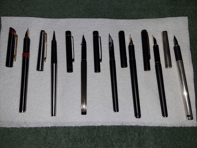
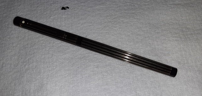
Having purchased an Aurora Ferrari (Hastil) around Xmas last year, I was spurred by Wattz for Ziti's January thread about slim pens to go looking for other pens that were mentioned, especially those in alexwi's list. I love the Ferrari but the cap is super heavy due to the huge brass clip and I wanted to find a few lighter offerings. Here's what I ended up with (soorry for the poor quality of the pics, eh): L to R: Ferrari, Parker 180 Flighter, Sheaffer Slim Targa Pinstripes, Slim Targa matte black/chrome, Hastil matte black, Fashion matte black, Hastil Ciselle, with a Parker 50; even that diminutive pen looks fat in comparison nibs: gold EF, steel M/EF, gold M Triumph, steel M Triumph, gold EF, gold-plated steel F, gold EF (I'm assuming, haven't inked it) Here's another pic of the striped Targa; though the 1st pic prob shows it off better, pics just don't do it justice, the way the gold stripes catch the light is amazing. One small problem it has is there's always a smear of ink across the nib just below the breather hole, that's where that ink spot above came from. I don't recall this happening on the black/chrome one when I had it inked. I've been checking ebay occasionally looking for a 14k F Triumph, though the M isn't too bad. They all write well, the F's and M's smoother than the EF's on the Hastils, of course. The black Hastil and the striped Targa both use carts and the first time I refilled them, they both ended up leaking into the barrel (and out the bottom spring pad holes on the Hastil into my shirt pocket) but hadn't had any problems on subsequent fills. Ink-wise, I have KWZ Lux Grey in the striped Targa, the black Hastil and the Fashion, Diamine Manngis in the 180 and Diamine Ruby in the Ferrari; I first tried Monaco which was great and laid down a nice, very distinct line but I wanted something a little closer to the red accents. Wild Strawberry was too pale in EF but the Ruby is a good choice, color matches fairly well and the line is pretty distinct. Black Targe not inked atm and I haven't inked the silver Hastil. Looks-wise, they're all quite nice, especially the striped Targa, though a bit too striking perhaps; the Ferrari is dashing and I'd use it more if it weren't for the heavy clip; the black/chrome Targa is kind of meh, while the black Fashion and Hastil are the cat's PJs - there's just something elegant about matte black with gold trim that I find very appealing. The Hastil has the edge here, the barrel taper isn't as pronounced and the brushed clip is more subdued than the shiny Targa one. The silver Hastil, well, I just saw silver Hastil and odered it without looking more carefully to see the "Ciselle". It's nice enough, I suppose and at least it's not Parker Ciselle, with the big, honking squares and what looks (in photos) like black crosshatching; no, the pattern is extremely fine, with the tiny facets like glitter so it sparkles in the light but, being just a length of shiny silver with no variation, it's kind of bland. Maybe if it had a gold clip... The Parker 180 is perhaps the most interesting. It looks quite dainty; it's the shortest (by 3/16s - 1/4") and the barrel tapers the most (it's not the slimmest, though, as the Targa's cap can easily slip into the 180's cap). The brushed stainless is also very smooth and very slippery - I did drop it once. It's also the only one I have trouble maintaining the right positioning of the nib (I find it rolls slightly to one side or the other), possibly because of the long tapering section. Still, it has the (possibly most) quintessential Parker "look" and the wedge-shaped nib exerts an almost hypnotic fascination. That's my little collection of slim pens. If you have any questions about particular pens, please ask.
-
- slim
- parker 180
-
(and 3 more)
Tagged with:
-

Is It Possible To Get A Sailor Pro Gear Slim Mini With An Ef Nib?
Venemo posted a topic in Japan - Asia
I was looking at getting another Japanese fountain pen. I found the Sailor Pro Gear Slim Mini which looks like something my brother would enjoy, he loves small pens with very fine nibs, so I thought I'd get one for him as a present. He is studying Japanese and currently uses a Pilot Elite 95S EF that I gave him when he was accepted to university. However, I was disappointed to see that the Slim Mini is only available with a MF nib. So I wonder, is it possible to find it anywhere with an EF nib? Or if not, is it compatible with any other Sailor pen, so that I could just swap the nibs? Also, how does the MF compare to a normal japanese EF? -
Just this afternoon I've ordered this combo SHEAFFER Targa Slim (according to the seller) ... apparently previously owned by an IBM person? I know, the seller's pictures are suboptimal, but I think, it does look like "23ct Gold plated, fluted, slim model", and hence I guess it's a "1005s" (http://www.sheaffertarga.com/fountainpenlist.htm). Can someone who perhaps is in possession of that pen confirm, please? Thank you
-
Music from the Ocean It was a little fight for the Slim or the Standard one. Would the Slim be too small? Would the 14k nib performs bad? As I had the Standard already, also the price is just half of the Standard, I give the Slim a shot. A slim review: Outlook: Normal package with converter, normal excellent quality, zero complaint. Oh I love the THICK center band (KOP induced?) and is in shinny chrome details, I always prefer chrome than gold. (The center band of the regular Slim has two ring lines). And the color is a special, a voyage green blended with little blue I think, and the whole body is nearly opaque. (Yet it’s not difficult to persuade yourself that you could “see through” the material…) The pen is quite light, and yes, it is quite smaller than the standard. The pen seems to be a bit short when uncapped, (I could use the Standard uncapped happily), but I could adapt it easily as I like light pens too. 14k Music Nib: I flush the pen with mild soap water before having it inked, and I picked the Diamine’s Golden Honey this time. The nib is very smooth with good feedback. It is a wet nib but not as wet as the pilot or platinum music nib that has 3 tines (I don’t have any music nib, just have a try on a pen shop before). This music nib has only one slit and two tines, and that’s the reason for me to choose it. Writing with a not very wet music nib is fun, like writing a 1.1 stub or italic, but wetter, and smoother. As said in many threads, writing with music nib or stub, a little adjustment on writing angle is needed, yes, it is, but not difficult, the sweet spot is quite large for this pen actually. Conclusion: Pro Gear: Standard or Slim? I choose Standard, always. But if you had the standard already like me, surely it is not a bad idea to get the slim, the smaller size fits many shirt pockets (also the slim price this time is just half of the standard). Performance wise, no worry, Sailor has good nibs, 21k is wonderful, but 14k is very good already. I am very, very happy to have this, no regret at all. Again, I love the thick center band, it makes the pen looks thicker…lol.
-
Hey guys! So, many years ago I received a fountain pen as a gift, which I have only recently been able to identify as the Sheaffer Fashion II. Since I had never used a fountain pen before, I left it untouched for many years until recently. The pen is completely dried up, and there is no cartridge nor converter in it. I have a few 'slim cartridges' that came with the gift bundle, but they are all dried up too. Regardless, I tried to install the cartridge, but it wouldn't fit. There is something inside blocking it, and I have no idea what it is. As I am very eager to try using a fountain pen, I am in desperate need of your advice! Thanks in advance. https://ibb.co/74066Vp https://ibb.co/PNfW29W https://ibb.co/HFH2Chj https://ibb.co/x3Tnp5T https://ibb.co/d452Sqd
-
Hey all, Any recommendations on a good small/slim Montblanc fine nib pen? Been looking at the 146 and was wondering if there are any 'experts' with using this as an every day writer. I prefer slim/small pens with a fine nib to write for extended periods and really like the Montblanc brand. Kind Regards Ben
-
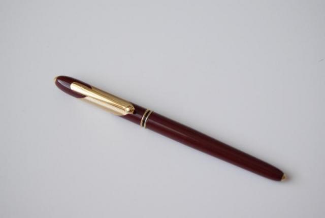
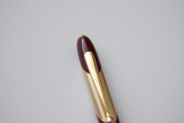
hi everyone, if anyone know which pen is this? It has an engraved symbol on the clip but it is hard to say what the symbol is about. I am appreciated any information you may know or have.Thanks a lot,
- 4 replies
-
- fountain pen
- merlot red
-
(and 8 more)
Tagged with:
-
No Greek In The Pro Gear - The Sailor Pro Gear 2 (Sigma) Slim Review
sannidh posted a topic in Fountain Pen Reviews
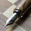
My first review posted on FPN, was of this pen. I wanted to give this pen another look with relatively more experience with other pens. Here is a link to my blog with some more pictures: The Sailor Pro Gear 2 (Sigma) Slim So here goes a rather detailed review. PRELUDE After bidding adieu to my only Sailor fountain pen - a stunning 1911 Profit Standard in Navy Blue colour, dazzling with golden accents with a broad 14k nib, I was constantly missing a Sailor. It was not that there was a dearth of good pens. For all good reasons, I believe that these Sailors are a great piece of workmanship as far as design, build and quality of materials are concerned. However, my romance with Sailor Pens was rather an one-sided affair, as far as their nibs were concerned. Not once but for five consecutive times, I had gone for a return. Thanks Raul & Engeika. With a strong feeling for a sixth luck since it corresponds to my birth number, the urge for a Sailor was getting bolstered with each passing day. And then, giving in to my temptation, I went for the newly launched Pro Gear 2 or Sigma ∑ Series, which kind of fulfilled my criteria of being a Sailor as well as having a two-tone nib. THE SAILOR STORY In 1911, Mr. Kyugoro Sakata, an Engineer from Hiroshima, Japan, was introduced to the fountain pen by friend, who was a British sailor. He was so intrigued by the design and function of a fountain pen that he started a company to craft fountain pens among others. In honour of his British friend, he chose to name the company as Sailor Pen. Henceforth, the Sailor nibs carried an imprint of 1911, the foundation year. Today, the Sailor pens come mostly in a classic cigar design (KOP, 1911) or a tapered cigar cut (Pro Gear), excluding a few like Reglus, Somiko among others. In 2013, Sailor changed the classical Pro Gear design to appeal to modern tastes of the 21st century folks, at least this is what their marketing campaigns said. There was a visible change in design of the clip and the logo on the finial. And I admit, I never could find a connection of Pro Gear ‘Sigma’ with the eighteenth letter of the Greek alphabet. Finally when I asked Sailor, it seemed their intent was to create another luxury segment out of their already successful Pro Gear/ Sapporo Series with an enhanced nib/design. The Sigma nomenclature was originally aimed for the domestic Japanese market. For the international markets, Sailor renamed it as Professional Gear II when Sigma did not gain enough foothold. http://1.bp.blogspot.com/--0VIcGpyMHc/VbNiVLxVMcI/AAAAAAAAE9U/7krtTKGLjiQ/s1600/Sigma%2BBrochure.jpg PRESENTATION The pen comes in a beautiful blue gift box, packed with two black cartridges, a converter and a user manual. http://4.bp.blogspot.com/-bFUnosPl0Sg/VbNhfFQ5AOI/AAAAAAAAE74/OGqZwpvneyM/s1600/DSC_4612.jpg http://1.bp.blogspot.com/-US6RHlmzw08/VbNh3ze_xtI/AAAAAAAAE8I/cfzNjzbD6HU/s1600/DSC_4614.jpg DESIGN - THE TAPERED CIGAR (5/6) The Pro Gear II (or Sigma) Slim comes in two standard designs - Gold Accents and Silver Accents. They also feature corresponding ballpoints and mechanical pencils. The build is remarkably sturdy without addition of weight. It is made up of PMMA resin or Polymethyl Methacrylate which was developed by a group of scientists in 1928. PMMA is easier to mould with heat. It’s actually transparent when synthesised from petroleum and therefore dyes are added to impart colour. Besides, it’s resistant to normal scratches with a hardness of around 4 in Mohs scale. So you would probably need iron or steel to make a bad enough scratch on it. The pen is 0.6 cm longer compared to the Sapporo Slim with an increased taper at either finials. The lustre of the pen is rendered chiefly by nickel-chrome plated accents (it’s not rhodium), though the resin does have a gleam of black shine. A thin layer of chrome plating over bright nickel coat makes the surface resistant to common corrosion by air or water. The rings at either ends along with the clip and cap bands deliver the dazzle. Apart from the thick clip, the pen does have an understated look. http://3.bp.blogspot.com/-ZkQoi8ApkLQ/VbNiAB3SBfI/AAAAAAAAE8Q/ZR-rzuu7enQ/s1600/DSC_4618.jpg The cap feels light and unscrews with two complete turns, revealing a grand two-tone nib. There is a loop of glitter from the metallic threads, which marks a start for the grip section. http://4.bp.blogspot.com/-kr9Yq30MIX0/VbNiGHhrxzI/AAAAAAAAE8Y/tFoU4g4VxzY/s1600/DSC_4622.jpg The cap band carries an imprint of SAILOR JAPAN FOUNDED 1911 and has a thin loop just above it for the pure aesthetics part. The finial carries a distinct anchor logo within a dome of transparent acrylic. A much-debated anchor embedded inside its tension-fit clip, has also got wider proportions in terms of size when compared to the earlier clip. http://2.bp.blogspot.com/-2P2X8vubO7Q/VbNg-kdqP7I/AAAAAAAAE7Y/cEupnOlxGRQ/s1600/Cap.jpg FILLING SYSTEM (4/6) As a CC filler, the supplied convertor is limited by a volume of 0.6 mL. It does give an advantage to frequent ink-swappers or you can use cartridges. The barrel unscrews from the grip section with eight turns with an usual metallic thread section on the grip. The resin barrel is directly threaded on its insides. The nib and the font part of the grip have to be completely immersed inside ink to get a proper suction. http://2.bp.blogspot.com/-8zVSLm1vzYY/VbNiUCZl3_I/AAAAAAAAE9c/F8j-R5rj3NA/s1600/DSC_4624.jpg NIB - ALL THAT MATTERS (5/6) The nib/feed section is friction-fit and comes in a 14k two-tone design across three stock widths - F, M & B. Sailor does make absolute stunners here. The silver accented one carries a rhodium coated nib adorned with a band of gold and it's vice versa for the gold-accented one. http://3.bp.blogspot.com/-eDnHWBZk1PI/VbNiU_aJ5bI/AAAAAAAAE9Q/yNUP0jVtOek/s1600/DSC_4691.jpg The tail end carries the brand imprint of Sailor with the traditional elongated S and the nib-composition (14 C, 58.5% Au) rests above it. 1911 and the Anchor logo are embossed above, towards the circular breather hole. A band of golden decor runs in between the body and its shoulders which enhances the decor. The size H-M (Hard Medium) is imprinted on one of the faceted shoulders. The nib lays a wet and fine line, writing quite smoothly for its sweet-spot. While writing, it does produce a distinct sound when the iridium tip touches the paper. A slight rotation changes the tip angle and makes it toothy. Between, I have never seen any Soft nibs from Sailor. (S-M or S-F) http://3.bp.blogspot.com/-DjmsHGg92o0/VbNiMvWel7I/AAAAAAAAE8g/JkibXWoh5wY/s1600/DSC_4682.jpg A standard black plastic feed with closely spaced fins allows a buffer capacity of ink and even with the cap open for a while, it does not take any effort to lay a nice wet line. http://4.bp.blogspot.com/-sHwdlXpT-U0/VbNiRWQUdXI/AAAAAAAAE8o/IWexwzrqkt8/s1600/DSC_4690.jpg PHYSICS OF IT (5/6) – RELATIVELY SPEAKING The cap needs to be posted, else the pen seems to lack both length and heft. The grip section is about 1 cm thick and provides a decent level of comfort, while writing. Uncapped Length ~ 11.3 cm Posted Length ~ 14.5 cm Nib Leverage ~ 2 cm Overall Weight ~ 17 g (Cap Weight ~ 7 g) Capped, uncapped and posted comparisons with a pelikan m405 run below for your reference. A pelikan m4xx is apparently shorter than the PG2 Slim, but only when capped. http://4.bp.blogspot.com/-0QdmKdFql1s/VbNhFf_WRHI/AAAAAAAAE7g/8PiK0Fi_is8/s1600/DSC_4598.jpg Uncapped or posted the m4xx is a good 0.5 cm longer than the PG2 Slim. http://2.bp.blogspot.com/-wAdXxCvzFx0/VbNhY1uSSGI/AAAAAAAAE7w/wNMxU6M9Mu0/s1600/DSC_4602.jpg http://1.bp.blogspot.com/-v-1wPUxCGRQ/VbNhjpiIjYI/AAAAAAAAE8A/Th2qsyapUHc/s1600/DSC_4606.jpg ECONOMIC VALUE (6/6) The Pro Gear Slim retails at around US$ 200, though it might be available at lower street prices. I was able to get the pen at around $ 145 from Engeika’s Indian arm. I feel that it’s a good value for money pen. OVERALL (5/6) This stunning 14k nib is smooth at a normal angles with a pretty wet flow. There is no noticeable line variation between the horizontal & vertical strokes. A slight rotation changing the tip angle makes it feel toothy and a little more change makes it scratchy. The nib is a H-M (Hard Medium) nib and is like a nail. There is a slight bit of spring and an absence of any perceptible softness with this nib. Even being a wet writer out of the box, the Sailor Medium nib puts a line which takes around 15 seconds to dry on MD Paper. Ink used was Sailor Sky High. http://1.bp.blogspot.com/-CzLlyEaY4_k/VbNhJBdp0pI/AAAAAAAAE7o/yW3ca4Z77u4/s1600/DSC_4594.jpg REFERENCES Sailor History PMMA Resin Hardness Scale Thank you for going through the review.- 21 replies
-
- sailorpro gearsigma
- slim
-
(and 5 more)
Tagged with:
-
Hi, New here. I bought my first Cross today and really want to use green ink with it. I looked on the Cross site and it states the orange converter should work. However, my main concern is that the guy in the shop said that it didn't take converters because of the slim size. I can understand this as the cartridges are longer and thinner than the regular type. I just want to make sure! Thanks for your help, Juli
-
This is my first review at FPN site. I hope you do forgive my transgressions if caught Below is a link to the same on my blog. If there is some problem with the shared pictures below, I would request you to please go to the below link: http://iwonder-thecartographer.blogspot.in/2014/09/sailor-pro-gear-ii-slim-review.html After selling off my one and only Sailor left - a Profit Standard – Navy blue, gold accents with a broad nib, I did feel a subtle sense of absence – of a Sailor. This was the prime momentum behind buying a pro-gear ∑ slim, albeit it accomplished both criterions of being a Sailor and equipped with a two-tone nib. One funny thing is that, I have always ended up in the dark side of the sailor nibs, be it a Reglus – Medium or Fine or a Profit S – Broad or Music and instinctively I am a fan of their nib design rather than superior writing experience. There are two versions to the Pro Gear (II) ∑ Slim, one is a gold accented one, other a silver accented one. I inched towards a silver accents one, because the rhodium accented nib with a thin embellishment of gold appeared to convey the two-tone character with a lot more emphasis than the one with golden accents. You views may differ depending on your preference for the yellow metal. So the story with pictures begins…. The pen came in a Sailor Standard Gift box as shown below. And yes, I do intend to keep the gift box unlike the cardboard Pelikans’ or the plastic Pilots’. http://s25.postimg.org/qxpxiaey7/DSC_0704.jpg Packed inside the box.. http://s25.postimg.org/q4idmsf8v/DSC_0708_1.jpg http://s25.postimg.org/ockcurpkf/DSC_0711.jpg Pen and its sections. Fitted with one of the standard sailor black cartridges http://s25.postimg.org/9xc36q88f/DSC_0716.jpg http://s25.postimg.org/6hjyx6azz/DSC_0724.jpg A much Debated Clip design, Cap top-logo and the Nib http://s25.postimg.org/6ik9fqh4f/DSC_0720.jpg http://s25.postimg.org/7me12jxgv/DSC_0749.jpg Posted Sailor Pro Gear ∑ (Sigma) Slim http://s25.postimg.org/m4b8ajorz/DSC_0726.jpg M405 vs PG ∑ Slim Capped, Pelikan M405 is actually shorter than the Sailor PG Sigma SlimPosted, M405 exceeds PG ∑ Slim by ~ 0.3 - 0.4 cmClip of PG ∑ Slim does show a strange resemblance with the pelikan http://s25.postimg.org/6ju795iy7/DSC_0732.jpg http://s25.postimg.org/518gf1833/DSC_0736.jpg http://s25.postimg.org/5ityk11yn/DSC_0737.jpg Writing Sample Though the nib is not the smoothest of the lot, it is not scratchy either. With a decent bit of feedback it does inhibit the paper glide usually enjoyed by the Pelikans. The flow is quite wet and the cartridge levels do reinforce the wetness of the nib. One ineffable dimension, is the distinguished character portrayed by the nib with its innate design, stiffness, sound and writing experience. The nib produces a distinctive sound while writing, due to the geometrical edges of the tipping point and yes it’s an enjoyable feedback. http://s25.postimg.org/93pu396i7/DSC_0740.jpg Ratings Along with my own biases* PG ∑ Slim -Feature Spec if applicable Rating (of 10)* Comments Length Capped ~ 12.8 cm Posted ~ 14.6 cm Unposted ~ 11.3 cm Nib Leverage ~ 2.0 cm 9 - Posted length is comfortable for long writing sessions for bigger hands Weight Posted ~ 16.8 g 9.5 - Balancing is very good Design Silver Accents (Gold Accents Edition is also available) 8 - Tapered cigar cut - Nib is the high point - Clip seems somewhat bulky at top due to an embedded anchor design - Subtle resemblance with a Pelikan clip Filling System Sailor Standard Cartridge/Converter 7.5 - 0.6 ml converter capacity - Advantage for frequent ink swappers Nib 14K Gold-Rhodium Coated Dual Tone Leverage ~ 2.0 cm 7 - Unique nib design on dual tone accents - Nib has a bit of “sailor” feedback - Wet Flow Economic Value Best Price with all custom duties paid 9 - Compared to other luxury pens with similar specs it’s a quite competitive offer Accessories - Elegant Gift Box which one would rather keep - 2 Standard Black Cartridges - 1 pack of Sailor Jentle Blue Cartridges (not included as standard accessory) - Sailor Standard Converter 9 - High Quality Overall Rating 8.42
- 24 replies
-
- sailor
- pro gear sigma
-
(and 2 more)
Tagged with:
-
Hi! I've been looking for a good pen for myself. I write a lot, and usually destroy my pens, and I have small hands so I like slim pens. The Highace Neo is available locally for $13. I really like it's fine nib. But the metal and plastic parts just "clash" for me. So would it be suitable for me? Is it comfortable when writing for a lot of time? Should I use converters or cartridges (I use up a Platinum cartriidge, 1.1 ml, in two days)? If converters, what kind of ink? Has someone got a long-term review of it? Any tips, tricks? Which colour is your favourite? Thanks!
-
Hi there, Once again I am on the hunt for a fairly specific type of pen. I'm taking a holiday and want to take a cartridge-using pen with me - but the ink I want to use is in Long SI cartridges, and none of my pens take them! Plus, I wanted a pen to use with my diary's pen loop anyway. So it must fit the following: Slim Takes Long Standard International Cartridges Preferably non-metal grip section Western fine / Japanese Medium nib available Accepts a convertor would be a bonus.I've considered: The Pilot MR - the European version takes SI, IIRC. Kaweco Sport - but I think this only takes the short ones?Any suggestions?
- 7 replies
-
- standard international
- slim
-
(and 1 more)
Tagged with:
-
On a recent trip to Osaka, Japan I decided to stop by Mr. Morita's fountain pen shop. I picked up a Sailor Professional Gear in a wonderful "robin's egg blue" color that was specially made by Sailor for the Morita Pen Shop. From the photos online, I didn't think the color looked like a "must-have" but when I saw it in person it grew on me really quickly. I noticed a serious lack of decent photos of this pen online so I thought I'd upload some shots that try and show the lovely color of this exclusive pen. For more info and photos, feel free to check out my blog post here: http://inklode.com/2014/02/28/the-morita-original-pro-gear-slim/ http://inklode.com/wp-content/uploads/2014/02/SailorProGearSlim_Morita_01.jpg http://inklode.com/wp-content/uploads/2014/02/SailorProGearSlim_Morita_02.jpg Thanks for looking!
-
Hi there, The other day, I got a new unique ballpoint pen made by CROSS. It's really tiny and slim! What is more,I found that it could be used as a bookmarker. http://www.youtube.com/watch?v=90YxK-_zQ1k Anyway, I think this pen is cool so far. ☆Love CROSS☆
- 22 replies
-
- slim
- ballpoint pen
-
(and 1 more)
Tagged with:


