Search the Community
Showing results for tags 'shading'.
-
☞ Please take a moment to adjust your gear to accurately depict the Grey Scale below. As the patches are neutral Grey, that is what you should see. Mac http://www.computer-darkroom.com/colorsync-display/colorsync_1.htmWintel PC http://www.calibrize.com/http://i783.photobucket.com/albums/yy116/Sandy1-1/FPN_2013/27ddb717.jpg ☞ As Photob*cket has lost the functionality to display linked files as required and includes advertising with linked images, I've embedded the HiRes images. I apologise should that choice slow your display times. ⊣:⊢ http://i783.photobucket.com/albums/yy116/Sandy1-1/FPN_2013/Ink%20Review%20-%20Barock%20Terra%20di%20Siena/BarockTdSbottle_zps3b7abe5c.jpg Fidelity As I could not find an 'official' depiction of this ink online, it could not be determined if the ink I used is as it should be. (Hello online shoppers!) Wiki: 'Terra di Siena' http://it.wikipedia.org/wiki/Terra_di_Siena Figure 1. Swabs & Swatch Paper: HPJ1124. http://i783.photobucket.com/albums/yy116/Sandy1-1/FPN_2013/Ink%20Review%20-%20Barock%20Terra%20di%20Siena/INK144_zps5e75fb2f.jpg Figure 2. NIB-ism Paper: HPJ1124. Depicts nibs' line-width and pens' relative wetness. Distance between feint vertical pencil lines is 25mm. http://i783.photobucket.com/albums/yy116/Sandy1-1/FPN_2013/Ink%20Review%20-%20Barock%20Terra%20di%20Siena/INK160_zpsa523466c.jpg L ➠ R: Elite, P99, 502, 45, NPS, Prelude. WRITTEN SAMPLES - Moby Dick Ruling: 8mm. Figure 3. Paper: HPJ1124. http://i783.photobucket.com/albums/yy116/Sandy1-1/FPN_2013/Ink%20Review%20-%20Barock%20Terra%20di%20Siena/INK146a_zps3b3e9fe0.jpg Figure 4. Paper: Rhodia. http://i783.photobucket.com/albums/yy116/Sandy1-1/FPN_2013/Ink%20Review%20-%20Barock%20Terra%20di%20Siena/INK147_zpsb22ce010.jpg Figure 5. Paper: G Lalo. http://i783.photobucket.com/albums/yy116/Sandy1-1/FPN_2013/Ink%20Review%20-%20Barock%20Terra%20di%20Siena/INK148_zpsb2a85ebb.jpg Figure 6. Paper: Royal. http://i783.photobucket.com/albums/yy116/Sandy1-1/FPN_2013/Ink%20Review%20-%20Barock%20Terra%20di%20Siena/INK149_zps4fd14bbf.jpg Figure 7. Paper: Clairefontaine Triomphe. Pens: Estie, Sonnet. http://i783.photobucket.com/albums/yy116/Sandy1-1/FPN_2013/Ink%20Review%20-%20Barock%20Terra%20di%20Siena/INK150_zps1e26f162.jpg Figure 8. Paper: Staples White. http://i783.photobucket.com/albums/yy116/Sandy1-1/FPN_2013/Ink%20Review%20-%20Barock%20Terra%20di%20Siena/INK152_zps589a6929.jpg Figure 9. Paper: Staples Creme. http://i783.photobucket.com/albums/yy116/Sandy1-1/FPN_2013/Ink%20Review%20-%20Barock%20Terra%20di%20Siena/INK151_zps3dabb61b.jpg OTHER STUFF Figure 10. Smear/Dry Times & Wet Tests. http://i783.photobucket.com/albums/yy116/Sandy1-1/FPN_2013/Ink%20Review%20-%20Barock%20Terra%20di%20Siena/INK154_zpsc61c6748.jpg Figure 11. Bleed- Show-Through on Staples White. (Reverse of Figure 8.) http://i783.photobucket.com/albums/yy116/Sandy1-1/FPN_2013/Ink%20Review%20-%20Barock%20Terra%20di%20Siena/INK153_zps0890189c.jpg Hi-Res Samples Originals are approximately 57x45mm Elite on HPJ1124: http://i783.photobucket.com/albums/yy116/Sandy1-1/FPN_2013/Ink%20Review%20-%20Barock%20Terra%20di%20Siena/INK155_zps575ea16d.jpg 502 on Rhodia: http://i783.photobucket.com/albums/yy116/Sandy1-1/FPN_2013/Ink%20Review%20-%20Barock%20Terra%20di%20Siena/INK156_zps56cfe1c5.jpg 45 on G Lalo: http://i783.photobucket.com/albums/yy116/Sandy1-1/FPN_2013/Ink%20Review%20-%20Barock%20Terra%20di%20Siena/INK157_zps577c3f5a.jpg Prelude on Royal: http://i783.photobucket.com/albums/yy116/Sandy1-1/FPN_2013/Ink%20Review%20-%20Barock%20Terra%20di%20Siena/INK158_zps31cfd17a.jpg Sonnet on Clairefontaine Triomphe: http://i783.photobucket.com/albums/yy116/Sandy1-1/FPN_2013/Ink%20Review%20-%20Barock%20Terra%20di%20Siena/INK159_zps59a73507.jpg GENERAL DESCRIPTION Type: handgefertigte Tinte für Füllfederhalter. (Handmade fountain pen ink.)Presentation: Bottle.Availability: Available when Topic posted.Exclusive to Pen-Paradise of Germany. pen-paradise dot deDaily writer? More of an 'on purpose' ink.A go-to ink? When a high performance warm Brown ink is desired.USE Business: (From the office of Ms Blue-Black.) I have yet to be convinced that [warm] Brown ink would be OK in the workplace, but . . .When run at the darker values, BTdS has depth, but not much gravitas, so I'd shy away from this one for routine correspondence, other than brief downward / lateral notes to a known person.For personal work product, determining the value (light - dark) of what's written would be essential to achieving high readability, especially for longer sessions; and as shading may slow the reading process, a move to absorbent papers seems a good option, or reach for that wet-ish narrow nib.The writing experience is quite neutral if not slightly austere, yet I found the toothy copy/print papers comfy enough.The line quality is very high, even on the C/P papers, so tiny marginalia are well within scope.The lack of appreciable bleed- show-through on the 'lowest bidder' papers is much appreciated, and supports the option of running this ink from a slightly wet pen to achieve a darker line and increase lubricity.BTdS appears quite warm in the pale to medium values, at which it would be welcome as an alt/aux ink: mark-up & editing of material printed in Black, and drafts written in Turquoise thru Blue thru Blue-Black; and occasional forms work.Illustrations / Graphics: In the lighter values, BTdS would be a very good pick for line charts & graphs, bringing some vibrancy and its crisp clean line quality, though shading may need to be suppressed. For area formats the full range of values could be utilised; and the colour remains Brown at light values - not wandering towards Orange.Typical of inks with a warm hue, the perceived colour is sensitive to the viewing light, so that should be taken into account.As a watercolour, BTdS emulates its namesake to a great extent. There is quite a difference in behaviour of the dyes when exposed to water, which enables one to generate colour gradients by reworking with a wet sponge or brush, overworking with wet media, and/or to removing dye to leave a strong clear Burgundy-Red remnant. Students: A good pick.Much as for Business Use above, the ink would be suitable for general notes at the darker values and at lighter values will do the necessary as an alt/aux ink.The ink is reluctant to bleed- show-through 'lowest bidder' papers, and has high degree of water resistance, which makes BTdS an attractive option for all but assignments.Personal: Certainly.Even though I currently prefer Brown inks that are low chroma and/or those of a more vegetal aspect that lean Green, I find BTdS has that 'certain something' which makes it quite appealing, though it may not be a constant companion. (I'm still trying to expand my palette.)Forget using this ink for pro forma writing - there are too many default Blues on the third shelf waiting to be used-up.As ever with the Brown inks, the perceived hue is greatly influenced by the value; and this ink has a very roomy performance envelope that supports considerable manipulation to get the appearance 'just right'. Not likely to be evident on your display, the ink displays a high degree of richness and lustre on the page.While I think this ink will attract those who have an array of pens & papers who are [OCD] inclined to seek a certain appearance, BTdS is so well mannered that when used with whatever pen+paper combo is to hand the result will be rewarding. PHYSICAL PERFORMANCE & CHARACTERISTICS Flow Rate: Lean. Nib Dry-Out: Not seen.Start-Up: Immediate.With confidence.BTdS may darken in the feed of uncapped idle pens, as seen from the 502 on HPJ1124. My bad.Lubricity: Modest.Allows for good feedback.Won't jostle when dancing across a textured sheet.Nib Creep: Not seen.Staining (pen): Not seen after three days.Clogging: Not seen.Seems unlikely.Bleed- Show-Through: Inconsequential. Feathering / Wooly Line: Not seen.Aroma: Not noticed.Hand oil sensitivity: Not evident.Clean-Up (pen): Thorough with plain water, but took a bit longer than usual, so adding a few extra soak+flush cycles to one's clean-up regimen seems a good idea.The use of a 0.3% ammonia solution greatly expedited clean-up.Mixing: No stated prohibitions.Archival: Not claimed. THE LOOK Presence: The radiant Summer of Tuscany.Saturation: Typically low.A fully-inked line may be achieved with little effort.Shading Potential: High.Pleasantly fluid & low-key.Possible from narrow mono-line nibs - even on 20lb paper. Line quality: Very high for a simple dye-based ink.Variability: Pen+nib combos used:Just a bit more than expected.The flex-ish nib on the 502 showed railroading to an extent beyond that attributable solely to the inept operator and/or the pen in her hand.Papers used:Greater than expected.Papers that are coated or slick may give results that are not quite as expected, so a bit of sampling is a good idea. (See below)Malleability: Quite high.Even though there is an extended range of the pen+paper combos used for the Written Samples, the potential of BTdS is still under-represented.We see the P99 on G Lalo approach the limit at the pale end, but there is more range to be explored through the use of quite wet nibs, which the roomy performance envelope should encompass. As such, BTdS may appeal to those who have wet pens, yet still like to elicit a bit of shading.The wily practitioner would choose paper before pen, which is not often the case.My reading of the runes is that the absorbency of the paper is unusually important, but the response of BTdS isn't quite typical, so a bit of uncharted territory lay on that heading. PAPERS Lovely papers: All.BTdS ♥ paper! Trip-wire Papers: ☠ Not seen.Copy/Printer Paper: All trumps!Crisp clean lines, lack of bleed- show-through, and fair shading.One does not need a dry narrow nib to get fine results on C/P papers.Tinted Papers: As ever with the Brown inks, there is a tendency to consider the warm tints, which suit BTdS very well.Is high-end paper 'worth it'? Even though the ink performed very well on the C/P papers, I think the high-end papers should be given a fair go. That may entail a bit of sampling to find matching pens to make high-end paper 'worth it', but Figures 4 & 7 give some indication of the pleasures that await. *reaches for the Elco Opal*Another reason to choose a high-end paper is to avoid those that use optical brightening agents to achieve brilliance. ETC. Majik: Possible, but would likely be quite subtle.Billets Doux? Not quite.Personal Pen & Paper Pick: A bit of an odd pick: the P99 on Staples White.The nib is rather narrow & dry, yet generates a crisp line with attractive shading which suits the line width to a T.The paper is totally unremarkable, but just so happens to match the pen+ink combo. (These things do happen - too often when one is not looking!)Yickity Yackity: I seem to have received more than was expected when I chose this ink. Nothing too 'wow', but BTdS will keep me smiling as I pen a warm thought; and the performance of the ink should cut down on the recycling and shorten the queue of pens to be cleansed. Now that BTdS has settled in, somehow I'm reluctant to look for another warm Brown ink. (?)Ah kushbaby, surely there must be space on your shelves for a small bottle of well-mannered warm Brown, especially if you've also sent P4BBrn to the Mixing Corral.= ==== = NUTS BOLTS & BOILERPLATE Pens Written Samples: A. Pilot Elite + 18K Script nib. B. Pelikan Technixx P99 + steel F nib. C. Waterman's England 502 (Blue) + flex-ish 14CT 2A nib. D. Parker 45 + g-p steel M nib. E. The Notorious Pink Safari + steel B nib. F. Sheaffer Prelude + factory stock steel Stub nib. ◦ Esterbrook J + 1461 steel nib. ◦ Parker Sonnet + factory stock 18K Stub nib. Lines & labels: OMAS Turquoise from a Pilot Penmanship + EF. Papers: HPJ1124: Hewlett-Packard laser copy/print, 24lb.Rhodia: satin finish vellum, 80gsm.G. Lalo Verge de France: natural white, laid, 100gsm.Royal: 25% cotton, laser/inkjet copy/print, 'letterhead', 90gsm.Clairefontaine Triomphe: brushed vellum, 90gsm.Staples White: house brand multi-use copy/print, USD4/ream, bears FSC logo, 20lb.Staples Creme: 'Pastels' house brand, multi-use copy/print, USD9/ream, 20lb.Imaging An Epson V600 scanner was used with the bundled Epson s/w at factory default settings to produce low-loss jpg files.No post-capture manipulation of scanner output was done, other than dumb-down by Epson, Photobouquet, IP.Board s/w, and your viewing gear.Other Inks This Review uses the same Written Sample format, atrocious handwriting and some pen+paper combos common to most of my previous Reviews of Brown inks. Consequently, ad hoc comparisons through manipulation of browser windows is supported. Should that functionality not meet your requirements, I welcome your PM requesting a specific comparison. Additional scans may be produced, but the likelihood of additional inky work is quite low. Fine Print ◊ The accuracy and relevance of this Review depends in great part upon consistency and reliability of matériel used. ◊ Ink does not require a label/notice to indicate (changes in) formulation, non-hazardous ingredients, batch ID, date of manufacture, etc. ◊ As always YMMV due to differences in materials, manner of working, environment, gravity dimples, etc. ◊ Also, I entrust readers to separate opinion from fact; to evaluate inferences and conclusions as to their merit; and to be amused by whatever tickles your fancy. -30- Tags: Fountain Pen Ink Review Sandy1 Barock Terra di Siena Sienna Brown Ochre 2013
- 29 replies
-
- warm brown
- shading
-
(and 3 more)
Tagged with:
-

Sandy1 review of Parker Penman Sapphire - close-up to show shading and feathering on Clairefontaine Triomphe paper.webp
Mercian posted a gallery image in FPN Image Albums
From the album: Sandy1
This image is the close-up that is intended to show shading and feathering on Sandy1’s review of PPS. It is a close-up of her writing with PPS on Clairefontaine Triomphe paper. It is the image from the sixth link from the top of the page - the image that used to reside behind the fifth link is currently inaccessible.
- 0 B
- x
-
- sandy1
- parker penman sapphire
- (and 4 more)
-
This ink was part of blind ink testing on another pen site. It's a happy colour, for people who love blue, shading and use good paper and avoid water I won’t recommend this for sweaty palms or mermaids It’s a great colour for artwork and washes, as you can see on this quick sketch on Apica: Chroma: Dry time is long on Rhodia: on Tomoe RIver 68gr it didn't dry after 3 hours, so I had to use a tissue paper as a blotter, see for yourself: Ink on tissue paper: It loves water as you can see, but something might be salvaged... Writing samples: (My apologies for the low quality of scans) Apica Midori: TR 68gr: Mnemosyne: a bonus sample, on Apica Premium notebook, (a different quote) · Pens used: : Jinhao Medium/ Fude, Jinhao X159 fine, WIngsung 3013 · Shading: Lovely · Ghosting: On cheap paper yes. · Bleed through: On cheap paper yes. · Flow Rate: Wet · Lubrication: Good · Nib Dry-out: Not noticed · Start-up: Not noticed · Saturation: Soft · Shading Potential: Good · Sheen: Faint · Spread / Feathering / Woolly Line: Not noticed · Nib Creep / “Crud”: No · Staining (pen): I doubt it. · Clogging: Nope. · Water resistance: Meh! · Availability: 3 oz/ 90 ml bottles
-
I’ve just read a note from my wife, written using Diamine Monboddo’s Hat. It looked black to me, so we had a discussion and she is still only using Monboddo to ink that pen. Further investigation showed this: (The contrast has been heavily reduced to show the effect on-camera, but the original is merely a more intense version of this) Horizontal lines come out as purple-ish, but the vertical ones - and cursive writing - show as totally black. Is this merely an example of extreme shading? The pen is a Jinhao clone (with Arrow clip) of the Parker Sonnet Silver Fougere, with bi-tone coated steel Jinhao F nib.
-
Hello FPNers, I’m a huge fan of shading inks but dislike sheening inks. In the blue-teal-green spectrum (and nowhere else), can you recommend high shading inks that have no sheen? My current champion blue is Colorverse Supernova and my current champion green is Diamine November Rain. But there have to be more! Again, only in the blue-teal-green spectrum. Thanks! Gary
- 24 replies
-
- shading
- shading ink
-
(and 6 more)
Tagged with:
-
Thanks @JungleJim for providing such a delightful ink Just check the chroma: Squeteague is a first nation name for Weakfish, native to the North Eastern Coast of North Amercia. The colour of this ink is inspired by the teals colour of the spots found on its head and back. Photo curtsey of The Rhode Island Party and Charter Boat Association This is a delightful ink for those who enjoy dark teals with shading and who don’t care for very long dry times, or use blotters. Ink has decent water resistance.... a short line and sketch - with a freshly inked pen... text by Leonard Cohen Here you can the contrast with Akkerman SBRE Brown.. Paper Tomoe River 68gr... Text Song of Songs... Translated by Ariel & Chana Bloch Photo • Pens used: Lamy Safari Broad Nib • Shading: Massive • Ghosting: Depending papers • Bleed through: None. • Flow Rate: Excellent • Lubrication: Great • Nib Dry-out: No • Start-up: No • Saturation: Nice and dark • Shading Potential: Yes • Sheen: No • Spread / Feathering / Woolly Line: Not noticed… • Nib Creep / “Crud”: Didn’t notice. • Staining (pen): Easy to clean… • Clogging: Nope • Water resistance: Some • Availability: 90 ml bottles.
- 10 replies
-
- noodlers
- squeteague
-
(and 1 more)
Tagged with:
-
desaturated.thumb.gif.5cb70ef1e977aa313d11eea3616aba7d.gif)
PenBBS Fountain Pen Ink No.178 Rose Quartz – a lazy review
A Smug Dill posted a topic in Ink Reviews
Here's a weird ink, probably closely comparable to Jacques Herbin Nude By Marc-Antoine Coulon (which I don't have), that I expected and really wanted to like, but in which I'm sadly disappointed by its performance characteristics that make it nigh unusable and useless. Colour: It really does look like rose quartz, at least the globes and other-shaped pieces that I recently saw in an antiques and secondhand knick-knacks store. The colour on the page defies proper capture with my Canon LiDE 300 scanner, in any mode and with a colour calibration reference card by the side of the review sheet. No amount of algorithmic colour correction or other post-processing — within my limited skill as a user of the software — in GIMP could make it look right in the scanned image; it should look far more pink, a bit like the Rose Taupe in the relatively recent ‘first release’ colours of the Sailor Professional Gear Slim Mini pens. The colour shown in the photo of the review sheet is much closer, even before colour correction was applied. However… with each pen stroke, the ink initially goes down looking close to the ‘quick’ broad stroke colour shown in the scan, making it difficult for me to see the exact shape of the mark I just made. Within less than a second, it gets darker, akin to the colour of the ‘3-pass’ patch in the scan, but still more taupe and dull than rose and pink. Then the mark becomes lighter, and finally more pink and (slightly) more vivid over the next several minutes, until it looks like the ink colour shown in the photo. Flow: I'm not sure how best to describe this. What I see is the behaviour of a somewhat wet-flowing ink, that somehow produces a very dry writing experience. The ink seems to be very watery, for lack of a better description, and not even remotely lubricating. When I'm ‘drawing’ a minuscule / lowercase 'l’ (or the stem in ‘t’), the vertical stroke looks faint until I lift the pen / nib off the page, and then suddenly a darker taupe colour rushes up to fill the length of the stem, so I must conclude that a fair amount of ink was laid down all along the trajectory of the stroke, but the liquid was easily pushed along the surface of the paper by the nib's tip, and only when the pen is lifted that the glob of ink is allowed to flow in reverse direction up the track of the mark that was made. That makes for a rather unpleasant writing experience. Feathering: Not observed per se on Rhodia Dotpad 80g/m² paper, but lines do ‘spread’ and become slightly thicker than they originally seemed as the ink dries Show-through: Low to nil, on account of the pale colour Bleed-through: There is a tiny bit, where two or three passes of the nib was made over a particular spot; probably on account of the ink not providing any lubrication, thus making it likely for a very fine / sharp nib to lightly damage the paper surface on the first pass, and the watery ink then seeps on the second or third pass Drying time: 9–10 seconds Smudging after fully dry: Didn't happen when I rubbed my thumb over the hatching/stippling panel and the largest Chinese hanzi chharacters Water resistance: Very poor Shading: Heaps, but not in any manner that I'd deem useful or pleasing Sheen: None observed (and I checked the ink marks under a loupe) Shimmer: None My thoughts: I don't mind the light rose taupe colour of the ink once it's dry, but the writing experience is extraordinarily horrible. (I also had the ink in a Kaigelu 316 with a steel F nib that isn't really that fine, and the writing experience with that was very marginally better; but then I had to contend with the lines spreading while the ink is drying on the page.) Maybe there is some use for such an ink in drawing portraits, or muted and faint monochrome images… but not for me. -
From the album: Ink swatches
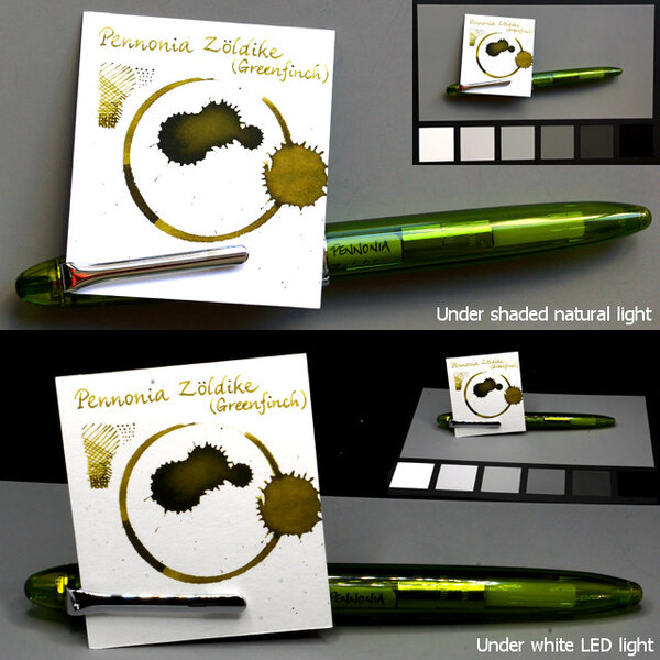
The white card stock was cut from Arttec Como Drawing Pad 210gsm mixed media paper. My eyes keep telling me this is a murky green, closer to what is shown (below) in the manufacturer's image, but in my photos it always comes out more tan/brown. Source: Pennonia© A Smug Dill
- 0 B
- x
-
From the album: Ink swatches
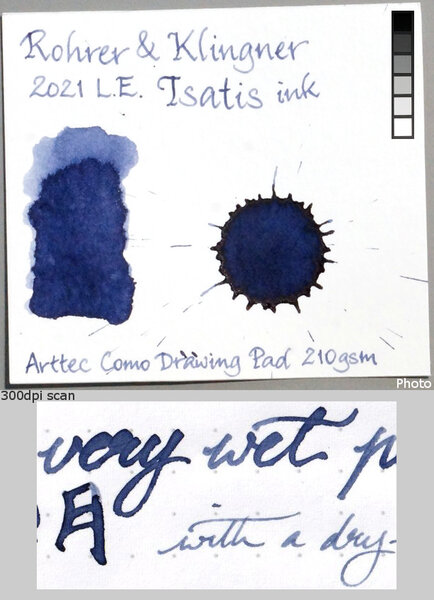
The white card stock was cut from Arttec Como Drawing Pad 210gsm mixed media paper.© A Smug Dill
- 0 B
- x
-
SAILOR MANYO NEKOYANAGI Sailor created another line of inks, the Manyo line. The inspiration for this line of inks are flowers found in the Manyoshu, an ancient collection of Japanese poems. The inks are presented in lovely square glass bottles and contain 50ml of inks. While the caps appear to be plastic, they are faceted for ease of opening. The opening of the bottle is 25mm in diameter and should fit most fountain pens. Now to the fun stuff! I first saw a review of this ink at mountainofinks.com (https://www.mountainofink.com/blog/sailor-nekoyanagi), and fell in love with the color and ordered a bottle from Pen Chalet. Nekoyanagi is a lovely soft purple color. It is a soft, almost periwinkle shade. But what is truly wonderful about this ink is the way it shades into pinks, blues and turquoise. This effect is seen on more non-absorbant papers such as Tomoe River, with a lesser effect on Rhodia and HP copy paper. Scan of HP Copy Paper Nekoyanagi is similar, but more purple and lighter in color than Pilot Iroshizuku Ajisai and also lighter but more blue than Graf von Faber Castel Violet Blue. Photo Tomoe River 68gsm Cream paper Photo Tomoe River 68gsm cream paper Photo Rhodia paper The ink is very well behaved. It dries quickly but has minimal water resistance. While it is a wet ink, it is not excessively wet, and has a nice lubricated feel. It has little to no sheen, does not bleed on any paper I have used to date, and minimal showthrough even on lighter weight Tomoe River 52gsm. I have used this ink in a variety of pens and have found it best suited to wider nibs. The lovely, multi-colored shading is enhanced in a wider nib. It is very nice in fine and extra fine nibs, but appropriately paler in color with less shading. While it is a pale color, I found it perfectly suited for journal writing and note taking. It is also very pleasant to sketch and doodle with. To highlight the beauty of this ink, I did a very simple abstract with water and Nekoyanagi on Arches watercolor paper. (In case you didn't guess, I am no artist). Abstract on Arches 160lb watercolor paper Finally, it is very easy to clean from your pen and does not stain the pen or converter. I really enjoy everything about this ink. If you like the color, I highly recommend.
-
An ink from Colorverse's Season 3 ‘Multiverse’. Pair with Cat shimmer (or ‘glistening’) ink as a retail package. Colour: A lively and cheerful green; stays bright and vivid after drying. Flow and lubrication: [revised] Relatively wet. My usually dry-writing Sailor Fude de Mannen pen write more smoothly with this ink than I expected; and, when I transferred the half-full converter into a new F-nibbed Sailor HiAce Neo — not a model that tends to write wetly or too smoothly out-of-the-box, in my experience — the ~0.2mm-wide lines come out wetter and darker than shown in this review, and wet enough to be a problem writing Chinese ideograms quickly in 5mm-squared space, in spite of the narrowness of the lines, because of how commonly lines intersect and criss-cross, causing pooling of the still-fluid ink on the page from earlier pen strokes. (I haven't timed it yet, but I hate to think how long those lines would take to dry!) Feathering: Not observed on Rhodia Dotpad 80g/m² paper. Show-through: Not observed on Rhodia Dotpad 80g/m² paper. Bleed-through: Not observed on Rhodia Dotpad 80g/m² paper. Drying time: Relatively slow, taking more than 30 seconds on Rhodia Dotpad 80g/m² paper. Water resistance: Low. Shading: Choppy shading along fine or broader lines, but not much that can be easily seen in extra fine lines. Sheen: Not observed on Rhodia Dotpad 80g/m² paper. My verdict: I like the colour a lot. The chromatography is pretty. It's not a Noodler's Ink. That's about all the good things I can think of to say about it, considering that I'm sure there is some Diamine ink colour (or half a dozen) that looks like this and behaves equally well, for about a quarter of the asking price (on a per-millilitre basis).
- 9 replies
-
- colorverse season 3
- multiverse
-
(and 3 more)
Tagged with:
-
-
- rohrer&klingner
- limited edition
-
(and 2 more)
Tagged with:
-
-
- rohrer&klingner
- limited edition
-
(and 2 more)
Tagged with:
-
-
- rohrer&klingner
- limited edition
-
(and 2 more)
Tagged with:
-
desaturated.thumb.gif.5cb70ef1e977aa313d11eea3616aba7d.gif)
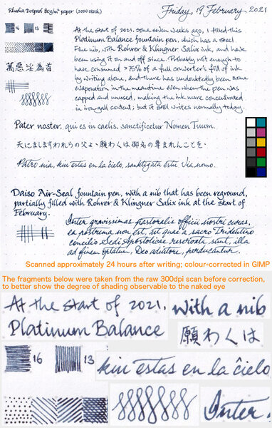
Shading from R&K Salix in writing samples with two different pens
A Smug Dill posted a gallery image in FPN Image Albums
-
- rohrer&klingner
- salix
-
(and 2 more)
Tagged with:
-
desaturated.thumb.gif.5cb70ef1e977aa313d11eea3616aba7d.gif)
PenBBS no.178 Rose Quartz ink review sheet — scan
A Smug Dill posted a gallery image in FPN Image Albums
From the album: Ink review
The colour of this ink simply defies capture with my Canon scanner, even with a colour reference card next to it; and no amount of colour correction post-processing in GIMP can make it look anything close to what I see. The photo here presents the ink colour relatively more accurately: https://www.fountainpennetwork.com/forum/gallery/image/1941-penbbs-no178-rose-quartz-ink-review-sheet-—-photo/© A Smug Dill
- 0 B
- x
-
desaturated.thumb.gif.5cb70ef1e977aa313d11eea3616aba7d.gif)
PenBBS no.178 Rose Quartz ink review sheet — photo
A Smug Dill posted a gallery image in FPN Image Albums
From the album: Ink review
The photo has been scaled down to approximately 114dpi, so that it is rendered true to size on the screen of my 13-inch MacBook Pro. The colour shown in the image, when displayed on my screen, is fairly close to what I see on the page — when the incident light makes the colour of the paper a cool, slightly bluish white. Right now, in the indirect evening sunlight, the colour of the paper looks much warmer, and that significantly changes how I perceive the ink colour.© A Smug Dill
- 0 B
- x
-
Introduction and Elephant in the room First paragraph same as Taccia cha so ignore if aware (info on bottle if interested). First let me take a moment to address the elephant in the room, box and bottle. Bottle has big mouth for any pens is no issues with filling, but then when ink is low might not be easy to get last drops of ink...I can’t be sure cos I cannot see any mechanism to help here..still a nice bottle overall. Box is not paper like most inks (not 100% at least) it sure does not feel like one, more durable and stronger with inside fins designed to keep ink from moving around and requires some effort to open as the top acts like a lock (its not hard just not too easy either basically the box does what box should do protect the ink)...not bad considering my waterman came out of box during shipping. Gotta love the warning labels, only for writing purpose...makes me want to draw always, and this one is quite good for that. Ink Review Section test papers 100 GSM JK cedar 75 GSM Spectra copy paper 52 and 57 GSM classmate registers. (52 GSM showed dot bleed) 70 and 80GSM Nightingale papers Cheap random registers and papers. GSM is well suspense at best, most likely 40 ish. Nature of ink the colors are off here and they are lighter in real life, my pea shooter camera is unable to pick it, close up shots will be added for actual color reference. A close up with better look at color, golden here is quite visible and is quite accurate. Dry Time- 8 to 25 sec on some papers, not 20 sec had to clear this one. Saturation- good Bleed- very slight on cheap papers and dot bleeds on 52 GSM classmate A decent bleed when closed in, done on 52 GSM classmate paper. Its not as bad as pic might make it seem, entire 'S' and 'C' for reference is ghosting and bleed is only considerable on 'T' and 'H' corners where first line of 'H' is again ghosting. This is also area where shade is high, more on this later. Feathering- very slight wool-ish on papers with high absorbent nature, present on shade area. Smudges-none at least by finger. Lubrication-great Ghosting (show-through)- none on most papers apart from cheap guys....and where it bled... Flow- good. Wet/Dry- Its balanced ink but very close to wet nature so much so that it might feel wet to some, mostly due to shading points where ink is present on page more then usual. Shading- quite high. this pic also has better color visible for the ink. Shading is quite high here and its these parts that show any sign of bleed on real cheap papers. Water resistance- none.. Cleaning- Easy clean with water. Personal take on ink I decided to separate this part as it varies from people to people and might not be interesting for some who just need quick info on ink, I intend to do same for any review I write, whenever I write. Anyway lets go. The ink does show a very nice dark golden brown color to it and the addition of shading was very welcome for me. The test pen Lamy Safari sees no issue of flow or hard starts and I don’t think there will be any either seeing how ink behaves. The picture of wheat fields might be little too much as from what I remember wheat fields are more golden in sunlight, but depends on light really so they are sorta right....they do miss mark there. Funny part aside, ink is really great and shows great golden color with lots of shading of dark brown color which is almost black making entire write up look different in good ways. The color I feel will be liked by most, its lighter then in pics abid by very small margin. No water resistance is a bummer but again taccia themselves say there is none so no big deal for me. The bleed which I see is mostly on places where there is more ink deposit for shading that ink gives, this also means that a quick writing with no pen lift will give only golden color with no shades, not happens in real world so shade will be seen and even when speed is fallen the shades tends to give in, as seen in small write up below. Speed writing reduces the shade to some extent but do not eliminate them, all in all shade is high as seen on Fine nibs and will be visible on most cases. I tried to write in continuous flow without lifting pen, made multi strokes on same line and slow speed due to not in habit of doing so made result look more or less same as normal😅 the upper paragraph show quite accurate color of ink when written on fast pace as done above. Conclusion I have not tried it yet but using flex nibs should give some beautiful results (my flex is currently filled with waterman serenity blue ink). All in all its very nice ink and I like it both for behaviour and color. Go ahead give it a go, you will like it for sure and costs of Rs 940 or 12-ish dollars plus shipping for 40ml.
-
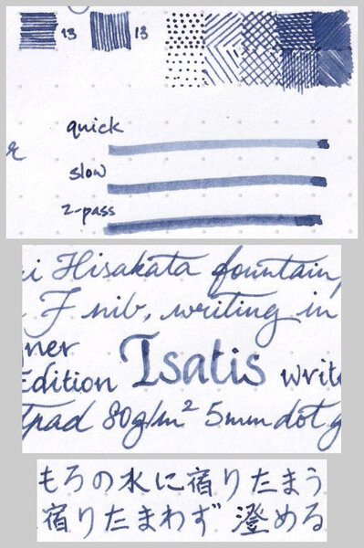
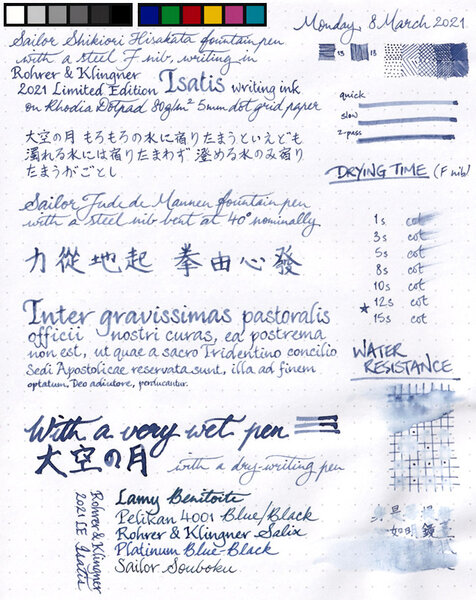
Close-up: Colour: Blue-black, as advertised; without being goes-down-blue, then-turns-black like iron-gall blue-black inks typically would, because as far as I'm aware this is a plain/standard dye ink without any iron-gall component (and with no water resistance) Flow: Slightly on the dry side of moderate, perhaps, on account of my being able to see a fainter line being left by the nib's slit along the broadest strokes Feathering: Not observed on Rhodia Dotpad 80g/m² paper, looking closely at the thinnest hatching lines, and words/glyphs ‘reverse-written’ with the nib upside-down (i.e. the bottom of the feed facing up) Show-through: Low to nil Bleed-through: Not observed Drying time: 11–12 seconds, which is relatively quick compared to most of the other inks I've tested or reviewed lately Smudging after fully dry: Didn't happen when I rubbed my thumb over the hatching/stippling panel and the largest Chinese hanzi characters Water resistance: So apparently poor that I don't think I need to soak some part of the sheet for an hour or so, to establish whether that would completely obliterate the marks made with this ink Shading: Moderate, without having too drastic a delineation between lighter parts and darker parts along the same pen stroke; can be seen even in very narrow ink marks (i.e. when writing with the equivalent of an Extra Fine nib) Sheen: None observed — and I checked with a loupe and a bright LED light Shimmer: None My thoughts: I can't imagine why I'd want to use a sombre blue-black ink that offers neither sheen nor water resistance, notwithstanding that this ink has a nice Delftware kinda colour as far as blue-black goes; but I suppose if someone wanted a blue-black that is cheap, and easy to clean from pens and/or after accidental spillage, this may well fit the bill nicely.
-
The new Sailor Mouseyo ink! Does anyone have any suggestion for a mix that would yield a shading grey with minimal pink sheen? I have a few (mainly Diamine and Pilot iroshizuku) grey inks here, but I wouldn't know where to begin.
-
I'm on a quest to find the perfect ink for each of many different color and other categories. Here's what I have for greens thus far For greens, I'm looking for two different types of greens: Light green - a beautiful vibrant light tea green with lots of shading.Green - a solid green with some shading and/or sheen, not too blue or yellow, and not dark or olive green. For this review, I've done a comparison of the following inks thus far: Diamine - Emerald Ink sample vialNagasawa Kobe - #19 Minatogawa Lime Ink sample vialVinta Inks - Sea Kelp Leyte 1944 Ink sample vialColorverse - Albert Ink sample vialPenBBS - #159 Bitter Herb Ink sample vialPilot Iroshizuku - Chiku-rin 15 mL ink bottleDiamine Inkvent - Mistletoe 7 mL ink bottleColorverse - Sea of Tranquility Ink sample vialMonteverde - Olivine Ink sample vialI'll update with PenBBS Forgive Green, Diamine Elf, Diamine Holly, and Diamine Sherwood Green once I get all of those inked up in every pen. For each ink, I test on CD Apica notebook, Life Noble notebook, Rhodia dot paper, Tomoe River paper, and HP Premium32 paper. I accidentally bought the cream-colored Life Noble Notebook to use for this, so the colors come out different on that. The pens I'm using are a flex pen (Waterman or Noodler's Creaper with a Waterman nib), Pilot Metropolitan, Lamy Safari, and 2 Nemosine stub pens. Please ignore my "Green" and "Light Green" headings for pages. That was to help me space out the ink samples in my notebooks, but I didn't always categorize inks properly based on what color I guessed they'd be. I also had to start over on the Chiku-rin because I didn't clean the pen out properly, which made it come out way more yellow than the ink actually is. There are also a few drips and smears from other inks because I'm not super careful about stacking paper. I'm not particularly concerned with water resistance in general, so I didn't intentionally review that aspect of any ink. I accidentally spilled some water on Diamine Emerald on TR. As you can see, it's not super water resistant, lol. I had a hard time taking images that looked properly lit and accurately captured the ink colors. Mad props to all those lovely reviews on FPN with beautiful images. If anyone has any tips/suggestions about how they do their ink review photos and uploads, please let me know.
- 13 replies
-
Only my second experience with a RO ink! This is a moderately thick, saturated turquoise that exhibits good shading, decent flow, but slightly problematic dry time for southpaws. I like it anyway. It also makes a good drawing ink, especially in an italic nib. Thanks once again to amberleadavis for the PIF! http://extras.ourpatioparty.com/files/5715/9019/0851/RO_Turquoise_001-640p.jpg The chroma twins show some separation into greens and blues. Which makes sense...it's turquoise! http://extras.ourpatioparty.com/files/3115/9019/0851/RO_Turquoise_Chroma_001-640p.jpg
-
I’ve been happily living in 0.45 - 0.65 line width land for some time now, and have been particularly enjoying the shading I get from soft Ti nibs. Of late I have been having a strong urge to purchase an EF. Digging around I’ve noticed Mr Kelly’s fondness for these, and have noted shading in some of his written examples. Something not seen so much, or so distinctly, in other brands. My question is, do contemporary MB EF nibs exhibit this characteristic? I’m particularly thinking of a Platinum 146. My only current MB experience is with a delightful OB 234.5. I had a 149 forty years ago but gave it away. Thank you for your input.
- 5 replies
-
- montblanc 146
- shading
-
(and 1 more)
Tagged with:
-
the main review is below. This is an Indian notebook called ITC classmate which is dirt cheap and exceptionally fountain pen friendly - doesn't feather or spread with the worst offenders (in my case, Noodler's 54th Mass for spreading, Noodler's forest green for feathering); dry time is quick but inks retain their vibrancy and shade nicely. Only strikes against it is that it doesn't particularly help with sheen and its not bright-white (there's a slight red tinge to the pages). Anyway, enough about the paper. This review was written with a PenBBS 480 with a Mini fude F nib. Really its more like an M. Writes wetter than normal. Note: the color balance is off in the top 5th of the page - probably due to paper not being totally flat. The ink in that area looks murkier than in real life. Here are some comparisions to other browns (Kiowa Pecan is similar, Yama Guri, not really). Also how the inks looks on blobs, swatches, smudges and dry times. Overall thoughts: It is a very nice brown, rich color with shading variations and possibilities of sheen (and a nice ink even without the sheen); with good flow, quick-ish dry times and no major drawback as far as I can see, except the tendency to stain clear plastic (though not sure if it was just that one cartridge converter). Will be receiving some Clairefontaine and Tomoe River shortly (I am out of stock now and all but essentially deliveries are closed due to C-Virus). Will check on sheening then. The pooled ink drop shows some green sheen around the rim of the darker area.
-
Hello again to all my FPN friends, I happened to have 2 pens of similar flow and nib size inked with these and thought it might be helpful to compare them. Both are iron-gall inks and somewhat similar in color. However, at least in my experience, Hero 232 is much drier than Pelikan 4001 Blue-Black. It's so dry that it stopped flowing at all in the pen I used for this comparison once the converter wasn't completely full. The dryness may be due to high iron gall content. I assume this because when I flushed the pen, there was a notable strong smell of fresh blood that I've only experienced before with the super-charged iron gall ink ESSRI. Hero 232 usually has the same smell many other Chinese inks, as well as Pilot Blue-Black, but when mixed with water in the sink the iron smell took over. So all you vampires out there will probably enjoy Hero 232. General observations: - The Hero is drier than the Pelikan. - The Hero is darker and more saturated than the Pelikan. - The Pelikan shades easier than the Hero. - The Hero can produce a nice, deep indigo when fully saturated, slightly reminiscent of my favorite Kung Te-Chung. - In China, the Hero is one tenth the price of the Pelikan. - Both are iron gall inks, but not so much as to harm your pens or leave sediment behind. - On absorbent paper, both are almost completely waterproof. The Hero looked completely unchanged, but some slight fading with the Pelikan. - Both are great inks if you have wet pens. The pen used for the Hero 232 writing is a Pelikan P30 with soft 14k broad nib. The pen used for Pelikan Blue-Black writing is an ebonite FPR Himalaya fitted with an extremely flexible steel Artus/Degussa oblique broad ("BS") nib and feed. I just scribbled this out on a cheap notepad, so I don't know how different they would look on better papers like TR or Rhodia. Comparison Close-ups: Hero 232 Close-up: Pelikan 4001 Blue-Black Close-ups:




.jpg.cd1bb0f2f93e61a04288301ca7c3fcb5.jpg)
.jpg.5dc5290739dc541e5d7517a060ad1b0e.jpg)
.jpg.9d38aec348399867cd99f363f9627186.jpg)
