Search the Community
Showing results for tags 'sepia'.
-
This is an excellent sepia ink by De Atramentis. I loved using it over and over again. Very well behaved, easier to clean than blue inks Let's start with the chroma: Writing Samples: Photo: Comparison: Water test: Left side was dabbed with water. The smudge beside the kitty was there before the watertest And per usual an art work, part of the Inktober yearly challenge, prompt was Camel: Paper is a Talens square notebook. · Pens used: Pilot Kakuno Ef, Stub/ Kaweco (EF/F/M/B/Stub 1.1), Osmiroid Copperplate nib · What I liked: Really well-behaved ink. Very well-behaved ink. Excellent for sketching! And easy to clean! · What I did not like: Nothing · What some might not like: It’s a nano pigment ink · Shading: Yes, with wider nibs. · Ghosting: No. · Bleed through: No. · Flow Rate: Lovely. · Lubrication: Nice, thought best with European pens. · Nib Dry-out: No. · Start-up: No. · Saturation: Nice. · Shading Potential: Only with flex nibs · Sheen: No. · Spread / Feathering / Woolly Line: No. · Nib Creep / “Crud”: Didn’t notice. · Staining (pen): No. · Clogging: No. · Cleaning: Very easy · Water resistance: Excellent. · Availability: 45 ml bottles. Please don't hesitate to share your experience, writing samples or any other comments. The more the merrier
- 16 replies
-
- de atramentis
- document ink
-
(and 2 more)
Tagged with:
-
- 12 replies
-
- rohrer & kingner
- sepia
-
(and 1 more)
Tagged with:
-
This ink belongs to the Artist series and is slightly less archival than the Document series. In a nutshell: I would recommend this ink only to those who either used broad nibs, wet medium/fine nibs without feedback and excellent smooth paper. For those who don't use these options, mindfulness is obligatory. 😇 Longwinded version: This is a high maintenance ink in a nonconventional way: It demands the right nib/paper combination! The Pilot Kakuno Ef wrote with a smoothness of fingernails on chalkboard. The perfect self-torture implement. The Stub like a blunt knife. With Lamy Safari F/M, while the line was nice and juicy, I recoiled each time I reached for the pen. Some one had mixed sand in the ink. It’s a good option for those who have serious pen /ink addicts. You will be pen sober in no time. However, writing with a Pilot M/Safari B/Kanwrite was surprisingly enjoyable. And with the fude nib acceptable. So be forewarned. Chroma Ink comparison: Writing samples: Rhodia TR 68gr Midori Cheap/ absorbent paper Back Photo: TR 68gr Close up: I challenge myself with the yearly inktober. This sketch was done with the Ef nib. I can blame the mediocrity of my talent to the ink... but surprisingly the experience was acceptable... The left to right motion worked fine. Water test: A bit of excess ink is removed, but other than that respectable. · Pens used: Pilot Kakuno (Ef/M/stub) Lamy Safari (Fine/ /Medium /Broad) / Kanwrite Ultraflex (wet) / Jinhao 450 fude (wet) · What I liked: Writing with a broad nib, and Kakuno M and sketching · What I didn’t liked: Writing with Ef, F, medium and stub. It needs a wet pen and a smooth nib. · Shading: From medium to broad · Ghosting: Yes, On cheap paper · Bleed through: Yes, with absorbent papers. · Flow Rate: Good · Lubrication: If you write with wet nib. · Nib Dry-out: Not noticed. · Start-up: No problem. · Saturation: Dark. · Shading Potential: Bleak. · Sheen: Nonexistent · Spread / Feathering / Woolly Line: Not noticed · Nib Creep / “Crud”: No · Staining (pen): No · Clogging: No. · Cleaning: Easy. Though it might stain transparent sections. · Water resistance: Excellent · Availability: 50 ml bottles Comments appreciated but not obligatory
- 13 replies
-
- de atramentis
- artist
-
(and 2 more)
Tagged with:
-
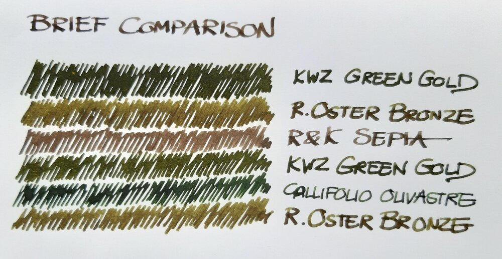
Just a brief note on a recent comparison: a bottle of Robert Oster Signature Bronze had been lingering in my ink drawer until I decided to use it a new acquisition by Atelier Veleray (more on that in the near future). It turned out greener than I'd expected, similar to KWZ Green Gold but slightly lighter. The attached image is an unprocessed photograph hastily taken with a smartphone. Still, it comes close to what I see on paper, especially in the lower part, where Bronze and Green Gold are separated by Callifolio Olivastre. In the upper part, where the two inks are next to each other, Green Gold appears a bit too dark. The other two inks included as a kind of control in the comparison are Callifolio Olivastre (in a Diamond Point with a flexible broad nib) and Rohrer & Klingner Sepia (in a Delta Tech & Web with a stub nib). KWZ Green Gold came from a Montblanc 149 with a medium nib and the Atelier Veleray pen sported a broad nib I had from a Visconti Rembrandt. Bottom line: nice colour and a well-behaved ink. As my interest in shading increases, Bronze may replace the darker KWZ Green Gold among my favourites.
- 11 replies
-
- robert oster
- kwz
-
(and 6 more)
Tagged with:
-
-
As many know from Visvamitra's epic review of the Kobe Nagasawa line of inks made by Sailor, these are the most extensive line of Sailor inks. Originally they were 50 inks. But they've been adding a new ink every now and then so the line is up to #55 or #56 now. This is #52. I love sepia inks, but as dpritch's epic review of Sepia inks shows, the color range on this ink is quite large. And this one is kind of over at the red-brown range which often gets called "sepia" in the labeling and marketing romance of inks. This is one of the few inks that when I received it and inked up, I was a bit disappointed. The color wasn't anything what I would call "vintage sepia". Now perhaps the folks at Kobe Nagasawa and Sailor have an example of a vintage sepia ink that appears now like this hue. And to it's credit the ink does have a nice golden-brown undertone instead of the typical red. But whenever I look I it I still see "red-brown". I have so many of these kinds of inks that I'm reluctant now to consider a new brown ink for the collection. There's nothing wrong with the handling of this ink. It's classic Sailor. Wet, lubricated, saturated. There is some nice subtle shading with the ink that probably isn't captured in the images. My typical test papers are: Mohawk via Linen=MvL, Tomoe River=TR, Hammermill 28 lb inkjet paper. The last is the driest of these papers in that an ink that feels nice on other papers can have some resistance there. Somewhat water resistant but a lot of ink washes way and that could obscure what one wants to save. A very interesting ink drop. There's possibilities here.
-
From "Seasonal Terms", a range in the same line and octagonal bottles as "Ancient Charm" (but without the shimmer) - so is that Pen BBS? Last year at the LA Pen Show I picked up "Beginning of Spring" (like Alt-GoldGrun but browner - the bottom row in the illustration) and "Beginning of Summer", both of which are rather nice, but "Grain in the Beard" was sold out. One year later and perseverance pays off! Now why was it again that the Mesopotamians turned from hunter-gatherers to farming?
-
Disclaimer: I enjoy doing mini ink reviews for my personal reference, and I'd like to share them with others if they might be of help to gain an insight into the ink's appearance and performance. I generally don't have time to put together super comprehensive reviews, like some of our fantastic reviewers here do (thank you so much for your hard work!), but hopefully these mini reviews will still be useful as another point of reference. Maruzen Athena - Sepia Brown This ink comes in beautiful old-style bottles and is available for sale from Japanese "Maruzen" book stores. I believe at some point it was imported for sale in the U.S. by Nanami Paper, but it seems to have been out of stock for a while. I bought my bottle at Maruzen on my recent visit to Japan. Athena Sepia is a rich and dark red-toned brown. It is so saturated and dark that you will likely not see much of any shading with finer nibs, even on fountain pen-friendly paper. I personally like red-leaning browns, and this is my kind of dark brown--as opposed to more green-gray-leaning Pilot Iroshizuku Yama-Guri. I am not 100% sure if this ink is made for Maruzen by Sailor, but it might be. I remember reading something to that extent a while ago. It does have the typical Sailor Jentle ink behavior and consistency. Flow is good but not excessive (depends on your pen), lubrication is good, I have not observed any feathering on good paper. Drying time varies based on paper used and pen, but it's not very long (subjectively). Despite the lack of shading in writing with fine nibs and the darkness of the color, it's actually fairly interesting in its constituent dye colors. So if you like to do a bit of water brush drawing with your fountain pen inks, this is a good ink for that purpose. There's a kind of pink brown component, and a warm golden component. There's even some green, as can be seen on the edges of the paper towel drop "chromatography". The ink has moderately good water resistance--clearly legible lines remain and not too much smears off to obscure original writing. This ink doesn't sheen for all practical purpose. I have not observed any smearing after the ink has dried. I am posting photographs (color-corrected) and scans of this ink and other inks in the general brown color family for comparison. Papers used in this review are: Fabriano Bioprima 4mm dot grid - a kind of ivory color, lightly textured, uncoated Rhodia Dot Pad 5mm dot grid #16 - bright white (perhaps with a slight lavender tinge) Nakabayashi Logical Prime notebook - coated and super smooth ivory-toned Japanese paper, shows things like sheen and hue variation pretty well (Image source: http://www.nanamipaper.com/products/maruzen-athena-ink.html) Photographs in diffuse daylight shade: On Fabriano Bioprima: On Nakabayashi Logical Prime paper: Scans: Nakabayashi Logical Prime paper:
-
Robert Oster 1980 - Honey Bee Robert Oster is an Australian ink maker that is well-known for its unique range of colours. With this mini-series he gives us a conglomeration of colours inspired by the anything goes world of the 1980s. These inks fit my personal preferences: muted pastel-type colours with great shading. In this review I take a closer look at Honey Bee - a yellow-orange-sepia chameleon of an ink. This ink substantially changes colour depending on the type of lighting. It's more of an orange-sepia colour in daylight, but a dark yellow under artificial light. Honey Bee is not a bad name, given that honey comes in a broad colour range, that is nicely captured by this ink. The ink feels dry - and I mean really dry - in my Lamy Safari test pens, and even in wetter pens with fine nibs. Saturation is also relatively low, meaning that you need wet pens to take full advantage of this ink. All this doesn't sound very promising, I know. But pair this ink with broad nibs in a wet pen, and the result looks really nice. And for drawing, this ink simply looks gorgeous. To show you the impact of saturation on the ink's look & feel on paper, I made some scribbles where I really saturated portions of the paper with ink. This gives you a good idea of what the ink is capable of in terms of colour range. As you can see, Honey Bee is quite faint at the lower saturation end, but reaches a much darker sepia-brown colour when fully saturated. The colour remains dusty and muted across the saturation range, which I personally like. To prove the chameleon quirks of this ink, I took a photo of the same saturation sample under artificial light. Here the ink transforms into a dusty dark yellow. Compare this to the more orange-sepia tones of the saturation sample above (my scanner uses light with a daytime colour temperature). To be honest, I personally prefer its nighttime appearance under artificial light. Like most Robert Oster inks, Honey Bee has zero water resistance. Short exposures to water completely obliterate the text, leaving next to nothing on the page. This is also apparent from the chromatography. Smudging is not a problem though - which is what I typically care about. I've tested the ink on a wide variety of paper - from crappy Moleskine to high-end Tomoe River. On every small band of paper I show you: An ink swab, made with a cotton Q-tip 1-2-3 pass swab, to show increasing saturation An ink scribble made with an M-nib Lamy Safari fountain pen The name of the paper used, written with a B-nib Lamy Safari A small text sample, written with an M-nib Lamy Safari Origin of the quote, written with a Kaweco Sport with M cursive italic nib Drying times of the ink on the paper (with the M-nib Lamy) Honey Bee is a well-behaving ink on most paper types, with no visible feathering. The ink dries quite quickly around the 5 second mark (with the M-nib Lamy Safari). The ink reacts weirdly with Moleskine paper, but works just fine with the other paper types in my test set. Due to the yellow-orange colour, the ink works best with pure white paper. Personally, I don't really like its looks on more yellowish paper. As can be seen from the quote origin texts written with an M cursive italic, Hoeny Bee works best with broader nibs or wet pens, where saturation improves, and the horrible dry-ness more or less disappears. I also show the back-side of the different paper types at the end of the review. No troubles there, except with the Moleskine paper, which shows significant bleed-through. All in all, a well-behaving ink (if you avoid the Moleskine where the chemistry gets weird). Writing with different nib sizes The picture below shows the effect of nib sizes on the writing. All samples were written with a Lamy Safari, which is typically a dry pen. I also added a couple of visiting pens. The ink's shading really starts showing up once you go to M-nibs or broader. With wet pens, the ink becomes much more saturated, while still keeping its toned-down muted appearance. Personally I think Honey Bee should only be used in wet pens with broader nibs. Below is a writing sample on Paperblanks journal paper, showcasing the difference between a Lamy Safari M-nib (dry pen) and a wetter-writing Kaweco Sport with M cursive italic nib. With the wetter pens, saturation and dryness are no longer a problem. Related inks To compare Honey Bee with related inks, I use my nine-grid format with the currently reviewed ink at the center. This format shows the name of related inks, a saturation sample, a 1-2-3 swab and a water resistance test - all in a very compact format. Inkxperiment – radiant madonna As a personal challenge, I try to create interesting drawings using only the ink I'm reviewing. Limiting myself to one ink allows me to creatively showcase all its colour-range nuances. It's often quite a challenge, but always great fun. For this drawing I started off with HP Premium photo paper. I created a background by pressing the photo paper on a water-soaked kitchen towel on which I splashed some ink. Next I used pure Honey Bee to paint in the subject. The radiant halo surrounding the madonna was added with Q-tips and different water/ink ratios. The resulting mini-picture gives you an idea of what can be achieved with this yellow-orange Honey Bee as a drawing ink. Conclusion Robert Oster 1980 Honey Bee is a pastel-toned yellow-orange-sepia chameleon, that mostly excels as a drawing ink. Personally, I didn't care much for its chameleon nature, which results in a completely different look under day- or artificial light. The ink also has technical issues, being dry and undersaturated. You really need wet pens and broader nibs to get a good-looking result. Overall, I'm not impressed by this ink - I've seen nicer ones with better behaviour. Technical test results on Rhodia N° 16 notepad paper, written with Lamy Safari, M-nib Back-side of writing samples on different paper types From idea to drawing Although Honey Bee disappoints as a writing ink, I found it to be a beautiful ink for drawing. In this appendix to the review, I'd like to give you a bit of insight into my drawing setup & process. This inkxperiment was born with some doodles, started during a lazy weekend-afternoon. I liked parts of different doodles, so I decided to combine them. I'm really bad at drawing, so I put together parts of different doodles on my computer, printed out the result, and used a light-box to transfer the resulting pic to the HP photo paper. The photo paper was already prepared with a Honey Bee background, created by pressing the paper on a water-soaked kitchen towel to which I added some splashes of ink. After finishing the Madonna picture with a fine brush and pure Honey Bee, I used Q-tips to draw in the radiant halo with multiple water-ink ratios. The end result is the inkxperiment drawing. Oh... and to protect my writing desk, I use a plastic kitchen placemat (white backside up) as a drawing surface - no accidents yet ;-)
- 6 replies
-
- robert oster
- robert oster 1980
-
(and 4 more)
Tagged with:
-
L'Artisan Pastellier Callifolio - Sepia L'Artisan Pastellier is a small company in southern France that specialises in natural pigments, and offers customers authentic and reliable products in beautiful colours based on mineral or vegetable pigments. In a collaboration with Loic Rainouard from Styloplume.net, the chemist Didier Boinnard from L'Artisan Pastellier created the line of Callifolio fountain pen inks. These pastel-coloured inks are traditionally crafted, and can be freely mixed and matched. Overall these inks are only moderately saturated, and have low water-resistance.The inks were specifically designed to work well with all types of paper, and all types of fountain pens. Being pastel-tinted, these inks have a watercolour-like appearance, and are not only fine inks for journaling, but are also really excellent inks for doodling & drawing. I only recently discovered them, and they are already the inks I gravitate towards for personal journaling. In this review the center stage is taken by Sepia, one of the ochre-type inks of the series. This one is an earth-toned pastel-type sepia-brown, that is great for drawing, but - in my opinion - too undersaturated for writing in many of my pens. In finer nibs with dry pens, the ink lacks character for writing. Only with wet pens does the ink obtain decent saturation and starts to look good on paper. I found the ink to be a bit on the dry side in my Lamy Safari test pens, with lubrication being somewhat subpar. A wet pen solves this problem. The ink shows little shading with fine nibs or wet pens. With broader nibs in dry pens (like the Lamy Safari) Sepia becomes a strong shader, even a bit too harsh for my personal tastes. As a writing ink, this one does not really convince me. To show you the impact of saturation on the ink's look & feel on paper, I made some scribbles on Tomoe River where I really saturated portions of the paper with ink. This gives you a good idea of what the ink is capable of in terms of colour range. As you can see, this ink has a fairly wide colour span ranging from a very light pastel-like sepia to a reasonably dark brown. This explains the harsh shading you get with broad nibs in dry pens. With wet pens, you get the darker version (right part of the saturation swab), with very little shading. On the smudge test - rubbing text with a moist Q-tip cotton swab - Sepia behaved very good. There is limited smearing, and the text remains very sharp and readable. Water resistance is quite good for a non-waterproof ink. An easily readable brownish residue remains even after longer exposures to water. This is also apparent from the lower part of the chromatography. I've tested the ink on a wide variety of paper - from crappy Moleskine to high-end Tomoe River. On every small band of paper I show you: An ink swab, made with a cotton Q-tip 1-2-3 pass swab, to show increasing saturation An ink scribble made with an M-nib Lamy Safari The name of the paper used, written with a Lamy Safari (B-nib) A small text sample, written with an M-nib (also Lamy Safari) The source of the quote, written with a wet Pelikan (F-nib) Drying times of the ink on the paper (with the M-nib Safari) Sepia behaved fairly well on most paper types, but did show some light feathering on papers where I didn't expect it (like the 100 gsm Optiimage printing paper, which usually works really well with fountain pen inks). Drying times are around the 10-second mark with the M-nibbed Lamy Safari. The ink looks best on pure white paper, and looks fairly underwhelming on more yellowish paper. At the end of the review, I show you the back-side of the different paper types, in the same order. With the low-end Moleskine there is prominent show-through and a bit of bleed-through. The GvFC paper also suffers from some show-through - a characteristic I have seen with several inks, and which you wouldn't associate with 100 gsm premium paper. With the other papers, Sepia's behaviour is impeccable. Overall, the ink copes well with a wide variety of paper types. Writing with different nib sizes The picture below shows the effect of nib sizes on the writing. All samples were written with a Lamy Safari, which is typically a dry pen. I also added a visiting pen - a wet-writing Pelikan M101N Bright Red with a fine nib. With this wet nib, the ink writes much more pleasantly. It also shows a substantially more saturated line. Personally I prefer the ink's more saturated look with the wet Pelikan pen. Related inks To compare Sepia with related inks, I use my nine-grid format with the currently reviewed ink at the center. This format shows the name of related inks, a saturation sample, a 1-2-3 swab and a water resistance test - all in a very compact format. I have only a limited number of browns in my ink collection, and no close match to this ink. This Callifolio ink is the most pastel-tinted brown that I own. Inkxperiment - a day at the farm As a personal challenge, I try to create interesting drawings using only the ink I'm reviewing. For me, this really brings extra fun to the hobby, and these single-ink drawings are great for stretching my drawing skills. With these small pictures, I try to give you an idea of what the ink is capable of in a more artistic setting. For this drawing, the earth-toned colour of the ink triggered memories of childhood holidays at my grandparents farmhouse. I started off with 300 gsm watercolour paper, on which I painted a background with water-diluted Sepia. The fields in the foreground were drawn with Q-tips, and multiple water/ink ratios. I then added the farmhouse and tree on the horizon line with a B-nibbed fountain pen. Finally I painted in the wheat stalks, and added some texture to the fields with my M-nibbed Lamy Safari filled with Sepia. The resulting picture gives you an idea of the colour range you can expect when using Sepia as a drawing ink. Conclusion Callifolio Sepia is a pastel-toned sepia-brown ink, that is at its best in wetter pens where it produces a dark and saturated line, and where it doesn't suffer from the subpar lubrication present wih dry pens like the Lamy Safari. Sepia fails to impress me as a writing ink, but shows some promise for use in pastel-toned drawings. Technical test results on Rhodia N° 16 notepad paper, written with Lamy Safari, M-nib Back-side of writing samples on different paper types
- 4 replies
-
- lartisan pastellier
- callifolio
-
(and 2 more)
Tagged with:
-
I'd taken some of the pics earlier, but only now getting to posting the review. Sailor makes inks for the Maruzen chain of stores under the Athena brand name. I'm not sure how widely they are available at the different stores. There have been some LE inks, but the Sepia is supposedly normally available. I received a sample from a generous FPN member. I hope someday to be able to acquire a whole bottle. There are a lot of other inks labeled "sepia," and this one is not the ultimate sepia. It's very good however. So having it in your ink wardrobe is not bad. Tried on Mohawk via Linen and Hammermill 28lb Inkjet paper. The photo here I just couldn't get the right color. One way too dark, another too red. In this it seems a bit too dark towards black. You can see the burgundy undertone in the wipe tests. An angled view. Again too black looking. You can see in the lighter parts of the shady notes the brownish tone. The ink held up well to water. Not eternal like Athena herself, but decent. The actual color here is quite accurate I think. Best of the bunch by far.
-
When I started out on my quest for inks that look nice AND have very good water resistance properties, honestly the last ink series I thought I'd be getting were J. Herbin's standard fountain pen inks. I had a very misguided opinion of the line as being too faded looking, low saturation, dull, certainly not water resistant. That's until I accidentally found some reviews that showed water tests of J. Herbin's Lie de Thé. I also realized how interesting of an ink it is. It led me down the path of reanalyzing the whole line of inks, and I almost got a large size of Poussiere de Lune and some other colors. But back to Lie de Thé! I take back what I thought and welcome this ink with open arms to the top of my favorite inks list. The color: It's a very complex sepia color! It keeps shifting between looking more green? or is it more orange? or yellow? As a paper towel drip test below shows (green-gray-brown base, orange and yellow elements over that), this ink has all of those colors, and due to the excellent shading property, all those colors are visible to some extent. But this ink definitely keeps you guessing if you stare at it for a while, influenced also by lighting conditions. Shading: Amazing shading! Not only that, but there's some color variation between different intensity parts of writing. This ink's ability to shade comes through well in all of my pens: from dry writers with wide italic nibs to wet writers with round nibs. Sheen: none, I really tried to make it appear, but it's not there Ink flow: Pretty high flow ink in all of my pens, lubrication is medium, not as high as, say, Organics Studio Walden Pond Blue, which is highly lubricating. Bleed-through: none observed on Fabriano's Bioprima or Clairefontaine paper. A small amount with a wet nib pen on standard [low quality] printer paper Feathering: none on high quality paper, a little bit on cheap paper. Water resistance: another stand-out property of this ink! Some pale color wash off, but what remains is a highly legible and neat gray-green-brown base color. Photographs were made in diffuse natural daylight indoors on a somewhat sunny day. I don't like using my scanner to show inks, as it's not terribly accurate. I can get accurate photographs much more easily with my set-up (paper shown below is Fabriano Bioprima 85g/m2, pale cream color)
-
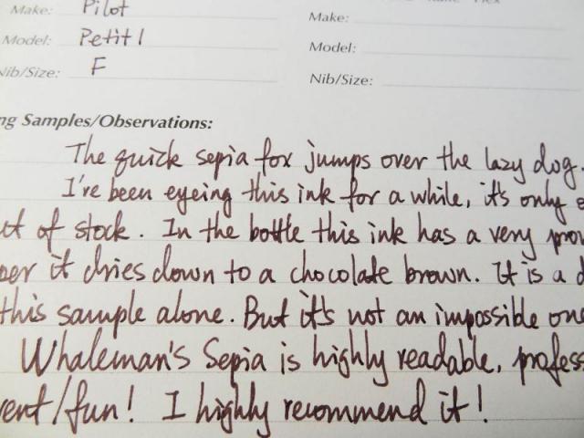
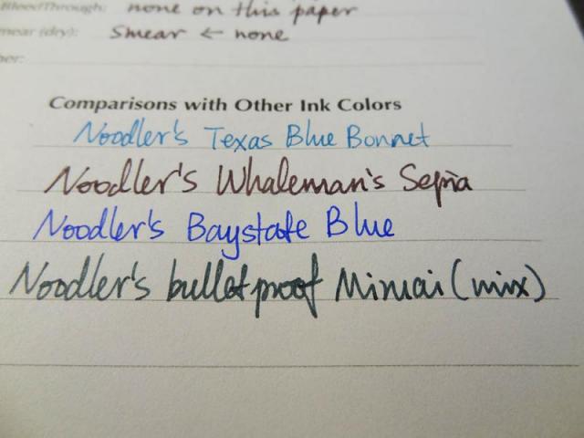
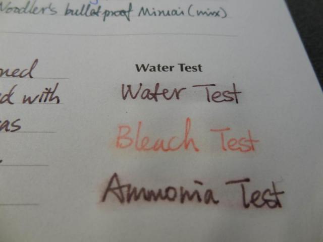
I received my bottle of Whaleman's Sepia a few days ago, and I'm like a rabbit now - very hoppy! This ink looks like reddish brown muddy sludge in the bottle. Not surprisingly it's a bit thick and dry, but its reputation as a nearly unusable ink is exaaaaaagerated. It behaves relatively well for me in a Pilot Petit1 and a preppy, both with fine nibs. If I pause for more than 10sec when writing the first stroke would be a bit hard, but that's it. I'm going to "tame" this bad boy with some decyl glucoside, a non-ionic surfactant similar to the surfactant in Photo-Flo. Will follow up with results. For now, hope you enjoy the review of the yet "wild" Whaleman's Sepia!
-
Sailor Kobe #3 Kyuu-Kyoryuuchi "old Foreigner's Ward Sepia"
white_lotus posted a topic in Ink Reviews
There have been a number of reviews of the Sailor Nagasawa Kobe line of inks, most recently by visvamitra showcasing the whole line. Starting with #1 https://www.fountainpennetwork.com/forum/topic/299898-sailor-kobe-01-rokko-green/?p=3497945 And his review of #3 https://www.fountainpennetwork.com/forum/topic/299024-sailor-kobe-3-old-foreigner-ward-sepia/?p=3485273 The usual test papers: MvL=Mohawk via Linen, Hij=Hammermill 28lb inkjet, TR=Tomoe River. Unfortunately the iPhone seems to not understand dark brown, and always thinks "black". It is so wrong. I've fiddled with the settings to no avail. Anyway, this is a wonderful, yummy ink. Surprisingly with some water resistance. And as always with Sailor custom inks, a very interesting chromatography. -
L'Artisan Pastellier Callifolio - Inca Sol L'Artisan Pastellier is a small company in southern France that specialises in natural pigments, and offers customers authentic and reliable products in beautiful colours based on mineral or vegetable pigments. In a collaboration with Loic Rainouard from Styloplume.net, the chemist Didier Boinnard from L'Artisan Pastellier created the line of Callifolio fountain pen inks. These pastel-coloured inks are traditionally crafted, and can be freely mixed and matched. Overall these inks are only moderately saturated, and have low water-resistance. The inks were specifically designed to work well with all types of paper, and all types of fountain pens. Being pastel-tinted, these inks have a watercolour-like appearance, and are not only fine inks for journaling, but are also really excellent inks for doodling & drawing. I only recently discovered them, and they are already the inks I gravitate towards for personal journaling. In this review I take a closer look at Inca Sol, one of several ochre-coloured inks in the Callifolio line. The name Inca Sol conjures up images of a dry & dusty valley, baking in the midday sun. And the ink fits this image well - a sepia-brown colour with red-orange undertones. Unfortunately, this ink also fits the dry & dusty moniker: in my fairly dry review pens (Lamy Safari), this ink definitely feels very dry, scratchy and undersaturated. You really need broad and wet pens to bring out the best in this ink. See also visvamitra's review, which shows the ink with wet/broad nibs. I tend to use F/M nibs, so this ink is not really made for me. Also, the colour doesn't really speak to me, but that is of course a purely personal matter. I much prefer the more orange-leaning sepia's in the Callifolio series (like itzamna, cannelle, ...). The ink shows some subdued shading, which is more pronounced in broader nibs. With fine nibs, the shading is almost non-existent, giving the ink a much flatter and less-appealing look. To show you the impact of saturation on the ink's look & feel on paper, I made some scribbles where I fully saturated portions of the paper with ink. This gives you a good idea of what the ink is capable of in terms of colour range. Inca Sol is capable of a broad range of sepia shades - ranging from a really light sepia, to an almost dark brown. On the smudge test - rubbing text with a moist Q-tip cotton swab - Inca Sol behaved really well. There is some small smearing of the text, but without any impact on readability. Water resistance is also remarkably good for a Callifolio ink. The residue left on the page can easily be reconstructed, so you won't lose your precious writing. This is also apparent from the bottom part of the chromatography: a sepia-brown residue remains, while the red-orange dyes drain away. I've tested the ink on a wide variety of paper - from crappy Moleskine to high-end Tomoe River. For the Callifolio reviews, I'm using a format that shows you the ink's appearance and behaviour on the different paper types. On every small band of paper I show you:An ink swab, made with a cotton Q-tip1-2-3 pass swab, to show increasing saturationAn ink scribble made with an M-nib Safari fountain penThe name of the paper used, written with a B-nibA small text sample, written with the M-nibDrying times of the ink on the paper (with the M-nib)Inca Sol behaved perfectly on all paper types, with only a tiny bit of feathering on the notoriously bad Moleskine paper. Drying times are quite short in the 5-10 second range with my Lamy Safari test pen (M-nib). The ink shows a more-or-less consistent look across paper types. For some reason, it looks more saturated on Paperblanks and HP 80gsm printer paper. Since I use Paperblanks for journaling, that's a plus for me personally. I also show the back-side of the different paper types, in the same order. The ink behaved very good with almost all paper types. Only with the Moleskine paper there is noticeable bleed-through, which means you cannot use the backside of the paper. All in all a really well-behaving ink. Inkxperiment – sun above pyramidAs a personal experiment, I try to produce interesting drawings using only the ink I'm reviewing. I find this to be a fun extension of the hobby, and have found these single-ink drawings a nice challenge. It also gives you an idea of what the ink is capable of in a more artistic setting. This drawing was done on 90gsm sketch paper. Inspiration came from the name "Inca Sol" itself. For the background I used water-diluted ink to obtain the lighter tones. Once dry, I penciled in the Inca pyramid with my Lamy Safari (B-nib), and painted the sun above the pyramid (here I added some bleach to produce the highlights - the protuberance detail looks cool, but in reality covers up a smear I made while painting in the ink ;-). I finally added the hieroglyphs to accentuate the Inca setting. The end result gives you a good idea of the colour span that Inca Sol is capable of. ConclusionCallifolio Inca Sol from L'Artisan Pastellier is a brown-red sepia ink, that's just not one of my favourites. The colour is not really for me, but that is a personal matter. But the ink is also too dry and undersaturated, especially in finer nibs. You really need wet & broad pens to get some satisfaction from this ink. As such, not really a good writing ink, but when used for drawing, this ink certainly has some potential. Technical test results on Rhodia N° 16 notepad paper, written with Lamy Safari, M-nib Back-side of writing samples on different paper types
- 5 replies
-
- lartisan pastellier
- callifolio
-
(and 2 more)
Tagged with:
-
Hello from Italy! Introducing myself after lurking for some time on FPN, I've used fountain pens on and off for some years now, lately I try to use them at home and at work - I usually carry 2 pens with me, one with blue ink, the other with brown ink. I have some Parker pens (45, 75, 180, Vector), a old Pelikan 400, a Montblanc Generation and 144, a Pilot 78g. My favourite inks are Waterman Blue-black, Pelikan Blue-black, Diamine Sepia, never use black ink. I cannot draw and my handwriting is just average, I need to practice and work on it. Thank you for your support
- 14 replies
-
Greetings All, There are some good lists of inks safe for vintage pens scattered throughout the forums, but I haven't seen any sepias specifically mentioned. I'm in the market for a vintage flex and would like my writing to have an old-timey feel. I'm hoping we can put together a list of sepia inks (including anything broadly defined as such according to one's own taste) that are vintage pen friendly. I don't mean high-maintenance inks that require utmost pen hygiene, but those you can leave in the pen for a couple weeks without having to worry about corrosion or clogging. Water-resistance is also a plus, but not essential. Staining also isn't much of an issue since vintage pens aren't usually demonstrators anyway. Any recommendarionaations are greatly appreciated!
-
I have been looking to develop my "Warm Earth" tones in general and my red earths in particular. Diamine seemed to have some good options (I have my "Cold Stone" colors from De Atramentis). I couldn't really find a good comparison so I narrowed it down to the few that I was most interested in and plumped for 30ml bottles rather than samples. It's neither scientific nor thorough, but I thought I would post my initial impressions as I couldn't find anything similar. . . . . which is a scan but the colors for Ochre and Rustic Brown are not true at all. I tried taking a photo, which is a much more fiddly process, but the colors seem truer: Two more bricks that I didn't like on the first page - I thought the Copper was rather strong! The Monaco Red might be a bit too pink in that one? Anyway it seems I have added the following to my "Sub-Tertiary Color Circle": Yellow Earths: Sepia and Ochre Orange Earths: Burnt Sienna and Ancient Copper Red Earths: Oxblood & Monaco Red (both still tending to orange - which is what I was looking for!) I don't have any "True Reds"! Rustic Brown I would count as a Rose - it's really on the purple end (where my sample of Morinda seemed to fit too). On the Orange front I also have Autumn Oak, a decent Coral (house blend!) and an Orange with a cute elephant on the label, but as these aren't anywhere near "brick" they did not seem relevant here. Hmmm, the only thing I might add is that this is my "cheap scribbling" paper (Daiso - great cheap paper for ink work!) rather than anything fancy, so the colors are a bit flatter than they might be elsewhere.
- 10 replies
-
Here's a brief review of an ink from another Chinese manufacturer. Their inks are some of the most expensive Chinese-made inks in China, but this one is too dry for most of my pens. Please pardon any grammar mistakes or nonsensical remarks. I wrote this all at once without stopping to think. SDG
-
I very much appreciate Rohrer and Klingner Sepia Ink. To me, it is a true sepia. It doesn't feather or bleed through when using low-quality paper. It dries quickly and shades nicely. The price is fair. The bottle is user friendly. But it has starting issues because it dries quickly in the nib between uses. Sometimes it fails to start after less than a day of letting the pen sit capped. I put up with it a long time, using it as my primary ink in my Leuchtturm1917 journal. Does anyone know of an ink that looks, behaves and is priced similarly but without starting issues? Thank you.
-
Just read through the Inky TOD Brown ink thread...... Lots of beautiful brown inks..... However, not sure if any of those are similar to the old manuscript writings one sees as in Da Vinci's journals, etc. See image below. Anyone have any suggestions for an old time look sepia brown ink such as this? Thanks for any and all suggestions. Mark http://i473.photobucket.com/albums/rr100/ArchiMark/codex-atlanticus-page_zps0a0ebqqw.jpg
-
Stipula makes a line of inks, one online shop had seven of their inks, another five. They don't seem to get much attention here on the forum. But I'm always interested in an ink named "sepia". They have big 70 ml bottles. This is my first bottle of theirs. There are old reviews here on FPN showing an ink with this name to be a muted gray-green. That is not what the ink currently is. The online shops correctly show the ink as a red-brown. It is nearly identical to Franklin-Christoph Brown in color, but very fast drying. The pictures here didn't quite capture the reddish hue here, and often just turned it dark. Maybe if I had a more modern iPhone I'd get better color capture. Perhaps someday. This ink washes red. It is not a replacement for PPM. There's nothing bad about this ink, but it is very similar to all the other red-brown inks out there. Not terribly water resistant.
-
DeAtramentis makes some interesting inks, and usually they have good behavior and handling characteristics. This ink conforms in that regard. This is a very reddish-brown, it's almost to my eyes more reddish than brown. I find it hard to define as sepia, but that's what the maker calls it. I'm not much for red or reddish inks as I personally have little use for them, while brown is an ink color whose appeal is hard to deny. You may personally really like this color. But not for me, so it's hard for me to get excited about the ink. I think the color is appearing a bit dark for the actual ink, as it seems lighter on the paper compared to the screen. But it handles quite well. Somewhat water resistant, in that the red washes away, leaving some of the brown behind. The usual papers appear here: MvL=Mohawk via Linen, Hij=Hammermill 28lb inkjet.
- 12 replies
-
- deatramentis
- sepia
-
(and 1 more)
Tagged with:
-
Noodler's makes a few custom inks for Fountain Pen Hospital in New York City. One of them is Old Dutch Colony Sepia. Apparently meant to imitate the ink used back in the day of the 17th century Old Dutch Colony of New Netherlands. It's not a bad imitation of some sepias. It is very similar to the Hakase Real Sepia, though a bit redder. My guess it is vastly less expensive, and no animals were harmed in the making of the Old Dutch Colony sepia. I've been using it on Moleskine notebook as my work log book, and it seems to be pretty OK there. And on better papers, it behaves very well. This time round, I found a Clairfontaine notebook, and so have included writing samples on that paper as well. The ink blot didn't really photograph well. To my eye, it is a bright greenish yellow halo around the brown center. But the photos all show yellow. I'm guessing my eye is generating some simultaneous contrast there. The regular pictures here are showing the ink a bit darker than it really is. The ink is quite similar to Sailor Ishida Bungu Hakodate Curry, but redder/more neutral than that ink. They are almost identical in value. Interestingly, when blotting water droplets, a rose color was left behind. When washing the ink, the yellow was what washed away, leaving some the brown.


.thumb.jpg.a72a0b7d2f7cce6831d6f268d85f3251.jpg)
