Search the Community
Showing results for tags 'sapphire'.
-
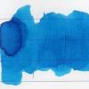
I like inks that I can usually bring at work, ordinary enough for documents, but with that particular tone enjoyable for the user and for the reader. I was looking for a deep dark blue when I've been reccomended (by my evil stationer) to buy Pelikan Edelstein Sapphire Blue, misled by a ink swab card which looked a lot darker than the actual ink. Pelikan Edelstein Sapphire is a quite ordinary blue ink, quite similar to the Pelikan 4001 Royal Blue, but with more shading and a hue more on the purple side of the colour spectrum. It's quite difficult to describe Pelikan Edelstein, you could just say "It's an ordinary blue" without having someone contraddicting you, but I think there's something more to be told. On white paper the Edelstein Sapphire looks intense, more like a purplish blue (you can see how much purple there is in the cromatography), with a good ammount of shading. Even if this ink clearly isn't my ideal blue, it stands out compared to the cheaper cousin of the 4001 line. It behaves well on every paper, no bleedthrough or feathering on Schizza & Strappa paper and on tracing paper, a little motr on common copy paper. Has nice shading properties with all tipes of nibs and good drying times. Almost none waterproofness. On swab test It seems unable to get darker than a certain ammount: the 2nd swab and the 3rd swab are about the same on every paper I used. In the end, is this ink worth the price? Even if I like it, even if lt leaves a noble looking colour on paper and makes your writing feel somehow "important", spending from 15€ to 20€ for an ink that can be easily mistaken with the 4€ Pelikan 4001 Royal Blue (especially to those who do not share our passion) leaves me a bit lost. I don't think this ink has the right features to be in a premium ink line like the Pelikan Edelstein. Don't mistake me, it's not a bad ink, it's not a bad colour, but in my opinion there are better and more exclusive blues in the same price range. COPY PAPER SCHIZZA & STRAPPA PAPER TRACING PAPER CROMATOGRAPHY INKDROP ON TOWEL
-
This box set had the delicious idea to be waiting for me under the Christmas tree! I don’t think I saw a review of the whole set or of all of these here so I thought I’d take a quick shot at it (sorry no lovely splash or real water test). The Gemstone set comes in a cardboard box that closes with a magnet. Fairly common for ink sets; no overwhelming, exclusive package, not much wow… Each ink comes in the standard 30ml bottle and plastic wrapping Now for the inks: (dipped pens, Tomoe River paper. Picture taken around a week after it was made) We’ll (almost) follow the order of the bottles in the box (only bringing Amethyst from right to left, with its fellow cold hues). So we start with Sapphire and Charoite, a dark royal blue and a blue purple. Nice, bright colours, nothing wrong to say about these inks, but just not really my kind of colours. I guess I’ll leave further comments and comparisons to blue and purple lovers. Amethyst is more for me; It’s another purple, but a little more pinkish and lighter than Charoite. It seems to be made of bright pink and bright blue stuff trying to run away from each other at every opportunity. There is definitely something lavender in Amethyst, but unlike other ‘lavender’ inks, it does not fade or lean towards grey. I like it Notes: - I struggled with taking a decent photo of the purples. This is as close as I got to the real thing. - There IS a small difference between Charoite and Amethyst, I swear. But; enough to justify having both in the same set? - I saw photos of Sapphire, Charoite and Amethyst showing sheen. I didn’t hunt for it here and didn’t get any yet. In Olivine there is ‘olive’, but while some ‘olive’ inks shade from neon yellow/green to dark khaki, sometimes looking like actual olive oil or even borderline radioactive, Olivine is a more composed, slightly muted army green. An olive-ish ink without the drama. (even if I do like some drama in my inks. See: FireOpal). Olivine still has nice shading: Erinite is an interesting colour, and I have to say I had fun using it. It’s a bright green, but it feels different, not just another green. It must be a little more yellow or more blue than just green, maybe like a ‘reverse turquoise’ (as in a green with a drop of blue). I don’t know enough inks to claim it’s unique, but whatever it does, it does it well, it’s fresh, and to me it would make a great spring ink. I would probably call Topaz a medium, balanced orange; not overly red or yellow, not too light when writing (disclaimer: dipped. I have not tried it in a pen yet), not too bright or hard on the eyes either. I find it rather nice –a bit subdued - and probably easily usable. I don’t have other oranges to compare with and not a lot more to say about it (paging HalloweenHJB) It’s easy to see why Fireopal is the ink that got the most buzz in this series. I guess my only comment could be that; An ink that goes that much distance (between dark red to bright orange) in just one touch of a nib or brush - no special effect, no dilution, no artsy touch – an ink which has not just a lovely colour but several lovely colours in it and which does THAT SHADING is a winner, a queen in my books. It seems to look fairly similar to Diamine Ancient Copper in some pictures found online, but I don’t have that one. I nicknamed FireOpal ‘Liquid Fire’ I love it. I think it goes straight into my top 5 fave inks. I want to buy litres, gallons, tankers of it. (that was childish) Zoom (did I mention the shading?) Ruby is a deep, slightly dark red, not eye searing. Another rich colour in which you can find some reddish orange and some cherry red. I wouldn’t call this one a pure red, but I’m not one who’ll have lots of red inks, so this one may be my main if not only red for a while. Garnet is in that sweet Yama Budo/Magenta/ grapey/ fuchsia spot – or whatever that colour is actually called. It’s slightly reddish than YB. The comparison below will make more sense than words. I think I still prefer Yama Budo but Garnet is certainly very nice. I’m not a connoisseur of black inks, and can only compare Onyx to the few blacks I have. It’s the blackest of my blacks, and still looks pretty ‘neutral’ (as in not overly blue or purple) when diluted. My new favourite among my very few blacks. To sum up; a really nice set of inks. Nothing wrong to flag in terms of any ink overly fading, being dry or watery. We all love/ dislike different colours, so I'll just note that the set covers quite a broad array; there should be something for everyone in there. I would have loved to get Emerald and Moonstone in that set – instead of having 2 quite similar purples for example. So I will try to get them.
- 18 replies
-
- monteverde
- gemstone
- (and 8 more)
-
Monteverde's revamped line of inks recently got my attention for their comprehensive lineup of clear, distinct hues, as well as good value. A 90ml bottle can be had for about $13-$15 USD from the better known online retailers in the United States, making it a very good deal. Monteverde touts their "ITF Technology". From Monteverde's promotional material, here's how it claims to benefit us writers: At my recent visit to the 2017 LA Pen Show, Monteverde gave a free bottle of Malibu Blue ink to all show attendees. A company representative had all their inks available for sampling with swabs, as well as show discounts. I brought home four bottles of Monteverde ink, and post-show I've purchased a few more online:Malibu BlueCapri BlueHorizon BlueSapphire BlueMonteverde also offers two blues I am missing: Caribbean Blue (turquoise), and a Blue-Black. I am posting individual reviews for each of the four Monteverde inks I have. I filled a variety of pens with these four inks, with nibs ranging from fine to double-broad stubs. Here's a snapshot from my Bullet Journal Ink Log, showing the pen/ink assignments and a writing sample from each. Monteverde Sapphire Blue This one is my hands-down favorite of the Monteverde inks I have tested. If I could have only one of these four inks, it would be Sapphire for sure. Clairefontaine paper sample. Color/Saturation Sapphire Blue is a rich, dark ultramarine blue. It reminds me of Levenger Cobalt Blue but without Cobalt's issues (very long dry time, smearing even after dry). I compared my writing sample of Monteverde Sapphire to Levenger Cobalt, and they're very close. Cobalt has a touch more purple. Otherwise they're dead ringers in terms of vibrancy and saturation. Shading/Sheening Shading is light to moderate on this Tomoe River sample. A little bit of a reddish-purple sheen appears in the wide lettering. Flow This ink flows beautifully from both my Pilot 78G BB Italic, and from the Lamy Safari. It is the best of the blues in this comparison. Lubrication Lubrication is also great with this ink, and is the best of the Monteverde inks I have tried so far. Like the other Monteverde inks, this one has a slight stiction feel with my Lamy Safari pen. Dry Time Dry time for this ink is very quick, under 15 seconds on Clairefontaine paper with the Lamy Safari. I should give this ink a try for note-taking. Feathering Sapphire Blue performs well in the feathering test on cheap office paper. Bleedthrough There is a medium amount of bleedthrough on the other side of the page on the cheap office paper. Water Resistance Sapphire Blue is not a water-resistant ink in the 10 second immersion test. Before After Comparison to Other Inks Here is a comparison with other ultra-marine type inks and related blues. Click on it for an enlargement.
- 16 replies
-
http://s5.postimg.org/ulpu7fuhz/48884_o.jpg can someone please translate this, thank you in advance.
-
This is my blend I've called Faux Edelstein Aquamarine. It is an equal parts blend of Edelstein Sapphire and Edelstein Topaz.
-
While I was working on some comparisons of PPS to some of the modern inks I have, I decided to work up a review. The short answer is PPS was a great ink with excellent handling characteristics. Perhaps the color was not so popular back in the day, but today there are many inks with saturated color. And this "middle blue" that ever so slightly leans green seems a very unusual color for modern inks which in my mind seem to lean red to blue-violet, or heavily towards green. For those that might not have heard of PPS, it's been long discontinued, with prices now heading towards the stratosphere. I received this PPS sample from a generous FPN member. I don't know how much evaporation occurred with this bottle, but it's my understanding that perhaps not so much. Maybe someone can verify that. I didn't do anything to dilute the ink. It handled excellently. Again, thanks for the chance to sample this bit of vintage ink history! The papers are MvL=Mohawk via Linen, HIJ=Hammermill 28 lb Inkjet, TR=Tomoe River. Sorry, forgot to reduce the size of the image. In the droplets of ink on a wet paper towel, the ink is mostly a single dye that leans very slightly to green. Very much a near perfect middle blue. There is a little bit of red dye which probably accounts for the red sheen seen on papers like Tomoe River. But probably as expected for the era, not very water resistant.
-
Hello, As per request of some fellow members, I decided to give away a bottle of Parker Penman Sapphire in form of 2-3 ml sample vials, the problem is that sending to so many people is not possible for me, so contacted amberleadavis and she very kindly accepted to help with the postage, so I will send the bottle to her and she will work on the sample vials and posting them. Details: - 15 people will be selected, Anyone interested please leave a comment and we will pick the 15 people at our discretion. - This PIF is for people who have not used PPS before. - Preferences will be given to those people who have done one review. - Expect to pay about $2 in postage for CONUS. We will pay for the ink, the vials and the envelopes. - Your commitment would be to write a letter using PPS and post it in the Great PPS CRV: Join the fun - be part of the largest BLUE ink comparison. Your inky-put is appreciated. Best regards.
-
One of my most recent purchase, Bung Box Hatsukoi, also known as Bung Box Sapphire. The name "First Love" actually refers to Penman Sapphire, which I never had the chance to experience, as I converted to "Inkism" only a year ago. Packaging It comes with standard Bung Box box and in an elegant glass bottle. Also a piece of paper explaining the name of the ink. http://s0.homezz.com/201412/5915/48883_o.jpg http://s1.homezz.com/201412/5915/48881_o.jpg http://s3.homezz.com/201412/5915/48884_o.jpg Splash http://s0.homezz.com/201412/5915/48874_o.jpg Writing Sample (etc.) http://s3.homezz.com/201412/5915/48879_o.jpg Comparison (with BB Omaezaki Ruri Kaishoku "Ocean Colour" on the left) http://s3.homezz.com/201412/5915/48880_o.jpg (First line, Kaishoku. Second, BB Sapphire. Third, Sailor Sei-boku) http://s1.homezz.com/201412/5915/48878_o.jpg To Conclude I like it! I think it's a very pretty blue ink. The name is appropriate and descriptive. It has nice shading, lovely sheen. The behaviour is standard-Sailor, very good.
-
Hi Everyone, After reading the many wonderful reviews that saskia_madding has been writing on the Sailor inks, I finally tried all of the Jentle line (except for Black and Doyou) and I of course got hooked! This brand really is amazing and now I’ve fallen in love with Epinard, Miruai, Shigure and Yama Dori! The only thing I am still searching for is one or two blues by Sailor. I don’t love cerulean blues so Souten wasn’t right for me and Nioi-Sumire was beautiful but not the shade I need at the moment. Although I loved the contrast of the red sheen and the blue ink of the basic Sailor Blue, this was the only ink from all of the Jentle line samples that I ordered that dried in my nib, and I had to use pen flush to get the dried sheen off after only a couple minutes of use, so it’s not a good match for my pen. I am looking for a bright true blue that doesn’t lean too much to green or purple and I love smooth inks with a great flow (Miruai blew me away from this point). After going through the extensive reviews of the Kobe, Bung Box and Ishida Bungu inks that once again I am so thankful to saskia_madding for posting, I’ve narrowed down the blues to: -Bung Box Sapphire -Kobe# 14 Maya Lapis -Kobe#37 Island Blue -Ishida Bungu Hakodate Twilight I’ve found a review from amberleadavis and a co-razy view from cyber6 of Kobe #37, so I’ve added those images to the comparison chart I’m compiling to help decide on the final blues. It’s been a rough week, so I am using it as an excuse to treat myself to 2 of the inks (I'll look for any excuse to get an inky treat haha) but I wanted to ask if anyone has writing samples and experience with these 4 inks that they could share in this post. Any information you could include about flow, smoothness, sheen (i love sheen lately!) and potential dry out or cleaning issues that would be very helpful! Thank you very much for your help!! Bahij
- 136 replies
-
I received an email from Fahrney's Pens advertising new Edelstein long catridges. Upon checking the Fahrney's site, http://www.fahrneyspens.com/Item--i-363266S?src=WP200714SENTTOEL&utm_source=Newsletter&utm_medium=Email&utm_content=Inhouse&utm_campaign=140710, I found the option for Edelstein Sapphire Blue. Since I had purchased a lot of Parker Penman Blue Sapphire ink before it became impossible to find and since I have been using Private Reserve American Blue catridges for the travel needs of my pens taking international size cartridges, I have not tried Edelstein Sapphire Blue ink; having a lot of Parker Penman Blue Sapphire ink, I have not needed to buy bottled ink. Since the picture of an ink blob on the Fahrney's site looked promising in regard to color, I wanted to ask how the Edelstein Sapphire Blue ink compares in color to my beloved Parker Penman Blue Sapphire and my substitute Private Reserve American Blue. Has anyone used each of these inks? If so, how do they compare in color? In particular, how does the color of Edelstein Sapphrie Blue compare to the rich deep color of Parker Penman Blue Sapphrire? Thanks! : )
- 4 replies
-
- parker penman
- blue sapphire
- (and 8 more)
-
I just received a Haolilai 661A, which I ordered from eBay. Since there is little about this brand on FPN, I thought I'd post this very informal, handwritten review.The pen I purchased was http://www.ebay.com/itm/FOUNTAIN-PEN-HAOLILAI-661-FINE-NIB-SILVERY-PURPLE-H055-/121127212869. The photo posted here of the pen is is from the eBay listing. My review is in the attached image, though I can't seem to modify the orientation of the photo.
-
Enjoy: http://i42.tinypic.com/imjdj9.jpg http://i40.tinypic.com/30sy4gi.jpg