Search the Community
Showing results for tags 'santini italia'.
-
.thumb.jpg.4b37dd6ffcffa13f64fb1de9f17d4a22.jpg)
Santini Libra Ebonite with an EF "superflexy" nib - initial impressions
Vintage_BE posted a topic in Fountain Pen Reviews
I have not yet posted a review on FPN, and I am a bit skeptical about reviews of recently acquired pens. I received this pen on 11 March 2021 and nevertheless decided to write a quick review for two reasons. First, I want to join in the praise that several other FPN members have heaped on the company for their stellar customer service and - communication. Second, I’d like to share my (initial) experience with their EF-tipped “superflexy” nib, since there appears to be some confusion as to the availability and characteristics of that nib. I will skip the customary “first impressions” section of the review template since this review is a first impression in its entirety. I bought a Libra Ebonite pen (in the “Lava” design), at the (then discounted) price of €359 (including shipping). Appearance and design: I have enclosed a few pictures. This is an oversize pen (see below for dimensions). As noted in other FPN posts, Santini's color schemes sometimes come across as rather baroque (not to use the term gaudy), however the “Lava” version seems inspired by the vintage “woodgrain” design that was popular with Waterman, Conway Stewart and other brands in the 1920s-1930s. The vintage aspect of the Libra is reinforced by its flat-top design (it reminds me of Conway Stewart’s 55 Duro model). The cap ring is perhaps a bit massive for my taste and the same goes for the “Santini Italia” inscription. The ebonite versions of the Libra (25 of them, when I checked their website, but they may be adding more) are all “limited editions” - i.e. limited to 33 pieces each. The serial number is etched on the top of the cap. In summary, perhaps not a pen to uncap in a meeting where you intend to keep a low profile (but then most meetings are videoconferences nowadays). Construction & quality: Santini advertises their pens as "100% made in Italy". I have no reason to doubt that claim, and my initial impression is one of high quality materials, genuine craftsmanship and careful finishing. No loose or wiggly parts, the ebonite has been polished to high gloss, the cap engages perfectly with the threads. And their nib is something special (see below). Weight and dimensions: The Libra measures 14.6 centimetres capped, 13.5 centimetres uncapped, and sports a hefty barrel that comes to 1.5 centimetres at its widest spot. The section is exceptionally long. Like I wrote, a truly oversized pen. It is slightly longer and significantly heftier than the Pelikan M1000, generally recognised as oversized (see enclosed picture). The ebonite barrel and cap help to keep the weight down (31 grams capped), in spite of the built-in piston component (see below). I have big hands and welcome pens of this size. You could post it but that would make the pen really too large for my taste. Nib & writing performance: This is why I am posting this review. Santini is one of the very few remaining fountain pen companies that manufacture their own nibs. Their website (https://www.santini-italia.com/nib-size-guide.html) gives the impression (perhaps deliberately) that the “superflexy” nib is not available in EF size, and states that the EF tip puts down a line with a width of 0.5mm. I had a (web-) chat with Katrina, one of the family owners and deservedly famous on FPN (and elsewhere) for being exceptionally responsive and flexible (in a commercial sense of course). She confirmed that they would be happy to prepare a superflexy nib with an extra fine tip - without surcharge by the way. The Santini superflexy nib comes with an ebonite feed which is claimed to improve ink flow. It’s difficult to verify such a claim (I do not have a Libra with a plastic feed) but I can confirm that my Libra yields a decent ink flow, in spite of its EF tip. My Libra does have noticeable feedback (as you can expect from any EF sized tip), but that helps to control the nib and does not result in a “draggy” feel. And what about the “superflexy” feature? My Santini nib is flexible, a bit less than the Pilot 912 #10 FA and the Montblanc Calligraphy nib, a bit more than the Jowo “soft” 14K nib (the one with the sideways cut-outs). When used at what I consider to be normal pressure, for writing cursive with a 55° right slant, Santini's superflexy nib does not produce significant line variation - but then almost no contemporary nib does that (the Pilot #10 FA being the exception in my limited experience). You certainly can squeeze line variation out of this nib, when writing vertical script and applying an amount of pressure that (in my view) is hard to sustain for more than a few lines (yes, I am one of those who believe that fountain pens are best used with a very light hand). I hasten to add that the superflexy nib has immediately become one of my favourite writers (and like many FPN members I do write with a rather large number of pens). It has a very pleasant bounce that helps to put down a nicely rounded, flowing script. And - other than what the Santini website states - my extra fine tip actually is an extra fine, and perfectly suited for cursive writing with an x-height of 2.5 mm or even less (see enclosed picture with ruler). In other words, Santini seems to have overdelivered - something I have not yet experienced when purchasing a fountain pen. Once again, this is a first impression after just four weeks of use, but I expect that this nib will remain one of my favourite writers in the longer term. Filling system and maintenance: Santini advertises the Libra as having a “piston filling system” and from the outside it does look exactly like a piston filling pen (without an ink window though). As other FPN members have noticed (see https://www.fountainpennetwork.com/forum/topic/348301-santini-italia-libra/?do=findComment&comment=4388621), the pen encapsulates a Schmidt piston component. That makes it a pen with a “built-in converter”. Compared to a standard converter, the Libra can be filled (and flushed) without having to first unscrew the barrel. However, its capacity is that of a converter, ergo a (bit) less than the capacity of a typical (think Pelikan) piston filler. A standard converter can be taken out of a pen (like a cartridge), which allows for easier flushing/cleaning of the pen. And if a standard converter fails, it can simply be replaced by another one (which usually costs less than €10). That being said, I have been using converters for many years, and have not yet been confronted with one that stopped working. Also, Schmidt is a well-known German quality brand and I have no reason to believe that their piston component is less reliable or sturdy than a classic piston filling system. And if worse comes to worst, Santini has a repair service. If that service is on par with the finishing of their pens, and with their customer service, I would not lose sleep over the continuing functioning of the Libra’s piston filling system. Cost, value and conclusion: at a price of €359 (VAT excl; at a VAT rate of 21% the price would be 434€, and I believe they regularly offer discounts) this is a proposition that is hard to beat. Santini may not (yet) have the reputation and prestige of brands such as Visconti, ASC, Leonardo and Scribo. They do not appear to invest in marketing and I think that they sell most of their products directly to the end customer. But my initial impression is that their pens are of the same (or perhaps superior) material and quality as/than the better known Italian brands. I suspect that this pen will remain one of my better purchases. YMMV of course.- 47 replies
-
- flex nibs
- ebonite fountain pen
-
(and 3 more)
Tagged with:
-
desaturated.thumb.gif.5cb70ef1e977aa313d11eea3616aba7d.gif)
Santini Calypso Mother-of-Pearl piston-filler
A Smug Dill posted a gallery image in FPN Image Albums
From the album: European pens
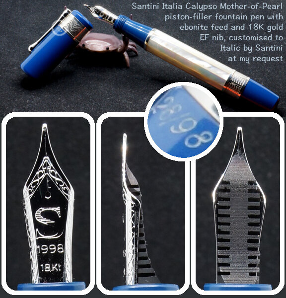
Calypso Mother-of-Pearl piston-filler by Santini Italia, numbered 28/98. Most Santini pen models and colourways are expressly ‘limited edition’, presumably on account of not intending to produce or source more of a particular pattern of acrylic or ebonite for their pen bodies. There are other Santini pen models, for example the Atene, with the same core design; but the Calypso is the only one using mother-of-pearl for the panels on the faceted barrel, bracketed by muted blue ebonite parts of the body.© A Smug Dill
- 0 B
- x
- 1 comment
-
- santini italia
- hybrid body construction
- (and 8 more)
-
desaturated.thumb.gif.5cb70ef1e977aa313d11eea3616aba7d.gif)
Santini Calypso writing sample in Pilot Iroshizuku Asa-gao
A Smug Dill posted a gallery image in FPN Image Albums
From the album: European pens
Produced by this pen: https://www.fountainpennetwork.com/forum/gallery/image/11064-santini-calypso-mother-of-pearl-piston-filler/ Follow-up to: https://www.fountainpennetwork.com/forum/topic/365641-leonardo-mosaico-hawaii-or-santini-michelangelo-the-eagles-wings/#comment-4522716© A Smug Dill
- 0 B
- x
-
- santini italia
- ebonite feed
-
(and 1 more)
Tagged with:
-
(cross-posted) in Fountain Pen Geeks forum) Santini pens with Flexy nibs must have ebonite feeds. Some of the pens I'm looking at are made of acrylic resin and others are ebonite. The former cost 259 euros and the latter cost 359 euros. What are the advantages and disadvantages of each? What do you get for 100 euros more when you get an ebonite pen? Examples of Ebonites are Libra Blackberry, Mora, Sand, Acqua, Cumberland, Ginger, Ethiopia and Lava. Examples of Acrylic Resins are Libra Black, Nut, Lord, Etna, Grape, Laurel, Diamod Blue, Lavender, Royal Blue, and Red.
- 40 replies
-
- santini italia
- ebonite
-
(and 1 more)
Tagged with:
-
desaturated.thumb.gif.5cb70ef1e977aa313d11eea3616aba7d.gif) I'm at a complete loss trying to figure out why this is happening. The nib unit for my Santini Italia Calypso Mother-of-Pearl pen, which houses a rhodium-plated 18K gold nib and an ebonite feed supporting it, has just been returned to me from Italy after repair. I bought a bottle of Waterman Mysterious Blue ink from a local department store a couple of weeks ago, while the nib was still away. After flushing and drying the nib unit, I decided to fill the Calypso pen with this ‘safe’ ink first, to test how the repaired nib writes. The first few pages of writing samples were sufficiently ‘wet’ on the page, that the ink marks exhibited sheen on Rhodia DotPad 80g/m² paper. I reported back to Santini that the nib is all good, thanks very much; and I set the pen aside — properly capped, of course. I picked up the pen not even two days later, and to my utter surprise, it wrote (“Sunday, 10 October 2021” below) extremely faintly. I thought the ink may have dried out somewhat in the nib and feed the pen was hard-starting, but there was no skipping or breakage in the lines of ink, so that wasn't what it was doing. Pushing the nib a bit harder, I got slightly more colour out of it, but it still looked nothing like Waterman Mysterious Blue ink. Eventually, I primed the feed by turning the piston knob, and the colour became a bit closer to blue (or teal-black). I've marked out in the image below —with straight magenta lines — where or each time I primed the feed. Only after the nib and feed were literally dripping ink (and cleaning it up with a paper towel) did the colour of the writing return to what I thought Waterman Mysterious Blue ink looks like. I emptied the contents of the ink reservoir into a sample vial, then flushed, cleaned and dried the nib unit. After reinstalling the nib, I gave the pen a fresh fill from the same bottle of ink as before, and started a second test sheet to check if the issue persists over the following couple of days. In the meantime, I compared the ink extracted from the pen and the ink still in the bottle by chromatography, just in case something has contaminated or denatured the ink from the first fill after it passed through the nib and feed into the reservoir. Nope, it doesn't appear to be the case. What it does look like, however, is that the blue and violet dyes have somehow been filtered out, such that then nib was only laying down the turquoise dye in the ink when I wrote with it after it was capped for a day or so, as opposed to the ink evaporating and getting more concentrated with dye (thus appearing darker). Can anyone explain what's actually happening?
I'm at a complete loss trying to figure out why this is happening. The nib unit for my Santini Italia Calypso Mother-of-Pearl pen, which houses a rhodium-plated 18K gold nib and an ebonite feed supporting it, has just been returned to me from Italy after repair. I bought a bottle of Waterman Mysterious Blue ink from a local department store a couple of weeks ago, while the nib was still away. After flushing and drying the nib unit, I decided to fill the Calypso pen with this ‘safe’ ink first, to test how the repaired nib writes. The first few pages of writing samples were sufficiently ‘wet’ on the page, that the ink marks exhibited sheen on Rhodia DotPad 80g/m² paper. I reported back to Santini that the nib is all good, thanks very much; and I set the pen aside — properly capped, of course. I picked up the pen not even two days later, and to my utter surprise, it wrote (“Sunday, 10 October 2021” below) extremely faintly. I thought the ink may have dried out somewhat in the nib and feed the pen was hard-starting, but there was no skipping or breakage in the lines of ink, so that wasn't what it was doing. Pushing the nib a bit harder, I got slightly more colour out of it, but it still looked nothing like Waterman Mysterious Blue ink. Eventually, I primed the feed by turning the piston knob, and the colour became a bit closer to blue (or teal-black). I've marked out in the image below —with straight magenta lines — where or each time I primed the feed. Only after the nib and feed were literally dripping ink (and cleaning it up with a paper towel) did the colour of the writing return to what I thought Waterman Mysterious Blue ink looks like. I emptied the contents of the ink reservoir into a sample vial, then flushed, cleaned and dried the nib unit. After reinstalling the nib, I gave the pen a fresh fill from the same bottle of ink as before, and started a second test sheet to check if the issue persists over the following couple of days. In the meantime, I compared the ink extracted from the pen and the ink still in the bottle by chromatography, just in case something has contaminated or denatured the ink from the first fill after it passed through the nib and feed into the reservoir. Nope, it doesn't appear to be the case. What it does look like, however, is that the blue and violet dyes have somehow been filtered out, such that then nib was only laying down the turquoise dye in the ink when I wrote with it after it was capped for a day or so, as opposed to the ink evaporating and getting more concentrated with dye (thus appearing darker). Can anyone explain what's actually happening?- 22 replies
-
- waterman mysterious blue
- ebonite feed
- (and 4 more)
-
How to grease a Santini piston?
collectorofmanythings posted a topic in Fountain & Dip Pens - First Stop
Looking into possibly buying a Santini... was wondering if any of you have greased the piston on it or know how to. Thanks for your help! W. H. Major- 20 replies
-
- santini
- santini italia
- (and 4 more)
-
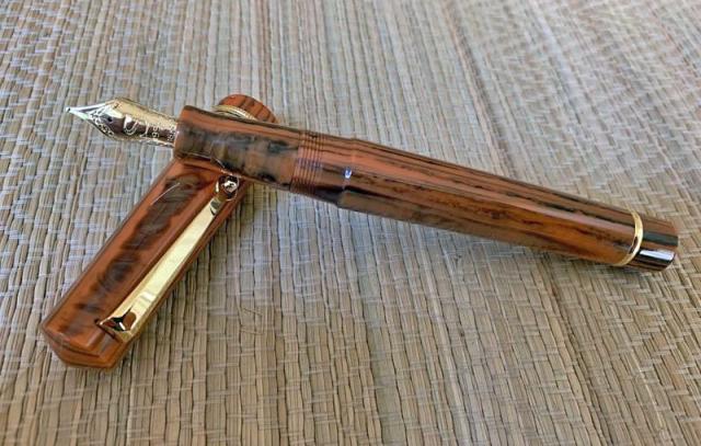
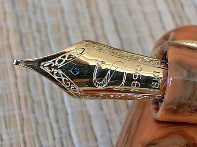
Santini Italia is a relatively new company, although there was an older Italian pen manufacturer named "Santini" which may have been the same family. I am not sure what the "1998" engraved on the nib represents, presumably some important milestone in the company's history. The company is owned by Giovanni Santini, and he is the pen maker as well. He was previously involved with Ancora pens. Santini Italia attracted my attention partly because they make their own 18Kt nibs, and they offer a stub nib. They do make some somewhat blingy limited editions but several models that are quite traditional and reasonably priced for pens made with handsome resins, piston filled and fitted with 18Kt gold nibs. So, I thought it was worth ordering one. I ordered directly from the company in Italy. Communication with them was easy and responsive. The pen arrived just a few days ago, so this is a "first look." General size, shape and appearance The Santini Italia "Libra" comes in several colors. The one I ordered is a light brown, wood grain resin. I find it rather handsome. The pen is a traditional "flat top" shape with low peaks on the top of the cap and the other end. It is a large pen, but not quite "oversize." it is about the length of a Pelikan M800 but a millimeter or so greater in diameter. I find that a positive characteristic, since I prefer thicker sections for comfort. The pen's fit and finish seem faultless. One feels it is very well made. The hardware appears to be gold plated. It is quite simple and in good taste. Santini Italia Libra with a Pelikan M800 and an Aurora 88 (both with custom bindes) Santini uncapped compare to a M800. Filling the pen The Libra is a piston filler. It takes about 6 turns to fill it. The capacity, tested with water, is about 1.5ml. It is very smooth to operate. When filling is complete, the end knob turns with a clicking sound, like the piston mechanism in my Delta Santuffos. The nib and writing As stated, the availability of a stub nib at no extra cost was a positive factor in my decision to buy this pen. My assessment revealed both strengths and weaknesses. On initial inspection, I was pleasantly surprised by the width of the nib tip. Most stock stubs on Italian pens are 0.9 to 1.3mm. This one appears to be about 0.8, which is much more usable for my daily italic handwriting. The nib is on the small size for the size of the pen. It is noticeably smaller than the nib of a M800. On closer inspection, I found one of the tines to be torqued slightly, and the tip looked like it had baby bottom. Also, it was on the round end of the "stub" spectrum. I expected writing problems. When I inked the pen, I found it wrote very smoothly with moderate to wet ink flow. On single strokes, the thick/thin line differentiation was about 2:1, but there was minimal thick/thin difference in writing because of how wet the nib is. I will be taking the pen to the San Francisco Pen Show to have the nib tuned and crisped up. I'll update my review afterwards. David
- 52 replies
-
- italian pen
- santini italia
-
(and 1 more)
Tagged with:


