Search the Community
Showing results for tags 'salix'.
-
I'm a fan of 'dry' (less lubricated) inks and over the last two years used exclusively the Diamine Registrar's/ESSRI, Salix and Pelikan 4001 blue black. Are there other similarly dry inks available? I would like to try something new, new colours and I'm not particularly concerned about permanency or its lack anymore.
- 65 replies
-
- dry ink
- diamine registrars ink
-
(and 3 more)
Tagged with:
-
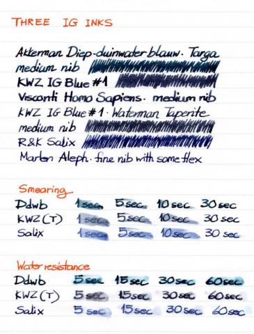
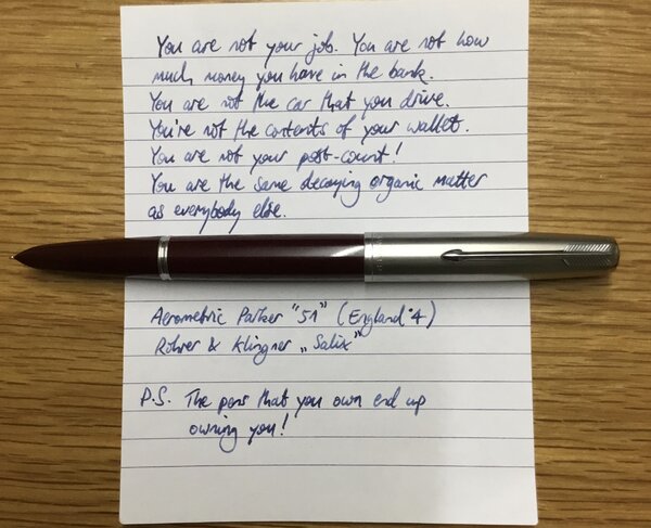
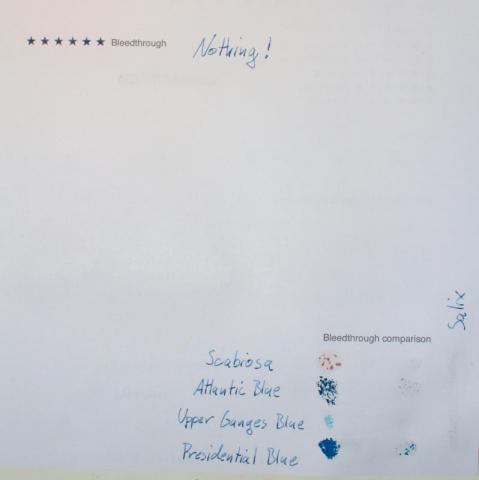
THREE IG INKS Waterproof, bulletproof, all kinds of inks that can withstand abuse from human malice or carelessness, the weather, time; I read about them and fail to find the fascination. First of all, I like inks that wash off easily from my hands, clothes and pens. I'm not that accident-prone but when I used to carry a Pelikan M600 in by breast pocket, many were the times when the cap unscrewed by itself and the pen decorated me with large blue blots. If those blots hadn't washed off, I might have given up on fountain pens - or carrying them around, at least. Secondly, what's the use of resistant inks when I write on paper, a carrier that can be completely destroyed so easily? Does it matter that the ink is still there when the sheet of paper has become pulp? I don't write anything that important that would be severely damaged by a droplet of fluid. So, you appreciate that I didn't get the inks I'm comparing here because they're waterproof; I just liked the colours and was curious to see how they behaved in my pens. The first is IG Blue #1 by KWZ Inks. Since I now have the delight of a local store that stocks KWZ (Fontoplumo), I decided to explore their products, including their IG range, since everybody told me that they were very well behaved. I liked it immediately, although it seemed rather dry for the Waterman Taperite I first inked with it. So, I tried it in one of my gushers, too, a Visconti Homo Sapiens with a medium nib reground into a CI by Oxonian, and the combination was a success. Interestingly, with time, ink flow in the Taperite improved, not to the level of e.g. Diamine Denim, but then that was a bit too much. The second IG ink I got was Rohrer & Klingner's Salix, just so that I would be able to make a comparison. I'm quite impressed by their inks, so I decided that yet another blue ink (I must have about twenty at the moment) was not superfluous if I were to form an opinion on IG inks through a hands-on comparison (I often use this excuse, that's why I have too many inks). It also helped that Couronne du Comte at Tilburg offered a generous discount to a visiting group of pen enthusiasts. Then I remembered that one of my favourite inks, Akkerman's Diep-duinwaterblauw, is reputedly an iron gall one, too, so I decided to include it in the comparison. THE SETUP OBSERVATIONS I love the colours of all three inks. The way the colour of IG Blue #1 and Salix changes as they dry on the page still catches my attention. Diep-duinwaterblauw remains the same but then it's the richest colour of the tree. The final greyish blue of IG Blue #1 is very much to my taste but the brighter blue of Salix seems more interesting in a finer nib. All three have enough shading. Concerning smearing, Diep-duinwaterblauw is the quickest to dry on paper, some twenty seconds ahead of the other two, which seem safe to touch after thirty seconds (or slightly longer in the case of Salix). Water resistance after a minute or so was high for Salix and IG Blue #1 (with the former performing slightly better in this respect) but less so for Diep-duinwaterblauw, which is nevertheless not marketed as water-resistant. In the smearing and water tests, the Taperite was used to represent IG Blue #1, as it was more comparable to the Marlen Aleph that was inked with Salix. In conclusion, I wholeheartedly recommend all three inks to people who know how to care for their pens. I don't know yet what the long-term effects of IG inks on the pens can be. More on that in a year or more; for the moment, I can confirm that the Parker 51 and Sheaffer Targa I keep inked with Diep-duinwaterblauw for a three years now have never given me any kind of trouble. THE PROOF The paper used must be in the area of 80g and is slightly less absorbent that common 80g copy paper. In the scan the colours seem just a smidgeon darker than in real life but their differences are well captured.
-
desaturated.thumb.gif.5cb70ef1e977aa313d11eea3616aba7d.gif)
How-to: Set, or change, personal info that others can see about me
A Smug Dill posted a blog entry in Sus Minervam docet
It helps to explore this yourself, revisiting once in a while if need be, and keep in mind where each of those personal info fields are entered. Don't leave it until the urge to change something specific to come upon you, and only then bother to ask the question! Invest the time surveying upfront, instead of waste it later waiting for an answer from nobody in particular. Most of the fields shown above are self-evident as to what they are. I think the only ones that could do with explanation are: Security and Privacy: There is only one setting under there, and that is a toggle for whether your online status (including ‘last active’ date or time) is visible to others Content View Behavior: That has nothing to do with what others can see about you, but only where you would like to start reading when accessing content Enable status updates: This toggle enables/disables the public feed on your profile page; if you disable it, then nobody (including you) can post publicly visible ‘status updates’ or any other message against your profile, but if you enable it, then anyone — friend, foe, or complete stranger — can post something there whenever, without waiting for you to initiate and then only reply to what you wrote Notification Settings have nothing to do with what others can see about you, and so is out of scope for this article, and I'm not going to delve into those right now. (You can look here, here, and here to wrap your head around how notifications work with respect to followed content.) N.B. There is a possibility that some of the above settings and data fields may not be available to Bronze members and/or Silver members, but I have no way of testing that or scoping it out. — • — Another way of getting to the Edit Profile dialog, and the way to change your profile photo (or ‘avatar’), is here: — • — Freeform, custom member titles that one enters for oneself are long gone, and have not been a thing since FPN came back from a long hiatus and platform upgrade late in 2020.-
- fight club
- salix
-
(and 101 more)
Tagged with:
- fight club
- salix
- parker 51
- jacques herbin
- bleu austral
- bleu de minuit
- graf von faber-castell
- moss green
- olive green
- deep sea green
- gulf blue
- cobalt blue
- midnight blue
- parker urban
- night sky blue
- diamine chocolate
- platinum
- vicoh
- kanazawa
- gold leaf
- maki-e
- kanazawa-haku
- modern maki-e
- slender
- feminine
- snap cap
- penbbs
- chinese ink
- lamy 2000
- aurora
- ottantotto
- aurolide
- rose gold
- 888
- limited edition
- solar system
- planets
- jupiter
- giove
- conway stewart
- cs 58
- duro nib
- 14k
- medium nib
- green
- hatched
- sheaffer
- balance
- statesman
- 14k
- fine nib
- 1930s
- sheaffer
- balance
- statesman
- 14k
- fine nib
- 1930s
- webster gold crown
- webster gold crown
- webster gold crown
- jinhao x159
- feed diameter
- size 8 nib
- my foot!
- pilot
- plumix
- ef nib
- bb nib
- stub nib
- steel nib
- pilot
- plumix
- ef nib
- bb nib
- stub nib
- steel nib
- pilot
- plumix
- ef nib
- bb nib
- stub nib
- steel nib
- space
- stationary
- planets
- rubber
- pencil
- ruler
- vjreviews
- vjreviews
- nibsmith
- dan smith
- italic
- nibsmith
- dan smith
- italic
- lamy z52
- lamy studio lx all black
- aurora ipsilon
- faber-castell essentio
- noodlers aircorp blue black
- aircorp blue black
-
- 1 comment
-
- fight club
- salix
-
(and 1 more)
Tagged with:
-
desaturated.thumb.gif.5cb70ef1e977aa313d11eea3616aba7d.gif)
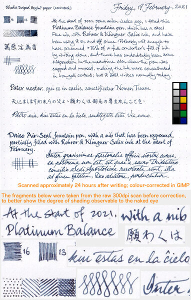
Shading from R&K Salix in writing samples with two different pens
A Smug Dill posted a gallery image in FPN Image Albums
-
- rohrer&klingner
- salix
-
(and 2 more)
Tagged with:
-
I have a question or two concerning Rohrer and Klinger's iron gall inks. The R&K website states that their iron galls (Salix and Scabiosa) are "archivally safe." They have to be...they're iron galls, right? Then how on earth do they fare so badly in lightfastness tests? Do they contain only a minuscule amount of iron gall? It seems they should perform pretty well. I'm just curious about an ink I'm falling in love with and must have a bottle of.
-
Disclaimer: I don't swear by my scanner's quality, so I've tweaked the colors a bit. They look ok on my monitor, but mileage may vary, so I apologize in advance. I've actually used 2 pens for this review. Most of it is written with a Lamy Safari (f), but for the comparison with Scabiosa (in the water test part) I used a Jinhao x750 (m). The paper is finocam, a spanish brand that you may or may not have experience with. It's fairly good for fp use; line widths run true to size and there isn't any feathering or bleedthrough, although you can see some minor showthrough, which has been exacerbated out of proportion by my scanner. It's actually not bad at all. The paper has some texture, which results in some feedback from nibs ranging from medium to anything narrower. The color is creamy, almost yellowish. http://i.imgur.com/mg562CY.jpg?1 http://i.imgur.com/87smCVD.jpg?1 http://i.imgur.com/gpNLvpg.jpg?1 I performed this test under running warm tap water for 10 seconds. As you can see, there is some saturation loss going on in the salix sample, but it does not impact legibility at all. That's why I rated the ink's water resistance as "very good". http://i.imgur.com/P5evCCK.jpg?1
-
Hi all! I've been lurking on the forums for a while, but I finally decided to create an accout. This is a mixture I discovered not too long ago. Salix and Sky High are two of my favorite blue inks, but they each possess a couple drawbacks that kept me from using them as much as I would like. Salix has great shading and performance, but it is quite dry and can be a bit too pale for my taste. Sky High, on the other hand, is a wonderfully vivid sky blue with a cool sheen, but its extreme wetness ruined the effect with most pen and paper combinations. So, one day I had the wild idea to mix them, 50/50, and thus was born the ink I have taken to calling "Magic Blue" for its ability to seamlessly combine the best characteristics of two very different inks. The only mediocre property I've noticed is its slow-ish (but by no means terrible) drying time. Also, the component inks may be a bit pricey and/or difficult to source for some people. US buyers can get both at a good price from iSellPens.com (no affiliation). The mixture is stable; I have kept a sample vial on my desk for almost a month, and it's still as silky-smooth as any standard ink. Anyway, enough talk - here are the pictures: http://i513.photobucket.com/albums/t331/InkandPaper88/Magic%20Blue/Review_zps98a2518e.jpg http://i513.photobucket.com/albums/t331/InkandPaper88/Magic%20Blue/Compare_zpscf1421b1.jpg http://i513.photobucket.com/albums/t331/InkandPaper88/Magic%20Blue/Sample1_zps59146b85.jpg (note the hint of sheen the darker spots; it is much more apparent in-person) http://i513.photobucket.com/albums/t331/InkandPaper88/Magic%20Blue/Sample2closeup_zps714353dc.jpg http://i513.photobucket.com/albums/t331/InkandPaper88/Magic%20Blue/Swabs_zps9db16245.jpg
-
Hello all, Everyone's experiences and apprehensions with iron gall inks seem to be all over the place. The take home message is usually something along the lines of "if you exercise proper pen hygiene and use modern iron gall inks formulated for fountain pens, you shouldn't have an issue". I've followed this and nope, haven't had an issue yet. What I do get apprehensive about is the reasoning behind the iron gall cleaning routine. It seems you don't want the ink sitting in the pen for very long but the issue arises if you want to dedicate IG ink to a pen. For example what if one were to use IG inks in a steel nibbed pen with proper hygiene (rinsing, thorough cleaning bi-weekly at best, etc) but kept refilling the pen with IG ink? Wouldn't the contact time with the steel eventually corrode the nib? That's my question -- about the hardiness of steel when exposed to IG ink with proper pen maintenance. Anyone have positive/negative stories to share? This includes IG ink experiences of all kind with any nib/pen material but i'd especially love to hear from folks that have been using an IG ink in a particular pen for a long time (e.g., >=1 year). How does your pen fare under these conditions? Best, sleepy P.S: Currently using ESSRI in a lamy 2k and am loving it. A left-handed overwriters dream!
-
Hi everyone: I've just registered into this forum as I have a doubt about iron-gall inks: I currently own a waterman carène, which is the best pen I have and has a great sentimental value, as it was given to me as a special gift. I'm trying to find a permanent ink for taking some notes i'd like to review on the future, and, from what I've read, iron-gall inks are permanent ones. I like the R&K Salix one, as I've seen it on this website reviews along with other inks. My doubt is: will my carène be harmed, or corroded if I end up using this ink? It has some kind of a gold cover on the nib, hence my doubt. And, a second one, but closely related question: Should I get a different pen for iron-gall inks? A TWSBI, for instance? Thanks for your advice
-
Has anyone else noticed that a page written with Rohrer & Klingner's Salix takes on an aged look? A perfectly white paper comes out looking off-white and antique after the ink has cured. I suspect this is because the dusky hue of oxidized iron gall duplicates somewhat the impression of a clearer blue on off-white paper, but it's different somehow - more aged than exactly off-white. I wonder if it's also partly due to the way, as Sandy1 puts it, iron gall inks seem to reside behind the plane of the page. I think it is a great effect and lends a document gravitas; but I certainly wouldn't have predicted it. I wonder if the other iron galls do the same thing.
-
i ordered a bottle of R&K Salix on Amazon, but didn't realize it was shipping from Germany. The wait begins! Any advice on staying sane during a long boat ride across the Atlantic?
-
These are my first ink reviews so I'd like to hear all suggestions how to improve them. I've got quite some inks in my collection already (most of them are samples but it's a start) and I will review some more in the future.
- 6 replies
-
- rohrer & klinger
- salix
-
(and 3 more)
Tagged with:


