Search the Community
Showing results for tags 'sailor nib'.
-
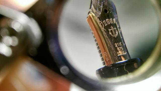
I recently picked up a Sailor Compass 1911 to round out an order, as well as satisfy curiosity about the shape/form factor of an actual Sailor 1911. Based on various reviews I've read and seen, I was prepared to be disappointed by the feel of the nib of the Compass. When I got the pen and inked it up with some Robert Oster Green Lady, I was very very surprised while trying it out on Rhodia and Tamoe River. It was was quieter, smoother, and had less feedback than all my other pens: Pilot Explorer (F); Platinum Preppy (EF) and (F); TWSBI 580 (EF), Eco (EF), Go (1.1 Stub); Lamy Vista (EF). The only pen that was smoother was my Platinum Preppy (M). It was only when I tested on regular paper -- 18 lbs laser paper -- that the Compass fell to the bottom of the heap exhibiting the often described pencil on paper feel. Did I just get lucky with this particular pen's nib and ink combination? Or is my grip or writing style just well suited for this pen? Or do I simply just not have enough experience yet being only about a month into this hobby?
- 7 replies
-
- sailor
- sailor nib
-
(and 2 more)
Tagged with:
-
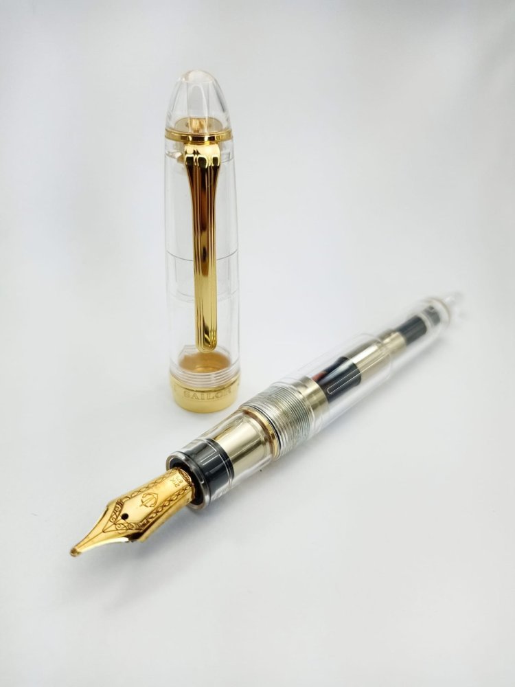
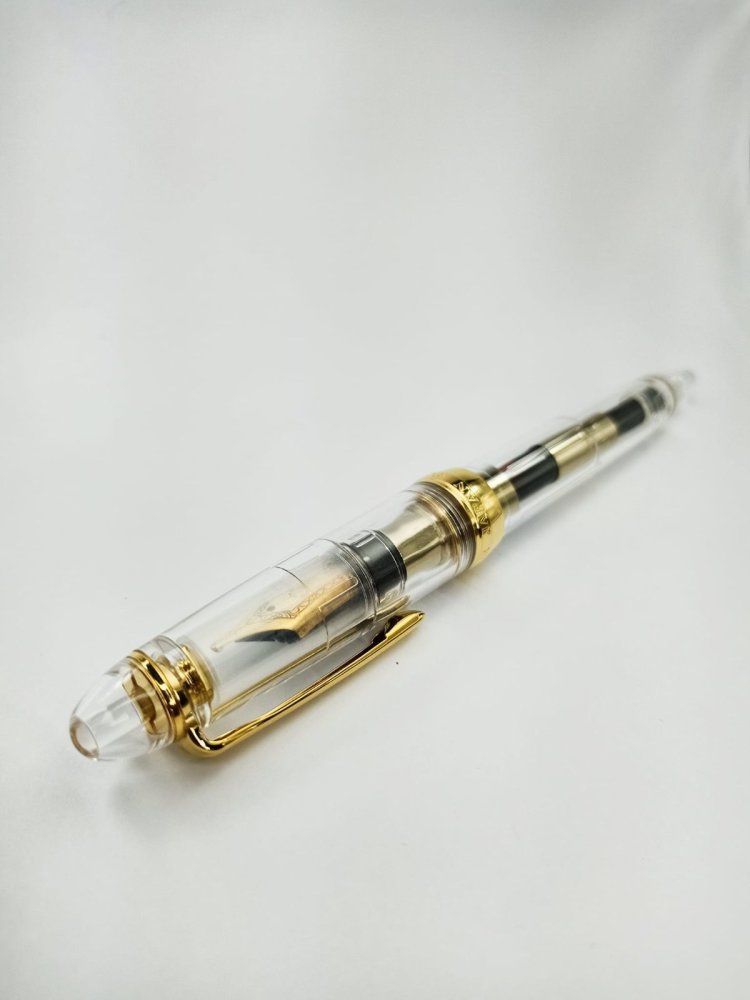
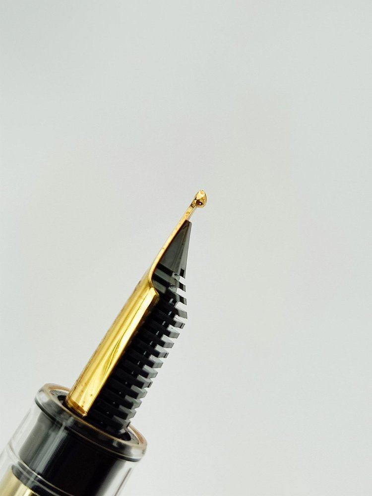
Hello there! Here's my review of the Sailor 1911L Demonstrator with a Zoom nib! Introduction: I wasn't always into Sailor pens. I got my first Sailor pen, a black and rhodium Progear over a year ago. I didn't really cared for the precise feedback of the B nib that I had on that pen. I was really into broad, glassy smooth writers like Pelikans and it was only until recently that I began to appreciate Sailor nibs (especially their Naginata Togi)! Considering the fact that Sailor are raising their prices to ridiculous amounts, I just had to have one asap. I chose the Zoom nib as I think it's the closest to the NTs. Once it arrived (two days before 2023) and got to write with it, I knew I was in for a treat! With that said, on with the review! - Price 7/10 This pen is worth USD 256 (converter included) from where I got this. It’s a bit more expensive than the ones with regular EF-B nibs. Considering Sailor pens are much more expensive in other places (especially in the US) I can’t really argue with that. - Packaging: 9/10 The pen came with a standard Sailor blue box, but with the new branding. Nothing breathtaking here. - Build Quality: 8/10 I have good experiences of the PMMA resin that Sailor uses for their Large fountain pens. With this demonstrator resin however, I feel it’s a bit lighter than the opaque ones. Maybe it’s psychological because I could see through it? But other than that, everything feels well-built! - Design: 10/10 I chose the demonstrator version as I think it’s the most unique looking in their regular production series. The gold trims add a look of luxury without making it boring, compared if the combination is black with gold trims. - Cap: 9/10 Very nice. The clip is solid but easy to operate. The pen takes 1 ½ turns to open which is quite less than my regular progear. The cap band is also quite different from the regular ones, and I think it looks very nice! Because this is a demonstrator, you could see the inner cap, which is semi-translucent. I wish it was clear like the rest of the pen, but I’m sure Sailor has their reasons for that. - Filling Mechanism: 8/10 This pen, like most Sailor pens, is a CC filler. There’s a huge debate on this matter but Sailor converters are well built in my experience. However with the zoom nib that this pen has, it goes through ink like there’s no tomorrow. I’m good with Sailor converters, but I believe they should make another one with a higher ink capacity for nibs like the zoom. - The Writing Experience/Nib: 9/10 This has a 21kt monotone gold nib. My experience on Sailor nibs are wonderful! I would agree with most folks that with a Sailor, you pay for the nib, which is phenomenal! This zoom nib is smooth but not overly smooth. It has a dull-pencil-like feedback which is good for my tastes. I inked this pen with Diamine Ancient Copper ever since I got this, and the flow and wetness is I would say moderate. I prefer things to be on the wetter side but I could see that the feed flows very well. I would say that it’s the ink as Ancient Copper leans on the dry side. Speaking more on the Zoom properties, it really does work! On the 90 degree angle, it's a good western fine. At about 60 degrees, it’s a western broad. And finally, when used 45 degrees and below, it’s a good double broad. It took quite a bit of practice to use it more practically. I typically use this on the 45 degree angle which works for me personally. That angle might be too wide for most people so try before you buy. I would also take note that the Zoom nib doesn’t work well on TRP which is rather unusual. My specific zoom nib also doesn't perform well when used in reverse writing. Again, the rather dry ink might the cause. The nib also has a bit of give to it which I love about their 21kt nibs! It’s worlds apart compared to Jowo steel nibs that I’m not too crazy about. But take note that this is not a flex nib, and shouldn’t be used as such. This nib also has the new nib design which sparked controversy in the pen community. Personally, I like the new design better than I expected! It’s more minimalist looking which I associate with Japanese pens. It also now looks way different from MB nibs which is good thing. - Comfort: 10/10 This pen is very comfortable! The ergonomics are similar with the PG, so I was sure that the pen would be good for me. The pen posts well and is actually more comfortable to hold that way but I don’t want to add wear on the barrel so I rarely post this pen. I don’t really mind having marks on my black PG, but I do care about the demonstrator so yeah. - Weight and Measurements The pen is a tad longer than a Lamy Safari and a wee shorter compared to a Montblanc 146. The Sailor 1911 unposted (inked with converter) is noticeably lighter than a MB 146 unposted with a brass piston mechanism. - Others: On the finial and end area, you could see the glue used on assembling the pen. I don’t mind that personally as it shows that this pen was assembled by hand, which I always appreciate. Another note is the gold trim. I’m very hesitant about gold trims as I have had bad experiences with my Platinum 3776 Century, which the gold plating worn off in just three months. But so far, I haven’t heard of recent reports of Sailor gold platings wearing off abnormally. Because this is the new design, I could be assured that this is a new production pen. I would be very upset if the gold would wear off like my 3776 but fortunately, it is still pristine. I don’t store it in leather cases just to be safe. It is also worth noting that the zoom nib is not an equal match for the Naginata Togi nibs imo. The latter is much broader with more of an architect nature and are considerably wetter. - Overall 9/10 The Sailor 1911L Demonstrator offers a lot of good features to me personally. I purchased this mainly for the Zoom nib and I found that it’s good mainly for special uses, not for everyday writing (unless you write huge, don't mind refilling more often and have an abundant access and finance for good paper). It's velvety smooth with good line variation. The looks do it good for me, and I’m not even a demonstrator fan. If you’re in the hobby for quite some time and would like a unique writing experience, I strongly recommend Sailor pens! They have very good build quality with amazing nibs for a decent price. As for the design, I would personally look towards the more unique special editions. Overall, this is a good pen from my favorite Japanese brand!
- 1 reply
-
- sailor
- sailor1911
-
(and 3 more)
Tagged with:
-
I recently managed to get my hands on a Sailor Pro Gear Slim Limited Edition Purple Cosmos with B nib. This being my first Sailor I was mega excited to receive it and try it out and the look and feel did not disappoint, however the nib has. Its is inconsistent and scratchy at times and so I think it may be slightly damaged. Its a real disappointment. With this in mind I am wanting to get the opinion of a nib specialist. Can anyone suggest a UK based nibsmith that may be able to help? Thanks FP community.
-
LINKED BLOG BELOW For more irrelevant pictures , I am sure people like me would click Cross Peerless 125 Tokyo Edition PRELUDE Plurality of singularities Among many other fountain pen lovers, I do retain a high level of adoration for the way the Sailor nibs look, aren’t they just beautiful? Paradoxically enough, there is also a certain distaste, when it comes to my acceptance of their nib smoothness. My humble experience has been mostly with sailor nibs straight from Japan and not the US market. Alas! the glassy smooth angle to manoeuvre writing with the Japanese ones (except the Naginata one), wouldn’t work for me, ever with the five sailor nibs. Also, I always felt an immense opportunity have something done with their relatively bland base pen designs and the CC filling system. Many times, I pondered whether it would be worth sending a sailor nib to Conid and have a pen made. The nib can be smoothened for English script rather than struggling on my part to learn the Kanji to have it used! As it turns out, I couldn’t justify the Conid plan for a long time, but I do intend to add one in future. By this time, Cross had relaunched the Peerless range in 2015, marking 125th anniversary of its original Peerless pen (1889). Hoorah! it came with a 18k Sailor nib! Cross was founded in 1846, in case you too thought this to be the company’s 125th anniversary . Below is an ad, I could find with respect to the original peerless fountain pen. PRESENTATION (6/6) Presented in Style Presentation is exquisite consisting of a paper box wrapped around a luxury gift box, along with a brand leaflet and two spare black cartridges. The screw-in (8756) converter, comes fitted inside the pen. I hope that the following pictures will do more justice. And if you are thinking of gifting this, I can assure you, it’s altogether a fantastic package. Full Marks! The hinged box is sturdy and substantial with enough cushion for all residents. In fact, there is enough space to fit two more large sized pens and probably you could smuggle a turtle inside! DESIGN (5/6) Designed by Aliens Cross released the Peerless 125 in four finishes: 23kt Heavy Gold Plate, Obsidian Black Lacquer, Platinum Plate/Medalist, and Platinum Plate in three models initially: fountain pen, ballpoint and rollerball. Later, three special editions NYC, London and Tokyo were released in Silver, Gold and Black, that imbibed prominent works of architecture (Chrysler Building, Big Ben and Skytree) in the respective megacities. I went for the Tokyo primarily because of silver accents and partly because of its availability over Obsidian Black edition. Eventually, I think that it was a good choice The pen looks elegant and appears quite substantial compared to a Townsend or a Century, while preserving in its signature cigar custom-design. The platinum coated metallic appointments at the centre, clip and either ends provide a pleasant lustre to an otherwise dull matt finish of the body. The taper is pretty nuanced and organically converges into the glitter at either ends. The Skytree being the tallest structure in Japan and the second tallest one in the world has a charm of its own, more so during night. It seems to blend between a pagoda and a futuristic spaceship control center, though is used primarily for Radio and TV broadcasts in Tokyo. Below go some pictures of Skytree at Night and Day! For the Peerless, the brushed black PVD coating of the body poses as the structural base and the circular glass houses perhaps get represented by the lustrous platinum appointments, although YMMV. While the pen does look hefty and is quite an oversized pen, the semblance of size no way compromises the impeccable balance and comfort of writing, with the Tokyo. The cap seems to imbibe most of the heft within itself with a cylindrical cross section Quite delicately, the PVD body tapers down towards the metallic blind-cap. The glazing finial looks quite industrial with the cross section of a conical frustum. Given the galvanising finish, it is prone to fingerprints! It may get misinterpreted as a piston knob. Apart from it’s enchanting shimmer, the black ring creates a step that serves for posting the cap securely. The tension-fit clip preserves the cross tradition, with a slightly elongated arclike structure. It carries the brandname CROSS imprinted on a black rectangular background, made to standout. Visconti also does that. Both ends of the cap have platinum plated appointments. The barrel end however has a thin sheen, thanks to the metallic ring at the end. The other side is well adorned with a jet hematite Swarovski crystal. The tassie carries the latitude and longitude of Skytree along with model name TOKYO and an individualised serial number. Pretty Cool! The centre band where the barrel meets the grip has a shimmering inscription of CROSS PEERLESS 125, deftly etched in black & silver. The jet hematite dazzles like a diamond with visible light and ambient angles. The tassie is anyway a frozen GPS of the Skytree. If you are lost on this planet with the Tokyo, and Aliens do come to your rescue, you can tell them exact location of the Skytree! When they turn rogue, you can probably deflect lasers with the jet hematite crystal or simply hit them with 43 grams of PVD and metal! It is oversize but I never felt any heft, while using the pen. Very Cool! The cap unscrews with two and a quarter turns, revealing the elegant dazzle of a 18k Sailor nib, with rhodium plating. The silvery section threads along with the centre band go well in the overall design. Quite some attention to details! The section ends up with a little bump with a shinier loop of metal, before the mind is bewitched again, by the shimmer of the rhodium plated nib. FILLING SYSTEM (6/6) It's a 8756! The barrel unscrews from the section with four and a half turns. Now if aliens indeed attack, this is not the time you are found to be putting ink in the Tokyo! Sitting inside is a Cross piston type screw-in converter (#8756). I found that this converter has a better capacity than traditional sailor ones. And filling ink is clean and easy. The converter might hold more than 0.5 ml if you happen to fill the converter with a syringe. It’s not interchangeable with a sailor converter and you can see that the feed connector has a smaller diameter in case of Cross. I have no qualms of this being a CC, piston would have been nicer though! I wouldn't have paid an extra 100 $ for a piston, by the way. NIB - ALL THAT MATTERS (6/6) In his majesty’s glittering service The dazzling nib is tested by hand, and comes in five different widths including EF, F, M,B, and sailor Z, the widths being Japanese. As mentioned earlier, I like the glamorous design of sailor nibs. The size and spread of the nib are standard#6. The lower middle section of the nib specifies carries the brand imprint of CROSS with the nib-composition (18 K, 750) and nib width M, resting above it. PEERLESS and 125 are embossed just below the circular breather hole. The scrollwork runs in between the body and the shoulders which enhances the decor, probably in a very industrial way. Reminds me of the machine drawing classes, where every cross section had to be cross-hatched, else you lose a point or so. The tines elongate themselves in trademark Sailor style. Both the gold & silver accents look like adorable cousins. A black plastic feed with closely spaced fins allows to maintain balance against air-pressure with a good buffer capacity of ink. The feeder hole provides the ink suction for the converter. It’s as good or bad, as a sailor.PHYSICS OF IT (5/6) – RELATIVELY SPEAKING Newtonian Laws Intact The overall capped length is around 15 cm. I would prefer to use the pen unposted as both weight and balance seem perfect with a good nib leverage. The section has a comfortable grip of around 1.32 cm. I feel it’s very comfortable from an overall perspective, balancing amazingly well for an oversized pen with metallic appointments. Uncapped Length ~ 13.3 cm Posted Length ~ 15.6 cmExposed Nib Leverage ~ 2.3 cm (#6 nib) Overall Weight ~ 43.4 g (without ink, cap weight~16 g) Below are the pictures along with a MB146 and a Pelikan m805 for your reference. ECONOMIC VALUE (4/6) Demand < Supply While an expensive retail price of around USD 625 puts off many people, these market rates sometimes come with a 35-55% discount. The best part is that the pen in itself is quite difficult to fake , with many parts i.e crystal, nib and body, imported from around the world. OVERALL (5.3/6) Buy This is a great pen. The writing experience is as amazing as the nib looks, with just the hint of control which you would expect from a well tuned sailor nib. Some springy softness is present in the nib with little line variation between horizontal and vertical strokes. The lines dry within 25-30 seconds with Sailor Red Grenade ink, running on MD Paper. The nib runs quite smoothly even on copy paper. This is a Japanese medium nib with a wet flow, so any effects on ink shading might miss the normal eye. There is the slightest hint of feedback, typical of sailor but that’s all there is. No glassy angles, just well tuned for English script. The nib has never skipped and always laid a wet line, and seems to be one of the best sailor nibs in my small collection. If the cap is left open for a few minutes or so, you might need to put a light effort to get the wet lines flowing again. REFERENCES Tokyo SkytreeSailor History Coming up Next… Thank you for going through the review!
-
Hello. So the nib is marked H-F but behaves very differently. It is more like a European Medium and very wet. Wetness is fine. The line is thick and that is bothering me. I have had this pen for a while. The paper is Black n' Red and ink is Lamy blue. The nib sounds scratchy on most types of papers except some types. Any suggestions ? Nib Adjustment ? Replacement units ? How should an H-F ideally write ? Scratchy fine ? I will appreciate some feedback from Sailor experts.
-
Ranga - Model 9B - In Red/black Premium Acrylic Swirl - New Favorite!
TheVintagelife posted a topic in Of Nibs & Tines
Brand: Ranga - Model 9B in red/black swirl premium ebonite (design P6 as per their catlog) Ranga pens is an Indian maker of hand turned fountain pens of great quality. As many regulars are aware, the brand was founded by the eponymous Mr. Pandurangan, who has been making fountain pens for half a century and the business is now managed by his son, Mr. Kandan. They are pretty well known for their ebonite and acrylic hand-made models, both in India and the international market. ______________________________________________________________________ Appearance & Design (1-10) - 9.5 I already knew I will like the looks of this pen when I ordered it. But even with such high expectation, the actual item was a very pleasant surprise. The pen is really a looker - simple timeless cigar design - smooth uninterrupted curves, and the subtle lustre of premium ebonite. The cap and barrel have a seamless continuity when capped. Uncapped,there is a step into the long and much slimmer section but it looks very aesthetic (and is very comfortable despite the step down as discussed later). the swirly red patterns continue from the barrel seamless into the section. Surprisingly, when the cap is posted most of the swirly patterns seem to continue into the cap as well. I do not know how that is possible, so hats off to them for this (they warned me over email that this continuity is not guaranteed as ebonite behavior is not perfectly predictable when turned, but pulled it off anyway!) This way, the pens look homogenous and seamless when both uncapped and capped. I may have preferred a more substantial clip than the one provided but that is a very minor nitpick. Construction & Quality (1-10) - 9 Nothing to fault. At all. if being very difficult, then I would say only that I wish it uncapped faster than the 3 whole turns it takes. Otherwise the ebonite has been finsihed beautifully. There is no blemish of the pen body and everything just feels solidly and thoughtfully executed. the soft-polish finishing of the ebonite surface is expertly done. When capped, the line between cap and barrel is well nigh invisible as the design intended. This is a luxury item at a non-luxury. A perfect item to gift oneself or someone else who loves well made things in general or pens in particular. Weight & Dimensions (1-10) - 10 Length - 155-156mm capped and 136mm uncapped (about) Weight - 31 gms capped; 20 gms uncapped This is LARGE pen. Currently the largest pen I won (given the wow factor of this one, I wonder how massive the giant variant would look! - a proper 'power pen'). Below is a picture with some of the other pens I won. It is slightly taller and much beefier in girth than other larger sized pens in the ~ 150mm length like the pilot Justus and the penBBS 380/ 456. But, for its size, its incredible light, on account of being made of ebonite and having no metal parts except that small clip. At 31 gms (20 gms uncapped) the weight is very comfortable and would cause no fatigue for long writing sessions. I am been using it continuously since receipt and it has never caused me discomfort. In fact, the girth of the barrel makes it rest very comfortably on the web between my thumb and forefinger (for the same reason, I never found very slender pens too comfortable). 10/10 - I wanted a large impressive pen without the off-putting weight and that's what I got. Nib & Performance (1-10) - 9.5\ The supplied nib was, as per my request, a chrome coloured JoWo #6 steel nib. This nib wrote brilliantly out opf the box - like a typical Jowo M, it was a stiff nib, about a 0.7 mm line and very juicy. No problems there. Then I realized I have a spare 21K Sailor rhodium plated Broad (H- nib from an old Pro-Gear pen whose barrel had cracked at the threads a few years back. This nib had been converted to use in Fountain pens accepting Jowo #6 housing by means of a converter-housing from flexiblenibs.com. So I thought I will make my own Ebonite KOP variant! Out went the supplied JoWo nib and housing and in went the Sailor nib in Jowo-compatible housing. My goodness, how smooth this is. I remember this nib was a mighty fine one, but I don't remember if it wrote SO wet and SO smooth in the old sailor pen. It was the smoothest writing experience I ever had - not smooth in the off-putting glassy sense - but in the sense that you fell that you gliding on roller skates over the paper. Maybe the line is a bit too broad and bit too wet for some uses (fast writing, annotations etc.) but I have many mediums and fines and only this and another Japanese broad - so I don't mind. Though I have a feeling part of the extra wetness is basically I had rinsed the nib and feed in photo-flo solution before using (to be investigated further). Filling System & Maintenance (1-10) - 8.5 Nothing fancy here - it came with a cartridge converter and is ebonite with ebonite section threads, hence eyedroppable. I tried the converter. It worked. end of. However, because the Sailor -JoWo compatible adapter housing does not accept CC, I have to use it solely as an eyedroppable pen. There was no o-ring but I had one handy that fit over the section threads and applied some TWSBI silicon grease to the threads as well. It works well with no leak. Cost & Value (1-10) - 10 It is easily worth its asking price and then some. As I remarked earlier - this piece screams bespoke luxury at a very affordable (for a hand made item) price. Conclusion (Final score : 9.4) -An unmitigated masterpiece. This pen can be appreciated both by fountain pen afficianados and even others who just appreciate something made well with care. This was a hit among my colleagues most of whom couldn't care about writing instruments beyond getting the job done. I am already plotting my next order from Ranga! -
Quick Review: Cross Peerless 125 With 18K M Sailor Nib
TheDutchGuy posted a topic in Fountain Pen Reviews
Cross Peerless 125 Every Cross fountain pen I've ever used thus far was a disappointment. Cross makes good ballpoints and mechanical pencils, but their fountain pens are not for me (though many people love them, so it might have been just bad luck). On the other hand, every Sailor fountain pen I've ever used wrote like a dream. I have two Sailors and they're my favourite pens. Really great, but cosmetically they're rather boring black cigars. Enter the Cross Peerless 125: a magnificent 18k Sailor nib (and Sailor feed) in a classy Cross design. I tried this one today, fell in love with it and bought it on the spot. I paid 300 euros for it, which is more than 10% below list price but nevertheless a lot more than I usually pay for a pen. Especially for a pen that's made in China... But we can't be snobbish: the quality of this thing speaks for itself and is second to none, regardless of place of origin. Whoever built this pen, they nailed it. We're talking at least Montblanc level quality. Even the act of unscrewing the cap... it feels as if there are ball bearings in there, it's really nice engineering. This is a rather large pen (very close to MB 146 and Pilot Custom 823) and it's not feather-light, but it's certainly not heavy and the ergonomics are fantastic. Size and weight are just perfect, it fits the hand like a glove. Out of the box, it writes very well. Nice and wet, but not a gusher. Note that if you dip the pen in an ink bottle, it'll write like a big, fat, juicy, European M. Use the converter or a cartridge, though, and it'll write somewhere halfway between European F and M. The nib is magical. If you like it smooth but with character, this is it. If you're looking for hot butter on glass smoothness, then this pen is not for you. It writes like Sailor's best pens. It does not write like a Cross, nor like a cross between a Sailor and a Cross (pun intended). If you're in the market for (say) a MB 146 or a Sailor King of Pen but would like to save some money, it might be worthwhile to try this pen. +Ergonomics, fits the hand like a glove, suitable for long sessions +Writes like a top-tier Sailor +Quality of materials and construction +Looks, writes and feels like a high-end pen +Packaging /Good value for money and very high quality, nevertheless a lot of money for a pen that's made in China /Not a black cigar, but the design is not for everyone (some might perceive it as ostentatious)- 17 replies
-
- cross peerless 125
- sailor nib
-
(and 1 more)
Tagged with:
-
Recently I saw a review claiming that the Cross Peerless 125 fountain pen has a Sailor nib. I am very much impressed with the pen and am looking forward to purchasing one. Especially because of the Sailor nib. I contacted A.T. Cross and spoke to their customer service department asking the origin of the nib since it is a 18k gold and not the normal 21kt gold used by Sailor. I was informed by the representative that the nibs are made in China and they have no idea of the manufacturer's name. Does anyone have any information whether the Sailor nib applies to the current supply of the Cross Peerless 125 pens?
-
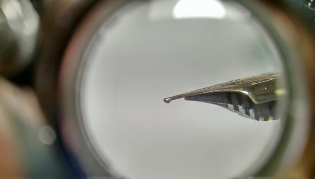
Hi I could really use your help. I bought a Sailor 1911 Large with M nib. I, however, don't think the nib is a round M as it should be, the tipping is very strange, reminds me of Naginata togi or Zoom, even though the marking H-M is there. It writes as Zoom does, meaning the line gets thinner the more you angle the pen. It is quite scratchy as well, more so with higher angles. Could this possibly be a mishap at the factory? Is this how regular round Sailor looks like?
-
Can anyone tell me is Sailor pen nibs are user removable? I have a King of Pen and a Sailor Profit 21. Thanks, Bill Kiel


