Search the Community
Showing results for tags 'sailor'.
-
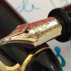
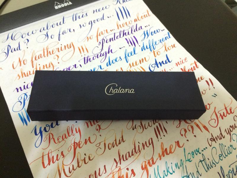
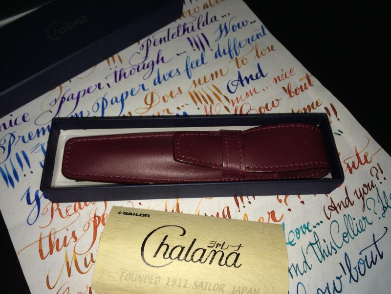
Sailor Chalana- the cutest little pen! Hello folks, I got this tiny pen a while back, and as I couldn´t find many review of it I decided to make one. So, bit of history first ( mine, not the pen´s ): The first time I saw one of these was at Fountain Pen Hospital, in NYC. I thought it was really cute, but such was the amount of pen porn around I barely gave it a second glance. Months later, I saw it online again and found myself gazing longingly at it. After a long period of indecisiveness, I ended up buying it from Nibs.com. Customs took their usual month+ to release it, and it was finally in my hands!!. Packing: Small cardboard box, with “Chalana” written on. Meh. But inside was a nice pen pouch, in what appears to be real leather! Nice… Also containing a booklet, and some minuscule cartdriges. And the pen. Appearance and design: 5/5 First thing I noticed! It´s TINY!! Then I looked at the nice barleycorn finish, the clip, and the engravings on the cap band : “Sailor Japan Founded 1911”. Very precise, lovely texture. Funny, reminds me a lot of a Sheaffer Targa I once saw with the same finish. So, I pop up the cap and THAT´S SUCH A CUTIE LITTLE NIB!!! Arram. Yep, the nib is minuscule, and soooo cute. But the proportions are quite interesting, actually. On the nib has some engravings… I think… wait, lemme get my loupe. Ah, it says “Sailor-18k-1-750” I suppose the one stands for the size of the nib, and the 750…damned if I know. Here´s the Chalana and a Pelikan M200. Look at the Pelikan nib, it looks like Godzilla besides the Chalana nib!! Filling system: 4/5 The tiniest converter or the minuscule cartridge. Made especially for this pen. Don´t know how much ink they hold, but has gotta be less than 0,5 ml. Nib: 5/5 I can´t really say how it feels out of the box because I had Mr Mottishaw adjust it for me for extra smoothnes, moderate flow. And that precisely what I got, nearly buttersmooth, a bit of feedback, great flow. The guy is a ninja. But not quite X-F, more like a Japanese F. The reverse side is a XXF, a bit scratchy but quite usable. Writing experience: 3/5 Well, there´s the rub. Although the pen is really cute, and the nib is very smooth, it´s just too small and thin to write with. Feels like I am writing with a needle. It just disappears in my hand. Closing comments: 17/20 The Sailor Chalana retails for 170-180 dollars, almost the same as a 1911. For that value you get a lovely, cute pen; that writes very well, but it´s not an everyday writer. I have the impression it was never meant for that, can´t help but think it derived from a drunken bet of the top brass of Sailor: “Ogey, Nagahara-san, if I drink this whooole pint of sake while standing on one leg, you´ll make the tiniest pen in history!!!” Hope you enjoyed it!! Please, any comments or critics are welcome!! Best regards; TJP
-
Triple ink shoot-out : Callifolio Cassis vs Diamine Earl Grey vs Sailor chu shu
namrehsnoom posted a topic in Ink Comparisons
Triple Ink Shoot-Out : Callifolio Cassis vs Diamine Earl Grey vs Sailor chu shu A couple of weeks ago I did a review of Sailor Jentle chu shu, and noticed I had some other purple-grey inks that look fairly similar in writing – Diamine Earl Grey and L’Artisan Pastellier Callifolio Cassis. All three of these inks are lovely, so a comparison is definitely in order. But which two of them to compare? Then @yazeh suggested to throw all three of them in the ring to fight it out. Interesting idea … Enter... the Triple Ink Shoot-Out – a special edition of the usual brutal fight. In five rounds, these three inks must engage in fierce battle to determine who is the winner. Choreographing a one-on-one battle is easy, but how to make it work with three contestants? Well… the triple shoot-out idea immediately brought to mind the iconic gun-fight in the final scene of Sergio Leone’s 1966 masterpiece “The Good, the Bad and the Ugly”. A memorable spaghetti western with an excellent musical score by Ennio Morricone. The ideal setting for a duel between three great inks. The hot summer sun shines brightly above the totally forgettable town Desierto in New Mexico. The shimmering heat creates wavering pictures of three lone riders that approach from different directions. Dust bowls blow through the only street in town when these strangers meet at the saloon. These are serious hombres that are not to be messed with. Tipping his hat, the tall blond stranger introduces himself – L’Artisan Pastellier Callifolio Cassis (“the Good”). The second rider – clearly a dark and silent type – simply nods his head in acknowledgement. Let’s introduce him: Diamine Earl Grey (“the Bad”). The third rider is the most extravagant of the bunch, and loudly and obtrusively makes his acquaintance: Sailor chu shu (“the Ugly”). Together they head for the saloon, eyeing each other wearily. Three dominant alpha males that come together… that can only mean trouble. A fight is in the air. May the best ink win … Round 1 – First Impressions The three strangers head to the bar. “Whiskey” … “Make that two” … “Tequila”. In one gulp, the glasses get emptied. “Another one”. The barkeep refills the glasses. Gulp … “Another one”. Seems like we are in the middle of a drinking contest, neither man willing to be outdone by the others. All three of these inks make a stellar first impression. Wonderful colours, that look great on paper – both in written text and in swabs. These are inks that can be used for any occasion, both for personal journaling as well as in a business context where they make a great alternative for the more standard blue or black. Also technically solid inks: good contrast with the page, nice and aesthetically pleasing shading, smooth writing. Great looking stuff! In this first round, the three champions give their best, and down their liquor without blinking an eye: Cassis is at heart a grey ink with strong purple undertones that easily surface in swabs. Sailor chu shu is more of a grey-purple, where purple seems to be the base colour but muted and toned down (it gets a bit lost in the picture, but to the naked eye the purple is much more obvious). Earl Grey definitely is the odd one out: a cool blue-grey ink, but also with definite purple undertones. I personally like the looks of this one the best. In swabs, both Cassis and Earl Grey show lots of depth: you can easily see the purple undertones that are prominently there just below the surface. In contrast, chu shu looks a bit flatter – there is that mix of purple and grey, but it’s all at the surface with less of a layered and multi-dimensional feel to it. Bonus points for the first two. Shading is most prominent with Earl Grey and chu shu: strong but well balanced, enhancing your writing with some extra oomph. Cassis shows more subtle shading with a lot less contrast between light and darker parts. The chroma comparison clearly shows that Earl Grey is the odd duckling – a totally different combination of dyes, resulting in a cool grey ink with a subtle purple undertone. Cassis and chu shu share a similar lineage, with chu shu having more purple in the mix. Of these two, I prefer the darker grey looks of the Callifolio ink. All three inks stand up well to one another, with neither of them giving in. They are all technically solid inks, with great looks both in writing and in swabs. Any of them would be a good choice, but the rules of the game demand that we express a preference. For this first round, Diamine Earl Grey must be the winner – it’s overall the best looking of the three. Second place goes to Callifolio Cassis, simply because of its grey-er looks, and that extra depth in the swabs. Sailor chu shu finishes third – not last, because that makes it sound inferior, and that’s certainly not the case. Round 2 – Writing Sample “Ola amigos! Fancy some cards?” Locals and strangers gather around the tables, cards are shuffled, a friendly game of poker starts. Money changes hands until suddenly… five aces on the table… that can’t be right?!? “Cheating bastardos!” Tables get overturned, fists get clenched and a serious brawl develops. The writing sample was done on Rhodia N°16 Notepad with 80 gsm paper. All inks behaved flawlessly, with no feathering and no show-through or bleed-through. With the EF nib, Cassis feels a bit “grippy” on the page, with sub-par lubrication. This improved considerably when using broader nibs. Earl Grey delivers solidly throughout: smooth and well lubricated in all nib sizes, with good contrast and some really nice shading. Sailor chu shu is also excellent, but a touch less smooth than the Diamine ink. At the start of the fight, “the Good” got a blow to the head, but quickly recovers; “the Bad” immediately grabbed a chair and is mostly untouchable. Chu shu “the Ugly” turns out to be a dirty fighter, dealing some serious damage. Overall, a memorable saloon fight that will be the talk of town for many weeks to come. Counting the points, Earl Grey is the clear winner, followed closely by chu shu and Callifolio Cassis. Round 3 – Pen on Paper After the fight, our trio feels no longer welcome in town. “I heard rumours about a stash of gold hidden by a soldier of the Confederates. Let’s move in with the military to find out more. They have a camp just a couple of miles from here.” The threesome mount their horses and depart town. “Last one at the camp buys the cold beers!”… and the race is on. This round allows the batlling inks to show how they behave on a range of fine writing papers. From top to bottom, we have : Clairefontaine Triomphe, Midori, Tomoe River 52 gsm, Paperblanks and Original Crown Mill cotton paper. All scribbling and writing was done with a Lamy Safari B-nib. All our champions did well, with no show-through nor bleed-through. But this round is not about technicalities, it is about aesthetics and beauty. Are the fighters able to make the paper shine ? One thing is immediately apparent: these inks might all share grey & purple, but they have totally different characters. Cassis is a purple-grey with the grey dominating. Earl Grey is a cool blue-grey with a purple undertone and Sailor chu shu is clearly a purple ink but toned down and muted. All three of them look superbly on the high quality papers in this writing sample. Earl Grey’s bronco consistently takes the lead. Wonderful shading, and lots of depth in the swabs. I love the looks of this ink. Next up rides Callifolio Cassis, closely matched by Sailor chu shu. Very close these two, but the darker hue of Cassis looks just a bit better on the page. When looking at crappy paper, we see that all three inks behave unexpectedly well with no visible feathering. There is some bleed-through – as is to be expected with Moleskine – but minimally so with Cassis. So in this race, Callifolio Cassis manages to enter camp just before chu shu. Earl Grey is already sitting at the bar, awaiting his first cold beer… Up to this round, Earl Grey is defnitely in the lead with Cassis and chu shu coming closely behind. I wonder whether the following rounds will change this picture? Round 4 – Ink Properties Given their experience as outdoors-men, the lieutenant asked our trio to tame some broncos. Fierce horses that are not to be trifled with. Given that this will most surely allow them to gain the soldiers’ trust and thus find out more about that stash of gold, our heroes agree. With some soldiers firmly holding the reins of the semi-wild horses, our heroes mount the saddle. Once the reins are released, the buckling starts… The inks have drying times in the 15 to 20 second range, with chu shu being the faster drying ink. On the smudge test, the text always remains easy to read, but with the Callifolio ink a lot of the dyes are rubbed off. The droplet test is the most conclusive: Earl Grey shows no water resistance at all, while chu shu easily survives a 15 minute soak in water. Some of the dyes get displaced, but what remains on the paper is certainly easy to read. Cassis retains just enough ink to be able to reconstruct your writing. After only a few seconds, Earl Grey is thrown from his bronco … not a good show! After a minute or so, Cassis’ bronco starts rolling on the ground, and “the Bad” must quickly jump aside in order to avoid getting crushed. But Sailor chu shu demonstrates his prowess and remains firmly in the saddle, calming the bristling horse until it follows his every command. Nicely done! The outcome leaves no doubt: chu shu solidly wins this round in spades. And Earl Grey is the obvious loser – horse-taming is clearly not his forte. Round 5 – The Fun Factor Welcome to the final round. Here I give you a purely personal impression of the three inks, where I judge which of them I like most when doing some fun stuff like doodling and drawing. And for this round, these inks are simply amazing. I did the drawing on HP Advanced Photo paper. The background uses heavily water-diluted ink. The flowers were added with a glass dip pen and pure ink. Their investigations led our trio of inks to a forgotten graveyard and a nameless tomb. Within lies buried the stash of gold. But which of them will take the treasure home? In the spirit of Christmas, they decide that instead of simply trying to kill one another, they will demonstrate their prowess with the revolver by shooting at canteens instead. Each will throw a canteen in the air and try to hit it as often as possible. Three… two… one… go! All three inks masterfully show their purple undertones that easily surface when drawing. Choosing between the inks will be difficult. The revolvers blast, and the canteens get a real pummeling, careening through the air with each solid hit. Unexpectedly, Sailor chu shu shows some really nice red-pink undertones surfacing among the more dark purple hues. Really nice. Cassis is also a really nice drawing ink, with more grainy grey showing in the drawing. I really liked the warmth showing in both these ink drawings. Earl Grey looks great, but looks a bit too cold compared to the other two. After the canteens have fallen to the ground, we start counting holes. Three holes for Earl Grey, four for Cassis and a whopping 6 solid hits for Sailor chu shu. By all rights, the gold is his! The Verdict All three inks in this shoot-out are winners in my book. But a choice has to be made, and so I will tally up the points as they were gained in each round: L’Artisan Pastellier Callifolio Cassis: 2 + 1 + 2 + 2 + 2 = 9 points Diamine Earl Grey: 3 + 3 + 3 + 1 + 1 = 11 points Sailor Jentle chu shu: 1 + 2 + 1 + 3 + 3 = 10 points The heroes of our story have been through a lot together – chu shu therefore decides to split up the loot. After all, there’s enough gold for the three of them! And even though the points indicate that Diamine Earl Grey is the ultimate winner of this triple shoot-out, the difference in outcome is small. Each one of these inks is a solid and beautiful one. You owe it to yourself to try at least one of them. Satisfaction guaranteed! Best wishes to you all for a splendid 2025 !- 9 replies
-
- ink shoot-out
- callifolio
-
(and 7 more)
Tagged with:
-
Just a quick poll. Have a couple extra dollars that I fell into and am considering these two pens. Which would you go for and why?
-
Given the assertion often made by others that Sailor kiwaguro pigment ink is (totally, utterly, 100%, or some other adjective meaning absolutely) waterproof, which I know is not factually true, and the assertion I've often made about Sailor souboku and seiboku being completely waterproof (which I now know is also not factually true), I decided to put the nine pigment inks I have to the test. They are: Pelikan Fount India black inkPlatinum Black Carbon InkPlatinum Brun Sepia Pigment InkSailor kiwaguro black inkSailor souboku blue-black inkSailor seiboku blue-black inkSailor STORiA Night Blue inkSailor STORiA Magic Purple inkSailor STORiA Lion Light Brown ink These inks shed colour observably while the page was being soaked in a bath of clean water: and this photo of the page after drying attests that the three blue-black and blue inks are in fact not completely waterproof, even though they fared much better Pelikan Fount India and Sailor kiwaguro: Out of the black inks, only Platinum Black Carbon Ink is completely waterproof. I cannot see any colour come off either Sailor STORiA Lion Light Brown or Platinum Brun Sepia Pigment Ink with my naked eye during or after soaking, and it may take a new test with a full page of writing with one of those inks individually for me to know for sure, but for now I'll also assume that they're completely waterproof. Of course, writing in all of the pigment inks tested remained very legible. Here's the full page after drying. (Click to bring up a larger image.)
- 33 replies
-
It took me some time to finish this comparison but here it is. Not flawless, not pefect, but it has plenty of colors to see. To be honest I've never been violet fan. I always liked dark purples but disliked most of violets. It's hanged with time. At the moment I'm quite keen on these hues. I've included 60-63 inks here (the number differs on different papers, I didn't have enough samples of some inks, I've forgotten about one or two inks and haven't included them everywhere). There are some odd-looking inks here that aren't violet/purple like KWZI Blue L51 (I just had a small sample so I included it here). Kung Te-Cheng, Potassium, Purpillusion are more blue than purple. Alt-Bordeaux and Deepwater Obsession can be regarded as burgundy but as I'm not planning (yet) to compare burgunds / bordeaux I've included them here as well. I need to thank Cyber6 here for A LOT of samples. You trully are Ink Smuggler Extraordinaire Ink Splashes http://imagizer.imageshack.us/v2/1024x768q90/674/D57Iib.jpg http://imageshack.com/a/img911/9309/XMowa7.jpg http://imageshack.com/a/img905/9462/Dzf3fY.jpg http://imageshack.com/a/img537/121/srURhs.jpg http://imageshack.com/a/img901/3985/xcEDod.jpg http://imageshack.com/a/img537/4492/NtfODA.jpg http://imageshack.com/a/img538/2685/q8cIq7.jpg http://imageshack.com/a/img673/1967/EnAfQy.jpg http://imageshack.com/a/img674/4319/WdEf3j.jpg http://imageshack.com/a/img631/7922/1S4blW.jpg http://imageshack.com/a/img673/9114/raVPLz.jpg http://imageshack.com/a/img674/3466/vK8xaM.jpg http://imageshack.com/a/img538/7629/ivb3lB.jpg http://imageshack.com/a/img538/2456/dhwe19.jpg http://imageshack.com/a/img745/7901/pw9g05.jpg http://imageshack.com/a/img674/6609/m4k036.jpg GEMS (they were cut from photos taken on a sunny day, you may find the colors bizarre but I like to show them this way even though most of the times we're not writing in a direct sunlight) http://imageshack.com/a/img910/3417/UZX0cP.jpg http://imageshack.com/a/img674/7610/4sDPbR.jpg http://imageshack.com/a/img538/8730/osVcHA.jpg http://imageshack.com/a/img912/9997/NAgsqc.jpg
- 54 replies
-
- akkermandiamine
- montblanc
- (and 7 more)
-
Hi, I'd like to present the comparison of 20 grey inks. To be honest, I don't like grey and I don't use it. I don't own a single bottle of grey ink Yet I've managed to gather quite a lot of samples and decided to make some use of them. I've made long introduction to this comparison on polish fountain pen forum but here I'll keep it simple and just say one thing: enjoy One note: my sample of GREY FLANNEL was contaminated. I decided to leave this but just skip this ink. It's not how it really looks like. If you like this comparison feel free to comment or to indicate your favourite greys. ALL WRITTEN SAMPLES ARE MADE WITH PILOT 78G WITH BROAD NIB INK SPLASHES http://imageshack.com/a/img674/1338/wgRutR.jpg http://imageshack.com/a/img673/3771/Gbwu2G.jpg http://imageshack.com/a/img661/6152/X8CPNA.jpg http://imageshack.com/a/img674/353/v7FP4f.jpg http://imageshack.com/a/img674/2434/aWPg6u.jpg COLOR "GEMS" CUT FROM THE SWAB PHOTO http://imageshack.com/a/img536/1733/iDKbvl.jpg http://imageshack.com/a/img910/2241/Q0D85y.jpg SWABS http://imageshack.com/a/img631/5290/fAsx5H.jpg http://imageshack.com/a/img540/381/v7punf.jpg http://imageshack.com/a/img536/2843/gQJuWx.jpg
- 84 replies
-
- sailor
- montblanc. graf von faber-ca
-
(and 2 more)
Tagged with:
-
Anybody Knows This Beauty? Is It From China, Korea Or Japan? What Is This Pen?
Lodzermensch posted a topic in Fountain & Dip Pens - First Stop
What is this pen? What is the brand / producer / origin? What model is this? This is a pen given to me by my father in early 80-ties. I used it for a couple of years as my every day pen. I cannot identify the producer nor the model. Must be produced somewhere in 1970-ties ot late 1960-ties? Much likely to be from China ? Maybe Japan? Maybe someone is able to read the signature on the nib? -
Here is a link to the official English website for this new line of pens: https://tuzu-en.sailor.co.jp/ This looks like a LAMY Safari/entry-level pen competitor, with some extra functionality to stand above its competition. What do you think about it? Would you get one to try it out? Apparently will appear on store shelves sometime in April this year.
- 49 replies
-
I have seven Sailor pens. I love using them. I have three with steel nibs: a fude ProFit Junior +10 a MF 1911 Compass. a gold plated F Sailor Shikiori Tsukuyo no Minamo Shimoyo I have three with a 14K gold nib: a black lacquer F Sailor ProFit. a MF Sailor Shikiori Fairy Tale Orihime (Vega) a black lacquer M Sailor Pro Gear Slim I also have a 21K gold nib model the EF Wicked Witch of the West 1911L I’ve written nine journals with them since last year alone, so I use them a lot. The problem is with the 14K black Sailor ProFit model. No matter how much I use pen flush or break the nib in through use, it gouges and scrapes the paper surface. It picks up paper fibers and becomes a brush all the time. I've been told that Sailor gold nib pens write “buttery”, but they are patterned after dip pens, so they make a scritchy sound on paper. Since I do art with dip pens, I love this tactile feedback. My 21K EF Witch writes smoothly as does my gold plated F Shimoyo. They’re a joy to write with, but not the ProFit. It even writes thinner than the EF. What can I do to fix this on my end? Is this a common difference between 14K nibs and 21K ones? How do I send this in to Sailor to get the nib repaired or replaced? Thanks for your friendly suggestions.
-
Sailor Storia Mix Red Many thanks @Lithium466 for the sample. Sailor Storia series are 8 pigment inks, made by Sailor. Sailor has another Storia series, making this line up quite confusing Photo courtesy of Sailor website While this ink looks like eye searing red nail polish in the vial, in reality it's some sort of watermelon red Shading is high especially on Japanese paper. Ink is excellent on copy paper, good lubrication and high shading on Japanese paper. In washes it’s watermelon pink/ red. Chroma: Writing Samples: As the ink was well lubricated and wet, I create a “Japanese” Ef by reverse writing. Photo: Note the contrast between the ink in the pen and its real colour. Comparison: Water test: Left side 10 seconds under running water. Sample was written with glass nib. So amount of ink is more than a normal nib. Art Work: The name of the ink, reminded me of the ancient Fire temples in the Middle East. Note how the ink misses the fire element. The paper is A4 size, absorbent paper. GvFC Lapis Lazuli Noodler's Apache Sunset Büroservice Bergmann IG red Here is a different take on Fabriano water-colour paper. Note the color change. The paper is a 1/4 th of the above paper, to give you a hint of contrast. Here I used: Noodler's Lexington Gray (brush pen) and R&K sketchInk Marlene + Klara mix. · Pens used: Lamy (Reverse Ef /EF/F/M/B, BB), Noodler’s Nib creaper. · What I liked: Behaviour. Even though it's not my colour, I enjoyed mixing it with oranges and other red to create the fire element. · What I did not like: I’m not a fan of bright red colours. · What some might not like: It’s a pigment ink. · Shading: Massive · Ghosting: None. · Bleed through: None · Flow Rate: Wet · Lubrication: Very good. · Nib Dry-out: Did not notice. · Start-up: Good · Saturation: Pastel · Shading Potential: Excellent · Sheen: No. · Spread / Feathering / Woolly Line: Did not notice. · Nib Creep / “Crud”: Did not notice. · Staining (pen): Yes. · Clogging: Did not notice. · Cleaning: It’s a red pigment ink, so don't expect it to clean easily · Water resistance: Excellent · Availability: 20 ml bottles. Please don't hesitate to share your experience, writing samples or any other comments. The more the merrier
-
I have Sailor 1911 L Sailor Compass aka Profit Junior Platinum 3776 Century Platinum President Pilot 74 Pilot 78g Muji pen
-
The King is here! I planned to purchase my second grail in June but opportunity presented itself, so here he is. My KOP has an M nib which seems a bit thinner than the M of my Pilot Custom 823 (my 1st grail). It has the 'Sailor feedback' but does not compromise smoothness. My Pilot Custom 823 seems to be slightly smoother but I prefer having some feedback whilst still maintaining smoothness. The nib of the king is bouncier than my Sailor 1911S without feeling bouncy 😱. It can make a slight line thickness variation but not a flex level of course. Though this is a big pen, it feels more comfortable in my hand compared to my 823 and 1911S. I felt the same with my Jinhao 9019 and JD Metal Big Pen. I am so elated with this purchase. Cheers
-
This is an old pen from the 1990's that is new to me. Condition is outstanding. The workmanship is really beyond. This is a Sailor Long Profit model, likely from the Koshyu Shitsugei series. It is called the 清照 - "Kiyoteru" or "Seiteru". The totally amazing maki-e work was evidently done by Otomaru Koda, the inventor of the choshitsu engraved lacquer technique used on the pen, and a National Treasure. The urushi is composed of many thick layers that is carved down to reveal concentric multi-colored layers. The carving is deep, it can be seen and felt. It is beautiful to say the least. The pen next to the Sailor is a Wancher Dream Pen in midori urushi. IMG_5022 by Ja Ja, on Flickr IMG_5023 by Ja Ja, on Flickr IMG_5026 by Ja Ja, on Flickr Also pictured is my Danitrio with kamakura-bori carving. Compared to the Sailor the carving on the Danitrio is simple. IMG_5025 by Ja Ja, on Flickr IMG_5024 by Ja Ja, on Flickr The nib was made by Nagahara Sr. It is his invention, the naginata-togi with emperor overfeed. The nib is perfect, sublime. Perfect writing with typical feedback. IMG_5036 by Ja Ja, on Flickr Packaging is a Paulowina wood box typical of Japanese craft items. IMG_5031 by Ja Ja, on Flickr
-
I recently purchased my first Sailor pen from Bungubox and it came with a wonderful, pigmented black ink they make with Sailor called “Eternal Music”. I love the flow, water resistance and lack of feathering with this ink but I also like sketching with a brown or sepia ink. This raises two questions for me: 1) Does Sailor make a sepia or brown pigmented ink with some decent water resistance? 2) Will using my current DeAtramentis Document Sepia void the Sailor warranty? I’m less concerned about the second question since it is the Japanese warranty which might be challenging to deal with if there is a problem anyway. However, I am a little concerned because I have read reports of some inks damaging the black ion plating on pens like mine. Thanks for any insights you may have.
-
Hello everyone, I just had to share how I feel about this pen. ------------- Disclaimer: I'm by no means an expert or connoisseur in fountain pens. My knowledge and experience with them have been quite limited.I don't have much idea on how to write a pen review properly. It may lack many parts, may even be a complete nonsense.I'm not so strong in writing in English, at times I may not be able to express myself well enough.------------- Sailor HighAce Neo Fountain Pen, Blue, Fine. I love this pen. I love how light it feels in the hand, how easy it is to manipulate it. It is not tiring to write with it at all. I like how its nib has some sort of pressure on the paper which feels firm but smooth, not scratchy. I like the little heart shaped hole on the nib. I personally like that it does not have indentations for placing fingers on the grip section, as I like to reverse write or even oblique write (is this even a thing?) quite often. Also, I believe the bottom end of the barrel is designed specifically to be able to post very securely, which is something I'd never seen before. It may be an extremely affordable pen, a beginner pen, a student pen. All those kinda apply to me anyways. Among my steel nib pens (Lamy Safari, Faber Castell OpArt, Pelikan Pelikano Up, Kaweco Perkeo, Pilot Metropolitan), This one is hands down my favourite. Thanks for reading!
-
Sailor KOP Ebonite, or save up for an MB Great Characters?
Le.Pen.Supremo posted a topic in Fountain & Dip Pens - First Stop
Hi there! There’s a local pen show happening in a few days and I want to hear some thoughts. I have been wanting the Sailor KOP Ebonite for two years now and I wonder if it’s worth getting. Will the ebonite body last for a long time (with proper care of course)? I’m afraid that the ebonite might easily discolor or lose its shine (one of the main reasons why I like it) after a year or so and that it might be too fragile. Or perhaps I should go for an acrylic version? On the other hand, my ultimate grail is the Montblanc Great Characters Enzo Ferrari. But it’s a bit far from my budget right now so I need to wait for a few months if that’s the better buy. As much as I want both, I will only be settling for one pen in the near future as I want to focusing on other things. So KOP or MB Great Characters? Let me know your thoughts! -
http://kobe-nagasawa.co.jp/system/wp-content/uploads/tcd-w/kobe-1.jpg http://imageshack.com/a/img903/6787/QslPHK.jpg Kobe (神戸市 Kōbe-shi) is the sixth-largest city in Japan and is the capital city of Hyōgo Prefecture. It is located on the southern side of the main island of Honshū, on the north shore of Osaka Bayand about 30 km (19 mi) west of Osaka. With a population around 1.5 million, the city is part of the Kyoto-Osaka-Kobe metropolitan area along with Osaka and Kyoto. Its name comes from "kanbe" (神戸), an archaic title for supporters of the city's Ikuta Shrine. Kobe became one of Japan's 17 designated cities in 1956. Kobe is famous for its shirines and nioce architecture but among fountain pen and ink afficionados the name Kobe cause increased heart-rate. The city is a home of Nagasawa-Kobe stationery shop that offers incredible lione of more than fifty inks made by Sailor. http://imageshack.com/a/img908/7578/dtzhVS.jpg https://kobe-nagasawa.co.jp/ My master - plan is to prepare comparison of full line of Nagasawa-Kobe inks. Not an easy task as they're not the most obtainable inks on the market, but hopefully I'll manage to do it At the moment Nagasawa-Kobe offers 52 inks: Rokko GreenPier BlueOld Foreigner Ward SepiaKitano Foreigners Residence RedEast Asia BlackKobe BordeauxKaikyo BlueArima AmberSuma PurpleMikage GreyIkuta OrangeOkamoto PinkNunobiki EmeraldMaya LapisMaiko GreenNada BrownShioya BlueSannomiya PanseMinatogawa LimeMotomachi RougeTaisanji YellowShinkaichi GoldNagata BlueNakayamate BlackTarumi ApricotWadamisaki BlueKounan MaroonSuzuran GreenSuma Kaihin BlueOoji CherryKaigan Stone GreyTamon Purple GreyRikyuu Moon YellowSourakuen Tea GreenSuwayama Leaf GreenSakaemachi IndigoMinatojima Island BlueKitanozaka Night BlueKobe BrickSumiyoshi BrownSuma Rikyu RoseRokko Island SkyGakuen Toshi Fresh GreenSumaura Seaside BlueHashibuse Silhouette GreenNagisa Museum GreyAoya Cascade GreenSuidousuji Marchais BlueKitano Olive GreenKyo-machi Legend BlueKano-cho Midnight Shioya Vintage Sepia Mmg112 has sent me some crazy amount of samples of different inks and guess what? Nagasawa some Kobe inks were among the samples. Thank you mmg112! Let's take a look at no 3 Old Foreigner Ward Sepia. The color is stunning. Yes, I know, sometimes it may look almost as blacj but when can I say. Strong, earthy browns witg great lubtication are my thing. This ink rocks! I need a bottle. Ink Splash http://imageshack.com/a/img911/4071/QmxYss.jpg Drops of ink on kitchen towel http://imageshack.com/a/img903/7187/EbkK2v.jpg Software ID http://imageshack.com/a/img633/4782/lyG6AE.jpg Color range http://imageshack.com/a/img633/6979/q2kphT.jpg Tomoe River, Kaweco Classic Sport, B http://imageshack.com/a/img907/2512/Lqe3rh.jpg http://imageshack.com/a/img907/1154/59nK0a.jpg http://imageshack.com/a/img903/8300/axjPQY.jpg Leuchturm 1917, Kaweco Classic Sport, B http://imageshack.com/a/img910/4338/0EjfyX.jpg http://imageshack.com/a/img905/3758/OM1HnJ.jpg http://imageshack.com/a/img908/606/FJu6uO.jpg Rhodia, Gama Airborne, F/M nib http://imageshack.com/a/img903/5935/Jg5NJV.jpg http://imageshack.com/a/img908/1899/DAk5fg.jpg Lyreco budget notebook 60 g, Gama Airborne, F/M nib http://imageshack.com/a/img908/6541/HZ5Hfs.jpg http://imageshack.com/a/img905/6976/pKmfjE.jpg http://imageshack.com/a/img633/5930/KSjfpv.jpg Oxford, Hero 5028, stub 1,9 http://imageshack.com/a/img907/7273/LJ6Vsy.jpg Water resistance (30 seconds under current water) http://imageshack.com/a/img907/1121/tSpQut.jpg
-
Sailor 1911 Realo Maroon 21K EF ~ In the area where I work and live, the leading stationery retailer is Eslite Spectrum, located in the Hi-Tech Park district, at the MixC World shopping mall. A bookstore based in Taiwan, their local outlet has a Writer’s Boutique where a wide variety of fountain pens and inks are displayed. Several Japanese fountain pens purchased there have been excellent writers. Their selection of inks offers the variety I’d previously lacked. Among other brands they stock Sailor products which are attractively presented for the consideration of potential buyers. For over half a year within the Sailor display I admired a sleek pen with an ink window. As it happened, the staff was fairly unfamiliar with that particular model. Low-key investigation revealed that it was a 1911 Realo with a 21K F nib. I asked if there was any possibility of ordering the same model with an EF nib, as in 2020 I’m adding EF nibs for detailed sketching, note-taking and writing. The manager indicated that EF nibs were not among those which might be ordered. Despite that information, my interest in the pen persisted. When I mentioned my interest in a Sailor 1911 Realo 21K EF nib to an overseas friend, I learned that one such pen was available in his area. The surprise was that the pen itself was maroon, rather than the black which I had been admiring in Eslite Spectrum. It was an easy decision. The pen was ordered with careful arrangements made to safely ship it to me. After a number of weeks it arrived undamaged, thanks to the sturdy packaging. The pen wrote well from first inking with Herbin Rouge Grenat, an ink I had on hand but had never used. The 21K Extra Fine nib is less stiff than I’d expected. It’s highly responsive to subtle changes in finger motion. I tend to write with a fairly light touch, so the nib is well-suited to my needs. A set of images follows which shows the unboxing and details of the pen. In this case a few comparison images are included showing a Montblanc 146 Special Edition Petit Prince and Planet EF pen. As the two models share certain characteristics, it seemed appropriate to photograph them together. Tom K. As Delivered Grey Wrapping Sturdy Box North America Limited Warranty 1911 Realo MN EF Newly Arrived and Opened Dark Tones Fully Opened Pen Revealed Prior to Handling Soft Grey Maroon 1911 Realo 1911 Realo Maroon EF Uncapped H-EF Side-by-Side Two EF Nibs Both Uncapped Nib Engraving
- 25 replies
-
I recently picked up a Sailor Compass 1911 to round out an order, as well as satisfy curiosity about the shape/form factor of an actual Sailor 1911. Based on various reviews I've read and seen, I was prepared to be disappointed by the feel of the nib of the Compass. When I got the pen and inked it up with some Robert Oster Green Lady, I was very very surprised while trying it out on Rhodia and Tamoe River. It was was quieter, smoother, and had less feedback than all my other pens: Pilot Explorer (F); Platinum Preppy (EF) and (F); TWSBI 580 (EF), Eco (EF), Go (1.1 Stub); Lamy Vista (EF). The only pen that was smoother was my Platinum Preppy (M). It was only when I tested on regular paper -- 18 lbs laser paper -- that the Compass fell to the bottom of the heap exhibiting the often described pencil on paper feel. Did I just get lucky with this particular pen's nib and ink combination? Or is my grip or writing style just well suited for this pen? Or do I simply just not have enough experience yet being only about a month into this hobby?
- 7 replies
-
- sailor
- sailor nib
-
(and 2 more)
Tagged with:
-
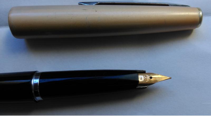
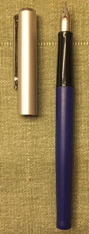
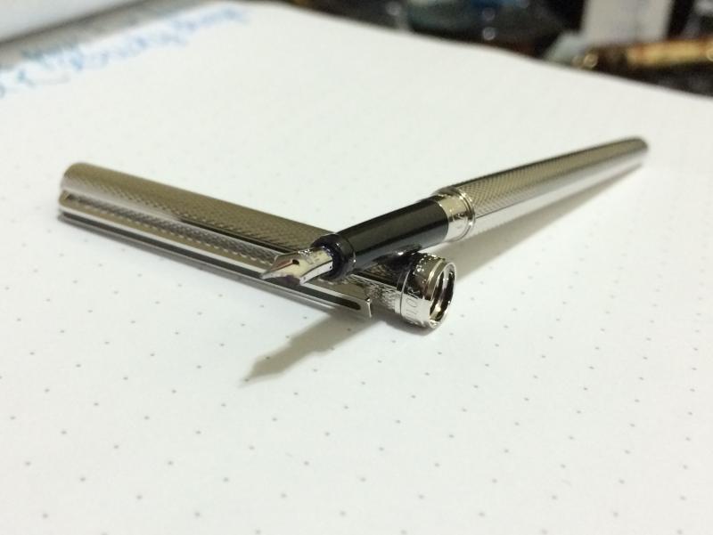
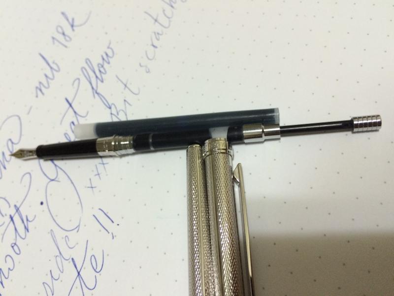
Help with Sailor Pocket Pen: id and nib material determination
Hamigua2000 posted a topic in Japan - Asia
I picked up this apparently NOS Sailor pocket pen in a Japanese auction recently. It still has a sticker on it for 1000 yen, so I suspect that the nib is not gold, but rather steel. The only markings on the nib are the word "Sailor" and a small round logo of sorts. I've seen some pictures of similar nibs which are stamped 14k or the like, but where such stamping would be on this nib is obscured by the section, and I'm not keen on removing the nib from the section to find out. (Though if it is not too hard to remove and then replace the nib without messing things up, instructions on how to do so would be appreciated). In any case, any help with an id and/or a determination of the nib material would be greatly appreciated. Apologies for the poor photo quality. Hopefully it is good enough for this purpose.- 8 replies
-
- sailor
- pocket pen
-
(and 1 more)
Tagged with:
-
Sailor is my favorite pen and I've owned quite a few over 20 years. I just purchased a Pro Gear 21K medium. The nib is marked "M" and not "H-M". In comparing it with the same model (different color) purchased in 2012, I find nib differences that, to me, are not acceptable. The line width has jumped from 0.28 mm to 0.41mm, that is, it has become "Western". Flow is inferior, with ink pooling at the bottom of letters and it writes poorly, with bleeding & feathering, on papers not designed for fountain pens. It is no longer an EDC. Worst of all, it does not have that precision feel, sharp imprint, and tactile feedback that we Sailor aficionados love. It writes like any one of the acceptable $60 pens I've owned. I contacted Sailor. They verified they are changing their nomenclature but have not made any other changes. I returned the pen for a refund. Maybe I got a rare defective nib. If I buy one of these new Sailors, I'll make sure it is easily returnable. For those who complained that Sailors are scratchy, this may be the one you like. There is a great YouTube post comparing Sailor 14K and 21K nibs. The author shows that all write about the same width and ink flow with the exception of M, where the 21K nib is much wider that the 14K equivalent,
-
Have the opportunity to get this pen SH... Nearly unused. I have some smaller sailors pro gear and other similar pens pilot VP, 74, 912 etc, lamy 2000 SS. I love the sailor nibs but the question is about Urushi Lacquer on this pen and how hardy it is regarding wear etc. Pens normally in case or inside book I'm using ... It's a big purchase so want to make sure and be warned of any issues. Thanks
- 2 replies
-
- sailor
- sailor 21k
-
(and 2 more)
Tagged with:
-
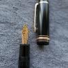
Hello, I have this sailor WG pocket fountain pen. Nib is amazing! But the section is rusted through. Does anyone here have a section that I can buy? Any ideas are welcome. Thank you!
-
The Chinkin process sounds rather simple but there is no room for error in carving the surface material. An appropriate design for the lacquered object is initially sketched. Then the artist ‘carves’ the urushi surface with special chisels and carving tools. Next, urushi is rubbed just into the lines and dots as adhesion and sprinkled with gold foils, powders, or colored pigments, and finally polished by washi, a japanese traditional paper. The Sailor Chinkin Bumbeblee limited edition is created by Chinkin artist Misato Tsukada. Only 28 pcs for the world. If you are interested #3/28 can be yours. https://www.sakurafountainpengallery.com/en
-
- sailor
- sailorbumblebee
- (and 3 more)
-
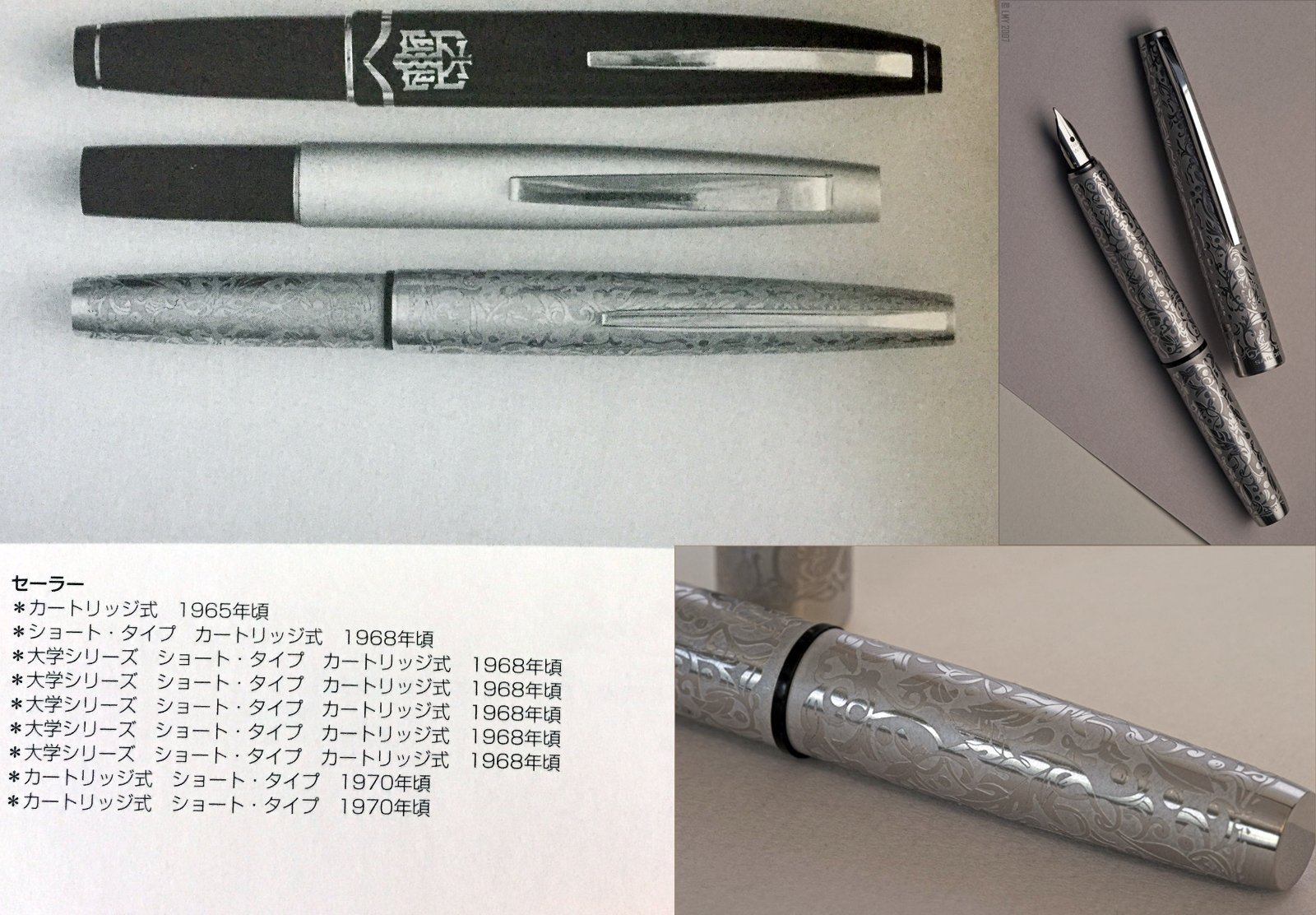
I've never seen this fountain pen in person, first hand. I saw it appear on-line only once. It was in a small sale that Stan used to run of vintage fountain pens... and Laura (Phthalo) managed to buy it. Those two embedded photos on the right were lifted from her old blog. I'm curious if anyone here has ever seen one in the wild, or owns one. I've been looking on auction sites for years... and have still yet to spot it.