Search the Community
Showing results for tags 'rouge hematite'.
-
Since J. Herbin released the beautiful Rouge Hematite as the first in their the-new 1670 Anniversary line it has been through several iterations. The first release was, in my eyes, as close to perfection as Rouge Hematite could ever be; deep and rich without being dark or dull, shimmery and sparkly without being garish or gaudy. The ink's sheen was not simply caused by what we're all familiar with, which is sheen induced by (according to Nathan Tardif) drying ink crystalizing. Rouge Hematite had its sheeny component resting at the bottom of the gorgeous bottle waiting to be shaken—a minutes-long process with the bottom new and full. It looked not gold or red, but almost like a maroon-tinted wax (until shaken). And then, from the inky shadows (see what I did there?), came the whiners. The ones who know not how to maintain a good hygiene schedule for their pens. And with their ignorance came the clogging. With the clogging, complaints. So J. Herbin, listening to their customers (which is usually a good thing), took a good portion of the heavily-sheening component out. The second formulation still has the same type of sheeny bits, but just way less than the original. But since haters gonna hate hate hate, the third iteration of the once-perfect ink came soon after, with barely any of the gold-inducing sediment at all. This, as Henry Hill once said, is the bad time. The third iteration was sheen-less. The third iteration was boring. The third iteration was wrong. And thankfully, J. Herbin heard RH's faithfuls' complaints. They made the announcement that they re-instituted the sheening component to match the good ol' days. Or did they?… Yes. Well, sort of. But first, I'll backtrack. When the company released the second ink in the Anniversary series, Bleu Ocean, a lot of people, including myself, were disappointed that the ink lacked any sort of sheen. Many had wished it would be given a similar, but silver-colored, sheen component. When I tried it I couldn't even coax any good old crystal-based sheen from it. It was a nice shade of blue, but without the signature sheen, and coupled with the fact that it wasn't half as well behaved as Rouge Hematite—RH can be used with a flex nib on cheap paper and still retain its sheen and shading—it was a bust for many. More recently, us sheenoholics have praised the release of J. Herbin's Stormy Grey 1670. In contrast to the earlier Rouge Hematite, Stormy Grey has a blatantly golden pigment component to impart its sheen. With the original RH, once the sediment was shaken and integrated into the ink the only difference was that the ink took on a bit of a chalky look in the bottle; it also took quite a while for the sheen component to settle back down to the bottom of the bottle. Stormy Grey's golden component, whatever it really is, is very consistent and exceedingly easy to see as it swirls around in the ink after shaking it. It also settles back to the bottom MUCH quicker. Now, back to the most recently released Rouge Hematite version (what I dub the fourth version). The fourth version of RH seems to have the same sheening component in it as Stormy Grey. It's obviously metallic when it's at the bottom of the bottle (not waxy looking, like the original), and it settles very quickly like Stormy Grey. Instead of the original formulation's smooth "fog" of gold/green sheen that would settle over the red ink when spread with a q-tip, the newest version has star-like "pinpoints" of gold spread fairly evenly over the entire q-tip sample. I'm not going to say it's inferior to the original version (mainly because I haven't even done a writing sample with it yet), but it is different, and I think people buying it with the understanding from the company that the original formula is back need to know the differences. I'll be doing a new review of the most recent version in the next few days. When it's out I'll link to it from this thread. Now for the comparison pictures! Left to right: Original version, Second version, Fourth version: http://imagizer.imageshack.us/v2/xq90/538/1GzS1a.jpg http://imagizer.imageshack.us/v2/xq90/661/7vDUYL.jpg Original Version: http://imagizer.imageshack.us/v2/xq90/661/2RoPFk.jpg Second Version: http://imagizer.imageshack.us/v2/xq90/537/ujBGrt.jpg Fourth Version: http://imagizer.imageshack.us/v2/xq90/673/ovuTGg.jpg Left to right: Original version, Second version, Fourth version: http://imagizer.imageshack.us/v2/xq90/673/rorNxl.jpg Original Version: http://imagizer.imageshack.us/v2/xq90/661/dZq7Ha.jpg Second Version: http://imagizer.imageshack.us/v2/xq90/661/4iJYeo.jpg Fourth Version: http://imagizer.imageshack.us/v2/xq90/538/xs7Eq2.jpg Original Version: http://imagizer.imageshack.us/v2/xq90/905/8O3cbM.jpg Fourth Version: http://imagizer.imageshack.us/v2/xq90/673/q6ILau.jpg http://imagizer.imageshack.us/v2/xq90/673/XSNAOZ.jpg Here's what Stormy Grey's sediment looks like: http://imagizer.imageshack.us/v2/xq90/746/ofYoGc.jpg And now on the page: http://imagizer.imageshack.us/v2/xq90/908/GYZE0R.jpg Left to right: Fourth version, Second version, Original version: http://imagizer.imageshack.us/v2/xq90/661/I7UZzn.jpg Again, this comparison is just about the inks' properties in general; I still haven't filled a pen with the newest version yet. I'll post back when I have some more to say about the most recent version.
- 40 replies
-
- j herbin
- rouge hematite
-
(and 4 more)
Tagged with:
-
Hello, I got a sample of J. Herbin Rouge Hematite 1670 recently and I just love the color. It's the perfect red! The problem is the gold flecks in the ink clog my pens pretty terribly. I don't really think the ink is improved by the gold since the red is perfect as it is (to me at least). I was wondering if anyone could suggest a similar red (sans gold flecks) that might behave better in my pens. Thanks!
- 3 replies
-
- j herbin
- rouge hematite
-
(and 1 more)
Tagged with:
-
My Lamy Vista with J Herbin Rouge Hematite refused to start even though I filled it recenlty, but had not used it since; it's not a big drama this time as I've come to expect this ink clogging the pen. After cleaning it and getting stained in loud pink remains, I realized the bottle is 2/3 gone, and I haven't really used this ink, I've managed to write a paragraph here and there before moving on to another one. I believe in only buying something to be used but this ink makes me a gear hoarder (the horror); but what's worse I'm already thinking of buying it again, in spite of the high maintenance, the random variations on the same page, which makes me feel this is some sort of Stockholm syndrome, with me as the hostage to this terrorist ink. It even seems to have a mind of its own: here it decided "whom" should look different from every other word on the page... How did I get here?? Anyone else being derailed by their medium of choice? No disrespect intended to ink collectors.
-
In particular, are they as easy to clean as Safaris / Vistas? I have a Vista dedicated to Rouge Hematite, which eventually gunks up but is very easy to clean, I got a a Studio will eventually get to me, and have to decide if I keep Rouge Hematite in the safe pen or use it in the Studio...
-
Just a little fun with a macro lens... I cleaned that pen with Rouge Hematite on the left a few days ago. The other one's got Diamine Poppy red.
-
Hello there, here is my first review for a wonderful ink. Hope you enjoy Armand.D Pictures : http://image.noelshack.com/fichiers/2015/31/1438347092-review-herbin-re-2.jpg http://image.noelshack.com/fichiers/2015/31/1438347102-img-0315.jpg http://image.noelshack.com/fichiers/2015/31/1438347109-img-0317.jpg
-
I recently ordered a sample of the J. Herbin Rouge Hematite. I have heard though that they did a reformulation due to clogging of the nib. I have the old formulation. How does it compare to the new one. Is there more gold sheen? Less? Thanks!!!
- 26 replies
-
- sample
- reformulation
-
(and 2 more)
Tagged with:
-
http://i900.photobucket.com/albums/ac209/jasonchickerson/_FUJ0651.jpg http://i900.photobucket.com/albums/ac209/jasonchickerson/_FUJ0651-2.jpg http://i900.photobucket.com/albums/ac209/jasonchickerson/_FUJ0650.jpg http://i900.photobucket.com/albums/ac209/jasonchickerson/_FUJ0650%20copy.jpg http://i900.photobucket.com/albums/ac209/jasonchickerson/_FUJ6440_1.jpg Valentine Card, Rouge Hematite with R&K Alt-goldgrün Card is OCM Pure Cotton paper, Envelopes are OCM Classic Laid paper In expectation of my bottle of Emeraude de Chivor arriving in the mail, I decided it was past time to review its sister, Rouge Hematite. Rouge Hematite is a really interesting ink that I use almost exclusively for card-making. It simply dips better than any other ink out there and the green-gold sheen looks magical when you lay down a lot of ink. It is very staining, though, and ink gets on fingers and transfers back to paper terribly easily. I've ruined more than a few attempts through smudgery. As mentioned in the review, it smears, too. I kept it in my daily carry Lamy 2000 for a few days while writing this review. Thankfully, the gold glitter does not come across strongly in that pen, so it can be used as any other red ink, and does a fine job at that. I have not had any problems with clogging. While I don't really enjoy using red on a daily basis, the performance of this one is quite good. Care was taken to ensure color accuracy, but with an ink like this, where view angle and light source matter a great deal (see second and third pics), what you see may not be what you get when you try it for yourself. EDIT TO ADD: I should point out that my bottle is the fourth iteration of Rouge Hematite, purchased from Goulet Pens toward the end of 2014.
-

Excellent Experience With Massdrop For Three Herbin 1670 Inks
stevesurf posted a topic in Market Watch
Hi people, I received my three bottles of Herbin Chivor ink from the Massdrop, yesterday. First of all, the packaging was superb! This is how it came: -Longer box, approx 8 x 8 x 16 in -Extra large bubble rap, doubled up -Each bottle wrapped in multiple layers of smaller bubble wrap -Each bottle already comes shrink-wrapped Great drop; keep your eye out for the next one as over 200 have requested it!. https://www.massdrop.com/buy/j-herbin-1670-ink?referer=WY4GXL- 3 replies
-
- massdrop
- j herbin 1670
- (and 4 more)
-
Massdrop is doing a new drop for J. Herbin's 1670 anniversary inks - 2 bottles of Stormy Grey and one of Rouge Hematite. Direct link: here. Space is limited, 150 available. Well, 149 now. ^_^
- 13 replies
-
Humble as opposed to the epic comparos found here! Still, might be of use to someone. Paper: HP laser 32lb, which is as nice as I read it would be. Iroshizuku fuyu gaki in Platinum Cool M nib.J Herbin orange indien in Parker sonnet with a beat up F nib. Deserves a better home.Pelikan Edelstein mandarin in Lamy Vista M nib.Diamine poppy red in Muji F nib.J Herbin 1670 rouge hematite in Lamy Vista F nib (over flowing with crud but hey, it flows). It looks darker and less red than on clairefontaine paper, more tyrian purple than blood. Colours look faithful at least on a macbook pro retina 13 except for Mandarin. Mandarin looks more like this: They are all distinct from each other and beautiful; I was worried fuyu gaki might be pink which I can't stand but it's definitely an orange with red undertones.
-
J HERBIN’s ROUGE HEMATITE LOOKS TO BE IN GOOD SHAPE Does an ink having more saturation than usual can have good flow properties in a pen? Can an ink having good flow properties in a pen can show no feathering/ bleeding tendencies on paper? Both anwers can be “ Yes” if you are using J Herbin’s Rouge Hematite . J Herbin’s 1670 Rouge Hematite, Anniversary Edition. So what’s about it? CLAIMS This is what J Herbin claims – “ To celebrate the 340th Anniversary of the brand, we are introducing the “ 1670” ink especially formulated for this event. With a dark red color and earthy tone,it is a reminder of the historic color of the Herbin logo and the sealing wax by the members of royal courts.This rich deepdye will bring brightness and majesty to all your writing”. Probably calling this as just another FP ink may be under estimating it. So here the review goes… BOTTLE, COVER The cover shows earthy red and golden colors, an indication of what this ink is going to deliver. Bottle design - So radical, so classy…. An any day head turner. Bottle, Opened…The cap is made of combination of Aluminium and Rubber, have a nice feel in hand. Get past the appearance of the bottle to reveal the flaw – Bye Big pens..! COLOR The ink writes on paper with a bright red color and then dries to an earthy tone as the booklet describes. An impressive bright red with an earthy tone. Swab. See the golden tinge. This is the most peculiar feature of this ink. Swab color analysis of area with out golden tinge - shows Reddish brown on brighter side. Swab analysis of area with golden tinge- shows more Yellow still on very bright side. It’s strange that chromatography do not reveal any Yellow or Brown tone. It simply shows Red and Pink components. I believe the golden tone appears where the ink is dried with out much absorption. Where there is more absorption like a swab, the gold tinge can not appear. This is more in line with the property of the dye used rather than any suspended particles, but I am not sure. COLOR ON PAPER BRIGHT.. STRONG… AND CHEERFUL..! Yes, a bright, saturated and happy color. With a Fine nib. [ With Medium nib. Passes. PROPERTIES IN PEN Testing materials include Camlin Trinity Fine nib Convertor Filled Lamy Safari Medium Convertor Filled Wingsung Medium Aerometric Filled Kim Small Medium stub Eyedropper Filled Camlin trinity Fine nib writing sample Lamy Medium nib writing sample Kim stub writing sample. With nib changed to a Broader one. See the golden tinge more and more appearing with broader ( and more flow) nibs.
-
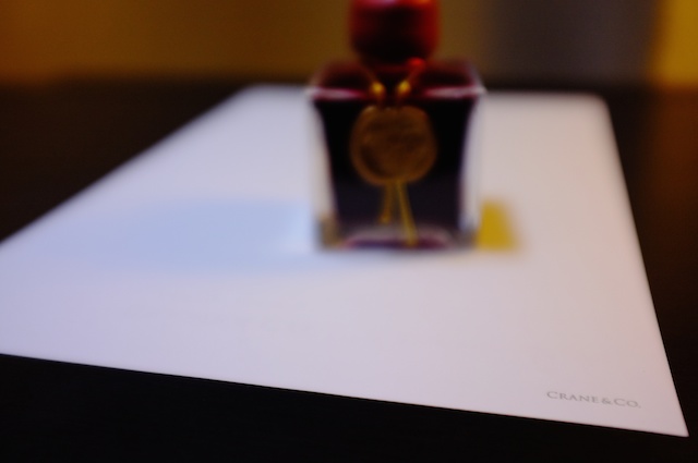
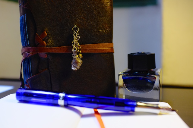
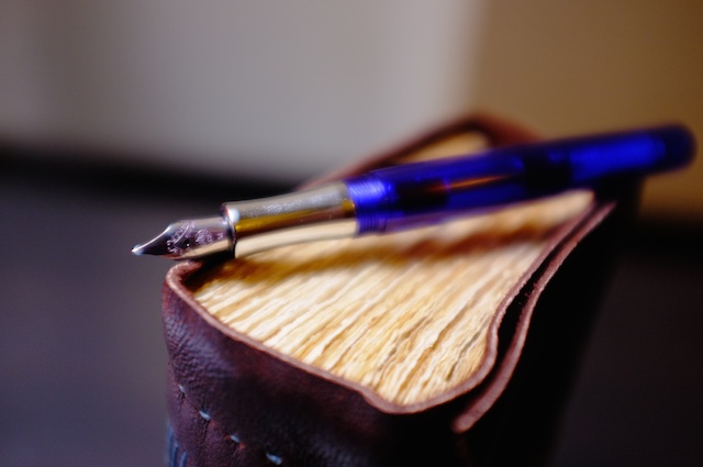
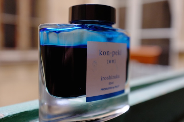
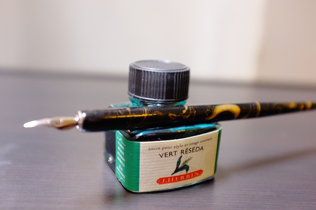
Hi friends! I've been gradually getting deeper and deeper into this world o' fountain pens since giving my first Lamy Safari a shot two years ago. I finally wrote a post on my own blog about the hobby and what fountain pens mean to me and why I like them, which necessitated some pictures. So I busted out my camera and tried to get all pretty-like with some of my gear. All of what you see below is also in the blog post. Hope you enjoy these first attempts. Feedback and advice greatly appreciated. And thanks to all for the mountains of info I've gleaned as a long-time lurker here on FPN. Wouldn't have enjoyed the beginnings of this fanaticism wonderful hobby without you all! -The Idle Expatter (AKA Steve B.) My overall favorite ink, J. Herbin 1670 Rouge Hematite. The Rouge H. again with (the reverse side of) a sheet of Crane & Co. triple hairline My Faber-Castell e-motion in pearwood, a bottle of Iroshizuku kon-peki, and my custom-made journal from Bibliographica (on Etsy) A random dip pen and a bottle of J. Herbin vert reseda Iroshizuku kon-peki, enjoying some fresh air and sunlight (don't worry, only long enough to take the picture) My Kaweco Student (underrated gem of a pen, by the way!) and another handmade Bibliographica journal, this one called "The Nomad" Kaweco Student, Bibliographica "Nomad" journal, an orange Leuchtturm1917 dot pocket notebook, and an unlabeled bottle of Caran d'Ache Storm B for me Wordsworth in red (J. Herbin 1670 Rouge Hematite, out of a Lamy with a 1.5mm italic)
- 3 replies
-
- kaweco
- fabercastell
-
(and 8 more)
Tagged with:
-
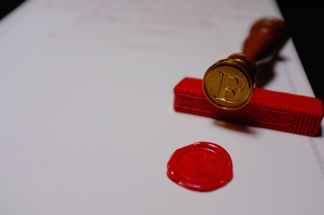
I was roaming around at the local book/pen store last week, where I broke down and bought a bottle of inkJ. Herbin Rouge Hematite 1670 Anniversary Edition. This is a red ink that’s got some sort of pigment in it which causes it to shade bronze. It’s original formulation was so full of this beautiful pigment (at least I think it’s pigment?), and that it would clog pens and resulted in a reformulation after being on the market for a year. I love inks that have fun shading properties, and I love this ink. http://nibcrease.files.wordpress.com/2013/07/p1020133.jpg First, the ink comes in this lovely little square bottle, with a wax seal on the front and a wax-seal-looking cap to make it look all old-timey-classy-like. Fortunately the cap is really a twist-off cap so opening the bottle isn’t a one-way street. My one complaint here is that the bottle neck is so narrow and long. Combine this with added obstacle of highly saturated red ink all over the lip, and you get bloody red hand every time you fill a pen up because you’ve got to get your pen through the narrow neck, where the pen barrel, and probably your fingers too, touch the lip and sides of the neck. I wider opening here would have been welcome. http://nibcrease.files.wordpress.com/2013/07/p1020129.jpg I had imagined the red would lean a little more on the blue side, but is more of a magenta/pink sort of red. Very bright, and the metallic shading is more bronze than gold. Other pictures I’ve seen of it made it look more like gold. It did seem that way at first, but the next day, the ink had definitely settled into a darker and warmer bronze look than gold. The writing sample is written on a sheet of Black ‘n’ Red notebook paper, using my Oberthur Sequoia Pen, with a custom ground italic stub nib. Don’t mind the smear over the layering example. That was the result of some wet paper towel drifting over it after I blotted out the drip test. http://nibcrease.files.wordpress.com/2013/07/p1020128.jpg And a close-up look at the sediment that makes that wonderful shading. The bottle comes with a little warning that this ink is highly saturated, and should not be left in a pen for days at a time. I found it did gunk up my Oberthur Sequoia a bit, but I did in fact leave the ink in there for about 5 days, and after a little bit of hard starting, it did seem worse for the wear. Mind you, I DID take the nib, feed, and section apart and wash each piece thoroughly when I was done, and a TON of inky gunk came out. I would not recommend using this ink in a pen you can’t take apart and clean piece-by-piece. http://nibcrease.files.wordpress.com/2013/07/p1020135.jpg In general, I was expecting a lot from this ink. While it did have some surprises for me color-wise. It has exceeded my expectations in terms of characteristics and behavior. It’s not an everyday ink by far, but if you’re looking for an ink for a special-occasion (and have a not so special pen to use for that occasion), I can’t think of very many inks that are as special as this one. Please see more images of this review as well as more reviews at http://nibcrease,wordpress.com!
- 18 replies
-
- j herbin
- rouge hematite
-
(and 2 more)
Tagged with:
-
Following up from this thread: https://www.fountainpennetwork.com/forum/index.php/topic/249977-how-to-recognize-old-formula-j-herbin-1670-rouge/ It seems there are people who dislike the sediment-heavy original J. Herbin 1670 Rouge Hematite but liked the red color. And there are people who dislike the new sheen-reduced reformulation. I thought it would be nice to start a thread where people who may be interested in exchanging their reasonably unused (for whichever reason) bottles for the opposite with someone who has the opposite problem. Please make all trade offers via PM to keep personal details out of the threads. Also, an update when your trade has been made would be nice, to let people know you're off the list. To participate in this, simply supply the following in your post (using myself as example): I Have: Reformulation I Want: Original
-
Got said ink some time ago and I've always struggled to get it to flow after a day... Tried different pens, nothing... It was so bad I realized I wasn't even using the ink and I started looking for alternatives (blood red, although I'd like to get Diamine's Poppy Red too). Then I decided to clean the pen with a bit of dishwasher liquid, letting it soak for a night, and give it a final go by trying to write every day, even if it's a single line... Lo and behold, it hasn't skipped for a whole week... This is probably obvious, but I thought I'd write this for those of us with less patience... There's still a lot of gunk but it hasn't even skipped once, I'm amazed. Still just might get that Poppy Red for another pen though.
- 11 replies
-
- the glaringly obvious?
- lamy vista
-
(and 2 more)
Tagged with:

