Search the Community
Showing results for tags 'rose quartz'.
-

Quick Look - Pelikan Edelstein Rose Quartz (2023 Ink of the Year)
namrehsnoom posted a topic in Ink Reviews
Quick Look - Pelikan Edelstein Rose Quartz (Ink of the Year 2023) The Pelikan Edelstein Ink of the Year 2023 "Rose Quartz" is available. A full review might be coming, but I wanted to give a quick look at the ink for those of you who are wondering what it looks like. The first thing you'll notice is that the promotion pics of the ink bottle are a big lie - totally Photoshopped. In reality, the bottle looks green! Fortunately, the ink within the bottle is still the promised light rose colour. No idea why it looks green - it must have something to do with the breaking index between ink and glass (my guess). Below is a saturation picture of the ink - showing both photo and scan. The colour is best represented in the photo. The scan is definitely too purple. The ink itself is best described as a light pastel-tinted rose. The inks saturation on the page is fairly low. Not totally unusable, but for me it's borderline tolerable, especially in drier pens. The chomatography looks really delicate. Below, I show you some writing with the ink (photo), and a comparison with some other rose/pink inks I have in my collection. Overall, I like the colour - I just wish it would be a little bit more saturated. But compared to the previous two Inks of the Year, this one is definitely an improvement. -
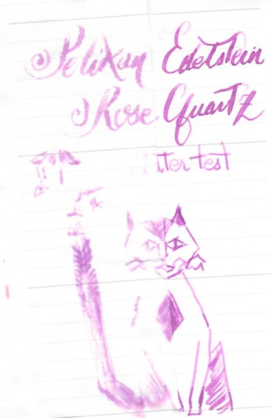
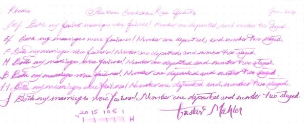
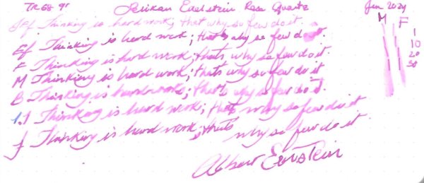
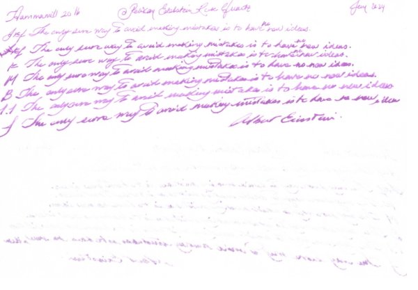
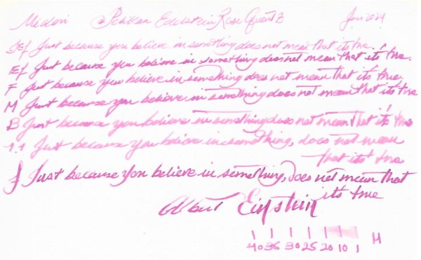
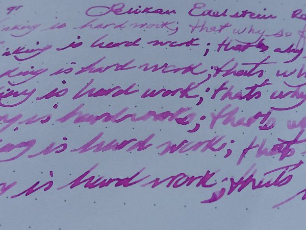
Pelikan Edelstein Rose Quartz Ink of the Year 2023 Many thanks to @Lithium466for the sample. It’s a chameleon of an ink. It has a lot of character with Ef to M nibs and gorgeous with flex, where the halo effect is accentuated. However, with Japanese Ef, B & Stub nibs it was just a plain boring pink. It doesn’t like copy paper. Ink is wet with slightly below average lubrication. You can check this excellent overview by @namrehsnoom Let's start with the chorma: Writing Samples: Quotes are at best attributed. As far as I know Mahler had only one wife. Photo: Comparison: Water test: And finally an art work, inspired by a Japanese vintage photograph and block prints: Other inks used are Platinum Carbon Black and Kuretake Shimbashi Iro · Pens used: Pilot Kakuno Ef, Lamy (EF/F/M/B, 1.1), Kanwrite with an Ahab nib. · What I liked: The halo effect and murky pink. · What I did not like: With B/ Stub nibs. Very Pale with Japanese Ef · What some might not like: The colour, paleness. · Shading: I didn’t see much. · Ghosting: Yes, on copy paper · Bleed through: Same as above. · Flow Rate: Wet · Lubrication: Below average. · Nib Dry-out: Did not notice. · Start-up: Did not notice. · Saturation: Not saturated. · Shading Potential: With flex nibs. · Sheen: Hint of halo. · Spread / Feathering / Woolly Line: Yes, on copy paper. · Nib Creep / “Crud”: Did not notice. · Staining (pen): Did not notice. · Clogging: Did not notice. · Cleaning: Should be easy. · Water resistance: Not so good. · Availability: 50 ml bottles. Please don't hesitate to share your experience, writing samples or any other comments. The more the merrier
-
-
-
-
-
-
-
-

