Search the Community
Showing results for tags 'rose gold'.
-
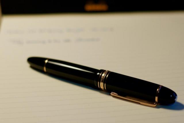
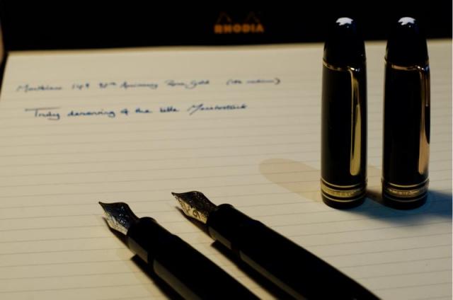
Hello, I am hoping to get some direction. I purchased a used 75th anniversary Montblanc 149. About a 2 weeks ago I noticed that a small piece of the rose gold flaked off of the nib near the breather hole. Does anyone know of someone that I can reach out to that can completely re-plate the nib. I understand MB did a really bad job on plating these nibs so I would like to get it re-done so that I don't have to worry about it in the future.
-
desaturated.thumb.gif.5cb70ef1e977aa313d11eea3616aba7d.gif)
How-to: Set, or change, personal info that others can see about me
A Smug Dill posted a blog entry in Sus Minervam docet
It helps to explore this yourself, revisiting once in a while if need be, and keep in mind where each of those personal info fields are entered. Don't leave it until the urge to change something specific to come upon you, and only then bother to ask the question! Invest the time surveying upfront, instead of waste it later waiting for an answer from nobody in particular. Most of the fields shown above are self-evident as to what they are. I think the only ones that could do with explanation are: Security and Privacy: There is only one setting under there, and that is a toggle for whether your online status (including ‘last active’ date or time) is visible to others Content View Behavior: That has nothing to do with what others can see about you, but only where you would like to start reading when accessing content Enable status updates: This toggle enables/disables the public feed on your profile page; if you disable it, then nobody (including you) can post publicly visible ‘status updates’ or any other message against your profile, but if you enable it, then anyone — friend, foe, or complete stranger — can post something there whenever, without waiting for you to initiate and then only reply to what you wrote Notification Settings have nothing to do with what others can see about you, and so is out of scope for this article, and I'm not going to delve into those right now. (You can look here, here, and here to wrap your head around how notifications work with respect to followed content.) N.B. There is a possibility that some of the above settings and data fields may not be available to Bronze members and/or Silver members, but I have no way of testing that or scoping it out. — • — Another way of getting to the Edit Profile dialog, and the way to change your profile photo (or ‘avatar’), is here: — • — Freeform, custom member titles that one enters for oneself are long gone, and have not been a thing since FPN came back from a long hiatus and platform upgrade late in 2020.-
- fight club
- salix
-
(and 101 more)
Tagged with:
- fight club
- salix
- parker 51
- jacques herbin
- bleu austral
- bleu de minuit
- graf von faber-castell
- moss green
- olive green
- deep sea green
- gulf blue
- cobalt blue
- midnight blue
- parker urban
- night sky blue
- diamine chocolate
- platinum
- vicoh
- kanazawa
- gold leaf
- maki-e
- kanazawa-haku
- modern maki-e
- slender
- feminine
- snap cap
- penbbs
- chinese ink
- lamy 2000
- aurora
- ottantotto
- aurolide
- rose gold
- 888
- limited edition
- solar system
- planets
- jupiter
- giove
- conway stewart
- cs 58
- duro nib
- 14k
- medium nib
- green
- hatched
- sheaffer
- balance
- statesman
- 14k
- fine nib
- 1930s
- sheaffer
- balance
- statesman
- 14k
- fine nib
- 1930s
- webster gold crown
- webster gold crown
- webster gold crown
- jinhao x159
- feed diameter
- size 8 nib
- my foot!
- pilot
- plumix
- ef nib
- bb nib
- stub nib
- steel nib
- pilot
- plumix
- ef nib
- bb nib
- stub nib
- steel nib
- pilot
- plumix
- ef nib
- bb nib
- stub nib
- steel nib
- space
- stationary
- planets
- rubber
- pencil
- ruler
- vjreviews
- vjreviews
- nibsmith
- dan smith
- italic
- nibsmith
- dan smith
- italic
- lamy z52
- lamy studio lx all black
- aurora ipsilon
- faber-castell essentio
- noodlers aircorp blue black
- aircorp blue black
-
desaturated.thumb.gif.5cb70ef1e977aa313d11eea3616aba7d.gif)
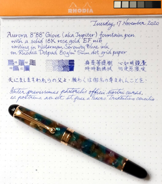
Aurora 8"88" Giove, closed and sitting on tonal reference card.jpg
A Smug Dill posted a gallery image in FPN Image Albums
From the album: European pens
This pen is rather tricky to photo and show off its true colours, so I placed it on top of a reference card to help you better calibrate your perception of the colours in its aurolide body.© A Smug Dill
- 0 B
- x
- 8 comments
-
- aurora
- ottantotto
-
(and 8 more)
Tagged with:
-
desaturated.thumb.gif.5cb70ef1e977aa313d11eea3616aba7d.gif)
Aurora 8"88" Giove 18K rose gold EF nib writing sample.jpg
A Smug Dill posted a gallery image in FPN Image Albums
-
- aurora
- ottantotto
-
(and 8 more)
Tagged with:
-
Hello again! This is my review of the 90th Anniversary Edition limited release of the Montblanc Meisterstuck 149 with a medium nib. I this was the third pen I purchased as part of my birthday splurge, and is also the third Montblanc that I own (second 149). Conventionally, I would never dream of buying a 149 in-store, as Montblanc decrees that no lower price than their dictated one be displayed on their new products. However, I was wandering around my local shopping centre, and saw a 149 with a sale tag on it in the window of Ernest Jones. Due to the lack of a box and it being a display piece, the price listed was but 40% of the usual list price for the pen, so I simply couldn't resist! As an aside, the images got butchered by the uploader somehow, so if you wish to see the intended images, I have a Flickr link at the end with the highest quality versions. Dimensions Presentation and appearance Fit and finish Filling system Ergonomics Nib performance Closing thoughts and conclusion Dimensions Length capped - 144mm Length uncapped - 130mm Nib length - 28mm Section length - 16mm Section diameter lo - 13.3mm Section diameter hi - 12.8mm Presentation and Appearance Having not come with the original box, I can't fully comment on this aspect of the pen (they gave me a standard 149 box for the pen to take it home). From what I have seen though, the 90th AE packaging is merely a standard 149 clamshell presentation box, but with a completely redone graphic set on the cardboard outer sleeve. Perhaps somewhat dissatisfying considering the price and significance of the pen, but it seems that sometimes 149s come with the large square box with an ink bottle, and others with the smaller-than-Pelikan's snap close box, so no comment there... I am sure you have all seen a 149 image before, and the majority of you will likely have watched a video or read about them somewhere, so forgive me if you have read this before (you are free to skip if you feel as though it sounds like a less catchy marketing dossier). In my opinion, and that of a great number of others, the 149 exudes 'presence', in that whilst it is not necessarily my largest pen (that goes to the OMAS Paragon) nor my most outwardly flashy pen (probably a title taken by the Homo Sapiens Crystal), but it is the one that you are aware is there, and more often than not the eye is drawn to. Whatever your opinion on the 149's appearance, whether you like it or loathe it, you will likely be hard-pressed to argue that it isn't a classic design, and at that, one which has remained so since its conception and will probably last long after this current peak in fountain pen interest we seem to have found ourselves in. There are three words that my friends and colleagues generally use to describe the pen; classy, elegant and stylish - even to the uninitiated this pen has an impact, moreso than others. Whilst I was not initially a huge fan of the 149 style, over the past year of owning my 149, then 146 Pt Line, and now this one, I have found myself increasingly appreciating the aesthetics and styling on the pen. To me it just looks right!? The 90th Anniversary Edition features a significantly different nib imprint to that of the usual 149 line. Instead of the bi-colour or tri-colour finish, the nib is wholly rose gold, and a large '90' dominates the surface, with the MB logo and 4810 being shifted down and up respectively to make way. The 90 is filled with tiny stipples, which really highlights the number, and works exceptionally well with the rest of the pen. Something that I believe is a major feature of the Montblanc design is their attention to detail. The subtle hatching in the letters of the cap band. The precise spacing of the gold bands. The stippling within the 90 on the nib to accentuate it. All these little things combine to form a beautifully well executed package. (My attempt at showing the difference between the standard yellow gold on the left and the anniversary rose gold on the right. Even in optimal conditions it is very difficult to fully capture) The key highlight of the pen which really differentiates it from the main line of Montblanc is the rose gold trim. Now, I would like to take a moment to say that I firmly believe this to be the best application of rose gold I have seen. Period. It is subdued without being overly subtle. It is still identifiable as gold without being garish. Lately, companies across all industries have been using 'rose gold' in their lineups, Apple probably being the main offender here. In many cases, the finish is almost pink, for whatever reason, and the result is a colour that looks more like a random pink metal than gold at all. Here though, the difference is very slight. The colour almost looks as though one has turned the shadows and exposure level down to 25% in a photo-editing suite. This has been the first pen where I feel the colour combination truly speaks to me, as opposed to just 'working well together'. I find myself toying with the pen in my hand and turning it around idly, admiring the 'muted' tones of the trim and its relationship with the main body. Although I wouldn't go so far as to say it is a work of art, I will say that it is about as close to perfection as I think I will find when it comes to matching two colours for impact, contrast and aesthetic appeal / draw. Fit and Finish As you might expect from a pen of this price range, the fit and finish is exemplary, with every edge and seam lining up perfectly and running flush against their respective face. The cap requires 1.5 rotations to be detached, and the threads are smooth with only marginal wiggle room. The piston knob sits fully flush with the barrel when totally done up, and is very easy to screw and unscrew, no hitches or sticking here! The only minor grip I have with the pen is that the snow cap on the finial is perhaps 20deg off from lining up with the clip, but this is something that isn't intended to fully line up (afaik), nor is it apparent enough to notice most of the time. Overall, I have nothing to complain about here. My experience with Montblanc and German pen brands in general has always been one living up to the joke about Ze Germanz and their manufacturing standards. Although there are exceptions, I will go out on a limb and say that compared to many other countries, these exceptions are few and far between when compared to some other regions...who we all know and love... Filling System Yeah, its another piston filler. For those of you who are returning to read my review having read my others (for which I am extremely grateful), you will be aware of my preference for pistons. I won't delve into that debate here, as countless others have covered it before. Suffice it to say, the 149's piston performs excellently; smooth, even and just 'the right' amount of resistance to ensure a pleasant operation. The ink window lies a fraction of a millimetre beneath the cap band when it is capped, which is another nice touch in my opinion, and being clear is very easy to tell remaining ink level. I have always preferred the Montblanc implementation of an ink window outside of demonstrators, as I think that the 50% clear 50% obscured effect they have keeps it out of sight when you want it, and easy to gauge when you need it. I am sure some care more than others about this, and there are likely those of you who couldn't care less, but its the little thing ya know! Ergonomics The 149 is famed for being a gigantic pen, whose size and power doth crush the will of lesser pens, Goliath himself wielded a 149 to reduce the armies of David to nothi- oh wait...yeah...nevermind. The 149 is large. Yes. Is it the largest? Not by a long shot. Length wise it is bested by the OMAS Paragon, Visconti Homo Sapiens, Sailor King of Pens, Custom 823 Demo, and many others I won't name. Girth wise, it is definitely up there, but again, probably not deserving of the belief that it is too big for a mortal to use comfortably for casual writing. Personally, I love the size. I have a quadropod grip, which is likely the reason for my enjoyment of the pen's size, but even when I force a 3 finger grip, it is still definitely usable. The length is very comfortable and sits very nicely against the webbing of the hand. Regarding threads, a factor that I am forced to consider more and more after ultimately having to sell the M805 because of this, the threads are not at all sharp, so even if you hold the pen highly, you will probably find this a non-issue. Balance wise, it is definitely biased toward the back end, though not at all uncomfortably, with the balance point being perhaps 2/3 of the way toward the piston end of the barrel. It feels as though you don't need to push with the pen, just guide it and it is capable of writing under its own weight. I never tend to post my pens, but you can definitely do it here, although should you wish to, you might find a shallow relaxed writing angle preferable due to the ungainly shift in weight introduced by the cap. Overall, whilst not my definitive most comfortable pen to use, it is definitely a tied second favourite for comfort and balance, switching places with the Homo Sapiens depending on my mood and preference on that given day. Aaaas usual, the YMMV disclaimer holds true, and this pen more than most should really be tried out in a store before committing to the purchase if you can do this. Nib Performance The nib is a very very nice 18k rose gold medium. Out of the box, the nib was pretty much exactly how it should be; tines aligned and converging at the tip without being too tight. I did flex the nib a teeny weeny bit at first to get the ink flowing just a tad more, but this was more a personal preference than a flaw. Someone mentioned once that Montblanc now polishes their nibs somewhat similarly to Aurora and Pilot; they are smooth, but with definite feedback. This nib is no exception. Being a medium I kind of expected a glass-like level of feedback -so basically none- but instead was given a pencil like experience. It is still smooth as silk with no hitches at all, but you feel every single change in direction and movement, something I am now strangely fond of. The line it puts down is what I would call a perfect 5 in wetness, making it ideal for any writing paper I am likely to encounter in my daily life. Flow is stunning, an area only my Japanese pens have ever managed to be truly up there in (maybe my OMAS as well?) and I can put the pen to paper after any break for it to work immediately. I have every confidence in this pen performing every time I go to use it, just as it should be. Closing Thoughts and Conclusion If you have lasted this long throughout all my rambling, my thanks. I went in with the intention of reducing the words used, but here I found I simply could not to fully convey my opinion. With this pen I have found myself in the fortunate / unfortunate position of seemingly having found my end game in pens. I have recently been able to try a KoP, Aurora, M1000, Divina Elegance and some other flagship pens in a shop, but each time I tried them I knew instantly that they were not for me, or were immediately uncomfortable to use for one reason or another (though it pained me greatly for the Divina and Sailor especially...maybe in time...). I might find myself getting a CONID or something customised eventually after this point, but as far as I can see it, I can't really go up from here. Though my dream pen is a 149 Blue Hour Skeleton, this is something I likely will never be able to reasonably afford, and similarly, other pens I have interest in, or lust for also fall into this category. Thus, for the first time since starting my collection, I find myself utterly content with that which I have. I paid £340 for this pen (I am pretty sure...), which is an absolute steal considering what I got; limited release of a flagship high end pen, months after it was discontinued. Would I have paid full price for it? No I would not, but if I had known how much pleasure it would bring me later down the line? Definitely yes. Is it worth the price? Again, for what I paid I think it is very difficult to argue that it wasn't, compared too the alternatives. Would it have been worth full price? Perhaps, but it depends on your ability to spend and whether you would value paying for the brand name as a significant portion of the price on top of a special edition. In this price range, there are many alternative purchases; M800 special editions, Pelikan M1000 if you are lucky, Sailor KoP editions, Homo Sapiens, etc. Given that this is a limited release special edition pen, for a not insignificant anniversary of one of the most famous of the pen companies, contesting the value of this pen over another in the price I paid is challenging, especially considering potential resale value down the line. At full listed price, you get into the Nakaya and special KoP range, where the workmanship and artisan value of the final piece is often much higher than a Montblanc, once more we find ourselves considering the point of whether it is worth paying the extra for the Montblanc due to the streetcred it gets, or whether you would rather buy it second hand for closer to its actual comparative value. With the unfortunate demise of my M805 and it passing on into the afterlife of another person's collection, after finally concluding that the discomfort in use just wasn't worth owning it, I found myself rotating less and less into my rotation. It got to the point where I was almost every day, for months, carrying this and the two other pens I have reviewed (HS Crystal and Paragon). I now operate two sets of 3 as my carries; my favourites, consisting of the aforementioned offenders, and my 'not-favourite-but-I-still-really-like' group, made of my Opera Elements, vintage Paragon, 146, L2k Stainless and M400 vintage tortoise. If I am not packing a bag, that trio is the set I will reach for each and every time no exception. Although it has taken a while, and many buys, sells and returns, I believe I have found my favourite three pens in these. Higher quality link: https://flic.kr/s/aHskATRPeG My Personal 'Grand Triad'
- 17 replies
-

Montblanc 149 75Th Anniversary Limited Edition 1924
jamesgibby posted a topic in Fountain Pen Reviews
Today i finally received one of my all time grail pens. whilst my main focus is the WE editions i could not pass up the chance to buy this 149 as i had always wanted one from the first time i laid eyes on it in a post on FPN back in 2010. This is therefore my review of the Montblanc 149 75th Anniversary Limited Edition 1924. http://i.imgur.com/ZBwUnrz.jpg Whilst in reality it is just a modified 149, it isn't in fact just a modified 149. The rose gold trim is markedly..well rose.... unlike the current 90th Anniversary edition that is somewhere in between this one and a regular yellow gold 149 this has a confident and defined red hue. http://i.imgur.com/1LvcnTD.jpg In my opinion what makes this pen the most sought after (non-skeleton) 149 is the sheer beauty of the nib. it is by far my favourite MB nib in terms of design and exudes a certain elegance that leaves you staring at it for longer than you realise! it is truly mesmerising. http://i.imgur.com/whm0JCE.jpg it goes without saying that a nib like this writes like a regular 149 M Nib. The cap is the other aspect that draws you to this pen. i must first confess that i am very biased towards MoP stars, i think that all limited editions should carry them but i also respect that it wouldn't suit some of the WE pens (somehow i doubt a Defoe, Swift or Kafka could pull it off). My Copernicus has a large MoP star but somehow think that the Rose Gold trim and the MoP star make this pen something very special. http://i.imgur.com/9v9HPgW.jpg the Cap has a band above the clip with "75 Years of Passion and Soul" inscribed on it. a further design touch is the small diamond on the "O" of passion http://i.imgur.com/wFYKpPO.jpg to conclude whilst this pen is a 149 and therefore has all of the much reviewed features of an ordinary MB 149, it is anything but an ordinary 149 in every aspect. For me, there are few pens which surpass the sense of occasion that comes with sitting at your desk and reaching for your 149; this pen is extra special though. You immediately feel, like the Hemingway for example, that this pen has something more, something extra, something truly special. a sense of pedigree and of unadulterated class and sophistication. Its a shame that what this pen also highlights is the over commercialisation of MB. This pen was released in 1999, the same year as the Proust and post dates pens such as the Medici, Hemingway Agatha etc. For me these are the best of the modern era pens. compare this 149 to the current 90th 149 (working on review next ) the new 90th 149 has no soul, no passion (see what i did there ) no extra details to denote the sense of occasion or anniversary; heck the rose gold aint even that rosy! this pen was made to mark an important occasion and it does just that and more. it makes every day an occasion and it now takes pride of place in my ever expanding collection!- 41 replies
-
I'm not sure if this has been reviewed before so I decided to jump in and provide an opinion just in case anyone is considering a purchase. This is a review of the Montegrappa Ducale in rose gold with a fine nib. I've never had a Montegrappa before so this purchase was a bit of a risk for me, but it was on fleabay for very little money and I thought it might be worth the risk. I tend to associate the brand with a bit of 'hit and miss' design; some of their pens look very beautiful, while others are the epitome of bad taste. Thankfully I find this one rather beautiful and understated. I think the Ducale comes in a selection of two or three colours and you can also buy a different trim, this one is rose gold in a tortoise shell effect with nice deep colour and sheen. It is quite a big pen - at 5.5 inches capped and 7 inches posted (can be posted securely). The rose gold trim is plated and is very nice. At the top of the large cap is a large band (giving a curious crown appearance) with Montegrappa's brand name engraved into it and a wide banded wave clip that terminates in a roller ball. The other end of the cap has a thin gold band. The pen body itself has a thin gold band towards the top, giving the appearance of a blind cap for a piston filler, but this pen is converter. Towards the grip the gold band also houses the threads to screw the cap on. The converter is a screw in converter with silver trim - again emblazoned with the Montegrappa name - and it holds a decent amount of ink. The feel of the pen is very nice; it is warm to the touch and the grip is especially good and very comfortable. I really dislike pens that have a large 'step' towards the grip as I find it irritates my fingers and distracts me when I'm writing, but this is very comfortable and very pleasant to write with. It feels like it is a quality pen, although I do have a couple of niggles with it which may be deal-breakers for some. The nib is beautiful. It's quite a large nib engraved again with the Montegrappa name and a honeycomb effect. It is not a solid gold nib, which for some might be off-putting considering the normal retail price of this pen. I have to admit that the nib surprised me. It is very smooth, but it also has a strange sweet spot. It suits me, but for some they may find writing with it a little distracting - it feels like the pen is training you to use it, but when you do hit that sweet spot and get used to it, it is a lovely thing (it didn't take long to train my hand!). It lacks any of the pleasing spring of a solid gold nib, but doesn't forgo any of the smoothness. Part of the feeling of getting a sweet spot may be that this is a fine nib, but to me it feels a little more like a medium as it writes rather wet (the ink I used was Kobe's Wadimasaki Blue). To try and give you some idea of what the nib is like, I would compare it in smoothness to the Conklin Mark Twain, although it doesn't feel nearly as stiff as that. Apologies for the nasty paper! Now for the niggles - and they are just that for me anyway. They both concern the cap. The cap is large - which I don't mind at all - but it is heavy. For some people I could see this being an annoyance, especially if like me you like to post your pen when writing. Unposted the pen feels a little on the light side, but posting it makes it feel a little unbalanced too, with quite a bit of weight to the top. It takes a little bit of getting used to, but with continued use I have found that I have become quite used to it. The other niggle is the interior of the cap. This one is a little more serious. The cap is lined on the inside with a metal insert, which is obviously what is providing such weight, but I have no idea why they didn't make it thinner. When capping the pen it screws in with a nicely cushioned feeling, but every now and again it is possible to snag the nib on the inner insert. I would be really annoyed if it were to damage the nib at some point, but I will have to remind myself to be cautious. Overall I like the pen. It is beautiful and understated and writes very nicely. To me the niggles are just that - niggles. I would recommend it to anyone with the added caveats about the cap. Even if I had bought this pen at full retail price I would not have been disappointed, it's a very stylish and good pen but for some the niggles I have might be of greater concern. 9/10
- 15 replies
-
- montegrappa
- ducale
-
(and 2 more)
Tagged with:
-
Hi all! Here's my review of the TWSBI 580 Rose Gold. There is a bit copy and paste from my review of the TWSBI Classic, as in most ways the pens are similar. Appearance + Design 5 / 5 Like all TWSBI fountain pens, this is a lovely, well made pen. The design is well thought out. To be able to fully take it apart and service it, is a bonus. I have a 540, which I love. Then TWSBI released the Rose Gold version of the Mini which I thought was nice, but I preferred the look of black and gold, rather the Mini's white ad gold, so I ended up buying the 580 Rose Gold version. I love the look of the pen. It looks at lot more expensive than it is. Quality 5 / 5 For £60, great value. I haven’t had in long enough to ascertain durability, but it ‘feels’ it will last a long time. The piston moves smoothly and there’s a feeling of quality. It looks and feels more expensive than it is. It’s heavier than my Pelikan M200. Nib 4 / 5 I bought the pen with a Fine nib. It has some flex, which was a nice surprise. This Jowo nib is finer than the than the Bock nib in my 540. The nib was a bit dry to start with. I had used Noodler's Apache Sunset, which looked great in the pen but not so much in the writing. In the ink needs a 'fatter' and wetter nib. I then tried Mont Blanc Limited Edition Daniel Dafoe. Worse. Very Dry. I made some adjustments to the nib, which helped. Next ink was Diamine Sepia. Wow. The pen came alive! It's was now a wettish, smooth nib. The short writing sample in the photos show the shading the ink can give, even with a fine nib. Compared to my 540, the 580 is not there yet, but then I've had the 540 for 2 years longer and had time to 'bed' in. It's early days for the 580. Value 5/ 5 £60 on a quality piston filler. What’s not to like! My M200 was almost double the price. The TWSBI feels more expensive/substantial.
-
Has anyone here tried it yet? It looks beautiful! I also see that the price of the Vac 700 has gone down to $65. http://www.twsbi.com/img/p/59-258-thickbox.jpg
-
Hi everyone, You guys have already helped me buy a Pilot Metropolitan (fine) and a Kaweco Classic (fine), now I need your help again. My older brother is buying me a Twsbi 580 in Rose Gold (for my birthday woo) but i'm not sure what nib size is should get. I do like my fine nibs but this time I want something that is really smooth, so I was just wondering what your opinions are on the fine and medium Twsbi nibs. Thanks
-
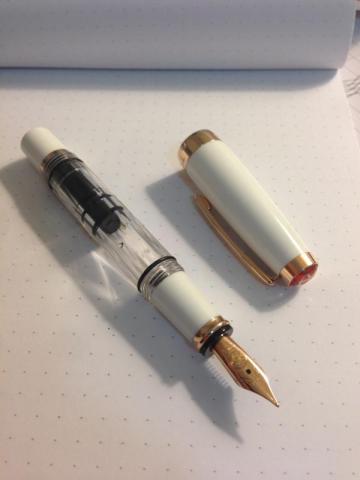
TWSBI Mini in Rose Gold Review First Impression (10/10) So, there are two reasons why I got this pen. First is that I really wanted a piston filler, the second being that I wanted a shiny white pen. The pen is nicely packaged as any other TWSBI pen, with the cardboard box and plastic shell, completed with wrench and silicon grease. This pen looked beautiful out of the box, it is a little smaller than I expected, but I do like smaller pens so it’s a plus for me. Appearance and Design (8/10) Again, the Mini is a really beautiful pen when empty. However, it does look somewhat worse when it is filled with dark black ink, but it still looks good nevertheless. I would warn you that it does give off a feminine feel, which may turn off those who prefer manly-man, black on black stealth pens. The design is excellent; I especially enjoy the ability to take it apart for cleaning and maintenance. Weight and Dimensions (10/10) The pen is small, and since I have smaller hands it is perfect for me. The pen does post pretty well with the screw on cap, so it’ll fit those with larger hands as well. Nib and performance (6/10) As a student, I always go with the fine nib for best performance on cheap paper. The nib is beautifully coated with rose gold. The nib did not start off being the smoothest, but got much better after a little bit of adjustments with my writing angle (small sweet spot). I do have a big complaint with how dry this pen is. This pen is beyond just causing a little bit of hard start: it completely stops working when kept in an upright position, causing a lot of frustration for me needing to prime it each time. Now I keep the pen flat on my desk and keep it half full to make sure it works every time when I pick it up. This is not best choice for use as a student pen. Filling system & Maintenance (10/10) The filling system is easy to use, and holds a lot of ink. Maintenance is superior because I can take apart the pen easily to clean out the pen really quickly. Cost & Value (6/10) Ok, this pen looks nice, but you can get an identical pen with just a different color (the regular TWSBI Mini) for $15 less. So if you’re not looking for a white and gold pen, getting this pen is low in value. Reliability wise it is disappointing for the dryness mentioned above, thus obviously lower in value than other pens like Lamy Safari as a work pen. Conclusion (8/10) This pen looks really nice and writes smoothly now, which is why I’m sure to be keeping it. I do have complaints of its dryness, but it is nothing that I can’t overlook easily, just problematic for taking notes. Overall I like this pen and accept its flaws.
-
I was wondering if it were possible to buy a spare rose gold or rose gold tone nib. I've been looking and I still haven't found one. This doesnot make entire sense to me because the rise gold twsbi uses a bock rose gold plated nib. Does Twsbi plate their own nibs?
-
So I am new to this forum and I am debating on whether to purchase a vintage 149 or a 149 75th 1924. I understand the vintage ones were better made compared to the modern ones so I guess does this hold true for the 75th one as well? Is it just a decked out 149 in a modern and not as durable body like the vintage ones produced way back when. Just looking for honest opinions. What would you buy? Thanks so much for shedding light on my question.
-
I just ordered a Monteverde Invincia from eBay and the nib doesn't have the Monteverde's engraving. The seller told me that are old Monteverde stocks from 3 years back. I've seen that kind of nib in a lot of handmade custom pens here, how well do these nibs behave? Thanks. Here is the listing: http://www.ebay.com/itm/171347601704?ssPageName=STRK:MEWNX:IT&_trksid=p3984.m1497.l2649
- 8 replies
-
- monteverde
- invincia
-
(and 2 more)
Tagged with:
-
So ive decided i want to add a twsbi to my collection. Ive done all the research i can on the models but still undecided... I like the diamond 580 in rose gold and the vac 700, so its between those two... What are your thoughts? They are both the dame price. I havent been able to find a dealer that sells the rose gold nib units though... I dont have any vac fillers and the only piston fillers i have are noodlers.
- 17 replies
-
- twsbi
- diamond 580
-
(and 3 more)
Tagged with:
-
So I am also looking for a 146 limited rose gold doue, but was curious to see what the more astute fp aficionados think of this pen. Is is overkill having a silver cap over a resin body? I would think the resin body is easier to write with as opposed to an all silver body which i have found to be WAY TOO expensive for my taste. Even if I could throw down that kind of bling, I think I would shoot myself before I did. Opinions on the Doue would be appreciated. Is it overkill and I should just stick with an all resin body? I know to each his/her own, but it never hurts to get a few opinions. Thanks!
- 10 replies
-
- 146
- fountain pen
-
(and 3 more)
Tagged with:
-
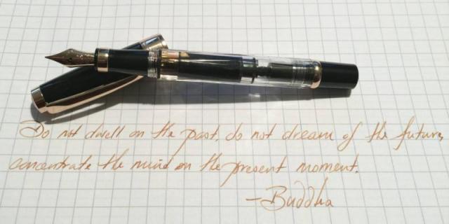
Black and Gold is a classic look for pens, and has been for a very long time. We see pens every day here at Cult Pens (quite a few of them!), and it's a look that doesn't usually excite us much any more. So we were rather surprised when we finally got to see TWSBI's new Diamond 580 Rose Gold up close - it looks somehow different. http://www.cultpens.com/acatalog/TWSBI-Diamond-580-fp-rose-gold.jpg It's still, essentially, a black and gold pen. But the gold is copper-tinted rose gold - it's a subtle change, but it makes a big difference. It's also both black and transparent - the main barrel is clear, like a demonstrator; but the cap, section and blind cap are all black. TWSBI have done this combination before with the 'classic' version of the Diamond Mini, and it's a popular choice - the ink and piston are visible, but the more messy parts of the mechanism stay out of sight. The reason we're telling you all this, of course, is because we now have them in stock, ready to ship worldwide, so if all that sounds good, you can find them here.
-
- twsbi
- diamond 580
-
(and 3 more)
Tagged with:


