Search the Community
Showing results for tags 'rohrer & kingner'.
-
Rohrer & Klingner - Limited Edition 2024 - Blue Eyed Mary Special limited edition 2024 by R&K. It is named after the plant Omphalodes verna, creeping navelwort or blue-eyed-Mary. Photo: Courtesy of WIkipedia. After the gorgeous Ebony, this one is superbly underwhelming. It’s a basic turquoise, with some curious behavior. It doesn’t like copy paper, but to my surprise it sporadically bled through Iroful (but ironically didn’t ghost), and only bled through Rhodia with the Pilot F3A semi-flex when I applied it a bit too enthusiastically. It was well behaved on Midori and Tomoe River 68 gr. It's very difficult to scan, so I omitted most of the scans as they took looked fluorescent There is some shading, but it’s barely visible from M/B above nibs. The best shading is with B nib on Iroful paper, @LizEF favorite paper Chroma: Writing Samples: The Stub line was mistakingly written by another "turquoise/teal" ink. I had to blot it out and put this one. Photo: Now some bleed through scans: Comparison: Water test: Left side 10 seconds under running water. I tried to draw a mouse hiding in a bunch of blue eyed Mary flowers. Thankfully, it all washed away Art Work: I was really uninspired by this ink. Paper is Talens Mixed media. Note when the ink was applied and dried it was difficult to wash it off. So, I had to lighten the "sky" with Octopus Polar Bear White. I also used a glass pen and bleach to create waves. Other inks are: Noodler's Lexington Gray/ Polar Brown Kakimori Kurun Sailor Storia Mix Red · Pens used: Pilot F3A Ef, Semi-flex, Lamy Safari (EF/F/M/B, 1.1) · What I liked: Let me get back at you, cleaning · What I did not like: Limited Edition Hype, behavior. Ink lacks depth. · What some might not like: There are too many inks like that. · Shading: Subtle on most papers, best B nib on Iroful. · Ghosting: Yes, on cheap paper. · Bleed through: Yes, on cheap paper, sporadically on Iroful and Rhodia. · Flow Rate: Wet · Lubrication: Good. · Nib Dry-out: Did not notice. · Start-up: Good · Saturation: Pastel · Shading Potential: Not exciting. · Sheen: No. · Spread / Feathering / Woolly Line: A bit if the feed is saturated on copy paper. · Nib Creep / “Crud”: Did not notice. · Staining (pen): No. · Clogging: Did not notice. · Cleaning: Easy · Water resistance: Non-existent. · Availability: 50 ml bottles. Please don't hesitate to share your experience, writing samples or any other comments. The more the merrier
-
Rohrer & Klingner Königsblau (Royal blue) Many thanks @Lithium466 for the sample. I’m not into royal blues, but if there would have one, this might have been a contender, had it any water resistance. The writing experience is senstational. Ink is wet, with excellent lubrication. It made the Pilot Kakuno Ef, sing, a rare feat for the scratchiest of all nibs. I enjoyed a lot for drawing. If you're in for a good washable blue and enjoyable writing experience this is for you. However, if you're looking for a bit more oomph, there are still many options, including one coming this weekend hopefully Chroma: Writing Samples: I try to find appropriate quotes, but more often than not, I don’t know if they are attributed or real. See how a drop of water obliterated the ink Photo: Comparison: The three first swatches look almost identical, but boy they cannot be more different Water test: Left side 10 seconds under running water. Art Work: I continued with the "royal" theme King Ginger and Queen snap For those interested @Lithium466 & @InesF I mixed Königsblau with Star Ruby on the paper, to create the purple gown. . (Talens notebook) Other inks used: Pelikan Edelstein Star Ruby Sailor Kiwa-guro Noodler's Lexington Gray/ Apache Sunset/Polar Brown and a gold metallic pen. · Pens used: Pilot Kakuno EF, Lamy (EF/F/M/B), Osmiroid Copperplate · What I liked: Tactile sensation, drawing with. · What I did not like: As a writing colour and its fatal attraction to water. · What some might not like: It’s wet, no water resistance. · Shading: It won’t win any awards. · Ghosting: Acceptable on cheap paper. Depends on the wetness of pen. · Bleed through: A bit with Ef. · Flow Rate: Very wet · Lubrication: Nice · Nib Dry-out: Did not notice. · Start-up: Excellent. · Saturation: Rich · Shading Potential: Eh! · Sheen: A hint on Japanese paper. · Spread / Feathering / Woolly Line: Did not notice. · Nib Creep / “Crud”: Did not notice. · Staining (pen): No. · Clogging: Did not notice. · Cleaning: Very easy · Water resistance: Non-existent! · Availability: 50 ml bottles. Please don't hesitate to share your experience, writing samples or any other comments. The more the merrier
- 18 replies
-
- rohrer & kingner
- königsblau
-
(and 3 more)
Tagged with:
-
-
- jacques herbin
- rohrer & kingner
- (and 8 more)
-
-
- rohrer & kingner
- königsblau
-
(and 1 more)
Tagged with:
-
-
- rohrer & kingner
- königsblau
-
(and 1 more)
Tagged with:
-
-
- rohrer & kingner
- königsblau
-
(and 1 more)
Tagged with:
-
-
- rohrer & kingner
- königsblau
-
(and 1 more)
Tagged with:
-
-
- rohrer & kingner
- königsblau
-
(and 1 more)
Tagged with:
-
-
- rohrer & kingner
- königsblau
-
(and 1 more)
Tagged with:
-
-
- rohrer & kingner
- königsblau
-
(and 1 more)
Tagged with:
-
Rohrer & Klingner Iron Gall Nut Ink Ebony Thanks @Lithium466 for the sample. This is a limited-edition 2023 ink by R&K . It’s a purple tinged iron gall ink, that depending the light, pen, it will look brown, purple or grey. As of the date of this review it is still available at Jet Pens in North America, and Stilo et Stile in Europe. It’s one of those inks, that I wanted keep using and using and was sad when I had to empty the pen. It has a lot of character. At first, I was surprised by the lack of lubrication at the beginning but as time went on, it became a very pleasant writer. So, give it a chance to settle in the pen. It’s a water resistant ink, but only with time. What surprised me most, was its bad behaviour on copy paper. It didn’t behave like a “normal” iron gall ink. If you think using this for artwork, note that the purple dye washes away. It’s very easy to clean, but I believe a wet, well sealed pen would be best suited for it. The Chroma is simply gorgeous Writing Samples: I reverse wrote with an Ef nib to create the Ultra Ef nib. Surprisingly, dry times are long Here I added two final lines by a "true" Iron gall ink, to show you how a "real" Iron gall ink should behave Photo: I took the photo a week later to see if it darker. Note the scan is grey, the photo purple Comparison: Water test: Left side 10 seconds under running water. Sample was written with glass nib. So amount of nib is more than a normal nib. The paper was still humid when I scanned the image. Ink has been applied 24 hours before. Art Work: I really enjoyed doing artwork with this ink. Talens pocket book paper. This is a nod to Some Like Hot 1959 movie, on a tan Clairefontaine mix media paper (A5) and finally the Egyptian Queen, inspired by Ancient Egyptian cat art. Paper is an A5 Talens notebook. The outfit is pure R&K Ebony, the blue is Monteverde Malibu, and the grey is diluted Lexington Gray 1:1, and the darker part is mix with Sailor Kiwa-guro. · Pens used: Lamy (Reverse Ef, EF/F/M/B, BB), Nib creeper semiflex · What I liked: The colour, writing, doing washes, and cleaning. · What I did not like: It is not a "true" Iron gall. · What some might not like: It's a bit dry at first. · Shading: Faint · Ghosting: Yes, on cheap paper. · Bleed through: Yes, on cheap paper. · Flow Rate: Wet · Lubrication: Slightly below average · Nib Dry-out: Did not notice. · Start-up: Ok · Saturation: Nice and dark · Shading Potential: Diant · Sheen: No. · Spread / Feathering / Woolly Line: Did not notice. · Nib Creep / “Crud”: Did not notice. · Staining (pen): No. · Clogging: Did not notice. · Cleaning: Very easy · Water resistance: Very good with time, but note if the ink is just applied and it rains, the purple dye will separate and you'll have mess · Availability: Limited Edition 2023. 50 ml bottles. Please don't hesitate to share your experience, writing samples or any other comments. The more the merrier
- 29 replies
-
- rohrer & kingner
- ebony
-
(and 1 more)
Tagged with:
-
Rohrer & Klingner Dokumentus Ink - Braun This ink is one of the best, permanent inks I’ve ever used. It has wonderful low dry time, below 30s with broad nib on all paper. It’s a joy to write or sketch with. It is the epitome of German efficiency. It works, it’s solid and it’s simple. There’s nothing “sexy” about this ink, it hasn’t got a complex chroma or an unusual name. For simplicity’s sake, I limited my testing to two pen, and avoided flex and fude nibs. Writing samples: A full written page with a broad nib, might have a hint of green, or a lovely grey haze, depending on the light. As a sketch ink, it looks almost black, especially on absorbent paper, as you can see on this sketch: Paper is Fabriano Sketch - Very absorbent paper. Cat at the therapist Cat: I identify as I dog. But the dogs don't like me. Dr. Mouse: As long as you don't identify as a cat, I'm fine with that Watertest: I cut the paper into two. The left side was held under running water for 10 seconds. Comparaison · Pens used: Pilot Elite (Ef/Stub) Lamy Safari (Ef/F/M/B) · What I liked: Well lubricated, classy, fast dry times, lovely in all pens. · What I did not like: Nothing. · What some might not like: Price – Lack of shading. · Shading: None. · Ghosting: Faint · Bleed through: None · Flow Rate: Wet · Lubrication: Excellent · Nib Dry-out: None. · Start-up: None · Saturation: Dark · Shading Potential: None. · Sheen: None. · Spread / Feathering / Woolly Line: None · Nib Creep / “Crud”: Nope. · Staining (pen): No. · Clogging: No. · Cleaning: · Water resistance: Excellent · Availability: 50 ml bottles Please don't hesitate to share your experience, writing samples or any other comments. The more the merrier
- 9 replies
-
- rohrer & kingner
- document ink
-
(and 1 more)
Tagged with:
-
- 12 replies
-
- rohrer & kingner
- sepia
-
(and 1 more)
Tagged with:
-
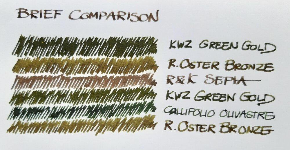
Just a brief note on a recent comparison: a bottle of Robert Oster Signature Bronze had been lingering in my ink drawer until I decided to use it a new acquisition by Atelier Veleray (more on that in the near future). It turned out greener than I'd expected, similar to KWZ Green Gold but slightly lighter. The attached image is an unprocessed photograph hastily taken with a smartphone. Still, it comes close to what I see on paper, especially in the lower part, where Bronze and Green Gold are separated by Callifolio Olivastre. In the upper part, where the two inks are next to each other, Green Gold appears a bit too dark. The other two inks included as a kind of control in the comparison are Callifolio Olivastre (in a Diamond Point with a flexible broad nib) and Rohrer & Klingner Sepia (in a Delta Tech & Web with a stub nib). KWZ Green Gold came from a Montblanc 149 with a medium nib and the Atelier Veleray pen sported a broad nib I had from a Visconti Rembrandt. Bottom line: nice colour and a well-behaved ink. As my interest in shading increases, Bronze may replace the darker KWZ Green Gold among my favourites.
- 11 replies
-
- robert oster
- kwz
-
(and 6 more)
Tagged with:
-
desaturated.thumb.gif.5cb70ef1e977aa313d11eea3616aba7d.gif)
Platinum Balance nib condition after R&K Salix
A Smug Dill posted a gallery image in FPN Image Albums
From the album: Japanese pens
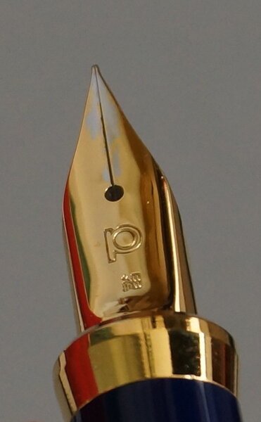
This Platinum Balance pen, with a gold-plated steel nib, held Rohrer & Klingner Salix for ten or eleven weeks. At no point did the nib hard-start, despite the known shortcoming that the cap seal performance on the Platinum Balance is nowhere near as good as on cheaper Platinum models equipped with Slip & Seal inner caps. However, by the end of said period, less than 10% of the initially full fill of ink remained in the converter, even though the pen was only used moderately lightly for writing in the meantime.© A Smug Dill
- 0 B
- x
- 9 comments
-
- rohrer & kingner
- iron-gall
-
(and 1 more)
Tagged with:
-
Rohrer and Klingner sketchINK® Jule These pigmented inks are purported to be both lightfast and waterproof and are designed for sketching. Jule is la lighter version of Super5 Australia. Truly delightful both on Midori and TR 68, the papers I use most often, but equally great on all types of paper. Tomoe River 6 8gr Midori Dry time in my experience is on the longer side. However, it can be mitigated with finer nibs, drier pens or more absorbent paper. I prefer this series with modern flex, or wide nibs where I get more character out of these inks. However, it is imperative to use pens with a good seal, otherwise you need dip your nib under water to keep it running again. • Pen used: Noodler’s Ahab, Lamy Safari broad • Shading: Yes • Ghosting: None • Bleed through: None. • Flow Rate: Good. Austalia is wetter. • Lubrication: Nice • Nib Dry-out: Depending the pen. Needs well sealed pens. • Start-up: If not used it can dry out, in pens with high evaporation. • Saturation: Dusky • Shading Potential: With broad and flex. • Sheen: No • Spread / Feathering / Woolly Line: None. • Nib Creep / “Crud”: None • Staining (pen): I use a pen cleaning solution for the feeds. • Clogging: Nope • Water resistance: Waterproof • Availability: Only in bottle 50 ml bottles.
- 10 replies
-
- rohrer & kingner
- sketchink
-
(and 2 more)
Tagged with:
-
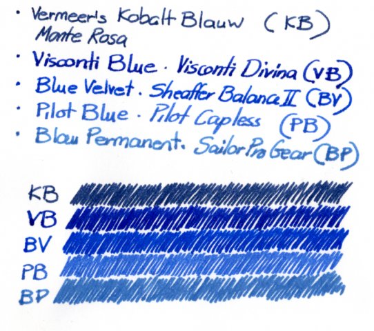
If there were a support group for blue ink addicts, I should attend the meetings. I just can't resist the blues. I already have more than enough but still keep buying and comparing them, always in search of yet another perfect blue ink. Until recently my favourites were Diamine Midnight (dark blue), Visconti Blue and Akkerman KoninginneNach-blauw (light blue). Rohrer & Klingner Blau Permanent fell out of favour when I discovered that it was rather too washable; pity, because it's lovely. After many months of sticking to the same inks (mostly to use up the ones that failed in similar comparisons), I took some of my most reliable pens and inked them with the new candidates. In the scan (which seems quite true on my computer), Akkerman Vermeer's Kobalt Blauw and Blau Permanent are used to define the boundaries of my search.The comparison is primarily between Visconti Blue, Diamine Blue Velvet and Pilot Blue. I had expected more from Pilot Blue. In comparison to the others it appears rather watery. Blue Velvet is impressively bright and clear, and when Visconti Blue is compared to it I can see a hint of a sheen in the latter. Not been into sheens, I therefore decided to replace Visconti with Blue Velvet. So I'm off to fill pages with the Pilot and Visconti blues. It's nice when one has to use up such good inks.
- 6 replies
-
- visconti blue
- pilot blue
- (and 5 more)
-
Pen Chalet is now proud to offer Rohrer & Klingner bottled fountain ink. Made in Germany with 18 great colors to choose from. 50 ml bottles which retail for $11.95. Add a reusable Rohrer & Klingner Erka Rapid Reservoir inside the bottles for easier fountain pen filling.
- 1 reply
-
- rohrer & kingner
- fountain pen ink
-
(and 2 more)
Tagged with:

