Search the Community
Showing results for tags 'robert oster'.
-
From the album: Poems copied out by Mercian
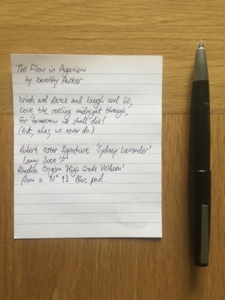
A photo of the sheet of Rhodia 80gsm ‘High Grade Vellum’ paper on which I have written out ‘The Flaw in Paganism’ by Dorothy Parker. I wrote it with my Lamy 2000 with an ‘F’ nib. The ink is Robert Oster Signature ‘Sydney Lavender’. The poem is pleasingly nihilistic/self-aware (delete as you prefer) 😊 My handwriting, being hurriedly-scrawled without paying conscious attention to the shapes of my letterforms (comme d’hab), remains as ‘pants’ as ever 🙄© Mercian
- 0 B
- x
-
- dorothy parker
- the flaw in paganism
- (and 5 more)
-

Robert Oster Signature Sydney Lavender - colour variation on paper & on envelope.jpeg
Mercian posted a gallery image in FPN Image Albums
From the album: Some of Mercian’s inks
Just a photo to illustrate that Robert Oster Signature Ink ‘Sydney Lavender’ varies in colour on different types of paper. The upper part of this image shows the ink written on a piece of inkjet(?) paper (the back of a letter that I received). The lower part of the image shows the same ink, from the same pen, written at the same time, on the envelope in which said letter was enclosed.© Mercian
- 0 B
- x
-
- robert oster
- sydney lavender
-
(and 1 more)
Tagged with:
-
Summer Storm doesn't get a lot of love, but if you're looking for a blue-grey (with a slight emphasis on the blue), you might consider it. Personally, I really enjoy it, but I like blue-greys, so I am biased in that. It behaves well, although it is on the dry side. It's dark enough to read without turning into black (a pet peeve). This isn't the perfect grey, but it's a nice color.
- 9 replies
-
- robert oster
- summer storm
-
(and 1 more)
Tagged with:
-
- 7 replies
-
- robert oster
- diamine
-
(and 2 more)
Tagged with:
-
Robert Oster Signature - Eucalyptus Leaf Robert Oster is an Australian ink maker that is well-known for his unique range of colours. On his website, he describes our shared love quite eloquently: "Robert Oster Signature originates from one of the most famous wine producing regions of the world, the Coonawarra district of South Australia, an idyllic setting with great influence on the senses. There is my inspiration. It's a joy to share it with you." Well, we are certainly fortunate to have inspiring ink makers like Robert Oster to satiate our thirst for glorious inks. In this review, I take a closer look at Eucalyptus Leaf. Catherine from Sakura provided me with a sample of this ink to play around with - much appreciated! Eucalyptus Leaf is an enchanting mossy green, with a slightly brownish streak to it. This is definitely my kind of green! It looks absolutely beautiful on all kinds of paper. This ink shows tons of shading, without too much contrast between the light and darker parts, exactly as I like it. It really enhances your writing, and clearly shows that your words have been written with a fountain pen. Nicely executed! To show you the impact of saturation on the ink's look & feel on paper, I made some scribbles where I really saturated portions of the paper with ink. This gives you a good idea of what the ink is capable of in terms of colour range. As you can see, Eucalyptus Leaf strikes just the right balance in its colour spectrum, with not too width a gap between the light and darker parts. This explains its expressiveness, and the aesthetics it shows off in its shading. Like most Robert Oster inks, Eucalyptus Leaf has zero water resistance. Short exposures to water completely obliterate the text, leaving next to nothing on the page. As the chromatography shows, only a faint pale-pink residue remains on the paper. Smudge resistance is acceptable: although there is lots of smearing of the ink, the text itself remains perfectly readable. I've tested the ink on a wide variety of paper - from crappy Moleskine to high-end Tomoe River. On every small band of paper I show you:An ink swab, made with a cotton Q-tip1-2-3 pass swab, to show increasing saturationAn ink scribble made with an M-nib fountain penThe name of the paper used, written with a B-nibA small text sample, written with an M-nibDrying times of the ink on the paper (with the M-nib)Eucalyptus Leaf is a well-behaving ink on most paper types, with no visible feathering (except on Moleskine paper, which should not come as a surprise). With lower quality paper you can experience some bleed-through. The colour looks great on both white and more yellowish paper, which I also appreciate. The ink dries quite quickly within the 5-10 second range (with the M-nib). I also show the back-side of the different paper types at the end of the review. No troubles there, except with the Moleskine paper, which shows significant bleed-through. All in all, a well-behaving ink. Writing with different nib sizesThe picture below shows the effect of nib sizes on the writing. All samples were written with a Lamy Safari, which is typically a dry pen. I also added a visiting pen - a wet-writing Parker Sonnet with F-nib. With this pen the ink leaves a very saturated line, which diminishes the expressiveness of its shading. In my opinion, this is an ink that looks at its best with drier pens (like the Safari), where you get more contrast between light and darker parts, which improves the aesthetics of the shading. Related inksTo compare Eucalyptus Leaf with related inks, I use a nine-grid format with the currently reviewed ink at the center. This format shows the name of related inks, a saturation sample, a 1-2-3 swab and a water resistance test - all in a very compact format. I hope that you'll find this way of presenting related inks useful. It's a bit more work, but in my opinion worth the effort for the extra information you gain. Inkxperiment - Fawlty FlowersAs a personal challenge, I try to create interesting drawings using only the ink I'm reviewing. For me, this brings some extra fun to the hobby, and these single-ink drawings present a real challenge at times. With these small pictures, I try to give you an idea of what the ink is capable of in a more artistic setting. For this drawing I used Moleskine 200 gsm Cold-Pressed Watercolour Paper. I soaked the outline of the rectangle with water, and applied a line of ink, letting it bleed out. Here the brownish streak in the ink really comes to the surface. I then drew the flowers using ink diluted with a bit of water (in different ratios). The stems and leafs were painted in with pure Eucalyptus Leaf. This mini-picture gives you an idea of what can be achieved with this ink in a more artistic context. ConclusionRobert Oster Eucalyptus Leaf is a beautiful mossy-green writing ink, that really excels when used for drawing. The ink shows great shading with drier pens, that leave a not too saturated line. Overall, I enjoyed using it. I only got a sample, but this is an ink that definitely deserves a full bottle. Technical test results on Rhodia N° 16 notepad paper, written with Lamy Safari, M-nib Back-side of writing samples on different paper types
- 14 replies
-
- robert oster
- signature
-
(and 2 more)
Tagged with:
-

Ink Shoot-Out : Robert Oster Muddy Swamp vs Papier Plume Bayou Nightfall
namrehsnoom posted a topic in Ink Comparisons
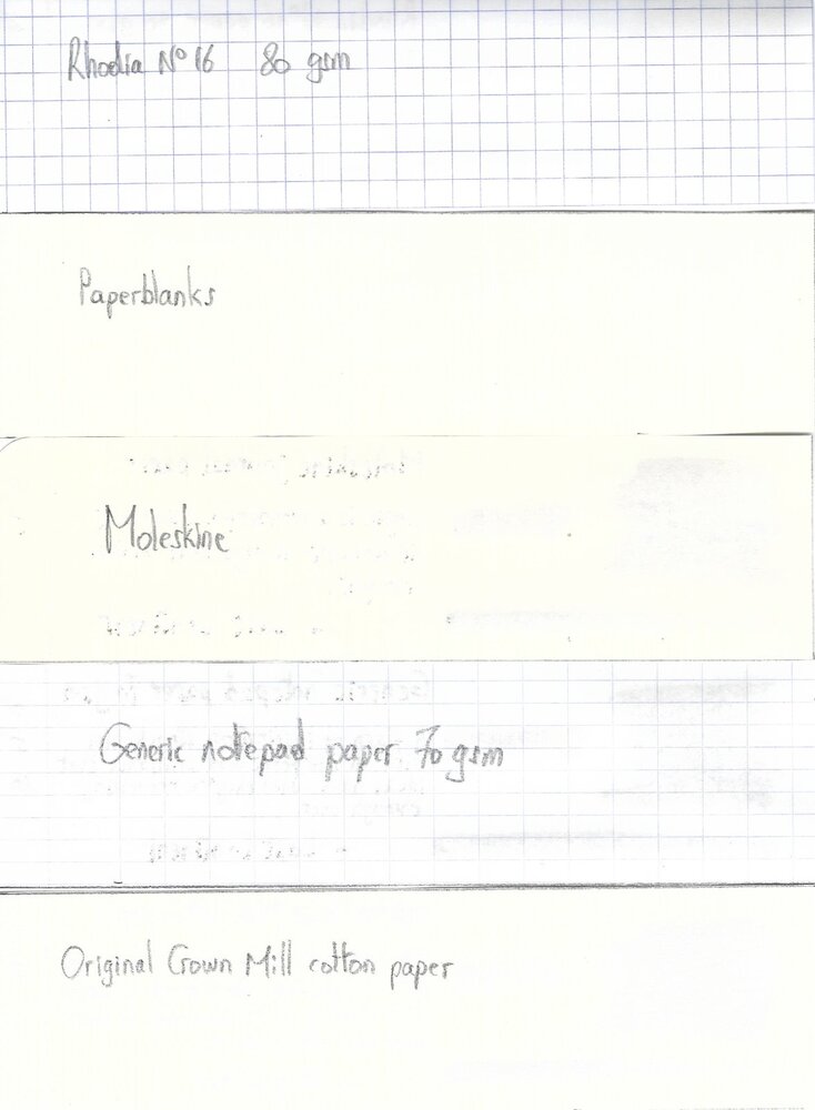
Ink Shoot-Out : Robert Oster Muddy Swamp vs Papier Plume Bayou Nightfall A couple of months ago, I discovered Robert Oster Muddy Swamp – a beautifully complex ink, kind of a murky grey-green-blue – and one that totally fits my taste. I also noticed that it looks amazingly similar to Papier Plume’s Bayou Nightfall. Two great-looking inks that deserve a more in-depth comparison. I wonder which one I will like the most. The sun is slowly setting over the small village of Santa Maria. Soft golden rays sweeping through the open door of the local cantina; playful bajo music drifting to the street. Then a shadow falls through the door… a tall stranger enters and settles at the bar. His steely eyes fall on the raven-haired waitress, moving seductively through the room. “Hey Sheila,” he shouts, “that tequila has my name on it. Be a nice lass and bring it to Rick Dundee.” The bajo stops playing, silence falls. The slender Don Alejandro Vegas raises from his chair, and approaches the stranger. “Ola señor, in this town we treat ladies with respect. So please apologize, or else…” Eyes lock, fists get balled, a fight is in the air… Enter... the Ink Shoot-Out. A brutal fight spanning five rounds, where two inks engage in fierce battle to determine who is the winner. Tonight’s fight is a bare-knuckles special, set in Santa Maria’s cantina. In the left corner, the tall and strong stranger from Down Under – Robert Oster Muddy Swamp. In the right corner, the slender and fast-moving caballero from Southern America: Papier Plume Bayou Nightfall. The local crowd sets aside chairs and tables, forming a ring – anticipations are high, this promises to be an interesting fight. The barman approaches: “Caballeros, no biting, no hitting beneath the belt. May the best man win.” The barman claps his hands, signaling the start of the first round. May the best ink win… Round 1 – First Impressions Both inks make a stellar first impression. The colours are simply amazing, a murky mix of greys and greens and blues, mixed with a wonderful complexity. These inks look beautiful – both in written text and in swabs. I love the toned-down nature of their colour, which feels restful and relaxed. No eye-searing vibrancy, just a soft beauty that looks great on paper. Shading is elegant and aesthetically pleasing, firmly present but never too harsh. Great looking stuff! In this first round, both champions give their best, and both throw serious punches, trying to impress their opponent (and no doubt also that seductive señorita in the corner): Muddy Swamp definitely has the stronger swing. The ink writes wet and saturated, with a strong presence on the paper. Bayou Nightfall writes less lubricated, with a lighter colour tone that looks more soothing and subtle. The saturation swab shows that Bayou Nightfall has a broader colour span, which translates to stronger shading compared to its Robert Oster counterpart. Both inks make a great first impression. The Australian Muddy Swamp definitely writes more smoothly, leaving a more saturated line with a slightly darker colour. On the other hand, the Papier Plume ink shows a bit more character in its shading. But there’s also that flicker of uncertainty in Bayou Nightfall’s eye… take a close look at the text in the intro pic with the Fallout guys. This was done on 80 gsm HP Multipurpose paper – a medium quality print paper. The Papier Plume ink shows a tiny bit of feathering, best noticeable in the word “Papier”. Not much, but there is that flicker of uncertainty… A great first round, and both inks certainly impress the crowd. The Australian ink seems a bit more confident, but it’s too early to tell whether it will dominate the fight. As such, the first round ends with a draw. Both fighter’s are really closely matched! Round 2 – Writing Sample The writing sample was done on a Rhodia N°16 Notepad with 80 gsm paper. Both inks behaved flawlessly, with no feathering and no show-through or bleed-through. With the EF nib, Bayou Nightfall showed sub-par lubrication, and struggled with the paper. This results in writing that looks a bit too light, and shading that looks a bit too harsh. In contrast, the Robert Oster ink writes wet and smooth with good contrast, even in the finest nib. Rick Dundee’s fist connects with Don Alejandro’s chin with a snapping crunch. Ouch! That’s a punch that counts. The crowd jumps up and cheers, showing its approval. The Papier Plume ink recovers when nib sizes broaden. With M-nibs and above, the feeling of sub-par lubrication disappears, and the ink again feels well-balanced. Overall, Muddy Swamp looks a bit darker and more saturated, while Bayou Nightfall looks a bit lighter, and – to my eye – shows a bit more of a green tinge. This extra layer of complexity is evident when looking at the chromatographies of both inks. But in this round we don’t score looks, but focus on the writing, and here the strength of the Australian’s fist clearly dominates. This round is a definite win for the Robert Oster ink. The crowd is loving the fight, and even the raven-haired señorita can’t hide her fascination. A great display of testosterone-filled masculinity with fighters that still look closely matched. Round 3 – Pen on Paper This round allows the battling inks to show how they behave on a range of fine writing papers. From top to bottom, we have : Midori notebook paper, Tomoe River 52 gsm, Original Crown Mill cotton paper, Clairefontaine Triomphe 90 gsm and Paperblanks 120 gsm journal paper. All scribbling and writing was done with a Lamy Safari M-nib. Both champions did well, with no show-through nor bleed-through. But this round is not about technicalities, it is about aesthetics and beauty. Are the fighters able to make the paper shine? One thing is immediately apparent: these inks work well with both white and creamy paper. They also look stunningly similar. Bayou Nightfall is just a touch lighter, and shows a bit more character in the shading – due to its wider saturation span. But the differences are really minor. Both inks truly succeed in making the paper shine! In this round both champions really throw their punches, trying to impress the wide-eyed señorita. Rick Dundee relies on his strength, focuses on the attack and puts his weight behind his punches. Don Alejandro on the other hand brings his speed and mobility into play, evades the Australian’s punches and delivers some lightning-fast hits himself. What a fight! The audience is really enjoying the show. A great round, but no winner emerges – the fighters appear evenly matched. Round 4 – Ink Properties Both inks have drying times in the 15-20 second range with the M-nib in my Lamy Safari. The American ink dries just a tad faster than Muddy Swamp. To test their smudge resistance, I rubbed the text with a moist Q-tip cotton swab. Here, the Robert Oster ink shows a bit more smudging – probably due to its higher saturation. But in either case, the written word remains crisp and clear. To test water resistance, I dripped water on the grid and let it sit there for 15 minutes, after which I removed the water with a paper towel. Both champions can survive a watery accident, but it’s clear that Bayou Nightfall handles this case the best - there’s less spreading of the dyes. Overall, there seems to be a slight advantage here for the Papier Plume ink. Not a great round. The champions seem to be tiring. They keep circling one another, without much initiative from either side. But there is that slightly better water resistance with Bayou Nightfall, so it wins this round on points (although just barely). Round 5 – The Fun Factor Welcome to the final round. Here I give you a purely personal impression of both inks, where I judge which of them I like most when doing some fun stuff like doodling and drawing. And for this round, both inks are simply amazing. I did the drawing on HP Permium Plus Photo paper. The background uses heavily water-diluted ink, applied with a cotton pad. For the ground, I poured the remaining ink on the photo paper, and let it dry completely. The trees were drawn with the side of a plastic card, dipped in pure ink. As a final touch, I added the small people to the setting with a dip pen. Both inks are a pleasure to draw with. On the photo paper, Muddy Swamp remains true to its grey-blue-green character, but shows some purple tones rising to the surface. Bayou Nightfall on the other hand really surfaces those green undertones, which add some fascinating complexity. Both inks are great looking in this more artistic setting. I really enjoyed using them both. For this round, both fighters recovered completely, and gave their best, impressing the crowd with the intensity of their moves and punches. At the end of the round, the judge hesitates. Which fighter showed most artistry? The judge’s eyes drift to the side, falling on the señorita who clearly enjoyed all this masculine display. A seductive smile lifts her lips, clearly targeted at the tall stranger. At this sign, the judge lifts the Australian’s arm, declaring him the winner of this round. The Verdict Both inks are great-looking muted inks, murky grey-blue-greens that look fantastic on all types of paper. You can’t go wrong with either of these. I must admit that I was rooting for Bayou Nightfall at the start of the fight. But hey… in the end the beautiful señorita got her way, and so I declare Robert Oster Muddy Swamp the winner of this exciting shoot-out.- 9 replies
-
- ink shoot-out
- robert oster
- (and 4 more)
-
Robert Oster Muddy Swamp Robert Oster is an Australian ink maker that is well-known for its unique range of colours. On his website he describes our shared love quite eloquently: “Robert Oster Signature originates from one of the most famous wine producing regions of the world, the Coonawarra district of South Australia, an idyllic setting with great influence on the senses. There is my inspiration. It’s a joy to share it with you.” Well, we are certainly fortunate to have inspiring ink makers like Robert Oster to satiate our thirst for glorious inks. It’s been a while since I reviewed a Robert Oster ink, but recently I got me a bottle of Muddy Swamp, that really impressed me. This ink’s colour is totally intriguing… a murky mix of teal, blue-black, grey and green. Difficult to describe, wonderful to experience! To me, the closest I can come is to classify it as a dark teal-grey. The ink’s name is well chosen: it definitely breathes that muddy feel of dark swamp water, with bubbling eddies of weeds swirling around, frogs croaking, dragonflies zipping around… An ink that creates a pensive mood, ideal for an intimate journaling session in the evening. A nicely saturated ink, that is at home in all nib sizes. Also an ink with strong shading, but somewhat subdued and not at all harsh on the eye. This Muddy Swamp is right up my alley – one of the best inks I tried this year! The fairly heavy shading caused some problems with my scanner, which tends to exaggerate the contrast of written text. As such, I mostly present photos of the ink that more accurately show its real looks. To show you the impact of saturation on the ink’s look & feel on paper, I made some scribbles where I really saturated portions of a strip of 52 gsm Tomoe River paper with ink. This gives you a good idea of what the ink is capable of in terms of colour range. This Muddy Swamp has a fairly broad dynamic range, ranging from a light grey-blue to a much darker teal-grey. This translates to prominent shading, but without a harsh contrast between the light & darker parts. Aesthetically very pleasing, and I like it a lot! On the smudge test – rubbing text with a moist Q-tip cotton swab – Muddy Swamp behaved really well, with only minimal smearing. Water resistance is also fairly good: a lot of the colour dissipates, but what’s left on the page is still legible without too much trouble. Even after 15 minutes of soaking, there’s still readable text left on the page. Not bad at all. The ink’s chromatography shows a complex mix of dyes: I see green and blue, grey of course but also some hints of purple. The bottom part of the chroma shows that the grey dyes are firmly attached to the paper, which explains the waterresistant properties of the ink. I’ve tested the ink on a wide variety of paper – from crappy Moleskine to high-end Tomoe River. On every small band of paper I show you: An ink swab, made with a cotton Q-tip 1-2-3 pass swab, to show increasing saturation An ink scribble made with an M-nib Lamy Safari fountain pen The name of the paper used, written with a B-nib Lamy Safari A small text sample, written with the M-nib Safari Origin of the quote, written with an Edison Collier with 1.1 stub Drying times of the ink on the paper (with the M-nib Safari) Muddy Swamp behaved perfectly on most paper types, with only a hint of feathering on the lower quality papers (like Moleskine), where you also get show-through and bleed-through, but not the worst I have seen. Drying times are mostly around the 10 second mark with the Lamy Safari. This ink is definitely made for pure white paper, where it truly shines. I personally find it a bit underwhelming on cream paper – still good looking, but the yellow tinge shines through and significantly breaks down the ink’s inherent beauty. My advice: avoid strong cream-coloured paper. I’ve also added a scanned image of some writing samples, just to give another view on the ink. The scanner captures the colour fairly well, but greatly exaggerates the contrast. That’s why I used photos to present the writing samples on different paper types. Writing with different nib sizes The picture below shows the effect of nib sizes on the writing. Muddy Swamp writes a well-saturated line in all nib sizes, showing good contrast with the paper. The EF-nib already presents hints of shading, with shading picking up with F-nibs and above. The ink looks at its best with more dry-writing pens or broader nibs. With wet writers, the ink’s shading drowns away and becomes less prominent. But no matter the pen/nib combination, Muddy Swamp delivers, and gives you a stunningly beautiful result. Related inks To compare Muddy Swamp with related inks, I use my nine-grid format with the currently reviewed ink at the center. This format shows the name of related inks, a saturation sample, a 1-2-3 swab and a water resistance test – all in a very compact format. This Robert Oster creation is different from other blue-green grey-toned inks in my collection. As such, it was a wonderful discovery. I just love grey-leaning inks with a bit of colour to them, and this teal-grey is really superb! Inkxperiment – Cityscape As part of my ink reviews, I try to create an interesting drawing that showcases the ink in a more artistic setting. I love doing this part: a real challenge at times, and a great way to improve my drawing skills. And besides, it’s just fun to use inks for more than just writing. Inspiration for this drawing comes from the original Blade Runner movie that I recently revisited. I especially love the scene at the end of the movie with Rutger Hauer sitting in the rain, uttering the unforgettable words: “… All those moments will be lost in time, like tears in the rain…” Still gives me goosebumps. Rober Oster Muddy Swamp seemed like an ideal ink to depict a gloomy dystopian cityscape. For this inkxperiment I started with an A4 piece of HP photo paper, onto which I painted a background by applying heavily water-diluted ink through a piece of kitchen towel. I then used a piece of textured carpet anti-slip material to draw the city buildings, starting with strongly diluted ink in the background and building up with more pure ink for the city blocks in the foreground. A fairly simple drawing, but the result is quite good and shows what can be achieved with Muddy Swamp in an artistic setting. Inkxpired – computational art I love experimenting with pen/ink/paper and have added another layer as part of the hobby. I’m exploring computational art, inspired by the ink drawings I do during ink reviews. Another fun offshoot of the hobby… and all that starting with a few drops of dye-coloured water on paper. For this computational derivation, I made a square cut-out of the inkxperiment drawing, and applied a negative colour filter to it. Nothing more, nothing less. The result shows the city at night and looks amazingly well. I’m really pleased with it. Conclusion Robert Oster Muddy Swamp has a very unusual dirty-looking teal-grey colour, that is simply amazing. A gorgeous looking ink that works equally well for writing as for drawing. I enjoyed this ink immensely and can definitely recommend it. I you like teal or grey-leaning inks, this is a must-have in my book. Technical test results on Rhodia N° 16 notepad paper, written with Lamy Safari, M-nib Back-side of writing samples on different paper types
- 10 replies
-
- robert oster
- muddy swamp
-
(and 2 more)
Tagged with:
-
Help! I really love the Robert Oster inks. Where can I get them in India? Have you guys used Robert Oster?
- 6 replies
-
- robert oster
- pen
- (and 6 more)
-
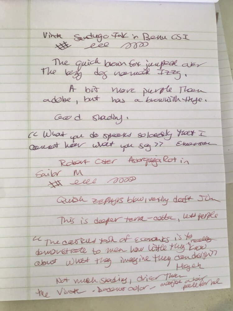
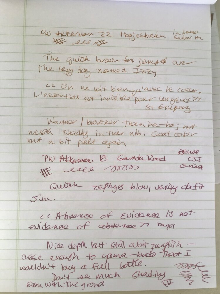
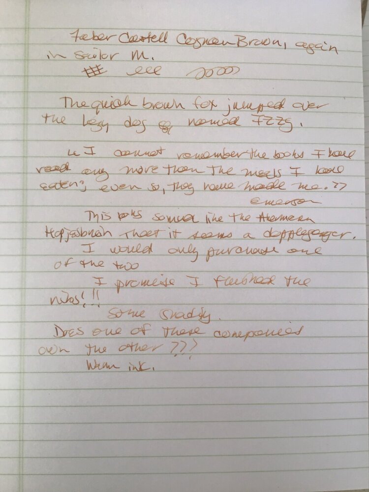
Brownish red inks as I try to find the right one for a particular pen. Not so scientific, so feel free to move this thread if another forum is more appropriate. N.B. I think the Hopjesbruin and the Cognac are doppelgängers. I'm leaning towards one of the two of the inks tested here, though I do like the Oster.
-
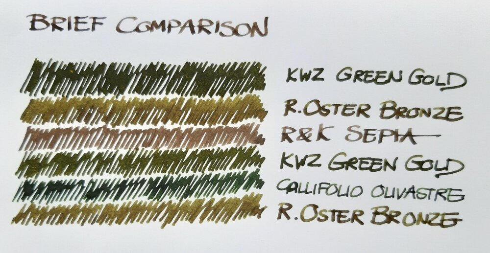
Just a brief note on a recent comparison: a bottle of Robert Oster Signature Bronze had been lingering in my ink drawer until I decided to use it a new acquisition by Atelier Veleray (more on that in the near future). It turned out greener than I'd expected, similar to KWZ Green Gold but slightly lighter. The attached image is an unprocessed photograph hastily taken with a smartphone. Still, it comes close to what I see on paper, especially in the lower part, where Bronze and Green Gold are separated by Callifolio Olivastre. In the upper part, where the two inks are next to each other, Green Gold appears a bit too dark. The other two inks included as a kind of control in the comparison are Callifolio Olivastre (in a Diamond Point with a flexible broad nib) and Rohrer & Klingner Sepia (in a Delta Tech & Web with a stub nib). KWZ Green Gold came from a Montblanc 149 with a medium nib and the Atelier Veleray pen sported a broad nib I had from a Visconti Rembrandt. Bottom line: nice colour and a well-behaved ink. As my interest in shading increases, Bronze may replace the darker KWZ Green Gold among my favourites.
- 11 replies
-
- robert oster
- kwz
-
(and 6 more)
Tagged with:
-
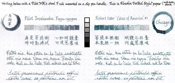
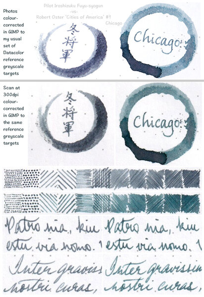
My bottle of Robert Oster Chicago ink in the ‘Cities of America’ series just came in this morning. The colour makes me think of it as a slightly darker and greener-leaning Pilot Iroshizuku Fuyu-syogun, of which a 50ml bottle also arrived today in the same parcel; but this ink's flow is rather drier in a properly (converter-)filled pen. Probably not the best ink for a nib that offers a lot of kinaesthetic feedback; but, on the whole, I like it.
- 18 replies
-
- robert oster
- cities of america
-
(and 1 more)
Tagged with:
-
desaturated.thumb.gif.5cb70ef1e977aa313d11eea3616aba7d.gif)
Pilot Iroshizuku Fuyu-syogun vs Robert Oster Chicago
A Smug Dill posted a gallery image in FPN Image Albums
-
- pilot iroshizuku
- iroshizuku
- (and 6 more)
-
desaturated.thumb.gif.5cb70ef1e977aa313d11eea3616aba7d.gif)
Pilot Iroshizuku Fuyu-syogun vs Robert Oster Chicago
A Smug Dill posted a gallery image in FPN Image Albums
-
- pilot iroshizuku
- iroshizuku
- (and 8 more)
-
desaturated.thumb.gif.5cb70ef1e977aa313d11eea3616aba7d.gif)
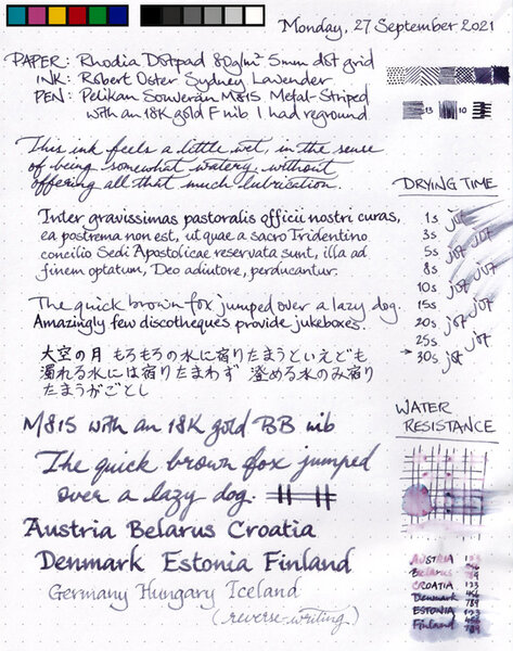
Robert Oster Sydney Lavender review sheet overview
A Smug Dill posted a gallery image in FPN Image Albums
From the album: Ink review
(right-sized to match the screen resolution of my MacBook Pro's built-in display panel at ~115dpi)© A Smug Dill
- 0 B
- x
-
desaturated.thumb.gif.5cb70ef1e977aa313d11eea3616aba7d.gif)
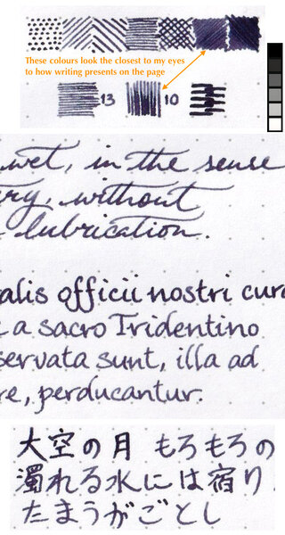
Fragments of Robert Oster Sydney Lavender review sheet
A Smug Dill posted a gallery image in FPN Image Albums
-
From the album: Ink review
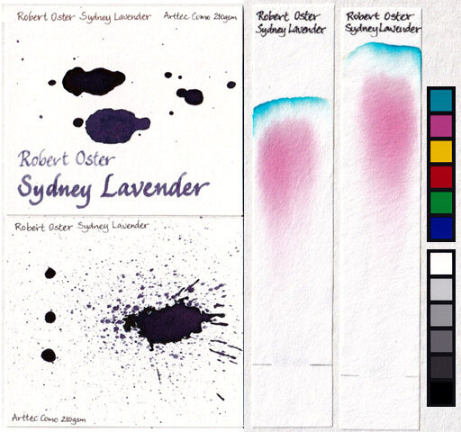
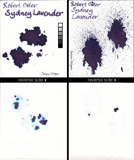
Chromatograms produced using Loikaw medium-speed qualitative filter paper (grade 102). Drips and splat done on Arttec Como Sketch Pad 210gsm paper.© A Smug Dill
- 0 B
- x
-
From the album: Ink review
Drips and splats done on Canson Drawing 220 Pad 220gsm paper.© A Smug Dill
- 0 B
- x
-
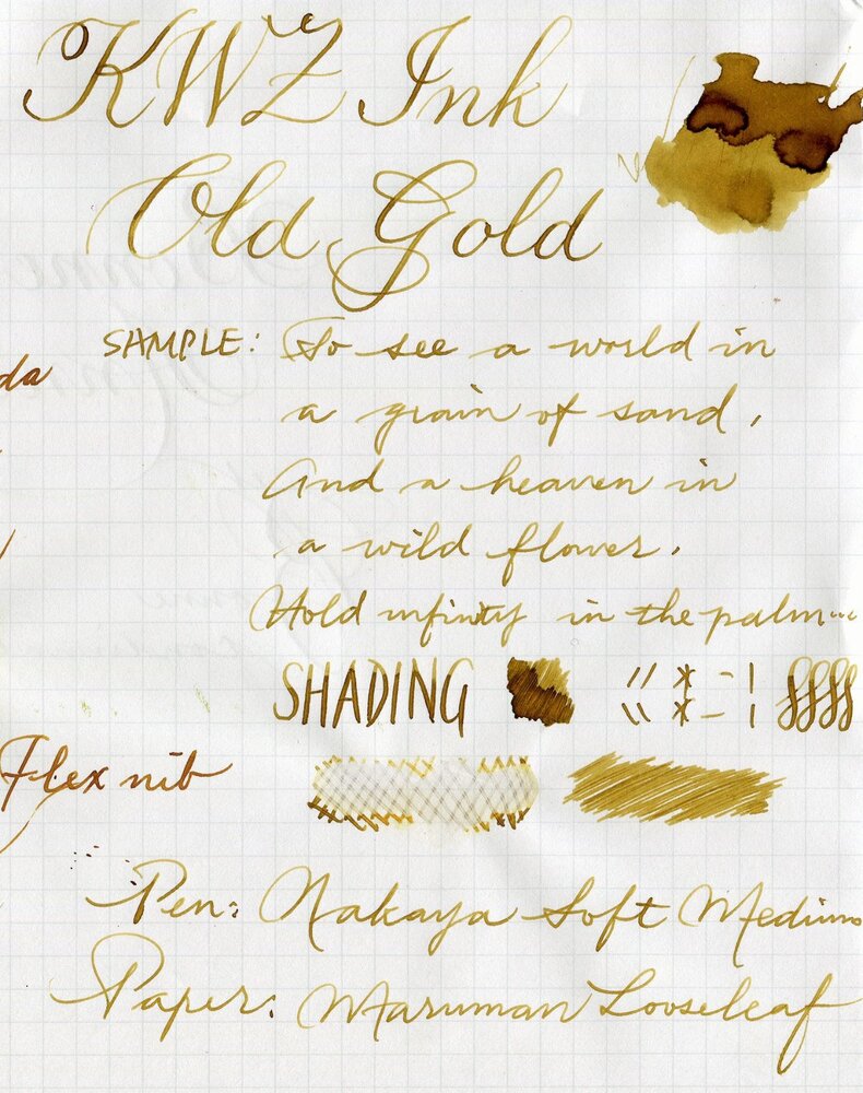
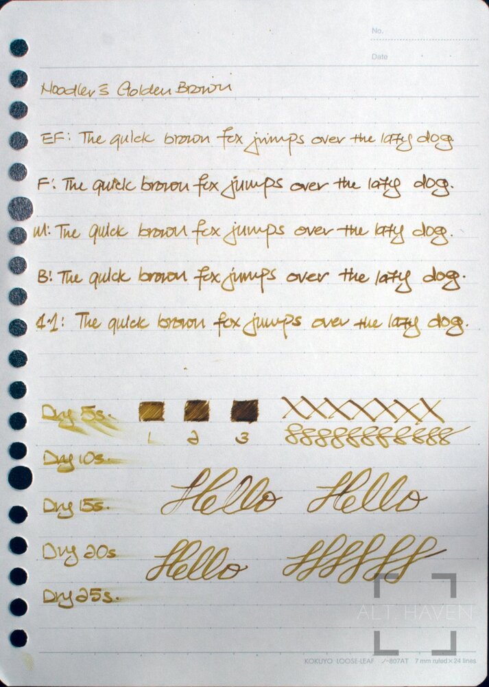
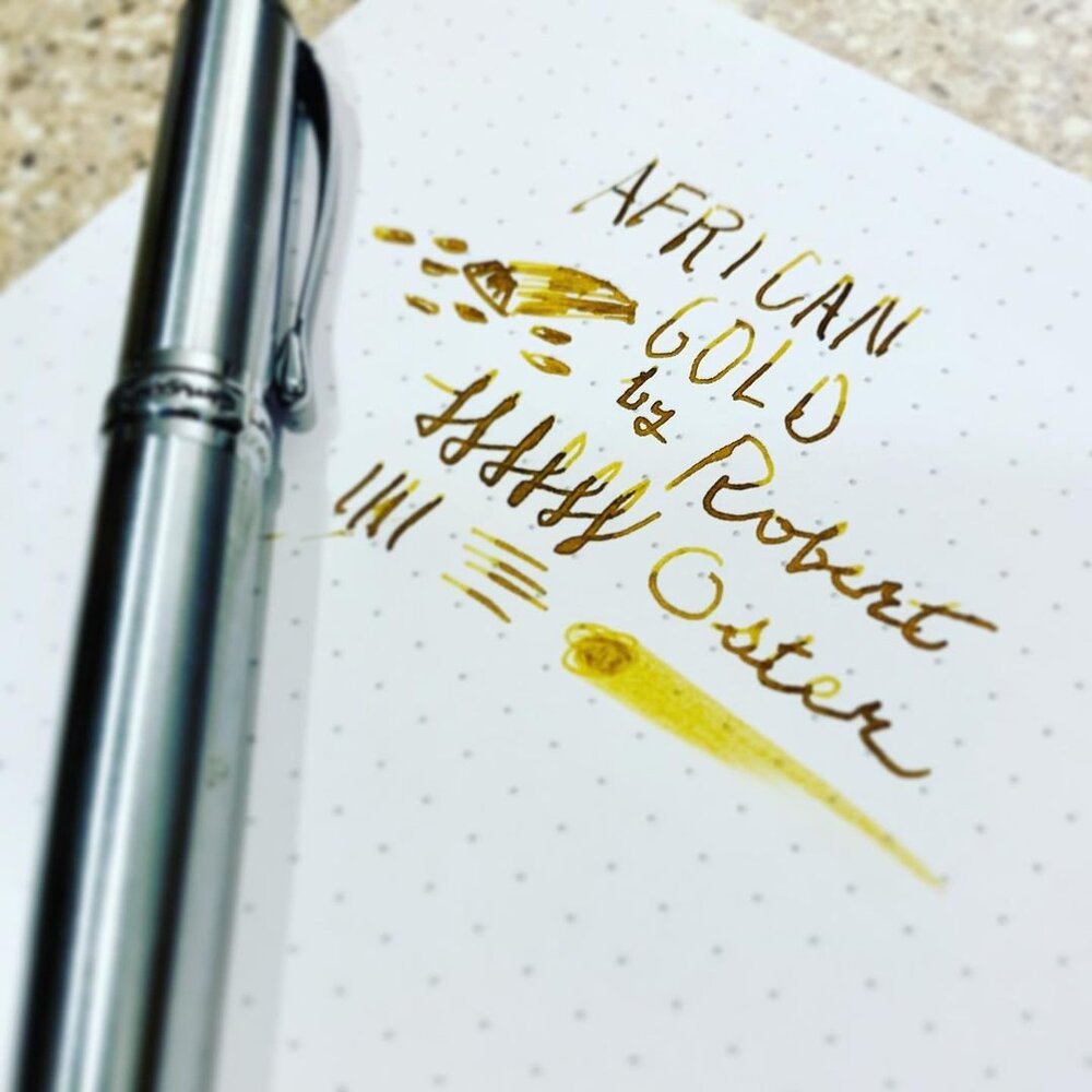
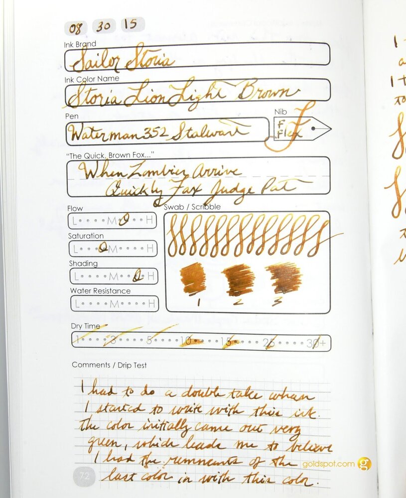
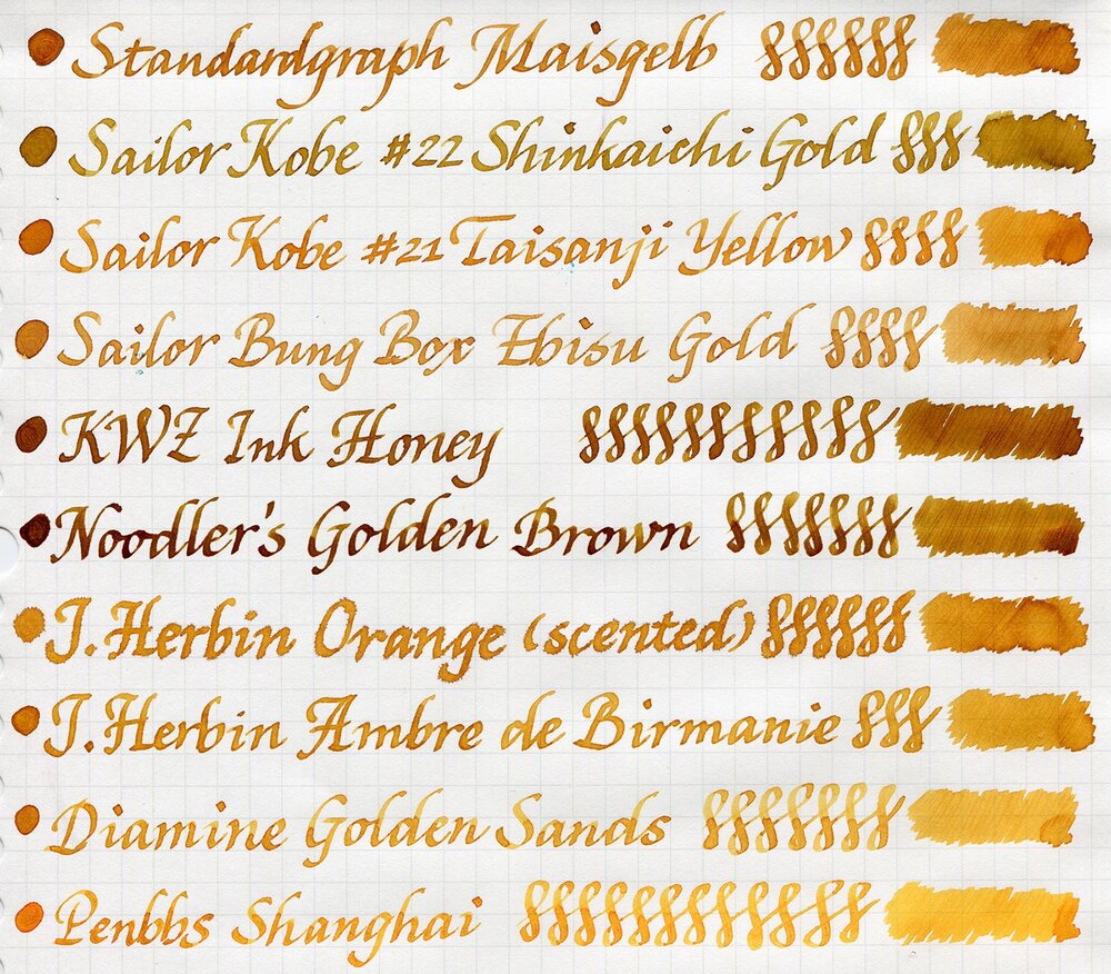
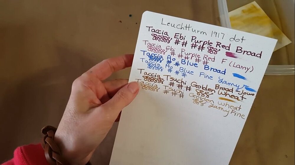
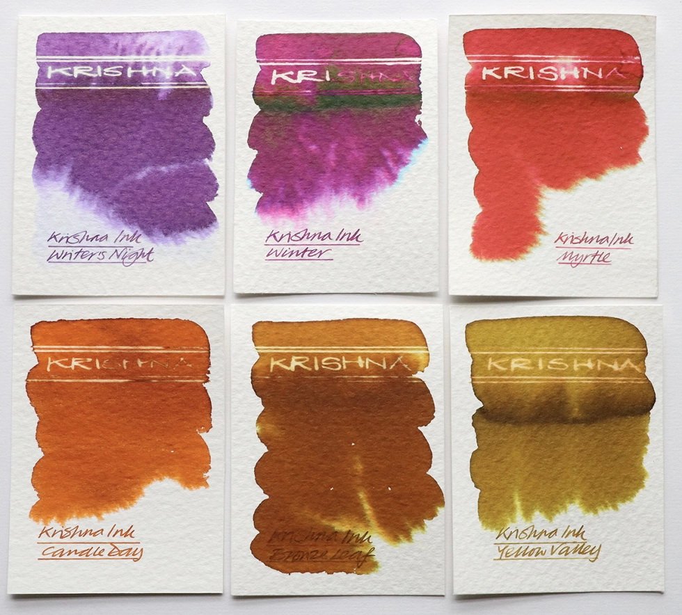
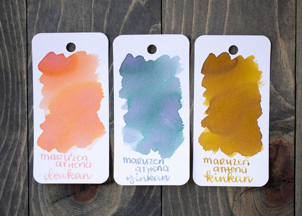
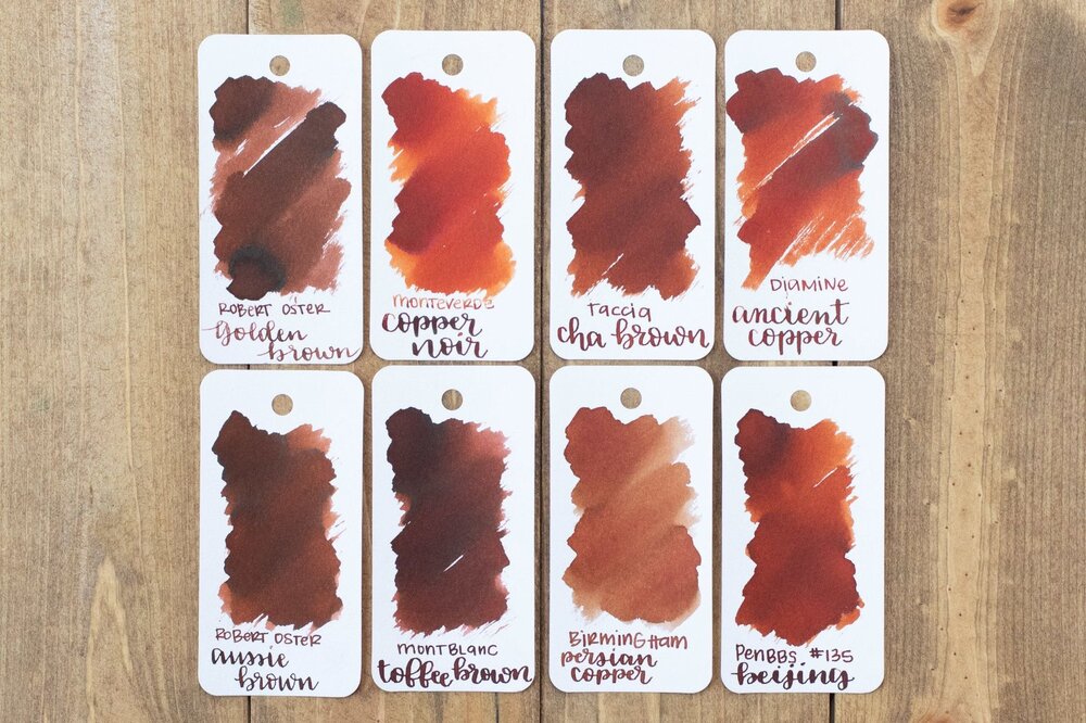
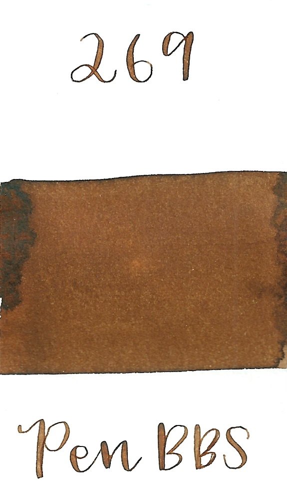
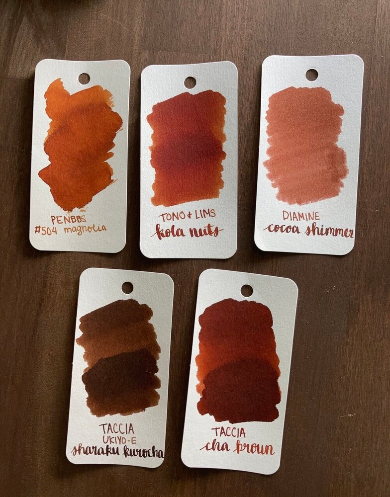
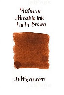
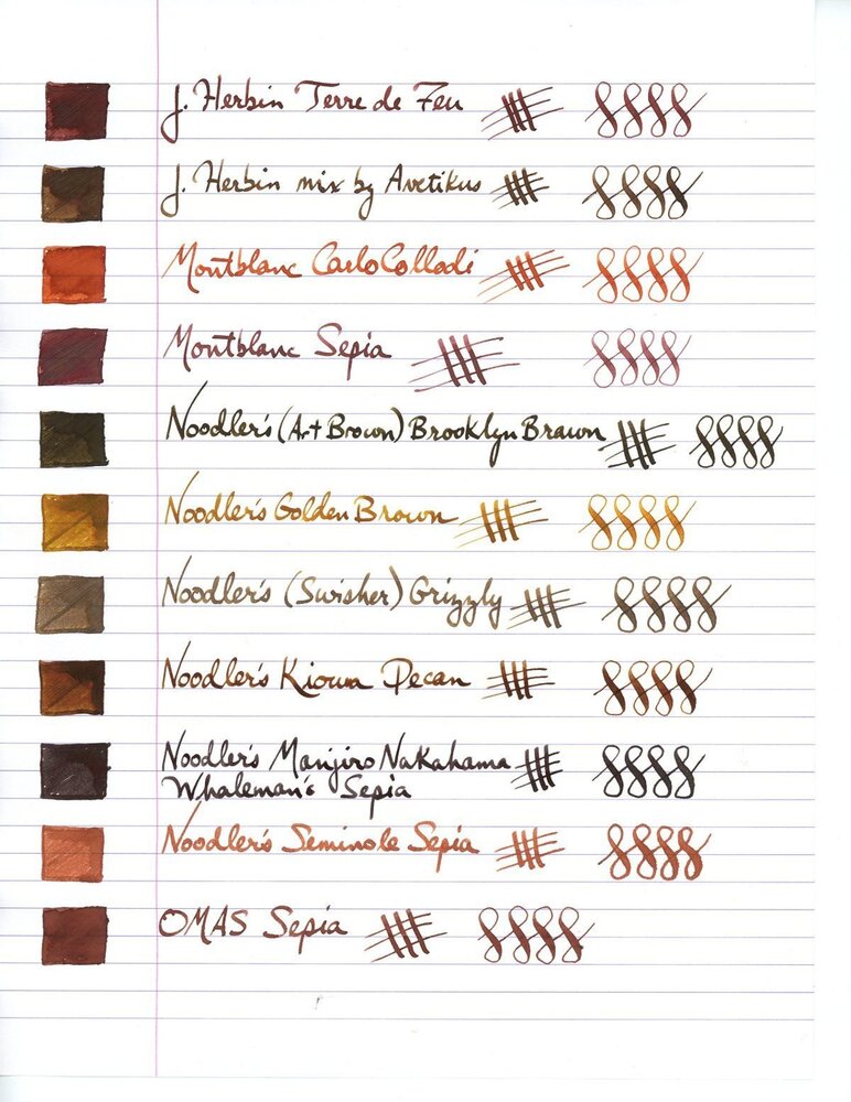
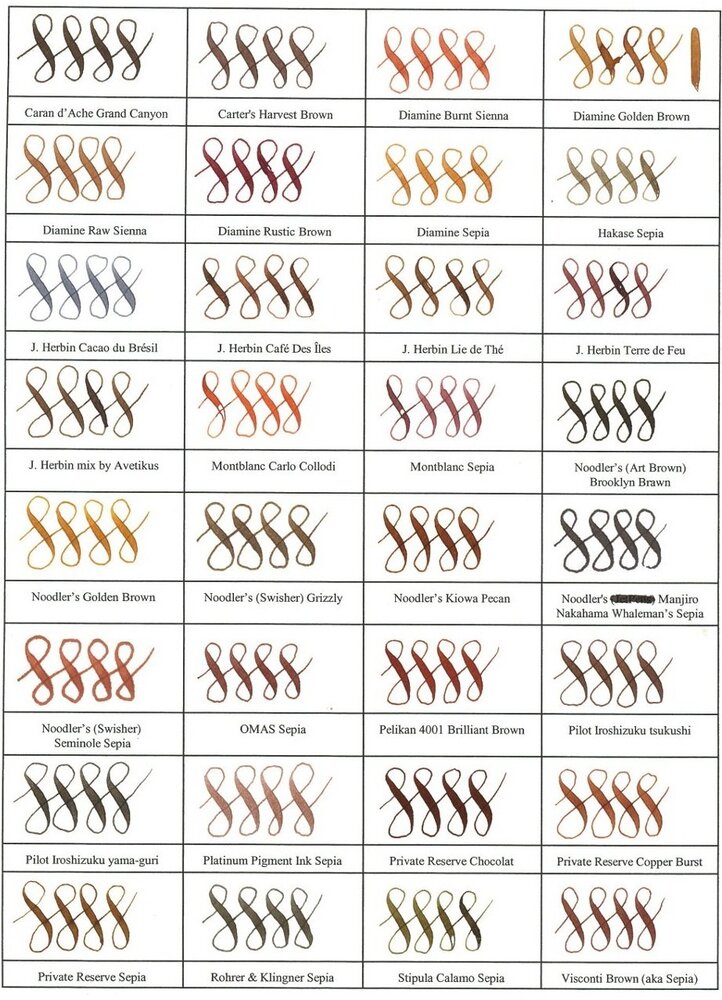
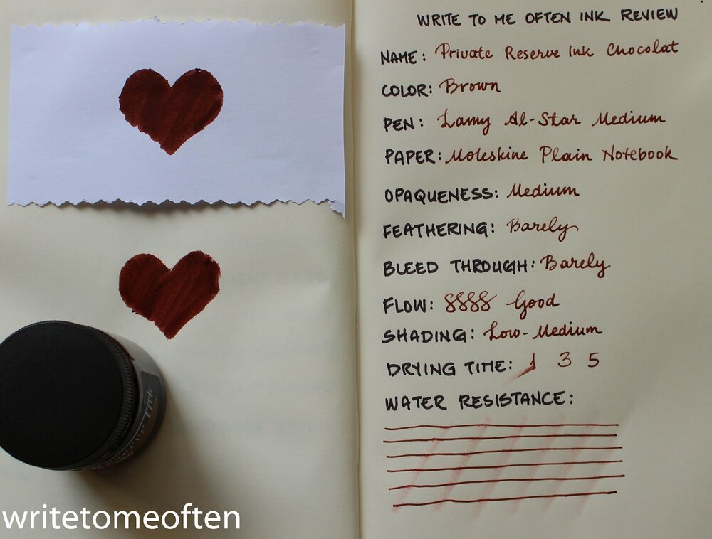
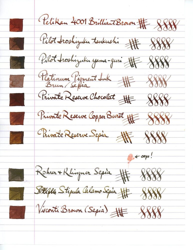
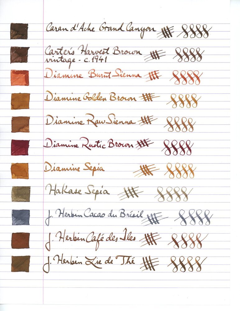
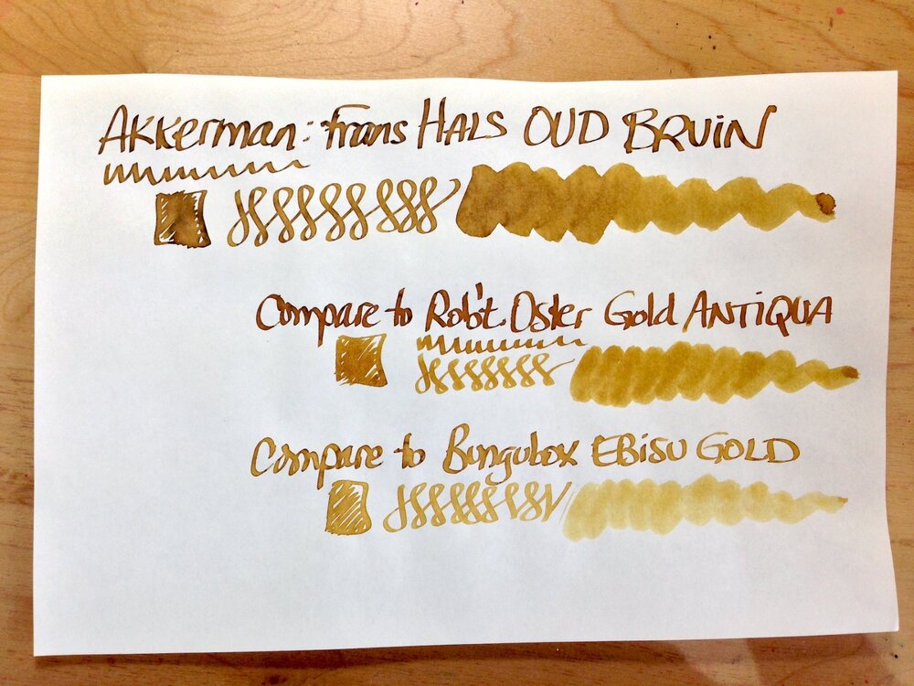
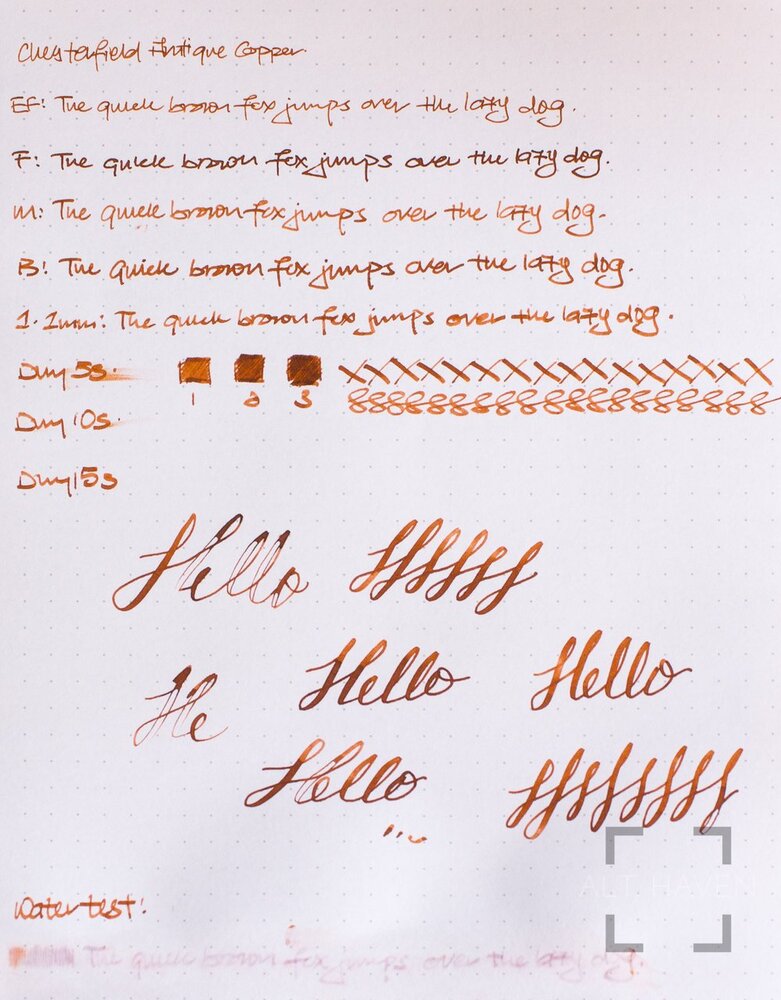
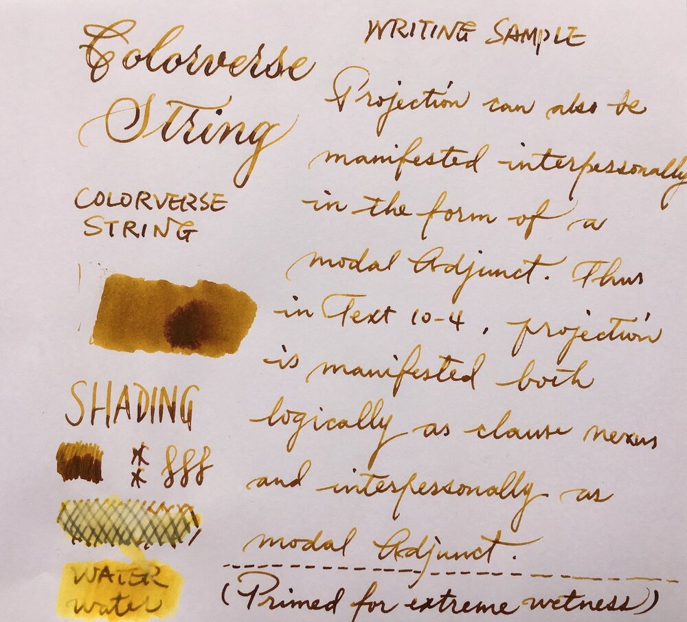
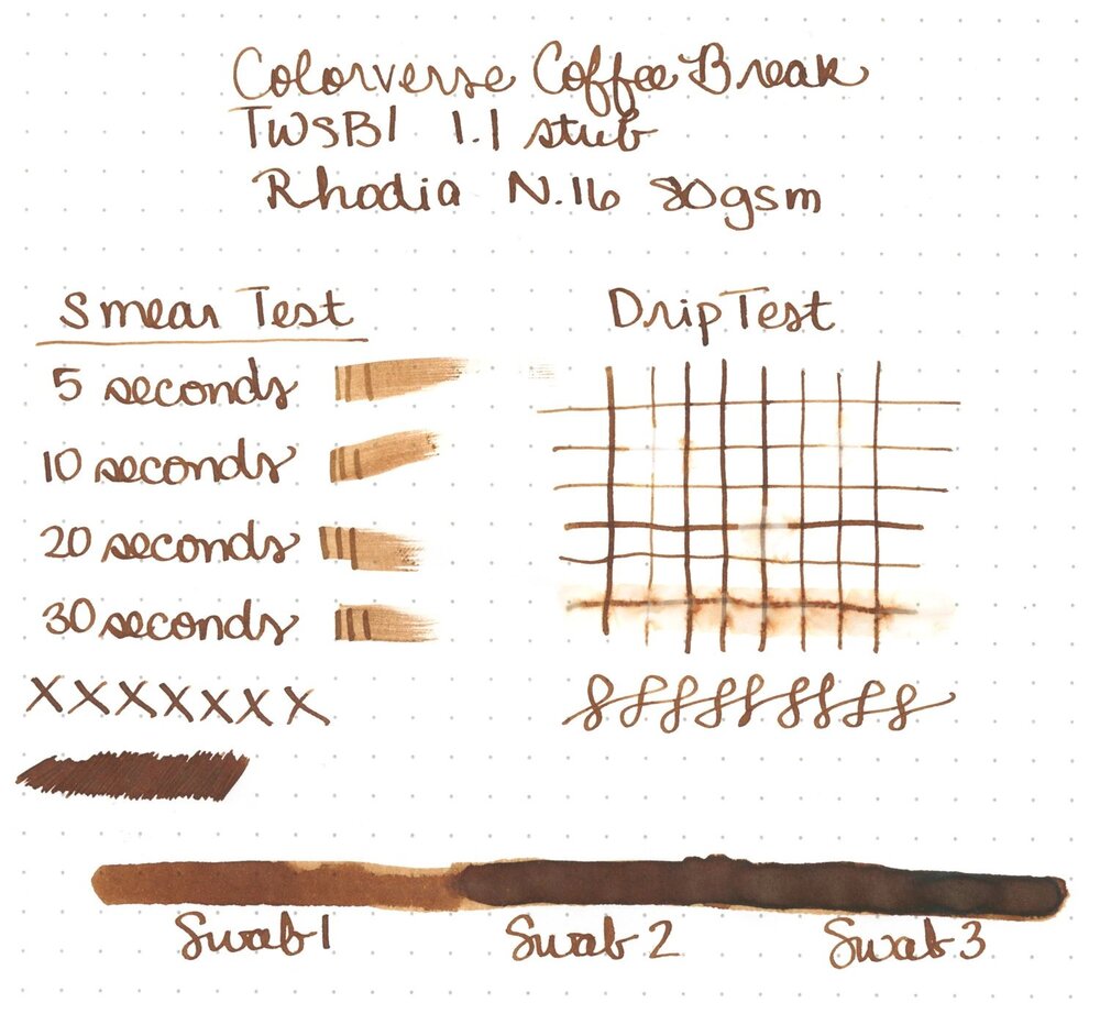
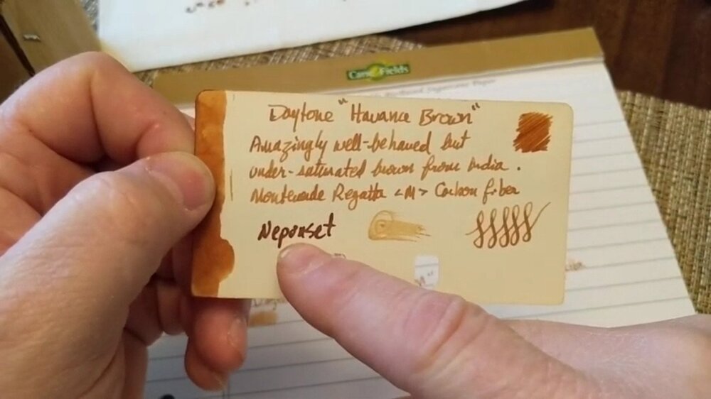
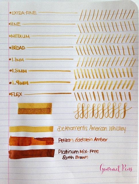
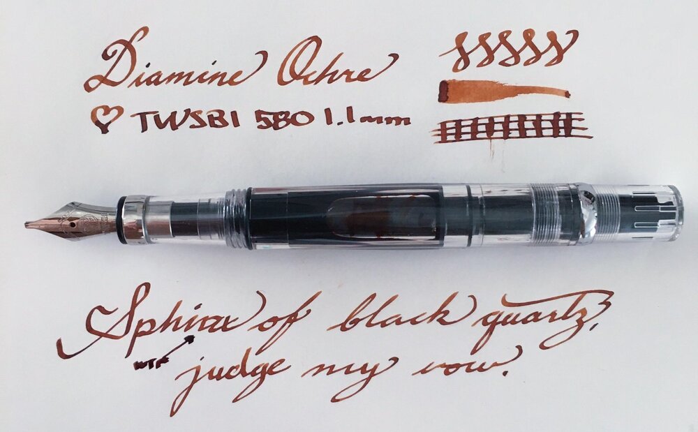
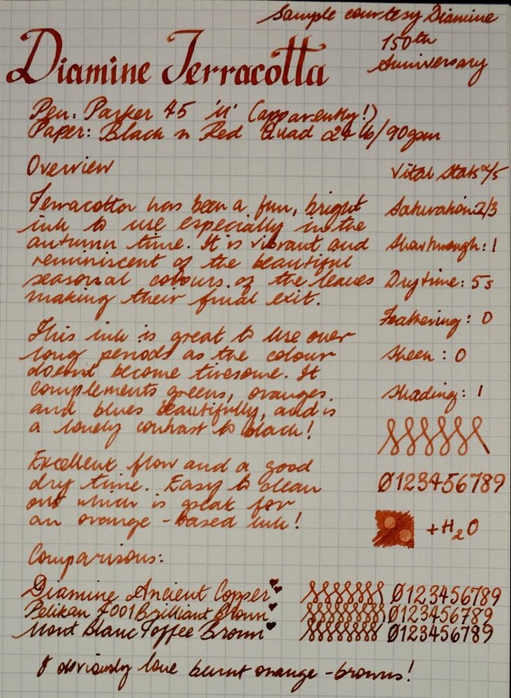
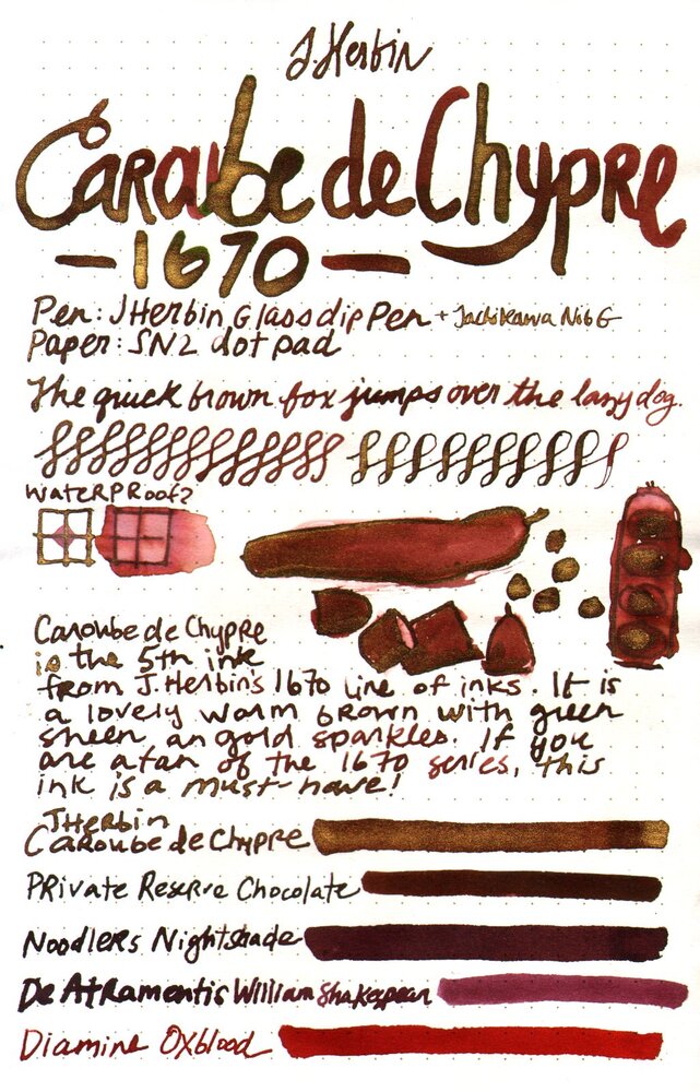
This collection has been made in an intensive attempt to find the most ideal and complete shades of brown color fountain pen inks over the internet and as long as writing with a medium size fountain pen is what I'm concerned of, the "infinity symbol" on a regular paper is the thing I've considered saving these samples. I've also benchmarked the index card samples for those which were not available in infinity sample. All the top-rated fountain pen inks – even those which are not mentioned here probably for the lack of a quality brown ink – have been taken into account. ~ Here's the list ~ Akkerman Hals Oud Bruin Akkerman SBRE Brown Chesterfield Antique Copper Colorverse #25 String Colorverse Coffee Break Daytone Havana Brown De Atramentis American Whisky Brown Gold De Atramentis Havanna De Atramentis Scottish Whiskey Diamine Ancient Copper Diamine Chocolate Brown Diamine Desert Burst Diamine Golden Brown, Carter's Harvest Brown, Diamine Raw Sienna Diamine Ochre Diamine Terracotta Diamine Tobacco Sunburst Faber Castell Hazelnut Brown J. Herbin Café Des Iles J. Herbin Caroube De Chypre J. Herbin Lie de The J. Herbin Terre d'Ombre KWZ Honey KWZ Iron-gall Aztec Gold KWZ Iron-gall Mandarin (Corrected Version) KWZ Old Gold L'Artisan Pastellier Callifolio Cannelle Leonardo Sepia Classico Monteverde Copper Noir Monteverde Joy Sepia Monteverde Scotch Brown Noodler's Golden Brown Noodler's Kiowa Pecan OMAS Sepia Private Reserve Chocolate Private Reserve Copper Burst Private Reserve Sepia Robert Oster African Gold Robert Oster Antelope Canyon Robert Oster Caffe Crema Robert Oster Gold Antique Robert Oster Toffee Sailor Kobe #22 Shinkaichi Gold Sailor Storia Lion Light Brown Scribo Classico Seppia Standardgraph Maisgelb by @lgsoltek Taccia Tsuchi Golden Wheat Vinta Heritage Brown Vinta La Paz Diplomat Caramel Krishna Bronze Leaf, Krishna Yellow Valley L'Artisan Pastellier Callifolio Anahuac L'Artisan Pastellier Callifolio Itzamna L'Artisan Pastellier Encre Classique Ocre Jaune Maruzen Athena Kinkan PenBBS #135 Beijing PenBBS #269 45th POTUS PenBBS #504 Vernal Equinox Platinum Mix-Free Earth Brown Taccia Ukiyo-e Hokusai Benitsuchi Tono & Lims Kela Nuts Vinta Terracotta Vinta Ochre Note: the absorption of the ink to the paper could vary. Before purchasing any of the inks above be aware some of them are dry while the others are wet. Plus, based on the fountain pen model and paper you use, the colors could look different. Make sure to use fountain pen inks only, otherwise your fountain pen will clog. Stay away from drawing, calligraphy, lawyer, and India inks. They are not designed for the fountain pens. Platinum and Sailor have some pigmented-based inks; avoid them. Take all these into account.
- 4 replies
-
- private reserve
- kwz
- (and 8 more)
-
This is a quick review of Robert Oster Purple Jazz. Robert Oster inks come in 50ml recyclable PET bottles manufactured in Australia's first carbon neutral plastics plant. They are hand made in Australia. A message from Robert Oster: My great interest in fountain pen inks and by extension inks that combine many creative applications began with the birth of my love of fountain pens in 1989. As Robert Oster Signature Inks are quite recent to the market, think of the interim between 1989 and today, as the fertile ground into which my present love of all things ink was seeded and grown. The contents and packaging of my Inks are all nature friendly and the colours a genuine inventory of the Australian palette. Robert Oster Signature originates from one of the most famous wine producing regions of the world, the Coonawarra district of South Australia, an idyllic setting with great influence on the senses. There is my inspiration. Its a joy to share it with you. I purchased a sample of one of the many Robert Oster colors (I've lost count) - Purple Jazz - from Anderson Pens, although Goulet Pens also sells them. I hate to break it to all of you purple fans - THIS IS NOT PURPLE! When I received this sample, loaded into a cleaned pen and wrote with it, I thought they had mislabeled the sample. So, I contacted Anderson Pens, sent them my ink swab and writing sample, and asked them if this was the right sample. They confirmed that it was. But, before you look at my scans and tell me my scanner is off, the color truly is more of a black-blue-green with some hint of purple-gray in there. This is written on Tomoe River paper: But wait, it doesn't stop there. Not only does this ink look a different color than what is described, it looks different on different papers! Cambridge Premium Spiral Bound Notebook Paper: Same pens, same ink, same time. Even though it isn't what I expected, I really like how this ink behaves. It writes very nicely in any pen that I put it in. I would love to get your opinion of this ink.
-
Robert Oster is new player in fountain pen ink market. He operates through ebay shop. The inks are sold in 50 ml PET bottles with a tightly secure twist cap. I don't know who makes the inks for the shop, but the colors look interesting and fresh. At the moment Robert Oster inks are available in colors Aqua Australian Sky Blue Barossa Grape Black Blue Black Blue Denim Blue Night Blue Sea Bondi Blue Burgundy Chocolate Claret Copper Brown Deep Sea Emerald Green Ever Green Fire Engine Red Forest Green Graphite Green Green Green Lime Green Olive Jade Khakhi Light Green Marine Moss Orange Peach Pinky Red Orange Royal Red Ruby Red School Blue Spearmint Torquay Tranquility Turquoise Yellow Sunset On Robert Oster's shop website Barossa Grape is described as follows: " Flows on like a Cab Sauv, dries on like a light Shiraz with excellent shading" I enjoy this ink although in some pens it looks boring. In order to fully enjoy it - given that you like such hues - broader or really wet nib would help. In old Waterman Drops of ink on kitchen towel Software ID Tomoe River, Kaweco Classic Sport - eyedropper, B Leuchtturm 1917, Kaweco Classic Sport - eyedropper, B Oxford, Kaweco Classic Sport, B + Hero 5028, stub 1,9 Poljet, Waterman Commando, semi-flex nib Mini-comparison
-
Robert Oster is new player in fountain pen ink market. He operates through ebay shop. The inks are sold in 50 ml PET bottles with a tightly secure twist cap. I don't know who makes the inks for the shop, but the colors look interesting and fresh. At the moment Robert Oster inks are available in colors Aqua Australian Sky Blue Barossa Grape Black Blue Black Blue Denim Blue Night Blue Sea Bondi Blue Burgundy Chocolate Claret Copper Brown Deep Sea Emerald Green Ever Green Fire Engine Red Forest Green Graphite Green Green Green Lime Green Olive Jade Khakhi Light Green Marine Moss Orange Peach Pinky Red Orange Royal Red Ruby Red School Blue Spearmint Torquay Tranquility Turquoise Yellow Sunset I received sixteen samples (marked in cursive) from well known ink enabler - Cyber6. Thank you Claudia You rock! On Robert Oster's shop website Bondi Blue is described as follows: "Bondi Blue ~ Aqua's love child. Flows on Blue, dries on like a summery Bondi Beach sea view.". I believe this one may be popular - for me however it's rather boring. The flow is good, it doesn't cause any bleedthrough or feathering and behaves well, also after few days spent in unused pen. Drops of ink on kitchen towel Software ID Tomoe River, Kaweco Classic Sport - eyedropper, B Leuchtturm 1917, Kaweco Classic Sport - eyedropper, B Oxford Comparison
-
In her amazing review of Robert Oster inks, Cyber6 mentioned that they are very wet. I prefer rather dry inks in most of my pens, but I really like a number of the Robert Oster Ink colors. So, can those of you who have actually written with Robert Oster Inks semi-quantify their wetness? Let's propose a 10-point scale of wetness. Say Waterman inks score 8, and Pelikan inks score 2. Where would Robert Oster inks fall on this scale? Thanks. David
-
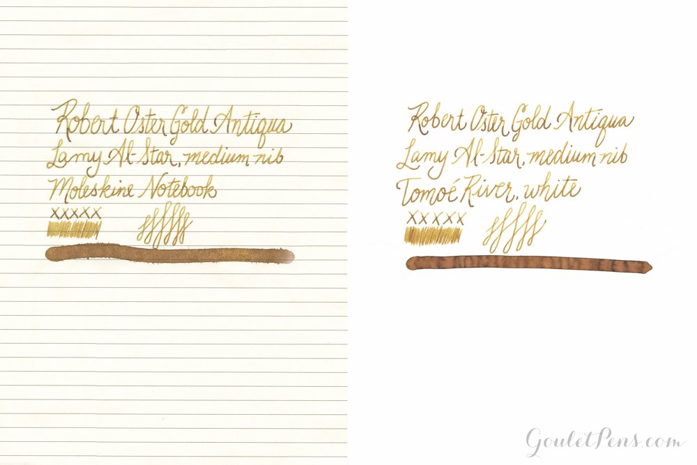
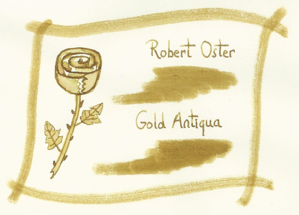
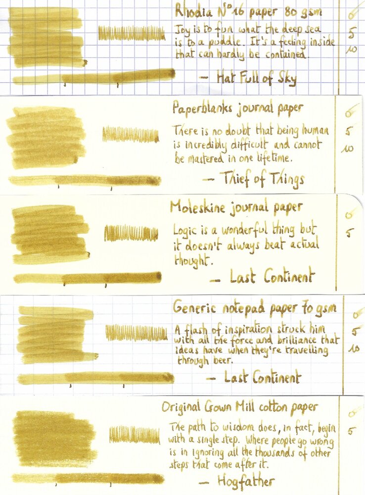
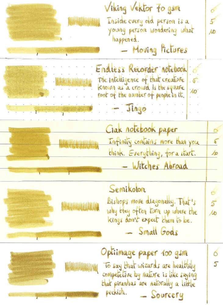
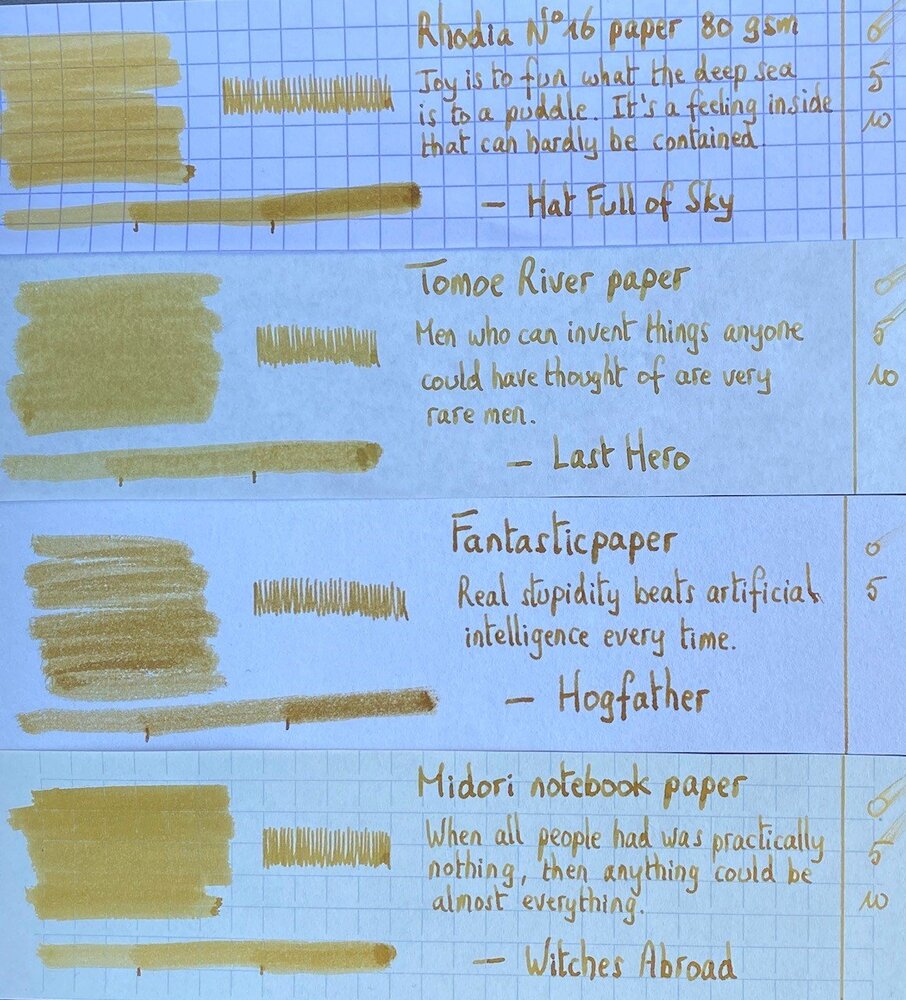
Robert Oster Signature - Gold Antiqua Robert Oster is an Australian ink maker that is well-known for its unique range of colours. On his website, he describes our shared love quite eloquently: “Robert Oster Signature originates from one of the most famous wine producing regions of the world, the Coonawarra district of South Australia, an idyllic setting with great influence on the senses. There is my inspiration. It’s a joy to share it with you.” Well, we are certainly fortunate to have inspiring ink makers like Robert Oster to satiate our thirst for glorious inks. In this review I take a closer look at Gold Antiqua – a yellow-gold-brown with a very pleasing appearance. Yellow-leaning inks often suffer from insufficient contrast with the paper, making them less suitable for writing. But this Gold Antiqua also leans towards brown, which enhances the contrast. As it turns out, this makes it a very pleasant-looking colour that looks great on paper. A playful ink for happy times. Gold Antiqua came to my attention through one of LizEF’s excellent Efnir video reviews. Turns out I had a small sample I received from Catherine of Sakura – just enough to give it a test drive. To show you the impact of saturation on the ink’s look & feel on paper, I made some scribbles on Tomoe River where I really saturated portions of the paper with ink. This gives you a good idea of what the ink is capable of in terms of colour range. As you can see, Gold Antiqua has a rather broad tonal range, with quite a bit of contrast between the light and dark parts. This translates to a strong shading ink. Like most Robert Oster inks there is zero water resistance. Short exposures to water completely obliterate the text, leaving next to nothing on the page. The chroma for this ink is definitely interesting, and shows some amazing complexity. I see a multitude of component dyes, that miraculously combine to form the ink’s golden glow. Master mixer at work! I’ve tested the ink on a wide variety of paper – from crappy Moleskine to high-end Tomoe River. On every small band of paper I show you: An ink swab, made with a cotton Q-tip 1-2-3 pass swab, to show increasing saturation An ink scribble made with an M-nib Lamy Safari fountain pen The name of the paper used, written with a B-nib Lamy Safari A small text sample, written with an M-nib Lamy Safari Origin of the quote, written with the B-nib Safari Drying times of the ink on the paper (with the M-nib Lamy) Gold Antiqua behaves well on most paper types. I didn’t notice any feathering, and only a tiny bit of show-through and bleed-through on the Moleskine. Drying times are quite low in the 5-second range with the Lamy Safari M-nib. The strong shading is very present on all papers, but a bit less pronounced on more yellow paper. The yellow paper seems to reduce the contrast between light and dark parts of the writing – the yellow background darkens up the light parts a bit. As a result, I personally like this ink best on the more yellow paper. I’ve also added a few photos to give another view on the ink. In the scanner samples above, the shading contrast in the written text is a bit exaggerated, making it look too harsh. The photos below show a more realistic view of the ink’s shading. Writing with different nib sizes The picture below shows the effect of nib sizes on the writing. All samples were written with a Lamy Safari, which is typically a dry pen. I also added a visiting pen: a wet-writing Lamy Dialog 3 with M-nib. I personally find the ink a bit weak in the EF/F nib – if you use fine nibs, you’re advised to use a wet pen (the dry-writing Safari is no good match). The ink is clearly a very heavy shader. Normally, I don’t like this, but with Gold Antiqua the interplay between light and dark gold works, and results in an interesting look. It makes for a great ink to use on greeting cards – my guess is it will look just stunning in a wet pen with a broad stub. Related inks To compare Gold Antiqua with related inks, I use my nine-grid format with the currently reviewed ink at the center. This format shows the name of related inks, a saturation sample, a 1-2-3 swab and a water resistance test – all in a very compact format. Inkxperiment – In Flanders Fields With every review, I try to create an interesting drawing using only the ink I’m working on. Limiting myself to one ink allows me to showcase its colour-range nuances. For me, this is the fun part of every ink review. Having only a 2.5 ml ink sample meant that I had to make every drop count. So I reused the Q-tips from the text-sample swabs to paint the drawing. I started with a 10x15 cm piece of HP photo paper, and used the Q-tips to draw the sky and Flanders Fields. A Q-tip with my last drop of pure Gold Antiqua was used for the sun. The trees and the accents in the field are added with the M/B nibbed Lamy Safari. Yellow inks are often amazing for drawing, and Gold Antiqua is no exception. This one is born for creating your own greeting cards. I enjoy the way it looks on the photo paper – add a “Happy New Year” and you’ve got a greeting card with a personal touch that beats any you can buy in stores. Conclusion Robert Oster Gold Antiqua truly is a beautiful golden ink, with good contrast on paper and very strong shading. Although I’m not in general a fan of strong-shading inks, this one manages to pull it off. A fine ink for personal correspondence or for use on greeting cards. I really liked this ink for drawing – it just looks amazing! A playful ink that I loved experimenting with. Technical test results on Rhodia N° 16 notepad paper, written with Lamy Safari, M-nib Back-side of writing samples on different paper types
- 5 replies
-
- robert oster
- gold antiqua
-
(and 2 more)
Tagged with:
-
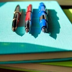
The New Five Star College Ruled Notebook
DrDebG posted a topic in Paper & Pen Paraphernalia Reviews and Articles
I am always hunting inexpensive notebooks or legal pads that are fountain pen friendly for my work. I have been, for the most part, disappointed by the cheap quality of the paper on most pads and notebooks for everyday use. Last night, I spotted a display of these "new" notebooks that boast a high quality paper that resists ink bleed. At $1.97 per notebook, I decided to purchase a couple. A Quick Review of the new Five Star Coillege Ruled Notebook by Acco Brands in A5-related size: This notebook is made in the U.S, and is Number 11231. It has a 2 subject divider and a colorful cover. The paper is a light weight, student quality and likely not archival. The overall feel of the paper is smooth, but has a slight amount of toothiness. The manufacturer indicates that the notebook "Lasts all year. Guranteed!", and contains reinforced storage pockets, water resistant cover and high quality paper, "which resists ink bleed with common student writing instruments such as pencil, ball point pens, gel pens, felt tip pens and markers". I decided to see how fountain pen ink would do. The pens, nibs and inks used in this test for feathering, bleedthrough and showthrough were: Montblanc 144, fine 18K gold nib: Sailor Kobe Ooji Cherry Namisu Nova, medium titanium nib: Montblanc Irish Green Conklin Duragraph, 1.1 stub nib: Midnight Blue ink creation of mine Franklin Christoph Panther, Matsuyama medium italic 14K semi-flex nib: DeAtramentis Aubergine Italix Captain's Commission, medium italic nib: Diamine Woodland Green Lamy Studio, fine 18K gold nib: Akkermann #14 Purple Lamy 2000, medium 18K gold nib: Sailor Nioi Sumire Lamy LX, medium nib: Robert Oster Australian Mauve Opal Delta Capri Marina, broad fusion nib: GvFC Deep Sea Green Lamy Safari, broad nib: Diamine Bilberry Lamy Safari, medium nib: Robert Oster River of Fire Lamy Al-Star, fine nib: Robert Oster Tranquility Lamy Safari, fine nib: Cross Violet Custom made, fine 18k nib: Robert Oster Green Diamond Delta Horsepower, 1.1 stub fusion nib: DeAtramentis Robert Louis Stevenson Jinhao 450, Goulet 1.1 stub nib: DeAtramentis Edgar Allen Poe The following are printer scans of the inks tested on the paper. The image quality is not the best, but it should give you some idea. Note that the pink/red/purple colors seem "fuzzy". This is the result of my printer scanner, not the ink feathering. Page 1: Page 2: Feathering/Spreading: Overall there was minimal feathering. Those which did have some feathering included those inks which came from stub or broad nibs. Almost all fine or medium nibs showed little to no feathering. Bleedthrough: There was no bleedthrough, except with my very wet Italix Captain's Commission with Diamine Woodland Green,there were a few tiny spots where the ink was just beginning to bleed. Showthrough: Almost all of the fine and medium point nibs did not show through. The exception is my Namisu Nova which has an exceptionally wet medium titanium nib, and Lamy Safari medium nib with the very wet Robert Oster River of Fire ink. Almost all of the broad and stub nibs did showthrough, with the exception of Conklin Duragraph because the ink is fairly light in color, and surprisingly the Delta Capri Marina with a very wet broad nib filled with GvFC Deep Sea Green. Overall, I am very impressed with these little notebooks. I would recommend these to any student who uses fountain pens, particularly with fine and medium nibs. And with the black or dark blue cover, this would be acceptable for professional use as well as long as your use is non-archival.- 11 replies
-
- notebook paper
- five star
-
(and 8 more)
Tagged with:
-
Fountain Pen Ink Is The Perfect Match For The Rhodia Touch Pen And Inkwash Book
NickiStew posted a topic in The Write Stuff
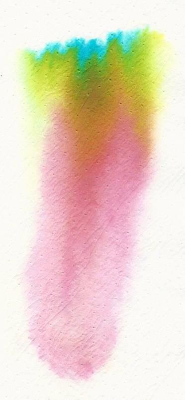
I have recently been testing some of the Rhodia Touch products. Until now, the products tested just couldn’t fully cope with fountain pen ink art with bleed through being an issue... until now! The Rhodia Ink and Wash book is just a delight. See what you think. Ink used is Robert Oster Australian Opal Mauve. Amazing chromatography, no show through, no bleed through and silky smooth for writing! Incredible!












.thumb.jpg.d05b6f268f070b332881eb2dc538b0e5.jpg)
