Search the Community
Showing results for tags 'review'.
-

comparison COMPARISON: Platinum Curidas vs Lanbitou 3088
donnweinberg posted a topic in Fountain Pen Reviews
This is a review and comparison of competing brands of essentially the same fountain pen -- the Platinum Curidas and the Lanbitou 3088. After Platinum began selling its relatively recent Curidas model in 5 transparent colors, the Chinese pen maker, Lanbitou, came out with it's version of the Curidas, which Lanbitou designated the "3088." In virtually all respects, except the badging, the two brands offer identical pens. The biggest difference is the retail pricing; the Curidas sports an SRP of $90, but the 3088 can be purchased within a range, in USD, of around $9 and a bit more. The question is whether the Curidas is 10-times better than the 3088. It is not. In fact, in my estimation, the two pens are so comparable in appearance, build quality, and performance that the 3088 is the much better value. However, the 3088's resale value, if you try to sell one, will be much less than that of the Curidas, primarily because the Curidas is a Platinum product. I recently purchased all 12 color options of the 3088, but will compare its transparent teal version with the transparent teal version of the Curidas. Notwithstanding the color variation in the first two photos, in fact the color of each pen is virtually the same, and I would describe it as a greenish-blue or teal. Held to the light, it appears that the Curidas' color is a bit more saturated than that of the 3088. The third photo of the middle-inside of each pen is provided to show one (surprising?) difference between the pens. Notice that the Curidas has a plastic sleeve over its converter, while the less-expensive 3088 has a metal (brass? copper?) sleeve in the same location. Perhaps the metal on the 3088 accounts for the 1 g weight difference. Other than that difference, the pens work exactly the same inside in terms of filling by converter. Here are some objective comparisons: Weight empty: Curidas 24 g ; 3088 25 g. Weight after filling, expelling air and filling twice: Curidas 28 g ; 3088 26 g ; did the 3088's converter not work as well as the Curidas'? Length: exactly the same -- approximately 5 7/8 inches. (Sorry to mix metric and English systems) After filling each pen, each with a fine nib, each wrote immediately. The Curidas writes a bit wetter-thicker than the 3088. There is no question in my mind that the Curidas' fine stainless steel nib has more give (albeit limited) and feels better than that of the 3088, the nib of which is extremely firm and perhaps nail-like. When clicking the button to hide the nib, the Curidas manifested some hesitation (even after I removed and returned its spring), but did close, whereas the 3088 clicked closed immediately. If price is no object, I prefer the Curidas for its slightly more saturated color, its better-feeling nib, and its higher market value. However, for those not concerned with market value and slight color saturation difference, the 3088 is a superior value by far. As I mentioned earlier, I purchased one of each of the 12 colors of the 3088. In addition to the four transparent colors (whereas the Curidas offers five transparent colors, also including a true blue), the 3088 offers 8 solid colors (not offered at all in the Curidas line). The Curidas transparent colors offered are: clear, grey, red, teal, and blue. The 3088 transparent colors offered are: clear, grey, red, and teal (why not blue?). The 3088 solid colors offered are: black, grey, white, blue, red, pink, cocoa, and light green. I purchased my twelve 3088s on Ebay from a seller who shipped for free. When I checked today on Ebay about pricing, it appeared that the price of the 3088s increased, but that impression may have been mistaken. I noticed that just about every Ebay seller of the 3088s from China "advertised" a lower price than actually is charged when one "selects" the color and nib (either EF or F), which is disturbing; one cannot actually find the pen with the advertised price. On the other hand, the real price was so inexpensive for what I got that I didn't quibble.
-

twsbi TWSBI Precision RT 0.7 mm first impressions
jthole posted a topic in It Writes, But It Is Not A Fountain Pen ....
There are several video and text reviews online already for the TWSBI Precision mechanical pencil (no lead hardness indicator, so would it be a drafting pencil?), and I am not going to add another one. But here are my first impressions of the pencil, after a few days of ownership. In those days, I have used the pencil mainly for notes taking and drawing simple diagrams. And to be fair, that's all I need from a pencil anyway. I bought my TWSBI Precision online, from a Netherlands shop (Fontoplumo), partly because it looks different from the Rotring 600 and less common. You may also call it curiosity. Of course the retractable tip was a big plus as well. It's available in silver and black, in 0.5 and 0.7 mm, with a fixed or retractable tip for the same price. Unfortunately there's no 0.9 or 1.0 mm, otherwise I probably would have chosen that one. I have a strong preference for black or dark colored pencils and pens, so that was an easy choice. Like I said, the pencil arrived a couple of days ago. As already mentioned in the various reviews online, it comes in a plastic box, which also contains a generous amount of extra lead and erasers. Since then I have used it daily at work. To get to the essentials, here are my impressions of the pencil so far (TWSBI Precision RT 0.7 mm in black). Positives: The pencil is very nicely balanced, with the center of gravity approximately in the middle of the pencil (a bit in front of the first dash). This version has a retractable tip, and both versions (fixed and retractable) are sold for the same price. Retracting the tip takes some force, but can be done against my finger. The TWSBI Precision has a large eraser, and comes with extra erasers. That's a nice gesture, even if I prefer using a dedicated eraser. There also is a tube with ten extra leads included, plus two additional leads inside the pencil itself. The quality of the black paint is excellent, without any blemishes. Of course I cannot say anything about the durability yet. There were complaints online about frequent lead breakage when using the eraser; I have not noticed anything yet, despite using the eraser a few times. Neutral: Despite the nice balance, this is still a heavy pencil with 25 gr. That makes it a bit heavier than a Rotring 600 and about the same as a Rotring Rapid Pro. The supplied leads (HB?) are good and write with a dark line, but there is no information about the manufacturer (unless TWSBI produces them themselves). There's no lead grade indicator. It's not a big issue for me, since I don't plan to buy multiple TWSBI pencils anyway (I have multiple Rotring 500s, so there it is important to me). Negatives: The black paint isn't as matte as on a Rotring 600, and the chrome parts are fingerprint magnets. I would have preferred a black or brushed clip. The knurling looks nice, but it is less grippy than I prefer. The pencil doesn't stick to my fingers like for instance the Rotring Rapid Pro does. I am not a big fan of the clip. It's too stiff and the underside is not flat. In general, I really like the pencil. It's different in appearance and feel from the Rotring 600 (so if you expect a Rotring copy, you will be disappointed). TWSBI did most things right, in my opinion, and this is a great pencil to have always packed in my laptop bag.
-
Nice, well behaved, ink from Diamine. Well lubricating, vivid blue-green closer to the green end of the spectrum. The significantly compressed scan is showing a greener and lighter tinge than it is. E.g. the Ku-Jaku comparison I have shows up bluer than on the scan.
-
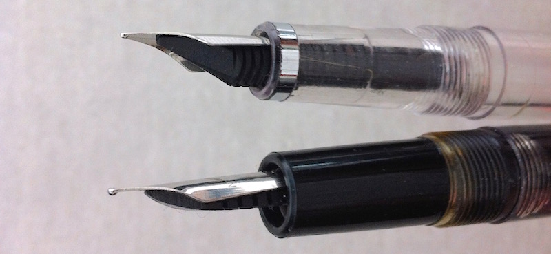
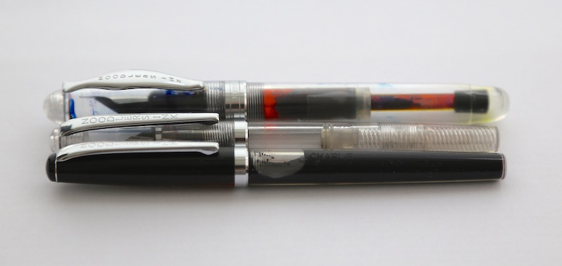
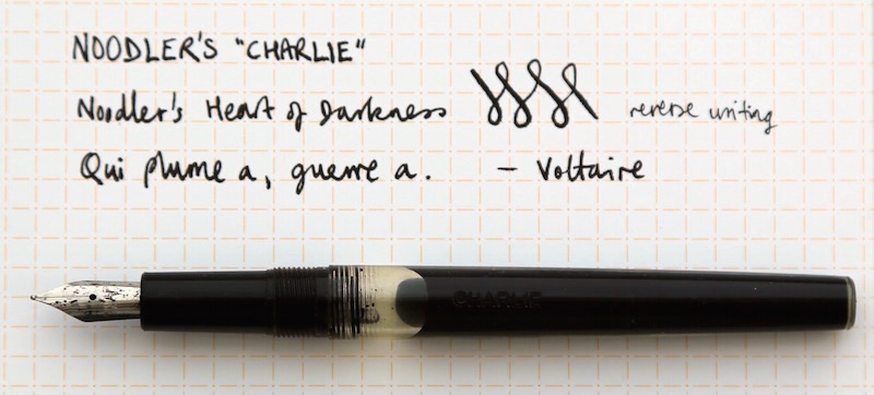
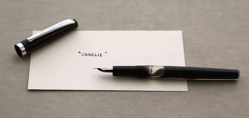
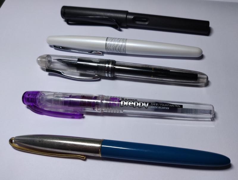
My first attempt at a pen review. Comments and suggestions for improvement gratefully received. ----- Noodler’s 'Charlie' is a free eyedropper pen that comes with the 4.5 oz size of Noodler’s Heart of Darkness - and now also with FPN Voltaire Candide Vermilion. These are my impressions after using them together for about a month. BACKGROUND The free pen with Heart of Darkness used to be an eyedropper-converted Platinum Preppy. As Nathan Tardif of Noodler’s Ink explains, the Charlie pen is a response to the events in Paris in January 2015 - his way of saying ‘Je suis Charlie’, or at least ‘Ce stylo est Charlie’. https://www.youtube.com/watch?v=G-FpVSf8udI I missed out on the first batch of 140 Charlies, which sold out quickly. In some ways, being neither a satirical writer nor a cartoonist, I felt unqualified to take up that torch. But as soon as Goulet Pens (no affiliation, happy customer) got a second batch in stock around mid-May, I put in an order. FIRST IMPRESSIONS Charlie is a light, slim pen, similar in size, shape and materials to a Noodler’s Creaper. It feels comfortable and solid. The screw cap (mine is black with muted red-brown streaks that are hard to photograph) is interchangeable with a Creaper cap. Creaper above, Charlie below. The clear barrel, which is perhaps a touch softer than a Creaper’s, has NOODLERS INK CO stamped into one side and CHARLIE on the other. I think the absence of the ‘CHARLIE’ imprint on the barrel identifies a pen from the first production run. Uncapping the pen reveals a black section and a friction-fit steel nib with an ebonite feed and a classic profile. It looks like it might be possible to swap a Creaper nib and feed into the Charlie. Nib and section: Creaper above, Charlie below. Approximate dimensions (ruler and kitchen scale) Length: capped 132 mm, uncapped 118 mm, posted 138 mm Section diameter: 9 mm Inked weight: capped 12 g, uncapped 9 g Size comparison: (top to bottom) Ahab, Creaper, Charlie WRITING EXPERIENCE Before filling I pulled and cleaned the nib and feed to remove any manufacturing residues, as recommended for Noodler’s pens. The internal threads of the barrel are pre-greased. When filled to just below the threads, the barrel holds about 2.5 ml of ink. After filling, the pen wrote on the first touch - no hesitation or skipping. Inked with Heart of Darkness, the smooth non-flex nib produces a fine, wettish, and very black line. Reverse writing yields a finer, drier, but no less black line. It was briefly a hard starter after a couple of days nib-up in a pen cup. Loosening the section a half turn and then tightening it again primed the feed and restored normal flow. Writing sample on Nock index card. CLOSING OBSERVATIONS After a month using Charlie, I have only a few minor issues: - The ink reservoir seems to run down faster than I use it. The same is true of all my Noodler’s pens. Something about the permeability to air of vegetal resin compared to other plastics? - Because the cap posts deeply, any ink in the cap gets on the barrel and then on my hands. (I don't usually post but discovered this when measuring the posted length.) - The cap threads bind slightly, as on other Noodler’s pens. Quibbles aside, I like Charlie very much. I like its looks, the way it writes, and what it stands for. There is something attractive about a straightforward pen with a huge supply of indelible ink. Only the thought of all that ink getting loose in a bag or pocket stops me using it, or any eyedropper, as a carry pen. But that could change. As for Heart of Darkness, I don’t yet know if it will become my standard black. I like it well enough that I shall be using it a lot in Charlie (and other pens) - and not just because I have a lot of it. With many pens, aesthetics, fine materials, heritage - even price - inform the writing experience. Because it is functional, unadorned and free, Noodler’s Charlie removes these from consideration. There is almost nothing to distract from the essential function of putting ink on paper to fix your thoughts for posterity, or until you get to the supermarket. (I say ‘almost nothing’ because any transparent container of ink is quite distracting to me.) Whether you write and draw to advance free speech and great ideas, or for less exalted reasons, Charlie is an enjoyable little pen. Noodler’s Charlie Design: classic, open nib Options: random cap swirls, otherwise none Filling system: eyedropper only Nib: steel Feed: ebonite Body material: vegetal resin Pros free (with 4.5 oz bottle of Heart of Darkness or FPN Voltaire Candide Vermilion) smooth writer large capacity small and light posts securely feels sturdy Cons smells a bit (doesn’t bother me) too small and light for some Hommage à Tardif.
-
-
James Purdey & Sons Single Malt scented ink was released in 2018 by Montblanc as part of a series in collaboration with James A. Purdey, a gunmaker and hunting lifestyle brand. The ink surprised me! Single malt scented ink sounded at first like a (overpriced) gimmick and to some extend it is of course. But the color is a deep, beautiful orange-brown with amazing shading. Definitely a fall color which can be used in both a business environment (note taking) as well as for personal writing and correspondence. Be careful though, when opening the bottle or the pen cap the whisky scent is quite strong. It might be frowned upon at 830am when the meeting starts... The scent fades quickly though, within minutes. After 20-30 minutes the smell of the paper itself always wins. The ink behaves like most Montblanc inks I own. Perfect behavior in a broad, wide nib. A bit dry and with a strong dislike for TWSBI pens. The shading is wonderful, no feathering, and no show-through. Drying time is well below average at roughly 22 seconds. As can be seen, the ink doesn't really appreciate water. This ink is the most bright, orange-brown ink I have. SBRE brown (P.W. Akkerman) is not far off, Comte de l'Or (produced by Diamine) is much more gold (of course), Herbin's café des Îles and Caroube de Chypre have far less orange in them and are a more true brown. The ink will definitely gain some attention in the office, but I will use it for a while. I really like it. N.B. Review written on Original Crown Mill Vellum paper
-
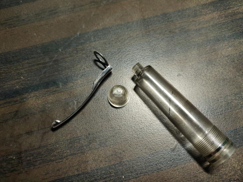
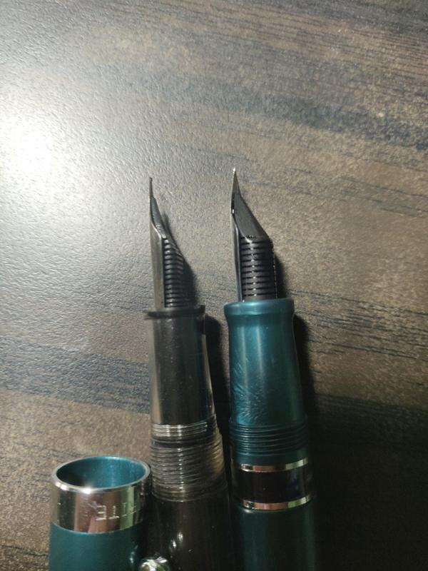
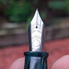
Let's talk about a pen which is seldom mentioned here (or anywhere else for that matter...). The Gate City Belmont Syringe Filler. 1. Appearance & Design (9/10) This is the caribbean version, which looks pretty amazing, under my lamp the material sparkles like metal flake paint on cars (I tried to capture that in the first photo following this paragraph), the material is resin as far as I can tell. The pen tapers towards the end of the filler cap and the section, with the biggest circumference at the thread of the filling 'mechanism'. The ink chamber is translucent with a slightly blue/turquoise hue. It has a black section and a two-tone steel nib (it's possible to order the pen with a gold nib) and a pretty big cap with some engraved text on it. All in all, a pretty looking pen. Three things which bother me: The threads at both ends of the ink chamber look somewhat rough, the cap is build from two parts and I don't like the seam between them and finally the clip, which is too small for the cap and looks like a joke. ] 2. Construction & Quality (6/10) Not sure if I wanna go down even further to 5 points. This is a 160,- US $ pen and it just doesn't feel the part. The whole thing and its components feel flimsy. There was glue (or pretty old silicone grease) at the threads, making the thing feel sticky. Nib wasn't correctly aligned to the feed and now for the thing which drives me nuts: The filler cap sits slightly askew on the barrel (see photo below), I can feel a ridge with my thumb. Maybe this is because I'm German and precision craftsmanship is something we germans like very much, but I could rant for hours about this... Addendum: For folks who think a Ford Lightning pickup truck is nicely build, this won't be a problem, you can add 2 points to the score... 3. Weight & Dimensions (8/10) Not much to say, it's light (that's nice, at least in my opinion) and a bit bigger than a Pelikan M200. For me (6'2 guy with small hands) this is the right size. It posts pretty well, if that's important for you. To add a bit more text to this paragraph I've made three photos of the box, as you can see the pen seems to be made by Bexley. 4. Nib & Performance (9/10) Now for the important part: The nib is a two-tone steel nib and it would look nice if there was just a Bexley-logo and not this big, ugly "Iridium Point Germany" text... This was a broad, which Richard transformed into a 0.8 stub nib. After aligning the feed and a bit of writing it skipped, a lot. After some extreme flushing/cleaning/scrubbing/cursing this was solved and now the pen writes as it should. The line is easily as wide as my Lamy 1.1 and shows nice variation. I've ordered a 6/10 wetness (Richards default wetness) and the pen lays down beautiful wet lines. It's smooth and writes with minimal feedback, but it's not as smooth as my TWSBI 1.5 stub, which glides without any feedback at all. 5. Filling system & Maintenance (9/10) System or mechanism is a big word for something which is essentially a simple syringe. Unscrew the filler cap and you can move the plunger up and down. That's it... Great for fast flushing and it holds a ton of ink, around 1.8ml! If you are into nifty filling systems, buy a piston or vacuum filler, this here is easy, fast, reliable and pretty simple. Everything can be disassembled for cleaning and re-greasing. Nib and feed are friction fit and pull out easily. I would give it 10 out of 10, but there's a thread insert which holds the plunger and is screwed into the ink chamber. The filler cap also attaches to that insert and the thing is pretty difficult to remove. If this could be unscrewed with -let's say- a TWSBI wrench, this would be pretty close to perfect... 6. Cost & Value (7/10) It looks really nice, I love how it sparkles in bright light, it writes really well and it's a syringe filler, which is something you don't see that much. But it's also a pen with a very simple filling mechanism, mediocre build quality, average materials and an ugly steel nib to put it very bluntly. I know that Bexley isn't the biggest manufacturer and that I shouldn't compare it to mass production pens, but in the end a 60,- $ TWSBI seems the much better deal than the 160,- $ Belmont. 7. Conclusion (48/60) I'm sure that in some parts this review sounds like I hate the thing. But no, I like it, really! It looks really great, it's a great writer and the filling system is special (even if it's as simple as it gets). I'm disappointed with the quality, I've expected something that was built like a tank but I've got a paper plane...made out of thin paper... I hope this was useful to some of you and if you have questions/unsolicited criticism/useful info/bitter rants/etc. please voice them below
-
SCRIBO FEEL I should begin this review by acknowledging the elephant in the room; I was (and still am) an Omas fan. There are two aspects of Omas that I really enjoy. The first, most practical, is the nibs. They are truly in a class of their own, right up with custom work I’ve had the pleasure to receive from Oxonian. They just suit my hand and my writing “style.” The second aspect is the relatively small company behind them. I never really got into the fancy pens produced during the LVMH years, though I understand why a small company had to make the decisions it did. But Omas always produced a line of relatively affordable and beautifully crafted pens. So when considering what might make for a “new Omas” I was looking for great nibs and the sense of a small company/workshop; who doesn’t love the romance of a pen made by an atelier in Bologna, just round the corner from the oldest university in Europe? So it’s fair to say I have been a little hesitant to explore some of the claimants to the Omas crown. They either were producing different nibs or were aiming to create companies that would fill the same space in the market and allude to their Italian roots, sometimes when their claim to being related in any real way to Omas was perhaps a little thin. For example, I am not completely sure that simply using the same body materials really establishes a line of descent. Scribo (Scrittura Bolognese) was created by folk who actually worked at Omas. They claimed to be using the same nib manufacturing jigs used for Omas, and they certainly count as a small atelier. The central team is Luca, Elena, and Flaminia! Luca is an excellent, funny, and warm correspondent whom I knew slightly from Omas days, and so I decided to give their first production (as opposed to custom) pen a go. That pen is the Feel. I will not be referring to Omas again in this review (except for once). This review is an assessment of the first real product of a small shop in Italy, created by a new design and marketing team and, perhaps, destined to take its place among the legendary European manufacturers. I really like to support start-ups, so when the pen became available for purchase in Fall 2018 I held my breath and ordered two, one for myself and one for my long-suffering partner to acknowledge an anniversary and her patience. We received them early in December 2018 and saved opening them until 25 December. I really enjoyed the experience of opening the big white boxes. The packing was simple but lovely, and ALL RECYCLABLE! That’s wonderful. As you can see below, the pens come in a leather and fabric wrap. Now, usually I’m not a fan of such things, but this one has a sort of mediaeval vibe that I quite enjoy. There is room for two pens and a pocket for a cleaning cloth. I’m going to try slipping the back cover of a midori travel notebook into that pocket and see if I can make it up a handy travelling kit. My partner, for whom I will use the pseudonym Her Majesty (HM), thought that the experience of unwrapping her pen was “really luxurious.” I think this is absolutely accurate. Despite the simplicity of the packaging, there is a Mont Blanc-like satisfaction of unwrapping the pen. I’m not a big fan of MB as a brand, but they do make their pens feel special in a way I believe only Nakaya really match. Scribo is right up there in terms of the “this feels special” factor. I'm sorry for the photos, but I'm not Christof! Still, they do give a "real-world" feel for the pens :-) I’m not going to give ratings out of ten for the factors below, since they are really just a form of disguised subjectivity. But you’ll know what I think! ______________________________________________________________________ Appearance & Design The pen is available in two colour ways, and we received one of each. Mine is grey-blue with ruthenium trim, while HM’s is dark blue with rhodium trim. Both are very attractive, and we each prefer our own! The plating on both is flawless, with the ruthenium seeming perhaps a tone or two darker than I’ve seen it in other applications. The ruthenium works beautifully with the grey-blue, and the dark blue and rhodium is a classic combination. Both versions would work well in a professional environment, with the grey-blue being perhaps more quirky/designy in appearance. The pen, as should be obvious from the pictures, has two unusual design features. The first is the swells, giving it a Mae West sort of look. HM calls my PFMs Rita MacNeil after a well-endowed Canadian songstress, but considers the Feel much more like Claudia Cardinale- a compliment indeed! The curves have a practical purpose. The Feel is a big pen, about MB149 size (see comparison shot below, with a Parker 51 and M805). It does not feel too big in the hand though, because the section is narrow. The wide part of the barrel sits in the web of the thumb, and balance the pen very nicely. It’s an interesting and unusual approach. The other design feature is the facets, of which there are 12. They are rounded but obvious on the body and cap, and fall away to a gentle ridged effect on the section. They improve grip and angle unobtrusively. They also align from one end of the pen to the other, not an easy feat with 12 facets and two screw threads to get right. As seen in the photos, the cap finial has the Scribo logo (a quill) set into it. The cap does not post. The cap band says “SCRIBO Feel the writing” Overall, this is a lovely full-sized to large pen with lots of presence and terrific manufacturing standards. There is literally nothing to complain about here. Construction & Quality This is an expensive pen, so it’s fair to expect great construction and quality, and the Feel delivers. It’s not a super fancy pen, it hits the point where the curves of utility and luxury cross. My view is that it’s better put together than an M800 (or M1000 in strict terms of size) with better flow in the design and absolutely perfect execution. This pen really does feel special. I cannot see where a single corner has been cut. HM says that the pen gives the exact opposite feeling from renting a cheap car! Weight & Dimensions This is a big pen. Weight capped is 36g, and uncapped but full of ink it’s 21g (This is the same as a M800 posted, for easy reference). Length is 147mm capped, and around 136mm uncapped. Due to the design it’s surprisingly easy to handle. I’m not usually a fan of huge pens, but as dapprman says on his video, this one just seems to work very nicely. Nib & Performance This is where it all gets interesting. The Feel comes equipped with a very nice ebonite feed. I know the science that says it doesn’t make a difference, but I have to admit in my experience I’ve often perceived that it does. My Feel has an EF Flessibile (bearing the phrase “Feel the flex”) and HM’s has a regular F (“Feel the writing”). Both are very, very good nibs indeed. The flessible has a slightly wetter flow, and provides plenty of character to one’s writing without trying at all, even for those of us with a very light touch. The regular fine nib is a little drier but works extremely nicely. HM gets some line variation from this nib (it is a soft nib) but has less of a light touch than I do. This is where the final Omas reference comes in. It’s just unavoidable. These pens write just like my Omas when the Omas are properly set up. They have that indefinable feel of a “real” nib, not too smooth, not scratchy at all, but just the presence of the nib on the paper. They were both absolutely perfect out of the box, no baby bottom silliness or mis-aligned tines. If you told me these nibs were just back from a nibmeister, I would believe you. I’m really impressed. Line width is slightly thinner than Pelikan using the included ink sample, in my opinion. Fine is a good all around width a tiny bit thinner than a Lamy 2000 Fine, while ExtraFine is visibly thinner than a Pelikan M120 EF. To be honest, though, I’ve only used the included ink in the pen. It’s a cool misty grey-blue-black which is lovely, both vintage and ultra-modern, somehow. However, the nib widths should be treated with a slight pinch of salt since I don’t know how dry this ink is. I expect that nib widths will be consistent with Omas, if folks need a reliable reference. So which nib to choose? I’d say the EF is a great nib, and not at all temperamental. The regular Fine is a terrific nib with quite different characteristics. I don’t think you can really go wrong, it comes down to use. If you have a heavier hand, it might be too much for the flessibile, but you’ll see some nice variation from the regular nib and I suspect you won’t miss the flessibile. The top sample is the EF Flessibile, the bottom is the Fine Regular. You may note that HM and I do not spend our spare time in calligraphy classes . . . Filling System & Maintenance This is a really nice smooth piston. No problems whatsoever and a pleasure to use. Cost & Value These are not cheap pens, being €530 to those of us living outside Europe (just over $600US). But that tells us very little about value. For me, I feel (heh) they give good value. I got to know Luca a little better and felt that I was supporting a small scale start-up, and in return I got an excellent product with an outstanding writing experience. I can compare this with buying Nakayas and Pelikans. Nakaya produce pens for the same price (and way, way up) that feel more personalised, but the overall experience doesn’t give you a story, and they are part of a corporation. Pelikan M1000s are around €100 cheaper right now on Amazon.de, but again no story, and no personalisation at all. Taking these prices into account, my personal view is that the Feel hits a sweet spot where you are getting a great experience and a terrific, beautifully-made pen for a small price premium. For somebody like me, who enjoys a bit of “special-ness” in the tools of everyday life, and who is lucky enough to have the choice, this is an easy decision. Also worth noting-- a three year guarantee . . . Conclusion I really like this pen, and look forward to using it for years to come. The fact that HM has its sister in memory of a special event, and that it does feel like an artisanal product, just add to that. It is going to take me a couple of weeks to adjust to the size, but I’m up for the challenge. HM is very happy with hers, which makes me happier still. This is a terrific first pen for the general market, easily placing among the best European pens available, and suggesting that there really is a small new Italian company with all the history and values we associate with that beautiful part of the world. Thanks to the Scribo team for giving this venture a go, and good luck to them! Pros - Presentation is outstanding - The writing experience is superb - It’s a big, comfortable pen - Flawless construction and set-up Cons - It is expensive for a new brand - It may be too big for the smallest hands
-
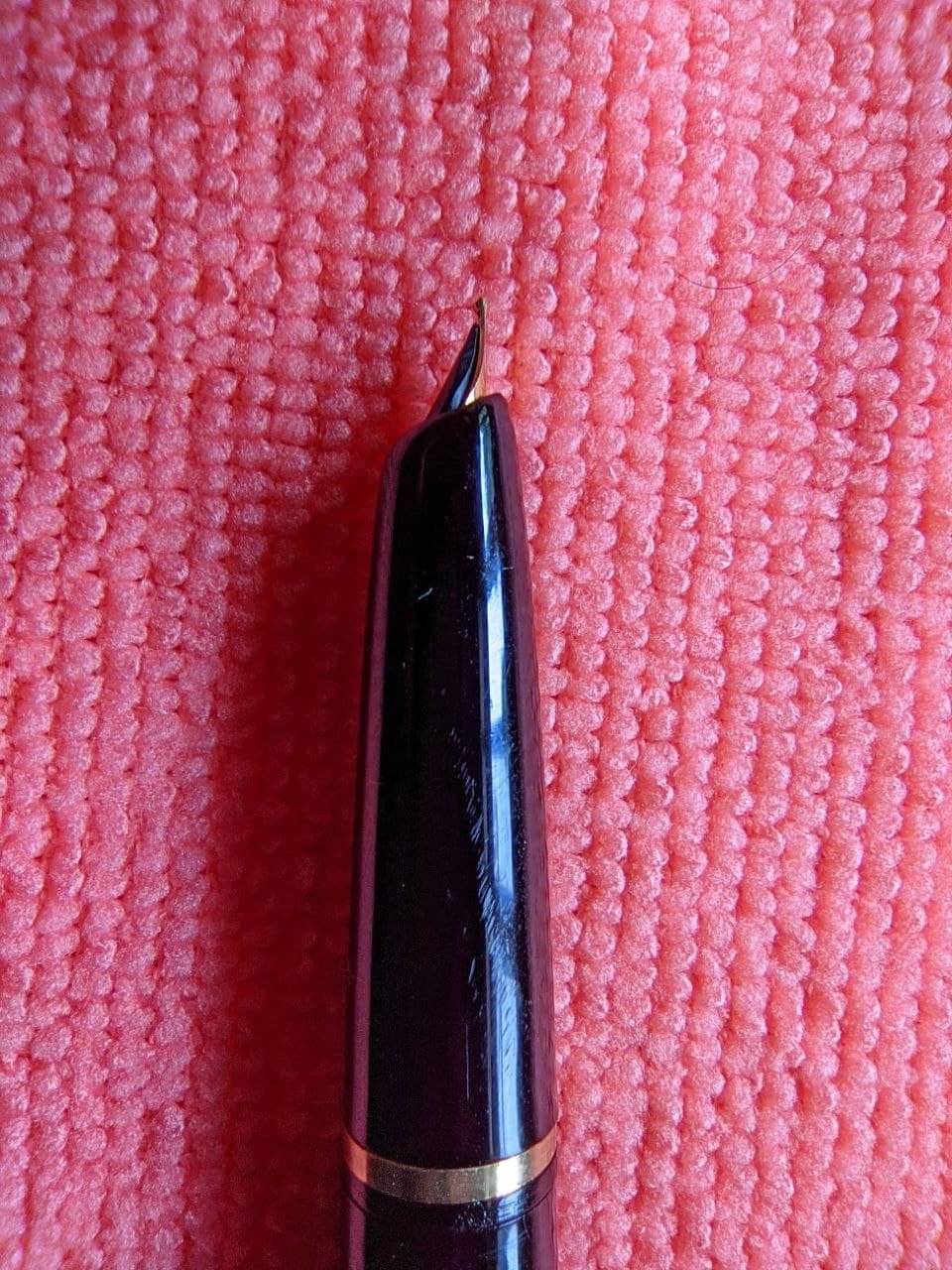
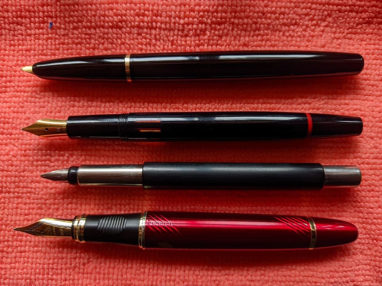
Kanwrite as a pen holds a special place for me, a pen that reignited my desire to look for Indian pens over staple of other well established FP manufacturers. Kanwrite in itself are not a small name from India in our little world of fountains but it certainly was big step for me to get this in my hand mostly due to lack of general awareness and issue of availability locally. As sad it is, the reality is most Indian markets are either dominated by cheapo china or full-blown Luxor. Quite ironic, in a place where so many masters of this craft of making a pen are hidden in plain sight, we get mostly whats rather pale imitation of same product in maybe better looking package. Thus is my title beginning of a journey to look again and broaden my view……...its been a couple of year since then but I only managed to get a desire for myself after a while almost a year ago to be exact. So I thought what better way to start a review on FPN with the pen that restarted it all for me. A small disclaimer; This is my first review so please do ask for anything I missed and apologies for mistakes upfront. Also my experience may differ from other fellow users so do share them would love to hear from everyone. Also pen has ink stains inside cos of using multiple permanent inks in a demonstrator as ED….yeah I know. This will be my take of desire with honest opinion after using for almost a year now and its long. Looks and design: The most subjective of all the aspects of anything so lets take it down first. The pen is classic cigar shaped with no surprises to go with. There is tapering at end but its practically negligible. Now color options are a lot really including 4 demonstrator, solids and marbles so there is something for everyone. The pen has a simple clip so no surprise here either. Its not ball ended as such there is no visible ball on end but the pen does has ball shaped tapering for easy slides in pocket and it works with no issues no complain here and I in general prefer understated designs. Clip is secured via screw on top which can be removed to get change clip or change the positioning or anything else. It has good springiness to it as well. Its also the only part in my pen with kanwrite written on it.The pen posts quite nicely and securely so no issues here either. Marble color options taken from kanwrite brochure there are more marble options than this in brochure. Body and construction: The pen is made of acrylic, it was once CAB but that was changed along the way with other change being new threaded screw type converter by kanwrite from earlier plunger type design more on that later. The body being acrylic is welcome step from plastic and sure feels sturdier in hand but, and this is important, its by no means a pen that you want to fall with. The pen should survive but I have my doubts on this point, at the very least I suspect a crack may happen if fallen on hard surface from decent height. Best case avoid it. I have demonstrator version so it could be that too (I feel demonstrators require more care in this aspect). The pen is light overall which is to be expected of acrylic so no surprise here either. Pen needs 1+3/4 turn to unscrew the cap. Threads are fine and have no issues in either closing or opening this applies for all threads from barrel, cap and nib housing which was nice to see. Nib housing will be a bit tight but that is to be expected here. a pic of cap and clip Filling mechanism and converter: Desire is a 3 in 1 pen so no surprise here…….well there is though. The converter is the point. This will be interesting as it was for me at least. The pen has threaded screw converter developed in house by Kanwrite (that's what I think correct me if wrong) and it performs well…....until it does not. See the converter has silicon grease at end to offer extra layer of seal and it works great until the grease is there. In my case the grease was cleaned by me while cleaning the converter and that caused a leak from end section of converter…...solution is simple though just apply some grease and done. Also the pen accepts standard international converters and cartridges so its fine to just replace the thing if its having issue or not interested in hassle. Nib, feed and writing: This is the party piece of the pen. First what is what. The nib is Kanwrite steel nib while feed is plastic and both are friction fit so easy to replace the nibs when one wants to. The entire assembly is screwed in and can be removed by turning anti-clockwise so replacing nib housing is also very easy. The nib options are #6 (35mm) and #5 (27mm) nibs with fine, medium, broad, stub Regular and Fine Medium Flex on the table. I went for fine nib for daily use of pen. The pen is wet writer which I personally prefer so this was great for me. No skips or hard starts either with very consistent flow. The nib has a bit of feedback which is characteristic of Kanwrite nibs its not scratchy by any means and will feel like very fine pencil. In fact take a 0.7mm pencil and use it for a while after this put very gentle force to write….that's the feedback you will get (a very crude way to judge but that closest I can think without comparing to other nibs). If compared then closest feeling among my lot is lamy safari with shin-kai ink in my case. Overall its very smooth and wet nib to write with. Width is Indian fine which is between western fine and medium. Once combined with wet ink the pen will become really wet writer, no leaks but still very wet. Eye Dropper conversion is easily possible. Reverse writing is possible and lines will be very fine but pen will feel a bit scratchy. nib comparison with different pens. pen order from left to right- Camlin trinity, platinum preppy, Kanwrite Desire, Pilot Metropolitan and Lamy Safari pen size comparison- from left to right Camlin trinity, platinum preppy, Kanwrite Desire, Pilot metropolitan and Lamy safari feed comparison with Kanwrite Heritage which has ebonite feed. side image Line variation is possible but its not a flex nib so don’t try to get too much out of it, a little is possible but go for flex version otherwise. On the note of lines I do feel that nib is quite forgiving and allows for errors in angle for holding to great extent which is really good for those new to Fountains and I personally appreciate on long writing sessions as mistakes there are possible and can break flow of writing easily (at least for me). Inks that I have tested are waterman serenity blue (my staple testing ink): result was wet and smooth lines and nib on wetter side. ED conversion shows burping at standard 3/4th mark. R&K Sallix: Iron gall ink, a dry ink and will make feedback more visible, no scratchy feel just more feedback. No skips or flow issue seen. ED conversion possible and dry ink shows bit more resistant to burp but it will still occur sooner or later (it managed to cross 3/4th mark in my case abide by small margin). Iroshizuku murasaki shikibu: wetter side of spectrum the feedback will still be present but lesser then dry inks. No issue in flow and no skips seen. No leaks and ED is very much possible with burp at standard 3/4th mark it good. Platinum Carbon ink: a very wet ink, feedback is fallen by a several notches but flow sees a big rise no leaks or over release of ink the flow is still managed nicely, wont recommend ED for this type of ink though as in my case it left permanent stains and ink burp issue was seen earlier then usual ED case (earlier than standard 3/4th mark). A small writing sample, ink used is platinum carbon black. Final thoughts and price: For the price of Rs 650 (~$ 9) plus delivery I feel its a great deal considering what one gets, simply put good pen and for those who go for long writing sessions or for those who are new to fountain pens and are aiming for such price ranges or just about anyone looking to add another one. Yes there are minor issues but for me they were easy to overlook and that made the pen great from good for me. Honestly I felt the flaw were mostly nitpicking for this price. Also I would say that the customer service from kanwrite was excellent in my eyes. The contact was established on watsapp after a direct call and order was done there, mails sent received the replies withing 3 days so I am quite satisfied with that aspect as well. These are strange times so keep yourself healthy and happy, wishing you all a long inky and colorful days ahead.
-
Waterford Powerscourt Fountain Pen early review
donnweinberg posted a topic in Other Brands - Europe
I recently purchased on Ebay for USD$150 a gold-plated Waterford Powerscourt fountain pen with a fine 18K/750 nib and have used it for a week, writing with it at least twice each day. Here are photos, to be followed by my impressions at this relatively early stage. The pen is very attractive and feels nice in the hand. It has a solid feel and nice weight; the pen is of average length and weighs 41 grams. It fills easily with its included converter. I used Noodlers Green ink. It took awhile for the pen to write consistently; at first, it skipped a bit. The fine nib writes with a relatively dry line. The nib is on the firm side and makes an easily audible sound when writing on decent quality paper. My "gut" feeling is that the Powerscourt is an attractive pen that feels nice in the hand but writes in an uninspiring manner. I gather that for my tastes, a medium or broad nib (which I generally prefer) would feel better. However, my guess is that the Waterford line is more about looks than about the writing experience. What are the experiences and impressions of others who have written with this pen or other Waterford pens? Am I being unfair to this pen and brand?
-
Dollar 717I - The Most Underrated Pen Ever? Written Review + Bonus Pictures
Sui-Generis posted a topic in Fountain Pen Reviews
-
Recently visited Pens Point, a pen store in New Delhi, India, more known perhaps for the handmade fountain pens it markets under the brand Delmoon. Got a Sheaffer Fashion II, as in the 2nd edition of the Fashion line offered by Sheaffer, manufactured in the United States of America through the 1990s. In fact, this is the first and only Sheaffer pen that I have from that period till now. This probably also ranks among the last Sheaffer pens to be manufactured in the US before the production units in Hong Kong took over. It’s splitting hairs but it might be the smoothest medium steel nib Sheaffer I have come to own till date. This one probably takes the cake not only because of the sweet spot but more because of the lack of almost any feedback whatsoever. Performance wise, there are absolutely no issues so far, save for it being too smooth a medium nib for the writing to be controlled sometimes! This unit has a slightly loose clip on the cap, but these issues can be expected from used pens. So, I am definitely not looking forward to wearing it clipped to my shirt. It’s a 1990s production as I stated earlier, so probably attracts the debate as to whether it would qualify as a true vintage – I mean, I have lived longer than this pen has been in existence. Playing around with it for a visual review here.
-
This is not sponsored or compensated in any way, I am just very happy with the great service provided by Yasukazu Hagiwara of Tokyo Pen Shop Quill (Asahiyakami Bunguten Co. Ltd). He responded quickly to my emails about what his store carried, prices, shipping costs, and several other questions I had. He also shipped my order very quickly and it was incredibly well packed, so everything inside was in perfect condition. I have never been so impressed with any seller of anything as I have been with Tokyo Pen Shop Quill.
-
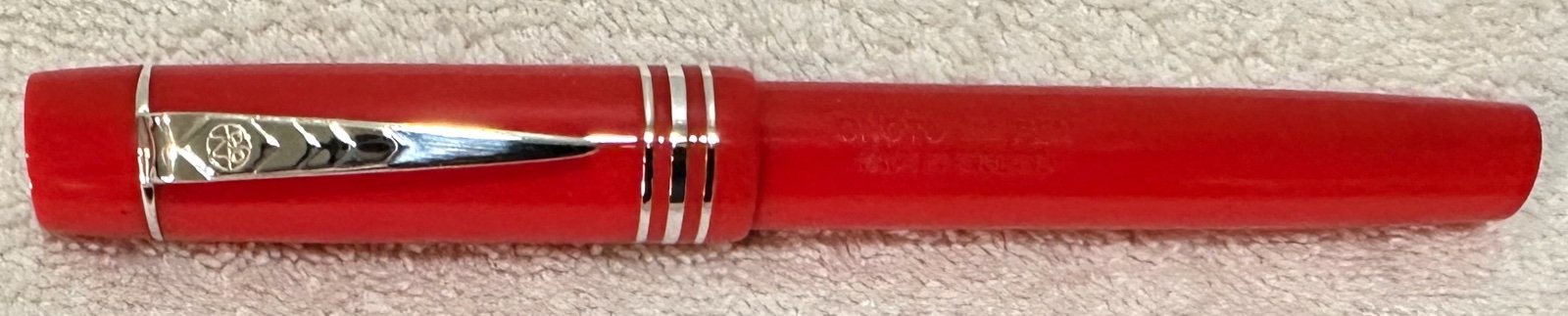
Review of the ONOTO Magna Rosso w/ 18K broad nib
donnweinberg posted a topic in Great Britain & Ireland - Europe
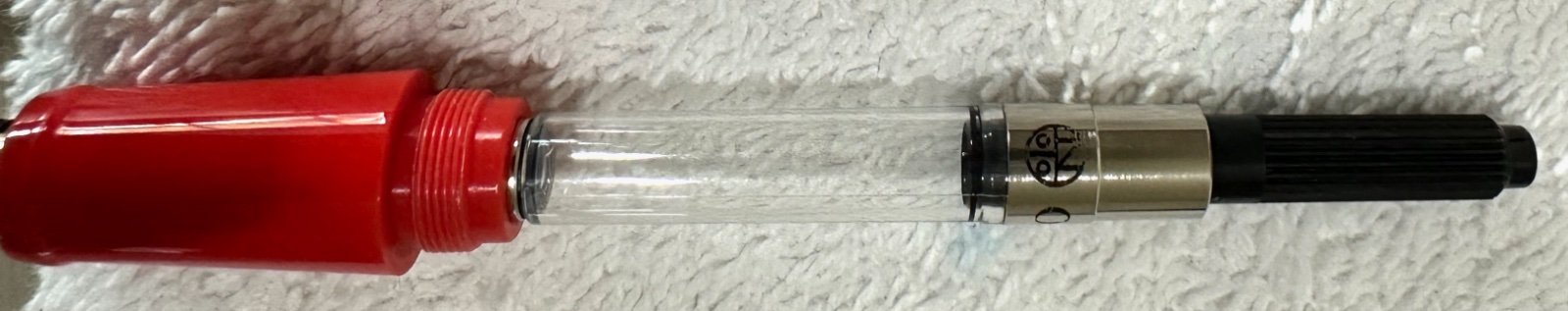
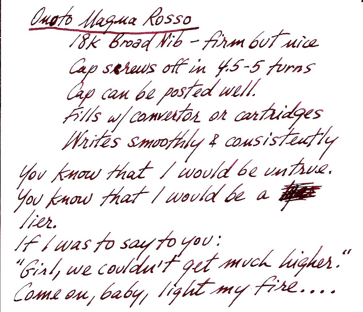
This is my review of a new, currently produced Onoto Magna Classic Rosso fountain pen, with a broad 18K nib. First, some photos of what I'm talking about. (1) Onoto gives you a choice of box for your new pen, either a "high gloss lacquered presentation box" or a "leather pen roll with a leatherette box." I chose the former, which is pictured here: The lacquered box is quite attractive and solid and comes in the cardboard box. When one unwraps everything and opens the wood box, here is what you get (I don't show the polishing cloth, but one comes inside a glossy cardboard holder): The blue "Onoto" ribbon actually is on the outside of the black cardboard box's paper wrapping, so the effect is that of a fancy gift. Next, here are photos of the pen itself: I ordered this pen with only two extra-cost options; I got the 18K nib (in broad width), which cost $209.16, and the "extra weight" option (shown in the photo looking into the barrel; the brass insert), which cost $20.92. Other options available are: (a) nib modification to stub, italic, or other ($87) ; (b) customized engraving ($40.67) ; (c) an additional rollerball conversion kit ($87.15) ; or (d) a plunger-fill converter ($290.50), which you can't get with the extra weight option (that special converter won't fit). The base price of the pen with a bi-color steel nib in either F, M, or B is $463.63. These costs reflect the exchange rate between Pound and Dollar at the time of the order in January. According to the Onoto website page for this pen, the following are the important measurements: Length capped: 127mm = 5.0" Length posted, including nib: 166mm = 6.535" Length of cap: 67mm = 2.638" Barrel Diameter range: 11 - 13.2mm = 0.433" - 0.52" Cap Diameter range: 14 - 15.8mm = 0.55" - 0.622" Weight: 25g (standard) or 32g (with extra weight option) Cap Weight alone: 13g The cost of shipping from the U.K. to Baltimore was approximately $25 (19.99 pounds), using today's exchange rate. So, this is an expensive pen, and many of you justifiably will want to compare it's value with that of it closest competitors. I'll leave that exercise to you all. In the meantime, here are my relatively early impressions of this pen: The 18K broad nib is two-toned. It writes with a medium-to-broad stroke and is on the firmer side, but is by no means a "nail." In fact, it writes with a silky smoothness, gliding across nice paper in a satisfying way. Depending on how you write, but considering how I write, there was some subtle shading in the various strokes of the pen. I provide a writing sample a bit lower here. The cap takes about 4-5 turns to remove and relocate on the barrel. For some, that is too many turns, and I'm inclined to agree, but for me this issue is minor. The cap can be posted quite easily and sits securely on the end of the barrel. I don't generally post my caps, and on this pen I see no reason to with this pen. As this pen has the extra weight option in which a brass (or other metal) cylinder is inserted into the barrel, this pen could not be purchased with the plunger-filler converter option. I purchased the pen with the standard twist converter, as shown. I filled the pen in the typical manner, and it wrote immediately and smoothly. I have been writing with it every day for 3 weeks, and I have not had any hard starts or skips. The pen writes beautifully. The resin body and cap feel warm and solid. The color is a bright red and is quite beautiful to my eyes. The ink being used in this pen is Private Reserve Black Cherry. Here is a writing sample: I am happy that I purchased this pen. I welcome any comments or questions you may have about it.
-
Posted a review video for the Kanwrite Desire Marble Red (dual tone steel #6 medium nib with gold plated trims on the cap) on Youtube, available here. You may find the featured pen here: for purchasing in Indian Rupees / for purchasing in US Dollars. A special mention of the ink I use for the writing sample: Sulekha Selam 21. It is a tribute from Sulekha to commemorate the occasion of 21st February, which is observed by UNESCO as the International Mother Language Day to honour the martyrs of this day in 1952 among the student demonstrators of the University of Dacca (now University of Dhaka) who were protesting against policies imposing Urdu as the lingua franca in the Bengali-speaking majority East Pakistan (now Bangladesh). You may find the ink here.
-
Posted a review video for the Kanwrite Heritage Marble Swirl (dual tone steel no. 6 medium nib with gold plated trims on the cap and barrels) on Youtube, available here. You may find the featured pen here: for purchasing in Indian Rupees / for purchase in US Dollars. You may find the ink featured here. Part 2 of this video reviewing the Kanwrite Desire Marble Red I bought along with this to be out soon.
-
Posted a review video for the Kanwrite Heritage Marble Swirl (dual tone steel #6 medium nib with gold plated trims on the cap and barrels) on Youtube, available here. You may find the featured pen here: for purchasing in Indian Rupees / for purchase in US Dollars. You may find the ink featured here. Part 2 of this video reviewing the Kanwrite Desire Marble Red I bought along with this to be out soon.
-
I have recently purchased a Vazir Patriot 4 from their website. For those who are not acquainted with Vazir, it is a handmade fountain pen brand from India. As the name of the pen suggests, there have been three preceding versions of the Vazir Patriot, all of whose design elements have alluded to the Indian Tricolour flag. The Patriot 4 is no exception, but with an added point of distinction that it is a limited edition of 75 units only - commemorating 75 years of Indian independence from British colonial rule. The pen I purchased sports a Schmidt no. 5 medium gold-plated steel nib, but also comes in fine and broad nib variants. The website offers the pen at INR 3000/- (for those who would purchase it with Indian currency) / USD 42. I have recently posted a full review video of the pen on my Youtube channel, which can be viewed here. (Image credit: http://www.vazirfountainpens.com/product-page/vazir-patriot-4-0 https://www.vazirfountainpens.co.in/product-page/vazir-patriot-4)
-
I recently found an OMAS Ogiva Alba on Ebay for a pretty good price, and considering the rumors that OMAS was closing its doors, I decided to get this beautiful pen. I made a video review of the Alba that you can watch here: https://youtu.be/Qb4Z_A2cDC8 Packaging OMAS does a very good job with their packaging. This is the first thing that the customer interacts with, and I'm convinced that impressive packaging makes a strong first impression. That is certainly the case with this pen. The pen comes in a large, heavy coffin-style box. Pulling off the top of the box reveals the pen in a suede pouch, comfortably holding the writing instrument. Initial Impressions Wow. I had always assumed that the Ogiva Alba was a small pen, but I was definitely wrong. Not only is it long, but its also quite girthy. The pen feels substantial in my hand, and the ribbed body feels comfortable. The Body The body of the pen is made of a purple cotton resin. It feels and looks great to the touch, but also remains fairly light. Those people that associate heft with quality might feel let down, but I personally find the pen to have a demanding size and shape. This particular mode comes in several colors and they're all demonstrators. Being a dark color, the purple version makes it harder to see the innards of the pen. The Cap The cap screws on to the section securely and smoothly. OMAS is famous for its tight tolerances and smooth threads, and now I see why. The cap has a silver-colored clip with the OMAS wheel on it. This allows the pen to slide in and out of a pocket. I like this feature. The Filling Mechanism The Alba uses a piston mechanism to fill its massive reservoir. Keeping in mind that I had received my pen second-hand, the piston mechanism was smooth, but not as smooth as my Pelikan or even Lamy 2000. I could probably fix this with a bit of lube. The Section The section is made of the same cotton resin as the body of the pen with a thin, silver band near the edge. It feels great in the hands, and the threads don't bother me when I write. The Nib This is where the pen gets interesting. My pen came with a broad nib, and apparently broad means stub to OMAS. This pen is a true joy to write with! After I filled the purple pen with some Mont Blanc Lavender and started writing, the nib glided over the smooth Clairefontain paper with ease and grace, and the ink flowed out with perfect precision. It really is a joy to write with. I personally love very wet nibs, and this is now my wettest nib taking a rating around 9 out of 10 on the wetness chart. Summary Overall, the OMAS Ogiva Alba with a broad 18k nib truly is a wonderful pen! Not only does it have the looks and precious hand-feel, but it also writes amazingly well. What do others think? I know that OMAS also
-
*comes in a 3 oz glass bottle * it's definitely pink *more of a blue-pink than an orange-pink (the third photo looks the most accurate to me, but your monitor may show it differently) *dries pretty fast, under 5 seconds *highlights over a variety of inks without smearing *not water resistant (that's not a surprise!) The first sheet is the 32 lb HP laser paper - the only part that really shows (obviously) is where I shot the paper with a syringe full of ink! The second sheet is cheap 20 lb copy paper, and I (personally) wouldn't have any trouble highlighting on both sides of the paper. You can see it a bit, but it's really not bad at all.
-
I recently ordered a Click "Aristocrat" fountain pen from a seller on Ebay. I have purchased and used many different Indian fountain pens in the past few years, both from overseas Ebay sellers and from Fountain Pen Revolution, and am usually impressed by the value they deliver at their price point. With a Leuchtturm pocket notebook for comparison. The Click Aristocrat (for some reason, the packaging I received calls it a "Tulip", but since I'm familiar with that model from FPR's house version (the "Indus" piston-filler, I don't think this is really the Click Tulip) is a plastic cartridge-converter pen, designed very closely along the lines of the earliest Parker Duofolds. There are a number of colors available, and I chose the orange with black finial and section, since it reminded me a lot of the Parker Big Red. The build quality is of course pretty basic, but I did not see any defects. The cost, with international shipping was 10 USD. Posted. It is a lightweight pen, 16g altogether and 11g unposted. The cap posts readily on the barrel, and being plastic, has a good grip on the material of the barrel. It has no heavy metal components to throw the whole pen off balance. The nib is a fine-medium, somewhat toothy but I found it wrote well out of the box and did not need any polishing. The length is 5.25 inches capped, 6.5 inches posted, and about 5 inches unposted. The filling mechanism is a standard international cartridge converter system. Note the number of threads securing the section to the barrel. The filling mechanism was nothing much to note, as the pen has a standard no. 6 nib (I think) and plastic feed, with a nipple that accepts a standard international cartridge or converter. The manufacturer provided two long intl. cartridges of blue ink, and a basic slide-plunger converter. After trying the generic ink and finding it a bit washed out, I filled the converter with Chesterfield Zircon and got better results. The nib would be easy to upgrade but is good enough that I will probably continue writing with it for the foreseeable future. The number of threads connecting the section to the barrel invites eyedropper filling, but I'm not sure that the barrel would be insulated enough to keep ink from expanding and burping out the feed. The feed has not yet given me hard-start issues, such as I have had with other no. 6 nibs. The imprint and detail of the finish gives some idea of the material texture of this pen. It isn't hard rubber or acrylic but the plastic used feels fairly good despite its light weight. I would compare it to the Nemosine Singularity or the FPR Indus in terms of the feel of the material. In conclusion: a very distinctive workhorse pen for the price, which I intend to keep in regular rotation.
-
Has anyone tried CX Made ink, and if so what was your experience with it?
-
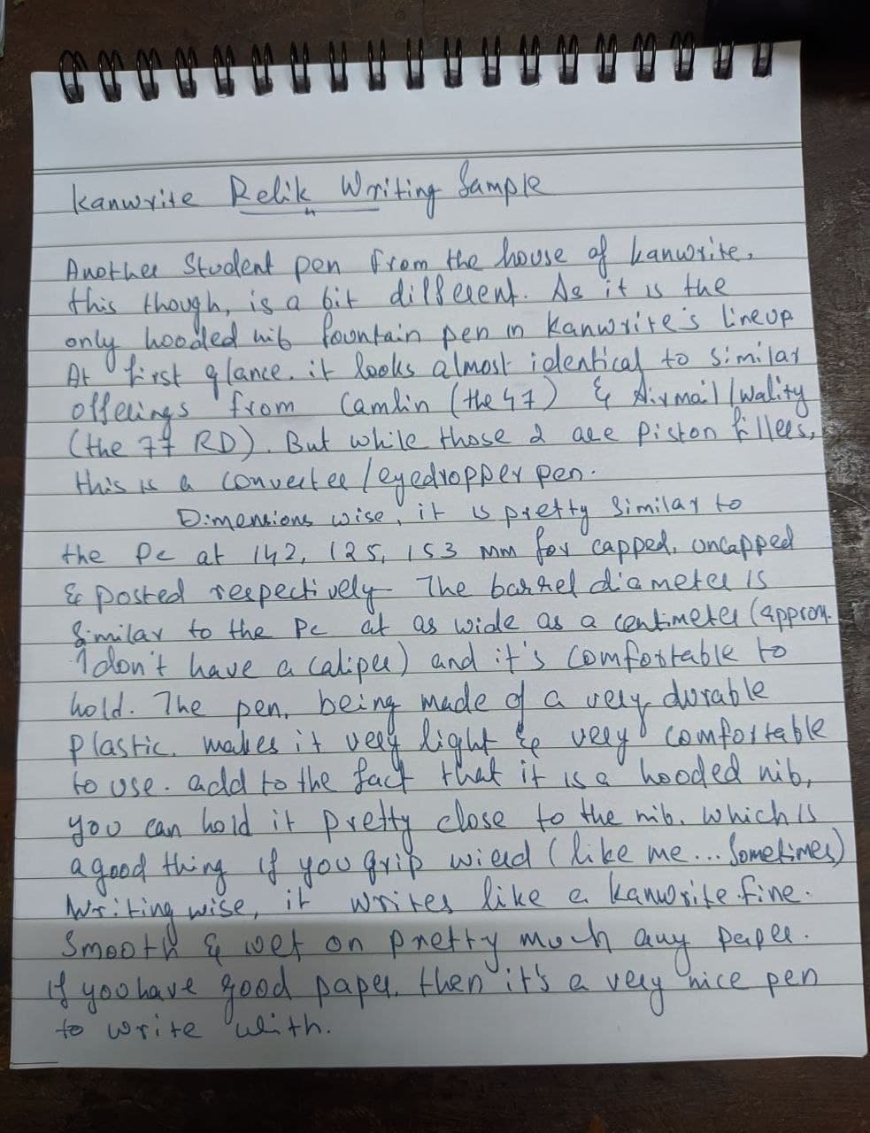
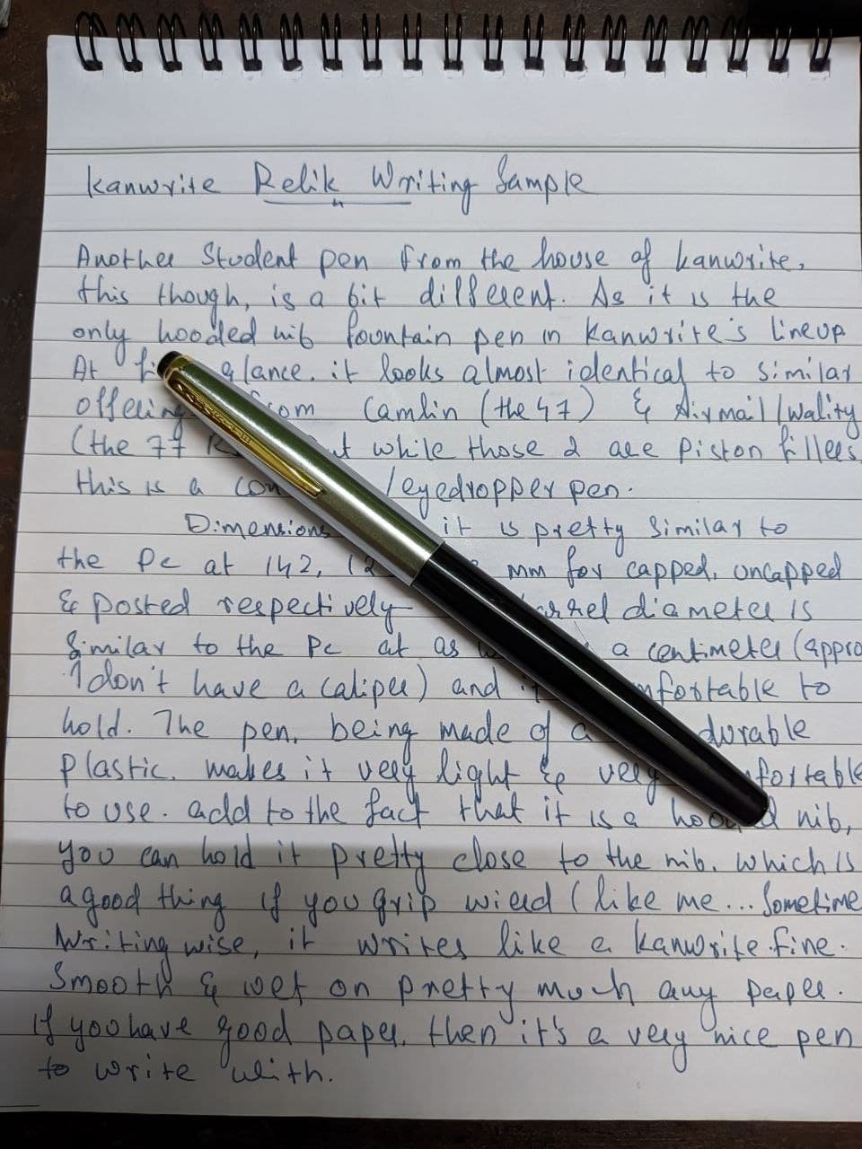
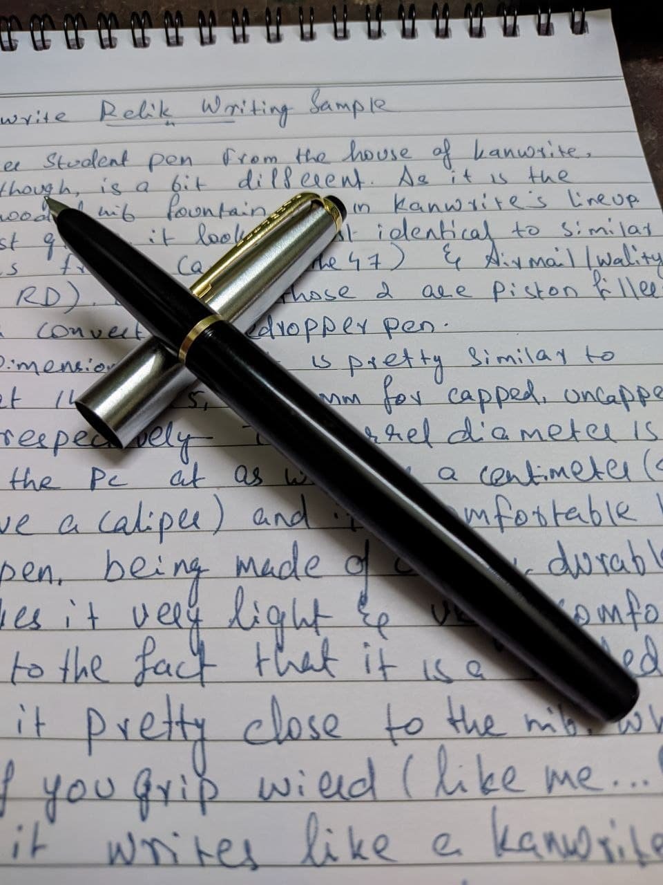
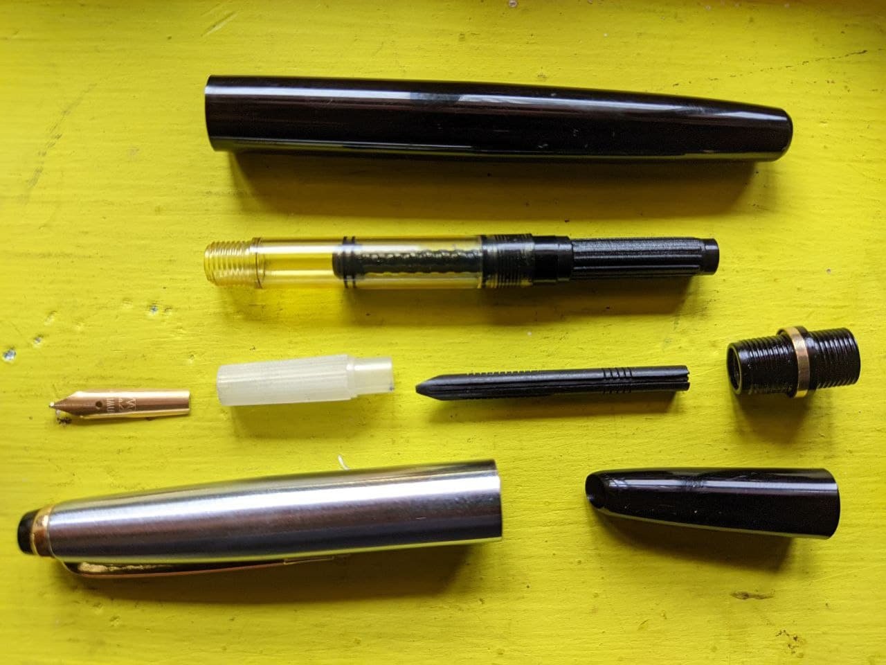
Kanwrite Relik. A Simple No-Nonsense EDC Pen
Aravind_A_2310 posted a topic in India & Subcontinent (Asia)
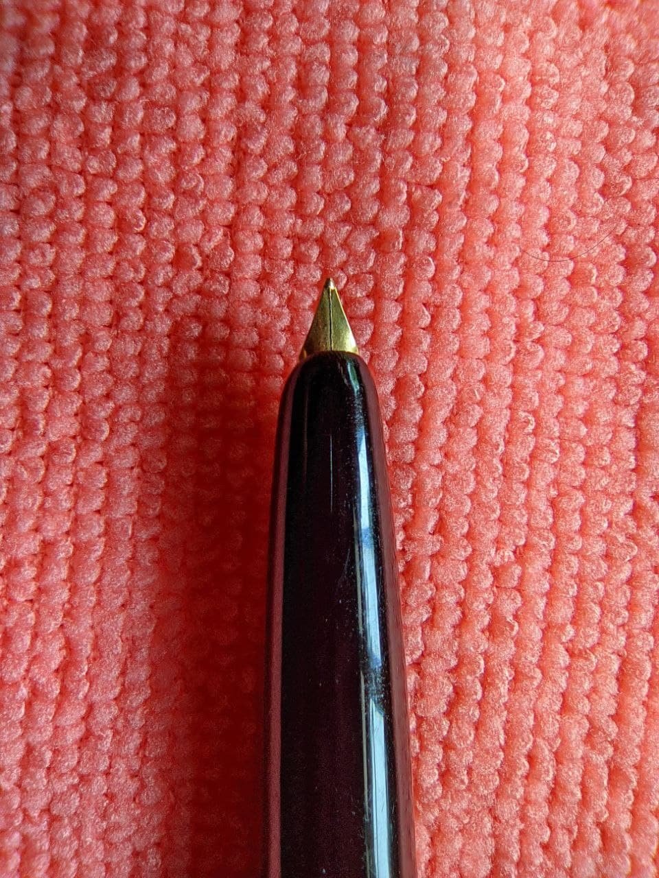
If you've been around fountain pens for a while, chances are you know about Kanwrite. At the risk of repeating myself... Again, let me repeat the intro that I said about my review of the Kanwrite PC. "Kanwrite or Kanpur Writers is one of the most popular pen companies in India and outside (If you've used a Noodler's pen, Chances are high that it may be made by Kanwrite...). Though their Desire and heritage have stolen the show for most of us, there are a few hidden gems in the brand..." One of which is the Relik, which is the only hooded nib pen in Kanwrite's lineup. And for about ₹350/- INR when bought directly from Kanwrite, just like other Kanwrite budget pens, it's a solid knock-around everyday carry pen. So without any further ado, Let's crack on... Design and Build Design wise, it's a classic design which harks back to the old reform piston filler pens of the 60's and 70's, and almost identical to the PC. Honestly, if I place a PC and a Relik side-by-side capped, and ask you to tell which one is which without touching them, you'd be hard pressed to notice any difference between them. It's when you open the difference becomes apparent. The hood over the nib is the main differentiator between the PC and the Relik, You can swap the parts like the converter, Body and the cap between the two and they'll fit perfectly. But design wise, It's a handsome fella. (Note: the standard relik comes with a gold plated nib however I dropped it nib down and bent the tines. since then I replaced it with a non plated nib, so some of the photos will contain the a silver nib on a gold trimmed pen... My bad) As far as the build, the cap is made of metal and has a slight texture to it, the body is made of plastic which is very durable. Easily able to handle drops without issues, and surprisingly scratch resistant. It does smell. But not a lot and you'll barely notice it after a week or so. The pen comes with a hooded nib which looks similar to pens like the Camlin 47 and the Airmail/Wality 77. It uses a No.00 nib and an ebonite feed housed in a plastic sleeve which is then slid inside the grip section. reassembly can be fiddly, as the sleeve is like a gear with a million billion teeth and to get the assembly just right takes some trial and error. Also a thing to note while cleaning the pen, the sleeve is fairly fragile so be careful when reassembling the feed. Don't just jam it in there with all the frustration of your last breakup or else the sleeve will be the next thing you'll break up (Poor joke... I know...). Because of the hooded design, you can leave the pen for more than an hour, and it won't dry up. So that's the reliability box ticked for the Relik. The pen accepts a converter which is a screw in type and it smells... like more than I expected... Luckily, the barrel has enough threads that makes it a perfect candidate for eyedropper conversion, but air-tight enough that it seals the smell off... As for the size comparisons, from top to bottom: 1. Kanwrite Relik 2. Beena Lincoln 3. Parker Vector CT Standard 4. Jinhao X450 One thing though, and it happened to my PC and the Relik, the plastic of the converter becomes yellowed when using Bril black ink, tough it does not seem an issue with the other inks that I use, which includes other Bril inks. It does not affect writing though. Speaking of which... Ergonomics, Writing and Final Verdict The ergonomics are fairly good. If you use a Gel or Ballpoint before, you'll feel right at home, plus the hooded nib design means you can hold it very close to the nib, if you're an imbecile like me and hold the pen according to the mood I'm in, this is a very good pen to write. Plus because of it's light weight, it's comfortable to use for long writing sessions. Posting it gives it that little bit more heft that in my opinion, adds to the overall writing experience. As for the writing, It's a typical Kanwrite fine nib. Smooth for the most part with a hint of feedback that is noticeable but not unpleasant. You really feel you're writing something, which I prefer over a nib that writes like writing on glass, as my hand tends to go out of control faster than when a fish slips out of the hand the moment you catch it out of the water. Wetness and flow is more than adequate enough, but not so much that it makes the ink feather and make the writing a bunch of squiggly lines on cheap copier paper. Flow keeps up with even the fastest of writing that I can manage and over long writings, the pen doesn't break a sweat. Overall, as a final verdict, This is a solid option if you are considering a hooded knock around EDC pen that is both durable and good to write with. Honestly these Kanwrite offerings doesn't leave me with anything to say that I haven't said before. For the price that you buy from Kanwrite directly, it's a great value and an excellent beginner pen. PS: Note that the min. order value for ordering from Kanwrite directly is ₹500/- INR (you can order by contacting them via Whatsapp). So I'd suggest you buy and Apex (Review of which you can see by clicking here) and some spare No.00 nibs as well just in case. Trust me, you won't regret it. That's all from me, and I'll catch you all next time
-
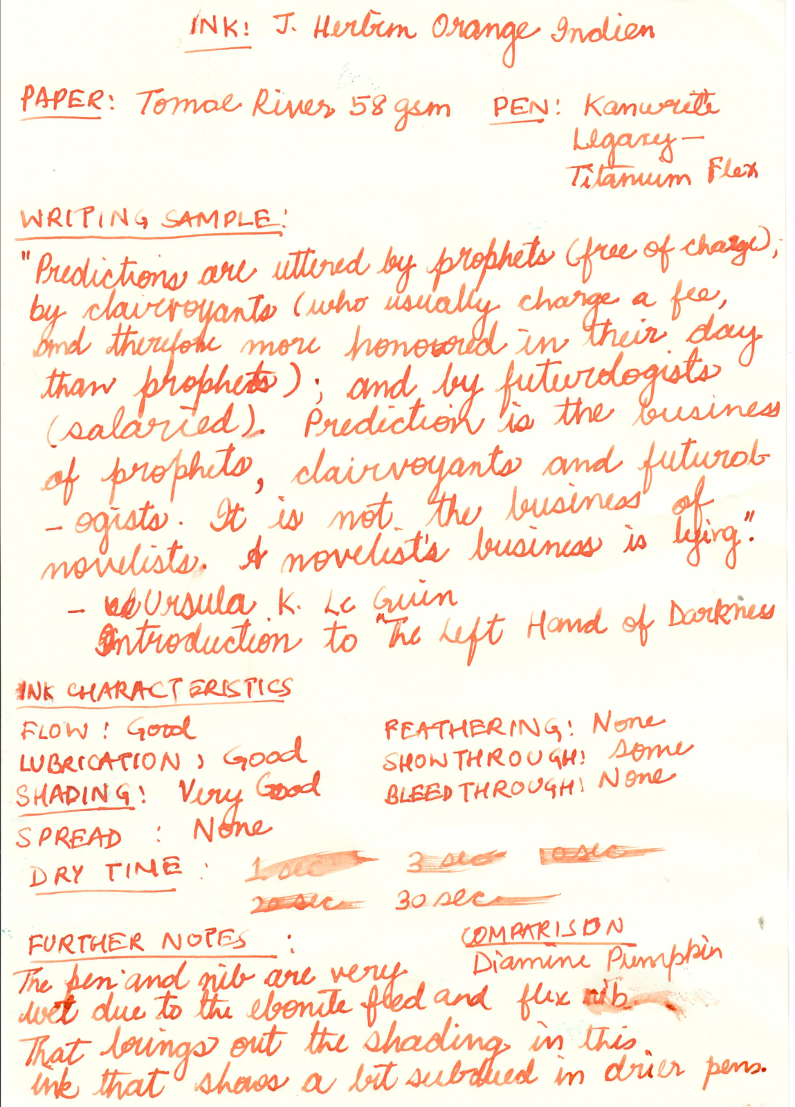
Note: The Diamine Pumpkin comparison looks very similar in the poor scan, but is actually distinct from the Orange Indien. The ink is less red and more orange in reality.