Search the Community
Showing results for tags 'retractable nib'.
-
This is a fun, diminutive-sized writing instrument, with a twist. The nib retracts. It's proving to be a pleasant alternative to the larger pens I've been enjoying lately. I can see it as a take-along pen for notes or general writing duties any day of the week. The Beena Magic was manufactured in the late 1980's. It’s available from ASA Pens. They’re sold in sets of 2 pens. Retractable NibYou turn the end cap to extend / retract the nib unit. It takes about 3/4 of a turn to complete the action. The motion is smooth and easy, if a little loose. I thought the nib might shift or wiggle, but that's proven to be largely a non-issue. Construction The brushed silver cap is plastic like the rest of the pen. It's positive and well engineered. It snaps on and off with an easy click that's crisp and definitive. There's no chance of the cap coming off accidentally. The pen takes international ink cartridges. It doesn't come with a converter. Posted, the pen is a bit smaller than a Jinhao 992 or the Jellyfish series (绘境 026). At just over 15g, it is nicely lightweight. Writing The No. 5 nib writes with a fine line bordering on medium. It's reasonably wet. I didn't experience any skipping. The pen feels good in the hand and was smooth right from the start. It's a natural for posting which is clearly how it was meant to be used. It’s hard to say how long the stock of Beena Magic pens at ASA will last. If you're interested in a bit of friendly Indian pen history, I can recommend you get yourself a pair. The second pen could make an excellent gift to a friend. More comments and photos here.
-
- 6 replies
-
- lanbitou
- retractable nib
-
(and 2 more)
Tagged with:
-
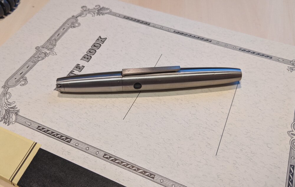
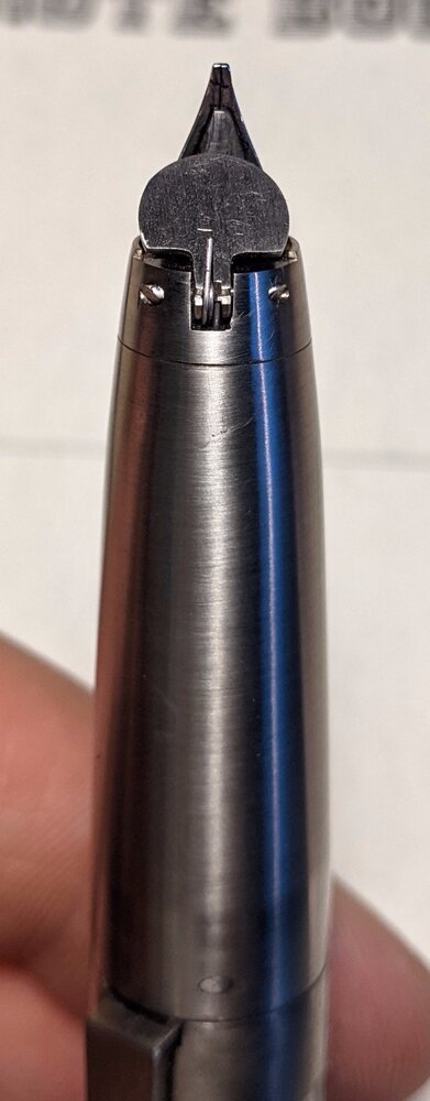
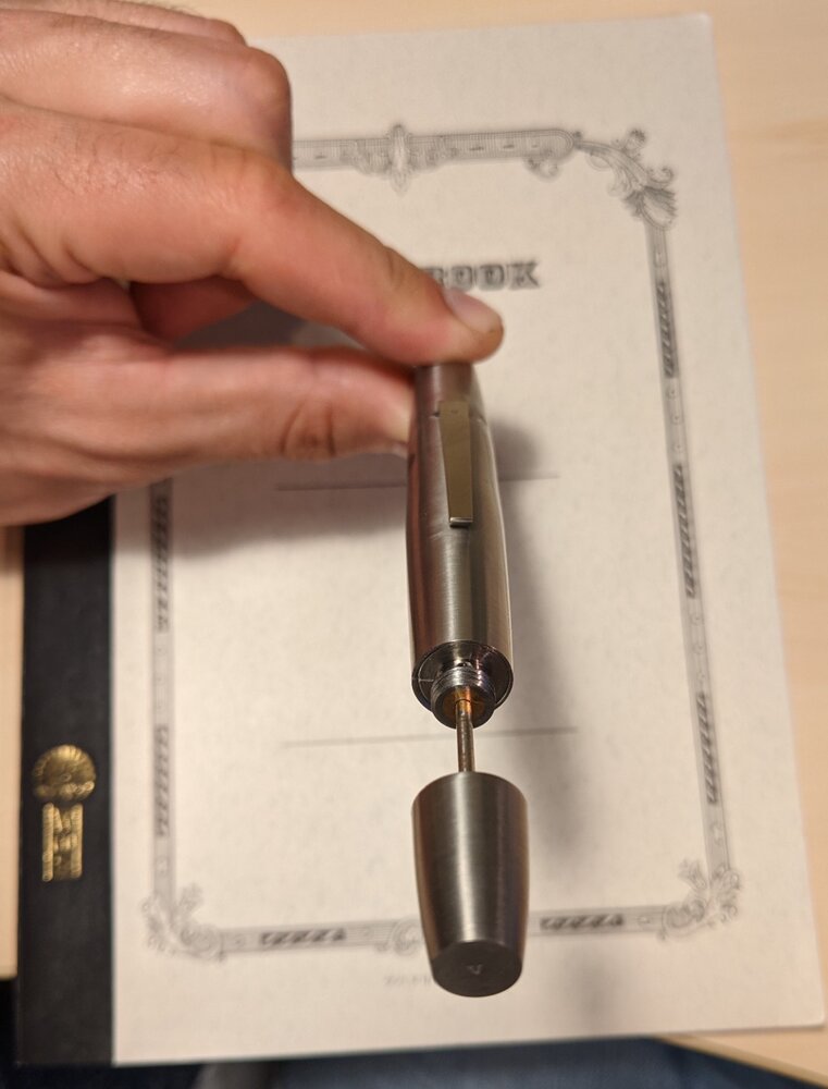
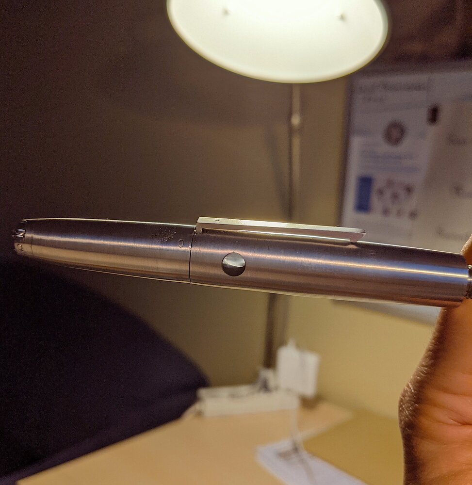
After 6 months of work, here is the new version of my retractable nib pen (V5). The external appearance of the pen is like a chimera of Pilot's MYU for its titanium body and Lamy 2000 for its overall shape and clip. On the inside of the pen, the nib retracts behind a spring loaded trap door, the nib mechanism is activated by rotating the section of 3/4 of turn, clockwise. The filling mechanism is a piston filler which acts similarly as FountainBell's Bulkfiller holding a large amount of ink. The nib is a cursive italic which was ground from a pelikan BB stainless steel nib, the feed is from an old french pen in ebonite. The pen now features a more discreet trap door for the nib: The piston system is basically the same than the other versions: The ink window is a minimalistic polycarbonate round window which makes the job well: This pen took so much time to design and build out of a single titanium rod: take a look at the titanium shavings! My micro 12kg lathe/milling machine made the job surprisingly well even on Grade 5 titanium. Some tricks had to be used, mainly for drilling procedures: slowing down spindle speed, only predrill holes at 2mm (drilling using progressively larger drillbits stucks them into the work), cooling the drill is also crucial (when you don't own special harware for this purpose you have to stop drilling and wait for it to cool which takes a long long time...). Here are some special setups: Once machined, the hard part was to assemble titanium parts together... Titanium parts don't glide on each others they get simply stucked. To allow free gliding of the titanium moving parts I Had to cover them with acetal caps which required additional extra work. Here you can see the part which allows the section to turn onto the barrel: an acetal ring serves as interface between the section and the barrel: I use this pen for 3 months now and I am very pleased with. Unlike the other versions in ebonite (V1,2,3) the inkflow is more consistent, nor too wet, nor to dry. The pen is much more robust than the other versions although it is heavier it did not broke or deform when falling from my shirt pocket on concrete for example: the grade 5 titanium made it simply bounce with a few minor scratches. Hope my journey to making this pen interested you. Jeremy Link to the other pens for comparison:
- 11 replies
-
I was on the hunt for a nice Pilot Vanishing Point but my local brick & mortar (Appelboom) doesn't carry Pilot. I mentioned this while picking up some ink for a colleague and was asked if I'd considered the Dialog 3. Well, no, I hadn't. It's considerably more expensive, it's massive, it lacks fancy colour schemes and most of all... it's a Lamy... Sure, I admire the ABC but otherwise no thanks, I'll pass. Lamy and I, we're just not meant to be. Or so I thought... because I fell like a brick for the design, the materials, the amazing engineering, the retractable nib mechanism and the EF nib. When Joost offered me a really good price, that clinched it. "Perfection is not attained when there is nothing more to add. It is attained when there is nothing more to remove." --Antione de Saint Exupéry Design, materials, size, fit and finish This old quote sums up the design of the Dialog 3 quite nicely. Some might see a black cylinder. I see a very attractive, minimalistic design that's modern yet refined at the same time. My matte black version looks like it was chiseled out of rock, then smoothed. The feel of the material reminds me of my Visconti Homo Sapiens Lava Steel (not a bad reference). It's very, very pleasant to the touch and never gives me the feeling of handling plastic. As a result, I love to fondle and twiddle it when not writing. It's a substantial pen to write with because there's no cap that comes off. And it's heavy, by far the heaviest pen in my little collection. Size and weight combined mean that this pen is not for everyone - so try before you buy! I can be brief about quality of engineering, fit and finish: I don't think I've ever held a pen that inspired more confidence than this one. It's like a Mercedes. A fantastic example of Deutsche Gründlichkeit. Rotating the barrel clockwise makes the nib come out and sinks the clip lower onto the barrel (how do they do it...?). It's very addictive to do - it feels so confident somehow. Watching the nib disappear behind its concave hood and seeing the clip rise is truly a thing to behold. Rotating the barrel counterclockwise unscrews the pen and reveals über-engineerd innards with a nice, big converter and the screwed-in, removable nib/feed unit. The nib: architect! The sleek, two-tone design of the nib is a good match to the overall vibe of the pen. The F wrote too wide for me so I requested the EF and was delighted to discover that Lamy chose to grind it as an architect nib! I compared this architect to my old MB 146 EF with 14C nib, which is also a factory-made architect. Both pens write in a very similar way when using straight-up print script (I do not know the proper names of writing styles, sorry) but very different when using cursive: the MB then writes a _much_ wider line. I find the MB EF nib to be slightly more forgiving and pleasant, but the Lamy EF to be more versatile and offering very good control. It's a rigid nib and I cannot detect even a tiny bit of bounce or sag but then again I've never seen a soft architect. As with all architects, it requires attention to keep the writing angle consistent. Tactile response from the writing surface is pronounced but not in the least unpleasant. 90 g/m^2 Oxford paper is a fantastic match; Tomoe is less forgiving, Rhodia is somewhere in the middle. Personally, I love this nib! (For those not acquainted with architect nibs: try before you buy! An architect requires you to maintain a constant writing angle. You might say that you don't move your hand down the page as you write, but you move the page upwards beneath your hand. I adore a good architect, but they're certainly not for everyone.) Ink and wetness Essentially the Dialog 3 is a C/C pen that accommodates either proprietary Lamy cartridges or the included converter. Filling the converter requires unscrewing the barrel, then screwing out the converter/nib/feed unit and dipping that into an ink bottle. When using cartridges, the unit can stay in the pen and you can just remove the cartridge. Ink capacity seems generous, though I did not measure it. Several hours of writing emptied the converter halfway. I inked the pen with Kaweco Midnight Blue, a relatively dry, high-quality ink which can appear black-ish in wet pens but transforms into a transparent, complex, night-sky kind of blue-black in dryer pens. Lamy warns not to flush the Dialog 3 with any kind of detergent, only with water, so I was curious to see how well the pen would perform out of the box. During the first hours, ink flow appeared to be almost perfect. Almost, because it is a trifle inconsistent, gradually varying from slightly dryer to slightly wetter. The complex nature of the ink is pleasantly revealed by this pen. The nib never skips, never hard starts. Endurance, ergonomy and such Despite its weight and size, this pen feels great in my hand and I can write longer sessions with it without fatigue, cramp or any other kind of discomfort. Having said that... if I then switch to a similarly sized pen from another brand, it feels like stepping over from a big, fat Merc S-Class into a Ferrari. My Pilot Justus 95 feels amazingly comfortable after a session with the Dialog 3. It's like being liberated from restraints, it's not subtle... To a lesser extent, the same is true of my Visconti Homo Sapiens Midi. Switching to another pen makes the hand fly over the page. The inevitable comparison to its Japanese counterpart Compared to the Pilot VP, the Dialog 3 is much heavier, girthier, holds much more ink, has a different nib release mechanism, offers less colour schemes, has a retractable clip and is of a more minimalistic, modern design that looks less like a ballpoint and more like a monolith. For the VP, one can buy additional nib/feed units in varying nib sizes. For the Dialog 3, and at a similar price, one can buy additional 14k nibs in varying sizes that easily slip on/off the pen. This basically means that you can buy a VP or a Dialog 3 and use various nib sizes with the same pen, at will. The Lamy is considerably more expensive compared to non-LE VP models, but both the Lamy and the Pilot can be found at (much) reduced prices if one is prepared to make the search effort. Both the Pilot and the Lamy are top-quality pens but personally I'd say that the build quality of the Lamy is even higher than that of the Pilot. In the end, as always, the choice is personal. Conclusion The combination of design, degree of engineering, quality and the architect nib make this pen irresistible to me. It's not just another pen; it really is a instrument of fine writing as well as a fashion statement and a showcase of amazing engineering. I don't think it will make me forget my other pens like the Justus, the HS or some of my vintage pens, but we'll see. Opinions can change over time, which is why this will be an expanding long-term review.
-
The LE Stipula DaVinci Samurai Review and photography by Laura Elizabeth Bullock Introduction The LE Stipula DaVinci Samurai was produced in a collaborative effort by music publisher Leeds Levy and Chatterley Luxuries’ Bryant Greer. Leeds and I have a mutual friend from the Big Apple Pen Club, Tim Ettenheim. Tim brought the pen to my attention and, along with Leeds, asked that I write a review of and photograph this unique pen, which is available for purchase at https://chatterleyluxuries.com/product/stipula-samurai-rose-gold-overlay-limited-edition-fountain-pen/ I am in no way affiliated with Stipula or Chatterley Luxuries and this review is a noncommercial effort. http://i1231.photobucket.com/albums/ee513/betweenthelens/IMG_7284.jpg Appearance and Design The barrel of this exquisite pen is transparent blue resin with rose gold vermeil overlay bonded permanently to solid sterling silver. The overlay is hallmarked in three places with 925 and a five-pointed star followed by 1770 and FI for Firenze. http://i1231.photobucket.com/albums/ee513/betweenthelens/IMG_7299.jpg The gorgeous overlay echoes the legendary tosei gusoku armor of Japanese samurai right down to the gilt kanamono used on the helmets, shoulder guards and plates. http://i1231.photobucket.com/albums/ee513/betweenthelens/IMG_7300.jpg The pen's trim is also rose gold vermeil as is the unique sword-like clip with the suggestion of a samurai at the top of the clip. http://i1231.photobucket.com/albums/ee513/betweenthelens/IMG_7314.jpg http://i1231.photobucket.com/albums/ee513/betweenthelens/IMG_7311.jpg The clear end of the blue resin barrel shows 0/18 as the pen is limited to 18 worldwide and this particular pen is a prototype. http://i1231.photobucket.com/albums/ee513/betweenthelens/IMG_7321.jpg Perhaps the most interesting and most unusual feature of the Samurai is its retractable nib that appears with a clockwise twist of the barrel through a half-moon shaped door bearing the Stipula name and disappears with a counterclockwise twist as it’s retracted and the door closes. http://i1231.photobucket.com/albums/ee513/betweenthelens/IMG_7326.jpg http://i1231.photobucket.com/albums/ee513/betweenthelens/IMG_7328.jpg http://i1231.photobucket.com/albums/ee513/betweenthelens/IMG_7330.jpg Finally, this Stipula pen features an interchangeable writing system. When the nib is retracted, the barrel pulled out and the universal cartridge or piston converter removed, the section and nib can be easily removed by applying light pressure to the section’s metal wings and gently pulling. http://i1231.photobucket.com/albums/ee513/betweenthelens/IMG_7309.jpg Construction and Quality The Samurai is extremely well made and hand-designed with superb attention to detail. Its sturdiness is apparent in its heft and solid construction. A firm grasp is required to remove the barrel and once the barrel is replaced, there is a satisfying, solid click. http://i1231.photobucket.com/albums/ee513/betweenthelens/IMG_7303.jpg The removable writing section is also of solid construction with a tab and hole mechanism to ensure its proper replacement without incurring damage to the nib. http://i1231.photobucket.com/albums/ee513/betweenthelens/IMG_7335.jpg Size The Samurai is 136-140 mm (5.35-5.51 inches) in length and the diameter is 16.1-18 mm (0.63-0.71 inches). Its weight is 61 grams (2.15 ounces). Its formidable size and girth are impressive. Because of this, it may be better suited to larger hands. However, this would not preclude usage by a woman. I am perfectly content using this pen and I can comfortably grip the barrel and write for an extended period of time. Nib and Performance This is a medium 14 kt. gold nib with the Stipula leaf logo in two places and a 585 gold mark, meaning the gold is near this percentage (58%) pure. http://i1231.photobucket.com/albums/ee513/betweenthelens/IMG_7331.jpg http://i1231.photobucket.com/albums/ee513/betweenthelens/IMG_7333.jpg The nib is not a flex nib; however, it does provide amazing line variation depending upon the angle at which the nib is used and how much pressure one exerts when writing. The paper I used to assess the nib’s performance included a Rhoda Webnotebook, L. Writing Paper made in Japan by Life Company, 60 lb. Fabriano sketch paper, a Moleskine lined Legendary Notebook, and 100 % cotton Crane Monarch sheets with Ecruwhite Kid Finish. The inks I used were J. Herbin Rouge Hematite, Waterman Florida Blue, Akkerman Passage Blauw, and Pelikan 4001 Violet. The Samurai performed well on all papers with all inks although the Moleskine did not provide quite the level of quality writing experience as the other papers. This paper paled in comparison to the similarly smooth, but higher quality, writing surfaces of the Rhodia and Life Company Japanese papers and there was even pleasant feedback on both the Crane and Fabriano papers. The pen performs better on higher quality, heavier papers but it must be mentioned that there was no skipping or hard starting on any of the papers with any of the inks. The pen performed well inked with the Pelikan 4001 Violet, the driest of the inks. There were consistent uniform color and even some subtle shading apparent. This pen was made for the very saturated J. Herbin Rouge Hematite with the extremely beautiful green-gold shading standing out and the rich color flowing freely. My Stipula Gladiator with medium nib is a wonderful pen; however, its nib doesn’t have the range of this Stipula Samurai and the Rouge Hematite in my Gladiator puts down a red line with no shading. I have to use a flex nib, such as the one on my Bayard LE 4 or the nib on my Morrison’s gold overlay ring top to see the shading. The Waterman Florida Blue (a wetter ink than the Pelikan 4001) and the Akkerman Passage Blauw (perhaps the wettest of the four inks) have a discernable flow, more so than that of the J. Herbin and especially more than that of the Pelikan 4001. Filling System The filling system utilizes a universal cartridge or piston converter, both of which are included with the pen. The converter took up the ink immediately. Cost and Value This pen retails for $1095. In my opinion, the pen is worth it. The quality and construction, the understated elegant design, uniqueness and outstanding performance are worthy enough to commandeer such a price. Conclusion This pen provides a truly luxurious writing experience. I’ve used it consistently for several days and for as much as an hour at a time. I’ve not experienced anything approaching fatigue or cramping, even owing to the pen’s size. If I were working a desk job, I would use this pen as a daily writer, however ostentatious it would appear; it’s that comfortable and that lovely with which to write. If one is looking to turn heads with a work of art that also happens to be a fountain pen, this is also the pen for you.
- 36 replies
-
- limited edition
- le
-
(and 5 more)
Tagged with:
-
Good evening fellow fountain pen enthusiasts, Today I am posting my first on the FPN but I must say, being a silent member for over a year, I have really enjoyed reading the Montbanc posts and following the people who post more frequently. I got my first Montblanc two years ago when I was 18. It was the Montblanc 147 75th Passion and Soul edition with an EF nib and it is still in my rotation. Today I am writing to you all with a question about two of my Montblanc Noir et Noir Fountain Pens. I have to admit that at the time of purchase of my first Noir et Noir, I was under the assumption that it was a Boheme until I realized that there was an absent ring fitting below the threads. With further examination, I noticed that the ring at the end of the pen where the cap posts did not say “Boheme” but instead “Noir et Noir.” It was then that I realized that I had stumbled upon the pen that preceded the Boheme but was later recalled by Montblanc due to copywrite infringement of the name “Noir et Noir.” I was pleasantly surprised when I read that! Unfortunately I over tightened the cap on the back of the pen and broke off the hinged piece where the ink cartridge goes. So early September I took a four hour drive down to the St. Petersburg to visit family and to drop of my Noir et Noir to be fixed along with my Czar Nikolai I Legrand FP which needed to be serviced. It was by luck that when I was down there I checked local CL Listings and found someone who was selling a broken Noir et Noir, coincidentally with the same problem mine had. So I ended up buying it from him and dropping three pens off at the Montblanc Boutique. Last Friday I received all three of my fountain pens back and all of them were functional again. There is just one detail on both the Noir et Noir that has been bothering me. When uncapping the pens and screwing them on the end for writing to retract the nib, neither clips line up with the nibs like I remember them to. So my question is, am I recalling this incorrectly or is the clip on the cap supposed to align with the nib when posted for writing? To me this is a very important detail because without the cap posted the Noir Et Noir is much smaller and almost unbearable to write with and that is why I would think Montblanc would have taken the time to align this correctly. In closing, we all love Montblanc because of their fine attention to detail and I would hate to think that Montblanc has a technician who is so carless and sloppy not to check to see if the pens post correctly. I will post pictures of my Noir et Noirs so that you can see what I am referring to and I would appreciate if you own a Noir et Noir or a Noir et Rouge or a Boheme with retractable nib, to post pictures of your pens posted to compare and see if the cap lines up with the nib. I know how helpful all of you are so thank you in advance for all your help! With much appreciation, Tyler
- 8 replies
-
- noir et noir
- boheme
-
(and 6 more)
Tagged with:


