Search the Community
Showing results for tags 'red-brown'.
Found 7 results
-
J.Herbin – Terre de Feu La Société Herbin, Maître Cirier à Paris, was established in 1670. This makes J. Herbin probably the oldest name among European ink makers. Today, Herbin produces a range of beautiful fountain pen and calligraphy inks, writing instruments, gift sets and accessories. Herbin inks are made in France, and the finishing touches on the bottles are still done by hand in Paris. A couple of weeks ago, @yazeh did an excellent review of Terre de Feu, but didn’t enjoy writing with it due to its low lubrication. I then remembered I also have a bottle of Terre de Feu in my stash. As such – a good time to load up a couple of pens with this ink, and add my own impressions. Terre de Feu is a red-brown ink that fits its name well: it makes one think of scorched earth, burnt land, and vast deserts where nothing ever grows. The ink’s colour doesn’t speak to me as a writing ink: a full page of it looks a bit too “bricky" - for me, the aesthetics don’t really work. I hunted around for a pen/nib combination that makes the most of the ink, and finally found one with an Esterbrook Estie with 1.1 stub. Terre de Feu looks a bit flat with low shading on most papers, but with the Estie 1.1 nib it gets more depth and character. The added line variation of the stub, and the enhanced shading you get definitely lift up the aesthetics. Use the ink for drawing though, and we get a completely different story. Terre de Feu works great for artwork, giving you a wide spectrum of brownish, red and red-orange tones. A pleasurable ink to work with. Terre de Feu lays down a fairly wet line with good contrast to the page. It works well across the complete nib-range from EF to stubs. The biggest technical drawback of this ink is its lower-than-normal lubrication. This is something you can physically feel while writing. I didn’t like the feel of it in my Safari test pens. Also, on hard & smooth paper the low lubrication translates to something of a “sticky” feel – it’s not exactly scratchy, but there is some resistance and unpleasant feedback. Wetter writing pens alleviate this, but they also increase the ink’s saturation, making it a lot darker and losing most of the shading. For me, the combination of wet pen and stub-nib worked the best. It corrected the lubrication issue, whilst maintaining the shading and line variation. On the smudge test – rubbing text with a moist Q-tip cotton swab – the ink behaved perfectly with only minimal smearing. Water resistance is quite good: most of the colour washes away, but a grey-black residue remains that is easily readable. This ink can survive accidents. This is also visible in the bottom part of the chromatography. Starting with this review, I have also added the way a splash of ink behaves on a kitchen towel. It gives some extra information of how easily the component dyes separate from one another. Terre de Feu is a fast-drying ink on the more absorbent papers in my test set (5-10 second range). On hard-surface paper drying times increase to the 15-20 second range with my Safari M-nib test pen. I’ve tested the ink on a wide variety of paper – from crappy Moleskine to high-end Tomoe River. On each scrap of paper I show you: An ink swab, made with a cotton Q-tip 1-2-3 pass swab, to show increasing saturation An ink scribble made with a Lamy Safari M-nib fountain pen The name of the paper used, written with a Lamy Safari B-nib A small text sample, written with my Yard-o-Led Standard with F-nib Source of the quote, written with an Esterbrook Estie with 1.1 nib Drying times of the ink on the paper (with the M-nib) Since this is my first review of 2025, I’ve started with a fresh set of quotes – this time from the novels of Patrick Rothfuss. There’s only a handful of them, but they are well worth reading. “The Slow Regard of Silent Things” is easily my favourite novella of all time. Terre de Feu handled all papers well, with no visible feathering – it even managed to cooperate with the dreadful Moleskine paper. On the lower quality paper, the backside has become unusable though due to see-through and some bleed-through. In my experience, the ink lacks a certain crispness – the edges of the writing look a bit fuzzy and not well-defined. Shading is present but not very strong due to the medium saturation range of the ink (see saturation sample above). The writing samples above are shown as photos. Red-brown ink colours are difficult to capture right, and in this case the photos seemed to capture the colours most accurately. Below I also present a scan of some writing samples – the shading gets exaggerated a bit in the scan, and the red undertones are a tiny bit too pronounced. Below you can find some enlarged details of writing samples. Shading is most pronounced on the Sakae Iroful paper, which seems to work well with this J. Herbin ink. Writing with different nib sizes The picture below shows the effect of nib sizes on the writing. All samples were written with a Lamy Safari, which is typically a dry pen – writing with the Safari was not pleasant, due to bad lubrication. But with the dry writers you do get more of the red tones, which I liked. Wetter pens increase saturation, giving your writing a browner look. I ultimately liked the ink best with my Esterbrook Estie with 1.1 nib – this combination worked well: you still get more of the red tones, and the nib coaxes some really nice shading from this Terre de Feu. Related inks To compare J. Herbin Terre de Feu with related inks, I use my nine-grid format with the currently reviewed ink at the center. This format shows the name of related inks, a saturation sample, a 1-2-3 swab and a water resistance test – all in a very compact format. There are lots of similar inks in this colour range that are technically superior to this Terre de Feu – take your pick. Personally, I think Callifolio Inca Sol (which I misnamed Inca Gold) is a good-looking alternative – it’s more sepia-toned with less red in it, and looks a bit better when you have written a full page with it. Inkxperiment – Space Flowers : Mars As a personal challenge, I try to create interesting drawings using only the ink I’m reviewing. I find this to be a fun extension of the hobby, and these single-ink drawings often present a real challenge. It also gives you an idea of what the ink is capable of in a more artistic setting. I experimented with some flower drawings in my most recent ink shoot-out. From this came the idea to do a short mini-series of eerie-looking space flowers. The strong red components in Terre de Feu made it obvious that this first drawing in the series depicts Martian flowers. I started with an A4 piece of HP photo paper. I first painted in the rocky backdrop, using water-diluted ink applied through a kitchen towel (which provided the rock-veined texture). Next I blotted out the sun with some cardboard, and used a cotton pad with heavily diluted ink to paint the sky. The red tones in Terre de Feu really came alive here. Against this backdrop, I used a glass dip-pen and pure ink to add the Martian flowers. The resulting drawing shows quite well wat can be achieved with Terre de Feu as a drawing ink. Inkxpired – computational art I love experimenting with pen/ink/paper, and have added another layer as part of the hobby. I’m exploring computational art, inspired by the ink drawings I do during ink reviews. Another fun offshoot of the hobby… and all that starting with a few drops of dye-coloured water on paper. I started by applying a lens-blur filter to the drawing that overexposed the image, and followed up with a polygon filter while keeping the colours of the original painting intact. The result is a more abstract looking piece. Conclusion J. Herbin Terre de Feu is a red-brown ink that suffers from some technical issues, most prominent being its lack of lubrication. The colour is not really my thing though, and as a writing ink there are many technically superior alternatives for you to consider. But I really did like the ink for doing artwork – the red tones easily separate from the brown and fully come to life when drawing. Technical test results on Rhodia N° 16 notepad paper, written with Lamy Safari, M-nib Backside of writing samples on different paper types
-
As many know from Visvamitra's epic review of the Kobe Nagasawa line of inks made by Sailor, these are the most extensive line of Sailor inks. Originally they were 50 inks. But they've been adding a new ink every now and then so the line is up to #55 or #56 now. This is #52. I love sepia inks, but as dpritch's epic review of Sepia inks shows, the color range on this ink is quite large. And this one is kind of over at the red-brown range which often gets called "sepia" in the labeling and marketing romance of inks. This is one of the few inks that when I received it and inked up, I was a bit disappointed. The color wasn't anything what I would call "vintage sepia". Now perhaps the folks at Kobe Nagasawa and Sailor have an example of a vintage sepia ink that appears now like this hue. And to it's credit the ink does have a nice golden-brown undertone instead of the typical red. But whenever I look I it I still see "red-brown". I have so many of these kinds of inks that I'm reluctant now to consider a new brown ink for the collection. There's nothing wrong with the handling of this ink. It's classic Sailor. Wet, lubricated, saturated. There is some nice subtle shading with the ink that probably isn't captured in the images. My typical test papers are: Mohawk via Linen=MvL, Tomoe River=TR, Hammermill 28 lb inkjet paper. The last is the driest of these papers in that an ink that feels nice on other papers can have some resistance there. Somewhat water resistant but a lot of ink washes way and that could obscure what one wants to save. A very interesting ink drop. There's possibilities here.
-
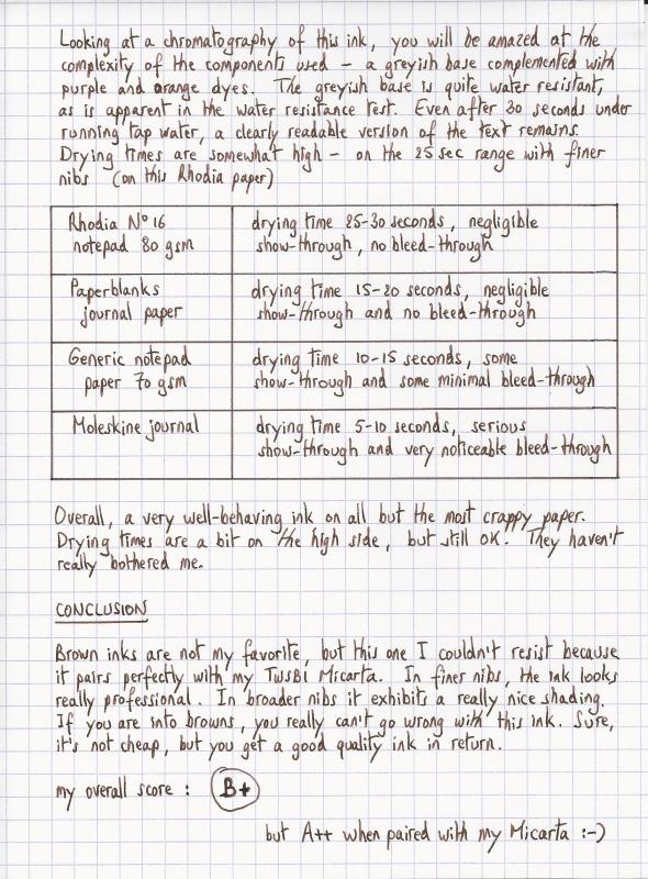
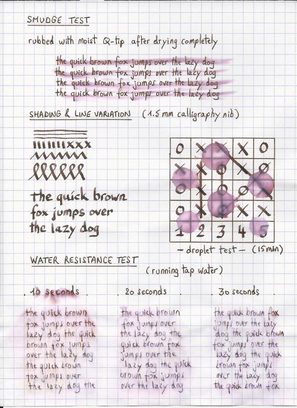
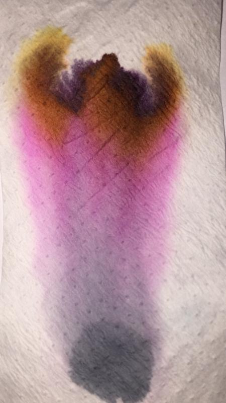
Ink Review : Pilot Iroshizuku Tsukushi (horsetail) Pen: TWSBI Micarta v2, F-nib Paper: Rhodia N°16 notepad 80 gsm "horsetail basking in sun-showered forest beautiful inkdrops" When an ink review starts off with a haiku, you just know that it will cover a Japanese ink. And you would be right ! This review examines Pilot Iroshizuku Tsukushi, a nice reddish-brown ink. As most of you know, Iroshizuku is Pilot's luxury line of fountain pen inks - read: these inks are really expensive. The name Iroshizuku is a combination of the japanese words Iro (coloring) and Shizuku (droplet). The name is meant to reflect the image of dripping water in a variety of beautiful colors. All the inks in the line are named after natural landscapes & plants, with each ink trying to capture the depth and essence of color of its namesake. For some reason, iroshizuku inks always remind me of Akira Kurosawa's movie Ran - in his castle, the Great Lord Hidetora Ichimonji writes his final will on a parchment, dividing his domain among his three sons. Iroshizuku tsukushi would have been an ink worthy of such an occasion. Tsukushi is a nicely saturated soft reddish-brown ink with some subtle shading. The shading is almost unnoticeable in finer nibs, but becomes more pronounced if you move to broader nibs. The reddish components become more visible with the wetter pens. This is a serious-looking ink that is not at all misplaced for business correspondence. It is one of my favorites for use at work. Furthermore, this reddish-brown ink is a match made in heaven for my TWSBI Micarta - these two go together perfectly. Looking at a chromatography of this ink, you will be amazed at the complexity of the components used - a greyish base complemented with purple and orange dyes. The greyish base is quite water-resistant, as is apparent in the water resistance tests I performed. Even after 30 seconds under running tap water, a clearly readable version of the text remains. Drying times are somewhat high - on the order of 25 seconds with finer nibs on Rhodia paper. Rhodia N°16 notepad 80 gsm - drying time 25-30 seconds, negligible show-through, no bleed-throughPaperblanks journal paper - drying time 15-20 seconds, negligible show-through and no bleed-throughGeneric notepad paper 70 gsm - drying time 10-15 seconds, some show-through and some minimal bleed-throughMoleskine journal - drying time 5-10 seconds, serious show-through and very noticeable bleed-throughOverall, a very well-behaving ink on all but the most crappy paper. Drying times are a bit on the high side, but still OK. They haven't really bothered me. Conclusion Brown inks are not my personal favorite, but this one I couldn't resist because it pairs perfectly with my TWSBI Micarta. In finer nibs, the ink looks really professional. In broader nibs it exhibits a really nice shading. If you're into browns, you really can't go wrong with this ink. Sure, it's not cheap, but you get a good quality ink in return. My overall rating: B+ (but A++ when paired with my Micarta ;-)

-

Sailor For Kingdom Note Trypoxylus Dichotomus "rhinoceros Beetle"
white_lotus posted a topic in Ink Reviews
Sailor makes inks for select shops carrying their pens and standard inks. One of those shops named Kingdom Note has a line of inks after Japanese wild birds, insects, and fungi. They have been sought after by ink cognoscenti to the detriment of their pocketbooks and wallets. Many of the inks may well be the best Sailor has produced. This ink is named after a particular Japanese beetle known as the "Rhinoceros beetle". It is sometimes sold as a pet in Japan and other parts of Asia. If I remember correctly it only lives for about 4 months or so as an actual beetle. They live about a year underground in larval form. The shell of the beetle is a red brown color, and this ink attempts to capture that hue. From photos I have seen, it appears that they have succeeded. The color is definitely brown, with a strong red, red-violet undertone. The handling as with so many Sailor inks is on the juicy, wet side which I prefer. On Mohawk via Linen paper. On Hammermill 28lb Inkjet paper. I definitely like this ink. EDIT: here is the pic of the waterfastness test: -
Ink Review : Diamine Strauss (Music Collection) Pen : Lamy AL-star, M-nib Paper : Rhodia N°16 notepad 80 gsm Review Vienna, summer of 1873. Last night in a red-brick dance-hall in the centre of Vienna, I witnessed bats flittering across the ceiling. Their playful aerial acrobatics were an amusing sight. This setting inspired my muse: I can see the notes of a similarly playful musical piece… a fitting overture for an operetta. I think I will call it “Die Fledermaus”. In 2015 Diamine released the Music Collection, a set of 10 subdued ink colours named after well-known composers. In this review, we take a look at Strauss. After the above introduction, you're sure to remember that this is a red-brick coloured ink. Diamine Strauss is a kind of red-brick colour, to my eye a red-brown ink but firmly on the red side of the spectrum. Technically the ink performs well – flow and lubrication are ok, and the ink doesn’t feather. It can handle even fountain pen unfriendly paper like Moleskine, where there is only minimal bleed-through. The ink looks somewhat flat in finer nibs, but becomes more lively with decent shading in the broader nibs. Contrast with the paper is excellent, resulting in an easy read. And yet… for an ink of the Music Collection, this one doesn’t sing to me. For me, the colour doesn’t work – it seems the ink can’t make up its mind: does it want to be a red or a brown? What you get is an in-between colour that I personally find unsatisfying. And it’s not that I dislike red-brown inks ! When done right, they can be really beautiful – Diamine Terracotta e.g. is one of my favourites. For some reason, this ink doesn't scan well. The non-colour-corrected scans turn out too purple. I first tried to colour-correct, but ultimately decided to go with the original scan - I'll add a photo to the comments later on. Diamine Strauss is fairly smudge-resistant – when rubbed with a moist Q-tip cotton swab, the text remains very readable despite a reddish smearing of the ink. Water resistance is totally absent though – when the ink comes into contact with water, all text is completely obliterated, leaving only some reddish-brown smudges. Definitely not an ink to use when some measure of water resistance is required. Strauss is an ink that is technically ok, but with a red-brick colour that is not to my liking. In my opinion this is the worst ink of the Music Collection. I’ve used it for a week or so in preparation of this review, but it is unlikely that it will find its way into my pens again. If you’re looking for a red-brown ink, my personal advice is to look elsewhere. My overall score : C
-
Monteverde's revamped line of inks recently got my attention for their comprehensive lineup of clear, distinct hues, as well as good value. A 90ml bottle can be had for about $13-$15 USD from the better known online retailers in the United States, making it a very good deal. Monteverde touts their "ITF Technology". From Monteverde's promotional material, here's how it claims to benefit us writers: Monteverde Canyon Rust I was PIF-ed this ink by Amberlea at the LA Pen Show. I think she might have noticed my budding interest in brown inks and gave this one to me to try. She gave it to me on the condition that if I did not like it, I would PIF it on to someone else. Color/Saturation Canyon Rust is a red-brown ink, to me more brown than red. The color varies highly with the pen and ink flow. From my Pilot 78G with a double-broad Italic nib, it comes out looking very much like a rust red color. My Aurora Talentum with a M regular nib gives the ink a darker, browner hue. Clairefontaine paper Shading/Sheening Canyon Rust shades well on several papers, including Clairefontaine, Fabriano and even on copy paper. I have not noticed sheening on any of the papers I have tried. Tomoe River paper Flow Though Monteverde bills their Ink Treatment Formula as a flow enhancer, their inks haven't been consistent and Canyon Rust runs somewhat to the dry side of the six Monteverde inks I have tried. Amberlea PIF-ed this ink to me for a simple reason: when she filled a pen with Canyon Rust, right out of the bottle, the pen went dry and refused to write. She rejected the ink on those grounds alone. I filled a brand-new Pilot 78G with Canyon Rust and put pen to paper. The pen refused to write for me as well. I twisted the converter to saturate the feed, and tried again. This time I got half a page in before the pen went dry. Since the 78G was a brand-new pen, I had no way of knowing if the problem was the ink or the pen, so I flushed and loaded it with Waterman Blue-Black, a known "reliable" ink. The pen had no problems. Loading the 78G a second time with Canyon Rust, I had no flow or starting issues. Over the past month, I've revisited the 78G, leaving it nib-up for days and sometimes over a week between uses. I haven't seen a repeat of the flow or starting issues. I suspect the pen simply needed a good flush because it was brand new. (And it also teaches me to use known pens for testing unknown inks, and vice-versa). I also loaded Canyon Rust into my Aurora Talentum, one of the best writers in my collection. The Aurora is about middle on the scale between dry and wet writer, and Canyon Rust works well in this pen, again with no starting or flow issues in a month of use. Lubrication Judging lubrication is a little difficult with my two test pens - the Italic nib on the 78G writes very crisply, and Aurora nibs have a characterstic "toothiness" to them that somewhat works at odds with the lubricating qualities of inks. That said, I would say that though Canyon Rust is less lubricated than the other Monteverde inks I've tried, it ranks about average compared to inks I've used in general. I have noticed the "stiction", where there's a little bit of added resistance at the beginning and end of each pen stroke. This has been characteristic of nearly all the Monteverde inks I have tried and I suspect comes from their "Ink Treatment Formula". Dry Time Dry Time for Canyon Rust is pretty quick on Clairefontaine paper, about 15 seconds . On 20 lb. copy paper, it's a bit slower than I expected, about 10 seconds. 20lb. Copy Paper Feathering Feathering is close to nonexistent on 20 lb. copy paper. On a cheap office pad, there is a mild to moderate amount of feathering. 20lb. Copy Paper Office Pad Bleedthrough There is no bleedthrough on 20 lb. copy paper. On a cheap office pad, bleedthrough is moderate, but enough so to make the back side of the page unusable. 20lb. Copy Paper Office Pad Water Resistance Canyon Rust does not have much water resistance. It practically all washed away in the 10-second immersion test. Noodler's Heart of Darkness, a waterproof ink, is used as a control. Clairefontaine paper
-
Ink Review : Diamine Mozart (Music Collection) Pen: Lamy Al-Star, M-nib Paper : Rhodia N°16 notepad 80 gsm Review Vienna countryside, summer of 1788 A hot late-summer afternoon just after a refreshing shower. Farmers in the red-brown freshly plowed fields. A friendly wrestling match between two young men trying to impress their lovers. Yey ! Mudfight. How hilarious ! This setting inspires my muse. I've got a splendid idea for a comical opera buffa with lovers as a theme - I think I will call it "Cosi Fan Tutte." In 2015 Diamine released the Music Collection, a set of ten inks named after well-known composers. This is a collection with serious, subdued colors. In this review, we take a look at Mozart - after the above discussion, you're sure to remember that this is a red-brown ink. Diamine Mozart is a nice red-brown ink, almost pinkish red-brown as shown in the chromatography. This ink writes well, with good flow, and exhibits some nice shading. Looks real good in broader nibs where the shading is more pronounced, and where the red-brown color shows its best. In finer nibs though, I find that the ink looks rather bland and uninspiring. Because of my small handwriting I typically use the finer nibs, so this Mozart is not really my thing. OK - but how does it behave on paper ? For this, I did some tests: Rhodia N°16 notepad 80 gsm - drying time 20-25 seconds, no feathering, no show-through and no bleed-through. Nice-looking on this white paperPaperblanks journal paper - drying time 10-15 seconds, no feathering, some minor show-through, no bleed-through. Looks more reddish on this more yellowish paperGeneric notepad paper 70 gsm - drying time 10-15 seconds, no feathering, no show-through nor bleed-throughMoleskine journal - drying time ~5 seconds, no feathering, significant show-through and bleed-through. Looks more reddish on this off-white paperMozart is a well-behaving ink on a wide variety of paper. Personally I like it best on pure white paper. On off-white, more yellowish paper, it looks really red. Too red for my taste. The ink is smudge resistant, but totally not water-resistant. Short exposure to water leaves a reddish residue that remains more or less readable. After a longer soak, the text is gone and only red-brown mudstains remain. Conclusion Diamine Mozart is a well-behaving ink with good flow, that tolerates a wide variety of paper. Even Moleskine journals are OK if you use only one side of the pages. A shame about the complete lack of water-resistance though. The color - as always - is a personal thing. Myself, I'm not a fan of this Mozart. It's a bit too red for my tastes. But if you like red-brown inks, this Mozart might just be your thing. my overall score : B