Search the Community
Showing results for tags 'red-black'.
-

Guider Capsule With Visconti Nib And Schimdt Nib Units Review
Samrat posted a topic in Fountain Pen Reviews
Hello everyone, This review is long due. I love this particular pen model so much just for the looks, with far less emphasis on the utility part. But surely, that’s my selfish choice not to subject these pens to the everyday rough working conditions, trying hard to preserve these absolute beauties. The model is named as Guider ‘Capsule’. Now, I can presume many would frown upon hearing the model name, but it’s not very hard to see the similarity between a very very elongated capsule and this model. Well, if you are not convinced, still the model name is pretty catchy. Guider Pen works is a famous Indian hand made fountain pen making company based out of a small town Rajahmundry in Andhra Pradesh. There are two pens on review today. One comes in black-grey-white mosaic patterned acrylic and another one in red-black mosaic acrylic. Both the colours and patterns look amazing. The black and white pen has a medium Schmidt nib unit and the red-black one has a steel Visconti medium nib unit. I would like to thank our respected member Mr. Sanjay Ramaswamy for arranging a group buy for these Visconti nibs and also commissioning these pens from Guider. I initially bought two Visconti steel nibs, one fine and one medium. The medium nib was fitted on the red-black mosaic pen and fine nib was with a yellow-black pen. Later I sold off the yellow-black pen with fine Visconti nib. Sanjay was also generous to give us a snake clip for each of the pen free of cost as roll stopper and I appreciate the beautiful clip. The second pen of black-white pattern with Schimdt nib was ordered directly from Mr. G. Subbarao of Guider pens. This is a rod shaped symmetrical fountain pen, with rounded ends and no tapering towards top or bottom. The cap is flushed with the body in such a way that it looks a single piece when capped. Why I like this pen- The simple yet beautiful looks!! What I don't like about this pen- It’s a bottom heavy pen, so I don’t like the balance of it. Posting is not possible. The design entails it to be clip less, so chance of rolling over table edge. But again, you don’t want to spoil the looks by introducing some roll stopper that might scratch the surface. Guider needs to improve their packing. They sent my pens in a plastic box with transparent plastic cover, which broke in all three pens. Fortunately none of my pens had any scratches etc. But I feel they should give attention to this aspect. Also they should provide better pictures of their offerings when one contacts them. You can never guess how his pens look by watching his photos sent in whatsapp 1. Appearance & Design: The particular bland appearance is the key in case of this model. Many Guider pens are beautiful, but this one is best. The streamlined shape, the simple minimalistic yet attractive design steals the show for me. But I don’t think everyone is going to love this pen, some even may find it to be too ordinary or lacking any specific appeal. It’s a medium sized pen with no finial, ornamental accessories, clip, extra curve, edge or groove. When capped, it looks like one round stick. One can chose a clip for this pen, but in my opinion that will destroy the look. On removing the cap, the section gently tapers towards the nibs before just flaring up a bit for a presumed finger rest. Or the end flaring might be there to render some strength to the section top and easy threading of nib unit. The tapering section is in contrast to the elongated rod shaped body, which feels a bit oversized compared to the section. The threads for cap don’t interfere with the grip. The cap unscrews in two and a half turns, but there is no tightness. The section proper is small, sits on top of a step down protrusion from body which actually sports the threads for cap. The section requires 8-9 turns to fit, but I haven’t tried this pen as eyedropper. I wouldn’t advise members to try it as eyedropper unless they are ready to face the hassles of a failure. 2. Construction & Quality: The material is very good looking. The polish is good on both pens. Though these are hand turned pens, there are minimal lathe marks on them. Both the pens look like premium models. The finishing on Guider pens is one of the best among Indian pen makers. The white-grey mosaic acrylic cap looks transparent. I am not sure about the strength of this acrylic, neither I want to drop this pen on floor like some You tubers do with their iPhones. Particularly I am concerned with the margin of the caps, as they look particularly thin. But considering the design, a cap ring is strict no no. Also the section end looks a bit thin. The pen nevertheless feels sturdy in hand. I don’t have any complaints with the finish. 3. Weight & Dimensions: It’s a lightweight medium to large sized pen. The dimensions are as follows (There may be slight piece to piece variations as these are hand made pens) Length of the pen: 152 mm Length of uncapped pen: Schmidt nib black-white pattern pen- 135 mm Visconti nib Red-black patterned pen- 143 mm. Posted length: Not possible Diameter of section: Schmidt nib pen - 10 mm at base to 7.5 mm at top. The flaring measures 8 mm. in diameter. Visconti nib pen- 11 mm. at base to 9 mm at top. The flaring part measures 9 mm. Barrel diameter: 12 mm. and 13 mm. respectively. Section length: 25 mm and 30 mm respectively. Nib length: 18 mm and 21 mm respectively. Posting is not possible. The balance is back heavy and I don’t like long writing sessions with the pen. 4. Nib & Performance: Schimdt medium nib- The nib is smooth and it has good flow. No skipping or dry start. Visconti Steel medium and fine nib – This is a famous nib and hard to get in our geographical area. Thanks to Sanjay, we got them at a good price in a group buy. Both the nibs are smooth, but the flow is towards a dry side. I didn’t get the fuss about Visconti steel nibs. The Schimdt nib in this case is better than both the fine and medium Visconti nibs. There was no skipping or hard start in either nibs. All the pens worked fine out of the box. The Schimdt nib was a delight to use. The Visconti steel nibs were average smooth performers. 5. Filling System & Maintenance: This pen is a cartridge converter pen. Unfortunately I didn’t receive any converter with any of these pens. They take Schimdt converters and probably international cartridges. The end of nib collar is flush with the section end, so effectively the converter hangs from the section end. Though with my limited usage, I didn’t face any leakage problems. I don’t advise to try converting these pens into eyedroppers. From Right: FC Loom, Sailor 1911,Conklin Duragraph, Guider Capsule 6. Cost & Value: The pen with Schimdt nib cost me Rs. 2000 (About $30) which is amazing price for this beautiful pen. The pen with Visconti nibs cost us Rs 3000 each (about $45). It’s a valuable addition to any collector’s possession. Guider pen is quick to prepare and ship my pens. He responds to queries properly, though occasionally it may take 1-2 days and follows deadlines. Sanjay did a great job in getting the custom Visconti pens done in a few month’s time. 7. Conclusion: I would love to recommend this pen only for the attractive material and the unique, albeit elementary design and appearance. I would recommend selecting a Schimdt nib rather than the Guider Stock nib, because in case you get a lemon of a nib, you can fit another nib unit far easily. Also the experience with Schimdt nib is far better than the Guider Stock nibs. This pen also comes in ebonite, but obviously the beauty will be much muted in that material. Different colours are available on contact with Guider pens. His no. for phone and whatsapp-- +91 9390163779. His website (though no direct buying link) Guider pens. If you are interested in their other pens and a bit of history of Guider as pen maker, you can check out this review. Disclaimer: I bought all pens, inks and papers with my money and none of them received as gift. -
More like, Red-black derived from Camel. I have used fountain pens all my life, but never once did I change my Ink. Have always been using Camel's Royal Blue and it is my favourite. Recently, I started wondering what it would be to use a different ink. But I was stunned to see the prices of the inks. I love Camel, and thought that I should get their Scarlet Red. But that red was a bit too bold for me (plus it reminded me of errors (as it is a colour my teachers used to correct.)). I wanted something like Oxblood or Havana brown that could be used for writing, and not just editing. Thanks to recipe by @madzaxmax (https://www.fountainpennetwork.com/forum/topic/241111-ink-mixing-experiment/) and using *almost* same proportions, I got this. This was my first attempt at mixing inks. And sorry for my handwriting!
-
http://i.imgur.com/cbxj88r.jpg?2
-
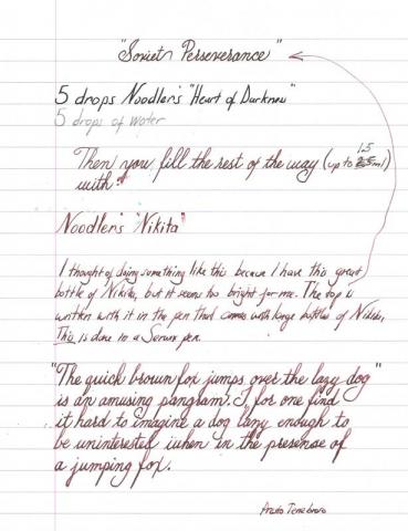
This homemade ink is the result of me wanting a darker red than Noodler's Nikita could provide and me having too much time on my hands. I looked up recipes on FPN that included inks I had on hand, and I came across Black Swan in North African Violets. I thought it was a great ink so I experimented with adding Heart of Darkness to it until I could get a shading, dark, dark red. After great toil, this was the best I could come up with. It works nicely in a flex pen, but it also looks pretty good in the F Noodler's pen the Nikita came with.


