Jump to content

Search the Community

Showing results for tags 'red'.

  • Search By Tags

    Type tags separated by commas.
  • Search By Author

Content Type


Forums

  • FPN Community
    • FPN News
    • Introductions
    • Clubs, Meetings and Events
    • Pay It Forward, Loaner Programs & Group Buys
  • The Market Place
    • The Mall
    • Market Watch
    • Historical Sales Forums
  • Writing Instruments
    • Fountain & Dip Pens - First Stop
    • Fountain Pen Reviews
    • Of Nibs & Tines
    • It Writes, But It Is Not A Fountain Pen ....
    • Pen History
    • Repair Q&A
  • Brand Focus
    • Cross
    • Esterbrook
    • Lamy
    • Mabie Todd Research/Special Interest Forum/Group
    • Montblanc
    • Parker
    • Pelikan
    • Sheaffer
    • TWSBI
    • Wahl-Eversharp
    • Waterman
  • Regional Focus
    • China, Korea and Others (Far East, Asia)
    • Great Britain & Ireland - Europe
    • India & Subcontinent (Asia)
    • Italy - Europe
    • Japan - Asia
    • USA - North America
    • Other Brands - Europe
  • Inks, Inc.
    • Inky Thoughts
    • Ink Reviews
    • Ink Comparisons
    • Co-Razy-Views
    • Th-INKing Outside the Bottle
    • Inky Recipes
  • Paper, and Pen Accessories
    • Paper and Pen Paraphernalia
    • Paper & Pen Paraphernalia Reviews and Articles
  • Creative Expressions
    • Pen Turning and Making
    • Pictures & Pen Photography
    • The Write Stuff
    • Handwriting & Handwriting Improvement
    • Calligraphy Discussions
    • Pointed Pen Calligraphy
    • Broad (or Edged) Pen Calligraphy

Blogs

  • FPN Board Talk
  • Incoherent Ramblings from Murphy Towers
  • The Blogg of Me
  • FPN Admin Column
  • Rules, Guidelines, FAQs, Guides
  • Musings on matters pen
  • Marketing & Sales
  • Iguana Sell Pens Blog
  • Newton Pens' Blog
  • Peyton Street Pens Blog
  • holygrail's Blog
  • A Gift For Words
  • I Don't Have a Name; So This Will Do
  • Karas Kustoms' Blog
  • Debbie Ohi's Inky Journal
  • Sus Minervam docet
  • Crud!
  • Clut and Clutter
  • Federalist Pens

Product Groups

  • FPN Pens
  • FPN Inks
  • FPN Donations
  • Premium/Trading/Retailer Accounts

Categories

  • Fonts
  • Tools & Software
  • Rules for Notepads & Paper

Find results in...

Find results that contain...


Date Created

  • Start

    End


Last Updated

  • Start

    End


Filter by number of...

  1. namrehsnoom

    Teranishi Guitar - Modern Red

    Teranishi Guitar – Modern Red Teranishi Chemical Industries – based in Osaka, Japan – was founded during the Taisho period around 1916, and got quite some fame as one of the earlier ink producers in Japan. For their 105th anniversary, the company introduced some stylish retro-inks, hinting at this exciting start-up period. The inks come in beautiful – almost art deco – boxes, containing a nice-looking 40ml bottle of ink. And please take a close look at the ink’s bottle cap: it’s marked with Teranishi’s original “Gold Star Guitar” brand, featuring a queen strumming a guitar … weird! I discovered the Teranishi inks in 2022, and have enjoyed them a lot. These inks are typically well saturated, but at the same time manage to look muted and toned-down – and the subject of this review is no exception. Modern Red is a beautiful cardinal red and as such a bit darker than your standard middle red. In my opinion also less pushy … looking at a full page of red can be difficult on the eyes, not so with this Modern Red. This ink has toned down the brightness a full notch, making it much more suitable as a writing ink. What I also like about this Teranishi ink is that it changes its looks depending on the paper used: from dark cardinal red to more orange-brown tones. Nice complexity that adds to the character of this ink. Modern Red is well-saturated, and writes with a nice wet and smooth flow. The ink works effortlessly with any pen and paper combination that I tried. Drying times are decent, but depend greatly on the hardness of the paper used. On smooth coated paper, you consistently get medium-long drying times in the 20-25 second range. On absorbent paper, the ink gets soaked into the fibers almost instantly with drying times in the 5 second range. With cheap copy paper this translates to a fair amount of bleed-through. To illustrate the colour span of this Teranishi ink, I did a swab on 52 gsm Tomoe River paper, where I really saturated portions of the paper with ink. Modern Red has a medium colour span, ranging from a soft pastel-like red to the darker cardinal red. The contrast range is not too extreme though and translates to nice and subtle shading. Not a heavy shader, but it’s definitely there and looks aesthetically pleasing. On the smudge test – rubbing text with a moist Q-tip cotton swab – the ink shows lots of smearing. The text itself remains perfectly readable, but you get red all over the page. Something to be aware of. Water resistance is largely absent. From the water test at the end of this review, you’d deduce that all writing is lost. Surprisingly, that is not the case. All of that red colour simply disappears, but a grey ghost of your writing is left behind, which is just readable enough to reconstruct your writing. This is also evident from the chromatography: The red dyes get flushed away by water, while a grey base colour remains firmly attached to the paper. I wouldn’t call this disaster-proof, but it gives some peace of mind that reconstruction is possible. I’ve tested the ink on a wide variety of paper – from crappy Moleskine to high-end Tomoe River. On each scrap of paper I show you: An ink swab, made with a cotton Q-tip 1-2-3 pass swab, to show increasing saturation An ink scribble made with a Lamy Safari M-nib fountain pen The name of the paper used, written with a B-nib Safari A small text sample, written with the M-nib Safari Source of the quote, written with a wet F-nib Pelikan Drying times of the ink on the paper (with the M-nib Safari) The multi-paper writing test shows that Teranishi Modern Red works well with both white and cream paper. There is a tiny amount of feathering on low-quality paper but nothing too serious: even Moleskine paper worked quite well. This ink works surprisingly well on crappy paper. Just be aware that the back-side of the paper becomes unusable, due to a fair amount of bleed-through. Overall, a technically solid ink – what I’ve come to expect from Teranishi. I used photos for the writing samples above to get the most accurate results. For completeness, I also add a scan of some writing samples. Beware that both photos and scan are slightly off – the ink’s colour looks a bit too brown, and shows more red when viewed by the naked eye. The saturation and title pics above are closest to the true colour. So use the sample text pics primarily to get a feel of the ink across a range of writing papers. Below you’ll find some zoomed-in parts of writing samples. On HP print paper, there’s a tiny amount of feathering with the bold nib – just noticeable enough to be annoying. With F and M nibs, there’s still some feathering present, but only if you look really close. If you restrict yourself to EF/F nibs on low-quality paper, this Modern Red will do just fine. Writing with different nib sizes The picture below shows the effect of nib sizes on the writing (written on Rhodia N°16 80 gsm paper). All samples were written with a Lamy Safari. I also added a couple of visiting pens: a Pelikan with F-nib, a fairly dry Kaweco Special with M-nib, and a wet-writing Pilot Capless with M-nib. This Teranishi Modern Red looks good in all nib sizes. You’ll also notice a substantial difference between wet and dry writers: the wetter Pelikan and Pilot pens write a much darker saturated red. So you can tune this ink to your liking by adjusting your pen. Nice! Related inks To compare Teranishi Modern Red with related inks, I use my nine-grid format with the currently reviewed ink at the center. This format shows the name of related inks, a saturation sample, a 1-2-3 swab and a water resistance test – all in a very compact format. As you can see, there are lots of alternatives in this colour range: Diamine Blood Orange and Carnival are fairly close matches for Modern Red. Inkxperiment – architexture “Lighthouse” As a personal challenge, I try to create interesting drawings using only the ink I am reviewing. A fun endeavour that’s always good for a couple of hours tinkering around with the ink. I simply love experimenting with inks to see how they behave in a more artistic context. Red inks have always been a challenge for me when creating an inkxperiment, and this Modern Red was no exception. I’m a great fan of Jim Butcher’s writing – especially his Harry Dresden novels. The author has now started a steampunk series “The Cinder Spires”, which I’m thoroughly enjoying. So I decided to try my hand at some architexture drawings with a steampunk feel. When the airships move to home base, it’s always good to have a guiding light. That’s where the lighthouse comes in. Its beacon shows the safest path to the docking bay even in the darkest hours. I started with an A4 piece of cardboard paper and painted in the foreground and lighthouse contours with water-diluted ink. Immediately things went wrong… red inks don’t dilute easily, and the ink was still way too dark. The lighthouse should have been a much lighter rose-red. Instead of jumping out of the window, I decided to own my mistake and follow through with the drawing. I used a glass dip pen and fountain pen to draw the lighthouse interior, and the side schematic of the beacon mechanism. I finished the drawing by adding the houses in the foreground, and the square imprints the airship sailors left with their beer glasses. I like the concept of this drawing, but not its execution. Well… lesson learned for next time. Inkxpired – computational art I love experimenting with pen/ink/paper, and have added another layer as part of the hobby. I’m exploring computational art, inspired by the ink drawings I do during ink reviews. Another fun offshoot of the hobby… and all that starting with a few drops of dye-coloured water on paper. In order to save the lighthouse drawing, some heavy duty digital manipulation is required. I started by using a filter that really stretched the contrast range. This worked wonders, and lifted the technical interior details from the too-dark background in the original drawing. I next used a vintage filter to give the drawing a more aged and steampunk feel. The resulting image fits my original intention nicely… and saves the inkxperiment from disaster 😉 Conclusion Teranishi Modern Red is a fairly saturated cardinal red, that writes wet and smooth. The ink works well with any pen/nib/paper combination. A decent ink … nothing wrong with it. But there are so many other reds in this colour range. If you already have some, there is not enough extra here to jusitify getting this Teranishi ink. Good but not exceptional. Technical test results on Rhodia N° 16 notepad paper written with Lamy Safari, M-nib Backside of writing samples on different paper types
  2. namrehsnoom

    Pelikan Edelstein Garnet

    Pelikan Edelstein Garnet In 2011 Pelikan introduced the Edelstein series of high-end inks, available in a variety of colours. The theme of the Edelstein concept is the gemstone – each ink corresponds to the beautiful colour of a gem. The Edelstein line of inks is presented in 50 ml high-value bottles, that are truly beautiful, and worthy of a place on your desk. In this review I take a closer look at Garnet, the Edelstein Ink of the Year 2014, which is now part of the regular Edelstein line-up. Garnet is a fairly bright and well-saturated orange-leaning red. In daylight and in scans the ink’s red tones dominate, but under warm artificial light Garnet definitely shows its orange-leaning nature. This is a decent red ink, that works well in all nib-sizes and on all types of paper. But that’s about it… personally I think there are lots of similar reds about, and there is little to lift Garnet above the pack. Below I give you enough background information to let you make up your own mind. The chromatography shows orange-red dyes and a bit of grey in the mix. The grey tones down the ink a bit, making Garnet appear less vibrant. For red inks, this can be a good thing: a full page of vibrant red might be a bit too much for some. From the bottom part of the chroma, you can already deduce that Garnet is not a water resistant ink. This Edelstein ink can handle all nib sizes with ease, always showing a well-saturated line. I actually prefer this ink with the finer nibs (EF/F), where its presence on the paper is less overwhelming. My personal opinion is that red inks are ok for occasional notes when reviewing/correcting a document, but are too loud for regular writing/journaling. A full page of Garnet hurts the eyes. To show you the impact of saturation on the ink’s look & feel on paper, I made some scribbles where I really saturated portions of a scrap of Tomoe River paper with ink. This gives you a good idea of what the ink is capable of in terms of colour range. Garnet has a low dynamic range, with little difference between the light and darker parts. Not a lot of shading with this ink! The little shading you get is most apparent when using Garnet in dry pens with broader nibs (like the 1.5 / 1.9 calligraphy nibs for a Lamy Safari). I’ve tested the ink on a wide variety of paper – from crappy Moleskine to high-end Tomoe River. On every small band of paper I show you: An ink swab, made with a cotton Q-tip 1-2-3 pass swab, to show increasing saturation An ink scribble made with an M-nib Lamy Safari fountain pen The name of the paper used, written with a B-nib Lamy Safari A small text sample, written with an M-nib Lamy Safari Origin of the quote, written with an F-nib Pelikan M101N Bright Red Drying times of the ink on the paper (with the M-nib Lamy) The ink copes well with a wide variety of paper – it even works well with Moleskine paper: just a tiny bit of feathering, and only a bit of bleed-through. This is an ink that can tolerate even crappy copier paper at the office. I like Garnet just a touch more on the yellow papers in my test set. The yellow background accentuates the orange undertones of the ink, and reduces the contrast between ink and paper, making a page of red writing less loud and in your face. Scanned images alone are not enough to give you a good view of the ink - they tend to exaggerate contrast, and sometimes have difficulty capturing the colour of an ink. I’ve therefore added a few photos to give you another view on the ink. Writing with different nib sizes The picture below shows the effect of nib sizes on the writing. As you can see, Garnet works well in all nib sizes, even the finest ones. I actually prefer using it with the EF/F nibs – the fine line you get tames the ink a bit, and makes a full page of Garnet look a little more palatable. Related inks To show off related inks, I use my nine-grid format, with the currently reviewed ink at the center. This format shows the name of related inks, a saturation sample, a 1-2-3 swab and a water resistance test – all in a very compact form. This allows you to easily compare the ink with its eight direct neighbours, which I hope will be useful to you. Garnet sits somewhere between MB Corn Poppy Red (which is a bit more vibrant) and kyo-iro Flaming Red of Fushimi (which looks a bit softer and more delicate). Inkxperiment – stilt village I’ve put myself a challenge to try to produce interesting drawings using only the ink I’m reviewing. For me this is an incredibly fun extension of the hobby, that continuously challenges my drawing skills. Red inks often have a low dynamic range, and are a real challenge for single-ink drawings, and Garnet is no exception. I therefore decided on a simple pen drawing. I started with an A4 piece of HP photo paper, on which I painted the background using a water-soaked kitchen towel on top of which I painted with water-diluted Garnet. This always produces a nicely textured background on which to paint the subject. In retrospect, I should have diluted the ink quite a bit more… the background turned out to be a bit too prominent. I then drew in the village buildings using a 2-point perspective, and added the stilts and netting with my Lamy Safari fountain pen. Final touches to the buildings were done with a felt-tip pen and fountain pen. The resulting drawing shows what can be achieved with Garnet in an artistic context. Due to its limited colour span, Garnet is best used for line drawings. The stilt village turned out quite well. A pity about the background that should have been softer… well, lesson learned for a next time 😉 Conclusion This Edelstein ink of the year 2014 (which is now part of the regular line-up) has no real technical shortcomings: well-saturated, works with all nib-sizes and paper types. It does lack water resistance though, if you care about such things. All in all a decent red, but personally I’ve seen better ones that I liked more. Technical test results on Rhodia N° 16 notepad paper, written with Lamy Safari, M-nib Back-side of writing samples on different paper types
  3. Diamine Blood Orange (150th Anniversary II) The ink maker from Liverpool is one of the staple brands in ink-land. They consistently produce solid inks for a very reasonable price. In 2017, Diamine released their second ink series to commemorate their 150th Anniversary. I obtained my set shortly thereafter, but more or less forgot about them when my attention drifted to Japanese inks. About time to finish the reviews. Fortunately, these anniversary inks are still easily obtainable, so if you like what you see you can still get them. Blood Orange is a nicely saturated dark red that looks quite lovely. It’s muted and subdued, not a screaming red that jumps from the page. Quite suited for marking up papers, or correcting a pupil’s homework – it won’t scream “You made a mistake!”, but is more subtle “Look, this is not what I expected… here a some pointers to learn more about the topic, and to improve your test next time.” With this ink, it’s definitely the fruit that is referred to, no orange colour that I can see in this ink. Diamine might just as well have called it Vampire Juice. As we are used to from Diamine, the ink performs well, and writes a saturated line in all nib sizes. Shading is present with M nibs and above, but fairly unobtrusive – there is not a lot of contrast between the light and darker parts. The ink itself is on the wet side: combine it with wet pens, and you get a deeply saturated red-black line that accentuates the shading. I simply love the way my Yard-o-Led with F-nib makes the most of this Diamine ink – see the nib-size sample below. Blood Orange plays well with both white and cream paper. Personally, I like it a touch better with the yellow papers in my test set… they soften up the ink a bit more. The ink easily handles low-quality paper, with only a tiny amount of feathering on Moleskine. Expect some show-through and even a little bit of bleed-through – not a lot, but too much to use low-quality paper on both sides. To illustrate the colour span of Blood Orange, I did a swab on 52 gsm Tomoe River paper where I really saturated portions of the paper with ink. Blood Orange has a fairly narrow colour span, with not much contrast between the light and darker parts. This translates to soft shading when writing. Shading is definitely there (starting with M nibs and above) but remains fairly unobtrusive. Just enough to accentuate that you’re writing with a fountain pen. On the smudge test – rubbing text with a moist Q-tip cotton swab – the ink showed only a limited amount of smearing, with the written word remaining crisp and clear. Water resistance is totally absent – most colour disappears from the page, leaving only some red-purple smudges. Not an ink to use if water-resistance is high on your list. This is also evident from the bottom part of the chromatography. I’ve tested the ink on a wide variety of paper – from crappy Moleskine to high-end Tomoe River. On each scrap of paper I show you: An ink swab, made with a cotton Q-tip 1-2-3 pass swab, to show increasing saturation An ink scribble made with a Lamy Safari M-nib fountain pen The name of the paper used, written with a Lamy Safari B-nib A small text sample, written with the Lamy Safari M-nib Source of the quote, written with a wet F-nib Yard-o-Led Drying times of the ink on the paper (with the M-nib Safari) The multi-paper writing test shows that Blood Orange handles all papers well, looking good on both white and cream paper. There is a small amount of feathering on the worst-quality paper (Moleskine), but nothing really extreme. With cheap paper, you do get a lot of see-through and some bleed-through, making it nigh impossible to use the backside of the paper. Drying times with the Lamy Safari M-nib varied widely, depending on the absorption characteristics of the paper (from 5 seconds on absorbent paper, to more than 20 seconds on hard Japanese paper). Because scans don't always capture an ink's colour and contrast with good precision, I also add a photo to give you an alternative look on this Diamine ink. To my eye, both scan and photo capture the colour quite well. Writing with different nib sizes The picture below shows the effect of nib sizes on the writing (written on Rhodia N°16 80 gsm paper). All samples were written with a Lamy Safari. I also added a couple of visiting pens: a Pelikan M600 with M-nib, and my wet Yard-o-Led with F-nib. Blood Orange looks good in all pens, but really shines in the wet F-nib on the Yard-o-Led with some awesome-looking shading that looks almost 3-dimensional. Related inks To compare Diamine Blood Orange with related inks, I use my nine-grid format with the currently reviewed ink at the center. This format shows the name of related inks, a saturation sample, a 1-2-3 swab and a water resistance test – all in a very compact format. Blood Orange looks like a slightly darker version of TACCIA benitsuchi. Oh – and by the way – while writing this review I noticed that I selected benitsuchi twice (apparently I had two sample cards of this ink, and I just selected on colour without paying attention to the ink names). Inkxperiment – Jack the Ripper As a personal challenge, I try to create interesting drawings using only the ink I’m reviewing. I consider this a fun extension of the hobby, and these single-ink drawings are great for exploring the colour-range nuances that are present in the ink. I love doing them! Inspiration for this drawing comes from the book “A Sympony of Echoes” by Jodi Taylor (one of the books in the Chronicles of St Mary’s series – highly recommended for a light and enjoyable read). The book chronicles the adventures of a group of time-traveling historians documenting major events in our history. In this novel, our historians travel to London of 1888, where they have a nasty encounter with a wraith-like Jack the Ripper. I tried to capture this particular moment in my drawing. I started with an A4 piece of HP photo paper to which I added a background of squares representing the city blocks and winding streets of London. I then added some city elements (Big Ben and city lights) to set the scene and painted in our brave historians. I then used a fine brush to add the wraith-like figure of Jack the Ripper, roaming the streets in London’s Whitechapel district, ready to slay and maim his victims. I got carried away a bit while drawing the figure of Jack the Ripper resulting in too much clutter in the drawing. But still, you get a good feeling of what can be achieved with this Diamine ink in a more artsy context. For a red ink, there’s quite some potential there. Inkxpired – computational art I love experimenting with pen/ink/paper, and have added another layer as part of the hobby. I’m exploring computational art, inspired by the ink drawings I do during ink reviews. Another fun offshoot of the hobby… and all that starting with a few drops of dye-coloured water on paper. Starting from the original drawing, I did a square cut-out and converted the drawing to black-and-white. Next I used a negative filter with gives a more ghost-like Jack the Ripper. I finally used an art filter to add some colour, and applied a radial blur filter that centered on the killer’s victim. Conclusion Diamine Blood Orange is a good-looking dark red – muted and with lots of character. What makes this ink stand out for me is the way it looks in my wet F-nib Yard-o-Led … simply amazing: an almost red-black with tons of shading and a 3-dimensional feel. The ink works well with both white and cream paper, and writes wet and well-saturated in all nib sizes. I enjoyed experimenting with it – both for writing and drawing - and can definitely recommend it if you like dark red inks. Technical test results on Rhodia N° 16 notepad paper, written with Lamy Safari, M-nib Backside of writing samples on different paper types
  4. yazeh

    De Atramentis Artist Red

    Like it’s document sibling, Artist red reminds me of watermelon juice or coral red to quote @lapis I honestly cannot see much of variation between the two. If you need a document red ink go for the sibling, if not Artist is fine. The bottles are different, Artist is 50 ml. Let's start with the chroma: Writing samples: I used the same poem by Mark Nepo, which you find here. If you use a wet flex pen on this paper, you'll have a bit of ghosting and bleed through. Photo (Tomoe River Paper) Comparison with De Atramentis Document red Comparison: Watertest And finally some art work: Prince of Cards... Pentel brush pen - De Atramentis Artist Red.. Happy birthday Pentel brush pen. J Herbin Bouton d'or and De Atramentis Artist Red · Pens used: Pilot Kakuna Ef/Stub, Kaweco (EF/Reverse BB/M/B/BB), Kanwrite Ultraflex, · What I liked: Teaching me to write with a feather hand, very easy to clean. Worked well with the pilot stub... · What I did not like: Not much lubricated, palish red, good for art work · What some might not like: Dryish, the colour. · Shading: None. · Ghosting: Faint on copy paper. If you're heavy handed. · Bleed through: None · Flow Rate: Wet. · Lubrication: It won’t make your scratchy nib glide. · Nib Dry-out: No. · Start-up: No. · Saturation: No. · Shading Potential: Dismal · Sheen: None · Spread / Feathering / Woolly Line: None. · Nib Creep / “Crud”: A bit · Staining (pen): No. · Clogging: No. · Cleaning: Easy. Like most pigment inks the more it stays in the pne the more you need to soak. But I didn’t need to use pen flush. · Water resistance: Excellent. · Availability: 50 ml bottles. Please don't hesitate to share your experience, writing samples or any other comments. The more the merrier
  5. yazeh

    De Atramentis Document Red

    This ink like and it’s artsy sibling reminds me of watermelon juice. It’s a pinkish red. I’ve done a back-to-back review of both and frankly I don’t see much of a difference between them other than Artsy is slightly darker. The ink is nothing like Noodler's Fox Red, that I reviewed recently. Frankly it's an underwhelming ink. However, if you need a good waterproof ink for editing it's a decent. Let's start with the chroma: Writing samples: I realized in retrospect, that I don't have a fine Kaweco, so the fine is Medium, Medium is B and B is double broad. My apologies Poem is Adrift by Mark Nepo. Minimal ghosting on Hammermill. Photo: You see the real colour. The more absorbent the colour the paler the ink. Comparison: Artist seems slightly darker. Watertest As usual as artwork, entitled: Dreaming of watermelon in a heat wave, it was inspired by @LizEF Colorverse Redwood forrest review. Inks used: Green: R&K Alt-Goldgrün Orange: Noodler's Apache sunset I mixed the orange / green at the the horizon level Black: Pentel Brush pen Red: De Atramentis Document Red Bright green: Pastel Spade and heart... Pentel Brush nib /Document Red · Pens used: Pilot Kakuna Ef/Stub Kaweco (EF/M/B/BB), Kanwrite Ultraflex · What I liked: Teaching me to write with a feather hand · What I did not like: Not lubricated, palish red · What some might not like: Dry, the colour, daytimes. · Shading: None. · Ghosting: Faint on copy paper. · Bleed through: None · Flow Rate: Alright. · Lubrication: It won’t make your scratchy nib glide. · Nib Dry-out: No. · Start-up: No. · Saturation: Nope. · Shading Potential: Dismal · Sheen: None · Spread / Feathering / Woolly Line: None. · Nib Creep / “Crud”: A bit · Staining (pen): No. · Clogging: No. · Cleaning: Normal. Like most pigment inks the more it stays in the pne the more you need to soak. But I didn’t need to use pen flush. · Water resistance: Excellent. · Availability: 45 ml bottles. Please don't hesitate to share your experience, writing samples or any other comments. The more the merrier
  6. My original review was deleted thanks to the server problem. So, I'm reposting it. Another great ink for Iron gall ink lovers. The name is quite a mouthful. Thanks to @christof for introducing them to me. They are made in Germany and exclusively sold from this site, by the maker, Thomas Bergmann. https://www.kalligraphie-shop.com/ep...roducts/32000T They come in 2 colours: red and blue. Both inks are water resistant. The blue one is slightly more. The price, plus shipping to Canada for two bottles was 16€. That's 8€ a bottle. The bottles look a lot like De Atramentis', bur smaller. As you can see the labels are very elegant, though not very clear. I can discern: the name: Büroservice Bergmann Iron gall ink 30 ml/ 1 fl oz. I hope some of our German speaking members can translate the surrounding text: Note the beautiful red dye: Now about the red IG ink. It's a wet ink, slightly dry, i.e, it's not lubricated like Doyou Chroma: The ink write a bright red, which in time darkens in a gorgeous dark burgundy Writing samples Tomoe River 68 gr: (Fine/ Flex/Medium/ Fude/ Broad) Midori Rhodia: Apica: This is by no means waterproof but it is quite water resistant, depending paper, how long the text has been written: Mnemosyne paper: (immediately after drying) Waiting after two days: (before /after) Very absorbent cheap paper: 2 days after - Not so good enveloppe better I have no ink close to this ink, while the Kala looks similar in the scan, it's more of a purple/brown, while BN is Dark burgundy and finally, I'll leave you with an artwork, I did part of Inktober. The top background is the IG blue which has turned black, the middle is the IG red and the bottom is Gutenberg Urkundentinten G10. The paper is a Canson watercolour paper. · Pens used: : Noodler’s Ahab /Jinhao 450 Medium & Fude / Lamy Safari Broad · Shading: Lovely · Ghosting: On thin/cheap paper, maybe · Bleed through: I doubt it. · Flow Rate: Wet · Lubrication: Quite good for an IG · Nib Dry-out: No. · Start-up: Not noticed. But it could be a bit sluggish with dry pens like Safari. It would be best in a well sealed pen. · Saturation: Nicely saturated… · Shading Potential: Really good. · Sheen: None · Spread / Feathering / Woolly Line: Not noticed · Nib Creep / “Crud”: No · Staining (pen): No, · Clogging: Nope. · Water resistance: Good. The red component washes away depending paper and time. See images. · Availability: 1 oz/ 30 ml bottle Comments appreciated....
  7. namrehsnoom

    TACCIA Ukiyo-e Utamaro benizakura

    TACCIA Ukiyo-e Utamaro benizakura TACCIA is a Japanese stationery company, that is part of the Nakabayashi group. They offer high-quality fountain pens, inks, pen-rolls, notebooks, etc. More specifically, TACCIA produce a line of inks, inspired by the unique look of Ukiyo-e paintings from Japan’s Edo period (17th century). Ukiyo-e paintings are woodblock prints where the work of an artist is carved into wood by woodworkers, and pressed onto paper by printers. This allows the production of multiple prints of an artwork with some different colours as well. In this review I take a closer look at benizakura, a very bright red ink with a strong yellow-gold sheen. The colour is inspired by the red squares of the young girl’s dress in the painting “Girl blowing a glass toy”, painted by the Japanese artist Kitagawa Utamaro around 1792-1793. This is one of his drawings from the series “Ten Physiognomic Aspects of Women”. The portrait shows a young woman with a Taka-shimada coiffure, playing with a glass toy, known as a “popen”. This thin glass object has a bulb covered with a thin diaphragm at one end and a pipe at the other. When the pipe is blown or sucked, the diaphragm makes a popping sound. Benizakura is a very bright and saturated orange-leaning red, that moves towards rose-pink in its most unsaturated form. In places of high saturation, the ink presents a heavy yellow-golden sheen on the right kind of paper (like e.g. Tomoe River). To be honest, this TACCIA ink is too saturated and bright for my personal taste, so I’m not going to use it in its raw form after this review. I’ll probable darken it up a bit by adding some grey or black. Even so, I know there are lots of people that like their inks bright and strong, so I’ll do my best to give an objective review below. The ink comes in a 40 ml bottle, that is packaged in a beautiful box showing the corresponding Ukiyo-e painting. Lovely packaging for an excellent ink. To show you the impact of saturation on the ink’s look & feel on paper, I made some scribbles where I really saturated portions of a strip of 52 gsm Tomoe River paper with ink. This gives you a good idea of what the ink is capable of in terms of colour range. Benizakura has a fairly narrow colour span, with not a lot of difference between the light and dark parts. With a moderately wet pen, your writing will lean towards the more saturated part of the swab below. This translates to writing that shows little in the way of shading – the ink is too saturated for that. I only got shading when using a dry-writing Safari with broad italic nibs. The ink’s chromatography shows some unexpected complexity. The bright red is there, plus the rose-pink undertones. And there’s even some yellow in the mix, that makes this an orange-leaning red that looks fairly nice. The bottom part of the chroma already shows that most of the colour will disappear from the page when the ink comes into contact with water. This is confirmed in the water test: some rose-pink remains, but it gets heavily smeared out, and your writing will be mostly gone. Not a good ink when some measure of water resistance is on your wish list. This might be a good place to issue a word of warning. Red inks often stain a lot, but this benizakura is a real b*tch. Get it on your fingers, and you’ll probably walk around with bloody fingertips for a couple of days. In my case, people at work got curious: “did you hurt yourself?” … and I had to explain several times that inky fingers are a hazard of the hobby. Also… good pen hygiene is a must. To clean benizakura out of my review pens took 3 times the normal cleaning regimen, and I even had to use some cleaning solution to get rid of the last remnants of ink. I’ve tested the ink on a wide variety of paper – from crappy Moleskine to high-end Tomoe River. On every small band of paper I show you: An ink swab, made with a cotton Q-tip 1-2-3 pass swab, to show increasing saturation An ink scribble made with an M-nib Lamy Safari The name of the paper used, written with a B-nib Lamy Safari A small text sample, written with the M-nib Safari Source of the quote, written with a wet Pelikan M101N with F-nib Drying times of the ink on the paper (with the M-nib Safari) Benizakura can handle both pure white and yellow-cream paper. There’s a tiny amount of feathering on lower quality paper, but nothing too bad. As can be expected from a very saturated & bright ink, there is a fair amount of see-through, even on better quality paper. And you also get quite some bleed-through on the low quality paper. Not a good ink to use on the crappy copy paper that is typically used in the workplace. Drying times are all over the place, from near eternal on high-sheen hard surface paper, to a very reasonable 10-15 seconds on absorbent papers. I’ve also added a photo to give you another view on the ink. Scanned images and photos often capture different aspects of the ink’s colour & contrast. That’s why I present them both. In this case, the photo shows the ink’s colour a bit too dark, while the scans show a tiny bit too much pink. The intro pic with the ink bottle looks about right. Writing with different nib sizes The picture below shows the effect of nib sizes on the writing. The top lines are written with my dry-writing Lamy Safari test pens, and show a small amount of shading that increases with nib width. With wet pens – like the Pelikan and Parker – the shading disappears due to the increased saturation of the ink. On the Rhodia paper used below, I didn’t see any of that beautiful yellow-golden sheen. You really need the right kind of paper to capture that. In my test set, most of the Japanese papers produced the sheen (with Tomoe River, Kobeha GRAPHILO and Yamamoto bank paper being the super-sheeners). Related inks To compare TACCIA’s benizakura with related inks, I use my nine-grid format with the currently reviewed ink at the center. This format shows the name of related inks, a saturation sample, a 1-2-3 swab and a water resistance test – all in a very compact format. There are quite a number of similar-looking inks in my collection, so colourwise this benizakura is not a must have. On the other hand, the ink manages to find its own ground between the other reds – it’s still different enough to carve out its own place. Inkxperiment – A Birthday Card for my Sister With every review, I try to create a drawing using only the ink I am reviewing. These small one-ink drawings are an excellent way to show the colour-range nuances that are hidden within the ink. It’s always a pleasure to do these pieces – I really enjoy the time I can play around with the ink in this more artistic context. Inspiration for this inkxperiment was a no-brainer. My sister has her 60th birthday coming up in a couple of weeks, so I decided to draw her a birthday card – makes it a bit more personal than getting one from the magazine store. And with the same amount of effort, I got the inkxperiment drawing for this review 😉 For this drawing, I started with an A4 piece of 300 gsm watercolour paper. I first penciled in the different areas of the painting as a guideline. Next I painted in the background using heavily water-diluted ink applied through some kitchen paper. For the straight lines, I used a plastic card dipped in pure ink. The other elements were drawn in with a Lamy Safari with 1.1 calligraphy nib. While I like the design of the birthday card, this benizakura shows too little oomph to make the drawing look captivating. In my opinion, there’s just too little contrast in the painting. Inkxpired – computational art I love experimenting with pen/ink/paper, and have added another layer as part of the hobby. I’m exploring computational art, inspired by the ink drawings I do during ink reviews. Another fun offshoot of the hobby… and all that starting with a few drops of dye-coloured water on paper. I’m getting more comfortable with my digital toolbox, and was fairly confident that the birthday card could be saved. I first used an art filter that extends the contrast range, and that abstracts the drawing a bit. Next I used a filter that translated the colour range to a spectrum with yellow, green and blue. I finally added a vintage filter to age the painting up a bit. I quite like the end result: happy colours, and the composition looks good to me. So this is the birthday card that will find its way to the birthday girl. Conclusion TACCIA Ukiyo-e Utamaro benizakura is a very bright and saturated red, with a lovely golden sheen on the right kind of paper (like Tomoe River), but not much in the way of shading. Not my type of ink, but I’m sure there are lots of you that like their inks this bold and bright. Technical test results on Rhodia N° 16 notepad paper, written with Lamy Safari, M-nib Back-side of writing samples on different paper types
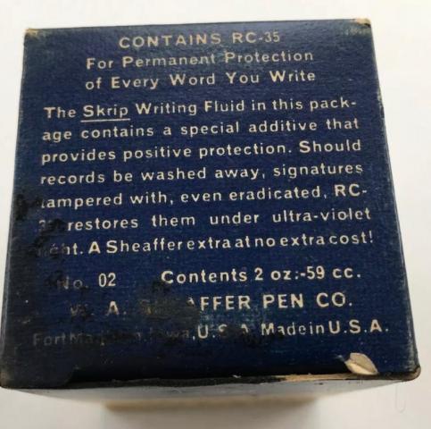
  8. Saw a pic of the top of an old Skrip Permanent Red, and it says this: Sounds fantastic! Does anyone know to what this is referring, did it work, and does the modern Red Skrip still contain anything like this?!
  9. I have a bottle of Diplomat red ink. I have used it very rarely. I haven't even fully filled a converter with it... I don't like the colour but someone else might. I don't charge money for the ink, but I do need you to cover the shipping costs. I live in the Netherlands. First come first serve. Happy penning, love, Alma
  10. I haven't done any ink reviews in a long time, but I also haven't acquired any inks in a long time. I wasn't really looking for any inks but was looking through the Taccia inks and noticed some new ones. Since Taccia was bought by Nakabayashi, it seems like the Taccia brand is being used to offer interesting special inks. There is a new series based on the Ukiyo-e printing of 17th century Japan. https://www.nakabayashi.co.jp/_files/EnProduct/0/82/pdf/TFPI-WD42-e.pdf The packaging is very nice as in the pics above and my own: Tested with two pens, a Sailor 1911 Std (M) and an Edison Premiere (M) on Mohawk via Linen and Tomoe River. The Edison pen is wetter and wider than the Sailor pen, and so a bit of of shading is lost. In the Sailor pen the shading is great. No sheen in the usual sense, but on the Tomoe River from the Sailor pen the ink appears as a silvery sheen when seen at just the proper angle. I'm very particular with red inks. Regular reds I don't like, I don't have any use for them. I was concerned whether this ink would be a standard red-leaning brown like MB Toffee Brown or Visconti Brown. I definitely wouldn't want just another ink like that. It is a red ink, but very muted, earthy. I like it a lot. A red that works like a brown. I didn't test water resistance as that's not a quality important to me. I presume it's not very water resistant. A reasonable price for a stealth Sailor ink. The Sailor 1911 Std on MvL; The Edison Premiere on MvL: Tomoe River:
  11. Cursive Child

    Krishna Inks-Granade

    Lovely, well-behaved ink from Kerala, India. https://krishnainks.com/ Apologies for the chicken (blood) scratch 😞
  12. Dear fellow Montblanc fans, We made an overview video about the new Montblanc Great Masters Red Python edition which was recently launched by Montblanc. https://www.youtube.com/watch?v=UtUOv6iq8Oo What do you think of this new addition of the Great Masters series? Which one is your favorite in this series?
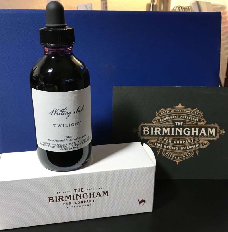
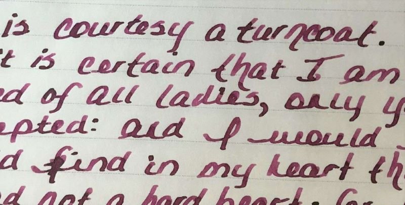
  13. Ink Review: Birmingham Pen Company Twilight Background: Birmingham Pen Company (BPC) started as the brainchild of two brothers – Nick and Josh. Initially, Nick and Josh worked with third party ink producers in England and Germany to produce their inks. BPC started making their own inks over a year ago. While some changes have been made, their new formulations include “Crisp” inks designed for everyday use on all papers, “Swift” inks that are a bit wetter, starts up quickly and works well on premium papers, “Rich” inks which have high sheen and saturation, “Everlasting” inks that have high water resistance, “Twinkle” inks with shimmer and “Wishy-Washy” inks that are designed for performance but a washable from fabrics and surfaces. The glass bottles with tight-fitting plastic lids bottles are very nice and functional. My largest pen fits nicely into the bottle for a full fill. BPC offers three sizes: 30ml, 60ml and 120ml for all inks except the Twinkle inks which are only available in 60ml. The 120ml bottles have an eye-dropper lid instead of the regular lid. Review in Brief: Saturation: moderate saturation Sheen: some nice green sheen Shading: medium shading from fine to wider nibs Haloing: low Lubrication: medium lubrication Wetness: moderately wet Water Resistance: Moderately water resistant Feathering: minimal feathering on lower quality papers Bleedthrough: minimal only on lower quality papers and with high ink application Showthrough: medium showthrough on 52gsm TR paper, minimal on Rhodia and Apica Price: reasonable for 30mls, very good for 60ml and exceptional for 120ml which is the best value. While some inks retained the same name (or an abbreviated version), they may be slightly different. Ana at the Well Appointed Desk discussed this very well in her January 2021 blog (https://www.wellappointeddesk.com/2021/01/ink-brand-overview-the-new-birmingham-pen-company-inks/) The older version of this ink, known as Allegheny River Twilight, was review by craptacular in 2018. You will note that there is a difference between the older version and the new “Swift” formula. Pens: a Pilot Vanishing Point with a fine nib, and a Conklin Duragraph with a 1.1 stub nib. Papers shown: Rhodia, Tomoe River, Cosmo Air Light; Not shown: Apica CD Premium, Advantage 24 lb copy paper; Cambridge Premium Notebook paper. Rhodia Dot Grid Paper The ink is nicely saturated with some green sheen when pooled. The ink flows wonderfully in both pens. The Pilot VP has a very dry nib and is very particular about the ink it uses. This pen glides effortlessly with this ink. The Conklin Duragraph, on the other hand, is a very wet pen. The Twilight ink is almost too wet to use in this pen. The ink does dry fairly quickly on all papers tested but is slower on Tomoe River and Cosmo Air Light (20-25 seconds). he ink is surprisingly quite water resistant although it is not known as an “Everlasting” formulation. Feathering and bleeding are not seen on Rhodia, Tomoe River, Cosmo Air Light. There is some feathering on the 24 lb. copy paper, and minimal feathering on the Apica CD and premium notebook paper, and the three papers showed small amounts bleedthrough in heavy applications of the ink. Because this is a fairly saturated ink, there is showthrough on Tomoe River, Rhodia and Apica as well as the copy and notebook papers, especially with the 1.1 stub nib. Tomoe River Ivory Paper Tomoe River Ivory Paper Cosmo Air LIght Paper Apica CD Premium Notebook Paper The chromatography was simply done with a coffee filter. It shows how the ink color breaks down in to a complex variety of yellow, blue and red. Here are some color comparisons. Overall this is a very nice ink that behaves very well. I highly recommend giving this ink a try. Disclaimer: I purchased this ink directly from Birmingham Pen Company. Any photos, opinions and thoughts regarding the ink are my own and are not sponsored by Birmingham Pen Company and do not necessarily reflect their opinions.
  14. namrehsnoom

    TACCIA Ukiyo-e Syaraku akasakura

    ink review : TACCIA Ukiyo-e - Syaraku - akasakura TACCIA is a Japanese stationery company, that - as far as I know - is now part of the Nakabayashi group. They offer high-quality fountain pens, inks, pen-rolls, notebooks, etc. More specifically, TACCIA produce a line of inks, inspired by the unique look of Ukiyo-e paintings from Japan’s Edo period (17th century). Ukiyo-e prints are woodblock prints where the work of an artist is carved into wood by woodworkers, and pressed onto paper by printers. This allows the production of multiple prints of an artwork with some different colours as well. The star of this review is akasakura, a brick-red ink that is inspired by the work of Syaraku (Sharaku), an artist that is best known for his iconic portraits of kabuki actors. Inspiration for this ink comes from the portrait of Ichikawa Omezõ I (1781-1833) playing a warrior named Yakko Ippei who was unsuccessful in his attempt to defeat his enemy. This portrait, created by Syaraku in 1794, is part of the collection of the Metropolitan Museum of Art in New York. Akasakura’ s cherry red is modelled after the colour of the actor’s kimono. 
Akasakura is a muted & understated brick-red, that is slightly pink-leaning. It’s a warm red colour that looks quite nice on all types of paper. Not vibrant at all, but soft and easy on the eye. The ink writes with average flow, and works well with all nib sizes - even the finest ones. The ink comes in a 40 ml bottle, that is packaged in a beautiful box showing the corresponding Ukiyo-e painting. Lovely packaging for an excellent ink. 
As is often the case with red inks, this one stains heavily, and requires extra pen-care. It needed a double cleaning cycle to remove all traces of the ink from my pens. 
To show you the impact of saturation on the ink’s look & feel on paper, I made some scribbles where I really saturated portions of a strip of 52 gsm Tomoe River paper with ink. This gives you a good idea of what the ink is capable of in terms of colour range. Akasakura has a fairly narrow dynamic range, ranging from a soft brick-red to a more saturated pink-leaning red. The contrast between the light and dark parts is fairly low, which translates to some beautiful soft shading. The shading appears in all nib sizes - just a hint with the EF nib, but really present with F-nibs and above. The aesthetics are superb, adding lots of character to your writing. That’s why we use fountain pens instead of ballpoints! 
The ink’s chromatography is a work of beauty, and shows the craftsmanship of TACCIA’s ink makers. Ink sommelier Hiroshi Ishiguro and colour consultant Hanse Matsumoto used a mix of mainly pink & yellow dyes to create this soft brick-red akasakura. The chroma shows that most of the dyes migrate with the water, leaving only some residue behind. What’s left on the paper is not really readable, just some smudges that hint at the original text. TACCIA akasakura is not an ink that can survive watery accidents. 
I’ve tested the ink on a wide variety of paper – from crappy Moleskine to high-end Tomoe River. On every small band of paper I show you: An ink swab, made with a cotton Q-tip 1-2-3 pass swab, to show increasing saturation An ink scribble made with an M-nib Lamy Safari The name of the paper used, written with a B-nib Lamy Safari A small text sample, written with the M-nib Lamy Safari Source of the quote, with a Pelikan M600 with M-nib Drying times of the ink on the paper (with the M-nib Safari) Akasakura looks good on all types of paper – both white and creamy ones. I personally like this ink best in combination with the more yellow paper. The ink shows a tiny amount of feathering on lower quality paper, together with some show-through and bleed-through. This is mostly the case with the broader nibs. Overall, it worked really well, even with the notoriously bad Moleskine paper. Drying times with the M-nib Safari are in the 5 to 10 second range. 
I’ve also added a few photos to give you another view on the ink. Scanned images and photos often capture different aspects of the ink’s colour & contrast. That’s why I present them both. In this case, the photos capture akasakura’ s colour best – the scans of the writing samples seem to be a bit too pink. Writing with different nib sizes The picture below shows the effect of nib sizes on the writing. The EF-nib already shows a hint of shading. But it is with the F-nib and above that the ink’s soft & elegant shading really comes into play. It’s this lovely shading that lifts this brick-red above the pack. I personally prefer to use this ink with the wet Pelikan with M-nib, where the shading looks at its best. The shading also looks truly gorgeous with really broad italic nibs - like the 1.9 mm calligraphy nib (but that’s not a typical nib for daily journaling, more something to use on greeting cards). Related inks To compare akasakura’ s brick red colour with related inks, I use my nine-grid format with the currently reviewed ink at the center. This format shows the name of related inks, a saturation sample, a 1-2-3 swab and a water resistance test – all in a very compact format. Kyo-Iro Flaming Red of Fushimi is of the same colour family, but a bit more vibrant. In contrast, TACCIA akasakura looks more muted and dusty. Inkxperiment – fire demon With every review, I try to create an inkxperiment using only the ink I am presenting. These one-ink drawings are perfect to show off all the colour-range nuances within the ink. And they are certainly fun to do - definitely my favourite part of every ink review. In previous reviews, I introduced a river goddess and forest god - these also happen to represent the elements water and earth. I therefore decided to continue on this theme, and create the full series with the four elements. For this red ink, that element definitely is fire - hence the fire demon at the erupting volcano. 
I started with an A4 piece of HP photo paper, and a small doodle in my daily journal. To paint the background, I dripped ink in different water/ink ratios on a piece of kitchen towel. The ink transfers to the photo paper through the kitchen towel, creating the background pattern of the volcano’s lava stream. I used a paper cutout to draw the demon’s silhouette on the photo paper, and then used a brush and fountain pen to paint in the figure, adding the wings and horns. The volcano on the left was drawn in with a piece of cardboard and pure akasakura, and for the lava bubbles I used a fine brush with pure ink. Final touches were added with a B-nibbed Safari. The resulting drawing shows what can be achieved with this TACCIA ink in a more artistic context. Conclusion TACCIA Ukiyo-e Syaraku akasakura turned out to be a really nice brick-red ink with truly phenomenal soft & elegant shading. I also liked that this is a muted and non-vibrant ink - easy on the eye even with a full page of text. Overall a very good ink, that could handle all nib sizes and papers really well. I’m looking forward to further explore this ink series. Technical test results on Rhodia N° 16 notepad paper, written with Lamy Safari, M-nib Back-side of writing samples on different paper types
  15. TAG Kyoto – kyo-iro – Flaming Red of Fushimi TAG is a stationary shop in Kyoto (Japan) that produces some interesting soft watercolour-style inks. With the kyo-iro series they produce a line of inks that that are inspired by the city’s many beautiful and historic sights. Each of these inks is dedicated to a specific town in the Kyoto area. The inks come in 40 ml bottles, packaged in luxurious thick paper with a texture that feels like heavy watercolour paper. In this review the center stage is taken by Flaming Red of Fushimi. The vermillion red colour of this ink is a reference to the vibrant torii gates of the Fushimi Inari shrine, that is home to the revered Inari god of abundant harvests, thriving businesses, safe homes & family. This ink’s colour ranges from a soft rose-red in dry pens to more of a crimson red in wet pens. Use it in a Lamy Safari and you get the soft rose-red look, with subdued shading and a very delicate feel. In a wet pen (like a Pelikan), Flaming Red of Fushimi transforms to a heavily saturated red that loses most of the shading. Personally, I much prefer this kyo-iro ink’s character in the dry pen: soft, subdued, delicate writing that simply looks lovely! And yes, like other TAG Kyoto inks, it feels fairly dry – but if that’s the price to pay for delicate beauty, then I can live with it. Flaming Red of Fushimi works well with all nib sizes, with enough saturation in even the finest nibs. Be aware that it does feel very dry in EF/F nibs combined with dry pens. On the plus side, this ink looks good on both white and cream paper. To show you the impact of saturation on the ink’s look & feel on paper, I made some scribbles where I really saturated portions of the 52 gsm Tomoe River paper with ink. This gives you a good idea of what the ink is capable of in terms of colour range. Flaming Red of Fushimi has a moderate colour span. This should translate to soft shading, but this only happens in dry pens. With a wet pen, the ink becomes really saturated and drowns out the shading. The ink’s chromatography shows uniform & monochromatic red tones. From the bottom part of the chroma you can already derive that this is not a water-resistant ink. Most of the colour dissipates with water. I’ve tested the ink on a wide variety of paper – from crappy Moleskine to high-end Tomoe River. On every small band of paper I show you: An ink swab, made with a cotton Q-tip 1-2-3 pass swab, to show increasing saturation An ink scribble made with an M-nib Lamy Safari The name of the paper used, written with a B-nib Lamy Safari A small text sample, written with the M-nib Safari Source of the quote, with an Edison Collier with M nib Drying times of the ink on the paper (with the M-nib Safari) The ink looks great on all papers – both the white and creamy ones in my test set. Show-through and bleed-through are no problem at all – just a tiny bit of bleed-through on the horrible Moleskine paper. Drying times are in the 5 to 10 second range with the Lamy Safari M-nib. I didn’t find the ink “flaming” at all – the heat remains smoldering beneath the surface. This makes it a non-obtrusive red that is well-suited for marking up papers & articles. Since scans alone are not always enough to give you a complete picture of the ink, I also provide you with a few photos for an alternative look at Flaming Red of Fushimi. In this case, both the scans and photos seem to capture the ink equally well. Writing with different nib sizes The picture below shows the effect of nib sizes on the writing. Flaming Red of Fushimi writes with good contrast in all nib sizes, but feels very dry in the EF/F nibs. Writing quality improves substantially with wet pens. Nevertheless, I prefer to use this ink with a dry pen (like the Lamy Safari), where you get the delicate soft-rose look. A medium-wet pen like the Edison Collier provides a good middle ground: the colour still looks soft & subdued, with the added advantage that the dryness of the ink mostly disappears. Related inks To compare this kyo-iro red with related inks, I use my nine-grid format with the currently reviewed ink at the center. This format shows the name of related inks, a saturation sample, a 1-2-3 swab and a water resistance test – all in a very compact format. Robert Oster Fire Engine Red and Pelikan Edelstein Garnet are very similar looking reds. Inkxperiment – Fiery Flowers I love to experiment with my inks in an artistic context. With my inkxperiments, I limit myself to the single ink I’m reviewing, allowing me to explore all of its colour range nuances. I always enjoy this part of the review: experimenting with different techniques, and trying to coax many different shades of colour from the single bottle. The fiery flowers are a direct reference to the ink’s name: Flaming Red. For this drawing, I used an A4-sized piece of HP photo paper. I drew in the background by covering it with a paper towel, and painting water-diluted ink on it. The wooden grid pattern was drawn in with a piece of cardboard and pure ink. I next used a brush to paint in the flowers, and added texture using the Lamy Safari M/B fountain pens. And I totally forgot to make my usual drawing-construction photos… As is often the case with red inks, this one is difficult to draw with. Reds saturate quickly, which means that it’s difficult to control the contrast (as is evident with the flowers). Not the nicest drawing, but you do get an idea what Flaming Red of Fushimi is capable of in a more artistic context. Conclusion TAG kyo-iro Flaming Red of Fushimi ranges from a soft rose-red to a more vibrant vermillion red, depending on the dryness/wetness of your pen. I definitely prefer this ink in dry pens, where you get a soft & delicate rose-red with subdued shading. In wet pens, I find the ink a bit overwhelming. This is not the type of red I prefer – I like my reds much darker (think MB Shakespeare Velvet Red), but I can see myself using it for marking up papers/articles. A good ink, but not one that I get overly enthusiastic about. Technical test results on Rhodia N° 16 notepad paper, written with Lamy Safari, M-nib Back-side of writing samples on different paper types
  16. collectorofmanythings

    Conklin All American Courage Red Review

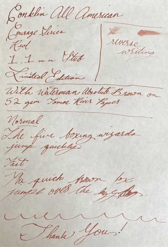
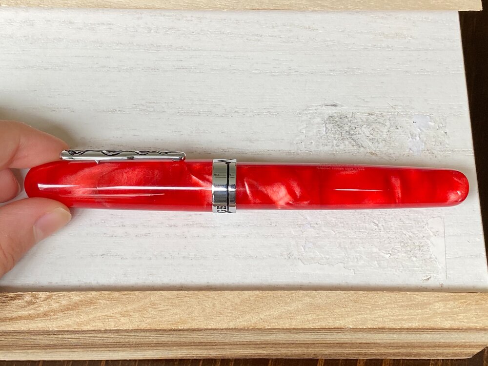
    Today, I am reviewing the Conklin All American Limited Edition Courage Red pen. First of all, in my opinion Conklin get a lot of unnecessary bad press. While brands like Edison get wonderful reviews for their pens which often are around 170 bucks that come with a steel nib, and Conklin which also offers cast resins for sometimes over 100 cheaper, and they get horrible reviews. Now I am not saying that Edison pens aren’t great, because they are, I’m just saying that they are pricey for what they are, and, in my humble opinion, Conklin pens are a steal. If you don’t like the nibs, then you can get a Goulet nib or an Edison nib, and if you want a good nib, you can get an Edison gold nib or a JoWo gold nib from fpnibs.com (who offers the JoWo 14k gold nib at just $115!) in the #6 size. Sorry about that, now let me get back on track. This pen is a limited edition of 1898 pieces (Conklin was founded in 1898) and I personally have #0693. So be sure to get it while you can! Design and Build Quality (8.5/10) This pen is huge. It’s about the size of my hand. Granted, I have relatively small hands, but nevertheless it is huge. I can’t imagine anyone ever posting this pen. I personally don’t like reds and pinks a lot, but this pen really spoke to me because it reminds me of a betta fish I used to have when I was younger. Without that though, I don’t think I would have gotten it. It is medical themed, and it is called the Courage series because of the incredible amount of courage shoes by first responders during the pandemic. The clip has the medical snake around a pole, and then the cap band has a heartbeat in the front with another heartbeat on the back which is used to spell “COURAGE”. The body tapers down to the end. The swirls in this pen are magnificent. The material has such a depth to it, and it has pearlescent whites and thin streaks of black all throughout the semi-translucent red resin. It is just gorgeous and a sight to behold. When you unscrew the cap (which takes about 1.75 turns), it reveals a JoWo steel nib, in my case a 1.1 mm stub. It doesn’t have a lot of decoration, just the Conklin logo and Toledo, U.S.A. . The reason that it is a 8.5 out of 10 is because it’s just so huge. Nib and Writing Experience (7.5/10) The writing experience is pretty good. You can’t write incredibly quickly, or else you’ll get skipping. Otherwise, it works great. Relatively dry, but that can be fixed. Reverse writing is not recommended. Has pretty good line variation. Adds a nice bit of character to your writing. I have nothing wrong with this nib, it’s just like a lot of stubs where you have to be more thoughtful how you are writing. In fact, I like it quite a bit. Thank you for reading this review! As this is only my second review, please leave some constructive criticism! I would appreciate very much. Or, just tell me what you thought if the review! Just please leave a comment so I know what to keep doing and what to improve upon. Here are the pictures:
  17. The Sailor Pro Gear Slim is one of those pens that I have wanted quite early on in the hobby. On paper ( no pun intended ), it has a lot of things going for it; it's attractive and well built, and for many, will probably be one of their first gold-nibbed pens ( my first modern one ). Was it worth the wait? Yes, it was worth the wait, but it was quite a long wait. When I got the pen, I rushed to clean it and ink it up, but there were a couple of problems. First, the nib tines were quite tight and the pen was far too dry to write properly. Obviously, you can adjust that yourself if you feel comfortable, however, the pen was also leaking ink from a gap between the section and the barrel, so right back to Anderson Pens it went. Since it came back, it's been smooth sailing (pun indeed intended). This just goes to show that probably no matter what pen you buy, something can always go wrong, so I recommend ordering from a place that will handle any issues you have. Back to the pen, what really won me over was this color combination; the reddish-orange and gold is really something that works for me. Sorry for the poor quality phone camera photos. I tried to do some color correction, so hopefully this is an accurate representation. There's also many more variants either with gold or rhodium trim, if you so desire. Design and Construction: Aesthetically, I find this a very attractive pen. The design may be conservative for some, but I think it's nice, and the color is certainly far from conservative. I think some of the smaller details such as the lettering on the cap band and the anchor on the finial help make the pen look more interesting. Holding the pen, you'll notice the quality feeling of the plastic, which has held up really well to scratches over the weeks I've been using it. The molding lines appear to have been sanded away on the barrel and cap, which helps make the pen feel like it's been turned out of a solid piece of resin. If only they sanded down the molding lines on the section, which, while mostly unobtrusive, are slightly annoying considering that's where you're intended to place your fingers. Aiding the feeling of quality however, is the exceptional balance, especially when posted. Unposted, the pen feels a little short. In general this is rather small pen, but luckily not too thin. A comparison of the capped, posted, and unposted lengths of a Kaweco Sport, Parker Duofold Junior, Sailor Pro Gear Slim, Sailor 1911s, Parker 21, Platinum Preppy, and Lamy Safari Dimensions wise, the Pro Gear Slim is identical to the 1911s except in length due to the rounded ends of the 1911 versus the flat ends of the Pro Gear. Filling System: Most Sailor pens ( except the Realo ) use Sailor's proprietary cartridge converter filling system. A converter is luckily included with the pen, but it isn't the best converter. It doesn't hold much ink, partially due to the air bubble that is always present (I've tried to expel the air out). It's enough ink to last through the day (for me), but it may be an issue. I've also heard that they sometimes leak. They do disassemble for cleaning and greasing, which is nice, but I think Sailor should really update their converter design. One oddity about filling is that it fills through the breather hole, and it's recommended by Sailor to do so. For this reason, although you can remove the nib and feed, you will break the seal and probably cause some problems ( It may also void the warranty). The Nib: The nib of any Sailor seems to be the most highly regarded part of the pen, it's practically the reason you buy one. While not perfect out the box, it's an absolutely spectacular nib. There's some feedback, but it's really smooth, definitely one of my favorite nibs. This single-tone 14k nib is also quite attractive as well ( the little things ). Sailor extra-fine versus medium I did the writing sample not long after receiving the pen, but after using it for a while with different inks, the feedback isn't as pronounced as I made it out to be. Conclusion: I think this is a wonderful pen for the $156 price. Honestly, while the gold nib is selling point for this pen, it's not the only one as this is, overall, a quality well-made pen. Do you need the gold nib? Not really since this nib produces no line variation, and a steel nib and a gold nib with the same tipping material can be almost indistinguishable. However, there is something wonderful about this nib ( which just so happens to be gold ). Not to mention that gold is an inert metal, and the alloy will resist ink staining. Some plain steel nibs can get stained rather easily from iron gall inks ( or just be harder to clean ), and some plated steel nibs I've used have had the plating come off really easily. For longevity, as far as I'm concerned, gold is a safe bet. It's also worth mentioning some of the other pens that you can get for around the same price such as the Lamy 2000, Platinum 3776, and Pilot 74, which are highly regarded by others although I have no experience with them ( yet ). If this pen appeals to you, also look at the Sailor 1911s which essentially the same pen except for the ends, which add some length. As always, your feedback is greatly appreciated.
  18. Hello, I like any advice or hint to change the colour band for another one. There is any difference between the ones that got just the colour band and the ones with the white bands too as happen with the Patrician crown caps tops some of them got to screw them and some others just pushing by friction. Thanks in advance for your answers.
  19. I am looking for a particular fountain pen from Montblanc. I believe it is a Meisterstuck fountain pen. I have attached the photo. It is the middle one with a name color of what may seem to be like a Crimson red or some thing. Does anyone know which model this one is exactly? I first encountered this from watching a YouTube video of a guy I think his video or channel is called the gentleman gazette. Please let me know if you know of this model and if you know where I can buy one? Thank you very much for your time.
  20. AidenMark

    New Red No 5, Berlin Notebook

    Hip stationers "Berlin Notebook" released the excellent Blue No.1 ink a few months back. What colour would you guess, their second ink would be? Well obviously ... blinding neon pink! Like Blue No.1 it's an artist created ink, in this case Caroline Corleone, who has an interesting tale to tell about its inspiration in pink water cannon (linked from the BN web site). It's a medium priced ink 13.50Euros for 30ml (between Pelikan 4001 and Edelstein). Although it's called New Red, the colour is actually more of a pink. (higher res scan here) Pink is not a colour I would use much for writing and this is more of a creative/art or statement ink but even for every day writing it has some interesting properties. First it's well behaved. No significant feathering or ghosting even on the swabs. There were no issues writing with it in a broad or fine nib, it dried quickly, flow was fine and it was moderately water resistant. Secondly it has interesting shading. For the broad nib writing I used a Delta Veneto pen and you can just see the pink colour shades to orange-red with a pleasing gold sheen on the stronger strokes. Finally it's legible. But, one aspect to be aware of is, it's not easy to clean and can stain convertors and demonstrators. I suspect it's a pigment ink but couldn't confirm it. I tried using it as a highlighter and it is transparent enough to reveal the ink below but there are cheeper inks for this purpose. Would I buy it? Probably not unless I had an art project in mind. Berlin Notebook sell 5ml EDC tubes of their blue ink but only stock this in 30ml bottles. If they brought out a EDC version of this New Red I might be tempted. It's bright and fun and something different.
  21. A few months ago Fountain Pen Revolution released a new line of inks under their brand - starting with three colours, though it's now expanded to six. These inks, according to their webpage, are made in the US, in partnership with "another small family business". I ordered all three (plus their existing Blue-Black) in late May - then began the lengthy process of waiting for the ink to arrive (via Qatar and Greece!). There was a small amount of leakage along the way (hardly surprising given their circuitous, COVID-affected route) - but apart from a slight discolouration of the labels and packaging, the inks arrived intact. FPR's inks are very pleasant to write with - bright and colourful, smooth-flowing, and more water resistant than I'd expected. The inks are very reasonably priced - $8.50 for a 30ml bottle - and for those who are interested, the bottles have a wide enough mouth to accommodate the largest of pens. Firecracker Red was the first ink I tried: it's a cheerful red that skews a little towards orange (which kinda goes with the name, I think!). The review I think captures my feelings about the ink - suffice to say, I very much enjoy using it! A photo of the review page: All four inks on Rhodia paper: All four inks on Tomoe River paper:
  22. akszugor

    Cross Red

    Manufacturer: Cross Series, colour: Red Pen: Waterman Hemisphere „F” Paper: Image Volume (gramatura 80 g / m2) Specifications: Flow rate: very good Lubrication: good Bleed through: possible point Shading: noticeable Feathering: unnoticeable Saturation: very good A drop of ink smeared with a nib The ink smudged with a cotton pad Lines Water resistance Ink drying time Ink drops on a handkerchief Chromatography Sample text in an Image Volume (gramatura 80 g / m2) Sample text in an Oxford notebook A5 (90 g / m2) Sample letters in a Rhodia notebook No 16 (90 g / m2) Sample letters in a Clairefontaine (gramatura 120 g / m2) Palette of shades
  23. Sharing the pictures of my new Deccan Author Red Ebonite eyedropper pen. There are 2 previous posts discussing about the acrylic versions of this pen: https://www.fountainpennetwork.com/forum/topic/216836-deccan-aurelius-author/https://www.fountainpennetwork.com/forum/topic/224094-the-deccan-aurelius-aka-the-author/I bought the eyedropper, ebonite Author in red colour, with Deccan stock fine nib. Overall design: It is a simple and elegant design. The colour appears more brownish-red than bright red that is seen in images with light. The clip appears slightly off the center (but it doesn't matter to me). There were small fragments of chipped off ebonite material in the barrel. The cap opens in exactly 2 turns. With cap posted: Barrel is quite thick and the pen looks very sturdy: Nib: The junction of nib/feeder and section is beautiful. Deccan logo (stylized D with stars): It is quite comfortable to hold in hands while writing. I will use the pen for a couple of weeks and follow-up with how the nib writes. My favorite writing style of nib is a fine nib that puts down a wet line. I will do whatever tuning it takes to suit this pen to my regular writing need. Please share your pictures of this pen if you have.
  24. Another Diamine ink in the Cult Pen exclusive 'Deep Dark' range has arrived. If you have been looking for a very dark red ink, this one is for you. I absolutely love the colour and it is one of the few red inks I would use in the office. Oh, and it has both shading and sheen! Form an orderly queue now USAGE DAILY WRITER: I can see that BUSINESS USE: I would use it for all but the most formal of communications ILLUSTRATIONS: Not convinced that it stands out enough NOTES: Yes (in a dry environment, at least) PERSONAL: Very welcome LOVE LETTERS: Not really my speciality but I can see this one being used for a serious love letter. PERFORMANCE FEATHERING: 4/4 BLEEDTHROUGH: 3/4 - very slight with the 1.1mm nib SHADING: 3/4 - lots, but can be hard to control? SHEEN: 2/4 - very obvious in the 3.8mm writing FLOW: medium, but can skip or burp on Rhodia though that may be the pens.... WATERPROOF: 1/4 DRYING TIME: 2/4 FADE RESISTANCE: (not tested) REVIEW WRITING SAMPLES Please forgive the even more than usually atrocious handwriting! (Bad cold => no patience) (As usual, the sample text is from the Office of Readings, in this case following the calendar for England and Wales where today is the Feast of the forty martyrs.) Cartridge stock Rhodia Rhodia R COMPARISONS WITH OTHER INKS The lines on the left (from the monster Diamine comparison) were written with the medium nib. This is cartridge stock. I hope this is useful.
  25. Recently, I acquired several samples of Taccia Ink. Taccia Ink is newly developed in California, but made in Japan by experienced ink makers. There are 13 colors that are vibrant and pleasurable. The inspiration for the colors comes from the "Japanese way of seeing colors in a pure, honest and innocent way". The bottles are similar to Sailor bottles, but I do not know if they have the pen filler insert since I have not purchased a bottle yet. (Photo compliments of Vanness Pens) This is a lovely ink that is a well saturated red that goes from a medium violet red to an intense dark cherry. The ink is nicely lubricated with hints of green sheen in areas where the ink pools. This ink is well behaved in this moderately wet nib, and reminds me of many Sailor inks - not just the bottle but the ink itself. Fast drying, limited bleedthrough, showthrough and feathering, and with some shading, Taccia Ebi is an excellent alternative to other well known inks in this color range. Taccia Ebi ink / Conklin Duragraph with 1.1 nib / Staples Arc paper Note: The ink name is Ebi, not Ebo; and the ink comes in 40 ml bottles Taccia Ebi ink / Conklin Duragraph with 1.1 nib / Tomoe River 68 gsm Note: The ink name is Ebi, not Ebo; and the ink comes in 40 ml bottles Pros: Fast drying Minimal bleedthrough, showthrough, feathering Excellent flow Moderate lubrication Above average shading Cons: Average dark red color Minimal sheening Price: In the US: $12 for 40 ml at Vanness Pens, Anderson Pens, PenChalet Overall, an great value both in terms of price and quality!


×
×
  • Create New...