Search the Community
Showing results for tags 'prithwijit'.
-
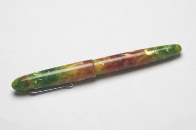
Introduction I had always wanted a Bamboo/Sugarcane shaped pen and had stocked up on materials that represent the colour of green and ripened sugarcane material. When fellow FPNer Sanjay Ramaswamy (@Sanjay13leo) got to know of my desire, he proactively reached out to Mr.Kandan of Ranga Pens to commission two pens – one for each of us. I had never dealt with Mr. Kandan before while Sanjay already had their standard bamboo pen. A big thank you to him for having made this pen possible. Design The design of the pen is supposed to mimic a small section of the sugarcane stem. Sugarcane belongs to the grass family Poaceae that also includes bamboo in its lineage. Like Bamboo, sugarcane grows as long, then stems with nodes at regular intervals. The inter-nodal regions of the stem are slightly convex with smooth undulations. In real life, these are stout jointed fibrous stalks that are rich in the sugar sucrose, which accumulates in the stalk internodes. The body of the pen is around 145mm long and mimics two nodes and the stalk area between and around them. One of the nodes is near the top of the cap representing the end finial and the other one in the barrel. The two end finials are characterized by two small holes shaped like simple annular cylinders that represent the hollow stalk between the nodes. All in all, the shape is exactly like a small piece of susutake. As the images will stand testament to, Ranga has managed to deliver exactly what was being sought. This is especially commendable given the blank we had used for getting the ripe sugarcane colour is especially difficult to work on since it is not meant for kitless pens. Ranga however had persevered and despite much pain, managed to deliver a work of art that accurately represents the design brief. http://i1097.photobucket.com/albums/g346/prithwijitchakiPrithwijit/Fountain%20Pen%20Reviews/Ranga%20Sugarcane%20Review/IMGP2034_zpsgfzm31ct.jpg http://i1097.photobucket.com/albums/g346/prithwijitchakiPrithwijit/Fountain%20Pen%20Reviews/Ranga%20Sugarcane%20Review/IMGP2036_zpskl7hzttt.jpg http://i1097.photobucket.com/albums/g346/prithwijitchakiPrithwijit/Fountain%20Pen%20Reviews/Ranga%20Sugarcane%20Review/IMGP2035_zpsec3iuj4n.jpg http://i1097.photobucket.com/albums/g346/prithwijitchakiPrithwijit/Fountain%20Pen%20Reviews/Ranga%20Sugarcane%20Review/IMGP2045_zpsvcqejbms.jpg Size and Balance At 144.5mm capped, this is a regular sized pen. Had it not been for the absence of a clip, it would have fit in squarely into the definition of an EDC (Every Day Carry) pen. There is no metal used anywhere except for the nib and that makes this an incredibly light and comfortable pen to use for extended periods. The weight distribution, the slim section design and the light weight of the polyester briar material all contribute to the comfort. I was initially concerned that the faux node design on the barrel may impact the writing experience, but in real life usage such apprehensions have been soundly negated because the diameter of the barrel even at the thickest point in the node is only 14mm and the smooth undulations don’t even let you feel its presence. Nib Based on my request, Ranga got the pen ready to accept WIN/Jowo #6 nib units. I decided to put on a Dual Tone EF nib unit from WIN/Jowo paired with a Schmidt K5 convertor. The nib was sourced from Mr. Subramaniam of ASApens.in . http://i1097.photobucket.com/albums/g346/prithwijitchakiPrithwijit/Fountain%20Pen%20Reviews/Ranga%20Sugarcane%20Review/IMGP2052_zpsn8mgtwur.jpg http://i1097.photobucket.com/albums/g346/prithwijitchakiPrithwijit/Fountain%20Pen%20Reviews/Ranga%20Sugarcane%20Review/IMGP2054_zpsv9eq8qky.jpg Filling Mechanism It’s a plain vanilla cartridge-convertor system that accepts standard international cartridges and compatible convertors. While it may be vanilla, it remains my favourite flavour for providing the best proposition around value, system longevity, convenience and widespread compatibility. Build Quality To summarize, this pen has impeccable build quality all around with one major flaw or oversight. The seams are well aligned, the threads are smooth and the finish is superlative. The polish on this pen is astounding and beats all expectations. The attention to detail all around is impressive except for the two cylindrical holes at the two ends which have not been polished properly. They still show lathe marks and are an eyesore in an otherwise fabulously finished pen. http://i1097.photobucket.com/albums/g346/prithwijitchakiPrithwijit/Fountain%20Pen%20Reviews/Ranga%20Sugarcane%20Review/IMGP2046_zpsg6nbpu0p.jpg Writing Experience I am normally not an EF nib user. I prefer Medium nibs for the smoothness and larger sweet spot they typically offer. So I may not be the best person to judge an EF nib. I did however find the nib on this pen rather smooth and comfortable to use so long as you use it within its sweet spot. I did in fact like it better than the Hero 100 fine nib or Schmidt fine nib. For the inaugural use, I had loaded the pen with Sheaffer brown ink. Though it doesn’t have the reputation of being a wet ink or a shading ink, I did notice some element of shading in my writings with this nib. So that tells me that it is a fairly wet nib for an EF and that makes me a happy camper. While I won’t become an EF user because of this one time experience, I would not mind using and recommending this nib to others who prefer F / EF nibs. Price and Value The Sugarcane is not yet a standard model for Ranga and there is no standard price for it. The pen was made by Mr. Kandan as a one off special request from Sanjay and myself. The remuneration they took is modest and equivalent to the cost of any of their standard pens. Nib and blanks were sourced by me on my own and costs for these were obviously extra. Overall, I find this great value because not many pen makers sell custom pens at regular pen prices. Specifications Please find below the measurements of the pen made using non precision instruments and approach. Given that these are handmade pens and there are small piece to piece variations anyway, the measurements should give you a fair enough indication of what to expect from the pen. Length (capped) – 144.5 mm Length (uncapped) – 137 mm Length (cap) – 61.5 mm Length (section) – 20 mm Maximum width (Cap) – 14 mm Minimum width (Barrel) – 11.5 mm Maximum section width – 9 mm Minimum section width – 7.5 mm Conclusion To draw a conclusion with regards to this pen is a bit tricky. If I were to look at the pen dispassionately and judge it by its merits and aesthetics alone, the pen looks superb and a definite buy. Ranga has clearly delivered and has created a masterpiece. However, I cannot help but acknowledge the fact that the design is not very different from Ken Carver’s Bamboo design. Once you realise that, then it makes more sense to opt for the original rather than go through the pains of making a custom pen which is not very different from a pre-existing model. There is one final point I wanted to make before I sign off. The material used for this pen is is a new type of poly-resin called Polyester Briar. This was a fairly new type of material for Ranga who did indeed find this a tad tricky material to use especially when using their traditional tools and methods. This was validated by two other independent pen-makers as well. Given these challenges, it’s doubly commendable on behalf of Ranga to have produced such a stunningly beautiful instrument with such a material. I do applaud them for that.
- 68 replies
-
Introduction I recently had an opportunity to act as an enabler by helping a colleague and friend of mine acquire a special custom fountain pen. This particular gentlemen has a very fine collection of writing equipments including models from almost all premier brands and certainly a few Parkers. But his heart was set on acquiring a classic all ebonite Duofold in glorious orange hues but with a contemporary filling system. Since such a chimera doesn't exist in the real world, we set about creating a pen that looks and behaves like a modern Duofold Centennial but with an orange ebonite cap and barrel with black finials. We approached Mr. Manoj Deshmukh of Fosforpens who was willing to take up the challenge. Since this pen was meant for someone else. I didn't dip it or ink it to test the nib. Hence I wont call it a full review in the true sense of the term. Instead, let us consider this a pictorial essay of the pen that was finally created. Design The Duofold is a classic design and has spawned innumerable variants and knock-offs for over ninety years ever since it first appeared in the scene circa 1921. Any fountain pen enthusiast is well aware of the design and words cannot express its simplistic but sophisticated elegance. So instead of subjecting my limited vocabulary to unnecessary stress, I will let the pictures do the talking. http://i1097.photobucket.com/albums/g346/prithwijitchakiPrithwijit/Fountain%20Pen%20Reviews/Fosfor%20Duofold/IMGP5199_zps2pvd355h.jpg http://i1097.photobucket.com/albums/g346/prithwijitchakiPrithwijit/Fountain%20Pen%20Reviews/Fosfor%20Duofold/IMGP5200_zpscyiraq2a.jpg Size and Balance At 137mm capped, the Duofold would be considered a mid-sized pen by contemporary standards. Being made of ebonite makes the delightfully light and easy to handle. It is superbly balanced and comfortable to write for extended periods. Even with the cap posted, the pen retains its balance and is a breeze to write with. For those of you who may seek a size reference, here is a side by side image with the Kaigelu 316 which is a clone of the Duofold Centennial. http://i1097.photobucket.com/albums/g346/prithwijitchakiPrithwijit/Fountain%20Pen%20Reviews/Fosfor%20Duofold/IMGP5210_zps6kjouwpd.jpg Nib Since the gentleman in question already had access to other Duofolds, we didn't bother about getting an original nib for the pen. Instead he opted for a 18K Jowo #6 pen in rose gold finish with his initials engraved on the nib. This technique is different from the laser engraving I had done on my Rajendran and arguably better if the limited typeface options available do not bother you. http://i1097.photobucket.com/albums/g346/prithwijitchakiPrithwijit/Fountain%20Pen%20Reviews/Fosfor%20Duofold/IMGP5201_zpsazxbejmk.jpg Filling Mechanism The pen uses the standard international cartridge converter mechanism with a Schmidt converter paired with the WIN/Jowo nib unit. The section itself was custom made by Manoj. The pen can accept any bottled ink as well as cartridges from a host of brands. http://i1097.photobucket.com/albums/g346/prithwijitchakiPrithwijit/Fountain%20Pen%20Reviews/Fosfor%20Duofold/IMGP5205_zpsltn81ktm.jpg Build Quality Manoj is synonymous with quality and he amply demonstrated that in this pen as well. All critical aspects of the pen such as the shape, fit, threading, buffing/polishing and the finish are impeccable and gives the overall impression of a high quality product. Specifications The measurements have not been taken with any precision instrument or laboratory techniques and should be considered as indicative only . Length (capped) – 137 mm Length (uncapped) – 130 mm Length (cap) – 63 mm Length (section) – 20 mm Maximum width – 13.5 mm Maximum section width – 10.5 mm Minimum section width – 9 mm Conclusion I found the idea of this pen pretty intriguing. In one broad brush we have covered 96 years of Duofold legacy from its ebonite origins, big red lineage to contemporary evolution and amenities. The final product has certainly been able to fulfil its design brief. It is a classic mid-sized comfortable and well balanced writing instrument. The SEM ebonite and silver trims are wonderful thing to have and Fosfor quality and finishing comes through. Useful Links Very good orange ebonite blanks can be sourced from http://www.ebonite-arts.de/en/index.php Jowo nibs of your choice can be sourced from www.asapens.in Pen is made by www.fosforpens.com
- 19 replies
-
- prithwijit
- review
-
(and 8 more)
Tagged with:
-
Vintage Indian Pens With Hand-Crafted Gold Nibs
Prithwijit posted a topic in India & Subcontinent (Asia)
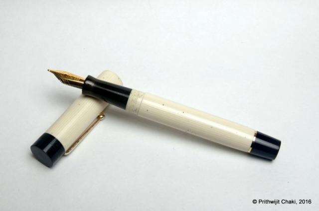
Prologue Long before the likes of Romilo and Scriptorium reintroduced and popularized the concept of hand-crafted gold nibs customized to individual tastes & needs, there has been a set of small dedicated Indian handmade pen-makers who have been diligently doing the same out of there small workshops located mostly around South India. Today I want to share pictures of a trio of such pens from my collection. All these pens are vintage, were bought by me as used pens and are made by artisans who are no longer with us or else are too old to be active themselves although the institutions they have set up are still active and still manufacture handmade pens mostly using steel nibs sourced from nib manufacturers. http://i1097.photobucket.com/albums/g346/prithwijitchakiPrithwijit/Fountain%20Pen%20Reviews/IMGP2306_zpsgzqvekso.jpg From Left to Right – Ratnamson, Guider and Ratnam http://i1097.photobucket.com/albums/g346/prithwijitchakiPrithwijit/Fountain%20Pen%20Reviews/IMGP2308_zpscwd4rmqe.jpg From Left to Right – Ratnamson, Guider and Ratnam Guider The most interesting pen out of these three is a vintage celluloid pen with a handmade conical gold nib. It is hard to put an exact date of manufacture for this pen but according to Mr Laxman Rao the current proprietor of Guider pen works this particular writing instrument is at least fifty years old. Such specimens are very rare to come across and even he doesn’t have access to any. http://i1097.photobucket.com/albums/g346/prithwijitchakiPrithwijit/Fountain%20Pen%20Reviews/IMGP2295_zpsry9fc6gl.jpg http://i1097.photobucket.com/albums/g346/prithwijitchakiPrithwijit/Fountain%20Pen%20Reviews/IMGP2296_zps81jyeqvk.jpg http://i1097.photobucket.com/albums/g346/prithwijitchakiPrithwijit/Fountain%20Pen%20Reviews/IMGP2302_zpsjhz6u0dp.jpg http://i1097.photobucket.com/albums/g346/prithwijitchakiPrithwijit/Fountain%20Pen%20Reviews/IMGP2310_zps628aw4rf.jpg Ratnam The next pen in the collection is another conical nib but this time manufactured by Ratnam Pen works of Rajahmundry. I do not know the exact model number but the trims on this pen are in exceptionally good shape. This is a huge nib and side by side, it dwarfs the #8 nibs I have from Jowo or Bock. http://i1097.photobucket.com/albums/g346/prithwijitchakiPrithwijit/Fountain%20Pen%20Reviews/IMGP2298_zpsjp10sw3e.jpg http://i1097.photobucket.com/albums/g346/prithwijitchakiPrithwijit/Fountain%20Pen%20Reviews/IMGP2297_zpstjhsrilo.jpg http://i1097.photobucket.com/albums/g346/prithwijitchakiPrithwijit/Fountain%20Pen%20Reviews/IMGP2303_zpsctiz06fc.jpg http://i1097.photobucket.com/albums/g346/prithwijitchakiPrithwijit/Fountain%20Pen%20Reviews/IMGP2312_zpsqykmci1r.jpg Ratnamson The third pen in the trio is a Ratnamson 302 with a handmade gold nib made circa 2007. I believe it is still possible to get such pens commissioned albeit being manufactured by the next generation. The interesting thing about this pen is that it has a bold nib which is quite unusual for Indian pens and is an extremely smooth writer. http://i1097.photobucket.com/albums/g346/prithwijitchakiPrithwijit/Fountain%20Pen%20Reviews/IMGP2299_zpsa6az8khh.jpg http://i1097.photobucket.com/albums/g346/prithwijitchakiPrithwijit/Fountain%20Pen%20Reviews/IMGP2300_zpsuv7gbpco.jpg http://i1097.photobucket.com/albums/g346/prithwijitchakiPrithwijit/Fountain%20Pen%20Reviews/IMGP2301_zpsst4ji1ht.jpg http://i1097.photobucket.com/albums/g346/prithwijitchakiPrithwijit/Fountain%20Pen%20Reviews/IMGP2311_zpsefppydp7.jpg One thing that is common to all the three pens (apart from 14K nibs) is that each of them come with custom hand cut ebonite feeds. Epilogue Shortly after taking these pictures I came to the realization that my personal enjoyment of fountain pens did not come from being a collector and certainly not from being a collector of vintage pens. At the same time I was acutely aware that this set that I had built up was historical in significance and wanted it to be maintained properly even if I was not the right person to do so. I started making a few discrete inquiries amidst our small fountain pen community and I am happy to let everyone know that fellow FPNer Sudhir (@Sudhir-ThePenPerson) is the new custodian of these pens. Sudhir is a passionate collector and a consummate gentleman. I am sure that the pens will be taken care of very well in his safe hands. Hope you guys liked reading about this part of Indian Fountain pen heritage and the pictures were enjoyable. Regards, Prithwijit- 15 replies
-
- prithwijit
- review
- (and 7 more)
-
Introduction After commissioning some customized designs via ASApens I decided to change track a bit and get a few of their standard offerings. Looking around, there seemed to be a few models that had got consistently good review in FPN. One of them was the I-Can design which has been reviewed favourably here, here and here. I quite liked the classical lines of the design and decided to order it. There is one concession I made for myself, which is to use the wild cheesecake acrylic blank from theturnersworkshop.co.uk instead of stock ebonite. Also, since I prefer to use CC instead of ED pens, I requested the CC version. The cartridge converter version of the pen has actually been christened I-Will by Mr. Subramaniam and hence my review of an I-Will instead of an I-Can. Design One of the reasons I went for this pen is the design. It is a simple cylindrical barrel with the cap diameter which is slightly more than the barrel diameter. The pen is adorned with simple straight lines for the cap and with only a hint of tapering of the barrel. The top of the cap and the bottom of the barrel are flat and polished. The body of the barrel and the cap are polished smooth and shiny. Aesthetically it is simple, elegant, purposeful and the design remains an all-time classic. One can go back at-least a 100 years in fountain pen history and see pens of this design being produced by almost all manufacturers of the early era. The most famous user of this design is probably Wahl-Eversharp with their Classic 1920s gold filled, Olympia and Art Deco designs. Waterman too has numerous pens such as 12, 52 and the jumbo 20 which are variants of this design. Even Parker and Sheaffer too has used it from time to time as have numerous other known and unknown pen makers. The moment I saw it, I knew that I wanted this since it pays homage to the era or origination of fountain pens. From an usage standpoint, it is a utilitarian design. It is a full sized pen fitted with a hourglass type concave section design which is a personal favourite for the comfort it offers. The clip used is the same vintage brass ball clip that is usually a staple of the Azaadi. I must mention here that this is not the normal clip used in I-Can and I had specially requested it. The blank used for this pen is called “Wild Cheesecake”. The expectation was that the pen would not only be a fine instrument, but also look like a yummy confectionary. Unfortunately, the final outcome was far from being so elegant. Various adjectives were used to describe the pattern which ranged from “troll snot” to “unicorn barf”. Finally some kind soul described the colour as “dal fry” to ascribe it a modicum of dignity and we decided to stick to that moniker. Those of you whose culinary interests range from Pâtisserie to the standard Indian cuisine, would doubtless be able appreciate the implied travesty. Size and Balance At a capped length of 152mm, the pen may seem oversized. However, it is a completely kitless pen with very little metal being used in it’s construction. This makes it a very lightweight and that makes it a perfect EDC (Every Day Carry) pen. The shape of the pen and especially the section design is also meant to accentuate the feeling of comfort. This is a pen that you can happily use for extended writing periods. Nib I got a Schmidt #6 nib with a fine tip in golden finish. From a design standpoint, the clip and nib complement each other quite nicely thanks to the golden hues. The nib is tuned nicely and lays down a consistent fine smooth line on paper. Filling Mechanism I make no secrets about my preference for pens that accept standard international cartridges and compatible convertors. In my opinion they the optimum combination of value, system longevity, convenience and widespread compatibility. It no surprise that this pen comes with a Schmidt K5 convertor out of the box to work with the FH-452 Schmidt nib unit. Build Quality The pen exhibits the standard ASA focus on quality while retaining the handmade quirks. The fit and finish and the tolerances are fine for a handmade pen. The joints are seamless and only discernible due to pattern variations. You can sense that the pen has been made with care and a considerable amount of time has gone into polishing and buffing to ensure a very high quality of the finish. However given that the pen is entirely hand-made, there is likely to be some fine trace marks or quirks if one inspects very minutely. Writing Experience Schmidt sells excellent nibs and their wide user base are a testament to their quality. Normally, I am not a big fan of EF or F nibs since I find them too scratchy. This particular nib however is very smooth so long as you can keep the nib within its relatively small sweet spot. It almost prompts you to rethink your nib preferences and encourages you to improve your grip to keep enjoying its sweet spot. As you can realise, I am a happy camper. While it is unlikely to make me a regular user of F nibs, I would however have no hesitation of reaching out for this pen should I be in the mood for some writing with a fine nib. Price and Value The i-Can and i-Will are extremely competitively priced. In my opinion they represent one of the best value propositions amongs't ASA’s current line-up which is even otherwise composed of an impressive catalogue of excellent VFM pens. Grab an ebonite I-Will before you get anything else and you are likely to be hooked for ever. Specifications The measurements mentioned in this section were not taken with any precision measurement instruments and you would have to settle for my efforts with a simple ruler. Hopefully, that should be sufficient to give you an indication of what to expect from the pen. Length (capped) – 152 mm Length (uncapped) – 141 mm Length (cap) – 68 mm Length (section) – 22 mm Maximum width – 12.5 mm Minimum width – 9.5 mm Maximum section width – 10 mm Minimum section width – 8 mm Conclusion The ASA i-Will is a quintessential design that has existed for over a century with periodic resurgence in popular imagination. Such a longevity would not have been possible had it not been for the elegance, beauty, balance and convenience that such a pen offers. Combine that with modern niceties such as a cartridge-converter system and outstanding nibs from Schmidt or Jowo, and you have a writing experience bar none. It is little wonder therefore that the model is so popular and has been oft reviewed before. I would definitely recommend this pen to others and more so for the ebonite version of the pen given the light weight and tactile nature of ebonite as a material. Go ahead and grab one if you already haven’t. This pen will put a smile on your lips.
- 22 replies
-
- prithwijit
- review
-
(and 3 more)
Tagged with:
-
Review Of Fosfor Rajendran (Aka Desi Kop) With Jowo #8 Gold Nib
Prithwijit posted a topic in Fountain Pen Reviews
Introduction During the early phases of my renewed fascination for all things fountain pens there was one model that reigned supreme amongst my list for grail pens and that was the Sailor King of Pens. Everything about it seemed to be just about perfect – the torpedo shape, the ebonite material and the large sized fabulous Sailor nibs. It was just a matter of time before I got one for myself. Two sailor pens and their less than perfect nibs later, my enthusiasm for the KOP started to wane a bit. I had realized that the tip shape and design of the stock sailor nibs (Naginata Togi or Nagahara special nibs excepted) was something that just didn’t suit my grip. The relatively small sweet spot meant that I quickly ended up in the scratchy zone and calling it feedback wasn’t about to change my opinion. I had also realised that the KOP actually wasn’t a full ebonite what with its plastic feed, plastic section and the section-barrel joint made of metal. When fellow FPNer Sudhir allowed me to write with his stock Broad nibbed Sailor KOP, I seized the opportunity to assess my purchase decision. I decided that while I may still go for a special nib KOP later, right now I would not enjoy a KOP with any stock nib. While that decision was made, I was not about to give up so easily on getting my grail pen even if that meant getting one made to my specs and sourcing everything myself. With unwavering focus, I started procuring everything to get the pen of my dreams – I scoured for the best possible ebonite material available for pen-making and zeroed down on some vintage Italian mottled reddish-brown ebonite from a source in the Europe. For some time I toyed with the idea of going with SEM Cumberland or Eboya, but this one just seemed better.I decided to go with a Jowo #8 nib in western medium with a hand cut ebonite feed from WIN. Rather than going for the stock motifs, I decided to source an absolute plain one so that I can have my own design engraved on it.I wanted a roller clip like on my Omas or Delta rather than the stock KOP clip design. Luckily my pen-maker arranged for gold plated roller clips.In order to make the pen I approached Mr. Manoj Deshmukh of Fosforpens. He had made a few pens for me before and was willing to take up the challenge. I decided to call the pen Rajendran which means King in Sanskrit as a homage to original KOP which inspired it. Design The KOP design is a classic and all of you are well aware of it. So instead of wasting any time typing about it, I will let the pictures do the talking. http://i1097.photobucket.com/albums/g346/prithwijitchakiPrithwijit/Fountain%20Pen%20Reviews/Fosfor%20Rajendran%20Review/IMGP2148_zpsv4kcczjn.jpg http://i1097.photobucket.com/albums/g346/prithwijitchakiPrithwijit/Fountain%20Pen%20Reviews/Fosfor%20Rajendran%20Review/IMGP2142_zpsem9s8tav.jpg Size and Balance At 155mm capped, the KOP/Rajendran is the leader of the oversized pens club. But the ebonite build and absence of metal anywhere other than in the nib and the clip means that the pen is delightfully light. It is nicely balanced and is very comfortable to write for extended periods. Writing with the pen makes you completely forget it’s considerable length and the customized section design adds considerably to the comfort quotient. I don’t write with the cap posted, but it can be done if so desired. But posting such a large pen does result in a slight rearward weight bias. Nib I had looked around for a nib that would be similar in size and stature to the large Sailor nibs used in KOP and finally decided on a #8 sized Jowo nib made of 18K gold material with medium tip. The complete nib unit is sold by WIN through their distributors (Fpnibs and Asapens) and comes with a nicely finned ebonite feed. Unlike most nibs which comes with pre-embossed or engraved motifs, I actively scouted around for a nib that would be absolutely plain with no design. This allowed me to engrave on the nib a small monogram of my own. The design is one that I made myself and it is essentially my initials enclosed inside a tiny shield akin to the coat of arms of yore. http://i1097.photobucket.com/albums/g346/prithwijitchakiPrithwijit/Fountain%20Pen%20Reviews/Fosfor%20Rajendran%20Review/PC20Logo200120JPG_zpsbayvjecq.jpg Image: Monogram design – Initials enclosed inside a shield Manoj doesn’t do engraving himself, but he actually looked around for people who do so and was able to replicate my exact design on the nib. Needless to say, I am elated that my dream has finally been realized and the gamble (of a plain nib) has paid off. http://i1097.photobucket.com/albums/g346/prithwijitchakiPrithwijit/Fountain%20Pen%20Reviews/Fosfor%20Rajendran%20Review/IMGP2138_zpse1q5xpao.jpg Image: Monogram design successfully replicated on the nib – the ultimate customization Filling Mechanism I love cartridge converter pens and that is one of the reasons I like the original KOP as well. The Rajendran beats the stock KOP in this regard by using the standard international system for cartridges and compatible convertors rather than proprietary ones. I like this system better than the original because of the wide compatibility, system life longevity, value and convenience. The ebonite feed of this pen is paired with a Schmidt K5 converter to use bottled inks and it can also accept cartridges from a host of brands. http://i1097.photobucket.com/albums/g346/prithwijitchakiPrithwijit/Fountain%20Pen%20Reviews/Fosfor%20Rajendran%20Review/IMGP2147_zpsiv2mfcoa.jpg Build Quality Manoj has built a reputation for himself as a craftsman with unparalleled focus on quality. He has demonstrated that in all my pens, but has somehow managed to simply surpass all his previous endeavours with this pen. The shape, the fit, the threading, buffing/polishing and the finish are impeccable for a handmade pen. The allowance to tolerances have been kept to a bare minimum and it is obvious that the pen has been made with considerable care to ensure a very high quality product. http://i1097.photobucket.com/albums/g346/prithwijitchakiPrithwijit/Fountain%20Pen%20Reviews/Fosfor%20Rajendran%20Review/IMGP2145_zpsdnklgzno.jpg Writing Experience This where the rubber hits the road. I have always been very happy with Jowo nibs and quite naturally the expectations from this nib was pretty high. I am happy to say that the nib has met its potential and then some. This is a tad wider than #6 Jowo medium nibs but still can comfortably be considered a medium nib. It is smooth, wet and lays down a nice wet line without any skips or false starts. The pen is a superb writer and a better performer than the stock Sailor nibs as far as my grip is concerned. I have been using this pen with Waterman serenity blue for about six weeks now and six fills later, I can safely recommend it to anyone who might be interested. The ebonite feed in this pen was a revelation. There is something about good ebonite feeds that just adds magic to your pens. This feed is very much like those of OMAS and is super wet without being a gusher. The extra lubrication afforded by it makes the writing experience that much more enjoyable. I particularly like the sheen that ebonite feeds seem to exhibit as ink droplets percolate into the fins. The only drawback is that the feed isn’t flight safe like the plastic Jowo feeds and there is some leakage on high altitude flights. Price and Value The Fosfor Rajendran is not a cheap pen. No expenses were spared in procuring the best material, the best nib and the best workmanship and all of this adds to the pens price. I could have bought a few very nice and expensive branded pens for the price I paid for it. But none of them would have been able to offer me the satisfaction and the value that this pens offers. So it is only fair that I make a clear distinction between the value proposition of the pen as made by Fosfor versus the cost of materials that I have procured myself. As a standalone pen shaped like the classic KOP, it is incredibly VFM. I am aware of no other pen maker in India who offers this level of quality and individualization at this price point other than Manoj and Mr. L Subramaniam of ASA Pens. In this particular case, Manoj was simply outstanding in hearing me out, understanding my needs and wishes and what is likely to give me the sense of satisfaction and pleasure. He even went out of his way to procure taps and dies for my special nib. That must have cost him more than what I paid him for4 this pen. Such service and customer orientation remains imprinted in your mind long after the cost is forgotten. Specifications The measurements in this section have not been taken with any precision instrument or laboratory techniques but should suffice to give you a fair idea of the size of the instrument. Length (capped) – 152.5 mm Length (uncapped) – 131 mm Length (cap) – 73.5 mm Length (section) – 20 mm Maximum width – 17.5 mm Maximum section width – 13.7 mm Minimum section width – 12 mm Conclusion Not everyone can understand why I paid substantial amounts on getting a KOP made to my specs rather than getting a stock one. I guess to me the importance of the attributes of the pen far exceeded any brand name it carried. As I look back as to what I have gained over a stock pen by going the custom route, I can safely tabulate quite a few pros - True vintage Italian reddish-brown mottled ebonite rather than stock black or expensive Urushi coated models.A wonderfully wet and nicely finned ebonite feed rather than a plastic one (this may not very important in the overall scheme of things, but would certainly be useful if I ever have to do any heat setting).Complete ebonite body with no plastic or metal parts. This means the pen is very lightweight and supremely balanced despite being oversized.A section that has been designed and sculptured based on my preferences.A nice oversized and dependable (to me) western nib.The “PC Shield” that would not be possible in a normal nib.A nice and smooth roller clip.International standard cartridges and converters instead of proprietary ones.To summarize, I have certainly been able to fulfill my objectives with this pen. It is nice oversized but comfortable and well balanced torpedo shaped pen. The writing is super smooth thanks to the beautiful Jowo nib paired with the wonderful ebonite feed. The roller clip is a wonderful thing to have and Fosfor quality and finishing comes through. This is certainly the right pen for me. Whether it will be the pen for you will depend on what you value in a pen. If you would love a Sailor KOP as a brand then you should certainly go for that instead of this. But of you value your personalization and writing comfort (in such cases where it is applicable), then you can certainly evaluate this option. Useful Links Very good Woodgrain ebonite blanks can be sourced from www.theturnersworkshop.co.uk German nibs of your choice can be sourced from www.beaufortink.co.uk or www.asapens.in Pen made by www.fosforpens.com -
Introduction The cigar shape has been an all-time fountain pen classic. Whether it is the Sheaffer Balance of 1920s or modern Meisterstruck or KOP, the shape has an enduring appeal and is often the signature design for top of the line pens from their respective pen marques. The shape and form have morphed into being a hallmark of quality exemplified by such storied models such as MB 149, Sailor KOP, Namiki Emperor or even the platinum president line. Not all cigar shapes however are created equal and there are many variations within the broader design. Intrigued, I dug a bit deeper and this source provided an enlightening education on the topic. To summarize, there are two basic cigar shapes: "parejo" and "figurado." A parejo is a cigar that has straight sides and a rounded head.A figurado is any shape other than a parejo.http://i1097.photobucket.com/albums/g346/prithwijitchakiPrithwijit/Fountain%20Pen%20Reviews/ASA%20Santulan%20Review/Parejo_zpsulicy0zv.jpg We can further classify figurados into Belicoso: A figurado shaped cigar that tapers sharply at the head like some kind of munition.Pyramid: A pyramid starts tapering right at the foot of the cigar.Torpedo: A torpedo has a longer and more gradual taper than other figurado designs. http://i1097.photobucket.com/albums/g346/prithwijitchakiPrithwijit/Fountain%20Pen%20Reviews/ASA%20Santulan%20Review/Torp-Beli-Pyra_zpskt0vci95.jpg There are many torpedo shaped fountain pens. These tend to be cylindrical in shape with smooth tapering towards rounded ends. Nothing exemplifies the genesis of this shape than the classic torpedo shaped Sheaffer’s pens such as the Balance and the Sovereign series. There are many contemporary pen makers who are churning out excellent torpedo shaped pens. From top of the mind recall, a few like Ranga, Edison and Guider come to mind. I wanted a few such pens to be made from different materials and requested Mr. Subramaniam of ASApens to make a variant of the torpedo shape. This was the genesis of the pen I am about to review. Fellow FPNers Kapil (@springrainbow) and Pradeep (@pdg84) christened the pen “Santulan” which means “Balance” in Hindi and is an obvious homage to the pioneering model of this design language. Design In case my rather lengthy and rambling introduction doesn’t make it clear enough, the Santulan is a cigar shaped pen. To be a bit more pedantic it is a cigar shaped pen with a torpedo like barrel and a pyramid like cap. There is a discernible step between the barrel and the section with a fairly large area where you have the threading for the cap. The section itself is long and comfortable. It is a new design by ASA and is mildly concave with the diameter at the barrel side being just a tad larger than the diameter near the nib, thus allowing for a gentle inward slope. The material used is the Conway Stewart Red Whirl acrylic. It’s a beautiful shade of emerald green with hues of pearlescent effect. The red swirly patterns add to the mystique and brilliantly complement the Stahl Rot (“Red Steel”) nib that has been used with this pen. The entire pen has been buffed smooth and gives off a nice shine. Trims have been kept deliberately to a minimum and there is just a clip for utility purposes. It’s a beautiful regular sized, light and robust pen that is meant to be used daily. http://i1097.photobucket.com/albums/g346/prithwijitchakiPrithwijit/Fountain%20Pen%20Reviews/ASA%20Santulan%20Review/IMGP2037_zpsbikd6ct5.jpg http://i1097.photobucket.com/albums/g346/prithwijitchakiPrithwijit/Fountain%20Pen%20Reviews/ASA%20Santulan%20Review/IMGP2042_zpsvft7oudt.jpg http://i1097.photobucket.com/albums/g346/prithwijitchakiPrithwijit/Fountain%20Pen%20Reviews/ASA%20Santulan%20Review/IMGP2040_zpsmxrptdar.jpg http://i1097.photobucket.com/albums/g346/prithwijitchakiPrithwijit/Fountain%20Pen%20Reviews/ASA%20Santulan%20Review/IMGP2041_zpsy69fe6hc.jpg http://i1097.photobucket.com/albums/g346/prithwijitchakiPrithwijit/Fountain%20Pen%20Reviews/ASA%20Santulan%20Review/IMGP2048_zpsbjvqy8k4.jpg Size and Balance At 153mm capped, the specifications may indicate that this is a heavy oversized pen. Nothing can be further from the truth. This is one of the lightest, slimmest and most comfortable ASA pen that I have ever used. Partly the reason for it’s lengths is the inherent length required of torpedo and missile like shape at the two finials. But a very slim barrel width of 10mm and section width of 8mm should leave no doubt about the fact that this is firmly an EDC (Every Day Carry) pen. This is the slimmest section in an ASA pen that I have ever used and should put to rest any concerns that anyone might have with regards to the thicker than normal girth of Indian handmade pens. Not only the thickness, but also the shape of the section is meant to accentuate the feeling of comfort. Nothing beats the feeling in hand once you start writing with it and realise feather-light weight and the comfort. Needless to say, the pen is well balanced and provides comfortable writing for extended periods. http://i1097.photobucket.com/albums/g346/prithwijitchakiPrithwijit/Fountain%20Pen%20Reviews/ASA%20Santulan%20Review/IMGP2051_zpsoexo6bjv.jpg http://i1097.photobucket.com/albums/g346/prithwijitchakiPrithwijit/Fountain%20Pen%20Reviews/ASA%20Santulan%20Review/IMGP2049_zpsjnj5vh21.jpg Nib Lately I have developed a fascination for experiencing nibs made of different materials. Given that The Bock 250 triple system seems to have the widest range of conceivable material options, its hardly surprising that I have embarked on developing a collection of different Bock 250 nibs. For the Santulan I had opted to use the “Bock 250 Stahl Rot” unit in medium width. This is essentially a steel nib with an anodized red coating. The coating process gives the nib a matte red outer appearance. The nib colour brilliantly complements the red whirl finish of the material. A big thank goes out to fellow FPNer Tervinder (@romee_win) and his brother Rajdilawar who took great pains and got it for me from Germany. Filling Mechanism Like most pens that I order, the Santulan too comes in a Cartridge-Converter system and accepts standard international cartridges and compatible convertors. In my opinion this provides the the optimum combination of value, system longevity, convenience and widespread compatibility. The pen comes with a Schmidt K5 convertor out of the box. Build Quality The Santulan exhibits the standard ASA quality attributes. As usual, the fit, finish and the tolerances are excellent and the joints are seamless. A lot of attention and care has been put into polishing and buffing to ensure a very high quality of the finish. However one has to keep in mind that it is an entirely hand-made pen and there is likely to be some fine trace marks under minute inspections. Writing Experience Bock is one of the most (if not the most) renowned independent manufacturer of nibs in Europe and worldwide. Their clientele include who’s who of leading pen brands in the world. Naturally expectations were very high from the nib. Unfortunately, out of the box the nib was extremely dry and maybe even a bit scratchy. While the initial experience was underwhelming, Mr. Subramaniam assured me that once properly tuned, this nib would be a joy to use. True to his words, he has done magic with this nib. Post tuning, the nib is smooth and glides over the paper. There is just a hint of feedback and that too the sort that is usually so enjoyable and adds character to the writing experience. I am very happy with how the pen writes now and can heartily recommend a tuned Bock to all. The only additional ask if I may add would be a slightly increased ink flow which would make things perfect. The nib does not have any softness or flexing characteristics and can be considered a nail. Overall, a great nib and a wonderful writing experience. There has been one major drawback of the tuning process which I feel compelled to highlight. While flossing the nib and adjusting it, the nib started to loose its red anodized coating and some flakes of paint have chipped off revealing the steel nib underneath. This is a big disappointment and severely undermines the aesthetics of the finished pen. http://i1097.photobucket.com/albums/g346/prithwijitchakiPrithwijit/Fountain%20Pen%20Reviews/ASA%20Santulan%20Review/IMGP2050_zps0rtjibja.jpg Price and Value The Santulan was a limited run based on orders given by myself and a few other group members. While we each paid a premium for our pens, much of that premium went towards the special material and the nibs that we had ordered. ASA however made it easy thanks to the affordable pricing for making the pens. The price reflects the price of components and the effort that goes into making each pen. To summarize, the pen represents good value at an affordable price point. Specifications The measurements shared below have been taken with a simple ruler and my bare eyes. While they may lack precision, they should still be adequate to give you an overall picture of the size of the instrument. Length (capped) – 153 mm Length (uncapped) – 137 mm Length (cap) – 71.5 mm Length (section) – 23 mm Maximum width (cap) – 11 mm Maximum width (barrel) – 10 mm Maximum section width – 8 mm Minimum section width – 7 mm Conclusion Mr Subramaniam of ASA pens has been very gracious in entertaining the Santulan order even though it is not part of the standard line. The very few who have owned or used this pen, have appreciated it’s balance, comfort and overall writing experience. It is an elegant pen oversized pen this is still lightweight. The design lends itself to using most #6 nibs that are available. With the risk of inherent bias clouding my judgement, I would still have little hesitation in recommending this pen to others. I am sure all of you would enjoy it too. The only caveat I would add is to opt for other standard Bock or Jowo nibs and not the Stahl Rot colour due to the fact that it’s a poor performer out of the box and while tuning it is likely to suffer flaking or loss of coating during tuning. Useful Links Conway Stewart Red Whirl blanks from www.theturnersworkshop.co.uk Bock 250 Stahl Rot nib from www.starbond-europa.de Bock nibs are also available at www.beaufortink.co.uk Pen made by www.asapens.in
-
Introduction Halwa / Halva (Bengali: হালুয়া) is a famous and traditional sweet of India which is slightly gelatinous and made from grain flour, typically semolina. The primary ingredients are clarified butter, flour, and sugar. So why would anyone name a pen after a confectionary item? The story behind this is really funny. It starts with me acquiring my first set of acrylic pen blanks called “Seasons” and sending a photograph of them to Mr. Subramaniam of ASA pens. Image: Seasons acrylic pen blanks Imagine my shock when he replied that the picture reminded him of Halwa. At first I was a bit miffed but then he shared a picture of a pack of Halwa and I found out more pictures of Halwa’s ready to be devoured. Image: Box pack of Halwa’s Image: Halwa’s ready to be devoured I couldn’t help but notice a certain degree of similarity in the colour themes and was amazed at the connection between the two. Ever since then, we kept on referring to these blanks as Halwa blanks and the pen that was made naturally inherited the title. Design The design brief I gave ASA for the Halwa was quite simple. I wanted it to be based on the ASA Popsicle but having ASA Daily size with an ASA I-Can section. For those of you who may not be familiar with the ASA catalogue, this essentially means that I wanted a simple and classic cigar shaped pen with the external dimensions of an ASA daily white still taking #6 nibs like that of ASA Popsicle (a larger cigar shaped pen in the ASA line up) with a section that is designed like ASA I-Can / I-Will which in my experience is extremely comfortable. The section gradually tapers from the barrel towards the nib before starting to flare out about 7mm to 8mm before it ends. As the images will stand testament to, ASA managed in delivering to me exactly what I wanted. The shape of the pen is a classic cigar shape with gradual tapering of the barrel and the cap towards the end filial. The entire pen is beautifully polished smooth and shines brilliantly. The pen comes with a chrome plated teardrop shaped clip which is similar to the one used in the ASA Daily. I wanted to see the impact of the beautiful material and contrasting colours and thus deliberately kept the design simple. As you can see, the colour combination has indeed come out very nicely. Whether posted or unposted, the interplay of the colours comes out clearly. The only fly in the ointment is the slight mismatch in colours between the cap filial and the cap itself. I reckon it has happened due to paucity of material of similar colour being available, but nevertheless wish this could be avoided somehow. Size and Balance The Halwa is a full sized pen comparable in length to the ASA Daily, MB 149, Sailor 1911 L, etc. Despite being a full sized pen, the Halwa is quite light has an amazing weight distribution making it extremely well balanced. The writing comfort is incredible and it promises hours of stress free writing experience. The light material and the cigar shape both contribute to the comfort negating any apprehensions that might be there due to the length and the diameter of the barrel. Nib The pen was paired with a Jowo/WIN #6 steel nib with Ruthenium plated finish with a medium tip. The nib is smooth and lays down a consistent medium width line on the paper. Filling Mechanism I prefer pens that accept standard international cartridges and compatible convertors. I find them to provide the best proposition around value, system longevity, convenience and widespread compatibility. The Halwa has the aforesaid filling mechanism and comes with a Schmidt K5 convertor out of the box. Build Quality As is usually the case with ASA, the fit and finish of the pen was superlative. The final polish and the attention to detail in obtaining the desired finish is impressive. It is however a hand-made pen, so there is likely to be some fine traces or quirks if one inspects very minutely. They are not visible to me with naked eye. The only area where there is still some likely room for improvement is where the cap filial meets the rest of the cap. Apart from the slight colour coordination issues I mentioned earlier, the clip ring is not flush fitting with the rest of the cap (About 0.5mm difference in diameter) and ASA can look into bettering this aspect of the design. Writing Experience The combination of the Jowo nib with WIN feeds and sleeves is very well known within the community and is usually considered a winner. The pen is smooth laying down an acceptable line of medium width. Where I found this nib a bit lacking was on the flow and it seems a bit dry to me. This is quite surprising since I have a lot of other Jowo/WIN nibs and I have generally found them to be excellent wet writers out of the box. I haven’t done any tweaking or tuning yet, but might do some simple stuff to try and increase the flow just a bit. Price and Value The Halwa was not sold as such to me like a commercial sale. Rather Mr. Subramaniam took a modest remuneration akin to cost of any pen in the ASA Stellar collection towards getting the pen made. Nib and blank costs were obviously extra. This is a great value because I am not aware of anyone else giving one off custom pens at regular pen prices and that too at the value end of the spectrum. Specifications I will put in my usual disclaimers here. I don’t have access to precision measurement instruments such as Vernier calliper and you would have to settle for the approximate measurements I made using a normal ruler and my eyes which means there might be a little bit of deviation due to parallax effect. However, given these pens are handmade and there are small piece to piece variations anyway, the measurements I am providing should give you a clear indication of what to expect from the pen. Length (capped) – 157 mm Length (uncapped) – 140 mm Length (cap) – 75 mm Length (section) – 25 mm Maximum width (Cap) – 15.5 mm Minimum width (Barrel) – 14 mm Maximum section width – 13 mm Minimum section width – 10 mm Conclusion This is the first pen I should have reviewed given that this was my first custom / semi-custom commissioned pen done from ASA. Needless to say that I am thrilled with it. Both as a writing instrument as well as a visual object or art it is superlative. Friends who have got a chance to play with my pen have commented positively on its balance, comfort and overall writing experience. Postscript Ever since getting this pen made, I have been pestering Mr. Subramaniam to release it as a regular product. I am happy to let you all know that he has finally agreed to make a small set of limited edition pens (approx. 10 to 15 pieces) using similar rainbow themed acrylic blanks. The design will be an updated/modified version of Halwa and the product is getting a proper name called “Santulan”. Let’s hope he can releases it before Christmas.
-
Casein (from Latin caseus, "cheese") is a milk protein which we widely consume in various forms such as cheese and as a food additives. An interesting anecdote in the story of Caseins is that it was a popular ingredient for making some of the earliest plastics called Casein plastics. For a very brief period of time, casein was a popular material in fountain pen manufacturing. This was in early 1920's when it was the only plastic that could be coloured. With the advent of celluloid which was a superior type of plastic, casein quickly fell out of favour. Pens made of casein are quite rare and I have never seen an Indian pen made out of this material. So when Vince Coates (http://theturnersworkshop.co.uk) made available some casein material, a bunch of us quickly seized the opportunity to get some unique pens done. The material we received was supposedly the same used by Conway Stewart in their brief sojourn of using Casein and hence we naturally opted for getting a few Azaadis made with these imported blanks. Below are the pictures of the ASA Azaadi made of Casein and also a side by side picture with it's cousin made with normal celluloid acetate. We did not use any rings on this pen since the material was considered too soft to attempt the heat setting method of inserting rings. Also the surface was kept largely untreated (except applying emery paper) in order to retain and exhibit the natural characteristics and property of the material. Hope you guys liked the pictures. Should you8 guys wish to read my review of the ASA Azaadi, then please click here. Regards, Prithwijit
-
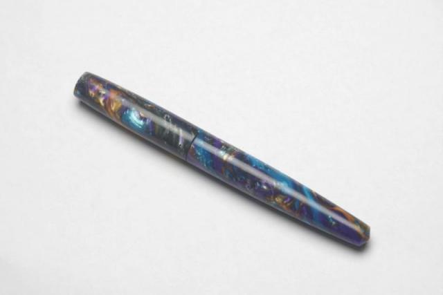
Introduction The sniper is a pen with very interesting history and one that has very close ties with FPN. The pen was launched as a group buy back in February 2015 by as a collaboration between ASApens and Vaibhav (@Mehandiratta) as just a concept without any drawing or prototype. Many enthusiastic FPNers rallied behind the concept of a hooded nib hand-made pen and the momentum was formed. We got to see the initial prototypes and the evolution of the design till the final shape took place and the pen was launched as a product. So in many ways this is a pen that has been conceived in, laboured within and delivered from the womb of FPN. Because of a variety of reasons the principal of which being my ignorance, I had not got the pen at the time. I had been meaning to remedy this for quite some time and when the opportunity arose earlier this year, I decided to go for it and get one sniper for myself. Design Much has already been written about the Sniper’s Lamy 2000 inspired design already. The key USP of this pen is a semi hooded/covered nib that looks strikingly similar to the way Lamy 2000’s nib is covered. Beyond this superficial similarity however, the pens are very different. It doesn’t use a proprietary and model specific nib like the Lamy and instead is designed to accommodate any Jowo/Win #5 open nib. This gives us a range of nib tips to choose from (EF, F, M, B, 1.1 and 1.4 italics) as well an option to have gold nibs instead of steel ones should your wallet so allow. For my personal pen, I opted to use a pair of purple twist blanks obtained from theturnersworkshop.co.uk to add a touch of exclusivity to my pen. Besides, I already had most of the standard ebonite colours in my other pens and wanted something different. Size and Balance At 152.5mm capped, this is clearly a full-sized / oversized pen. Normally such pens tend to be heavy and are meant for signing or occasional brief use for their heft. Thankfully the Sniper is not a heavy pen that imposes such restrictions on regular usage. Part of this lightness bonanza comes from it’s miserly usage of metal in it’s construction. It is a completely kitless pen with no metal other than in the nib and the clip. The pen overall is nicely balanced and the section design is sublime which adds to the comfort factor. The pen can be written both posted and unposted, but I prefer to use the pen unposted since posting does add a small element of rearward weight bias. To summarize this is a nicely balanced and light writing instrument designed to provide comfortable writing for extended periods. Nib The pen is designed to accept Jowo/Win #5 nib units. I believe the right SKU number is either 5-42 or 5-11. Since I have already have a small collection of Jowo nib units including everything from EF to 1.5mm italic nibs, I opted to get the one nib which I didn’t have, which is the 1.4mm italic nib. It’s a polished steel nib which is largely hidden from view by the hood of the section, except for the tines and the tip which obviously need to be exposed. Filling Mechanism It’s a cartridge converter pen that accepts standard international cartridges and compatible convertors. In my opinion, this is the best possible filling system and gives the best proposition around value, system longevity, convenience and widespread compatibility. Build Quality Being the current flagship model from ASApens, the pen obvious exudes the finest in quality that the marque has to offer. The general fit and finish and the tolerances are impeccable for a handmade pen and the joints are seamless. Attention has evidently been put into polishing and buffing to ensure a very high quality of the finish. Keep in mind however that this is an entirely hand-made pen and there is likely to be some fine trace marks under minute inspections. There was one small finishing issue on my pen however and that is the alignment of the nib with the hood. For whatever reasons, the alignment is just off by a couple of degrees and the result irritates my obsessive compulsive nature. I fully intend to reach out to ASA and request them to rectify this. Writing Experience By design, Italic nibs are supposed to have sharp edges and tricky to use unless you have the absolute right grip and hold the pen at the exact angle. Thankfully, this nib isn’t one of those cursive italic nibs and despite having no tipping, it is quite smooth. More than any technical aspect, what I would like stress upon is the fun aspect of writing with it. It gives your penmanship (or in my case lack of it) a flair that just begs to be experienced. You would smile after writing with this nib and it will encourage you to write more as you keep getting surprised how your own handwriting looks like. Beyond such simple pleasures, this is a highly competent calligraphic pen that helps in a host of writing styles such as Italic and Gothic. I am however not competent in any form of calligraphy and I would leave it to the experts to weigh in with their thoughts and opinions. Price and Value The Sniper is the current flagship of ASApens’ stellar collection. I find this entire series priced very attractively since the entire ASA line is such an affordable manner. The price is fully justified given the effort that goes into making each pen and that no compromises were made in using components within the constraints of what’s available in Chennai especially the nib which is the most important component. To summarize, the pen represents great value at an affordable price point. Specifications My usual disclaimer applies. The measurements in this section have not been taken with any precision instrument or laboratory techniques but should suffice to give you a fair idea of the size of the instrument. Length (capped) – 152.5 mm Length (uncapped) – 134.5 mm Length (cap) – 66 mm Length (section) – 37 mm Maximum width – 13 mm Minimum width – 8.5 mm Maximum section width – 5.5 mm (at the root of the exposed part of the feed) Minimum section width – 8.25 mm Conclusion The sniper is a beautiful looking handmade pen that exhibits a unique design. It is very light, comfortable and comes with a fabulous nib with a wide choice of tipping options. There is very little not to like in this pen and the price is just right. No wonder then that I strongly recommend this model to other connoisseurs of handmade fountain pens. Useful Links Purple Twist blanks from www.theturnersworkshop.co.uk Pen made by www.asapens.in
-
Introduction The story of this pen begins ironically with the story of my perception of a completely different pen brand which happens to be Pelikan. For quite some time there was a lot of enthusiasm in the “Fountain Pen Pals India” WhatsApp/Telegram group with people espousing the greatness of the brand and how Pelikan pens were the next best thing to sliced bread. I have been known to have a healthy dose of skepticism against any form of brand adulation and for some reason I found it very difficult to accept a steel nib lightweight M200 as being a much better pen than a Sailor 1911 standard or other pens of the same price point (we are talking street prices in India). My brief experience with a M400 and a M600 had not left me too impressed. A friend of mine was smitten with the M205 in white and I argued with him that he should preferably look elsewhere to get better deal for his money. Given my stated aversion, I was advised en masse by group members to try out a Pelikan to help change my mind. While I was open to the experience, I still wasn’t willing to spend Sailor 1911 money on a Pelikan. An opportunity arose when fellow FPNer Kapil Apshankar (@springrainbow) offered to get me a Pelikan M 200 nib unit from Europe at a cost that was substantially less than that of the entire pen. This was too good an opportunity to refuse and soon I was the proud owner of a M200 steel nib unit with medium tip. With the nib in hand, the next question was what pen to put it in. As is usually the case with me, I made an elaborate design of a beautiful pen using a mix of different acrylic rods. Unfortunately, making custom pens is a lengthy process and that design is yet to see the light of the day. I was however getting restless and reached out to Mr. Subramaniam of ASA pens to see if he has a quicker solution to the conundrum. I was pleasantly surprised to hear that this is not the first time he has encountered this request and he has in-fact got a design ready for precisely accommodating Pelikan nibs. Without any further ado I put in the order and within a few week time the Namenlos ended up in my mailbox. Design For those of you who are familiar with the ASA catalogue, you would immediately recognize the Namenlos as an adaptation of the ASA Genius. In fact the Namenlos is a slimmer version of the Genius with Cap and barrel diameters being about 3 mm less than the latter. The slimming down gives the pen a much more balanced and purposeful look and the silhouette closely resembles that of the Duofold Centennial. Like the classic Duofold this is a straight line design with only a slight tapering of the barrel and the cap towards the end filial. The top of the cap and the bottom of the barrel are flat and polished. The body of the barrel and the cap are brushed to give a bakul (matte) finish. The edge of the cap where it meets the barrel is bevelled and the polished bevelled edge provides a nice visual contrast to the matte finish. The section design has been patterned on the ASA I-Can / I-Will which in my experience is extremely comfortable. The section gradually tapers from the barrel towards the nib before starting to flare out about 7mm to 8mm before it ends. The pen comes with a chrome plated clip which in my mind resembles the shape of the beak of a Pelikan. This is probably unintended since ASA uses this clip on a number of their designs but I found this design cue very interesting. Size and Balance At 132 mm, this is a classic small pen. For the purpose of comparison, the length of the pen is very close to that of Sailor 1911 standard and the Parker Sonnet. Being made of ebonite and not having any complicated filling mechanism inside means the pen is extremely light and hence very comfortable to use. From top to bottom - Parker Sonnet Mk I, ASA Namenlos, Sailor 1911 Standard, ASA Rainbow, Kaigelu 316 The balance of the pen is very nice and can easily provide comfortable writing for extended periods. I must also make a mention here of the section design which is the best in the business from ASA and contributes immensely to the writing experience. This is one of those pens which can be used both capped as well as uncapped. Since the pen is very light, capping the pen does shift the balance a bit. I found it is great to use the pen capped when it’s fully tanked but it’s best to use the pen uncapped once the ink level goes down. My personal preference is to use the pen uncapped and enjoy the minimal weight. Nib The pen is fitted with gold plated Pelikan M200 nib with medium tipping. This is the same nib that comes in the Pelikan Souveran M200 line of pens Filling Mechanism My normal preference is to have pens with feeds that accept standard international cartridges and compatible convertors. The Pelikan nib system naturally doesn’t come with such support since it is meant to be used with a piston in the back of the barrel. I deliberated having a piston system in Namenlos but eventually for the sake of simplicity, economy and greater ink capacity, opted to have an eyedropper instead. This is where I wanted to talk about how going for an eyedropper paid off and the superior Pelikan feed with its high tolerances negated any occurrence of burps or other typical ED maladies. The unfortunate reality in my case has been exactly the opposite. While Pelikan must have designed the feed to have high enough tolerances, the ink capacity of a piston pen and an ED are just not comparable and the feed was not able to cope up. As a result I encountered all the problems of an ED while using the pen in terms of burps and ink dribbling once the ink in the barrel dropped below the halfway mark. I had taken some poor quality phone camera photos of the issue when I encountered them and am sharing them to illustrate the situation. Build Quality The pen exhibits the typical hallmark of ASA build quality. I had opted for a bakul (matte) finish and the attention to detail in obtaining the desired finish is impressive. At the end of the day however it is a hand-made pen, so there are bound to be some fine traces of tool marks visible under minute inspection. Writing Experience We have an entire section dedicated to Pelikan brand of pens in the forum with many threads and posts talking about the M200 line. So I won’t get too much about the details but would instead delve into my personal perception. There is absolutely nothing wrong with the nib. It is adequately smooth with a hint of feedback and leaves a nice wet line on the paper. Having said that, this is not a nib I would recommend to anyone. While it was good, it wasn’t great. There was nothing in this nib that would leave a smile on my face. It was a good all-rounder, but a solid middle of the class in all the subjects. I find it difficult to justify the 200% price premium that Pelikan charges over comparable #5 nibs from Schmidt, Bock or Jowo. I have a solid collection of nibs from these brands and almost all of them are comparable if not better than the nib I have. To ensure that I hadn’t got a lemon, I tried out a few more M200’s. Most were very similar to mine and exhibited similar neutral characteristics. However, fellow FPNer Hema Koppikar (@Hema) had a vintage M200 whose nib just blew me away. It was amazingly smooth and wet with a writing experience that leaves you hungry for more. I wish my M200 nib similar to hers but the sad reality is that it isn’t. Price and Value Mr Subramaniam charged me as ridiculously low amount for the pen (sans the nib of course). While the actual transaction happened in Indian rupees, translated in USD it was around $15 (may go up to $20 depending upon conversion rate applicable at that point). If this is not a good value, I am not sure what is. To the best of my knowledge there is no other proper nice ebonite pen with such a large ink capacity which is capable of using Pelikan nibs at such a price point. In case, there are such pens available, kindly let me know and I shall happily stand corrected. Specifications I will put in my usual disclaimers here. I don’t have access to precision measurement instruments such as Vernier calliper and you would have to settle for the approximate measurements I made using a normal ruler and my eyes which means there might be a little bit of deviation due to parallax effect. However, given these pens are handmade and there are small piece to piece variations anyway, the measurements I am providing should give you a clear indication of what to expect from the pen. Length (capped) – 132 mm Length (uncapped) – 123 mm Length (cap) – 66 mm Length (section) – 24 mm Maximum width – 13 mm Minimum width – 9 mm Maximum section width – 11 mm Minimum section width – 9 mm Conclusion The pen is beautiful. It is very light, very balanced, comfortable, great grip, well built and will definitely prove to be comfortable for long writing sessions. I can doubtless recommend this pen to all those who have the need or desire for such a pen for using Pelikan nibs. I am less enthusiastic about recommending the need for such a pen though since I am not sure what great element having a M200 nib brings to the table. I may have to wait to use a M800 and M1000 nib with this pen first to come to a conclusion on the subject. In the meanwhile, if you love Pelikan and would love to have a 2nd, 3rd or nth pen for your collection of Pelikan nibs and are adept at handling eyedroppers, please go ahead and get the Namenlos. It’s a steal and a very good one at that. Postscript I had considered calling Mr. Subramaniam of ASA pens to find out if he had any name in mind for the pen. But by then I had already taken a fancy to calling it Namenlos and decided to skip the step and continue with the prologue section that I had drafted.
- 12 replies
-
- asa
- prithwijit
-
(and 3 more)
Tagged with:
-
Hi everyone, this is my first attempt at a fountain pen review and I have decided to review the ASA Bheeshma which is a custom design that ASA pens has made based on my request. Since this is my first effort, please go easy on the brickbats. Constructive criticisms however are always welcome. Introduction The story of Bheeshma has to start with the discussion one day that we were having in the “Fountain Pen Pals India” WhatsApp group when someone introduced me to a picture of a Scriptorium pen in Lava Explosion blank. I was stunned as to how amazingly pretty the material was and how beautiful the pen looked. Without knowing it then, I was smitten and hooked. Days passed and my urge to possess one went up in leaps and bounds. Unable to resist any further, I reached out to Eugene Soto of muttblanks.com to enquire about blanks in larger than five inch sizes for kitless pens. He suggested using two five inch blanks or he could make seven inch blanks as a custom order. I am not sure why, but I chose the second option. Maybe, in my mind I thought since I am venturing into something new then why not stretch the envelope. Anyways, after 3 excruciating weeks of waiting, the blanks finally managed to pass through the hoops of transatlantic flight and customs clearance to land up in my mailbox. The next challenge was what pen to design for the blanks. Given that I had opted for small seven inch blanks, a large pen with clips and all paraphernalia was out of question since we simply didn’t have enough material. Fellow group members and FPNers Vaibhav (@mehandiratta) and Pradeep (@pdg84) chipped in and we decided to make an adaptation of the Onyx design that Pradeep had but with some modifications to the specifications. Vaibhav was kind enough to make a CAD based on the design ideas and the outline of the pen was ready. He even christened the concept Bheeshma based on the powerful thespian from the epic Mahabharata. When it came to the question of the pen being made, there was nobody else I could think of other than Mr. Subramaniam of ASA Pens. Not only had he helped me gain knowledge on all pen related matters, but I knew I could trust him to look after my dream and nurture it like as if it is his own. So off went the blocks to him to get turned (pun intended) into a pen. Design The design is inspired by the Onyx which in itself is inspired by the classic Nakaya Piccolo design. This is a classical design that starts as a cigar shape, tapering down towards the end filial and terminates with small conical end pieces at each side. The cap is flushed with the barrel with a small step down design where the cap and barrel meet. The section design has been patterned on the ASA I-Can / I-Will which in my experience is extremely comfortable. The section gradually tapers from the barrel towards the nib before starting to flare out about 7mm to 8mm before it ends. The design is clipless, i.e., doesn’t have a clip to put in your pocket and is also designed to be used unposted. This allows for a better control over determining the balance point and is set to provide comfortable writing for everyone. Without further ado, I will let the pictures do the talking about the design. . . . . Size and Balance By classical norms this is a large sized pen at 147mm capped. But those of you are familiar with Indian handmade pens would recognize the fact that it can almost be passed off as a medium sized pen amongst its peers. Since the material used is very light, the barrel could be made a bit thicker and stronger without compromising on the weight or balance. The pen is extremely well balanced and can easily provide comfortable writing for extended periods. The section design is the best in the business from ASA and that only adds to the pleasurable writing experience. Please note that the pen has been designed to be used uncapped and that is exactly how I have used it. Nib Originally the pen was designed to accommodate a #5 Jowo nib. But once it was made Mr. Subramaniam insisted that a #6 Jowo/WIN unit would be best fit for it. I am a sucker for large nibs and happily agreed to the recommendation. We finally paired the pen with a dual tone #6 Jowo steel nib with Medium tip. Filling Mechanism I am committed to using pens that accept standard international cartridges and compatible convertors. I find them to provide the best proposition around value, system longevity, convenience and widespread compatibility. Unless there is a compelling justification to do things differently, all my pens tend to have the cartridge convertor mechanism. The ASA Bheeshma is no exception to this rule and has the aforesaid filling mechanism. Build Quality The build quality of this pen is impeccable. The quality of polish is excellent. Given that it is a handmade pen, there are some fine traces of tool marks but they are only visible under minute inspection and the overall build is not much different from a normal injection moulded pen. I am given to understand that normally Lava Explosion or similar aluminite material benefits from a lacquer coating to highlight the shine. I had requested for no such coating and yet I am very happy with the lustre which is evident in the pictures. Writing Experience Mr Subramaniam doesn’t profess to be a nibmeister but on ample occasions he has given ample hints that he does tune some nibs. I am not sure what he has done here but this nib is magic. It is incredibly smooth yet not glassy and leaves a nice wet line on the paper. I had inked the pen with Bril Violet ink to match the ink colour with the pen colour and the combination has worked real well. There are no skips or false starts and the impression it leaves on the paper is of a nice smooth medium line rich in ink. Overall, a superb writer and amongst the better Jowo nibs that I have in my collection. Price and Value Since I had procured the blanks myself, Mr Subramaniam charged me just for the nib and for making the pen. The cost is comparable to the prices of recently launched pens of the ASA Stellar collection. Personally, I found that incredible value since he had to disrupt his normal production schedule and incur significant downtime to get this pen made. Specifications This section is for those of you who thrive on hard numbers. Unfortunately I do not have access to a Vernier calliper or other precision instruments. You would have to settle for the approximate measurements I made using a normal rules and my (admittedly weak) eyes. Length (capped) – 147 mm Length (uncapped) – 143 mm Length (cap) – 62 mm Length (section) – 27 mm Maximum width – 15.5 mm Minimum width – 12.5 mm Maximum section width – 12.5 mm Minimum section width – 9.5 mm Conclusion I am extremely happy with this pen. I started with an abstract desire and my friends and ASA have given it a concrete and excellent shape. Everybody who have written with it have only been impressed with it. It is an excellent design that is very balanced, comfortable, light and ideal for long writing sessions. It would be great if ASA considers bringing it to the market as a regular product.
-
Introduction Recently my interest in all things fountain pen related has spawned a specific sub-genre - a fascination for experiencing nibs made of different materials such as gold, titanium, palladium, etc. Looking around, it seems that the Bock 250 triple system is the ideal platform for experiencing material differences since they seem to have the widest range of conceivable material options for this particular nib. It is thus hardly surprising that I have embarked on developing a collection of different Bock 250 nibs. To eradicate as many variables as possible, I am getting all of them in medium tip so as to focus solely on experiencing material differences. Amongst the earliest Bock 250 sets, I got a Titanium one thanks to the help of fellow FPNer Tervinder (@romee_win) and his brother Rajdilawar who got it for me from Germany. Just looking at the colour of the Titanium nib convinced me that it will go very well with oxidized silver trims. Since Manoj is the only Indian pen maker that I am aware of who is using silver accoutrements, I approached him with a request to get a pen made. To match the colour of silver trims and titanium nibs, I opted to use Conway Stewart Heather blanks and hence the moniker used for the pen. Design Instead of creating a design from scratch, I shared with Manoj one of the drafts I had of the Azaadi design. This was largely similar in concept except for being slightly larger and having only one broad ring in the cap instead of having two slimmer ones. It is a classic design with simple straight lines for the cap and with only a slight tapering of the barrel. The top of the cap and the bottom of the barrel are flat and polished. The body of the barrel and the cap are polished smooth and shiny. The broad silver hand crafted band on the cap with elaborate motifs add a touch of flair. Just like the Azaadi (and its muse the Churchill), this pen too has the concentric circles on the cap finial to give it a crown like look. The clip and trims used are all made of silver. The turquoise/teal base colour of the heather material and its pearlescent properties nicely complements the muted colour of the silver trims and the titanium nib. Size and Balance At 155mm capped, this is a card carrying member of the oversized pens club. But don’t let the length let you have misconceptions about its heft. Being a completely kitless pen with no metal other than in the nib, clip and bands means it is in-fact surprisingly light. Despite the length, it is nicely balanced and can easily provide comfortable writing for extended periods. The simply sublime section design adds to the comfort quotient. One can post the cap if so desired, but I prefer to use the pen unposted. The excellent Conway Stewart acrylic material is light and yet strong and hence the pen despite being oversize doesn’t compromise on the weight aspect and this contributes a lot towards the overall comfort. Nib The Bock 250 Titan nib in medium width is the heart and soul of the pen. As I had mentioned earlier, this pen exists for the sole purpose of allowing me to experience this nib. From an appearance perspective, this nib looks exactly like any other Bock 250 nib out there. Only the subdued matte grey colour and the Titan branding on the nib below the Bock logo gives you a hint that it is a wolf in sheep’s clothing. The clip nib and bands complement each other nicely thanks to their colour. Filling Mechanism The thing I like about European pens is how most of them use the standard international system for cartridges and compatible convertors. I like this system better than any other because of the wide compatibility, system life longevity, value and convenience. So I am not at all surprised and quite delighted that Bock 250 triple systems adopt the same standard. This pen has paired the nib unit with a Schmidt K5 converter to use bottled inks and can also accept cartridges from a host of brands. Build Quality Manoj is a master craftsman who is known to work on only one pen at a time with an eagle’s eye focus on the details. That naturally translates to hallmark of quality and the pen benefits from the same. The fit and finish and the tolerances are impeccable for a handmade pen. It is obvious that the pen has been made with care and a considerable amount of time has gone into polishing and buffing to ensure a very high quality product. Writing Experience I know all of you are interested about the writing experience more than anything else. I will keep it short and unambiguously state that this nib is simply awesome. The nib is super smooth, appropriately wet and glides over the paper laying down a nice wet line. There are no skips or false starts and overall the pen is a superb writer. The closest analogy I can think of is a couple of Visconti Dreamtouch nibs I have tried and this nib feels exactly the same. Just to ensure that I am not being prematurely exuberant, I have been using this pen in continuous rotation for over a month now all the time keeping it inked with Daytone Blue-Black. I am happy to say, a month of cohabitation has not changed my opinion a bit and I still smile at the prospect of putting the pen to use. Please note that I am well aware that there are likely to be significant unit to unit variations between nibs and your personal experience might vary. So while I am no authority on whether all Bock Titanium nibs are great, the one I have received certainly makes me very happy. Price and Value I will make a distinction between the value proposition of the pen as made by Fosfor and the overall pen’s cost including that of the Titanium nib which I had procured by myself. As far as the standalone pen is concerned, it is incredibly VFM. I may have mentioned this before but I will do it again that I am not aware of any other custom pen-makers who offer this level of quality and individualization at this price point other than Manoj and Mr. L Subramaniam of ASA Pens. They hear you out, try to understand what is it that you wish to achieve and the satisfaction persists long after the cost concerns have receded. Given how happy I am with the Titan nib, it is no wonder that I find the overall pen an amazing value for the quality and beauty that it offers. I am under no illusion however that part of the value perception comes into the picture because I wanted to experience something different in a Titanium nib. There may be quite a few steel nibs that can be tuned equally well (and I may have quite a few of them as well) and your perception of value is likely to be influenced by this fact. To Summarize, the pen is a great value with a properly tuned steel nib and an amazing value with the Titan nib if such a nib is what you are specifically seeking out. Specifications The measurements in this section have not been taken with any precision instrument or laboratory techniques but should suffice to give you a fair idea of the size of the instrument. Length (capped) – 154.5 mm Length (uncapped) – 137 mm Length (cap) – 71 mm Length (section) – 22 mm Maximum width – 14 mm Minimum width – 8.5 mm Maximum section width – 10 mm Minimum section width – 8.25 mm Conclusion I had commissioned this pen with a very specific objective and it has successfully delivered without an iota of doubt. Not only do I like this pen, it has managed to wriggle into my regular list. I rarely ink up the same pen for four successive weeks and this one is breaking all records. It is very comfortable, well balanced and an excellent writer thanks to the wonderful Bock Titan nib. The silver clip and band is a unique Fosfor signature lends the pen a degree of exclusivity. I have no hesitation in recommending this model to others. Useful Links Conway Stewart Heather blanks from www.theturnersworkshop.co.uk Bock 250 Titan nib from www.starbond-europa.de The nib is also available at www.beaufortink.co.uk Pen made by www.fosforpens.com
- 16 replies
-
- prithwijit
- review
-
(and 5 more)
Tagged with:
-
Introduction Often in life one learns to appreciate the value of something only after the object is long gone. In my case, something along the same lines happened for Conway Stewart pens. One fine evening in July of 2015 I chanced upon a store selling off the last few Conway Stewarts they had in stock and I was mesmerised by their beauty. One look at the price tag however quickly brought me back to my senses. Modern CS pens were never known to be on the value end of the price spectrum and the huge custom duties and other applicable taxes in India meant that they were well outside my grasp. I was however acutely aware that CS pens would soon not be available anywhere anymore and was desperate to get a piece of the pie. Once back home, I resorted to trawling the internet and found the source for last few CS blanks being made available from their liquidation sale by Vince Coates (www.theturnersworkshop.co.uk). With the help of fellow FPNer Kapil Apshankar (@springrainbow) I managed to source some materials in sufficient quantity to make a few pens. I did not bother receiving the material in hand and instead had those sent directly to Mr. Subramaniam of www.asapens.in with full faith that he would help me make something nice out of them. I also found out that CS essentially used Bock 250 nibs in their pens and grabbed a small collection of nib units as complete triple system from www.beaufortink.co.uk. We worked on a design that was original and yet paid homage to CS and especially their flagship model Churchill. Once the outline was worked out, we launched the pen in the “Fountain Pen Pals India” WhatsApp/Telegram group on August 15th where it was received with incredible enthusiasm. After some ups and downs, we stabilized at around 30 orders within the group. That’s quite an achievement considering the fact that at that point of time, the group has fewer number of members than 30. While everybody didn’t necessarily book one Azaadi, there were quite a few members who opted to get more than one. Since it was launched on 15th August which happens to be India’s Independence Day, it was only fitting to call the pen “Azaadi” which means “Independence” in Hindi. It was also a cheeky repartee to Churchill whose opinions about Indians and the notion of Indian Independence weren’t necessarily very appropriate. Design I knew that I wanted an original design which would not be a rip-off of any existing Conway Stewart model and yet should provide some kind of a homage to the brand. We all know that the concentric circles on the cap filial of Churchill gives it a distinctive crown like look and decided to incorporate a similar crown in black ebonite in the pen we designed as a homage element. Other than that, it is a solidly utilitarian design that combines the best of the breed in a number of areas. Size-wise, we designed it to be approximately the same size as a Lamy Safari and fitted it with the section design from ASA I-Can / I-Will in black ebonite which is a personal favourite for the comfort it offers. The end of the barrel is also made using black ebonite and the barrel end was also tapered a bit as another homage clue to the CS Churchill. The clip used was a special vintage ball clip made of brass which is quite unique in itself. Design wise it’s a classic with simple straight lines for the cap and with only a slight tapering of the barrel. The top of the cap and the bottom of the barrel are flat and polished. The body of the barrel and the cap are polished smooth and shiny. The concentric golden bands on the cap add a touch of flair. All in all the pen was designed to be regular sized, light and robust with the two ends having design cues that pay homage to CS. Final CAD drawing of the pen design that went into production Since we didn’t have CS blanks for all, the pen was launched with the option of using a broad set of acrylic materials. Unsurprisingly, the pearlescent acrylic blanks used in the ASA Rainbow turned out to be the most popular. We were pleasantly surprised how the shine of the acrylic blanks was nicely complemented by the muted colour of the ebonite components helping offset the monotony. The materials and colours complement each other and their interplay enriches the design whether posted or unposted. Size and Balance At 140mm capped, this is the perfect size for an EDC (Every Day Carry) pen. The shape of the pen and especially the section design is also meant to accentuate the feeling of comfort. But nothing beats the feeling in hand once you start writing with it and realise the comfortable. Needless to say, the pen is well balanced and provides comfortable writing for extended periods. Nib While I did get a set of different bock nibs, the quantity available wasn’t sufficient to satisfy 30 orders. Hence the pen was launched with two nib options excluding Bock. One could get a Schmidt (Model FH 452) nib in F/M/B or else go for a Jowo/WIN nib (Model 12-56) in EF/F/M/B/1.1/1.5 tip options. Since I already have a considerable collection of Jowo nibs, I opted to get the pen with a Schmidt nib with a broad tip in golden finish. From a design standpoint, the clip nib and bands complement each other quite nicely thanks to the golden colour. Filling Mechanism I am a stickler for pens that accept standard international cartridges and compatible convertors since in my opinion they the optimum combination of value, system longevity, convenience and widespread compatibility. It is therefore hardly a surprise that the ASA Azaadi supports the same and it comes with a Schmidt K5 convertor out of the box. Build Quality The Azaadi exudes the usual hallmark of quality from ASA pens. The fit and finish and the tolerances are fine for a handmade pen. The joints are seamless and only discernible due to colour variations. It is obvious that the pen has been made with care and a considerable amount of time has gone into polishing and buffing to ensure a very high quality of the finish. The only improvement area that I can think of are the bands used in the cap. It isn’t as if the bands aren’t fitted properly, but rather I wish ASA had access to better (read thicker) bands to go with this pen. Writing Experience Schmidt is a renowned maker of triple units and their systems have a large user base thanks to a number of brands that use them. Such widespread adoption wouldn’t have been possible if the nibs weren’t of top notch quality. It is little surprise then that I am very happy with how the pen writes. Being a broad tipped unit means that the nib appears extra smooth and glides over the paper laying down a nice wet line. This nib however isn’t soft or flexible and is quite rigid or nail-like. We have to accept that as a characteristic of the nib and be happy about the excellent writing experience that it provides. Price and Value The ASA Azaadi is poised to be one of the flagships within ASA’s line up and its price is currently perched as amongst the highest in the line. That however doesn’t mean much in cost terms since the entire ASA line is so affordable and the pens so wonderful. Personally to me the price reflects the effort that goes into making each pen and that no compromises were made in using components within the constraints of what’s available in Chennai. AT the end of the day, the pen represents great value at an affordable price point. Specifications Since I have the benefit of having access to the original CAD drawing, I will be quoting the specifications from that. Actual production pens are likely to have small piece to piece variances given the nature of making handmade pens. The measurements should suffice to give you a fair idea of the size of the instrument. Length (capped) – 140 mm Length (uncapped) – 135 mm Length (cap) – 65 mm Length (section) – 25 mm Maximum width – 16 mm Minimum width – 10 mm Maximum section width – 12 mm Minimum section width – 10.5 mm From top to Bottom - Jinhao 159, ASA Azaadi and Lamy Safari Conclusion It is not very often that one gets an opportunity to be involved in getting a fountain pen design. It is even rarer to get an opportunity to direct the design and see the pen getting launched as a regularly available product in the vendor’s catalogue. For that reason alone the Azaadi is very special to me. People who have got a chance to own this pen have been very positively impressed by it’s balance, comfort and writing experience. The pen has been designed from the ground up as an EDC (Every Day Carry) pen and in my opinion it fulfills that role in a fitting and stylist fashion. I have no hesitation in recommending this pen to others and I am sure you would enjoy it too.
- 27 replies
-
2015 New Model Hero Classic 100 (Aka Hero Glorious) Review
Prithwijit posted a topic in Fountain Pen Reviews
Introduction Why would anyone be mad enough to splurge $49 on a Hero 100 fountain pen, especially a Hero 100 variant that you have neither seen nor heard of? You do so because Soumitra Sanyal (@sanyalsoumitra) himself recommends it and offers to buy it for you from China during his visit there. For those of you who aren't familiar with his exploits, Soumitra-da is our resident walking and talking encyclopaedia on Chinese fountain pen matters. Just refer to his thread here to get a glimpse of his expertise and experience with the oriental pen makers and their instruments. That is how one fine day I find myself committing to buy a 2015 New Model Hero Classic 100 (aka Hero Glorious) and a few weeks later the pen lands on my desk. A big shout out to Soumitra-da, the anonymous kind-heart and L Subramaniam for taking the effort in ensuring that the pen reaches me from China. Packaging Usually I do not give too much emphasis on packaging since my interest lies with the pen rather than with the box. But I had to mention the packaging of the pen separately here since it is such a deviation from the normal Hero packaging that we are accustomed to seeing. The pen comes in a large green leatherette box enclosed within a white paper sleeve. The box has the Hero logo on the bottom right corner with 1931 (the year of founding) mentioned prominently. Once you open the box the pen is tastefully placed within a lovely green velvety bed. There is a small golden plaque with ‘Hero 100’ engraved in it. Pulling out the velvet bed, reveals a small cavity which contains the usual paperwork. Design Lately there seems to be a preference towards design that emphasize heft and a certain amount of chrome or other metallic reflective surfaces in the body of the pen. Parker IM, Sheaffer 300, Jinhao 159 or Duke Chaplin are representative of this trend. These pens are typically designed to cater to an entry/newcomer clientele base who equate weight and presence of metal with quality. The Hero Glorious squarely belongs to this club. Design wise the pen combines the traditional Hero 100 section and filling mechanism with a brass body which has been lacquered in black and inlaid with golden arches motif. The cap and body ends are fitted with golden flat ends and the cap band has a brushed metal finish. Engraved on the cap band is Hero 100 in a mix of Chinese letters and English numerals. There is a small logo engraved at the top of the clip. The black section has the traditional golden arrow inlay near the front-end. Aesthetically the pen is a mix of pleasing and over-done. The only visual mismatch that I could discern is the aluminium joint between the section and the barrel. I have no clue why they couldn’t take the extra effort and give it a golden finish as well. I suspect they were raiding the existing parts bin and did not really want to procure any new parts and fittings that this would have entailed. Size and Balance The design approach that Hero has taken for this pen unfortunately means that it is a heavy pen. While do not have a measuring scale of my own, the specifications state that it is a full 45 grams. This is a serious drawback that impacts the writing experience. There copious amount of heavy brass in the barrel and even more so in the cap. Any attempt at writing with it posted had to be immediately terminated. It was just not comfortable enough. Even writing unposted wasn’t as comfortable as the classic Hero 100 which had the weight and balance nailed down to the T. A light section and heavy barrel does throw the balance for a toss and the pen felt decidedly top heavy. The weight issue is a real pity because at 142mm capped, this is the perfect size for an EDC (Every Day Carry) pen. The section design is a classic and is known to accentuate the feeling of comfort. Nib The pen comes fitted with the classic Hero 100 nib which is made of solid 14K gold and fine in width (tip size 0.5mm). While the pen professes to be a fine, in my writing experience it was much closer to a western EF than a western F. The original Shanghai Hero company is known to make excellent nibs and this one is no different. The nib is very smooth and if you are the sort who likes EF nibs, you should have little reason to complain. The only aspect which I wasn’t too happy about was with the ink flow. I found it on the dryer side. Filling Mechanism Like any Hero 100, this pen too is an aerometric filler. It comes equipped with a long and slender pump style converter which is fixed. The brand name “hero” is inscribed in the pressbar in English while the converter itself has the pen model name inscribed in Chinese with English numerals. Since it has a fixed converter, the pen can only accept ink from bottles and cannot use any sort of cartridges. Build Quality On first glance the pen exudes the usual quality vibes that we are familiar with these days from the better Chinese pens. The fit and finish and the tolerances are nice and the pen seems built to last. I do however have some reservations with regards to the long term durability of the pen. The fact that it has a simple plastic section paired to a heavy brass barrel and the two are joined via an aluminium threaded joint seems to me a potential failure point. During use, the heavy metal is likely to put stress on the plastic. Assuming the section design is the same for the classic Hero 100, I do not expect the section to be designed to withstand such weight/stress. In fact, quite a few other reviews have reported sections developing cracks in the plastic section. Writing Experience The original Shanghai Hero company has been in existence for long and during the period it has developed quite an impressive following of its own. The fact that it seems to be the most faked pen in China means that the original pen has got something right and has a great writing experience. The Hero glorious obviously benefits from using the same ‘business side’ of the pen. The nib despite being extra thin is very smooth and glides on paper. There is no scratchiness even on coarse or cheap paper. It is however hard as a nail and any thought of softness or flex has to be summarily banished. Such a smooth nib is however let down by a feed that is too dry. I had loaded the pen with Pilot black ink and the pen was visibly having trouble keeping up the supply even for such a thin nib. This meant that the sensation of a well lubricated nib gliding on paper was sorely missing. Had that been there, it would have shot right at the top of my EF nib collection. The other drawback to writing pleasure is the sheer weight of the pen. You don’t buy this pen for a better writing experience than the original classic. Price and Value I have observed that the price of this pen seems to be fluctuating a lot. My pen was purchased from mainland china for $49 and at the time the same pen was being sold on Aliexpress for around $80 - $120. Currently there are a couple of listings available for as low as $20 but these pens don’t come with the box. That may mean any one three things - either I paid for a $29 box or counterfeits are coming into the market or the price of the pen is genuinely coming down after the initial period is over. Whether the pen is VFM or not depends a lot on what the final price comes to be. For a brass bodied solid pen with a genuine 14K nib, the sum of $20 seems very reasonable while $49 is stretching the case a bit. Any figure above $60 would in my opinion make the pen non VFM since QC is not known to be equivalent to western standards. Specifications The measurements mentioned in this section were not taken with any precision measurement instruments and you would have to settle for the approximate measurements I made using a normal ruler. However, the measurements I am providing should give you a clear indication of what to expect from the pen. Length (capped) – 142 mm Length (uncapped) – 121 mm Length (cap) – 63 mm Length (section) – 43 mm Maximum width – 12 mm Weight – 45 gm (Not measured and as per specifications) Conclusion This is the section where I usually summarize my findings and either recommend or reject the pen. Frankly speaking, I am a bit conflicted on this pen for a variety of reasons. Firstly because of the ongoing price fluctuations, I would advise a wait and watch approach to see it pans out. Secondly the design of the pen and the weight won’t suit everyone. I personally found it a bit too over the top for my taste and the weight a bit tiring. But if you are of the sort that such models, then you would be delighted by this pen. Nitpicking aside, it’s a relatively nice writer and the brand itself has an impressive legacy. The size is just ideal to make it an EDC (Every Day Carry) pen and it fulfills that role fabulously. Should you go for it, I have no doubt that you would enjoy it.- 10 replies
-
- prithwijit
- review
-
(and 4 more)
Tagged with:
-
Review Of Fosfor Islander In Conway Stewart Flecked Amethyst
Prithwijit posted a topic in Fountain Pen Reviews
Introduction Manoj Deshmukh of Fosfor pens (http://www.fosforpens.com) is a master pen turner and I always wanted a pen made by him. Given that the Islander model is considered the flagship of his line, it is only natural that I would like to have one of those in my modest collection. Normally Islanders are made of exotic wood burls or hand cast resin that Manoj personally prepares based on individual preferences. Personally, I am not a big fan of wooden pens and didn’t have much faith in my aesthetic abilities in specifying the right colours to cast the resin. Instead I opted to use Conway Stewart Flecked Amethyst blanks that I had got from Vince Coates (http://www.theturnersworkshop.co.uk). I had always thought that the Flecked Amethyst material would be complemented nicely by the silver trims used in the Islander and decided to round off the look with a solid steel polished Jowo #6 nib in broad tipping. Design The Islander design is quite unique and distinct amongs't the India pen models. The cap portion is cylindrical while the barrel has a cigar like tapering towards the end filial. Both the cap and the barrel are ends are flat and polished. The body of the barrel and the cap are polished smooth and shiny. The cap is flushed with the barrel with no step down where the cap and barrel meet. The most important design element of the Islander and the raison d'être of this pen in my collection is the beautiful hand crafted silver band and clip combination. It is an artisanal product and I am not aware of any other pen with such and unique clip/band combination. The clip is springy and it is curved with a raised bottom for easy clipping. There is intricate hand-made design in the band above the clip and it is made of pure silver. One of the joys of getting a Fosfor pen is the customization in terms of section design that Manoj allows you to do to best suit your preferences and comfort. I opted for modified hourglass design which has proved to be extremely comfortable. In hindsight however, the design may have benefited is the edge at the end of the section was rounded off a bit. Size and Balance At 150mm capped, this is not a small pen. Despite it’s length, it is nicely balanced and can easily provide comfortable writing for extended periods. While the cap can be posted with some effort, I use it unposted as I find the length to be too long when you post the cap. The acrylic material is light and yet strong and hence the pen despite being oversize doesn’t compromise on weight or balance. Nib The standard Islander comes with a choice of Schmidt #6 nibs (Model FH 452) in either F/M/B. Schmidt nibs come with their logo embossed and I wanted a cleaner look on my pen. So I decided to go for a Jowo #6 polished steel nib instead which was devoid of any logo. Since I have many nibs with medium tipping, I opted for a broad tipping on this pen. Filling Mechanism My Islander is a non-proprietary cartridge/converter pen that accepts standard international cartridges and compatible converters and it comes with a Schmidt K5 converter out of the box. As I have mentioned in many of my earlier reviews, this is my favourite filling system since in my opinion it represent the optimum combination of value, system longevity, convenience and widespread compatibility. Build Quality Manoj has a reputation for focusing on the details and the pen clearly benefits from his focus and the resultant build quality is impeccable. One can easily appreciate that the pen has been made with care and a considerable amount of time has gone into producing it. Writing Experience Jowo is generally considered as being amongs't the top two or top three western nib OEMs and their nibs are widely used on a variety of pen brands. Their popularity itself is a testament to their general quality. Needless to say, I have been very satisfied with Jowo nibs in general and have quite a collection of them in different tipping. It is little surprise then that I am very happy with how the Islander performs. The broad Jowo unit is super smooth and glides over the paper laying down a nice wet line. There are no skips or false starts and overall the pen is a superb writer. Price and Value Currently as of December 2015, Islander pens are listed for a price that ranges between $75 and $99 based on the type of wood being used. These prices however are for pens with Schmidt nib units. If you opt for Jowo, then there is a slight price premium. I am not aware of any other custom pen-makers who offer this level of quality and individualization at this price point other than Manoj and Mr. L Subramaniam of ASA Pens. Needless to say, these pens are incredible value and the quality lingers in your hand long after the cost has left your mind. Specifications The measurements in this section have been taken with a simple ruler and may not be precise being subject to some amount of parallax error. Length (capped) – 156 mm Length (uncapped) – 141 mm Length (cap) – 70 mm Length (section) – 24 mm Maximum width – 16 mm Minimum width – 10 mm Maximum section width – 12.5 mm Minimum section width – 10.5 mm Conclusion This is my first Fosfor pen and I am very happy with what I have received. It is very comfortable, well balanced and an excellent writer thanks to its Broad tipped Jowo nib. The silver clip and band is unique and adds a touch of exclusivity. I have no hesitation in recommending this model to others.- 21 replies
-
- prithwijit
- review
-
(and 4 more)
Tagged with:
-
Introduction “A lot can happen over coffee” screams the tagline of Café Coffee Day which is a renowned café chain in India. While I may not know much about what else can happen over coffee, I am about the narrate the story of a pen that came into being thanks to a little chit-chat over the brew. It all happened when I had a business trip to Chennai which necessitated a stay over on Friday night. I opted for a late morning flight back home on Saturday and called up Mr. Subramaniam of ASA pens to set up a meeting in the early morning. The gentleman that he is, he couldn’t refuse my intrusion into his serene morning and we caught up over delicious strong filter coffee at his place. We discussed a lot of pens and I showed him the picture of a few orange coloured pens with the suggestion that he consider them for production using the orange acrylic blank that he had recently procured. Unknown to me, his mind was already on the job and a week after the meeting he surprised everyone in the “Fountain Pen Pals India” WhatsApp/Telegram group with a picture of a new prototype pen using a combination of orange and deep navy blue coloured acrylic material. Needless to say the pen looked beautiful and all of us wanted him to ensure that the pen goes into production. There was one small hitch though. The deep navy blue acrylic material used was from some vintage material stock he had and he had exhausted all of them. Only bits and pieces were left and it was not possible to make more than ten pens of that design. A mad scramble ensued and within thirty minutes all ten were booked. Since this colour combination was unlikely to be ever repeated, we decided to brand it as a Limited Edition (LE) and number code each pen. A lottery was conducted and I was lucky to get pen number 01. A number of suggestions were made for naming the pen. Fellow FPNer Kapil Apshankar (@springrainbow) shared the picture of a tropical paradise with an extremely attractive model at the beach with a Macaw on her shoulders. The picture must have been really good since I have no recollection of noticing the Macaw. Other group members who had better control over their hormones noticed how closely the colour of the pen matched that of the Macaw and voted to name the pen after the bird. Design The Macaw has a classic design in terms of simple straight lines with only a slight tapering of the barrel and the cap towards the end filial. The top of the cap and the bottom of the barrel are flat and polished. The body of the barrel and the cap are polished smooth and shiny. The section design is a homage to the traditional sections made by Indian hand-made pen makers – a simple straight section tapering slightly towards the nib and ending with a small ridge where it ends. It’s not my favourite design but does the job nicely. The pen comes with a plated beak shaped clip which is only fitting for a pen called Macaw. The highlight of the design is obviously the colour combination of the material used and how the colours have been used. To the best of my knowledge there are not too many pens with Orange and Blue colour combinations out there. The Macaw has attempted to use this unique combination and in my opinion has come out brilliantly successful. Essentially, the pen has a solid orange body and a solid blue cap. The monotony is broken by the usage of contrasting colours in the end filial of both the body and the cap. The colours complement each other and harmonizes the design. Whether posted or unposted, the interplay of the colours comes out very nicely yet subtly. . . . Size and Balance There is no beating around the bush that it is a large pen at 151mm capped. The shape of the pen also seems to accentuate the feeling of heft. But once you take it in hand and start writing you realise just how comfortable the pen is. Maybe because the material used is so light, that despite the length and the diameter of the barrel, the pen hasn’t really been penalized in terms of weight or balance. Needless to say, the pen is well balanced and provides comfortable writing for extended periods. Nib The pen comes fitted with a #6 Schmidt steel nib with paired Schmidt feed and sleeve (Model FH 452). There was a choice to go for either polished steel or gold plated model and I chose the latter and opted for a medium tip. I must mention here that this is a design that I believe would have greatly benefitted from a larger #8 nib. There is enough clearance in the cap to accommodate such a nib and the relatively larger diameter of the pen and the section would have matched nicely with a large and wide nib. Unfortunately going for Bock or Jowo #8 in gold would have made the pen prohibitively expensive and using the Ambitious 40mm nib would have meant that the pen becomes an eyedropper. So in hindsight, I believe going with the #6 nib was the right choice although I wish that in the marketspace there were options for economical but good #8 sized steel nibs as triple systems with standard international cartridge and convertor support. . Filling Mechanism I prefer pens that accept standard international cartridges and compatible convertors. I find them to provide the best proposition around value, system longevity, convenience and widespread compatibility. The ASA Macaw has the aforesaid filling mechanism and comes with a Schmidt K5 convertor out of the box. . Build Quality This is definitely one of the better handmade pens I have received from ASA. The fit and finish and the tolerances are fine for a handmade pen. If you look closely where the end filial meet the barrel and the cap you can hardly make out that there is a joint there. Only the contrasting Orange-Blue colour gives it away. That’s a testament to the quality of finishing and the amount of time spent in polishing and buffing. This is one handmade pen where you can risk calling it an injection moulded pen based on exterior finishing as it appears to the naked eye. Only the design and shape gives an indication that it’s something different and has not come off an assembly line. . Writing Experience Schmidt FH 452 is a very well known, popular and renowned nib and its merits are well known. Out of the box it is a very smooth writer laying down a nice wet line. I won’t call this nib as soft or flexible however and it is a simple honest nail. This was my first Schmidt medium nib and compared to the many Jowo and Lamy medium nibs that I have, the line width on this one seems to be a tad bit thinner. That does not however take anything away from the quality of the pen but is just a characteristic of the nib design. Should you need a nice wet line like a good Jowo medium, I suggest you consider a Schmidt broad instead. Price and Value The ASA Macaw was sold to us for a price that is comparable to the prices of recently launched pens of the ASA Stellar collection. In my opinion that is amazing value since we are getting a quasi-custom pen offered at a price that is at the value spectrum of handmade pens. Specifications I will put in my usual disclaimers here. I don’t have access to precision measurement instruments such as Vernier calliper and you would have to settle for the approximate measurements I made using a normal ruler and my eyes which means there might be a little bit of deviation due to parallax effect. However, given these pens are handmade and there are small piece to piece variations anyway, the measurements I am providing should give you a clear indication of what to expect from the pen. Length (capped) – 151 mm Length (uncapped) – 137 mm Length (cap) – 69 mm Length (section) – 19 mm Maximum width – 16 mm Minimum width – 11 mm Maximum section width – 12.5 mm Minimum section width – 11 mm Conclusion I am extremely happy with this pen. It started as a coffee table discussion and ended as a limited edition. Everybody who has this pen have been extremely impressed with its balance, comfort and writing experience. I would request Mr. Subramaniam to consider launching the pen as a regular model with other colour combinations with an option of having an Ambitious 40mm nib in eyedropper combination or with a #6 nib in cartridge-convertor version.
- 21 replies
-
- schmidt
- prithwijit
-
(and 3 more)
Tagged with: