Search the Community
Showing results for tags 'peerless'.
-
LINKED BLOG BELOW For more irrelevant pictures , I am sure people like me would click Cross Peerless 125 Tokyo Edition PRELUDE Plurality of singularities Among many other fountain pen lovers, I do retain a high level of adoration for the way the Sailor nibs look, aren’t they just beautiful? Paradoxically enough, there is also a certain distaste, when it comes to my acceptance of their nib smoothness. My humble experience has been mostly with sailor nibs straight from Japan and not the US market. Alas! the glassy smooth angle to manoeuvre writing with the Japanese ones (except the Naginata one), wouldn’t work for me, ever with the five sailor nibs. Also, I always felt an immense opportunity have something done with their relatively bland base pen designs and the CC filling system. Many times, I pondered whether it would be worth sending a sailor nib to Conid and have a pen made. The nib can be smoothened for English script rather than struggling on my part to learn the Kanji to have it used! As it turns out, I couldn’t justify the Conid plan for a long time, but I do intend to add one in future. By this time, Cross had relaunched the Peerless range in 2015, marking 125th anniversary of its original Peerless pen (1889). Hoorah! it came with a 18k Sailor nib! Cross was founded in 1846, in case you too thought this to be the company’s 125th anniversary . Below is an ad, I could find with respect to the original peerless fountain pen. PRESENTATION (6/6) Presented in Style Presentation is exquisite consisting of a paper box wrapped around a luxury gift box, along with a brand leaflet and two spare black cartridges. The screw-in (8756) converter, comes fitted inside the pen. I hope that the following pictures will do more justice. And if you are thinking of gifting this, I can assure you, it’s altogether a fantastic package. Full Marks! The hinged box is sturdy and substantial with enough cushion for all residents. In fact, there is enough space to fit two more large sized pens and probably you could smuggle a turtle inside! DESIGN (5/6) Designed by Aliens Cross released the Peerless 125 in four finishes: 23kt Heavy Gold Plate, Obsidian Black Lacquer, Platinum Plate/Medalist, and Platinum Plate in three models initially: fountain pen, ballpoint and rollerball. Later, three special editions NYC, London and Tokyo were released in Silver, Gold and Black, that imbibed prominent works of architecture (Chrysler Building, Big Ben and Skytree) in the respective megacities. I went for the Tokyo primarily because of silver accents and partly because of its availability over Obsidian Black edition. Eventually, I think that it was a good choice The pen looks elegant and appears quite substantial compared to a Townsend or a Century, while preserving in its signature cigar custom-design. The platinum coated metallic appointments at the centre, clip and either ends provide a pleasant lustre to an otherwise dull matt finish of the body. The taper is pretty nuanced and organically converges into the glitter at either ends. The Skytree being the tallest structure in Japan and the second tallest one in the world has a charm of its own, more so during night. It seems to blend between a pagoda and a futuristic spaceship control center, though is used primarily for Radio and TV broadcasts in Tokyo. Below go some pictures of Skytree at Night and Day! For the Peerless, the brushed black PVD coating of the body poses as the structural base and the circular glass houses perhaps get represented by the lustrous platinum appointments, although YMMV. While the pen does look hefty and is quite an oversized pen, the semblance of size no way compromises the impeccable balance and comfort of writing, with the Tokyo. The cap seems to imbibe most of the heft within itself with a cylindrical cross section Quite delicately, the PVD body tapers down towards the metallic blind-cap. The glazing finial looks quite industrial with the cross section of a conical frustum. Given the galvanising finish, it is prone to fingerprints! It may get misinterpreted as a piston knob. Apart from it’s enchanting shimmer, the black ring creates a step that serves for posting the cap securely. The tension-fit clip preserves the cross tradition, with a slightly elongated arclike structure. It carries the brandname CROSS imprinted on a black rectangular background, made to standout. Visconti also does that. Both ends of the cap have platinum plated appointments. The barrel end however has a thin sheen, thanks to the metallic ring at the end. The other side is well adorned with a jet hematite Swarovski crystal. The tassie carries the latitude and longitude of Skytree along with model name TOKYO and an individualised serial number. Pretty Cool! The centre band where the barrel meets the grip has a shimmering inscription of CROSS PEERLESS 125, deftly etched in black & silver. The jet hematite dazzles like a diamond with visible light and ambient angles. The tassie is anyway a frozen GPS of the Skytree. If you are lost on this planet with the Tokyo, and Aliens do come to your rescue, you can tell them exact location of the Skytree! When they turn rogue, you can probably deflect lasers with the jet hematite crystal or simply hit them with 43 grams of PVD and metal! It is oversize but I never felt any heft, while using the pen. Very Cool! The cap unscrews with two and a quarter turns, revealing the elegant dazzle of a 18k Sailor nib, with rhodium plating. The silvery section threads along with the centre band go well in the overall design. Quite some attention to details! The section ends up with a little bump with a shinier loop of metal, before the mind is bewitched again, by the shimmer of the rhodium plated nib. FILLING SYSTEM (6/6) It's a 8756! The barrel unscrews from the section with four and a half turns. Now if aliens indeed attack, this is not the time you are found to be putting ink in the Tokyo! Sitting inside is a Cross piston type screw-in converter (#8756). I found that this converter has a better capacity than traditional sailor ones. And filling ink is clean and easy. The converter might hold more than 0.5 ml if you happen to fill the converter with a syringe. It’s not interchangeable with a sailor converter and you can see that the feed connector has a smaller diameter in case of Cross. I have no qualms of this being a CC, piston would have been nicer though! I wouldn't have paid an extra 100 $ for a piston, by the way. NIB - ALL THAT MATTERS (6/6) In his majesty’s glittering service The dazzling nib is tested by hand, and comes in five different widths including EF, F, M,B, and sailor Z, the widths being Japanese. As mentioned earlier, I like the glamorous design of sailor nibs. The size and spread of the nib are standard#6. The lower middle section of the nib specifies carries the brand imprint of CROSS with the nib-composition (18 K, 750) and nib width M, resting above it. PEERLESS and 125 are embossed just below the circular breather hole. The scrollwork runs in between the body and the shoulders which enhances the decor, probably in a very industrial way. Reminds me of the machine drawing classes, where every cross section had to be cross-hatched, else you lose a point or so. The tines elongate themselves in trademark Sailor style. Both the gold & silver accents look like adorable cousins. A black plastic feed with closely spaced fins allows to maintain balance against air-pressure with a good buffer capacity of ink. The feeder hole provides the ink suction for the converter. It’s as good or bad, as a sailor.PHYSICS OF IT (5/6) – RELATIVELY SPEAKING Newtonian Laws Intact The overall capped length is around 15 cm. I would prefer to use the pen unposted as both weight and balance seem perfect with a good nib leverage. The section has a comfortable grip of around 1.32 cm. I feel it’s very comfortable from an overall perspective, balancing amazingly well for an oversized pen with metallic appointments. Uncapped Length ~ 13.3 cm Posted Length ~ 15.6 cmExposed Nib Leverage ~ 2.3 cm (#6 nib) Overall Weight ~ 43.4 g (without ink, cap weight~16 g) Below are the pictures along with a MB146 and a Pelikan m805 for your reference. ECONOMIC VALUE (4/6) Demand < Supply While an expensive retail price of around USD 625 puts off many people, these market rates sometimes come with a 35-55% discount. The best part is that the pen in itself is quite difficult to fake , with many parts i.e crystal, nib and body, imported from around the world. OVERALL (5.3/6) Buy This is a great pen. The writing experience is as amazing as the nib looks, with just the hint of control which you would expect from a well tuned sailor nib. Some springy softness is present in the nib with little line variation between horizontal and vertical strokes. The lines dry within 25-30 seconds with Sailor Red Grenade ink, running on MD Paper. The nib runs quite smoothly even on copy paper. This is a Japanese medium nib with a wet flow, so any effects on ink shading might miss the normal eye. There is the slightest hint of feedback, typical of sailor but that’s all there is. No glassy angles, just well tuned for English script. The nib has never skipped and always laid a wet line, and seems to be one of the best sailor nibs in my small collection. If the cap is left open for a few minutes or so, you might need to put a light effort to get the wet lines flowing again. REFERENCES Tokyo SkytreeSailor History Coming up Next… Thank you for going through the review!
-
desaturated.thumb.gif.5cb70ef1e977aa313d11eea3616aba7d.gif)
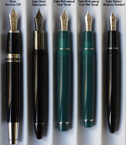
Cross Peerless 125 alongside some Sailor pen models
A Smug Dill posted a gallery image in FPN Image Albums
From the album: Size and shape comparisons
A photo I've taken for someone who was interested in getting a non-Sailor pen with a Sailor nib.© A Smug Dill
- 0 B
- x
-
- sailor nibs
- procolor
-
(and 3 more)
Tagged with:
-
I did a search and have not found an answer as to why the original Peerless 125 pens came with the acrylic display stand for each pen yet the Special Editions (New York, Tokyo & London) Peerless pens (which retail for more than the regular 125s) do not come with an acrylic stand. I have 2 of the Special Editions (New York & Tokyo) and I they do have a neat display card but why no acrylic stand? Anyone have any insight?


