Search the Community
Showing results for tags 'organics studio'.
-
I was really impressed the Ernest's Vintage Writing Fluid, Oscar's copper. I was intrigued by Blue Merle, and decided to give it a shot. From what I've understood, this is a recreation of one of Carter's inks. However, my sample does not reflect the original Blue Merle, a grey black colour but it's a delicious looking blue-black with a hint of teal: https://www.penchalet.com/blog/organics-studio-ernest-hemingway-blue-merle-ink/ Let's start with the complex chroma: Writing samples: Note bleed though is because I was using a gusher of a vintage pen. Photos: Paper is Mnemosyne - Pen is vintage wet noodle pen Comparison: As usual an art work, inspired by the Old Man and the Sea: The Sky, the sea and the marlin are all done by Blue Merle, diluted or concentrated. While not visible where the ink has pooled on the marlin, there's sheen. Other inks used: De Atramentis Artist Sepia (boat)/ Polar Brown Platinum Carbon Black / Pentel Brush Pen Paper is Canson Mixed Media paper. · Pens used: Pilot Kakuno, Lamy Safari (EF/F/M/B/Stub), Vintage Unic Wet Noodle, · What I liked: Classy ink, name. · What I did not like: A bit on the dry side. · What some might not like: Lack of lubrication, doesn’t like copy paper. · Shading: Yes · Ghosting: If you press hard. · Bleed through: If you use a gusher and insist on writing on copy paper. · Flow Rate: Wet · Lubrication: On the dry side. · Nib Dry-out: No. · Start-up: No. · Saturation: Just enough. · Shading Potential: Yes. · Sheen: Only in massive applications. · Spread / Feathering / Woolly Line: No. · Nib Creep / “Crud”: No. · Staining (pen): No. · Clogging: No. · Cleaning: Easy · Water resistance: Decent. · Availability: 55 ml Please don't hesitate to share your experience, writing samples or any other comments. The more the merrier
- 13 replies
-
- organics studio
- ernests vintage writing fluid
-
(and 1 more)
Tagged with:
-
Here's another newer ink that hasn't got a lot of color samples online yet. It's a nice gray color on the cool end of gray. Good wet flow. Some water resistance. No misbehaving. Dries pretty quick. I've been trying to decide whether to get Albert Einstein ink from Montblanc in a full bottle. I got a sample through some magical series of events, and tried it. I was wanting to see if I would like this one better. Honestly, I like them both. Einstein is a more neutral gray than this one. Sadly, it looks like I'm going to have to get both.
- 2 replies
-
- organics studio
- arsenic
-
(and 1 more)
Tagged with:
-
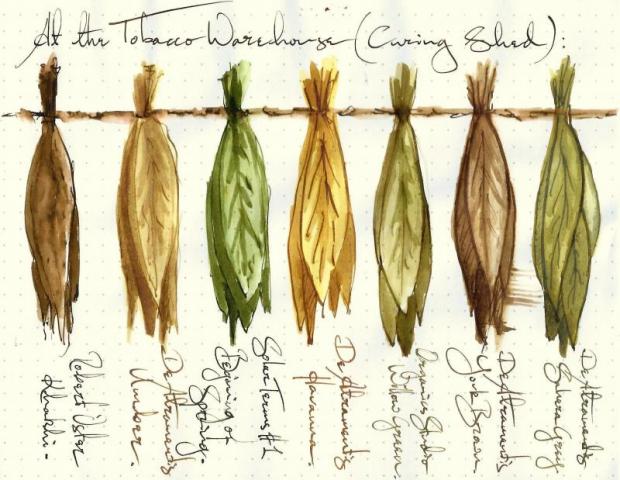
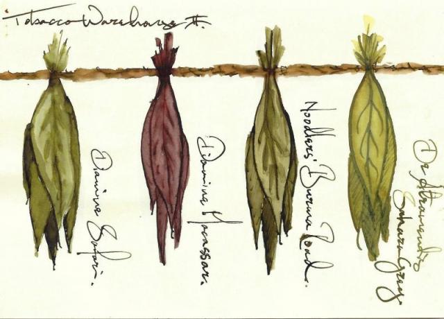
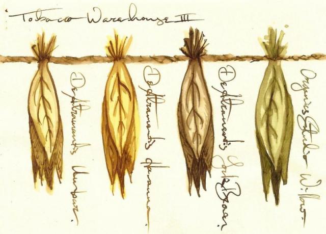
3 De Atramentis Brown Inks that I couldn't find distinguished elsewhere. Umber : Havanna : York Brown (with a few other tobacco leaves thrown in)
- 33 replies
-
- de atramentis
- havanna
-
(and 5 more)
Tagged with:
-
I must admit I'm surprised. I've just done some serious googling and haven't found any review of Organics Studio's FS Fitzgerald ink. Why? It's wonderful, vintage looking orange, one of nicest and pen-friendly oranges I know. OK - the swabs seen in web shops doesn't look exciting but reality is much more interesting than them. I would say it's my 4th favourite orange ink. Maybe third - maybe I'll give it Toucan Orange;s third place in my ranking. I hope my review will be helpful. If you like orange inks you may as well take a look at my comparison of 32 orange inks. Take a look: INK SPLASH http://imageshack.com/a/img902/7678/gXNO6X.jpg DROPS OF INK ON KITCHEN TOWEL http://imagizer.imageshack.us/v2/640x480q90/905/4ehMUG.jpg CHROMATOGRAPHY http://imageshack.com/a/img909/5724/t1zwe6.jpg SOFTWARE IDENTIFICATION / COLOR RANGE http://imageshack.com/a/img538/8025/cXiWJk.jpg COLOR RANGE (gradient tool in PS) http://imageshack.com/a/img904/6568/CxOuaT.jpg The name of the ink is inspired by work of well-known writer F. Scott Fitzgerald. Here's one quotastion from his work. (Hero 5028 1,9 stub on copy paper) http://imageshack.com/a/img537/5885/sED4Gu.jpg http://imageshack.com/a/img742/6526/uTuoZL.jpg http://imageshack.com/a/img674/2521/MwF3wY.jpg http://imageshack.com/a/img537/1440/Ovs8fy.jpg Jinhao 599 on Oxford paper http://imageshack.com/a/img673/2893/JghFse.jpg http://imageshack.com/a/img902/5762/tVufii.jpg Haolilai 908 in calendar http://imageshack.com/a/img674/6237/z6p59D.jpg http://imageshack.com/a/img537/6546/UuPXGj.jpg DRY TIME http://imageshack.com/a/img912/739/UYqRid.jpg
-
Hello! A couple years ago one of the first inks I bought was Organics Studio Potassium, but the bottle that arrived was a completely wrong color. After a brief pics exchange with the seller I got a refund and put the defective ink away (I'm a hoarder I physically cannot get rid of any ink but through writing). The recent activity from my fellow countryman Sansenri, together with my newly-rekindled interest in bluish and purplish hues prodded me to attempt to re-create the correct color of Potassium starting from my defective bottle. This is the color I was starting from As you can see it's totally off. It's got nothing of the charming purplish, delicately lavender hue it's supposed to have. I needed a pretty purple... Rohrer & Klingner Cassia to the rescue! I grabbed an eyedropper, a sample vial and some demineralized water, and started mixing away, noting the results on some scrap paper. In the end I was very satisfied with this result. One added bonus is that the mixed ink goes down a pretty purple, and dries towards the blue end of the gamut. I love that! Cassia is extremely saturated, and the mixture potassium + cassia was the right hue but way too saturated and would not shade as much as I'd hoped, that's why I added so much water. The mixture sat in the vial for a few days and it is stable so far.
- 2 replies
-
- organics studio
- potassium
-
(and 3 more)
Tagged with:
-
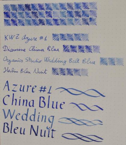
Hey guys! I was pondering whether or not to order a full bottle of KWZ Azure #1 and I made this to help me decide. It didn't look extremely ugly so I decided to share, maybe it can be useful or something
- 14 replies
-
- diamine
- china blue
-
(and 6 more)
Tagged with:
-
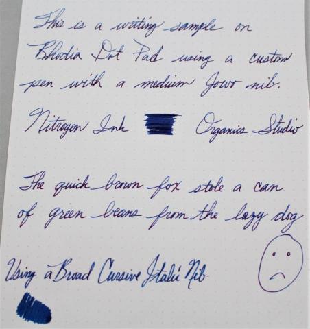
Here is my review of Nitrogen Ink by Organics Studios. I only tried this ink because so many people were raving about it. I get it now. It is a really cool blue ink. It has this weird shimmery thing going on. If you look at it in glancing light it looks purplish pink and if you see it head on it looks blue. Also, aside from a couple of hard starts, the ink seems to behave pretty well. I will probably permanently keep this in a pen from now on. I love blues, and this one is very unique. I hope you like the review. I would love to hear what everyone thinks. Thanks for looking.
-
I've just photographed a bunch of Col-O-Ring cards with darker blue-green inks, while comparing them to a custom-mixed ink discussed in Inky Recipes: https://www.fountainpennetwork.com/forum/topic/334121-masques-mix-black-swan-in-icelandic/ I thought I'd share the photographs here, in case they will be helpful for anyone. Since display calibration and general accuracy of representation varies, the main value of these is comparative between the shades. Though I did try to make the colors appear as I see them in person (at least on my devices). I think Fire& Ice should be slightly more saturated and a tad more green. Turquoise and Eau de Nil should be a bit less saturated, more matte. Diamine Asa Blue is a slightly turquoise medium blue. Birmingham Pen Co. Fountain Turquoise is a pale greenish turquoise. Lamy Petrol is similar to Noodler's Aircorp Blue Black in regular writing: both are quite green blue-blacks. ACBB has no sheen, Petrol has unique rose gold sheen. Sailor's Yama Dori was a disappointment to me: it's a dark teal-black that's got a kind of matte washed out appearance. Granted it does sheen easily, but I just didn't care for the lackluster base color. Robert Oster Fire & Ice: ranges from dark blue-teal to very vivid glowing turquoise, depending on the pen used (dry or wet). Sheen is pretty minimal unless you let the ink concentrate sitting in a pen for a few days. Diamine Eau de Nil: nice muted blue-teal, darker, not too vivid Robert Oster Tranquility: this is a green-teal Robert Oster Aqua: more green than Fire & Ice J. Herbin Emerald of Chivor: similar to Aqua in base color. Sheen and shimmer can be hit or miss, depending on paper and concentration Organics Studio Walden Pond "Blue" : definitely a misnomer, there is almost nothing blue about it. It's strongly green, though on the bluer green side. Sheens a vivid metallic magenta so easily, it can take over the whole writing. If you use a dip pen with it and low absorbent paper like Clairefontaine or greeting cards, the metallic sheen completely covers up the green-black, and the letters look like you wrote them with a metallic magenta ink.
-
Organics Studio is a boutique fountain pen ink company started by a University of Maryland biochemistry student. The company was present on the market few years ago and I guess some of their inks were quite popular. I remember I really enjoyed Walt Whitman, Blue Merle or Boron. In 2014 company's creator decided to take a break in creating inks and I have impression he did it in a way that discouraged many ink afficionados. Some of OS inks developped some sediment, some lost their colors or deteriorated. In June 2016 OS came back to market but as I see their inks aren't widely available. I bel;ieve regainiong trust in our small world won't be that easy. On the other hand I would gladly try their new inks and if such a possibility arises I'll do it. The bottle of Walt WHitman Leaves of Green was fifted to me by MMG112 - thank you Mary, it's very generous I liked this ink in the past when I had only sample and I like it now. I heard some people had issues with it turning grey but so far I haven't experienced it. The color is interesting and quite unique. It's definitely not perfect ink but I'm glad I have it as it's the kin of color I like to use on regular basis. Flow: the Ink feels dryish. The flow is average. Saturation: level of saturation is satisfying for my needs. Lubrication: average. Drying time: rather reasonable. 15-20 seconds on Rhodia, 10 – 15 seconds on absorbent paper. Clogging issues: None experienced. The ink may dry in the nib but only after few minutes. You can leave the pen uncapped for 2-3 minutes and everything should be fine. Feathering: none experienced. Bleedthrough: almost none, even on crappy paper - Moleskine Water resistance: this ink isn't water resistant. Drops of ink on kitchen towel Color ID Color range CIAK, TWSBI 580, stub 1.1 Leuchtturm 1917, TWSBI 580, stub 1.1 Moleskine, Hero 5028, stub 1,1 Water resistance
-
Organics Studio Ernest Hemingway Santiago's Sea Blue Master Of Writing Series No 18
jandrese posted a topic in Ink Reviews
Does not seem like this ink, Organics Studio Master of Writing Series volume No. 18 Ernest Hemingway Santiago's Sea Blue ink, has been reviewed in these pages. Perhaps that is because of the bottle it's all but unusable in a fountain pen. The ink is super saturated with dye that sheens like crazy, CRAZY SHEEN. Others have described the ink as pink sheen with teal undertone. Yeah, that's about right if you can get it out of a nib before it dries. I tried it in a Platinum 3776 Century and still had problems. It dries shut the nib just lifting the pen off the paper to move a line. Too bad, 'cause it seemed like a cool ink. Well, finally I diluted the ink 1:1 (50%) with ddH2O. Some inks won't survive this level of dilution, it would thin out the color too much or diluted additives cause a dry feeling, or maybe cause undesirable behavior on the paper. Not this ink, 1:1 dilution turned it into a usable, interesting, and beautiful ink. Not only is the dark teal color attractive, it still sheens a lot, and there is also some shading potential. Use in a broad, or even better a stub/italic nib for best effect. Very good ink now even for this lefty but I seriously doubt it will survive at water bath. Not much water resistance if that matters to you.- 8 replies
-
- organics studio
- ernest hemingway
-
(and 2 more)
Tagged with:
-
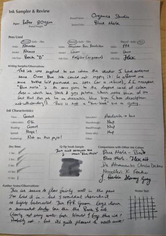
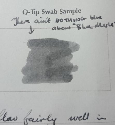
This is an ink I've been scratching my head over ever since I received a bottle of it several months ago - and having just re-inked a couple of pens with it, I figured it was time to 'go public' with my confusion. This wasn't actually an ink that I chose to buy: it was sent to me (along with a couple of other inks) as a kind of apology / substitute for an ink I'd ordered online, and paid for, that my supplier didn't have in stock. I'd wanted Omas Blue - I received Noodler's Steel Blue, Noodler's General of the Armies, and this ink. The first thing I noticed was that on the box, Organics Studio Blue Merle was described as "a medium saturation blue-black ink that is perfect for business and personal use". Except that in my Pilot Vanishing Point (with F nib), it came out a kind of nondescript grey. I flushed the pen, and put this ink away - only pulling it out again last week, when I decided to try it in a pen with a broader nib. Nothing had changed, though: this ink *still* came out grey. I have to confess, I'm now puzzled. A couple of posts on FPN suggest that an earlier formulation of this ink was more of a blue-grey - and/or that the ink is prone to discolour in the bottle over time. And the box *definitely* says it's meant to be blue-black. On the other hand, my online research into Australian blue merle Shepherd dogs (for whom this ink was named) suggest that their fur is actually a dappled grey rather than either blue or black. This ink is now (I believe) discontinued - don't know if it'll be back. Not being mad keen on grey inks, I'm not sure I'll use it often - but it behaves pretty well in my pens. In any case, I thought it was worth sharing my observations and a couple of scans, given the fact that it's not been widely reviewed on FPN. So here is my written review: And here's a close-up of the Q-tip swab:
- 21 replies
-
- organics studio
- ink
-
(and 2 more)
Tagged with:
-
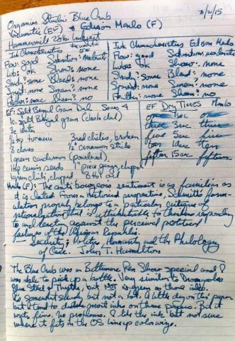
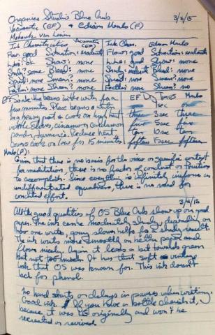
This is a mostly hand written review of Organics Studio Blue Crab ink. It was a Baltimore Pen Show special, and the leftovers were sold off by various retailers. Thus, I was able to purchase a bottle. In the artificial light here at home the color looks amazingly close to the Thistle T2 with 1/3rd more water added. It is not as shady as that ink, nor as wet, but it can appear very close. In natural light I think the Thistle is more to the green side (but that's based on memory). The ink is reasonably water resistant once dry on inkjet paper. I did not do a chromatic test of the ink while it was inked in a pen. So I don't have that. The ink is a bit on the drier side from what I love, so that's kind of my only quibble. Anderson Pens website lists OS Blue Crab in 55ml and 4oz bottles in stock as of the date of this writing. I have no affiliation with any company listed here.
-
Organics Studio is a boutique fountain pen ink company started by a University of Maryland biochemistry student. The company was present on the market few years ago and I guess some of their inks were quite popular. I remember I really enjoyed Walt Whitman, Blue Merle or Boron. In 2014 company's creator decided to take a break in creating inks and I have impression he did it in a way that discouraged many ink afficionados. Some of OS inks developped some sediment, some lost their colors or deteriorated. In June 2016 OS came back to market but as I see their inks aren't widely available. I bel;ieve regainiong trust in our small world won't be that easy. On the other hand I would gladly try their new inks and if such a possibility arises I'll do it. The sample of Blue Crab was gifted to me by MMG112 - thank you Mary, it's very generous The ink is rather disappointing. For me the color is lifeless and mind-numbingly boring. The physical properties are less than average. Flow: the Ink feels dry. Saturation: level of saturation in regular pen (Platinum Plaisir with medium nib) is below average. Add dryish feel and lack of lubrication and you get unpleasant writing experience, unless, of course, you use crazily wet pen. Lubrication: not enough. Drying time: rather reasonable. 10-15 seconds on Rhodia, 5 – 10 seconds on absorbent paper. Clogging issues: None experienced. The ink may dry in the nib but only after few minutes. You can leave the pen uncapped for 2-3 minutes and everything should be fine. Feathering: none experienced. Bleedthrough: almost none, even on crappy paper - Moleskine Water resistance: this ink isn't water resistant. Drops of ink on kitchen towel Color ID Color range No name notebook, Platinum Plaisir, medium nib and Diplomat Depeche, broad nib Leuchtturm 1917, TWSBI 580, stub 1.1 Moleskine, Hero 5028, stub 1,1 Water resistance
-
Thanks to fantastic Lgsoltek and Amberlea thread I'll have a pretext to re-review 52 inks this year. I'll write for a week with an ink before adding some thoughts. Week 2 theme was about choosing random ink. I've chosen (or rathoer random number generator has chosen for me) Organic's Studio Oscar's Copper ink. I used to like this ink but, truth be told, I haven't used it for more than a year. After trying it the first day I was enthusiastic, but after two days of use I started to feel tired of it and I guess I now know why I don't use it so often. First things first though. Organics Studio is a boutique fountain pen ink company started by a University of Maryland biochemistry student. The company was present on the market few years ago and I guess some of their inks were quite popular. I remember I really enjoyed Walt Whitman, Blue Merle or Boron. In 2014 company's creator decided to take a break in creating inks and I have impression he did it in a way that discouraged many ink afficionados. Some of OS inks developped some sediment, some lost their colors or deteriorated. In June 2016 OS came back to market but as I see their inks aren't widely available. I bel;ieve regainiong trust in our small world won't be that easy. On the other hand I would gladly try their new inks and if sych a possibility arises I'll do it. Oscar's Copper was part of Vintage Writing Fluids series that was quite remarkable - the colors were unusual and vintage looking as the name suggested. After three years the ink hasn't changed or deteriorated in any way. It's still perfectly usable and has the same writing properties as in the day I unboxed it. Oscar’s Copper doesn't look like copper at all. I would say that my batch (it was reintroduced on the market in june 2016 so the color may be a little different. I haven't tried new one) falls somewhere between smoked salmon, brick red and something strange with pinkish accents. There's not a lot of brown component to it but in some nibs and some papers you can have impresiion it's brownish (especially on absorbent cream papers). Oscar’s Copper produces strong shading, some greenish sheen. The flow is consistent and very smooth in wet nibs however in dry pens I would say the ink is averagely saturated and it may lack lubrication. Overall behavior is good - no bleethrough, no feathering, reasonable dry times, some water resistance. The thing is that in my case it's cool ink to use for a day. After a week I was tired of this color and feeling bored. Sure, I like to change inks but I use some of them almost everyday and never feel tired of them (J. Herbin Lie de The, Lamy Dark Lilac). This one is nice choice for occasional writing, especially in wet and broad stub nibs. In such nibs it does look impressive. Drops of ink on kitchen towel Color ID Color range Tomoe River, Lamy 2000, medium nib Tomoe River, Hero 5028, stub 1,5 Leuchtturm 1917, Kaweco AL Sport, broad nib Semicolon, Hero 5028, stub 1,5 Rhodia, TWSBI 580, stub 1,1 (this scan is old - from 2013 or 2014, I don't remember precisely) Water resistance
-
Interesting.. I just got an email from Anderson that Organics Studio is back... Now, I am wondering if this means he will take back those inks that lost their color and turned grey. (Ex. Blue Merle) I mean, don't all Ink Masters stand by their product? C.
- 15 replies
-
- organics studio
- blue merle
-
(and 1 more)
Tagged with:
-
Organics Studio was a small producer out of Maryland. Some of their inks were awesome. This is one of them. They have fallen into the category of unobtanium.
- 5 replies
-
- organics studio
- lewis carroll
-
(and 1 more)
Tagged with:
-
So I stumbled upon this reddit post about an hour ago: https://www.reddit.com/r/fountainpens/comments/4ge5ax/hey_guyshow_have_you_lovely_people_been/ Long story short, it was about a person who just hypothetically finished their masters degree, and was curious what people were looking out for in inks. After returning to reddit and re-reading the post, it hit me that the username is probably the same person who made the Organics Studio inks, and they might seriously be looking to get back into making ink. I cannot confirm nor deny that 100%, but definitely worth going over and commenting what you're looking for as far as ink goes, on the off chance it's legit!
-
Here is yet another of my reviews of the inks in my collection. This time yet another black. I know, I know, oh so boring. And this black is one that isn't readily available anymore, those I think there are some bottles at Anderson Pens. Perhaps there is another site or two that are still selling the last of these inks. Anyway, the ink is the Organics Studio John Hancock black. Written on the usual papers I use, Mohawk via Linen, Hammermill 28lb inkjet, and Tomoe River. The ink drops on a towel are quite interesting, and it's quite a strong black, blacker than Iro. take-sumi and OS Carbon. It was supposed to replicate or be like "vintage" inks, but who knows what that means. Vintage as in the 1920s or vintage as in the 1950s? My guess is it meant the use of simpler dyes and fewer additives making the ink safe for modern and vintage pens. The real downside of this ink was it's slow drying time, exceeding 15 seconds to be completely dry. For me that wasn't a problem, but I'm sure it could be an issue for left-handed writers, and those who want to make up-page notations. Considering all that, here are the photos. An unusual mix of black, red-violet, and a neutral dark blue. Not terribly water resistant.
- 4 replies
-
- organics studio
- os
-
(and 2 more)
Tagged with:
-
This is a review of the Organics Studio Carbon ink. The line is discontinued but there are one or two stores with some stock left. This is a nice dark grey ink. Not very waterfast though. Somewhat similar to Iroshizuku take-sumi, but a little lighter than that ink. The ink is a bit of a slow drier. The ink droplet shows a hint of purple that isn't really noticeable in the ink. Not very waterfast. Much of the ink lifts when blotted, and when washed it leaves a faint line.
-
- organics studio
- black
-
(and 1 more)
Tagged with:
-
As most of you know Organics Studio will be coming back with some of their inks. Aristotle didn't make it and won't be resurrected. A pity, because it's quite unique grey, greenish/yellow one. Sadly I lost Ink Splash of this one. I have like 80-90 reviews to scan. Text is in the Oxford notebook but ink splashes and drops of inks weren't stored as safely and I just can't find them anywhere. So there'll be ink splash / kitchen towel gaps in some of the reviews I'll post. A pity, cause I remember Aristotle splash to look funky. Sample's long gone as the ink itself. DROPS OF INK ON KITCHEN TOWEL http://imageshack.com/a/img540/6816/3wRzeg.jpg SOFTWARE IDENTIFICATION / COLOR RANGE http://imageshack.com/a/img661/5526/Jmvjrg.jpg http://imageshack.com/a/img538/386/0u50RM.jpg Oxford Recycled, Kaweco Sport Classic, B http://imageshack.com/a/img538/953/rhlX4f.jpg http://imageshack.com/a/img538/3987/ZsxRZ6.jpg http://imageshack.com/a/img673/8579/MTDbkm.jpg http://imageshack.com/a/img537/1492/snMMLA.jpg Comparison http://imageshack.com/a/img540/8611/rnYo4x.jpg
-
Well, I like earthy green-brown colors. I was sure I would like this ink in the moment I first saw a swab somewhere in internet. It took me quite some time to get a sample and it didn't disappoint me. The color is quite ubique and it blends green, brown and yellow in a unique way. I was disappointed by many Organics Studio inks but this one rocks. Take a look: INK SPLASH http://imagizer.imageshack.us/v2/1024x768q90/673/EUhgOs.jpg DROPS OF INK ON KITCHEN TOWEL http://imageshack.com/a/img538/838/pQpmn9.jpg CHROMATOGRAPHY http://imageshack.com/a/img746/7110/lwvCJ0.jpg SOFTWARE IDENTIFICATION / COLOR RANGE http://imageshack.com/a/img902/3481/SHpGvm.jpg http://imageshack.com/a/img909/4884/KLGFNZ.jpg The name Leaves of Grass is inspired by Walt Whitman's book Leaves of Grass. I've decided to write few verses of Leaves of Grass with Leaves of Grass. Surprising, isn't i? (Hero 5028 1,9 stub on copy paper) http://imageshack.com/a/img540/2209/WVFEgd.jpg http://imageshack.com/a/img673/9716/3If1gD.jpg Kaigelu 316 on Oxford paper http://imageshack.com/a/img540/2863/oXAN7A.jpg http://imageshack.com/a/img674/96/NbvmDE.jpg http://imageshack.com/a/img745/7161/V4XbFn.jpg Kaigelu 316 in calendar http://imageshack.com/a/img661/1471/o3zgy2.jpg http://imageshack.com/a/img745/6153/LFcJjF.jpg DRY TIME http://imageshack.com/a/img742/7002/oht0Qd.jpg
-
Some time ago there was a rumor Organics Studio would be coming back with some of their inks. I don't know if that happened or not. If anyone has some knowledge I would appreciate insight. HMS Beagle is crazy ink. The color isn't bad (not for me though) but the behaviour is different story,. Yes, it dries extemely fast. On the other hand it causes extreme bleedthrough. For me the ink is unusable. Drops of ink on kitchen towel http://imageshack.com/a/img537/8084/sFsnvV.jpg Drops of ink on kitchen towel http://imageshack.com/a/img907/4153/35L7l5.jpg Oxford Recycled, Kaweco Sport Classic, B http://imageshack.com/a/img901/6255/cluFVc.jpg http://imageshack.com/a/img901/7509/n1zJW3.jpg http://imageshack.com/a/img909/5750/JoWXvb.jpg http://imageshack.com/a/img673/3785/UyoIX4.jpg Bleedthrough http://imageshack.com/a/img908/9724/0edvmc.jpg
-
Organics Studio isn't making inks anymore, but back when they did I was a big fan. Nickel was the first ink of theirs I purchased, and after some time I started getting more. The creative inks were my favorite, like the iron gall Aristotle and the chlorophyl-pigmented Mendel. When I heard OS was stopping ink production I bought almost $100 worth of OS ink from the Goulets. Imagine my surprise when half of them developed SITB a few months later… So far the bottles lost to SITB are Neon, Nickel, and two others that are at the bottom of a shame pile I don't care to dig through. Luckily I'd written this review already, so while reading it just remember that when I wrote the review it was a currently produced ink and also didn't have a colony growing in it. http://imagizer.imageshack.us/v2/xq90/537/6AdqZc.jpg
- 2 replies
-
- organics studio
- nickel
-
(and 7 more)
Tagged with:
-
As most of you know Organics Studio will be coming back with some of their inks. Pigmented Pea Green won't make it back. I won't be sad. The ink is just too light for me, even thugh its waterproofness is amazing. Be sure to check Michael R.'s stunning review of this ink. http://imageshack.com/a/img907/4295/7EvtnW.jpg DROPS OF INK ON KITCHEN TOWEL http://imageshack.com/a/img540/5330/OAsdaR.jpg Waterproofness (after an hour of soaking) http://imageshack.com/a/img673/9939/cc6oNF.jpg SOFTWARE IDENTIFICATION / COLOR RANGE http://imageshack.com/a/img903/4043/m10S8H.jpg Oxford Recycled, Kaweco Sport Classic, B http://imageshack.com/a/img661/8690/00qB6l.jpg http://imageshack.com/a/img633/9906/ZcNFkI.jpg http://imageshack.com/a/img673/9736/Xwj2nr.jpg
-
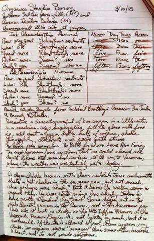
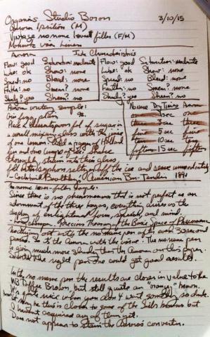
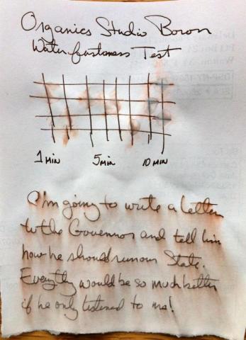
Here is a mostly handwritten review of Organics Studio Boron which is a brown ink. The other brown inks I have are MB Toffee Brown, Sailor Do-you, and Visconti Brown/Sepia, both of which are somewhat harder than this ink. That in itself is not good or bad, just the way of this ink. How it appears can change quite a bit depending on the pen. In one pen it was lighter, but another it was darker. Pictures taken with iPhone, so not really color corrected. I'll need to post the chromatics later as that's still drying. But there is a definite green dye there as well as the brown. OS inks aren't being made anymore at this time, but Vanness Pen Shop appears to have a little of this particular ink in stock. There may be another retailer out there that also has some bottles. Anderson Pens has others of the OS inks, but not this one.
- 4 replies
-
- organics studio
- brown
-
(and 2 more)
Tagged with:

