Search the Community
Showing results for tags 'nola'.
-
Im just back from a great trip to NOLA and was in Southern Heaven visiting Papier Plume. I went in 3 times and each time came away with a new bottle! In the end I bought: Ivy Green, Moss Green, Pecan, House of the Rising Sun, Calle Real, (Calligraphy) Copper, Peacock Blue and the Chicago Pen Show exclusive Da Blue. I also got a gorgeous leaf pen holder because of the smallish size and portability. I spoke to the owner of the store who started out in the French Market which I also visited and asked him about his inks. He was very forthcoming in saying he purchases his ink powders from France and a few other European locations and then mixes them with his own recipes in his shop so as far as Im concerned thats made in NOLA. He said sometimes the colors can change because a distributer may switch their powder recipe or go with a new distributor. He said he is confident his inks are perfectly safe for vintage fountain pens. I always ask this because so many inks are not and for this reason I only use waterman black in my vintage Soenneckens. I love that the ink colors even of the same name can vary this way. The owner said they love experimenting with color and are very fluid in this so that its not necessarily their intention to keep the same 5 colors. I asked him if he had received his red beans & rice ink yet and he shook his head and said no, we are still waiting for the powder to dock. Love it! It is a beautiful shop and I appreciate how it functions.
-

Ink View: Margi Gras Indians Purple: An Ink Homage To One Of Many Mardi Gras Secrecies!
Jackokun posted a topic in Ink Reviews
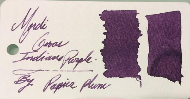
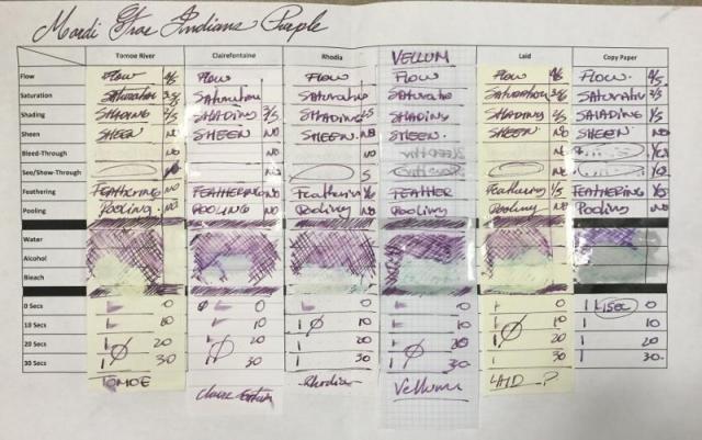
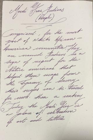
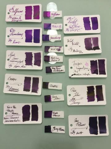
Ink View: Margi Gras Indians Purple: An Ink homage to one of MANY Mardi Gras Secrecies! So here we have the 4th installation of the limited edition inks. I would have liked this to be ready to go before the launch of the ink (gone by now) a couple of weeks ago, but the mail system here in Canada hasn’t been that kind, however it is picking up now J and as I am putting this up I will be getting the sample of the next one up Garden District Azalea, so look for my view on this one in a couple of days! PS: A quick peek is at the end ! Once again a big thanks to Papier Plume for sending me this sample, this is a really nice purple and one named after another good piece of history. And off we go! The Mardi Gras Indians (The brief – brief history) The Mardi Gras Indians is one of many New Orleans secrecies, and one of that surrounds the Mardi Gras festival. The Indians are made of African-American communities that had taken the name Indians in honor of the native Americans who during the time of oppression and slavery assisted in their freedom. Sounds nice and all, but at the beginning (and it seems that it was around a century ago, the different Indian organizations (tribes) had their disputes, and these were often violent and used the Mardi Gras to “settle” those scores as the police would have had a difficult time to do their enforcement as a result of the overly crowed city and busy streets that the Mardi Gras festival would bring. Now all is in the past. Today seeing Mardi Gras Indians are one of those things that if you go attend the Mardi Gras, and you are not attentive, you’ll miss. Their parades are not scheduled, happen at odd times and at random locations. The tribes will form a krewe – a group task with the parade – who will then give themselves a name for that moment. There will be a leader – The Big Chief who will guide and decide where the parade will go, and if the tribe meets another tribe there is an exchange between the tribes, this is reflected in dance (based on traditional African dance movement), singing and a little taunting of their suits. Their suits (not costumes) , and this is where our purple will be coming from, are full of vibrant colors resembling Native American ceremonial apparel. This apparel is made out of elaborate intrinsic designs, using a variety of materials, including feathers, beads and sequins. Some of the suits will take months and months to prepare, and will include a hefty amount of symbolism embedded within. So what does Indians’ suits look like? Something like this: This is just one of the many and unique expressions of a Mardi Gras Indian’s suit, as each suit is particular to that Indian. Would this then mean that there are many expressions of colors including the purple? and that may vary from suit to suit, correct? Correct. So what about PP’s ink? Well let’s just say that it falls (in my opinion) in that middle part of the spectrum of purple. But let’s see more in detail! The Mardi Gras Indians (The ink view) – Purple The 4th installment, out of five, that were intended to commemorate the city of New Orleans. Mardi G-P (for short ) follows the previous inks of this line: Street Car Green , Calle Real and Sazerac. A purple ink that reflects the color found on that of Mardi Gras Indians’ suits (see pic above). Here is how the production bottles looked like And here is the Swab From a first glance you will notice a couple of things: some degree in shading , looks like this is a little more saturated that it’s previous counterparts, and some feathering! Let’s look at this more in depth So how I looked at this view? Pens: I used three pens this time One fine/EF (Platinum President – Fine Nib ) , One Medium ( Faber Castell Emotion – Medium) and one BROAD – modified Mnemosyne, with a custom Broad Waverly Nib ! Paper: Tomoe River, Rhodia, Clairefountaine Thriomphe (CF), traditional copy paper , laid paper and Vellum ß this one courtesy of Barkingpig , thank you Sir! . Tests: Flow, saturation, shading, sheen, bleed-through, see-through/show-through, feathering and pooling. With other tests such as water, bleach and alcohol and dry times. Sometimes it will be a yes/no answer, sometimes 1-5 (1 being poor, 5 being excellent) Crossover Card My way to see all the papers and how the ink behaves across. You can see that each column is representative of the paper used. Thoughts on the ink-paper behavior Flow: Flow is good, very fluid, consistent across all papers and pens usedSaturation: Medium/High, sometimes it looked more saturated depending on the paper, there is definitely less shading on this ink than in the other releases..Sheen: None, Zip, Nada.Shade: There I shading on this ink, again no as drastic as with the other inks in this collection, but there is shading, the shading on this ink is more gradual. Bleed-through: On copy paper , now I was using a very wet nib, but it went through quickly.Show-through: There is some slight, very slight on most papers, I’ve circled the ones where this happened, more intense on the vellum, but that is expected. You would be able to write on both sides on most quality papers .Feathering: Now, I was using a wet nib and that might have contributed to some of the feathering, but I’ll say that this ink in wet-heavy pens will leave a lot of ink on the paper and will feather – not much but it will. Please take note that you the paper you are using is sensitive to the oils of your hand this ink will feather where the oils mix with the paper.Pooling: (This is not the shading but more on the pooling on the edges of the letters, I enjoy when the inks provide this). There was none that I could observe in any of the papersWater Resistance: The tests shown on the card were done using an eyedropper, leaving it a few seconds then using a tissue paper to retrieve the excess. But offline I did a more smear/spread test. Tests show that the ink has some waterproofness, however it is not a WP ink. You would be able recover the writing if need you need to. Big shout to Tomoe river as the ink just held on to the paper, for a paper that rejects ink by nature it is a bit odd. Alcohol Resistance: Very consistent across. You would be able to recover from this one – almost no effect. Where it shows that the ink has gone from the comparison is where the bleach spread to.Bleach Resistance: None, Zip , nada. Dry Times: As noted this is a wet ink and the drying times were there to support it with drying times that were around the 20sec mark and on some papers longer than that. On copy paper it is almost immediate, I’ll say this is because the ink is so watery that goes through quickly between the fibers One thing I had mentioned before, it is how easy is to clean any of PP’s inks from the pens. I would attribute this to the fact that they are not meant to be waterproof, as well as that they are not viscose and not too saturated. Ink Comparison Ink NameMakerOverall notesSolferinoR&KVery bright – lots of sheen (gold) – on the high of being the most violet of them allViolet BlueGvFCNew of GvFC a light Violet blue ink with good shading on moderate to heavy wet pens – see the middle sample on the two big shades this ink gives.Gummy berryKWZBig shout to Barkingpig for this one as well, more purple than blue ,very fruit like – good shadingWood VioletAnderson PensVery dry ink – good shading – the spectrum for this on is middle to darkMardi Gras Indians PurplePapier PlumeThe featured InkTenebris PurpiratumFCSomehow dry ink with good shading – however starts on the darker portion of the spectrumGrapeDiamineOn the Mnemosyne looked VERY similar to Mardi G-P, but on the sketch paper (the one in the middle) you can see that the grape is darker in all senses.Dark LilacLamySuper saturated, golden sheen, shading ink from dark to darker!Purple PazzazzDiamineInk with sparkles, good shading, and nice sparkles Grey PlumKWZDark, dark – however still manages to shade I realized now, that I had more purples that I imagined and I didn’t even show them all. But hopefully you can see that the Mardi G-P is indeed a medium hue purple, which is good in terms of shading since it can go from light to dark on that range. And here is a (quick) sketch of a Mardi Gars Indian using Mardi G-P - wasn’t as quick this time Here is some Cursive and Block writing for reference. Opinion This is a good purple, is subtle and has some fun to it, it is a wet ink, but this is very characteristic of the PP inks, so you should handle it with care on wet nibs. This is an ink that shows waterproof-ness. On finer nibs It is pleasant to read but as it is a wet ink will also be looking a slightly more than average dry times, again it all depends on the paper and how wet you nib is. To my later point be careful with possible feathering. This is not the more friendly ink you might want to use on copy paper. I’m very grateful that I got this sample, and happy to have this ink as part of the – now that I see – seemingly long list of purples. Availability As noted at the beginning of this view this is now sold out. For this release Papier Plume did 60 1 Oz / 30ml bottles. There is one more ink of this series and this one will have the same number of bottles. The name of the ink is Garden District Azalea – On sale September 16, 2016 (sample at the end of the View). Papier Plume notifies their ink availability through their newsletter first (link), then Instagram, then Facebook, and finally twitter (in that order). AND Here is a not so known story about this ink and why was purple and not another of the equally deserved colors of the Indians’ suits : “After the first one was released someone called about the green. While talking he asked if we were going to make a purple. At the time we only had 4 of the 5 colors. But I told him that it wasn't likely. He gave me his email address anyway to get on the mailing list. His email address had the word Tribe in it and he told me that he was a Cleveland Indians fan. So after I hung up I decided that the next color would be named after the Mardi Gras Indians and would be purple.” This is in my opinion a great story and another example of the influence we each carry (if you are not a fan of the Cleveland Indians, please don’t get mad). Now, how do I get to influence someone to do a likeness of me on an ink…. Still thinking And Now Garden District AZALEA!!! The (re)View on this will be up Monday/Tuesday! Remember the release is Friday the 16thJ Thanks for reading until the end!- 14 replies
-

Ink View: Garden District Azalea – A Homage To The Historic Neighborhood Of New Orleans
Jackokun posted a topic in Ink Reviews
Ink View: Garden District Azalea – A homage to the historic neighborhood of New Orleans Garden District Azalea (GDA) is the last installation of PP’s NOLA inspired limited edition inks. An ink evoking the colors of Azalea, commonly found on the Garden District, a Victorian style neighborhood in New Orleans and the subject of this view. Once again a big thanks to Papier Plume for sending me this sample, this is a nice pink, and despite not being a pink fan, it has enough of the red (and I like reds), that is legible and pleasant to use in my personal view. But I’m getting ahead, lets look at this ink and its name more in detail So what is this ink about? ----- The Garden District and the Azalea The Garden District(GD) is one of those neighborhoods in New Orleans that you would want to walk around, the old style Victorian homes, the well-kept garden and house are an appeal to both tourists and locals, and I know I sound like a travel agent now, but look at this picture!. Taken from : https://www.google.com/url?sa=i&rct=j&q=&esrc=s&source=images&cd=&cad=rja&uact=8&ved=0ahUKEwjnyOLg55HPAhUM0GMKHb_XB_EQjB0IBg&url=https%3A%2F%2Frdvernon.wordpress.com%2Fcategory%2Fnew-orleans-garden-district%2F&psig=AFQjCNFhjgBIOoO7oGQn-RMVpxeF3ek54A&ust=1474043941157159 And if the houses don’t attract you there is also the lower garden district where you can get original art, antiques, vintage clothing, and jewelry But GD was not originally part of New Orleans; in fact, it was part of the city of Lafayette until 1852 when it was incorporated to New Orleans. A neighborhood meant for wealthy Americans who didn’t want to mingle with the creole population that lived in the French quarter… ah history. Regardless the homes were built using Victorian and Greek revival style architecture, where the large houses in constant renovations and upgrades allowed the owners to host large parties and celebrations, especially during local festivities. The houses’ generous lots allowed the cultivation of the gardens, for which the area is named after, and both the gardens could compete to see which one stands out the most, but the fact is that both are now staples of the area. Its residents are known for being proud of their homes and maintaining them in pristine shape (they are also 4th/5th generation New Orleanians ) The Azalea - a spring showoff! . I’m way over my head when it comes to gardening, there has not been a single plant that has survived under my care, and the ones I have alive are all because of my SO, so I’ll probably trample on this part and deepest apologies to those knowledgeable with the art of gardening. Azaleas are a flower shrub, blooms on the spring and the flowers last several weeks, they are tolerant to shade and they prefer living near trees (Wikipedia). And that is all good, but what I found interesting (and NOT in wikipedia) is that the azaleas came to america from Orient two centuries ago, they can be found in seasons other than spring, they are known to bloom around March, that there are at least 5 types of azaleas in new Orleans and that there was a tour for the flower aficionado named after the city of Lafayette called Lafayette Azalea Trail (once lost, but it has now been resuscitated and modernized- see pic) And did you knew they were toxic? In large amounts they can be dangerous, I may add, but in essence they are! Now, I could not get the names of all the types of azaleas found in the New Orleans area, but I’m pretty sure that if you walk around the gardens, and you are knowledgeable enough, you would be able to spot them. I'm also positive that they will have multiples shades, but trying to be as fair as possible my take on the azalea pink will be: "middle of the road" i.e ‘George Lindley taber’ southern indica hybrid. - see bellow ‘George Lindley taber’ southern indica hybrid. ------- The Garden District Azalea (The ink view) As noted this is the last of release in the city of New Orleans line, following the previous inks of this line: Street Car Green , Calle Real, Sazerac and Mardi Gras Indians Purple. A pink ink that is pleasant to read, and an ink that in wet nibs shows reddish tones and a good amount of shading Here is how the production bottles looks like And here is the Swab From a first glance, this ink has high shading properties, not too saturated and as all PP’s inks some wet/watery nature. Let’s look at this more in depth So how I looked at this view? Pens: I used three pens this time One EF (Twsbi ECO), One Medium ( MB 146) and One Broad (FC model 1901 BS) Paper: Tomoe River, Rhodia, Clairefountaine Thriomphe (CF), traditional copy paper , laid paper and Vellum Tests: Flow, saturation, shading, sheen, bleed-through, see-through/show-through, feathering and pooling. With other tests such as water, bleach and alcohol and dry times. Sometimes it will be a yes/no answer, sometimes 1-5 (1 being poor, 5 being excellent) Crossover Card My way to see all the papers and how the ink behaves across. You can see that each column is representative of the paper used. Thoughts on the ink-paper behavior Flow: Flow is good, very fluid, consistent across all papers and pens usedSaturation: Medium, it does allow more shading having a mid-range saturation IMOSheen: None, Zip, Nada. – In general I have not found one PP ink with sheen propertiesShade: There is lots of shading on this one . Again you would need a wet nib regardless of the width to really experience it. On dryer nibs it will just be a pale pink – not too pale but pale ink. Bleed-through: Only bleed I saw was on copy paper , using a medium wet nib.Show-through: There is some slight, very slight on most papers, I’ve circled the ones where this happened, more intense on the vellum, but that is expected. You would be able to write on both sides on most quality papers .Feathering: No visible feathering on the papers I tried it withPooling: (This is not the shading but more on the pooling on the edges of the letters, I enjoy when the inks provide this). Only on the tomoe river paperWater Resistance: The tests shown on the card were done using an eyedropper, leaving it a few seconds then using a tissue paper to retrieve the excess. But offline I did a more smear/spread test. Tests show that the ink has no water proofAlcohol Resistance: Very consistent across. You would be able to recover from this one – almost no effect. Where it shows that the ink has gone from the comparison is where the bleach spread to.Bleach Resistance: None, Zip , nada. Dry Times: This is a somehow wet ink when it goes on paper, and takes time to dry between 10-20 seconds. On copy paper it is almost immediate, same as my previous view I believe is because the ink is watery that goes through quickly between the fibers One thing I had mentioned before it is how easy is to clean any of PP’s inks from the pens. I would attribute this to the fact that they are not meant to be waterproof, as well as that they are not viscose and not too saturated. Ink Comparison From the top and then left to right: Ink NameMakerOverall NotesMashmallow InkDe AtramentisLight-neon pink, good if you want to consider highlighting - has sheen behaves wellGarden District AzaleaPapier PlumeInk of this view Tourmaline - Ink of the YearPelikanPart of the Edelstein line - limited ink of the year 2012- more darker reddish tones hint of orange good shadingBordeauxViscontiThe darker of the bunch, after that you are entering the bordeaux range and moving away from the pink, good shading, good ink overall And here is a (quick) sketch, I went first for the flower then for the houses I'm not as happy with this sketch as I was with the other, I may have to work on it later on Here is some Cursive and Block writing for reference. Opinion This is a pink that at first sight might look light and on fine/EF nibs it could be, but dries a little darker and on wet nibs will show great amounts of shading and more reddish tones. It is pleasant to read, and the flow is not too bad. You may find that there is more feeling of your nib hitting the paper and that is because of how watery the inks generally are - this is not bad - but is something that you should be aware of if you are looking on an ink is that super lubricated feeling. There is no waterproof and in such place where there might be some you will note that after you clear out the water you will have a hard time to read due to the ink turning very pale, again the best attributes of this ink will be the shading. As I say before I don't have that many pinks and this is one I can work with. While I wont say I'll use it on a daily basis, I'm sure there will be times where pink will be needed and this one will do the trick. I’m very grateful that I got this sample, and happy to have this ink as part of the 2 other pinks I have . It is over all a great way to close off the Homage of New Orleans line. There are many many stories and places from the city where inspiration could be drawn from, but maybe we will see that if they (Papier Plume) decides to do Volume 2! - Lore stories anyone? Availability This ink will be up for sale today Friday the 16th This will be the link when the ink goes live: https://www.papierpl...ict-azalea.htmlExpect release at 11am CST - They will have a limited run 60 bottles to sell online and it is a limited production Papier Plume notifies their ink availability through their newsletter first (link), then Instagram, then Facebook, and finally twitter (in that order). Thanks for reading until the end!- 13 replies
-

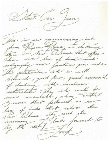
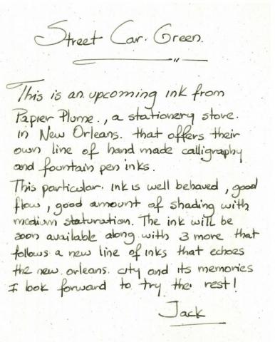
Ink View: Upcoming Ink - Street Car Green By Papier Plume Nola
Jackokun posted a topic in Ink Reviews
Last week I was fortunate enough to be down in New Orleans or a conference, during the times that we were not in the conference we wondered around the city and I decided to look for any local stationery stores - Of course , what else would you do on your free time - I stumbled upon Papier Plume. I have read about the store before, mostly on having a great selection on Rebecca moss pens , but as many things, it got stored in the back of my mind , way back. So by the time I got to the store, I had no expectations. As always when I go to a store, i like to buy something to remember the trip by, and I was pleasantly surprised to see that they had their own make of inks. Frankly by the time I got to the store it was almost closing time and I wanted to get some of their inks and I feel I as rushing it. So I decided to wait until the next day (and also bring some cash with me ) and I left not without looking at some incredible Wahl- Eversharp.... :focus: that night some serious web search went on inks reviews - found some , not many, but found some - and made my list Next day, with enough time and cash in my hands, I went back to the store, I had met the owner the day before, Patrick, who recognized me when I came back and helped me getting a good selection of their inks based on my list. The surprise came towards the end when he offered me to try one of the 4 new inks that they will be bringing up - Street Car Green. So of course I jumped to the opportunity. I also had the pleasure to meet Renso too, who takes care of all the online activities, both great people. Overall I had an incredible experience and I highly recommend if you are down in NOLA to visit the store or try out some of their inks, the owners and everyone of their staff is welcoming and very knowledgeable of the products they offer in the store. I'm very happy to have some of their inks in my collection. So, here is a humble review, I wanted to do one for a while and I thought this would be the perfect one to start with. Street Car Green (or as I call it SCG) - is a green/black that goes on the lighter side , I would even say a green/grey. It goes down light on paper and darkens a little when it dries. It also provides a great amount of shading. When talking about the ink with Patrick and Renso, the idea behind the new ink names and colors derives from the actual city of New Orleans. The colors are meant to represent unique parts of city, in the hopes that the color helps you take home a memory from New Orleans with you. Great Idea! One thing I didn't had, from my dozens of random pictures from the trip, was a picture of a Street Car... well, I had one but, it wasn't green. After a quick search, this is what a GREEN street car looks like. The ink comes in three presentations .5, 1, 2 Oz. Each will come on its own bottle and the bottles are different depending on the capacity. I have the 1 Oz and it looks like this: A swab of the ink would look like this on the nemosyne cards: Here is the overview card on SCG: Flow: Flow is really good, feels like you are using water, which is something to say since the ink has some waterproof properties. Dry Times: In terms of dry times 15-20 seconds on clairefountaine and even faster on tomoe river. Ink-comparison: Inks that I found to be in the similar hue were Franklin Christoph - Loden and Noodlers Zhivago, Zhivago being the darkest and SCG the lighter one. Saturation: Saturation I found it to be on the medium side, and that is reflected on how he shading shows. On a wet nib it shows really well, but if you have a EF eastern type nib or a dry nib, you might find the ink to be on the lighter side. Sheen; Not on this one, even when using a full drop of ink on paper. Feathering: None that I saw Bleed-through: None seen Show-through: There is some slight, very slight show through,you could probably say there is none, unless you are really really looking for it. Pooling: This is not the shading but more on the pooling on the edges of the letters, I enjoy when the inks provide this, but this one doesn't have that. Here is a quick sketch of a Street car using the SCG ink Here is some cursive and block writing - work in progress - Scans are also a work in progress ha! Opinion: SCG is unique on its own accord, while it is not as dark as Zhivago or even Loden (didn't had Diamine salamander to compare), it provides a fair amount of shading with good dry times and no smearing including some waterproof properties. It is a muted green that can be used at the workplace and it is pleasant to read. I currently have it on a wet medium nib and I intend using it as part of my rotation. And Finally Patrick and Renso, Patrick is the one the left. You can see what other goodies they have at http://www.papierplume.com I look forward to see what other inks they come up with, from my conversation they have the red and blue covered, so that leaves one TBD, maybe a yellow? Orange? who knows! And in case anyone is wondering, I also got Caramel, Oyster Grey, Midnight Blue, Moss Green and Peacock Blue- 48 replies
-
- papier plume
- street car green
-
(and 3 more)
Tagged with:
-

Papier Plume's Upcoming Limited Ink - Garden District Azalea
Jackokun posted a topic in Inky Thoughts
Quick shout: Papier Plume will be releasing the last of the ink in the Homage to New Orleans series this friday. The ink is called Garden District Azalea and it is a pink ink. I got a sample of the ink for (re)view purposes and that will be coming up soon, but wanted to give everyone a heads up - I happen to have just a handful of pink inks - mostly because they don't match my eyes Here is a swab of the ink Here is the official bottle / ink shot And this will be the link when the ink goes live: https://www.papierplume.com/product-catalogue/inks/inks-bottled/papier-plume-new-orleans-collection-fountain-pen-ink-garden-district-azalea.html Expect release at 11am CST on Friday the 16th. - They will have a limited run 60 bottles to sell online. I'll be posting a more formal view tomorrow, hoped for today, but I dont think it will be ready. Also Papier Plume notifies the ink availability and other news through their newsletter first, then Instagram, then Facebook, and finally twitter (in that order). Jack- 1 reply
-
- nola
- papier plume
-
(and 3 more)
Tagged with:
-
Papier Plume will be releasing their new ink in the Homage to New Orleans line tomorrow the ink is called Mardi Gras Indians Purple and will have a limited run of 60 bottles to sell online. I was hoping to get a sample and a view of the ink before the launch, but for those (like me ) that love ink and like PP inks this is a quick heads up Here is the official bottle / ink shot And the Official Card This will be the link when the ink goes live: https://www.papierplume.com/product-catalogue/inks/inks-bottled/papier-plume-new-orleans-collection-fountain-pen-ink-mardi-gras-indians-purple.html Also Papier Plume will their ink availability and other news through their newsletter first, then Instagram, then Facebook, and finally twitter (in that order). As soon as I get the sample I will be posting a (re)view of this - I really looking forward to it. Seems like the year for purple Jack
- 26 replies
-
- nola
- papier plume
-
(and 1 more)
Tagged with:
-

Ink View - Sazerac: Papier Plume's Homage To New Orleans Official (Dr)Ink!
Jackokun posted a topic in Ink Reviews
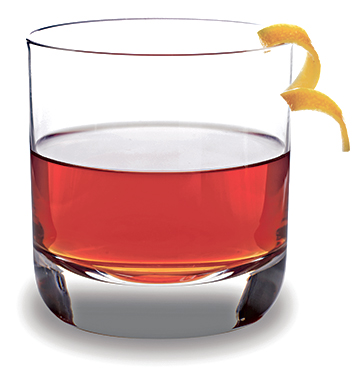
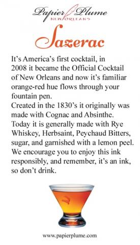
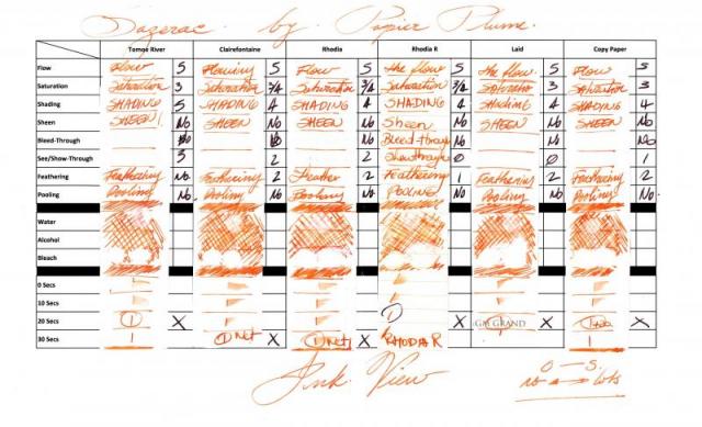
Ink View: Sazerac: Papier Plume’s homage to New Orleans official (dr)ink! Before we go any further. I wanted to apologize as my initial goal was to get this out to you before the ink was out for sale or sold out, but some unforeseen delays (mail system - mainly -) got me the sample too late to provide a meaningful view . I also want to thank Papier Plume for sending me a sample of this ink. and to Lapis for the earlier announcement. Now that that’s out of the way, I hope you enjoy this ink view as much as I enjoyed writing it. Sazerac, the drink and the (dr)ink. The Drink To start, you cannot talk about an ink about a drink, without talking about the said drink J (the rhyme was NOT on purpose). Sazerac is NOLA’s official cocktail drink. A heritage drink that dates back to the 19th century, with some arguing that it was created in the mid 1800s and others in the late 1800s. Others will consider Sazerac America’s first cocktail. What is unanimous, is that the drink was recorded (written) at the beginning of 20th century and that the name was derived from the liquor used in the original recipe: a Cognac produced by the Sazerac de Forge et Fils house (expensive, expensive), and that one of the more characteristic ingredients is peychaud’s bitters, produced by Peychaud’s apothecary (the bitters are now own by the sazerac company). Now again, some also say that it was Peychaud the one that had the recipe and shared the drink with his friends. But it wasn’t until the Sazerac bar (a bar that offered sazerac based drinks) that this drink was offered to a broader audience. Regardless , it’s a drink that had survived alterations (instead of Cognac using Rye Whiskey, addition to absinthe), changing times (different owner’s) and prohibitions(alcohol prohibitions including absinthe). It might not be in every cocktail menu in NOLA, but can surely be ordered off the menu (if asked politely ). As of 2008 The Sazerac became the official cocktail of New Orleans. So how do you prepare a Sazerac? - not the topic of this view but here is a good link for those that are curious. Now, let’s talk about the (dr)ink. The Ink Here is a shot of the bottles: (Quick trivia what is the pen on the background ? – answer at the end ) This (ink) is the third installment in Papier Plume’s (PP) homage to its native city, the first two being Street Car Green and Calle real. As with their previous inks, the hues are inspired on what they are looking to pay tribute to, in this case the drink itself. And as Papier Plume: “The drink varies from red to a golden orange depending on the hand of the bartender.” So, did the ink managed to achieve that? I think so, golden orange yes, red ? not to a deep red, but reddish tones. The shading is definitely there and it is strong. I’d say this before going any further – it does not smell or taste like the drink – shame! Let’s see the swab in the Mnemosyne card: This is definitely an orange family ink, it has yellow and redish tones depending on where and how much of the ink pools, my first impressions was how light it went on the paper. I let a few drops fall on the swab to see how it behaved and also to get a feeling about the drying time (definitely not quick). It also gave me some idea that this would be a good shading ink; however it requires a somewhat wet pen to truly bring out its properties. So on to the tools: Pens: Visconti HS Bronze – Medium, Van Graf FB – Sand – Medium, FC 02 Italian Glass - Broad Stub AND Twsbi Vac 700 Fine. Paper: Tomoe River, Rhodia, Rhodia R, Clairefountaine Thriomphe (CF), traditional copy paper and laid paper. Tests: Flow, saturation, shading, sheen, bleed-through, see-through/show-through, feathering and pooling. With other tests such as water, bleach and alcohol and dry times. Sometimes it will be a yes/no answer, sometimes 1-5 (1 being poor, 5 being excellent) CrossOver Card This is an idea I came about with my last ink view, it allows me to see all the papers and how the ink behaves across . You can see that each column is representative of the paper used. Thoughts on the ink-paper behavior Flow: Flow is good, very fluid, consistent across all papers and pens usedSaturation: Medium, sometimes it looked more saturated depending on the paper, but it was within my expectations if I was looking for good shading.Sheen: None, Zip, nada.Shade: This is where this SHINES. Yes, this ink shades. I was able to get shading across the papers used. And all nib types (thumbs up)Bleed-through: None, not even on copy paper, under normal writing circumstances. That being said I did let a fair amount of ink pool and let it dry to see the result and under those circumstances it did bleed on most papers.Show-through: There is some slight, very slight on all papers with the exception of Rhodia R and Laid . However it is not enough (IMHO) to not be able to write on both sides.Feathering: Now I did experience some tiny (and I’m being picky) feathering using a very wet nib, on all papers but tomoe. Now to be fair this was a very wet nib that I was using to see how far I could take it. Please take note that you the paper you are using is sensitive to the oils of your hand this ink will feather where the oils mix with the paper.Pooling: (This is not the shading but more on the pooling on the edges of the letters, I enjoy when the inks provide this). There was none that I could observe in any of the papersWater Resistance: The tests shown on the card were done using an eyedropper, leaving it a few seconds then using a tissue paper to retrieve the excess. But offline I did a more smear/spread test. Tests show that the ink was not waterproof, but you could potentially recover some of the writing if need to be. Big shout to Tomoe river as the ink just held on to the paper, for a paper that rejects ink by nature it is a bit odd. Alcohol Resistance: Very consistent across. You would be able to recover from this one – almost no effect.Bleach Resistance: None, Zip , nada.Dry Times: As noted this is a wet ink and the drying times were there to support it with drying times that were around the 20sec mark and on some papers longer than that. One thing I had not mentioned before it is how easy is to clean any of PP’s inks from the pens I have used them, I would attribute this to the fact that they are not meant to be waterproof, as well as that they are not viscose and not too saturated. Here are some other inks for comparison, From the top and then left to right: Ink NameMakerOverall notesAmberPelikanThis is a more yellow golden ink with great shadingSazeracPapier PlumeN/ACopper OrangeLamyLooks dark compared to Sazerac, not a lot of shading and more saturatedApache SunsetNoodlersDarker than Sazerac and renowned for its shading properties PumpkinDiamineNo shading, super bright almost no hint of brownHabaneroNoodlersApache’s darker shade or tanned brother haha! And here is a quick sketch of the Sazerac to draw Sazerac ! Here is some Cursive and Block writing for reference. Opinion Personally: I am a fan of oranges, I am. So I would say I like this ink. Objectively: this ink is not the easiest to have on a work environment, but everywhere else it would be a fun ink. This is an ink with great shading properties and it doesn’t completely washes away if by accident some water gets poured on to the paper. It is pleasant to read but it is a wet ink so you might be looking a slightly more than average dry times, again it all depends on the paper and how wet you nib is. I mentioned before that it goes lighter on the paper than any of the other inks I have, but that doesn’t mean there are others out there that could be in the same range and I don’t have or I have never tried (Caran d’ache saffron?, MB ink of Joy?, iroshizuku yu-yake?). I’m very happy to have this ink as part of my orange repertoire Availability As noted at the beginning of this view this is now sold out. For this release Papier Plume increased the production from 30 to 55 1 Oz / 30ml bottles, but sadly it was sold out within the hour of its release. I would say this, if you can get a change to try it, I strongly recommend it. For those that made it this far: what is the pen on the background of the bottle picture? The Answer : Visconti Van Gogh Room in Arles J In addition, as with all the inks in this collection Papier Plume includes nice double side card with the history of what the ink pays respect to and a list/teaser of all the inks on the collection, they don't come with samples though, but 2 more to go! Papier Plume notifies their ink availability through their newsletter first, then Instagram, then Facebook, and finally twitter (in that order). Thank you for keeping up with me up to this point !- 19 replies
-

Ink View: Calle Real: Papier Plume’S Next In The History Of New Orleans Inspired Inks
Jackokun posted a topic in Ink Reviews
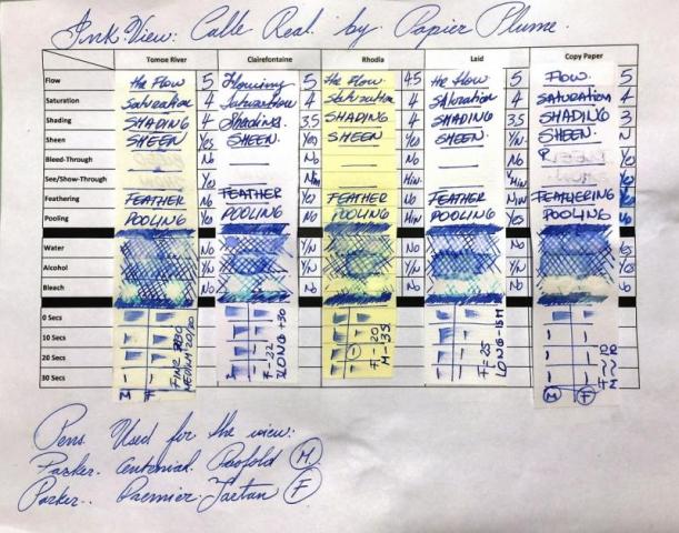
I got a nice surprise from Papier Plume when they sent me a sample of the next upcoming ink. The first one, Street Car Green(SCG), was one that I got by chance and Papier Plumes generosity. I used SCG for my first ink (re)View. The ink is Calle Real (Spanish for Royal Street), an ink that follows the theme of historic New Orleans, where each ink released is meant to evoke some portion of the city's history. With each ink bottle there is a brief history of the ink and what it evokes, including a teaser of the next releases (here is the hint, the inks to be released are NOT highlighted, ). All this information is well presented in nice card The Card Front/Back: So what is the actual Calle Real? (I know a few may have diferent opinions and thoughts on the matter, so please bear with me if I'm saying something that is not true or completely accurate ). Calle Real according to history is what Royal Street used to be called when Spain had control over New Orleans. It is one of the oldest streets in the city (dating back to when it was a French colony then Rue Royale ) and one of the best known streets in NOLA. At some point during the late 1800s and early 1900s the city designated the streets using tiles, one letter per tile (tiles are 4x 6x 3/4and the letter 5) and they were placed on each corner of every block. Now, when you walk New Orleans you will notice that there are wall tiles and street tiles. Yes! But the wall tiles are a way for the city to commemorate the street names as they were known then. The Original tiles are actually the street tiles. Here is a picture of one of the wall tiles: Here is a picture of the street tiles: And here a little more on facts: the tiles used are called Encaustic tiles. These are unglazed and the designs and colors are not painted using dyes or minerals, but come from different colors of clay using inlaid patters and then baked. The tiles made through this process are stronger and more resistant to wear/tear. ( from what I could find encaustic is not the right term in theory-, but it is how is commonly known ). The process for creating these types of tiles is costly and time consuming, but the city, per my understanding, makes the effort to maintain the tiles even during renovations. Over the years the tiles remain both as a historic reference and as a characteristic trait of the French Quarter. Royal Street is much, much more, located just one block away from the Bourbon Street; Royal Street is no less famous than his street relative. While Bourbon Street is known for its endless bars and nighttime entertainment, Royal Street is the home of multitude of shops and galleries, where you can appreciate during daytime the citys culture and art, street musicians and performers, great for-every-budget restaurants, some upscale lodging, the haunted LaLaurie House (for those that like some good ghost stories) and of course Papier Plume A well suited start for a commemorative ink. So here is New Orleans inspired inks Take 2! Calle Real As per Paiper Plume, Calle Real is inspired in the color of the wall tiles, yes some might argue that the color changes from tile to tile depending on the wear and tear and general passing of time, but as per my understanding the ink is based on the more consistent color on the wall tiles. As you can guess, Calle Real is a blue ink within the Royal Blue Family, which is a nice play on the Royal name of the street. Ha! (disclaimer: I'm still working out the kinks on picture vs. scan to have the most truer representation so it is a work in progress) Here is what the swab looks like in the Mnemosyne card After spending some time writing with ink, tossing it on medium and fine pens both wet and dry, and testing it using different papers, I would classify this as a mid-Royal Blue, not too dark and not too light, with a good flow and medium saturation (I personally medium to be a great setting of saturation if you are looking for shading in an ink), and very consistent in terms of properties with the other Papier Plumes inks I have. Now on my first review I used 2 kinds of paper. To be both consistent and a little more thorough this time, I used 5 types of paper, Tomoe River, Rhodia, Clairefountaine Thriomphe (CF), traditional copy paper and laid paper. The pens used for writing were Parker pens: A Parker Premier Tartan in Fine and Parker Duofold Centennial in Medium. The medium Duofold has a wetter nib, and was the one used for most of the comparisons. I looked into the following: Flow, saturation, shading, sheen, bleed-through, see-through/show-through, feathering and pooling. With other tests such as water, bleach and alcohol and dry times. Sometimes it will be a yes/no answer, sometimes 1-5 (1 being poor, 5 being excellent) I also came up with the following overview card, thought to be more practical than having fuill sheets of paper and you can also see the comparison right there. Here are some of the results in the crossover overview card You can see that each column is representative of the paper used. Flow: Flow is really good, very fluid, and constant across all papers and pens used (not just the ones on this view. feels like you are using water, which is something to say since the ink has some waterproof properties. Saturation: I found Calle Real to be a little more saturated, this did not compromised in the shading as much as I would thought, but on the plus side made the ink more vibrant and less subject to the texture of the paper giving it a an even spread.Sheen: This ink has some hints of sheen, they can really be seen in the Tomoe River paper, but depending on the wetness of the pen used it can also show in CF and Rhodia (as did in my experience)Bleed-through: None for the most part with the exception of the traditional copy paper who sucked in the ink like a spongeShow-through: There is some slight, very slight on the CF, more noticeable on the Tomoe River and the copy paper. But not enough to not be able to write on both sides (if the copy paper didnt bleed as it did this will also be true for it).Feathering: For the most part Calle real held its ground here. Some minimal feathering with CF and the laid paper (although this last one we can argue is the papers texture). The big fail was on the copy paper not surprising Pooling: This is not the shading but more on the pooling on the edges of the letters, I enjoy when the inks provide this, and I could see some of this pooling on Tomoe, CF and RhodiaWater Resistance: The tests shown on the card were done using an eyedropper, leaving it a few seconds then using a tissue paper to retrieve the excess. But offline I did a more smear/spread test. Tests show that the ink was not really waterproof, but you could potentially recover some of the writing if need to be. One exception was the copy paper, which absorbed the ink and held on to it. I know Im surprised as well.Alcohol Resistance: Very consistent across you, would be able to recover from this oneBleach Resistance: None, Zip , nada.Dry Times: They were very consistent across all but the copy paper (who was record breaking of less than 10 seconds). Now, keep in mind that I was using a wetter nib, the fine nib did better across. As for comparison, here are the closest blues I could find from the bottles that I have. From the top and then left to right: Ink NameMakerOverall notesCalle RealPapier PlumeN/ABlueViscontiDarker , some shading , sheen when it pools, more saturated. Royal BlueS.T. DupontThe lightest of the bunch, less saturated, has sheen, and a purpler hint than the rest, good shading.Blue VelvetDiamine (150th Collection)The darkest of the bunch, More saturated, darker, more sheen, slight shadingRoyal BluePelikanLighter, some shading, some sheen when it pools And here is a quick sketch of the Royal Street using Calle Real ! but imagine that the street is a very well transited street, in fact it becomes a pedestrian street during the afternoons. Here is some Cursive and Block writing for reference. Opinion I find blue one of the most personal colors when it comes to what you prefer. I know the same can be said for other colors, but I find blue one of the most extensive out there. That being said, in comparison of what I have experience with, and what I have, I find really good properties on Calle Real, the slightly more saturation allows for more solid lay down of the ink which makes it vibrant (more so than the ones I compare it to), while it also maintains shading properties across all types of paper used. It is work appropriate and fits right in the middle of the inks I have. There is some draw backs in terms of resistance to water, alcohol or bleach, but that is not a deal-breaker. A nice ink that it is pleasant to look at . Release So, hopefully you have stuck with me until this point. If you like this ink, note that there will only be 30 bottles for sale. From what I understand the first ink released in this collection (Street Car Green) was sold out in less than an hour. The ink will be sold in 1 Oz / 30 ml bottles and will look like this: If someone is interested my understanding is that will be up for grabs this Friday (June 17, 2016)/ or Monday at the latest. Availability will be noted through their newsletter first, then Instagram, then Facebook, and finally twitter (in that order). you can get this and more other goodies at https://www.papierplume.com/ Thank you for sticking with this view until the end- 13 replies
-
- ink review
- calle real
-
(and 2 more)
Tagged with:
-
For anyone interested, Papier Plume is now selling Street Car Green in store and through their website https://www.papierpl...-car-green.html Per the description, the ink will be a limited production, with a run of 30 of 1Oz bottles this time around They also have a more nicer description of the ink background that I've could have done in my review
-
- papier plume
- street car green
-
(and 3 more)
Tagged with:


