Search the Community
Showing results for tags 'nitrogen'.
-
Hi everyone, Is anyone else getting more practical with their ink choices? Although I have dozens of ink options, brands, and colors I find myself wanting to ink more with blues, blacks, greens and useable colors over the more whimsical colors like pinks, purples, reds, yellows or oranges. Don't get me wrong, I still love and use a sheen or shade (no shimmers). I just find myself wanting more suitable ink colors for day-to-day usage. Is it just me? My favorite inks to fill pens with recently are Organic Studios Nitrogen, Noodler's Heart of Darkness, Monblanc Irish Green, Diamine Salamander and Diamine Majestic Blue. I also have a Lamy Studio with a fine 14k nib filled with Baystate Blue that I use regularly. I have other pens filled with reds, browns and the purple/pinks, however, they rarely get used and I find aren't practical for everyday writing. I also happen to like Diamine Wagner that my Bordeaux LeGrand is inked with. It's a yellow-ish light/medium green (think olive) and I'd love to find more times to use it. Am I going nuts to want to resort to more basic colored inks? Like I mentioned above, I still use inks with sheen and I really like to see shading. Yet, when it come to colors and situations, the blues, blacks and greens are what I'm reaching for over the (to me) much less useful colors. Don't get me wrong, I love me some Claret and Apache Sunset. Who doesn't like a bit of Imperial Purple or a ribbon of Honey Blast? I just can't find a daily use for them. Sure, I can use them when I do some of my transcribing. But I don't feel the color when I'm doing so. A color switch would be more of a function of a change for the sake of the change. How do I make a color fit what I'm doing? Even if it's just the few times I write for pleasure. What do you think? Where are you at? Has anyone else here moved to more practical ink colors? Happy Holidays
-
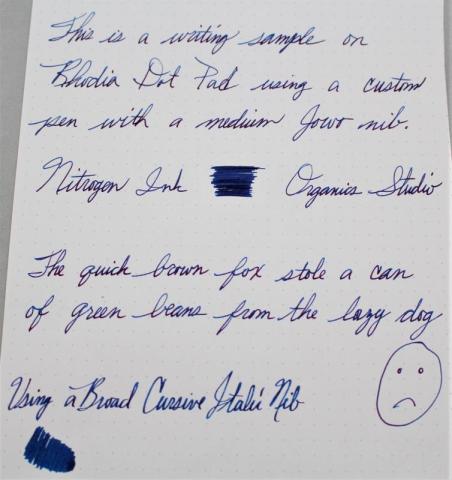
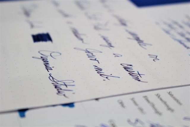
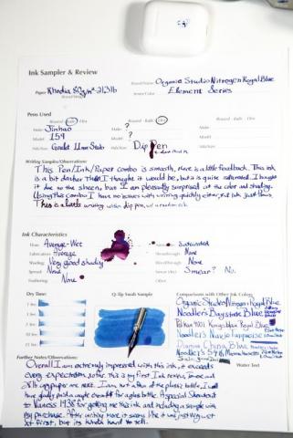
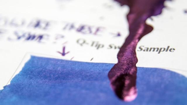
Here is my review of Nitrogen Ink by Organics Studios. I only tried this ink because so many people were raving about it. I get it now. It is a really cool blue ink. It has this weird shimmery thing going on. If you look at it in glancing light it looks purplish pink and if you see it head on it looks blue. Also, aside from a couple of hard starts, the ink seems to behave pretty well. I will probably permanently keep this in a pen from now on. I love blues, and this one is very unique. I hope you like the review. I would love to hear what everyone thinks. Thanks for looking.
-
I am a fan of sheening inks, and this is the king of them. At a very reasonable price I had to try it out, and I am glad I did. On Rhodia: On Tomoe River A4 A lot of the files are too big, so I put together an album: https://imgur.com/a/73uby
- 15 replies
-
- organic studio
- nitrogen
-
(and 1 more)
Tagged with: