Search the Community
Showing results for tags 'new orleans collection'.
-
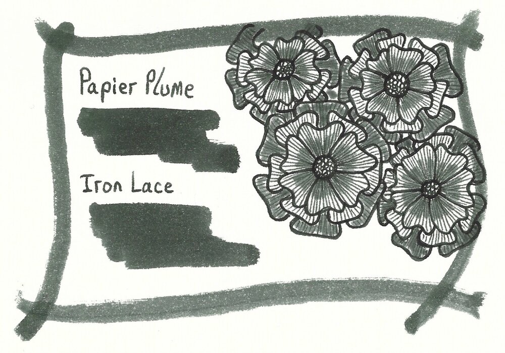
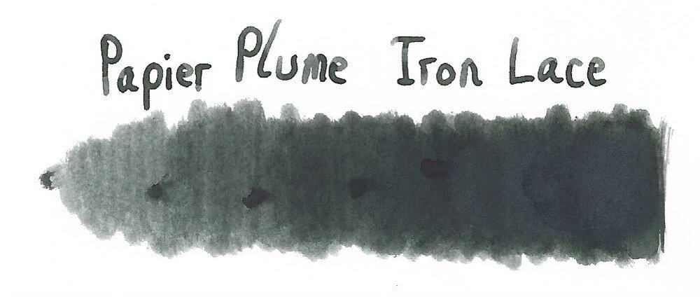
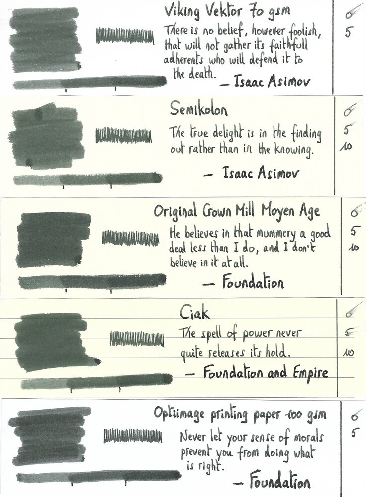
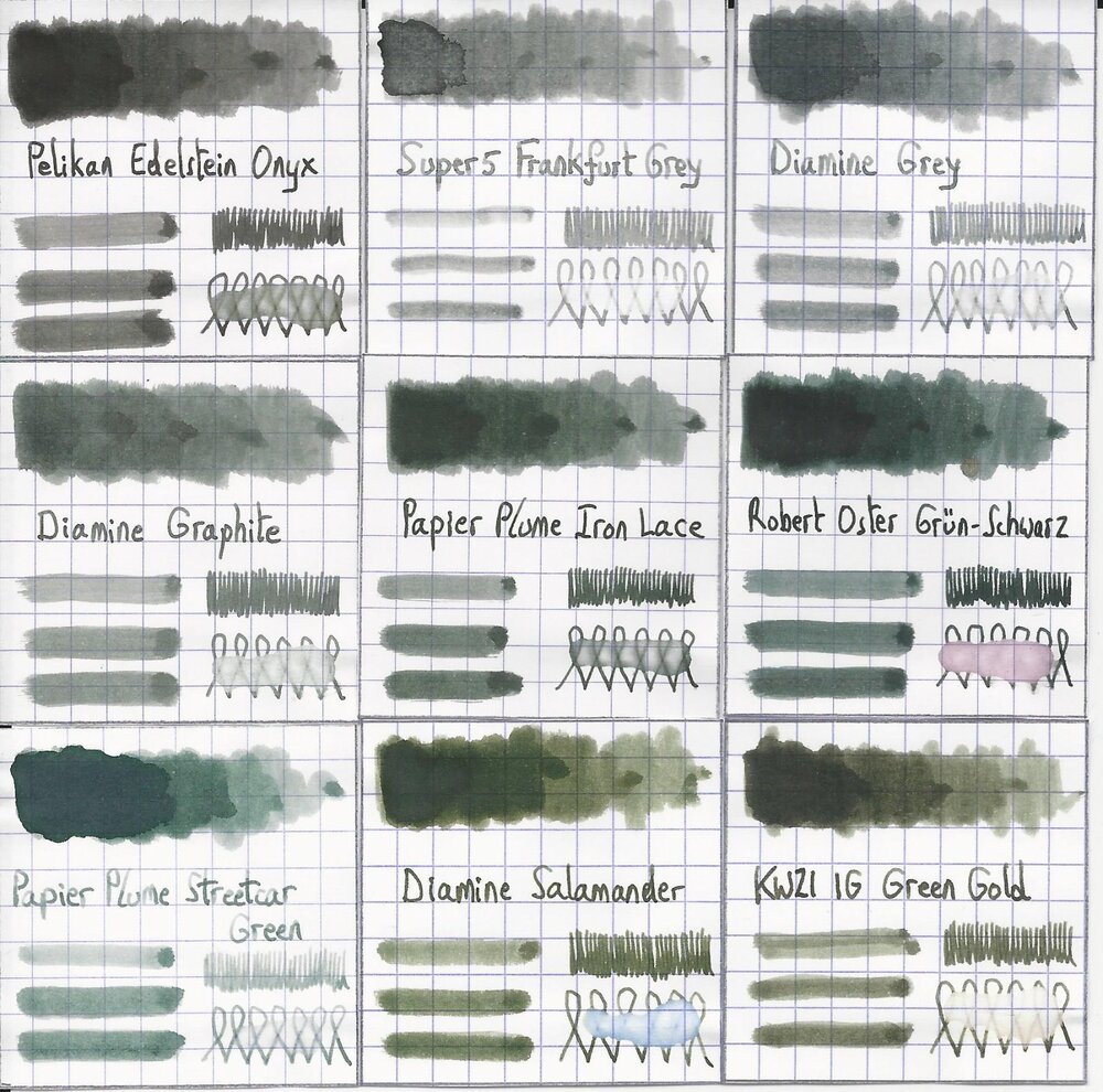
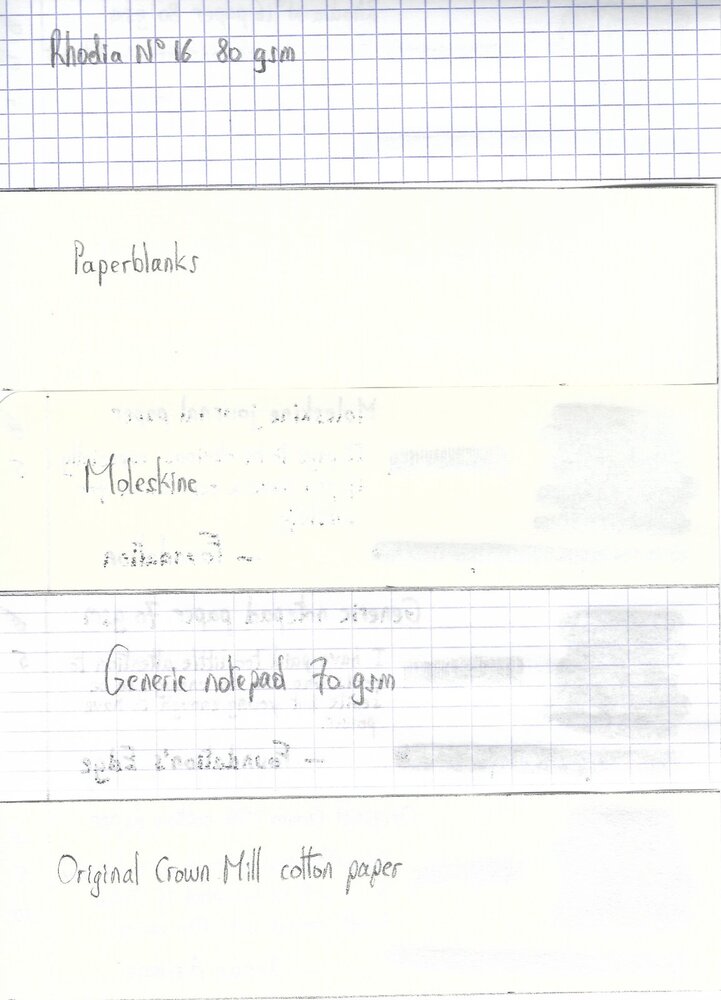
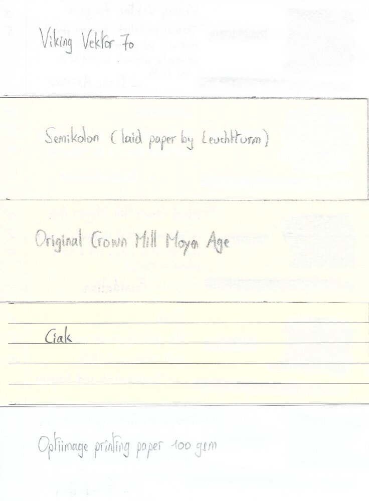
Papier Plume – Iron Lace (New Orleans Collection) Papier Plume is a stationary shop in New Orleans, that’s best known on this forum for their “New Orleans Inks”, that celebrate the rich colours and history of the city. One of their inks in this series is Iron Lace, a black ink with a strong green undertone. This ink from the New Orleans Collection is inspired by the iron lace galleries and balconies in the French Quarter. These intricate designs from wrought or cast iron can shift from black to green depending on the oxidation level of the iron. The Iron Lace ink captures this aspect just right: it’s a black ink at heart, but with a strong green component, that surfaces mostly in swatches. On the bottle it says “A Not-So Basic Black”, and they are totally right. This is not a dull and boring black, but one with layers of complexity that makes it a very interesting ink to write & draw with. The ink itself writes fairly wet with good lubrication in my Lamy Safari test pens. Quite a contrast with some of the other New Orleans inks. Saturation is excellent, even with EF nibs. The ink has a small dynamic range, without much contrast between light and dark areas. To illustrate this, I did a swab where I really saturated portions of the Tomoe River paper with ink, pooling it on. The limited contrast range translates to soft & elegant shading that looks aesthetically pleasing. Shading is just visible with the EF nib, and becomes more prominent with M-nibs and above. But it’s always subdued, giving just that extra touch of elegance to your writing. On the smudge test – rubbing text with a moist Q-tip cotton swab – there is quite some smearing, but the text itself remains crisp and clear. Water resistance is surprisingly good, both with my still water test (letting drops of water sit on the page for 15 minutes) and with a running water test. The ink easily survives watery accidents, making it an excellent ink for use at the office. The chromatography confirms this: the dyes remain firmly attached to the paper in the bottom part. I’ve tested the ink on a wide variety of paper – from crappy Moleskine to high-end Tomoe River. On each scrap of paper I show you: An ink swab, made with a cotton Q-tip 1-2-3 pass swab, to show increasing saturation An ink scribble made with a Lamy Safari M-nib fountain pen The name of the paper used, written with a Lamy Safari B-nib A small text sample, written with the M-nib The source of the quote, written with a Pelikan M101N with M-nib Drying times of the ink on the paper (with the M-nib) Iron Lace has a slight tendency to feather on the lower quality papers in my test set, most obvious when using a wet pen (see e.g. the source of the quote on the HP and Optiimage printing paper). I noticed no issues with better quality paper or when using finer nibs (M-nib or below) on paper of lesser quality. The ink writes smoothly with good lubrication, and provides excellent contrast with the page. Writing looks good on both white and more yellow paper. Drying times are fairly low – in the 5 second range with my Lamy Safari M-nib. All in all a fine ink for use in an EDC pen. At the end of the review, I also show the back-side of the different paper types, in the same order. A small amount of bleed-through is present on some of the lower-quality papers (Moleskine, generic notepad paper), but nothing too bad. Since scans alone are not always enough to give you a complete picture of the ink, I also provide you with a few photos for an alternative look at Iron Lace. Writing with different nib sizes The picture below shows the effect of nib sizes on the writing. Papier Plume Iron Lace manages to look good in all nib sizes from EF up to the 1.9mm calligraphy nib. With the very fine nibs shading is just visible, but starting at F/M and above the soft and eye-pleasing shading adds extra character to your writing without being overdone. I personally prefer Iron Lace in drier pens, where it writes a bit less saturated, and where the ink’s subdued shading is much more prominently visible. With wet pens, the more heavy saturation tends to overwhelm the ink’s shading, making your writing look more flat (my opinion). Related inks To compare Iron Lace with related inks, I use my nine-grid format with the currently reviewed ink at the center. This format shows the name of related inks, a saturation sample, a 1-2-3 swab and a water resistance test – all in a very compact format. I added Pelikan Onyx – which is a pure black – as a reference point. This clearly shows the green undertones that are present in Iron Lace. Diamine Graphite comes close in colour, but is lighter in nature (dark grey instead of black). Inkxperiment – Eye in the Sky With every review I try to do a single-ink drawing that shows what the ink is capable of in a more artistic setting. The most fun part of the ink review, and I quite enjoy brainstorming and then implementing these little pieces. Inspiration comes from the Alan Parsons song “Eye in the Sky”, with the lyrics: “I am the eye in the sky … Looking at you … I can read your mind”. I used these elements as the theme for the drawing. For this inkxperiment I used a piece of 300 gsm rough watercolour paper. I started by drawing in the outer eye surrounded by a geometric pattern. I then added the inner eye looking over the cityscape. Everything was drawn with Q-tips using different water/ink ratios. I finally added the details to the eye and the houses using a Lamy Safari pen filled with Iron Lace. In this more artistic setting, Iron Lace beautifully shows its green undertones. Conclusion Iron Lace from Papier Plume is a very well executed addition to their New Orleans line. A beautifully complex black with green undertones, that deviates enough from true black to make the ink quite interesting. Technically the ink is near perfect: good flow, well saturated, subtle shading, looks good in all nib sizes and on all paper types. I personally prefer the ink in drier pens, where the shading is more present. If you like off-black inks, this one is definitely worth your attention. Technical test results on Rhodia N° 16 notepad paper, written with Lamy Safari, M-nib Backside of writing samples on different paper types
- 20 replies
-
- papier plume
- new orleans collection
-
(and 3 more)
Tagged with:
-

Papier Plume - Mardi Gras Indians Purple (New Orleans Collection)
namrehsnoom posted a topic in Ink Reviews
Papier Plume - Mardi Gras Indians Purple (New Orleans Collection) Papier Plume is a stationary shop in New Orleans, that's been getting some attention lately on this forum with their "New Orleans Inks", that celebrate the rich colours and history of the city. One of their inks in this series is Mardi Gras Indians Purple, a very nice grey-puple ink that I immediately took a liking to. Mardi Gras Indians Purple is a dark purple ink that looks surprisingly good on paper. Sometimes an ink instinctively appeals to you on first use ... that's what happened to me with this Papier Plume colour. I really like it. It's a purple ink, but not of the vibrant kind. Its greyish tones make for a more subdued look, that will work quite well when used as an office ink. Shading is definitely there, but without too much contrast between the light and darker parts, just as I like it. A very classy ink ! And what a cool name! This ink is modelled after the purplish colours that are often present in the elaborate costumes of Mardi Gras Indians in New Orleans. As such, the ink has links to the colourful history of the city. Be sure to read Jackokun’s excellent review that has tons of historical background - highly recommended ! The ink differs from other Papier Plume inks in this series: this one is much wetter and quite well lubricated. It's by no means a wet ink, but it still pleasantly surprised me since it is definitely the wettest ink from Papier Plume that I have used so far. Another good point in its favour! The ink has a medium dynamic colour span. To illustrate this, I did a swab where I really saturated portions of the paper with ink, pooling it on. This illustrates the dynamics of Mardi Gras Indians Purple, with moves from a light violet to a dark grey-purple colour. On the smudge test - rubbing text with a moist Q-tip cotton swab - the ink behaved very well . There is very little smearing, and the text remains perfectly readable. Water resistance is remarkably good - both with a 15 minute soak test with still water, and when running tap water over the writing. The ink smudges, but the text itself remains clearly readable - even after 30 seconds under running tap water. A welcome plus if you'll be using this as an office ink. This is also apparent from the lower part of the chromatography, which shows that that greyish components of the ink remain firmly attached to the paper. I've tested the ink on a wide variety of paper - from crappy Moleskine to high-end Tomoe River. On each scrap of paper I show you: An ink swab, made with a cotton Q-tip 1-2-3 pass swab, to show increasing saturation An ink scribble made with a Lamy Safari M-nib fountain pen The name of the paper used, written with a Lamy Safari B-nib A small text sample, written with an M-nib Drying times of the ink on the paper (with the M-nib) Mardi Gras Indians Purple behaved perfectly with most papers in my test set. Drying times are very acceptable in the 10-15 second range with the M-nib. With the low-quality papers I noticed a tiny amount of feathering, especially with the broad nib. You also get a bit of bleed-through with these papers. With better quality paper, the ink works flawlessly. The ink has a very consistent appearance across paper types, and looks good on both the white and off-white paper. My personal opinion: a sophisticated and good-looking ink. Writing with different nib sizes The picture below shows the effect of nib sizes on the writing. All samples were written with a Lamy Safari, which is typically a dry pen. I also added a visiting pen - my wet Pelikan M400 White Tortoise with an M-nib. With all these combinations, the ink writes very pleasantly and leaves a nicely saturated line. Related inks To show off related inks, I recently switched to a nine-grid format, with the currently reviewed ink at the center. The new format shows the name of related inks, a saturation sample, a 1-2-3 swab and a water resistance test - all in a very compact format. This format makes it easy to compare the ink with its eight direct neighbours, which I hope will be useful to you. Inkxperiment – Lighthouse For some time now I've been experimenting with ink drawings, keeping things simple and more-or-less abstract. I find this to be a fun extension of the hobby, and these single-ink drawings often present quite a nice challenge. It also gives you an idea of what the ink is capable of in a more artistic setting. Recently I've been using HP photo paper as a drawing medium. I'm quite fascinated by the vibrancy that inks achieve on this type of paper. For this drawing, I started by submerging the paper in water to which I added a few drops of ink. This gives a light-purple background that forms the starting point for this little 10 by 15 cm drawing. Next I painted in the horizon lines and the lighthouse, using different mixes of ink & water. I then painted in the sky and the water. Finally I added the trees, and darkened up the horizon line and lighthouse with pure Mardi Gras Indians Purple. The end result gives you a good idea of the way the ink expresses itself when used for drawing. Conclusion Mardi Gras Indians Purple from Papier Plume is a gem of an ink: a classy dark-purple colour, that leaves a saturated nicely-shaded line, and that is quite water-resistant. As such, it's an excellent ink for use at the office. This ink immediately appealed to me with its subdued grey-purple tones - it went straight to my top three for 2019 (but the year still has nine months to go, so this may change... we’ll see). I you like your purples, this is an ink that you will almost certainly appreciate. I recommend giving it a try! Technical test results on Rhodia N° 16 notepad paper, written with Lamy Safari, M-nib Backside of writing samples on different paper types- 9 replies
-
- papier plume
- new orleans collection
- (and 2 more)

