Search the Community
Showing results for tags 'moonlight of higashiyama'.
-
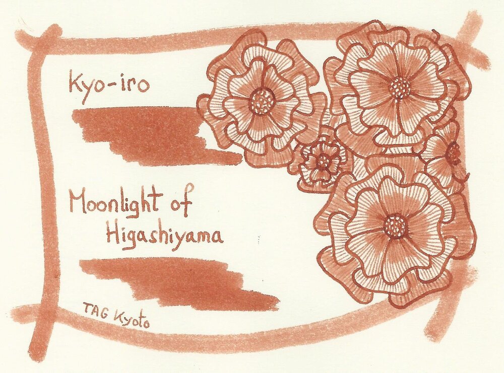
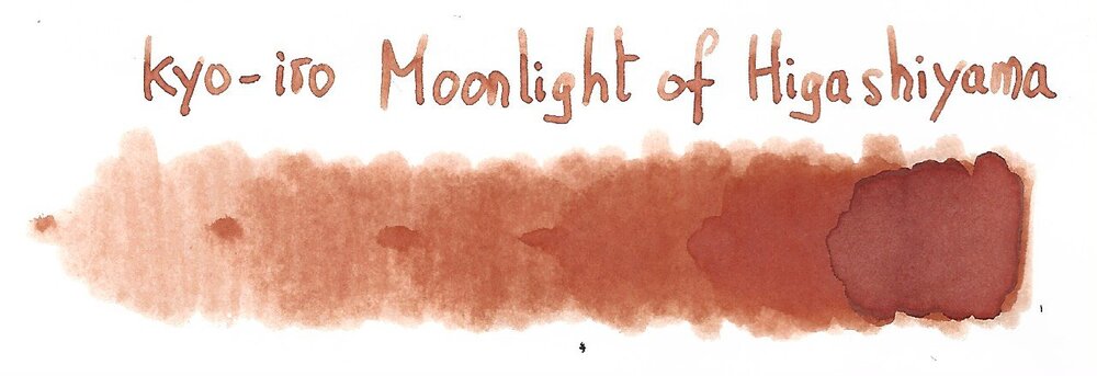
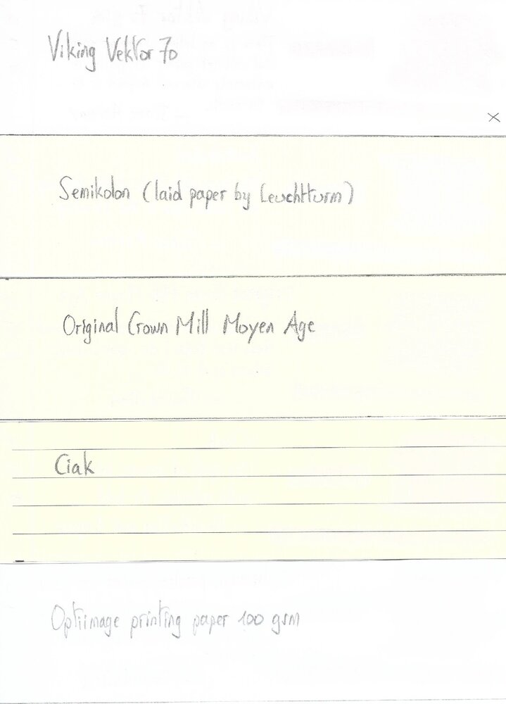
TAG Kyoto – kyo-iro – Moonlight of Higashiyama TAG is a stationary shop in Kyoto (Japan) that produces some interesting soft watercolour-style inks. With the kyo-iro series they produce a line of inks that that are inspired by the city’s many beautiful and historic sights. Each of these inks is dedicated to a specific town in the Kyoto area. The inks come in 40 ml bottles, packaged in luxurious thick paper with a texture that feels like heavy watercolour paper. In this review I take a closer look at Moonlight of Higashiyama. This ink’s colour is a warm burnt-orange, that is inspired by the traditional wooden Machiya houses in Kyoto’s historic Higashiyama district. Like many TAG Kyoto inks, this one looks subdued and delicate, with tons of shading. And the shading is really well executed: very present, but never too harsh. My first impression: a seducing beauty, that is ideally suited for wintertime journaling. There is big but though… this ink is really dry (about on par with kyo-no-oto hisoku), which will probably be a show-stopper for some. Adding a bit of flow-aid solves the lubrication problem, but also results in increased saturation which completely destroys the delicate nature of the ink’s colour. So I hunted for a workable pen/nib/ink combination, which I found with my new treasure: a Pelikan M600 Tortoiseshell Red with M-nib. Here the ink writes with quite tolerable lubrication; still dry but no longer uncomfortable. Moonlight of Higashiyama is a soft ink with moderate saturation. Still, it produces a very readable line on paper, even with the finer nibs. Bear in mind: with EF/F nibs writing is a scratchy affair due to the ink’s dryness and writing is definitely not a pleasant affair. The ink works well with both white and more yellow paper. Personally I prefer this ink on the more yellow paper – the yellow/orange combination enhances the softness of the ink. To show you the impact of saturation on the ink’s look & feel on paper, I made some scribbles where I really saturated portions of the Tomoe River paper with ink. This gives you a good idea of what the ink is capable of in terms of colour range. Moonlight of Higashiyama has a limited colour span, which translates to soft shading. Very elegant and eye-pleasing – I like this ink’s shading a lot. The ink’s chromatography shows yellow, orange and red tones. It also indicates that the ink’s dyes are only loosely attached to the paper. This is clear from the bottom part of the chroma: almost all colour dissipates with water. This already indicates that Moonlight of Higashiyama has no water-resistance to speak of. I’ve tested the ink on a wide variety of paper – from crappy Moleskine to high-end Tomoe River. On every small band of paper I show you: An ink swab, made with a cotton Q-tip 1-2-3 pass swab, to show increasing saturation An ink scribble made with an M-nib Lamy Safari The name of the paper used, written with a B-nib Lamy Safari A small text sample, written with the M-nib Safari Source of the quote, with a Pelikan M600 with M nib Drying times of the ink on the paper (with the M-nib Safari) The ink looks great on all papers, but – as I already mentioned – I prefer its looks on the more yellowish paper. See-through and bleed-through are not a problem. Only with the Moleskine paper did I get visible bleed-through. Drying times are in the 5 second range with the Lamy Safari M-nib. The ink has a tendency to feather a bit on some papers in my test set. Unexpectedly, I also noticed some feathering on the Paperblanks paper, which is usually very fountain-pen friendly. Because scans don't always capture an ink's colour and contrast with good precision, I also add a few photos to give you an alternative look on the ink. Writing with different nib sizes The picture below shows the effect of nib sizes on the writing. Moonlight of Higashiyama writes with good contrast in all nib sizes, but feels horribly dry in the EF/F nibs. I like it best in a wet Pelikan M600 with M-nib – here is still looks subtle and elegant and with beautiful shading, while also loosing enough of its dryness to make for pleasant writing (word of warning: I have a high tolerance for dryness, so what I consider pleasant may not fit your definition). Related inks To compare Moonlight of Higashiyama with related inks, I use my nine-grid format with the currently reviewed ink at the center. This format shows the name of related inks, a saturation sample, a 1-2-3 swab and a water resistance test – all in a very compact format. Callifolio Anahuac comes close in colour, but shows harsher shading. Inkxperiment – Kindergarten I love to experiment with my inks in an artistic context. With my inkxperiments, I limit myself to the single ink I’m reviewing, allowing me to explore all of its colour range nuances. This is the part where I play with the ink, experiment with drawing techniques, and just have loads of fun. For this review, inspiration comes from the drawing of a lion that the youngest member in the family brought home from Kindergarten. “Kindergarten” … the word triggered an association: a child’s drawing in a garden setting. Et voilà, this inkxperiment was born. I started with a piece of A4-sized HP photo paper. This has become one of my favourite media for ink drawings. The photo paper really enhances any ink’s colour, making it look that much more vibrant. I created the background using a piece of kitchen sponge. Next I drew in the lion’s mane, and added flower stems. As a final step I used my fountain pen and a glass dip pen to add structure to the lion’s mane of the three flowers and to draw in the lions faces. The end result is my Kindergarten, which shows what can be accomplished with Moonlight of Higashiyama as a drawing ink. In my opinion: an ink with lots of potential for artistic purposes. Conclusion TAG kyo-iro Moonlight of Higashiyama has a beautiful burnt-orange colour. A soft-looking and elegant ink, warm and glowing, and ideal for winter-time journaling. But also: annoyingly dry and with a slight tendency to feather. Hunting for the right pen/nib/paper combination is a must with this ink. But still… I personally like the looks of this kyo-iro ink a lot, and really appreciate its potential in more artistic settings. Not an ink for everyone, but for me Moonlight of Higashiyama totally works. Technical test results on Rhodia N° 16 notepad paper, written with Lamy Safari, M-nib Back-side of writing samples on different paper types
- 15 replies


